
Text/Wang Yangtu/baidu
As one of the oldest characters in the world, Chinese characters have unique charm and are one of the protagonists of contemporary graphic design. Each Chinese character font has its own unique visual personality and is widely used in the field of graphic design . 
Graphic design is everywhere in our life: such as packaging design, outdoor advertising design, poster design, illustration design and decorative painting design, etc. With the development of the economy, great changes have taken place in people's material life and spiritual life, and people's requirements for beauty have gradually penetrated into various fields. How to effectively convey specific information to the target in graphic design is of course a problem that cannot be ignored. 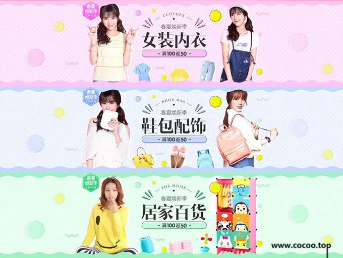
The place of text in graphic design
Text, as an abstract symbol and an important carrier for conveying information, plays a very important role in graphic design. People rely on the understanding of the "shape" of characters into "sound" and "meaning", and then generate communication and communication, so that the art of characters conveys profound connotations in graphic design. 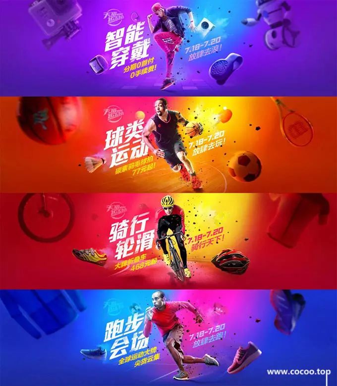
Text is more powerful than graphics and colors in graphic design, and proper text can often play a finishing touch. According to the morphological characteristics and output methods of fonts, Chinese character design can be divided into two forms: standard fonts and handwriting. Recommended reading:Use the "word" technique! The application and combination of Chinese characters in design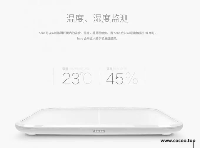
①Standard font: In the Chinese character system, standard font is the most widely used basic font in the field of modern design. These fonts have rigorous structure and simple strokes, emphasizing visual practicality and standardization. 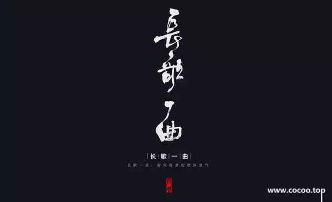
②Writing fonts: Standard fonts are highly standardized fonts, while writing fonts are free fonts created by using various writing tools according to your own ideas. 
Expressions of various fonts
Text, as a symbol system of visual recognition features, has a variety of shapes. Different font shapes have different independent characters, which give people different visual feelings and relatively direct visual appeal. Therefore, we need to understand various fonts The facial expression and visual personality, so that in the future design practice, different styles of fonts can be used more reasonably according to different design themes and contents. 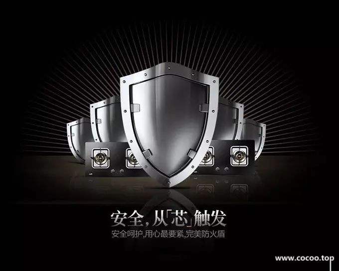
Arial
The morphological feature of Song typeface is that the font is square, the horizontal strokes are thin and the vertical strokes are thick. The thickness of point, left, right, pick, hook and vertical painting is basically equal, and its peak is short and powerful. It is a unique font formed by the combination of calligraphy pen and knife technique. It has elegant, neat, graceful and generous style characteristics. It is the longest and most widely used type of printing font. 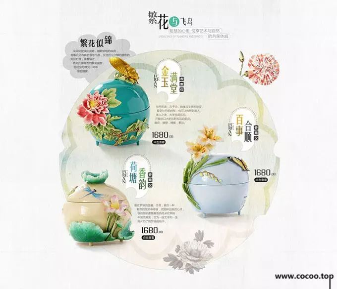
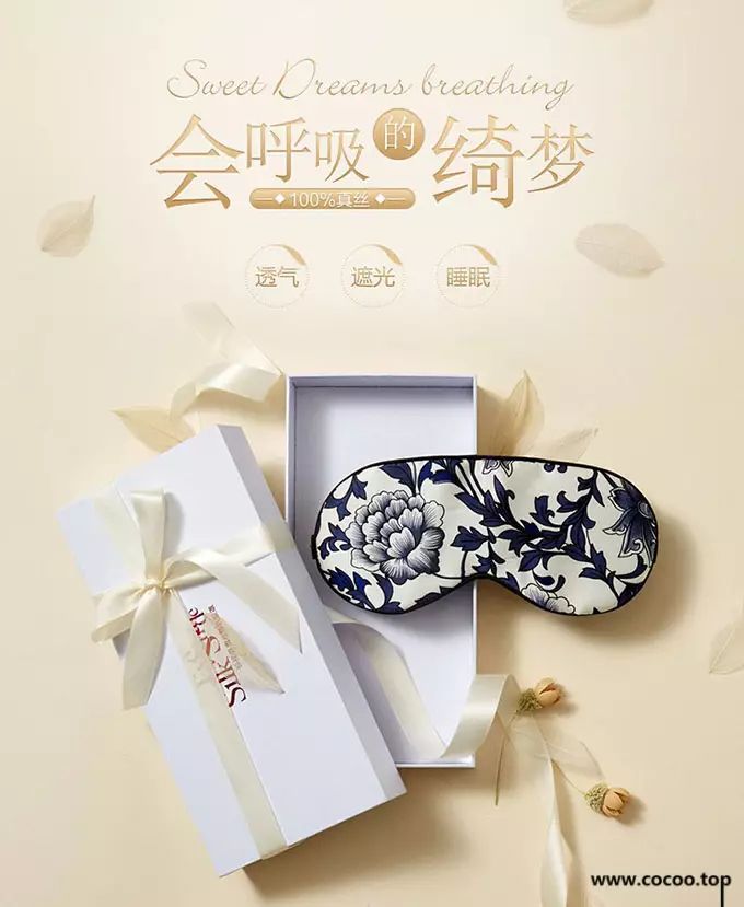
Song typeface is mostly used in graphic design for advertisements that can reflect the sense of age, history, and strong cultural atmosphere because of its graceful shape and thick strokes. For example, the elegant temperament and cultural connotation of Song typeface. Elegant pictures are matched with Song typeface, making the layout look elegant and harmonious, full of strong cultural atmosphere. 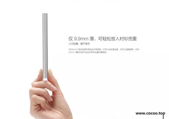
黑体
HeiTi has the opposite shape to SongTi, with horizontal and vertical strokes of the same thickness, a square head and a square tail, and dots, strokes, presses, picks, and hooks all have square heads and are of the same thickness. The black body strokes are thick and straight, and the shape of the characters is solemn and pure, giving people a modern, fashionable, stable, eye-catching and static visual experience. 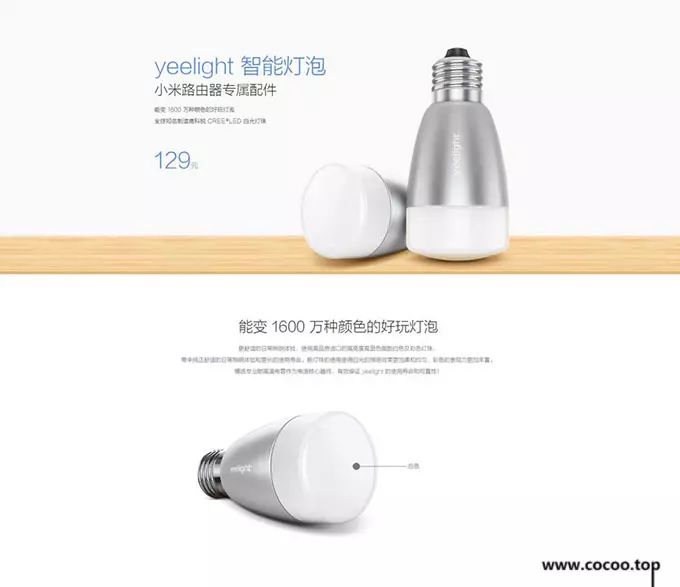
The black body is mostly used to express the layout with a strong sense of technology. The slogan is in bold, giving people a sense of authority that cannot be refuted at all, but also reveals a sense of modern technology. Simple graphics, combined with simple bold characters, make the atmosphere of the whole picture very harmonious, and fully express the connotation that the designer wants to express. 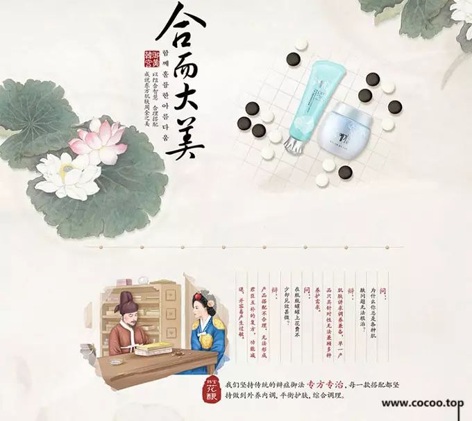
Italian
Calligraphy is a printed style that is closer to calligraphy. It has a rigorous structure, smooth and peaceful writing style, with the squareness of ancient Li, the beauty of Bafen, the simplicity of Zhangcao, and a sense of stability and tranquility. The horizontal painting is long, the straight painting is short, the structure is slightly wider, neat and beautiful, full of charm, and the strokes are light and dignified, giving people a sense of attention and longing, with classical beauty. 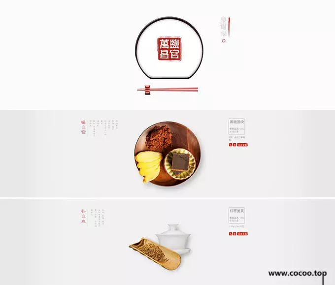
The classic temperament of Kai font is suitable for combining with traditional calligraphy or other traditional elements in graphic design, so as to fully express the classical temperament of Kai font. We must learn to distinguish the suitable range of various fonts. A basic principle is whether the temperament of the font matches the temperament of the layout. For example, italics has a strong cultural temperament, so it can be used in cultural and traditional designs. HeiTi is a modern font, which is firm and stable, but a little bulky and rough. 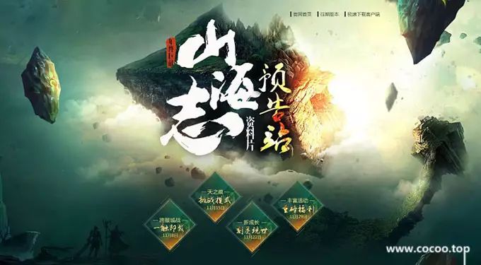
Traditional Calligraphy
Calligraphy, as a unique character art of the Chinese nation, developed along with the emergence and development of Chinese characters. Traditional Chinese calligraphy is different from general computer art characters by its simple, elegant, vigorous and agile artistic style. It can be said that the brilliance of various calligraphy styles such as Zhen, Cao, Li, Xing, and Zhuan makes the simple black and white world colorful. 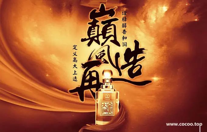
However, completely using calligraphy fonts without any changes is far from being able to meet the requirements of the times. It is necessary to make calligraphy art better have the flavor of the times, better integrate into graphic design works, and make it the finishing touch. role, it puts forward higher requirements for our design workers. First of all, the designer must have a systematic understanding and understanding of various book styles, so as to achieve a comprehensive understanding and flexible use. Secondly, the use of calligraphy fonts must be coordinated and integrated with the entire graphic design work. 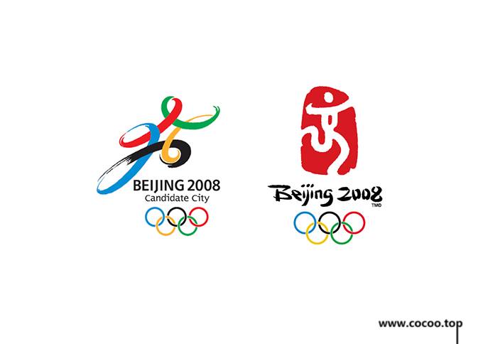
For example: the emblem of the 2008 Beijing Olympic Games "Chinese Seal - Dancing Beijing". The emblem combines traditional seal and calligraphy art forms with sports themes, which can be said to be a very successful example of using calligraphy elements in logo design. Rogge, President of the International Olympic Committee, praised this emblem as "the perfect combination of the Olympic spirit and the artistic conception of traditional Chinese culture." The important factor that makes the emblem of the 2008 Olympic Games "Chinese India-Dancing Beijing" gain world recognition is precisely: traditional calligraphy The strong cultural artistic conception conveyed by art. Recommended reading:Chinese character design techniques! Chinese font creation skills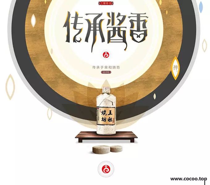
Whether it is standard fonts such as Song Ti and Hei Ti, or calligraphy fonts such as Xiaozhuan, Running Script, and Cursive Script, they all have their own unique visual characteristics and are widely used in the field of graphic design. Calligraphy and graphic design belong to the same art, and there are many things in common between them. By accepting and mastering the art of calligraphy, we can better understand our traditional culture, and integrate traditional culture into graphic design works to enhance the culture of the work Connotation and vitality. 

Articles are uploaded by users and are for non-commercial browsing only. Posted by: Lomu, please indicate the source: https://www.daogebangong.com/en/articles/detail/The%20visual%20personality%20of%20Chinese%20font%20elements%20Did%20you%20make%20it.html

 支付宝扫一扫
评论列表(196条)
测试