

Text/Lanhuali picture/baidu
In the visual communication design, as one of the visual image languages of the screen, the font has the function of expressing emotion and meaning. Therefore, in addition to conveying the meaning of the text itself, it must have a visual aesthetic feeling and be able to give people a sense of beauty. Modern designers summarize the visual design rules of fonts and make overall careful arrangements when designing fonts, highlighting the creativity and requirements of modern design. To design fonts, you must first have a general understanding of the composition and laws of visual aesthetics.

Visual Aesthetic Features
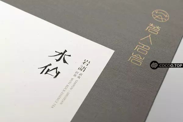
The visual beauty of fonts is the aesthetic characteristics revealed by the regular combination of various perceptual form factors (lines, shapes, colors, etc.) that make up fonts. The beauty of lines, density, and form of fonts is the accumulation and sublimation of people's aesthetic concepts. Chinese calligraphy was also bred and multiplied on the basis of oracle bone inscriptions, resulting in several forms of writing such as seal script, official script, regular script, running script, and cursive script. They have their own visual aesthetics. For example, seal script has a round and beautiful meaning, official script is simple and dignified, and regular script is rigorous. Neat and tidy, chic and agile running script, elegant cursive script and so on.
The visual beauty of fonts exists as the spiritual needs of people. Its formation and development are not a purely natural process, but the result of historical and cultural accumulation, which is related to people. Therefore, although the visual beauty of fonts exists in people's abstract thinking, their common form characteristics are accepted by people and constantly summarized. When the font design embodies people's consensus and aesthetic needs, people will feel beautiful. Through visual beauty, people can see harmony and rhythm, and get the aesthetic enjoyment of exquisite life.

Elements of Visual Aesthetics
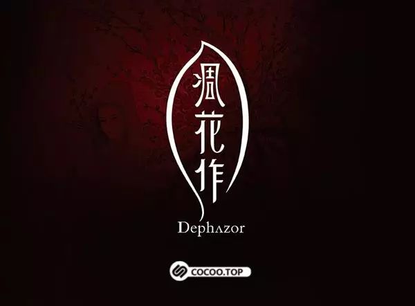
Strokes of fonts-- Strokes are the basic elements of font composition. In font design, the shape of strokes is very important, which determines the style and characteristics of fonts. To design a typeface, the shape of the strokes must first be shaped. Due to the different stroke shapes, fonts with different shapes such as Song typeface, black typeface, round black typeface, and water column type are produced.

In font design, the strokes of fonts are composed of lines. Lines are an important modeling element and the basis of all font images. Any font cannot be separated from lines. In terms of its shape, lines mainly include straight lines and curves. Vertical lines, horizontal lines, and oblique lines are all straight lines; curves are divided into geometric curves and free curves. They give people different feelings respectively. Straight lines generally represent fortitude, straightness, and simplicity, among which thick straight lines have a sense of thickness and strength, thin straight lines have a sense of sprightliness and sensitivity, horizontal lines have a sense of calm and stability; curves represent grace, and give people a feeling of softness, lightness and smoothness. The broken line indicates the direction of turning and changing, giving people a feeling of dynamic and dexterity. In terms of the styling style of the lines, the lines can be divided into two styles: geometric shapes and natural shapes. Geometric lines give people a rational and concise feeling, while natural lines give people a relaxed, free and lively feeling. As an important means of artistic modeling, font design pays attention to the use of various styles of lines, and pays attention to the use of line shapes to convey affection.
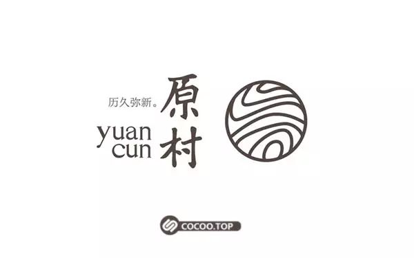
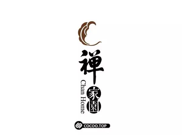
Shape of the font -- The shape of the font or simply "shape" is based on strokes, and is composed of points, lines, and surfaces according to certain rules. The shape is divided into three categories: rectangle, square and special shape. As one of the constituent elements, the shape conveys certain information and feelings. Fonts of different shapes and sizes have different character traits, which set a large visual feature for font design and give people different aesthetic feelings.

The rectangular frame has obvious directional characteristics. The horizontal rectangular frame is stable and full, the vertical rectangular frame is tall and dignified, and the narrow and long rectangular frame will show a delicate and fashionable feeling. A square gives people a sense of rigidity and uprightness, without a sense of direction, so it contains a moderate character; abnormal shapes refer to circles, triangles, trapezoids, unequal sides, stars and so on. Shapes are ever-changing, and their personalities and feelings are also different. This kind of figure has the characteristics of brisk and lively, with distinctive image and personality. Round and spherical shapes give people a sense of softness and perfection; triangles give people a sense of stability, and inverted triangles give people a sense of danger; tall and straight shapes give people a sense of upright and steepness, and wide and flat shapes give people a sense of stability.

The laws of the visual aesthetics of fonts are various laws of distinction and connection that people have continuously explored and summarized on the basis of long-term aesthetic activities. With the various needs of social practice, they have evolved from simple laws to complex laws. development process. Summarize the strokes, shapes and overall visual rules of the fonts, hoping to inspire modern designers. Recommended reading:Chinese fonts! That unique beauty

Unity of strokes
Consistent stroke thickness is the most basic requirement for font design. Because the strokes of each character are quite different, the unity of strokes is not a simple consistency, but a visual unity. Generally, in characters, the strokes that play a supporting role are called main strokes. It mainly refers to horizontal and vertical paintings, which occupy the main position in the text, so it can be slightly thicker. The remaining strokes mainly refer to pointing, skimming, pressing, picking, hooking, etc. as secondary strokes, which are in a subordinate position in the text and can be handled in a slightly more detailed manner. The strokes of Chinese characters will appear thick and black at the intersections during the combination process. In order to achieve visually uniform black and white and consistent thickness, the strokes at the intersections must be thinner. The distribution of strokes of some combined characters is very uneven. Some are dense on the top and sparse on the bottom, and some are dense on the left and sparse on the right. For example, when drawing and writing, the adjustment method is to thicken the places with sparse strokes and thinner the places with dense strokes.
Harmony and contrast of strokes
Harmony means that the strokes tend to be unified in the process of change, while contrast means that the strokes tend to be different in the process of change. They both show two states of contradictory movement. Specifically, in harmony, the strokes of various forms basically maintain the same style, and there is no obvious difference. Harmony can give people a visual aesthetic feeling of coordination, integration and tranquility. Comparison is to juxtapose two different modeling factors, which has a large contrast and a strong jump. Such as the contrast between straight lines and arcs of strokes, thick and thin strokes, geometric shapes and natural shapes. Contrast can give people a sharp, eye-catching, and exciting visual aesthetic. Thereby overcoming the rigidity and monotony in font design due to the blind pursuit of consistency.
Body balance and symmetry
Balance is the most common rule of glyph aesthetics. Some characters are completely symmetrical, and most of the characters are asymmetrical, so pay special attention to the balance of the shape when designing. Balance is a variant of symmetry. That is to say, the shapes on both sides of the central axis are not exactly the same, but the size, virtual reality, weight, thickness, and weight are roughly the same. Compared with symmetry, balance shows change, tends to move in stillness, and gives people a feeling of freedom and liveliness. People's eyes have some illusions when recognizing shapes, which is a reflection of psychological effects and physiological phenomena. For example, the visual center found with the eyes in a rectangular frame is higher than the geometric center measured with an instrument. A person's body has a compact upper body and a slender lower body looks pleasing to the eye. The same is true for font design. It is necessary to set the center point of a character on the center of vision, tightening up and loosening down, so as to meet people's aesthetic and psychological needs.

Overall Rhythm
The rhythm of font design refers to the orderly and regular repetition of strokes in the combined structure. One is the change process produced by the interval and continuity between strokes, and the other is the change of stroke thickness and strength. These two changes are regularly combined and alternated repeatedly to form a rhythm. The rhythm change from the strokes of one character to the combination of several characters is formed on the basis of rhythm, and endowed with a certain sentiment, showing a unique charm and interest. It is a rhythm full of emotion, reflecting It improves the overall visual rhythm of the font. Organically combine various forms of elements with differences, and integrate and eliminate differences in the whole.

Excellent font design can make people never forget it. It not only plays the role of conveying information, but also achieves the purpose of visual aesthetics. On the contrary, without grasping the visual rules of font design, random modification and deformation of existing fonts will make fonts ugly and vulgar, with scattered combinations, which will make people feel unhappy after reading, and it is difficult to produce aesthetic feeling visually. Recommended reading:Big reveal! Chinese font creation skills


Articles are uploaded by users and are for non-commercial browsing only. Posted by: Lomu, please indicate the source: https://www.daogebangong.com/en/articles/detail/The%20visual%20beauty%20of%20Chinese%20fonts%20Did%20you%20make%20it.html
 支付宝扫一扫
评论列表(196条)
测试