Walking on the street, the vernal equinox is blowing. Although it is still a bit cold, the willows by the river are the first to emerge with new green, bringing a hint of spring. I took out my mobile phone to record this beauty. When I come back, I want to I designed a font for Spring Breeze, carefully observed the style of wicker, and started to work, please read below:

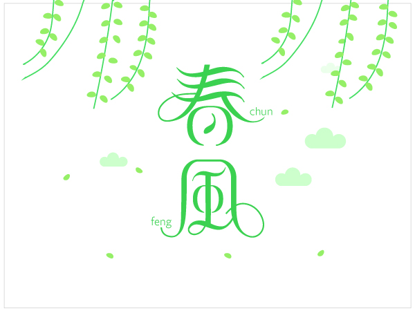
How to make such a dancing font, listen to the editor.
1. First draw a draft of the idea on paper, and after observing the shape and posture of the wicker, design the overall style of the font according to the shape of the wicker.
2. In the Ai software, input the bold "Spring Breeze" as a reference for the stroke structure, and lock this reference layer. Then create a new layer, use the pen tool to draw the basic strokes of the font on the new layer, pay attention to the stroke, turn off the fill, the thickness of the stroke depends on the situation.

3. Adjust the corners of the font nodes so that the right-angled strokes become rounded.
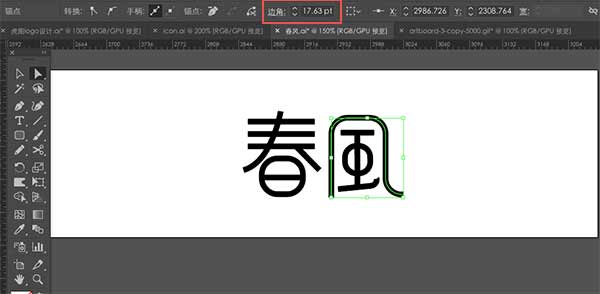
4. Let's creatively deform the font, and let the strokes move first. This process still uses the pen tool or pencil tool. If you have a hand-painted board, it will be easier for you. Draw curly strokes directly on the hand-painted board, and then use the scissors tool to cut off the blank space. Here we put the font vertical.
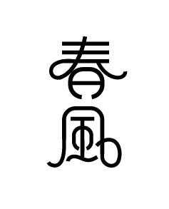
5. Continue to draw the horizontal curve with the pencil tool. Don't worry about it being unsightly, because we will adjust the thickness of the stroke later.
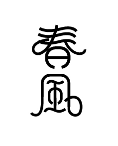
6. Select the outlined font and execute the object - extension, so that each node can be edited smoothly. Adjust the nodes of the strokes to make the font strokes from thick to thin, making a wicker shape. In this step, we can use the smoothing tool to adjust a rough path, and then use the smoothing tool to brush back and forth twice, the path will become very smooth, which can save a lot of time. Here we need to adjust patiently, the final effect is as follows:
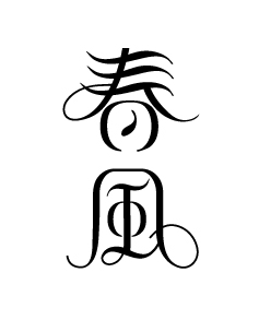
7. Finally, fill the text with a color, and it will be more beautiful in the background.

Okay, that's it, friends who like it, go and try it.
Articles are uploaded by users and are for non-commercial browsing only. Posted by: Lomu, please indicate the source: https://www.daogebangong.com/en/articles/detail/The%20vernal%20equinox%20is%20coming%20how%20is%20such%20a%20complex%20font%20designed.html

 支付宝扫一扫
评论列表(196条)
测试