
A reader asked me a very valuable question before, I believe you should have encountered it. He said:
Every time I make a PPT, all I can think of is parallel layout, which feels too monotonous, but I have no other ideas. What to do?
For example like this:


Except Outside of juxtaposition
What other creative typography methods are there?
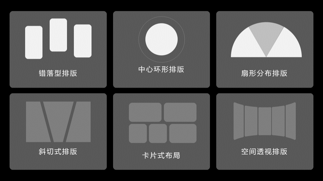
I have summed up 6 of them in one breath, the space is too long, let me talk about the first 3 today:
At the end of the article, I also prepared a detailed layout tutorial and universal layout template mentioned in the article, be sure to read to the end~

1. Staggered layout
As the name suggests, is to make the information high and low or up and down, so that it becomes more rhythmic visually.
For example, take this page:
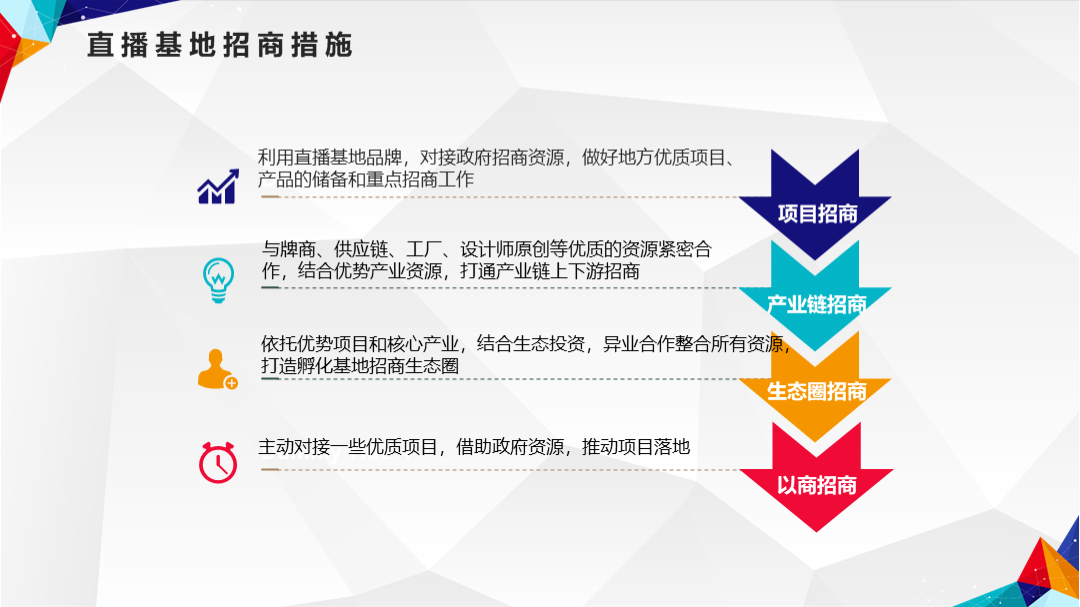
Turn it into a side-by-side layout, which is what many people can think of:
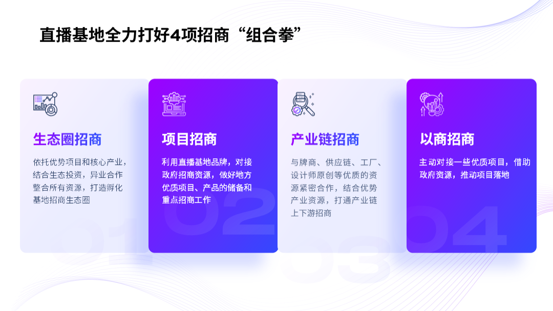
However, if we can do one more step, let the 4 plates have some random changes in position, won’t it immediately disappear? Same?

In addition, another example like this case:

If you don’t need to arrange them side by side, you can also use this method:

After staggered typesetting, will the effect be very different?

Of course, in addition, you can also add some lines to make the rigid layout more effective sense of rhythm.
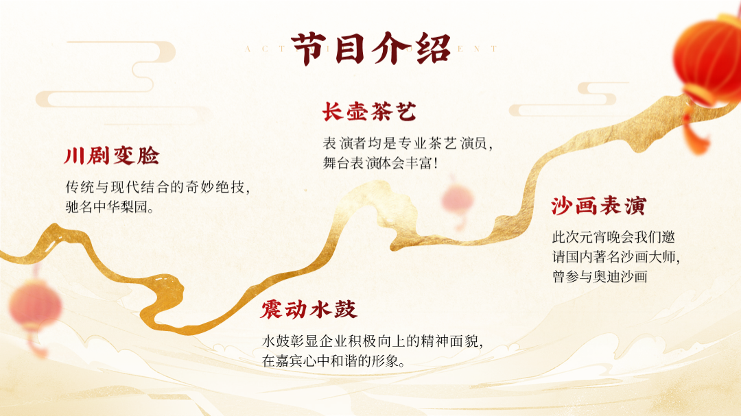
What do you mean? For example like this page:
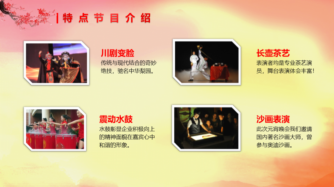
I believe that many people's typesetting methods are like this:

But if you can add a curved line to make the text typesetting along the line, wouldn't it be more rhythmic?
2. Center surround layout
Simply put , that is, let the text information be placed symmetrically along a central point.
For example, like this page, there are 4 parallel styles:

If you can make it arrange left and right along a circle, wouldn't it be different immediately?

Of course, the middle part, If there is only one circle, it will be a bit monotonous, you can add some graphics for decoration:< /strong>

Of course, the number of paragraphs here is an even number, if it is an odd number, what should I do?
It's very simple, we can use a semi-circular layout, and we can also achieve left-right symmetrical typesetting.
For example, like this page, it is now a large text:

After structurally combing the information, you will find that it contains 5 points:

So, if we adopt the half-ring style, can we solve this problem?

At the end of the article, I also prepared a detailed layout tutorial and universal layout template mentioned in the article, be sure to read to the end~
3. Fan-shaped layout
with the front half ring The layout is a bit similar, except that we replaced the graphics with a fan shape.
For example, take this page, which contains 3 points:
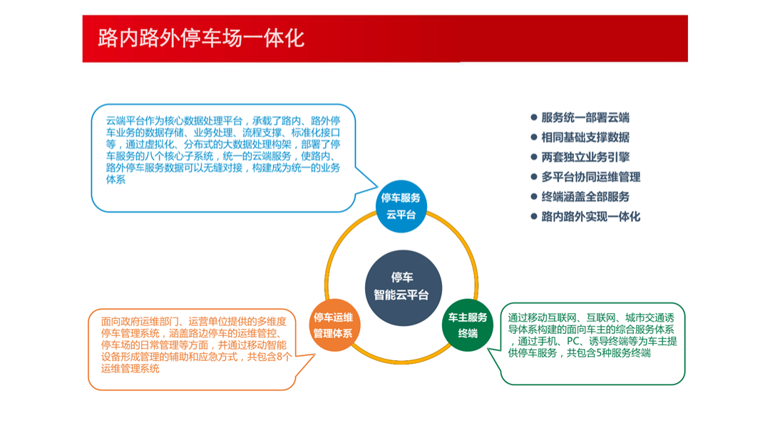
But if we change the typography style to this, doesn’t it look more creative?

The question is, how is the sector drawn here?
Very simple, first, we insert a chart in PPT:

If you want to make 3 fans, then the data setting is as follows:
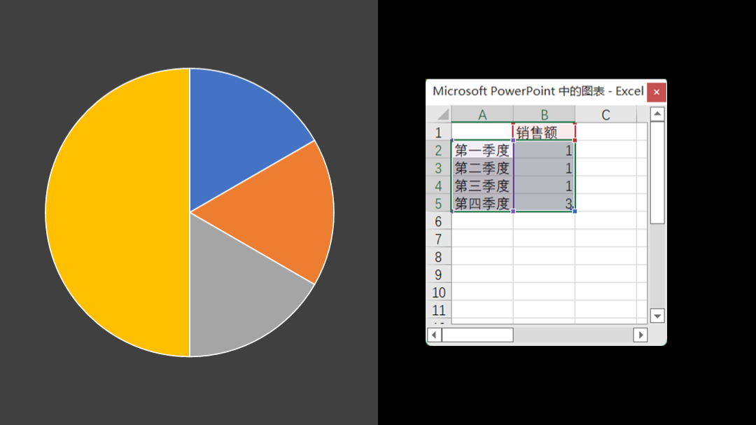
Next, click Start, find Paste, pull down the menu to find Paste Special, and paste as Enhanced Metafile:

Finally, cancel the combination twice. At this time, the data chart becomes a graph. Adjust the gradient color, just Can be made into a fan style:

Of course, in addition to typesetting 3-paragraph content, this method can also be used if the number of paragraphs is even.
For example, take the previous page:

Can you also use fan-shaped layout for typesetting?

How about it? Have you learned it? Of course, there are 3 other useful types of layout, we will talk about the space issue next time.

If you still don’t know how to typesetting, and you still don’t have any ideas about typesetting when making PPT, don’t worry, I have prepared a PPT universal typesetting template for you to apply directly, and there are two more detailed Tutorial, teach you PPT typesetting step by step

You can:

Articles are uploaded by users and are for non-commercial browsing only. Posted by: Lomu, please indicate the source: https://www.daogebangong.com/en/articles/detail/The%20typesetting%20method%20of%20this%20PPT%20is%20too%20awesome%20It%20can%20be%20used%20with%20too%20many%20words%20female%20colleague%20I%20love%20it.html

 支付宝扫一扫
评论列表(196条)
测试