Workplace PPT, I believe most people will choose templates,But it has no structure and no focus!
So, how to make a workplace PPT without a template?
I modified a PPT of e-commerce live broadcast two days ago, and I will share with you today have a chat.

Determine the overall tone first, It can be more youthful and reflect a certain sense of fashion.

01
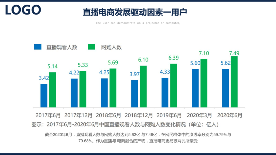
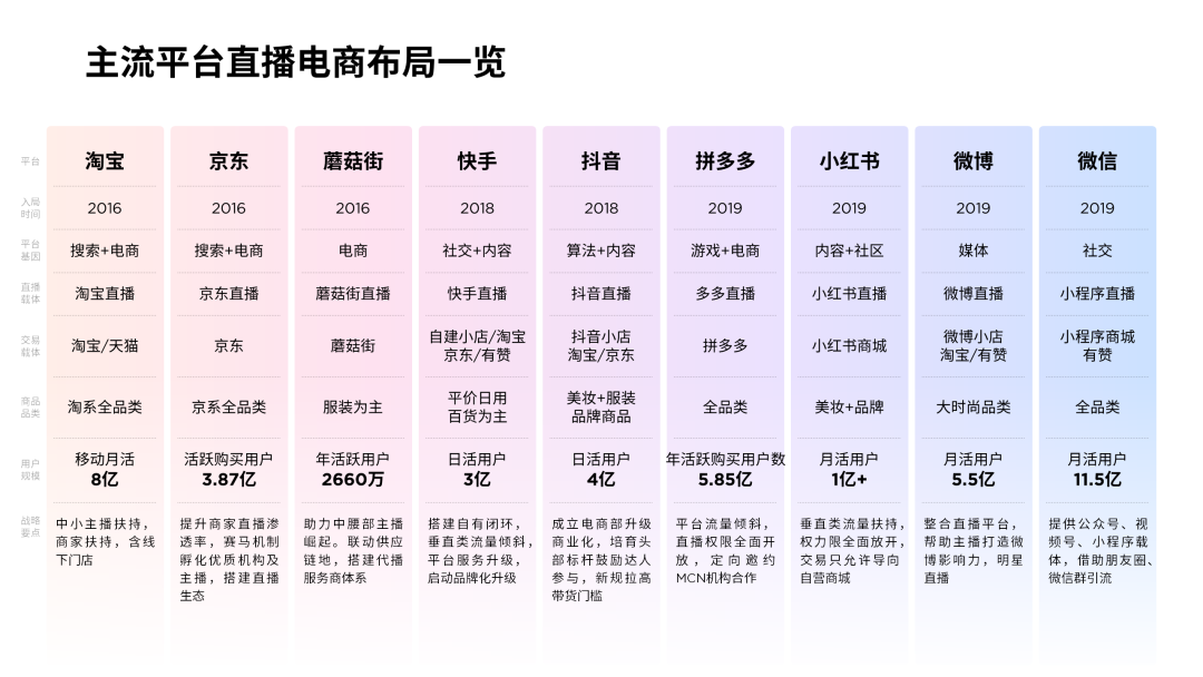
Look at the data chart page first
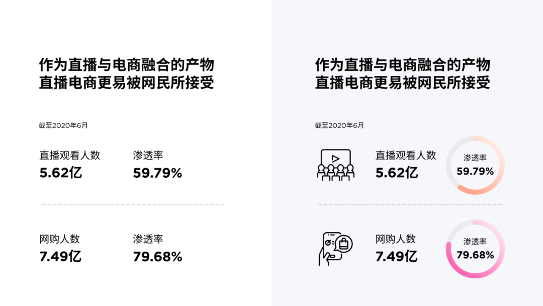
The charts are loosely spaced and the conclusions are not prominent enough to miss the point at a glance.
This page has a simple structure and is divided into two sections:
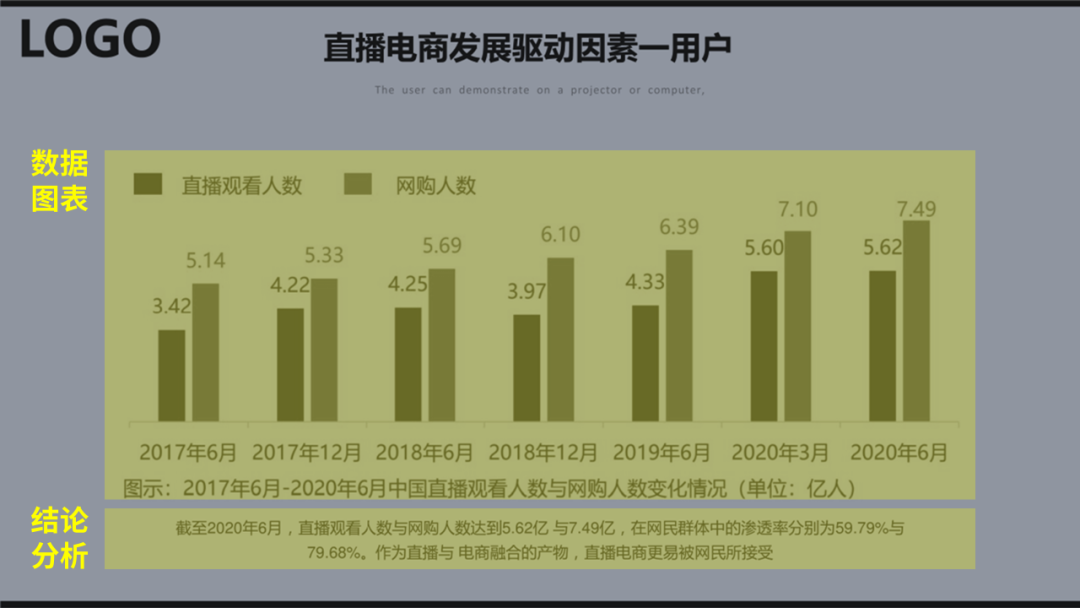
Let’s deal with the chart first, put the conclusion in front, and change the color. The gap width of the histogram can be 50%:
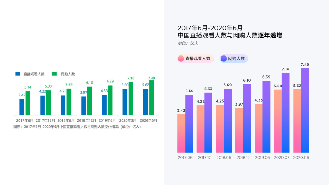
For chart analysis, extract the data and focus on display. I believe most people can think of this.
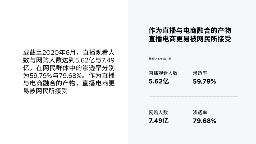
We can do one more step,to make the data more visual, such as adding icons, and using a ring chart to express the proportion :
Next, lay out the two parts left and right:
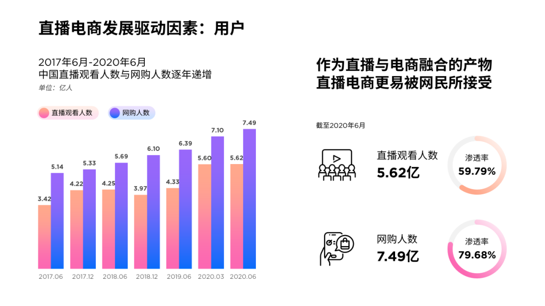
Insert a half-screen color block to divide the information:
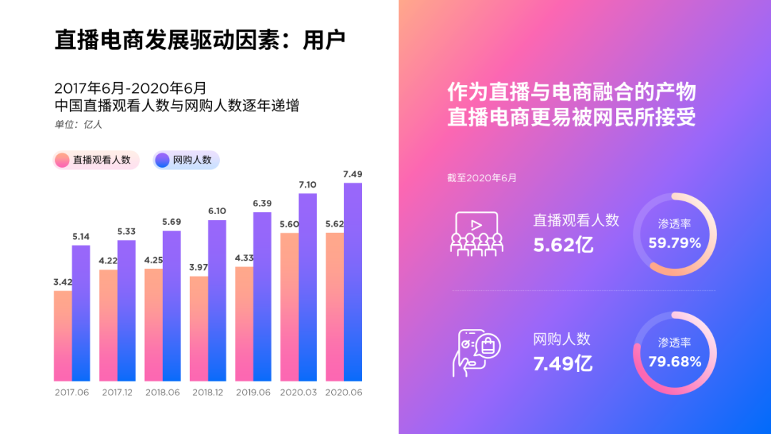
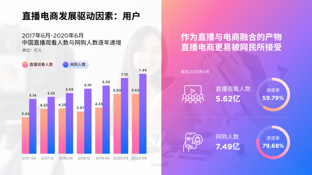
In order to reflect the atmosphere of live e-commerce, I found a related picture:

Adjust the transparency of the image as the background of the page:
02
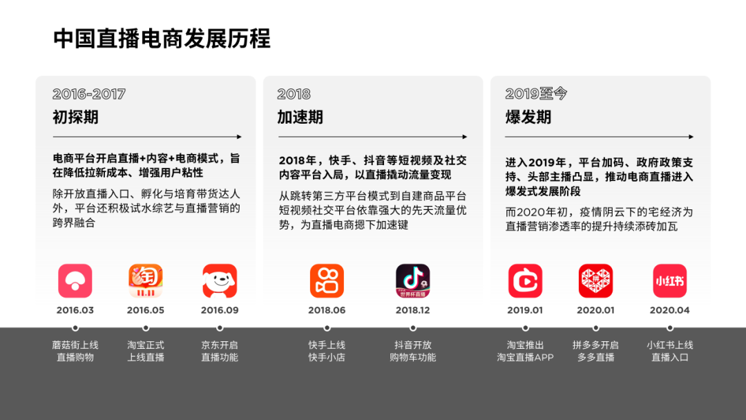
Look at the time flow page again
The structure of this page is fairly clear, but the layout is messy.
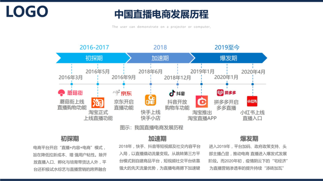
In fact, there is a one-to-one correspondence between the time axis at the top of the page and the three paragraphs of text below.
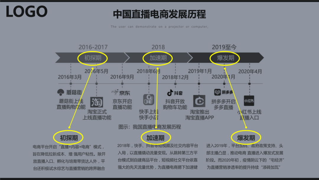
According to structural thinking, related content should be placed together:
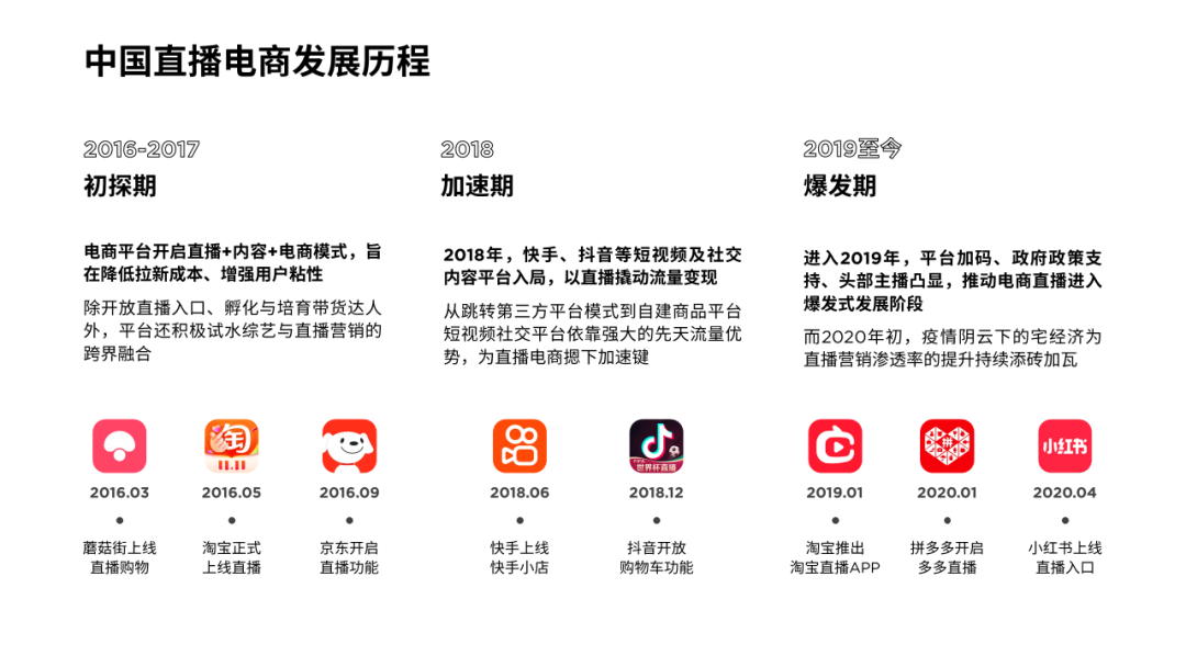
Using lines can not only divide the area, but also express the time relationship:
Or, use color blocks instead:
Change the color to see the effect:
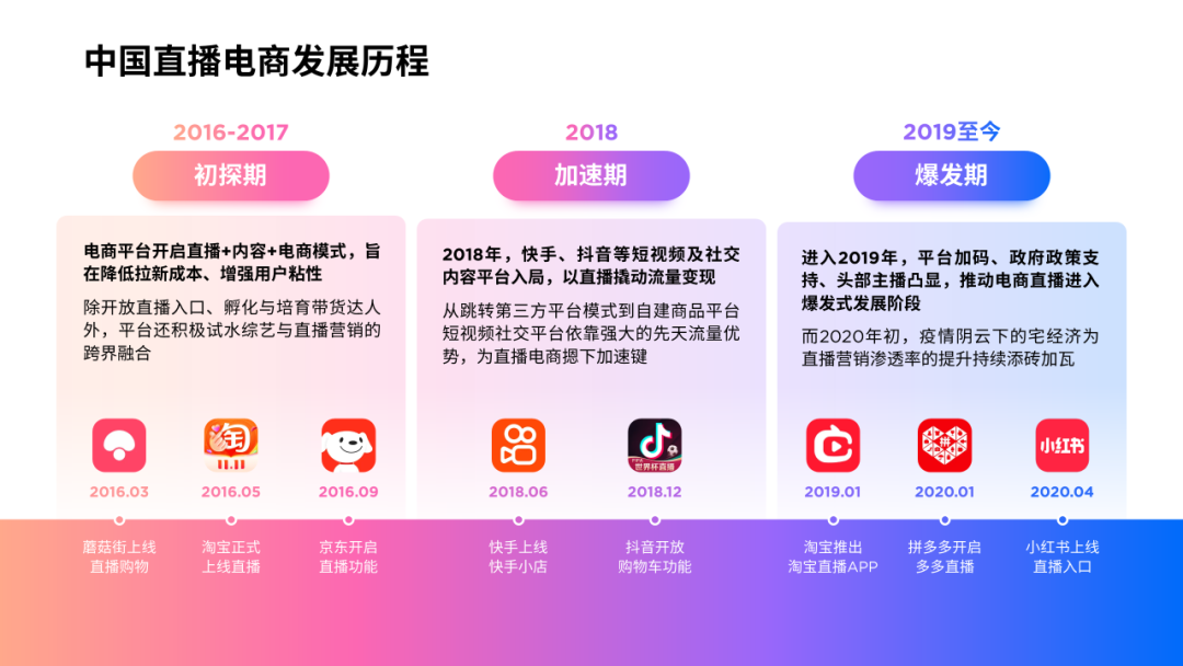
You can also replace the rectangle with a wave shape, and use its undulations to reflect the development speed of different stages:

03
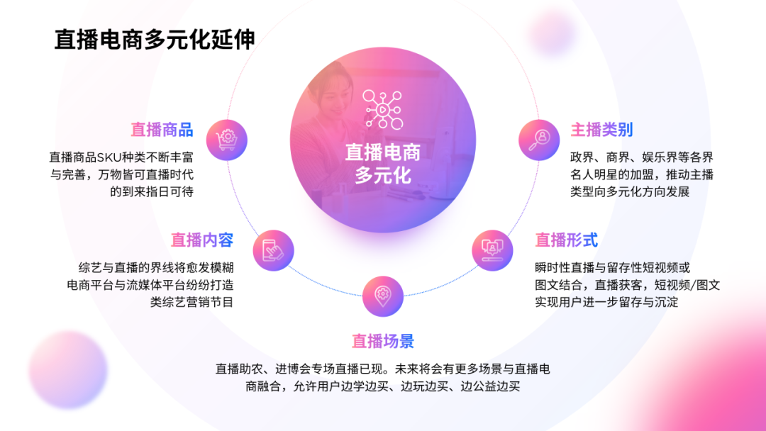
Next is a multi-point parallel content page
The text is centered and typeset, which looks uneven and the page will be a little monotonous.
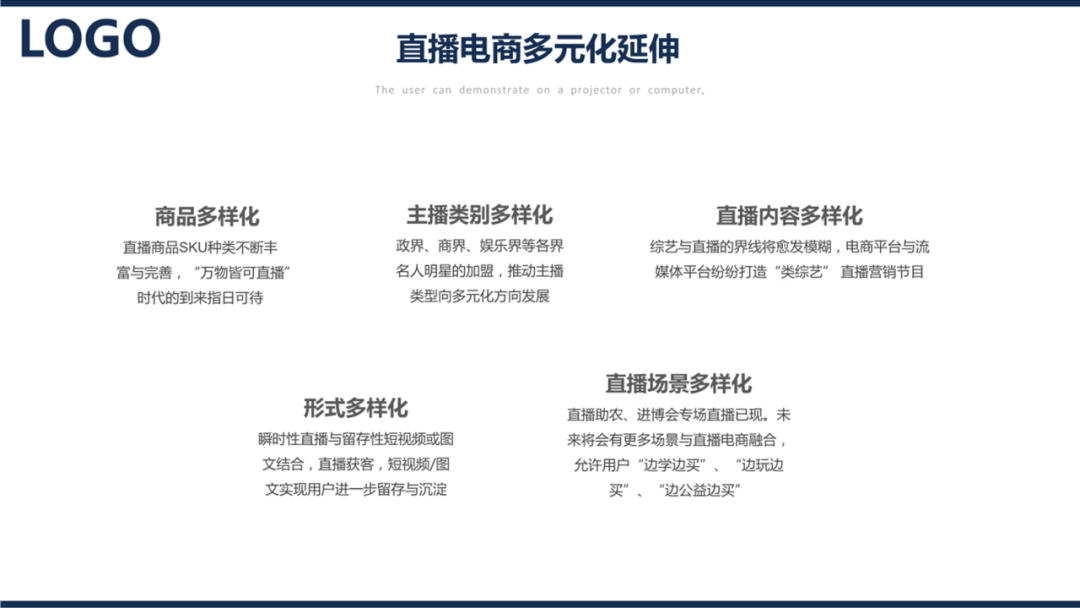
Aiming at multi-point parallel content, there is a universal typesetting method, called center surround layout.

is to arrange text paragraphs around a circle to form a symmetrical composition.
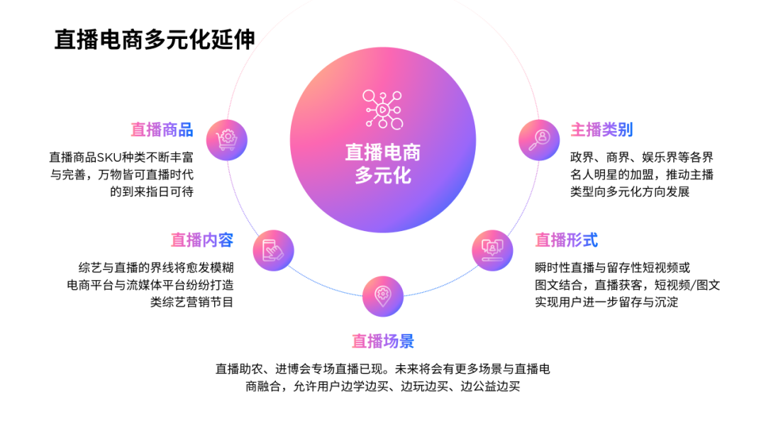
Use a light-colored ring to enrich the hierarchy of the page:
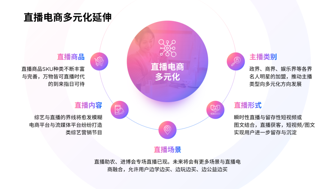
If you still feel monotonous, you can also add some fuzzy circles:
04
Then a form page
The frame of the table is too thick and interferes with the line of sight.
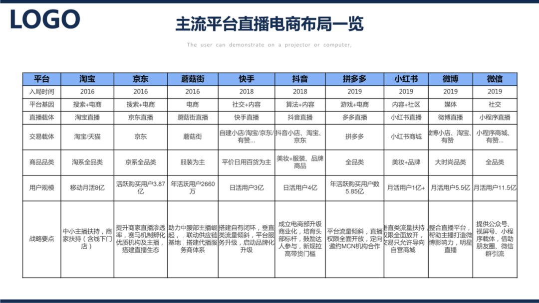
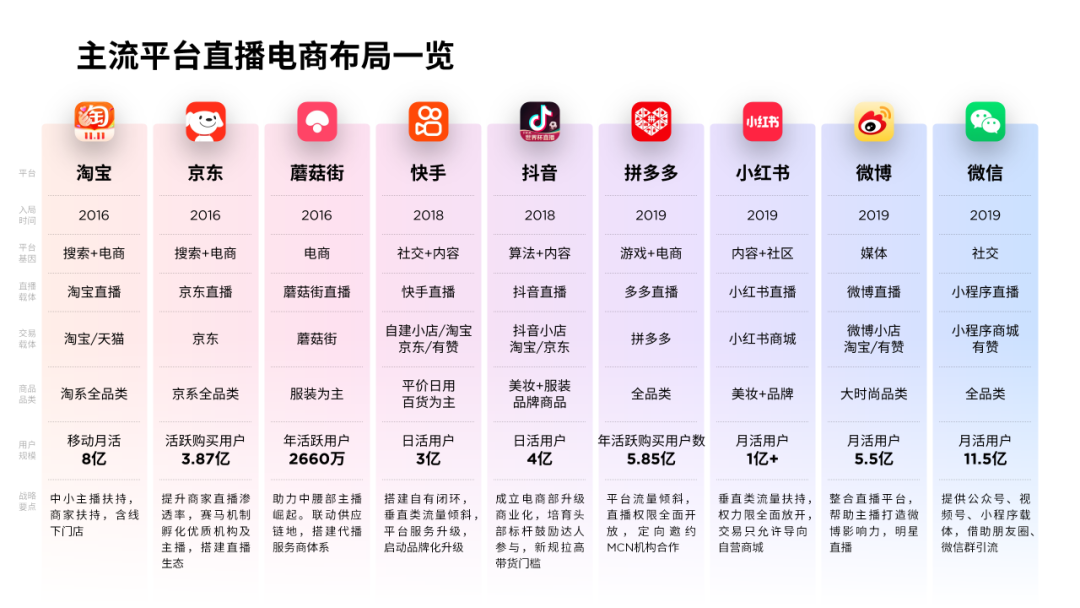
Delete unnecessary vertical lines and only keep horizontal lines, so that the table will look more concise:
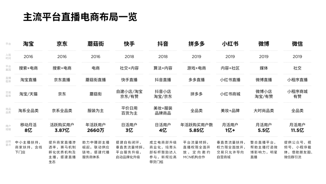
You can use different color blocks to distinguish different apps:
It is best to add software icons, so that it will look more intuitive:
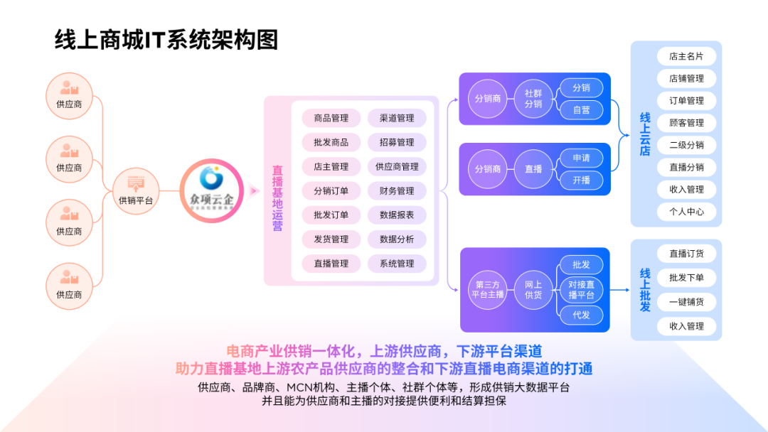
05
The last is the architecture diagram page
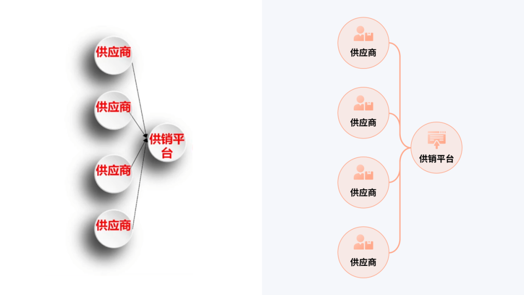
The logic of the architecture diagram is fairly clear, but the shadows of shapes and the drawing of lines will affect the overall visual presentation.
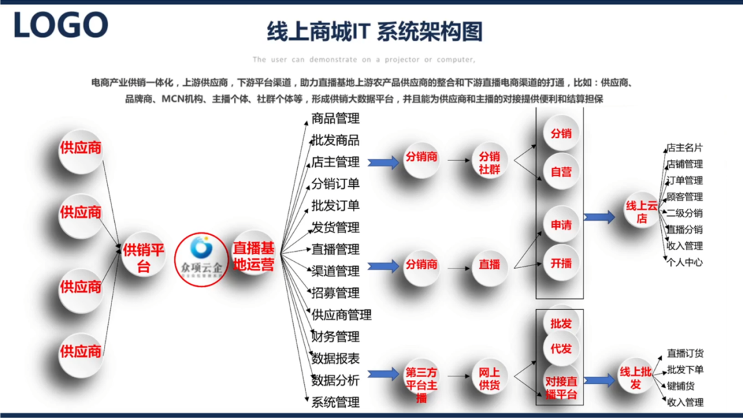
About the architecture diagram, there are actually general optimization ideas. One is to optimize the graphic style, such as removing shadows, using light-colored circles, and changing lines to soft curves.
The second is to reduce repetition, such as combining similar content into one and reducing the number of lines.
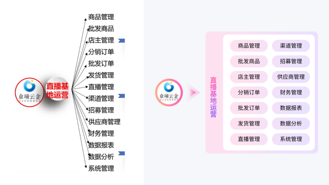
Mastering these two core points, you can make the architecture diagram like this:
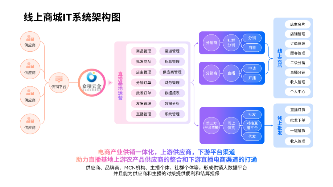
In order to avoid space at the bottom of the page, you can insert a gradient trapezoid to simulate the platform:
Let's take a look at the comparison before and after modification.
Before< /em>
Modified< /em>

Seeing this, do you still find it difficult to see the workplace PPT?
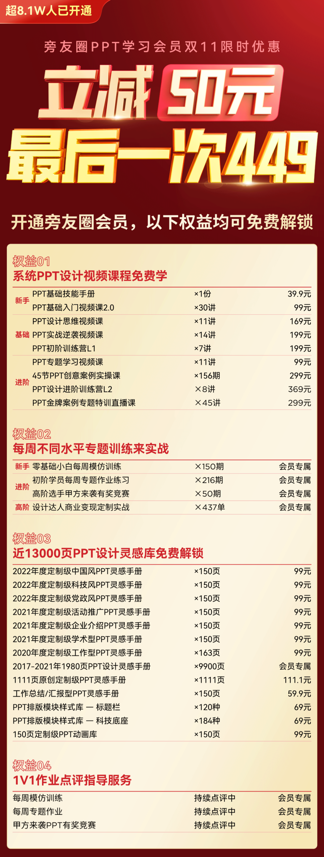
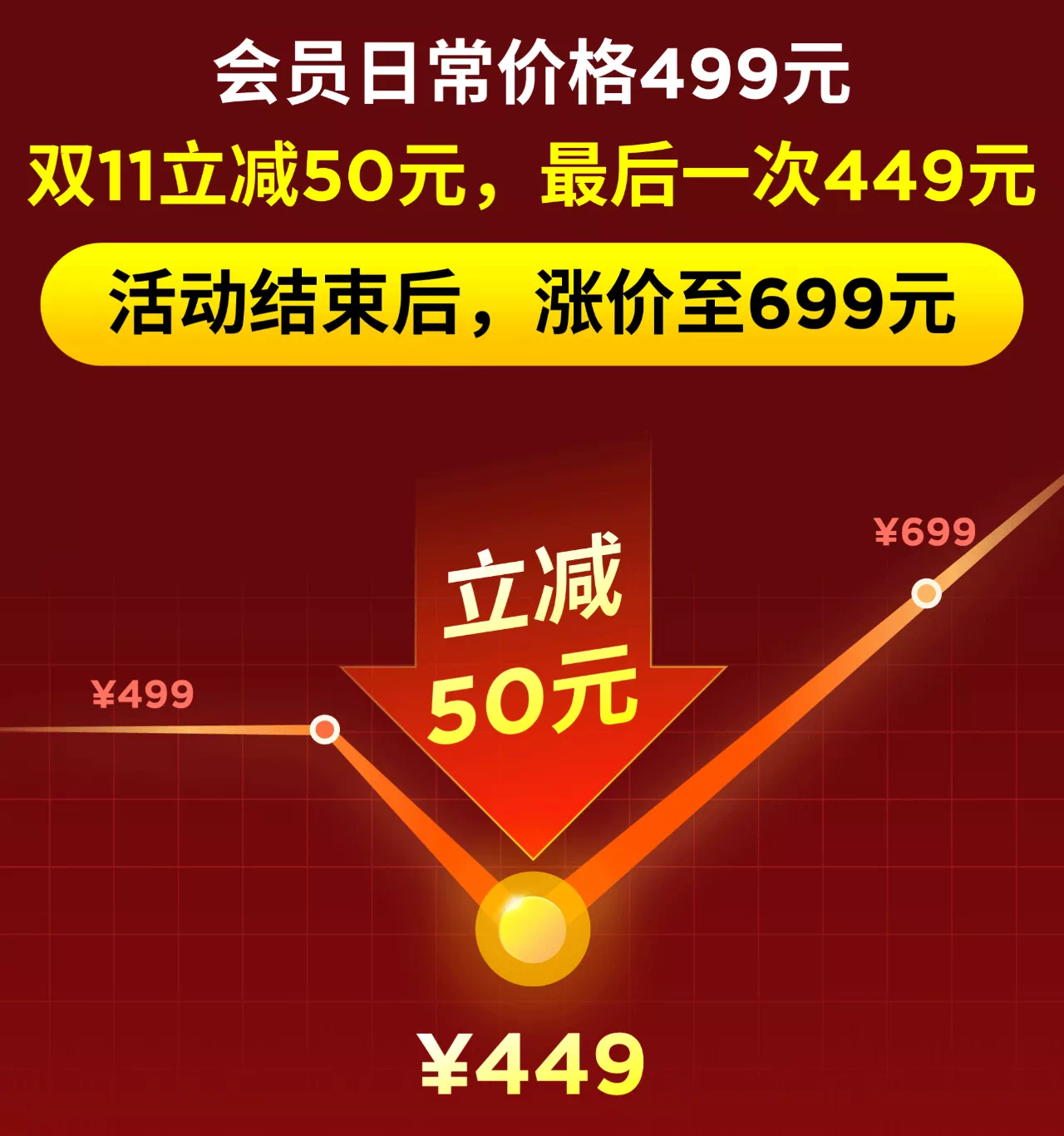
Double 11 event in the circle of friends, immediate discount of 50 yuan
The last 499 yuan low price promotion
After the event, the price will increase to 699 yuan
Once activated, permanently valid
This is the last time for such a favorable price, miss this time , There will never be such a low price again, so be sure to grab it.
Slide down to learn about the detailed benefits of members
Articles are uploaded by users and are for non-commercial browsing only. Posted by: Lomu, please indicate the source: https://www.daogebangong.com/en/articles/detail/The%20timeline%20of%20this%20PPT%20is%20too%20messy%20After%20adding%20a%20color%20block%20the%20thief%20is%20advanced.html
 支付宝扫一扫
评论列表(196条)
测试