
2015 7Month18afternoon, in Zhongguancun Innovation Workshop, UIChina's third phase< /span>UTalkInterview, Mr. Qiu Yin, the deputy director of the Founder Typeface Development Department, shared a detailed on-screen display font for the friends at the scene from the three aspects of scientific, aesthetic and technical aspects of Chinese font design design class. From the dot matrix characters completely succumbed to the low-pixel screen display at the beginning, to the fonts of the printing age, and then to the first generation of screen display fonts specially developed for computers, Chinese on-screen fonts have also moved from passive adaptation to active research and development. With the rapid popularization of retina screens, Founder Font has developed the second-generation screen fonts.
Brief introduction of the guests: Qiu Yin, Deputy Director of the Development Department of Founder Type,
Original designer of "Fang Zheng You Hei Ti" and "Fang Zheng Da Wei Ti".
The font designer of the emblem of the 2010 Guangzhou Asian Games.
Won the special prize of the Chinese Pen Calligraphy Contest.
First Prize in the First International Hard Pen Calligraphy Competition.
First Prize of "Founder Award" Chinese Typeface Design Competition.
Published a number of copybooks such as "Qiu Yin's Pen Writing", "Qiu Yin's Famous Foreign Poems", "Ancient Tie Xinlin Multi-body Pen Copybook".
It is a great honor to have the opportunity to share with you the experience of Founder developing the second generation of on-screen fonts.
The so-called Chinese screen display fonts are fonts for reading.
Font is a very special product, it appeals to people's vision, and the function of information transmission can only be completed through our sensory organs. Because it has to pass through human feelings, things become complicated. Thousands of semantics require thousands of symbols. Because it appeals to vision, it naturally has aesthetic, cultural and even spiritual attributes.
When doing font design, we should not only satisfy its functional attributes but also take into account its aesthetic attributes.

From the experience of Founder font development, there are three aspects that can be exchanged and shared with you, that is, the scientific nature, artistic nature and technical nature of font design.
The requirements of science belong to the rational level; the perceptual level is about the subjective; technology refers to the operational level, which is some techniques and methods. Any kind of font can only be presented through a medium, and the medium we use a lot now is the screen. If you want to get good reading comfort, you need to figure out the relationship between the font and the screen medium.
The biggest limitation of the screen medium is the precision of the display.
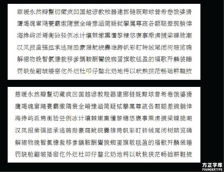
A set of Chinese fonts has a minimum of 6763 Chinese characters, which is completely incomparable with any other Western language system. From the more than 6000 characters in 6000, we find some examples to illustrate, such as the "quantity" of strength, the "stand" of standing, etc. These are very commonly used words.
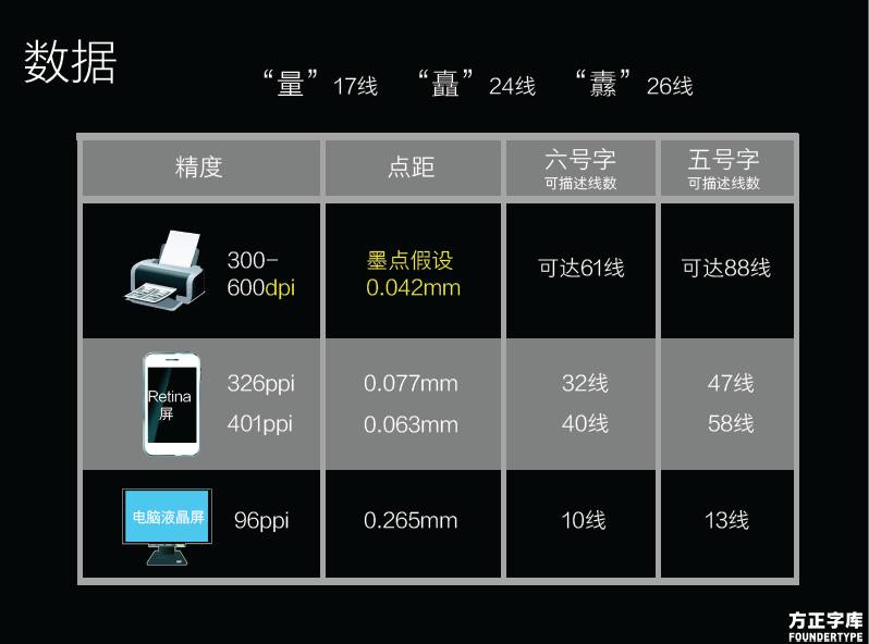
The longitudinal direction of "quantity" has 17 lines, and the longitudinal direction of "chu" is 24 lines. When printing on paper, there is no problem in expressing these numerous horizontal paintings. But when the screen is displayed, there will be problems under the small font size.
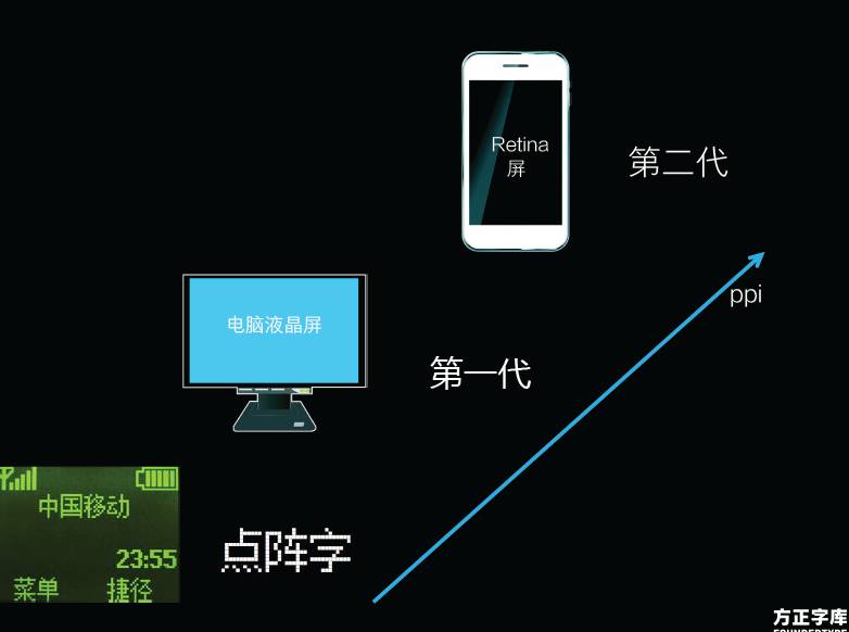
The picture below shows the different accuracy of paper printing, Retina screen and computer LCD screen, and the comparison of the number of lines that can be clearly expressed under the corresponding different font sizes.
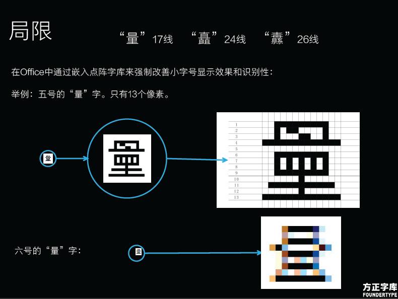
At 96ppi, the size of a pixel is 0.26mm, and the corresponding size five characters have only 13 lines, obviously there is no The way to fully express the word "quantity" requires 17 lines. The word "quantity" represented by 13 lines is actually a typo. However, the 6 font has only 10 lines, so the word "quantity" expressed in this way is even more horrible.

And on the Retina screen of 326ppi, the 6 font can already reflect the 32 line. On such a screen, every line of a Chinese character can be presented.
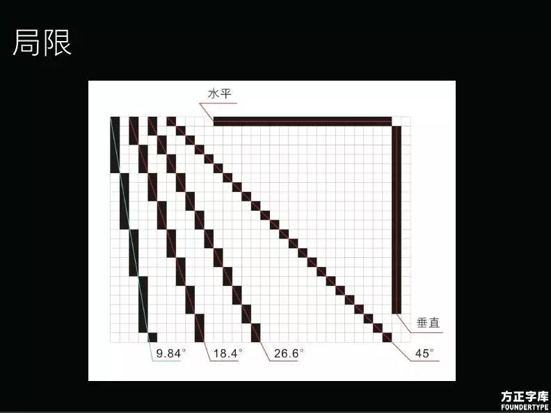
Under the current matrix pixel arrangement method, the horizontal and vertical lines are the lines with the best display quality, while the second best line is 45 degrees, and the third best display line is 26.6 degrees...
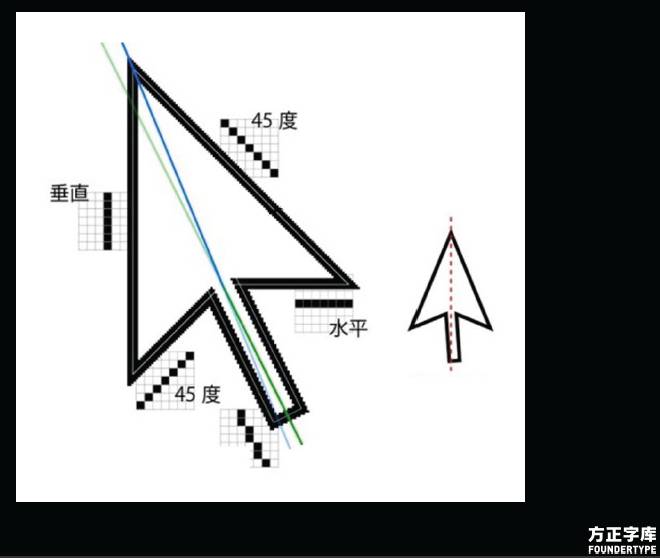
So our common arrow cursor is to use the best quality lines
The display method of pixels will affect the performance of our Chinese characters.
Due to historical reasons, the first Chinese characters used in computers can only be used by digitizing the Chinese characters that were previously used for printing. For example, the font shown in the above picture is the display effect of the printed font on the computer after digitization. So, based on our understanding of the screen display, what effect will the redesigned Song typeface have? (Pictured below) The gap between characters, the uniformity of Chinese character arrangement, the gap between Chinese character strokes and the beauty of the whole character will all be better presented.
Currently there is no ideal Song typeface suitable for screen display. As a commonly used font for typesetting and reading, Song typeface has good information transmission function and unique cultural value. Founder is currently working hard to develop Song typeface suitable for screen reading, hoping to bring new feelings to people's screen reading.
When the screen accuracy is not ideal, only dot matrix characters can be used to express Chinese characters.
In order to adapt to the LCD screen, Founder developed the first generation of on-screen fonts—Microsoft Yahei and Lantinghei. Now Retina technology has released the constraints for font design, allowing greater freedom of expression. So as the second generation screen display font - Fangzheng Youhei began to appear. The first and second generations adopted different font design strategies for the evolution of screen precision.
The Science of Typography
Today we mainly talk about the scientific content of font design from the perspective of Chinese character recognition. The text reading font used on the screen must be designed with its functional attributes as the goal. Making text easy to read is the key to comfort.
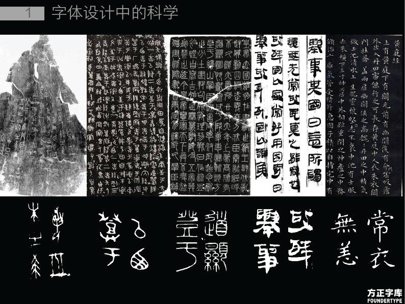
In fact, the evolution of Chinese characters is constantly advancing from difficult to read to easy to read.
The history of Chinese characters, from oracle bone inscriptions to bronze inscriptions, to Xiaozhuan, to official script, to regular script.
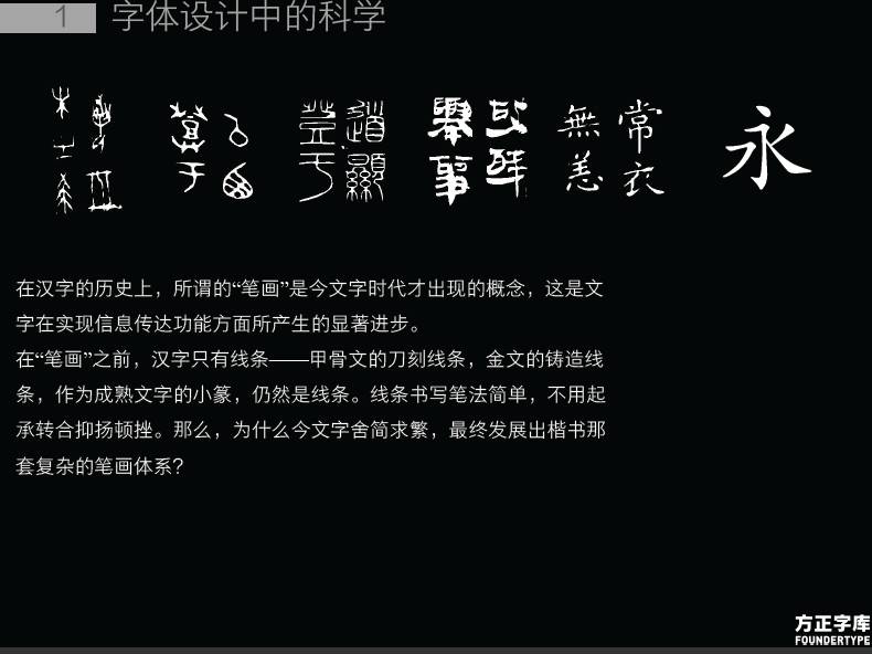
The characters before the earliest have only lines and no strokes. If Chinese characters are constructed purely with lines, it is very difficult to read them. When Chinese characters have strokes, the strokes with various shapes appear to be more complicated, but in fact they make Chinese characters easier to read. One of the most important roles played by Wang Xizhi in the history of calligraphy was to finalize Chinese regular script. The development of Chinese fonts in the sense of philology has ended in the era of Wang Xizhi.
Continuous evolution from line to stroke.
Through continuous evolution and elimination, history has chosen our characters to be displayed in the form of regular script instead of seal script, which conforms to the laws of people's cognition.
Similarly, simplified characters are far superior to traditional characters in screen reading. On the screen, after all, we need to spend more eyesight to distinguish traditional characters. As for the cultural content lost by the simplified characters, that is another matter.
There is another important factor to improve the recognizability of Chinese characters—the structure and shape of Chinese characters. The shape of Chinese characters is an important basis for us to recognize and read Chinese characters. Even in English, the same content, different capitalization, the difficulty of recognition is completely different.
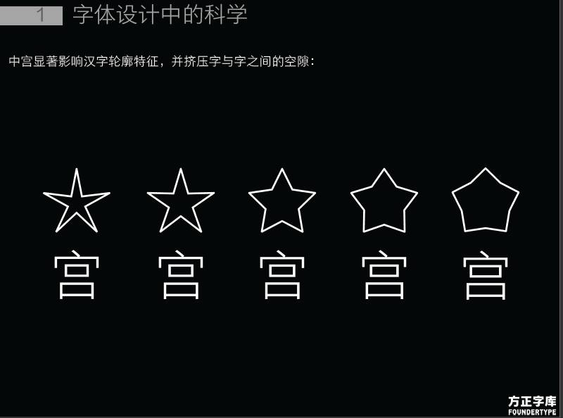
The one that has the greatest influence on the shape of Chinese characters is Zhonggong.
Zhonggong is to divide the square of Chinese characters into 9 grids, and the middle grid is called Zhonggong. The strokes that are concentrated toward the middle palace are called the middle palace tightens.
The figure below shows the influence of different Zhonggong on Chinese character recognition.
When making Fangzheng Youhei, a compromise solution was adopted. Nakamiya that is too tight on the screen will cause strokes to stick unnecessarily.
As an experiential product, judging whether a font is good and suitable for screen reading must be tested through our experience-the only way is silent recitation and comparison.
It is to recite the text of a paragraph silently from beginning to end to see if we can easily and smoothly understand the content of the text, not just to see if it is neatly arranged. Practice is the only criterion for testing truth! Through silent recitation and comparison, we can judge which font is more suitable for our reading. Read it silently, not aloud.

Art in font design - the pursuit of freehand brushwork
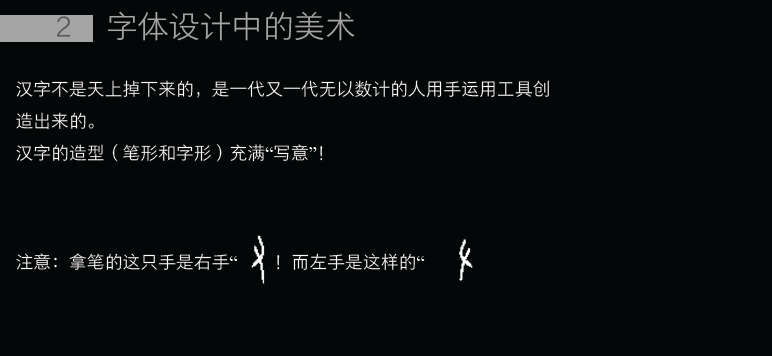
Chinese characters are living fossils of Chinese civilization. Through the interpretation of Chinese character codes, we will discover a lot of knowledge. How the Chinese understand and adapt to the world, how they go from barbarism to civilization can be found in Chinese characters.
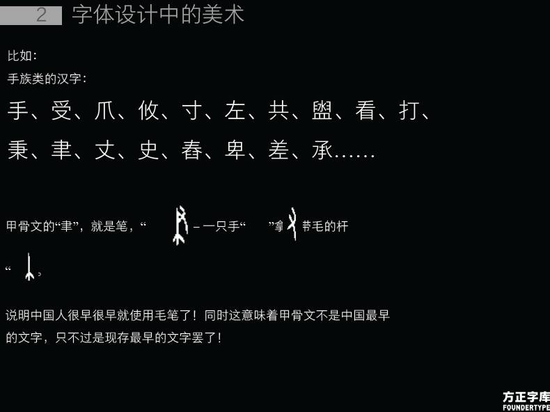
For example, there are many "hand" symbols in our Chinese characters. Chinese characters did not fall from the sky.
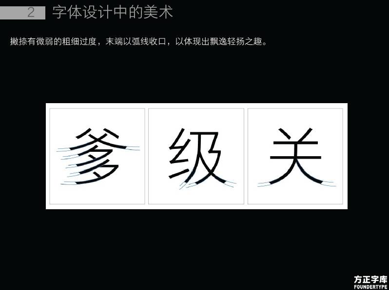
People's aesthetic emotions for various objects are interlinked, so there is an empathy effect. Monotonous, smooth, dull, fleshy, soft, and paralyzed make people feel tired, so when we make characters, we should choose their opposites - make them more harmonious, jerky, varied, and skinny... … But to grasp this "point", rather than excessive, it is very important to grasp a degree.
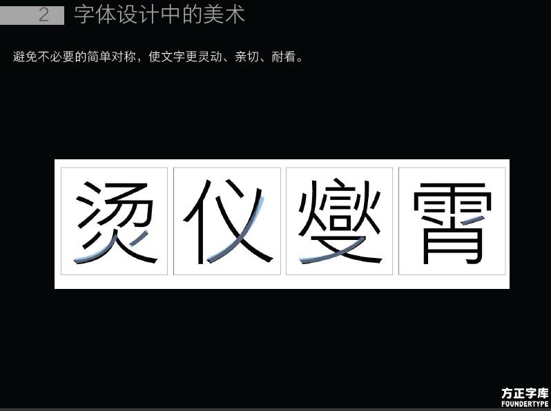
Avoid unnecessary simple symmetry and make the text more flexible, friendly and attractive. Symmetry is beautiful in design, but it may be better to not be completely symmetrical in the design of Chinese characters. A text that is suitable for reading should show a kind of tepid, neither aggressive nor severe, a very peaceful state.
Techniques in Type Design
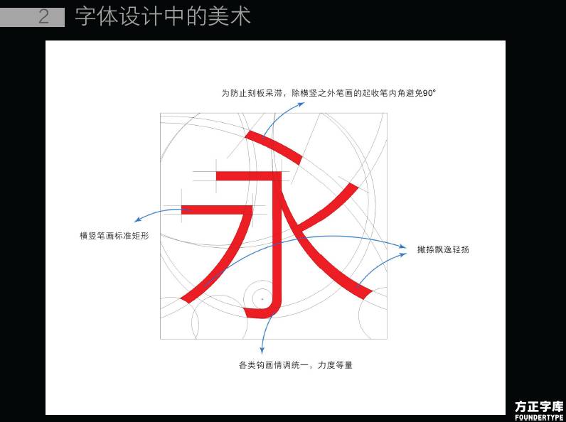
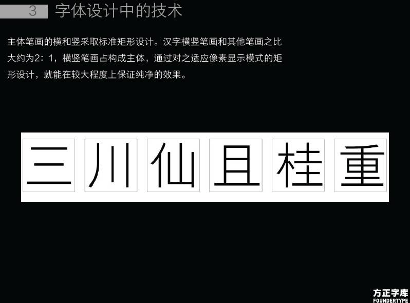
The horizontal and vertical strokes of Chinese characters take up the main body of the composition, and the horizontal and vertical strokes are designed with rectangles to make the layout more pure.
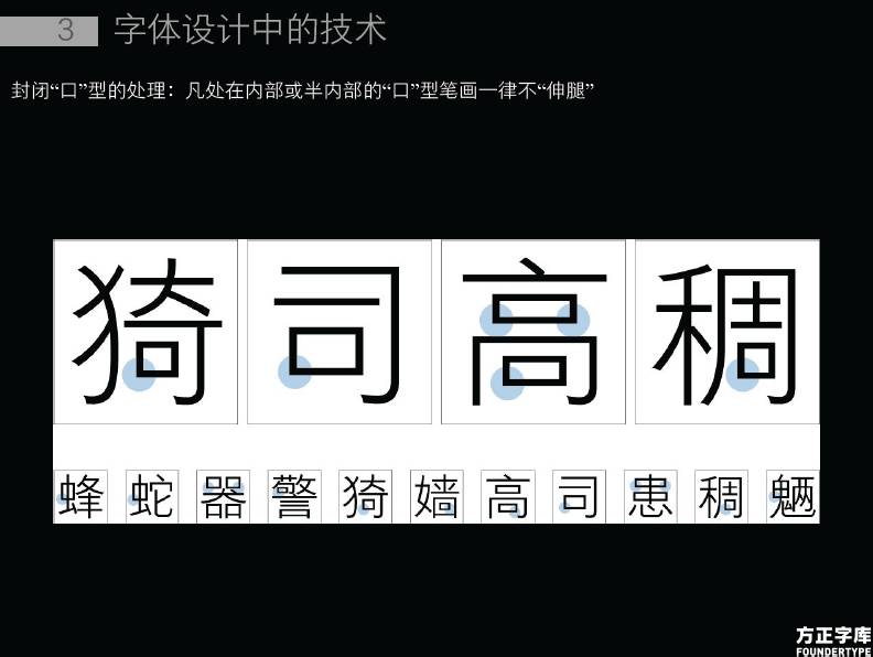
Remove visual impurities, and all "mouth" shapes that are inside or semi-inside will not "stretch their legs".
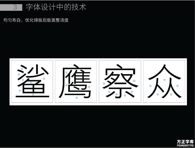
Uniform white distribution, optimize the cleanliness of the layout after typesetting.
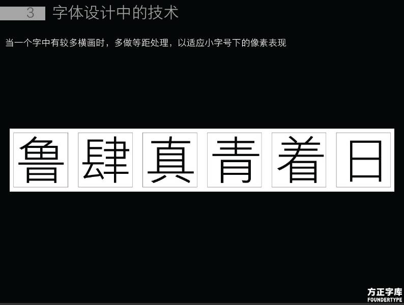
When there are many horizontal strokes in a word, do more equidistant processing to adapt to the pixel performance under small font size.
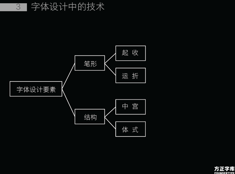
Elements of font design - pen shape and structure, among which the pen shape includes "starting, closing" and "moving, folding"; the structure includes "zhonggong" and "body style".
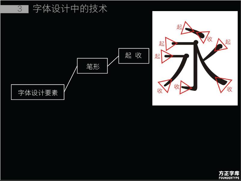
"Start Pen" and "End Pen".
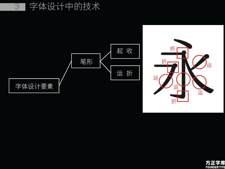
"Moving pen" and "Folding pen".
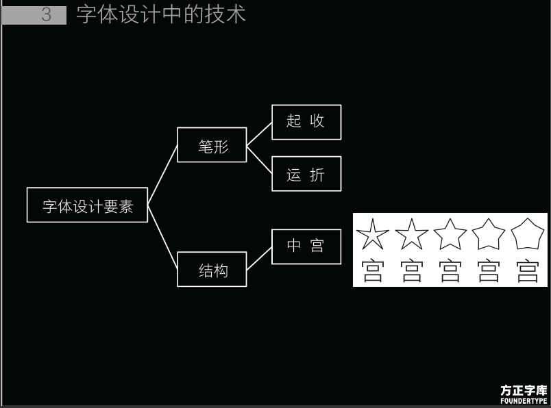
Different middle palaces.
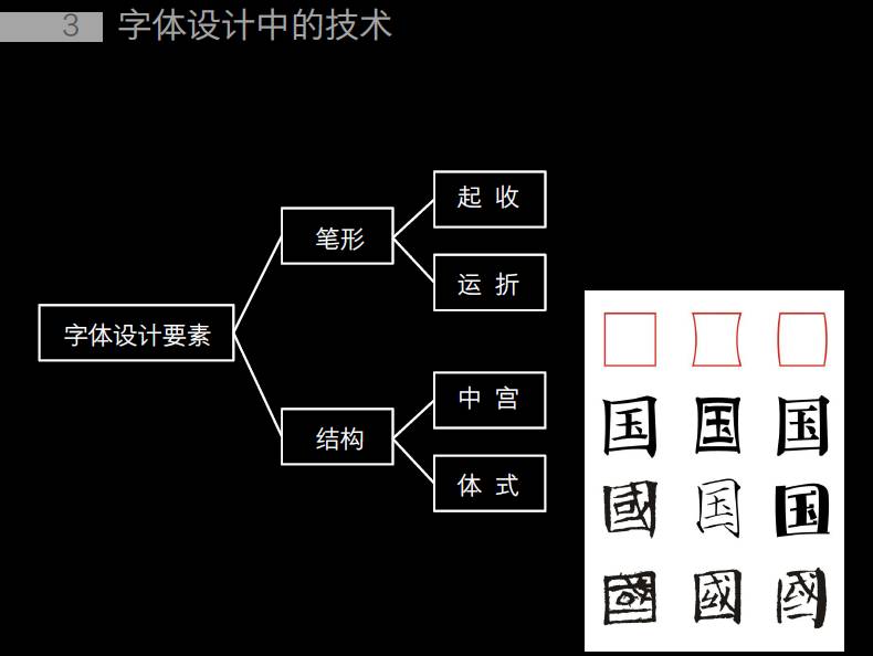
Different asanas.

The requirements that still need to be grasped in the design of Chinese characters are "adaptation" and "adaptation".
"Adaptive" means that the Chinese character itself is a complete shape, and it is a spiritual shape, which should be self-consistent. As shown in the picture, there are still some problems with the blank contrast of characters and the coordination of stroke shapes. After some adjustments, the perfection of each Chinese character has been improved.
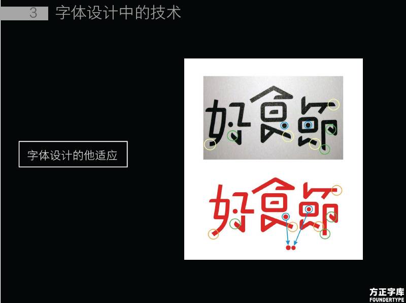
The adaptation of Chinese characters means that in a group of characters, each character must adapt to another character. For example, the three words "good", "food" and "festival" must be adapted to each other.
End.
This article is compiled by UI China based on UTalk on-site interviews. The text and pictures are all from Founder Font, please be sure to indicate when reprinting.
Please click "read the original text"
↓↓↓
Articles are uploaded by users and are for non-commercial browsing only. Posted by: Lomu, please indicate the source: https://www.daogebangong.com/en/articles/detail/The%20pursuit%20of%20freehand%20brushworkthe%20science%20art%20and%20technology%20of%20Chinese%20screen%20display%20font%20design.html
 支付宝扫一扫
评论列表(196条)
测试