
 Text/Wang Jian
Recognizability mainly refers to the recognizability and clarity of reading text. Different fonts have different glyph characteristics, so the strength of recognition is also different, and should be selected for different content. 
For example: content with many words and small font size is suitable for choosing highly recognizable fonts, while fonts with low recognition are more suitable for content with few words and large font size. When designing typefaces, it is important not to over-sacrifice recognition for visual stimulation. No matter how beautiful and well-designed the text is, if it is not recognizable, it cannot be regarded as a successful design. 
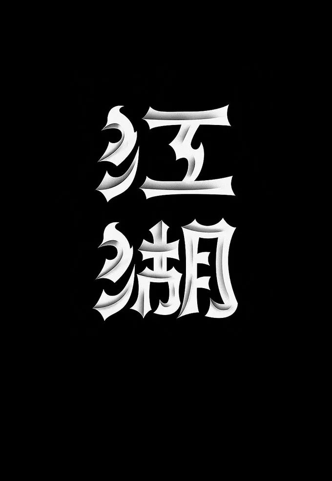
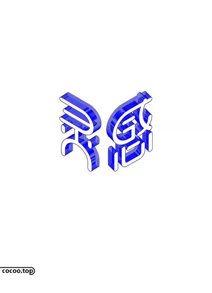
The positive and negative shape design of the text is mainly the shape of the font itself and the design of the outer space surrounded by the stroke structure line of the font, which can also be understood as the virtual reality between the font and the graphics Transformation design, positive and negative shape design can form a unique sense of space and visual effects, visually bringing a sense of changing movement. 
The key point of the design is to ensure the identity and be absolutely unique. The graphics should be related to the meaning of the text. The positive and negative shape design transforms the originally meaningless space into a meaningful shape, which deepens the connotation of the design. 
The weight of the text affects the stability and sense of space of the layout, which mainly changes according to the font size, thickness, and color brightness. Generally speaking, text with small font size, thin strokes, and bright colors gives people a light and breathable feeling; while text with large font size, thick strokes, and dull colors The text presents a thick and steady effect. 
People’s reading habit is to pay attention to large objects first. Usually, the font size of important content such as titles is set larger. The font size should be larger than the body text. The larger the font size, the more readable the text is, and the smaller the font size, the lower the readability. 
Generally speaking, the larger the format, the larger the font size should be. For the design of multi-level titles, in principle, the font size should be gradually reduced according to the level of parts, chapters, chapters, and sections. Although some text used as background shading has a large font size, its readability is low due to weakening treatment, so as to ensure the clarity of the main text. 
Kerning is mainly divided into loose type and compact type. Loose kerning is suitable for titles and other content with large font size and few words; compact kerning is suitable for content with large text volume and small font size such as main text, so that the relationship between words is closely connected, which is convenient for smooth reading. Because if the kerning is too large, the layout will be confused. 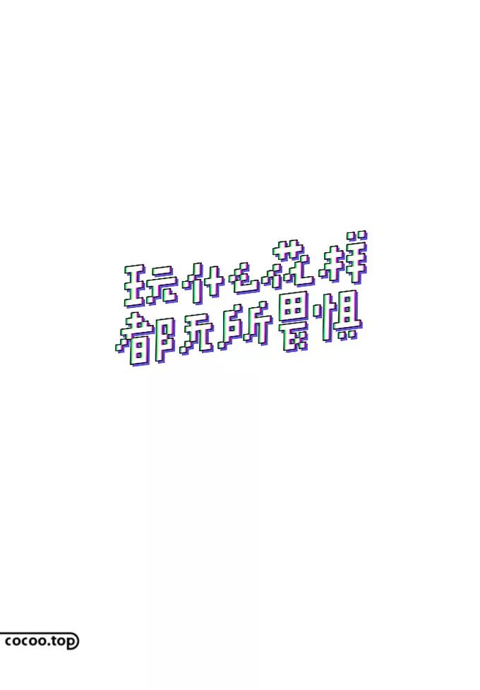
Different fonts have their own glyph features, so the applicable kerning is also different, and should be set according to the actual situation. The choice of kerning directly affects the division of text lines and paragraphs and the reading direction. Recommended reading: Seeking charm in the rules! Straight decoration of Chinese character design
The text grid means that the length and word count of each line of text are forced to be unified to form a very neat and standardized paragraph layout effect. Using text grid layout is very suitable for some serious, stable and rigorous theme designs due to its precise alignment effect, but it is not suitable for English font layout. 
The layout of the text grid is more suitable for the text design in books and magazines. If it is used for large-size text, it is easy to give people a too rigid feeling. 
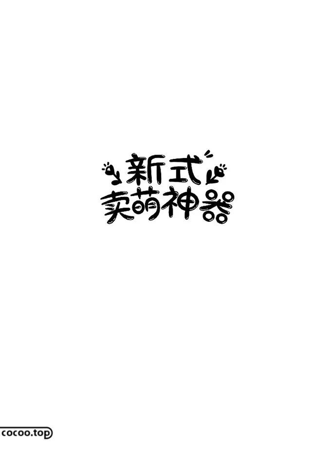
Font style is a standardized feature of the font itself. All characters in the same font have the same stroke performance characteristics. For example: The stroke width of the bold font is equal, square head, no decoration, and correct structure, forming a serious and stable style; the round head and rounded corners of the round font are Embody a more soft and lovely style. 
In addition, the feeling of the posture of the font is also an aspect of the font style, for example: italics give people a dynamic impression. 
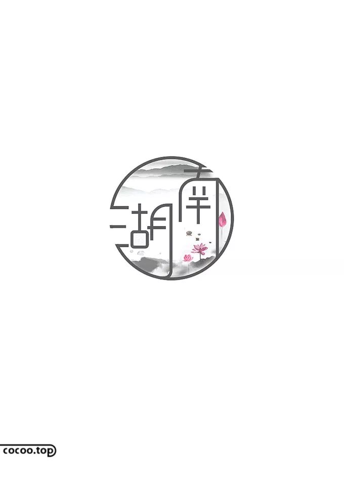
The shape of the font is the unique appearance of the font, including square, vertical, flat and wide, pointed, curved, vertical, left-leaning, right-leaning, and tightly sealed Shape, seal open shape, continuous pen shape and irregular shape, etc. The font shape also makes the text have certain graphic features, which can be selected according to the appearance characteristics of the main image. 
Structure is the law of font composition. What rules are used to build fonts, and what forms the style and characteristics of fonts in font composition all depend on structure to solve. The structure is the decisive factor in determining the transformation of the font style, and the transformation structure is the main method to reflect the creative expression of the font. 
The transformation of the font structure should be based on the existing structural rules of the font, and create various new structures through creative changes and transformations. Using the same pen shape to build fonts, if different structures are adopted in the formation, it will bring different transformation effects and get different font styles. 
Deformed text is a general term for various fonts that have been deformed but not invariant, and are usually deformed on the basis of conventional fonts such as Isoline and Arial. Common types include long fonts whose height is greater than width, flat fonts whose height is smaller than width, horizontal and vertical italic fonts, horizontal and vertical shrug fonts and other types. 
When doing font deformation design, it is necessary to analyze the trend of its stroke structure and the feeling it reflects comprehensively. For font deformation, all characters and strokes must be uniformly deformed in order to obtain an overall and unified design effect. 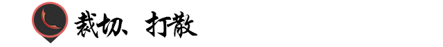
Cut text means to cut off part of the strokes of the text, for example: cut off the left half or right half of a symmetrical text, or properly break a gap in a word with a fully enclosed structure, the premise is to ensure Text recognition. 
Break up text is to break up familiar text or graphics, examine and reconstruct them from different angles, with the purpose of destroying their basic laws and seeking a new design life. On the basis of ensuring recognition, more concise and unique text effects can be obtained. Recommended reading: The basic strokes of Chinese character design! The way to change "shape"


Articles are uploaded by users and are for non-commercial browsing only. Posted by: Lomu, please indicate the source: https://www.daogebangong.com/en/articles/detail/The%20principles%20that%20font%20design%20needs%20to%20follow%20What.html
 支付宝扫一扫
评论列表(196条)
测试