This is a typography lesson for myself.
The original intention at the beginning was to solve some questions about fonts in the work (such as typography, LOGO design, etc.), and at the same time, I wanted to improve myself by reviewing the basic knowledge of design.
So I gave myself this topic. As a beginner, I only touched a little fur, so I sorted it out and shared it. If there are any deficiencies, please correct me. All reference articles are marked at the end of the article.

"Typography" is located at the intersection of language, culture, technology, and aesthetics. It is a big topic with rich connotations and extensions. This sharing only selects some basic useful knowledge.
·Directory·

·Font Basics·
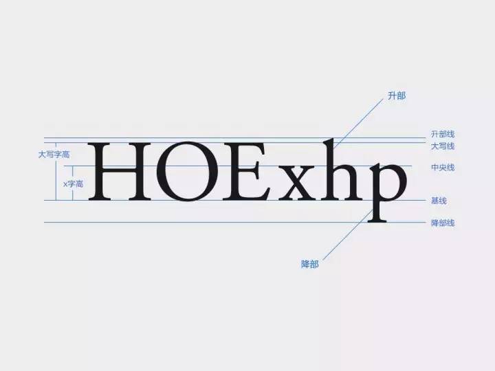
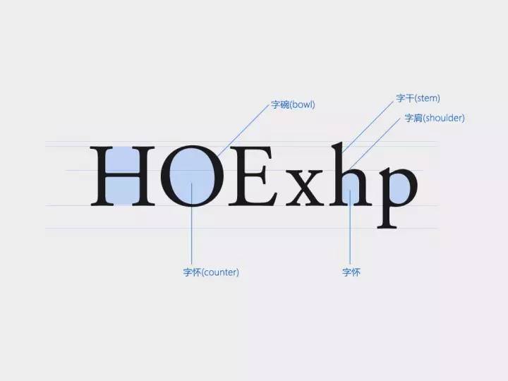

·Classification and History of Western Typefaces·
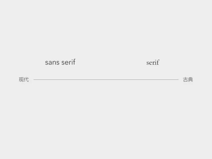
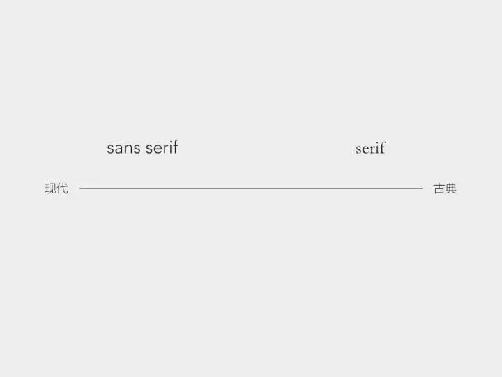
The most simplified classification of English fonts: serif and sans serif. The difference between the two is that the serif body has claw-shaped serifs and the stroke thickness varies.
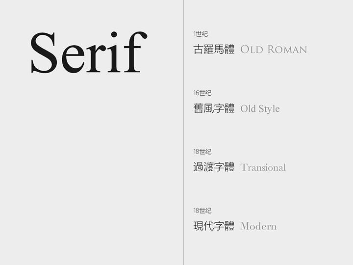
·serif·
The serif font is very old, dating back to the inscriptions on stone columns in ancient Rome. It is classical, formal, with historical tradition and significance.
According to the order of historical development, serifs can be classified into: Old Roman, Old style, Transitional, Modern.
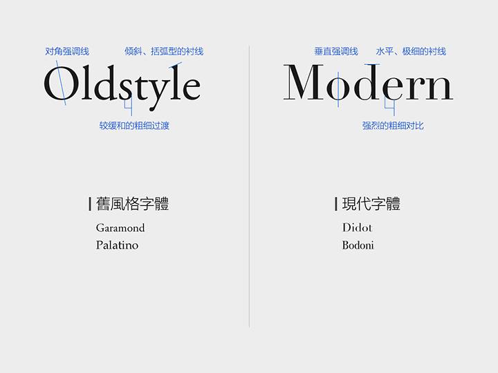
We select two of the nodes—Old style and Modern fonts. By comparing the characteristics of the two, we can understand the development of the entire serif font.
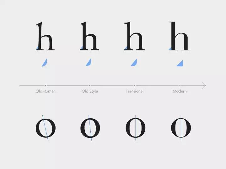
Old style:
Features: Diagonal accent lines, slanted, bracketed serifs, moderate thickness transitions.
style: traditional, common in the typesetting of books, newspapers and magazines.
Modern:
features: vertical accent lines, horizontal, ultra-thin serifs, strong contrast of thickness.
Style: horizontal and vertical, modern, cool.
 To sum up, throughout the development of the serif body, the stroke contrast becomes more and more intense, the serif becomes sharper and thinner, and the stroke thickness and serif radian of the transitional font are just between Old style and Modern. One of the main reasons is that the technology of engraving masters is getting more and more advanced, and the engraving has become more delicate, making it possible to have precise lines and finer thickness contrast. The angle of inclination of the emphasized line is also gradually "straightened", which is a manifestation of the transformation from handwriting to modern typography.
Old roman, old style serif font example:
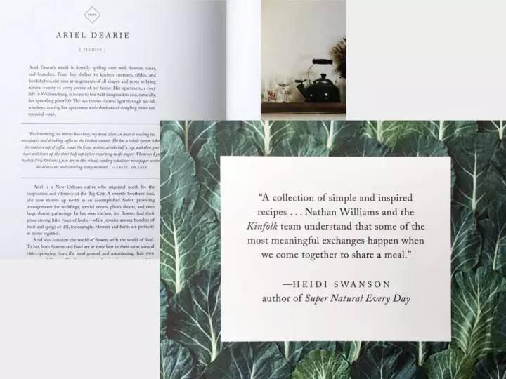
"Kinfolk" is a magazine that advocates slow life. It often introduces food, travel, and stylish home design, and appreciates the beauty of small, plain, and back to nature. In this context, its title uses an Old roman (Old roman): Optimus Priceps, which has a sense of handicraft, ancient taste, and taste of calligraphy. You can notice the asymmetry of the left and right sides of the F serif, and the unevenness of the O stroke. This font style is consistent with the positioning of kinfolk.
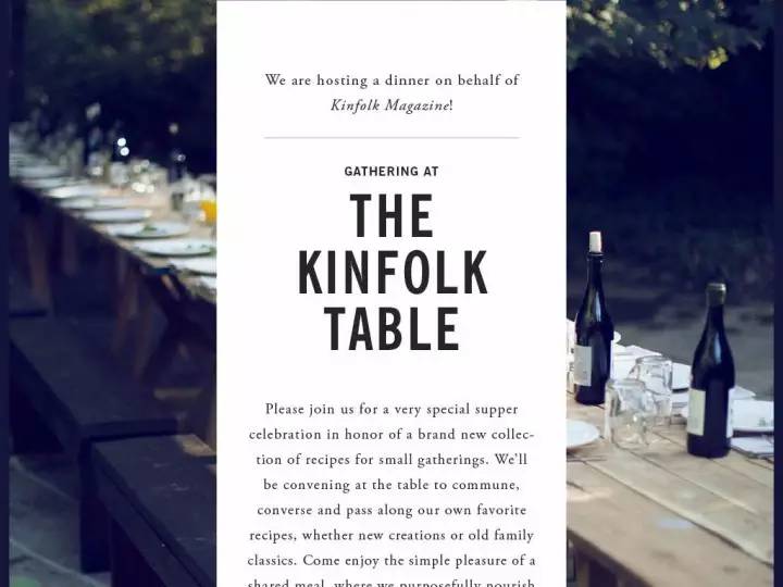

The old style fonts (Old style) Calson and Garamond are used in the text. Compared with the Garamond used in the text in the picture above, with a large background image and centered typesetting, it looks traditional, soft, and poetic beauty.
Modern example:
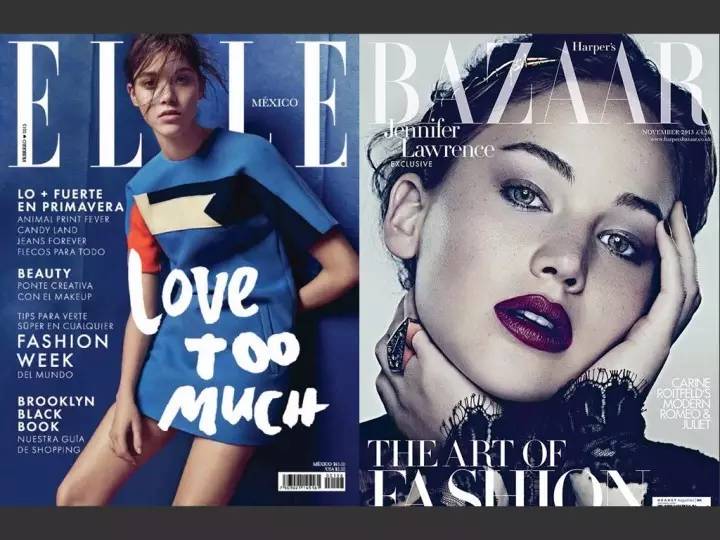
 Because the modern typeface (Modern) has a sharp industrial feel, it also retains the traditional serif elements, making it look modern and elegant. So it is very suitable for the fashion industry, and magazines such as Vogue and Elle have used modern fonts. Many luxury brands also use modern fonts as their logos, emphasizing their century-old traditional craftsmanship and excellent design. Such as Giorgio Armani with Didot, Burberry, and Valentino with Bodoni.
 It is generally believed that serif fonts represent classic formality and sans serif fonts represent modern affinity. But can the serif font really convey modernity and people-friendliness?
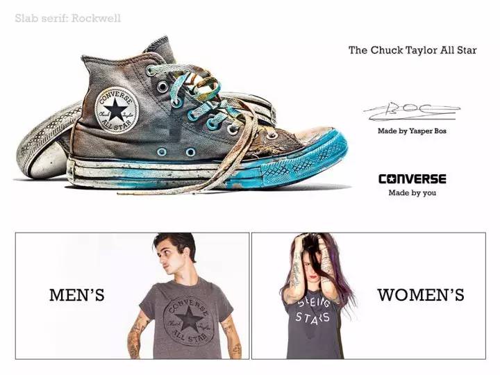
The answer is no. The font Rockwell used by Converse is a slab serif (Slab Serif), as shown in the figure below. It is characterized by the same thickness of serifs and characters, and the geometric and single-line design presents a modern and youthful feeling, which is not as fine as modern, suitable for retro trendy brands.
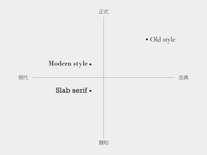
 So the emotions of fonts are actually relative, only inside the serif body, there are also different emotions.
·sans-serif·
Sans-serif features and styles:
(1) Completely abandon the decorative serifs, leaving only the trunk, with a concise and powerful shape, more modern
(2) Suitable for headlines and advertisements, with high instant recognition
(3) The stroke thickness contrast is small, and the visual appearance is basically the same
(4) Higher x height
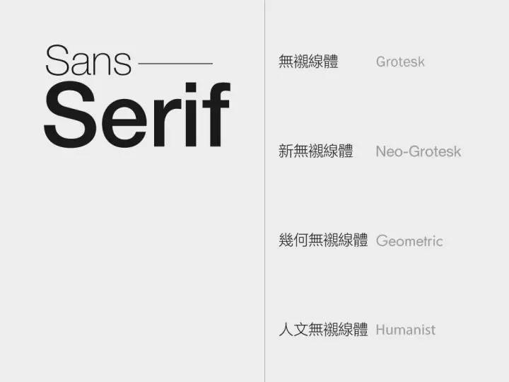
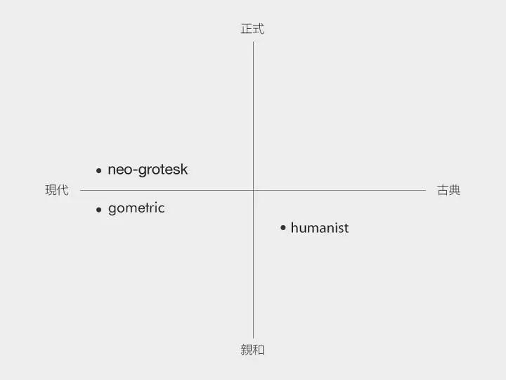
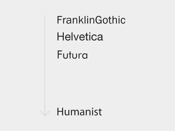
 Sans-serifs can also be divided into four categories: early sans-serifs (Grotesk), new sans-serifs (Neo-Grotesk), geometric sans-serifs (Geometric), humanistic sans-serifs Body (Humanist). In the following, a representative font is selected for each category for introduction, starting with Neo-Grotesk.
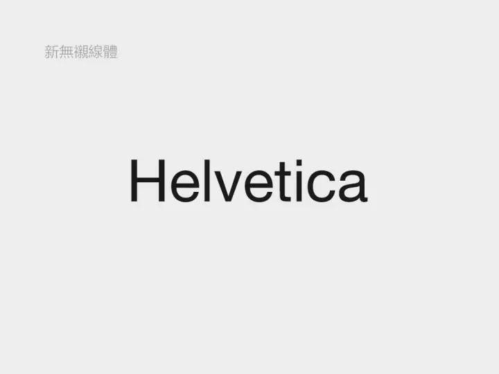
1. Neo-Grotesk
 The represents the well-known Helvetica font. There are countless brands that use Helvetica as their logo font. On the 50th anniversary of the font's birth, there was a documentary "Helvetica" that objectively recorded its birth background, popular influence, and designers of all ages' comments on it. I believe many designers have already seen it.
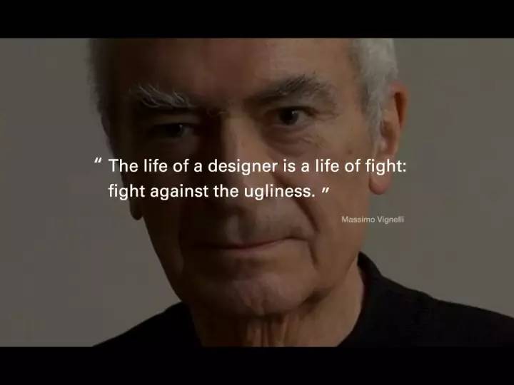
 "The life of a designer is a life of battle, a battle against ugliness." - Massimo Vignelli, "Helvetica"
Let’s talk about the advantages of helvetica first:
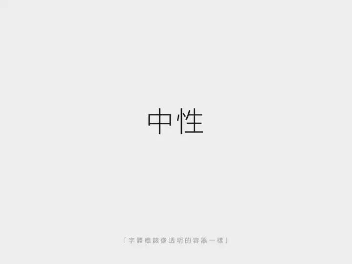
 (1) Neutral
Modernism believes that the font itself is only a medium to convey information, and concise fonts can convey information more accurately, which is more important than visual expression and style. Therefore, Helvetica follows this design concept in the design and remains neutral, just as the metaphor says "the font should be like a transparent container".
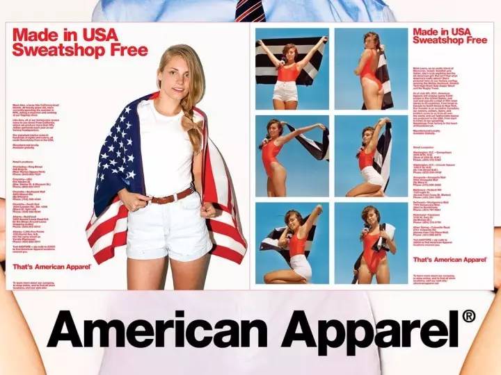
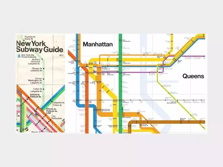
 Because of its neutral features, Helvetica can be applied to the subway guide system, which gives people a modern, efficient and clear feeling, and it can also be applied to fashion brands such as AA. Because of neutrality, there is a wider application space and a more open way of interpretation.
(2) have solid form
I say "solid form" here instead of "good readability" because its readability is challenging, but Helvetica does have serious consideration in font design. Before Helvetica, the fonts in advertisements and magazines were full of flamboyant handwriting. The appearance of Helvetica is like a clear stream. It removes redundant designs, focuses on the structure of the font itself, and brings better options to the design industry. .
 The overall impression is that it is a simple, clear, non-handmade, very calm font.
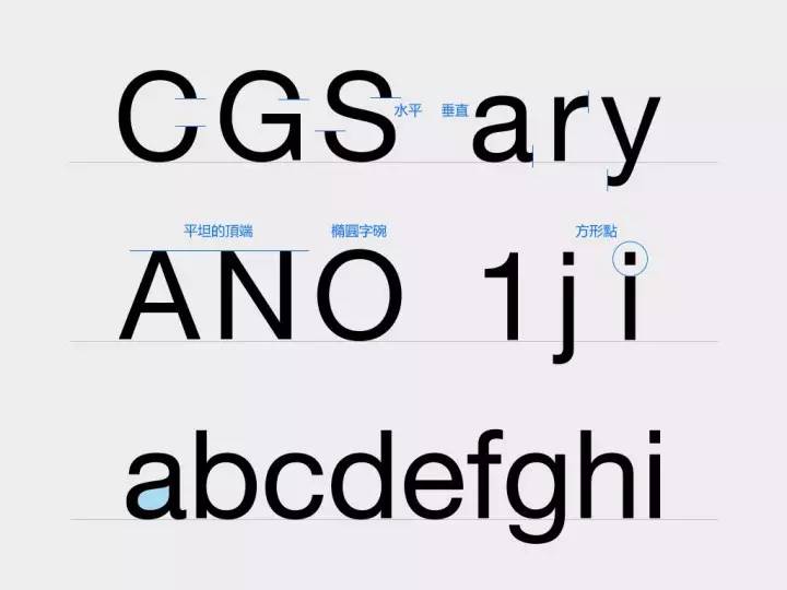
Details:
a. Cuts are flush and strokes always end horizontally or vertically
b. Flat top
c. square point
d. It is said that the area surrounded by Helvetica letters is the same as the area occupied by its strokes
e.a's negative space is in the shape of a water drop
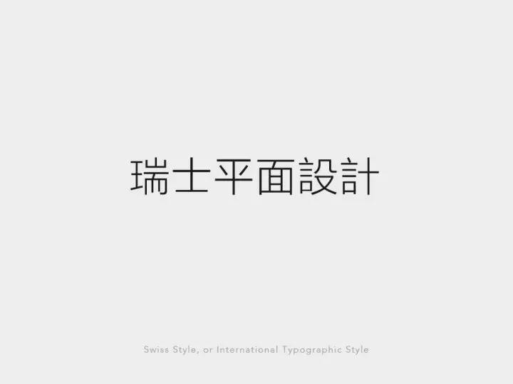
(3) closely related to Swiss graphic design
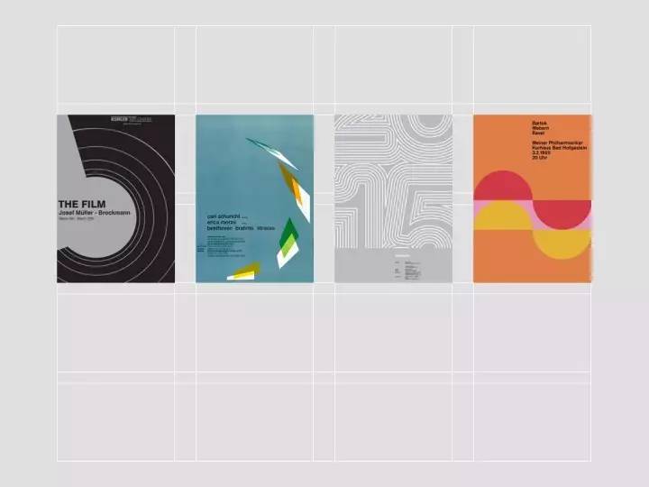
The success of Helvetica is not something that can be accomplished by a single font, it is inseparable from the emergence of a series of new sans-serif (Neo-Grotesk) and the integration with the entire Swiss graphic design, which has swept the world. Together, they form a complete set of concepts: advocating absolute rationality, objectivity, and systematization. As we are familiar with, the grid system is a visual embodiment that advocates systematization and mathematics.
 The typical approach of Swiss graphic design is to use pure text layout to communicate minimally. It became popular in the world after 1960 because of its concise and direct performance, and its easy standardization and systematization in operation. At that time, American companies were seeking a fast-spreading and unified visual solution for global expansion. The emergence of Swiss graphic design, Helvetica, and the successful use of various masters pushed them to the top together.
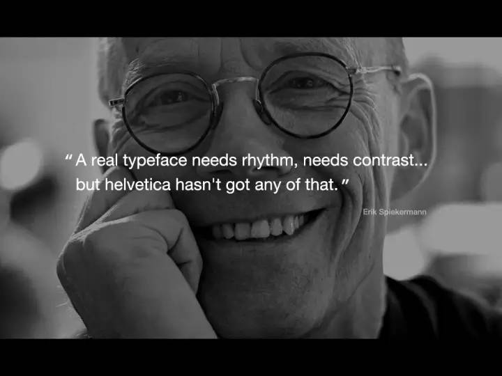
However, Helvetica is not perfect, here are three shortcomings:
(1) Lack of rhythm:The design concept of Helvetica is consistent and depersonalized. The overall shape of the letters is round, so it lacks reading rhythm and does not target small print Reading optimization. Today, when excellent fonts and subdivisions are abundant, Helvetica’s advantages have weakened.
(2) Neutrality is also a double-edged sword:While being calm and objective, it also obliterates emotion and ignores the pleasure that form may bring to users.
(3) Abuse:You can refer to the proliferation of Flatdesign today. Misuse and abuse cause people's aesthetic fatigue.

If you like neutral and sexy fonts and want to correct Helvetica’s readability flaws, you can try Univers, which has a more refined shape than Helvetica and has a complete font weight.
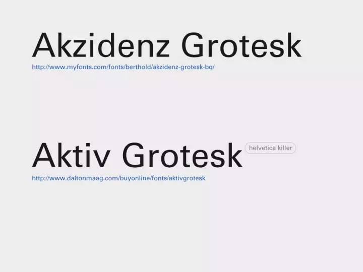
The other two new sans-serif fonts (Neo-Grotesk) are the predecessor of Helvetica and the font known as Helveticakiller.
2. Geometric
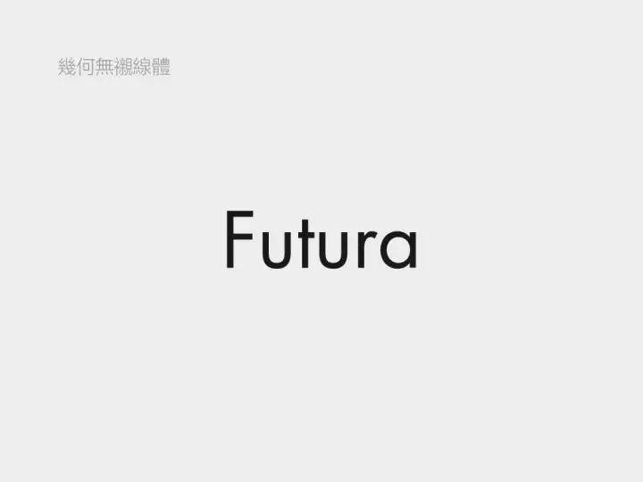
represents the Futura font. The so-called "geometry" is a font that summarizes letters into geometric shapes such as circles, squares, and triangles.
 Futura is influenced by Bauhaus, and its shape has a sense of design. The strokes are mainly vertical and horizontal tough strokes.
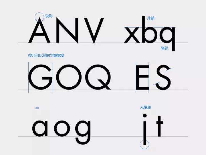
Details:
(1) The top and bottom corners are very sharp;
(2) letter perfect circle processing;
(3) Ascent and descender are long and elegant.
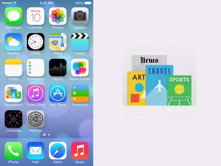
 The iPhone newspaper and magazine icon, the three letters of "ART" are Futura.
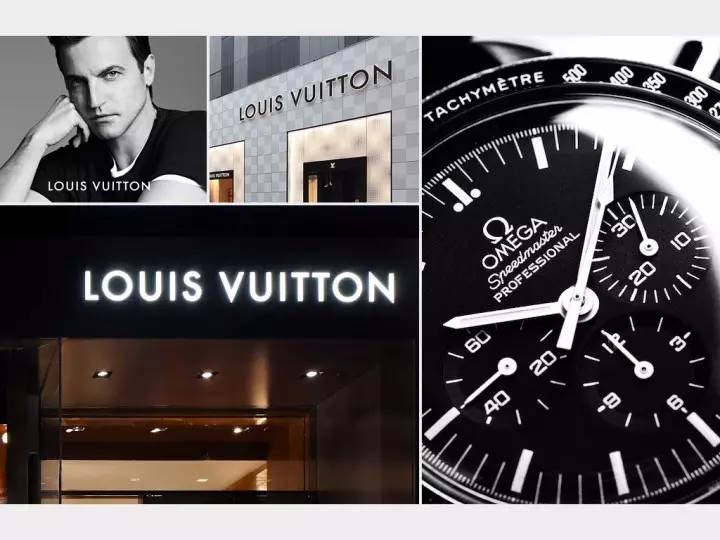
Futura means "future" in German and Latin, so it is not only common in design products, such as LV and Omega, but also often used in "future" themes.
 In the previous figure, we can see that in order to maintain the sense of design, Futura omitted the tail of j and t, and used a single-layer structure for a and g, so there are some problems in readability and are not suitable for content layout. And it has a distinctive personality and is a bit "eye-catching".
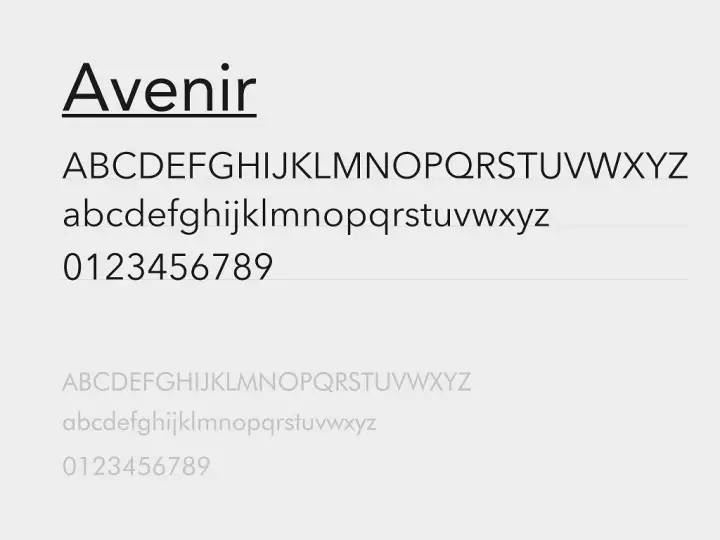
 If you like a geometric sans-serif look but want something softer and more readable, try Avenir. Although Avenir is also a geometric sans-serif, it is not limited to geometric forms when it is designed, but it is based on vision, which looks humane and soft, such as the tail of a with a little warped small details.
3. Humanist
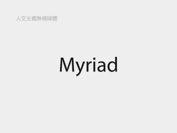
represents the font is Myriad. The humanistic sans-serif font has a better sense of rhythm, and its temperament is open and friendly. Compared with Helvetica, it is more elegant and less ingenious. By comparison in the figure below, you can intuitively feel what is the "humanistic" feature.
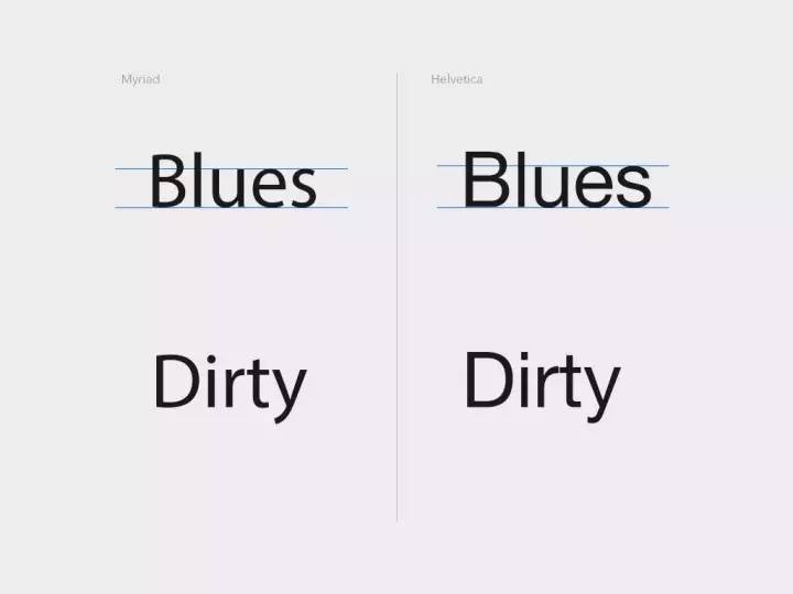
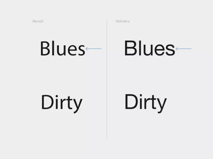
(1) The x-height of the humanistic sans-serif font is relatively small, which makes the whole more rhythmic.
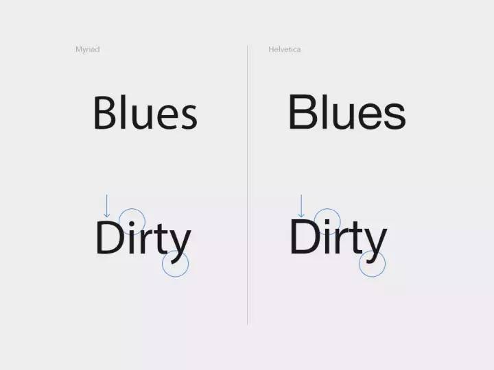
(2) The e, s and other letters of the humanistic sans-serif font use a semi-enclosed structure at the end, which is more open, not as rigid as the fully enclosed Helvetica, and looks friendly and casual.
(3) The humanistic sans-serif body has soft lines, not the engineering sense of Helvetica, but more streamlined, with a certain handwriting flavor.
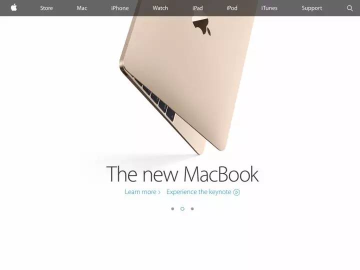
Case:Apple’s VI font, used for publicity: advertisements, websites, product inscriptions, etc.
Some fonts of the MTR map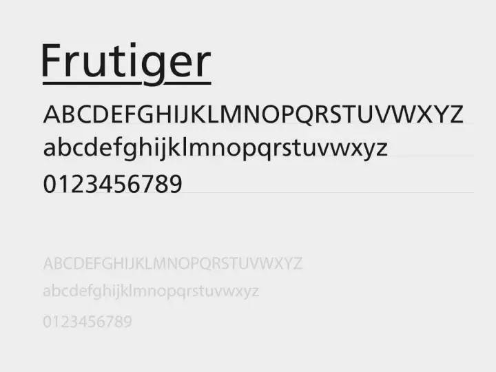
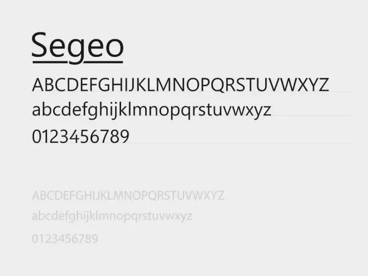
Fonts that also belong to humanistic sans serifs include: Frutiger, Segeo
It is generally believed that serif fonts represent classic formality and sans serif fonts represent modern affinity. So can't sans serifs be elegant and classic?
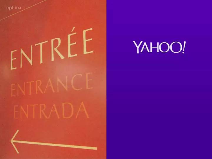
The answer is no. The sans-serif font Optima incorporates the serif gene. Although there is no serif, the change in thickness is relatively obvious, and the end of the gesture is thickened, which is very elegant and charming. (If you want to be elegant and classic when dealing with logos without looking old-fashioned, you can refer to this idea.)
Sentiment axis for sans serif font.

·Font details·
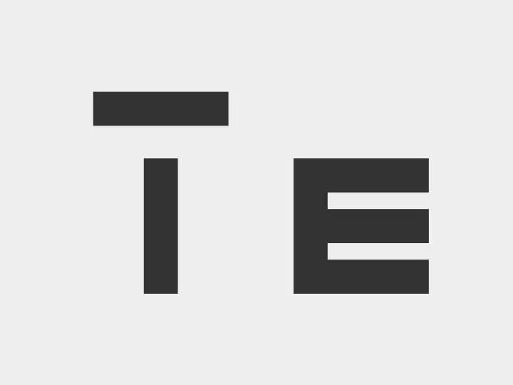
1. Visual balance
(1) For lines of the same thickness, due to visual errors, the horizontal ones appear thicker than the vertical ones. Therefore, when designing English letters, parallax should be fully considered. Many such cases are explained in Akira Kobayashi's books.
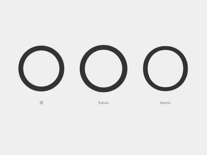
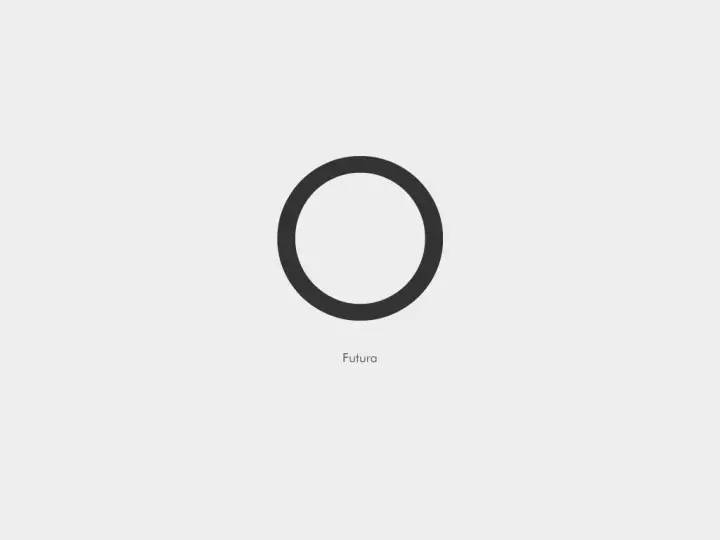
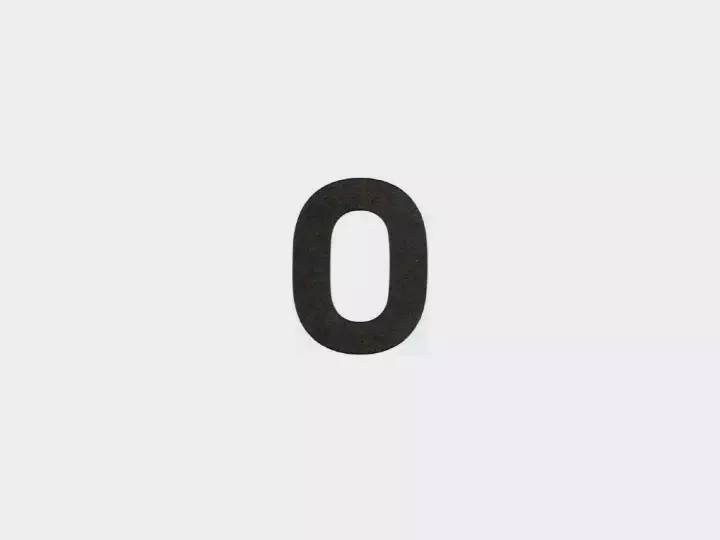
 (2) Futura is a geometric sans-serif body, and its O looks like a perfect circle. When we compare it with the real perfect circle, we will find that the geometric shape of Futura is also optimized, and the strokes in the horizontal direction are fine-tuned and repaired. thin. Compared with the three "circles", although Avenir is the least like a perfect circle, as the letter O, it looks the most comfortable and stable in space.
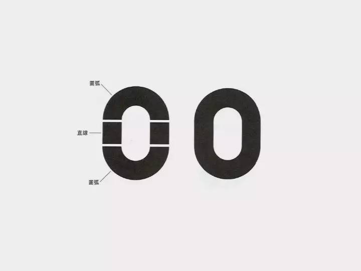
(3) This is an O spliced with arcs and straight lines. However, due to parallax, it looks like the illusion that both sides are sunken. Therefore, when processing, the two sides will be slightly raised outwards, and the horizontal lines will be fine-tuned, so that the stiff and unrounded circle can be transformed into a visually soft O letter.
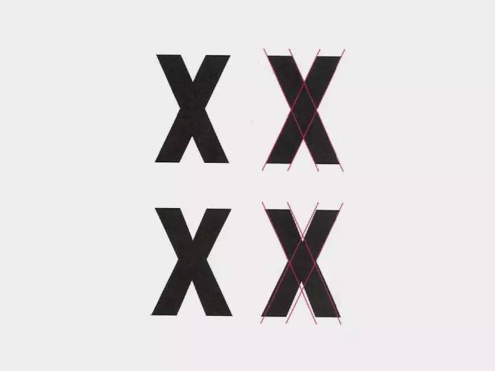
(4) The shape of the X is not the result of the direct intersection of the slashes, but the slashes are slightly staggered so that it looks like a connected state. And in order to avoid the dense black part in the middle caused by the intersection of four oblique lines, the stroke in the center is slightly thinner.
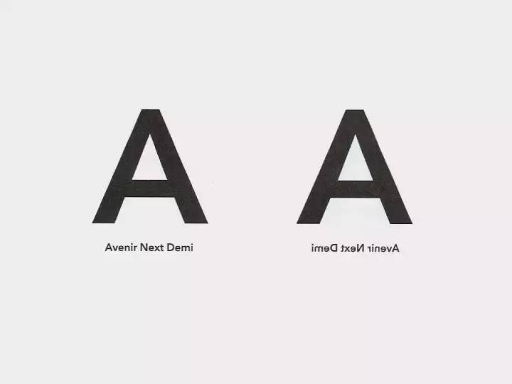
 (5) Although the stroke thickness of the sans-serif font is basically the same, there is still a slight gap in reality. The A (pictured on the left) seen from the front is very normal, but when A is flipped horizontally (pictured on the right), it immediately feels slightly weird and unstable. The stroke on the right side of A is thicker than the left side, which is influenced by the habit of writing in flat pen and serif in history. Over the wall to watch the videoHow are Roman capital letters formed? "
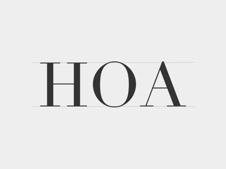
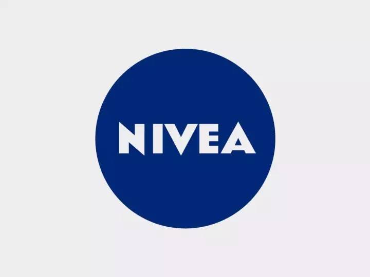
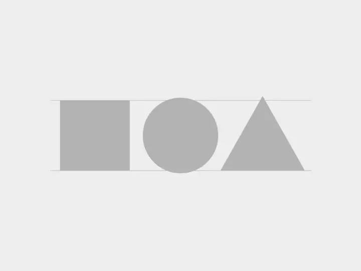
(6) We all have experience in drawing icons. Due to the difference in outline and internal complexity of icons, the sense of visual volume is different, which cannot be judged entirely by the size but by the visual experience. Typography has something in common. For text of the same font size, the circular O and the triangular A should be higher than the reference line. You can pay attention to this point when making LOGO, refer to the case of NIVEA.
2. Negative space
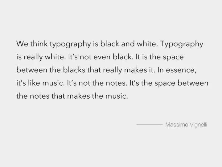
Negative space refers to the space inside letters and the space between letters. In the font design process, the designer should not only design the stroke structure of the letters, but more importantly, consider the design of the negative space to make it balanced and coordinated. To quote Massimo, the master typeface: "We usually think of typography as black and white. Typography is actually white, not black. Because fonts are defined by the spaces between shapes. It's a bit Like music, music is defined not by the notes but by the pauses between the notes". It is said that English font designers may spend about 1/3 of the overall font design content on the negative space relationship.
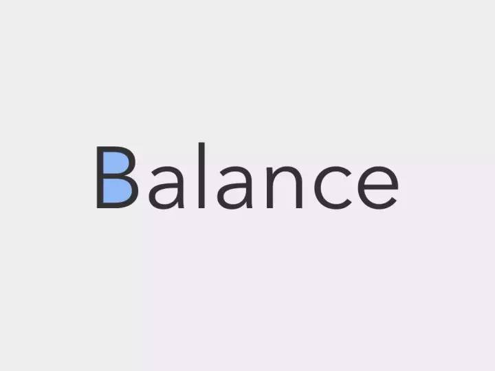
 (1) The space inside a single letter: "B" has two spaces above and below. The top must be smaller than the bottom. If the top and bottom are the same, the top will appear larger visually, and the center of gravity of the letter will be unstable. A similar letter is S.
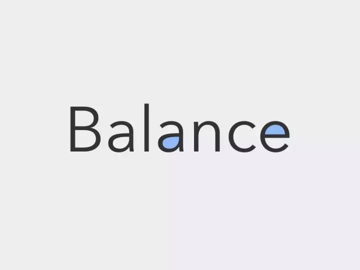
 (2) The mutual balance between the letters: the visual consistency of the negative space should also be achieved between the letters.
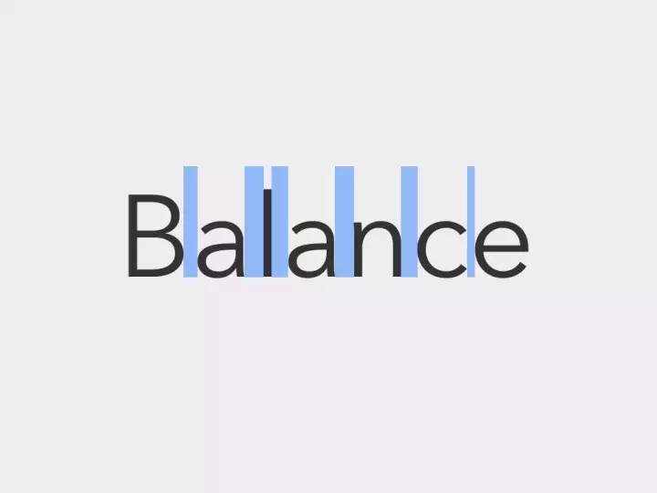
 (3) The spacing between words: adjust the space between letters, and pursue a visually uniform distribution rather than numerical uniformity, so as to achieve a sense of visual rhythm and balance. For example, the distance between I and lowercase l in the font should be larger, because the space between the two vertical lines is the smallest; V, Y and other letters should be adjacent to each other, because the space generated by the oblique stroke is relatively small big.
·Thinking about Design·
1. How should information be designed
 Rather than saying that we are learning font design and typography, it is better to say that we use fonts to think about the issue of "how information should be designed".
On this issue, "typeface design" provides us with at least two paths for reference.
(1) Form follows function
English typography has always been a model of "form follows function" design. What function, what scene, what problem to solve, what kind of font will be produced to suit it, and even the subdivision is very clear. Historically, there were Times designed for newspapers; Bell Centennial designed for the yellow pages of the telephone book, to cope with the harsh environment with extremely small text and poor printing paper and ink; there are also the familiar Georgia and Verdana designed for display screens, Solve the problem of low resolution.
In 1913, Frank Pick, director of the London Underground, put forward such requirements for the corporate image and font design of the subway at that time: "This typeface must accurately reflect the era we live in, and allow passengers to read quickly and without mistakes. Letters Even if it is used as a single symbol (without context), it must be clearly identifiable. Moreover, the typeface must be systematic and must be clearly distinguishable from the surrounding advertising copy and other unsystematic information.” These requirements are clear The functional goals of the design are achieved: high accuracy, recognizability, clear recognition can be guaranteed in extreme cases, etc.
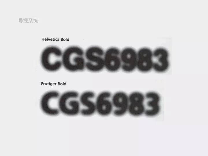
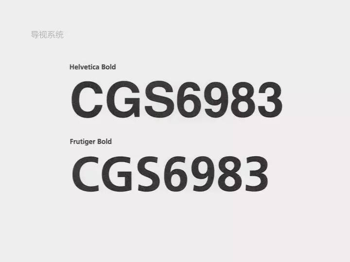
The above is the Frutiger font designed for Charles de Gaulle Airport in France. Due to its large font bowl, large opening, and the characteristics of moderate thickness, the text can remain relatively clear and not sticky even under the interference of halo.
(2) Transparent container
The concept of modernism believes that an excellent font is like a "transparent container". The font only plays the role of carrying, and the important thing is the transmission of information.
Another interesting metaphor from the master Frutiger is, "If you can still remember the shape of the spoon after drinking the soup, the design of the spoon is a failure." The analogy is a bit extreme, but information and design are not mutually exclusive , The two are fully integrated and integrated into one, which is the perfect match. Design can exist as air, indispensable, but users will not obviously perceive it.
2. The relationship between technology and design
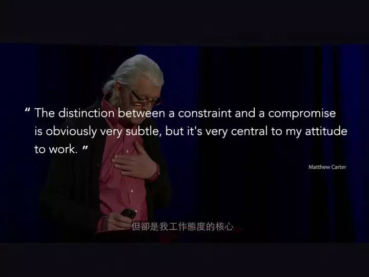 Mathew Carter, who has designed famous fonts such as Georgia, Tahoma, Verdana, Meiryo, etc., gave a speech on TED——《My Life in typefaces 》. After reading it, I am very moved, and I can deeply feel the requirements and professionalism of a designer for himself.
Type design is actually very closely related to technology. Writing tools, paper, books, electronic screens, and the Internet, every innovation in media and printing technology changes the presentation of fonts, and also affects the ideas and methods of designers. However, in that era of technological innovation, designers did not avoid technology, but wanted to be influenced by unknown ideas, to respond to the unknown, and to push themselves to explore the unknown world. In the process of exploring technology and design, there are bound to be contradictions and doubts: Will the design made to alleviate technical problems completely disappear due to the change of technology? Does a design that is "imperfect" because of technology lack value?
 Matthew’s design responded: the value of a font depends on whether it can work effectively in actual application scenarios, and the quality of a font determines whether it can exist independently of technology. Matthew said in his speech: "All designers have limitations in their work. Design is not art. The question is, does limitation lead to compromise? Does it reduce the quality of design? There is a very subtle relationship between limitation and compromise. difference, but that difference is at the heart of my approach to work.”
3. Design trends and reincarnation
(1) The world is becoming softer
Maybe after two industrial revolutions and two world wars, everyone has calmed down a lot. From government public relations, to corporate management, to personal life interests, they are gradually humanized. The propaganda method of holding up big banners and shouting slogans is no longer so effective, and it may even cause a backlash from the hearts of the people. It's no longer a time when the volume is loud enough to be listened to.
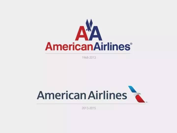 The revisions of the two LOGOs in the picture below, whether it is fonts, graphic shapes, or colors, have become softer.
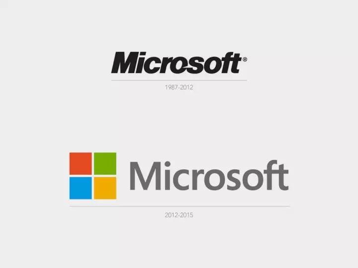
From the LOGO, the image of American Airline seems to have changed from the seriousness of "we are professional aviation experts" in the past to the closeness of "we provide comfortable and pleasant journeys".
(2) Traditional revival
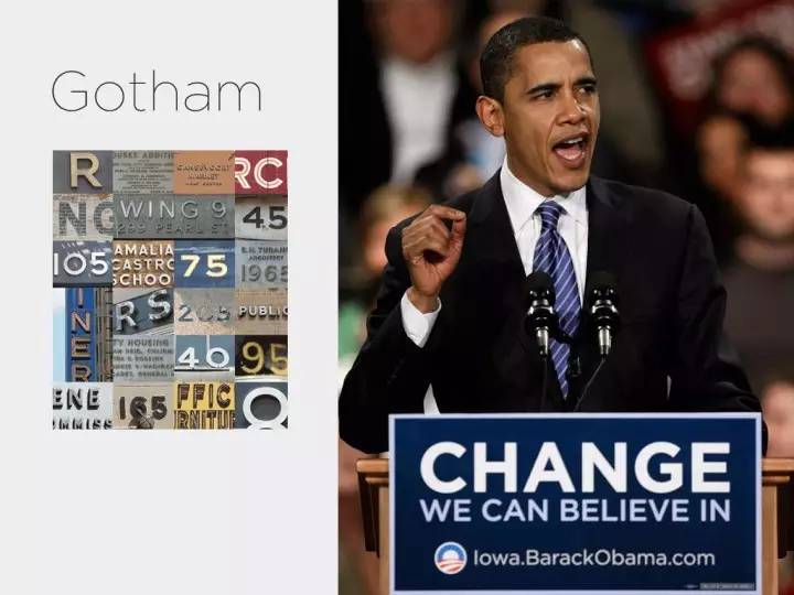
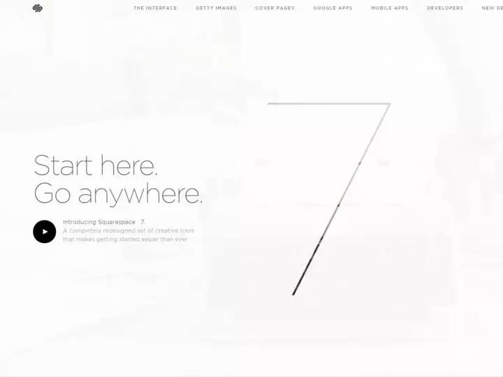
Frere-Jones, the designer of Gotham, lamented the end of traditional hand-made cards with the advent of mechanical technology. He was inspired by old building signs, store signs, and storefront advertisements in New York from 1930 to 1940. He believes that these words hand-painted by ordinary Americans represent New York's "straightforward, sincere, tenacious, and full of personality." Therefore, the Gotham font not only makes the American people feel familiar, but also has the modern sense of the new font, not only has a reliable and stable shape, but also is very simple and friendly. This font became a hot font after the Obama election. The website Squarespace, Tesla all use Gotham.

 Many generations of artists and designers in history have experienced dissatisfaction with the current society, respected classical classics, and pursued the revival of traditions, such as the Renaissance and the Handicraft Movement. However, like font design, while these fields are constantly reincarnated, they are also constantly injecting fresh vitality into them, thus spiraling up and developing.
·last·
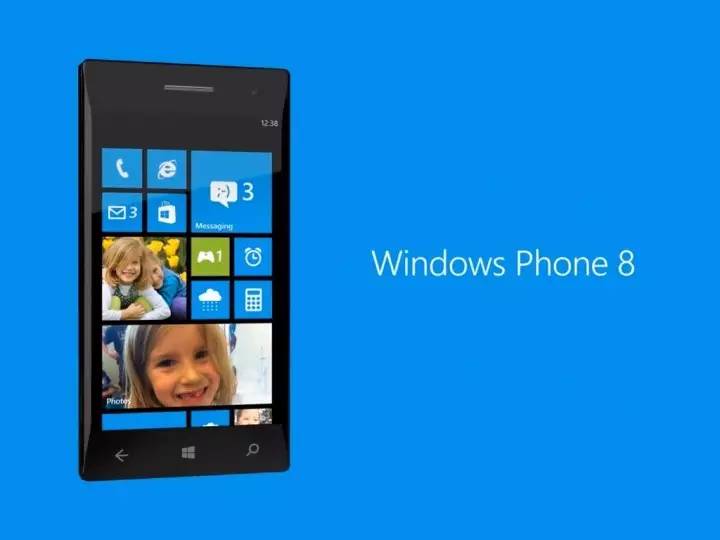
Looking back at our UI design, the design of Windows Phone grids and tiles is not only a retrospect to Swiss graphic design, but also opens a new flat era, following "simple and modern, removing decorations, and content as the core" .

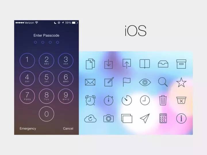
However, excessive minimalism creates a single and boring impression, and tends to become mere formality. Since then, iOS7 has used thin and elegant lines and softer graphics to gently solve the emotional and differentiation problems of flat design.
Going to Google's new design, whether it is illustrations full of human touch and details, or interesting illustrations of Geek spirit, you can feel more individuality and details. Is skeuomorphism also revived in another form of illustration?
Reference Books:
"Western Fonts" (Japanese) Kobayashi Chapter
"Unbelievable Fonts" (Japanese) Akira Kobayashi
"New Concept Typeface Basics & Application" Su Ke
"Principles of Text Design" (Japanese) Date Chiyo
"A few questions about font design: Zhihu Xu Hanwen's self-selected collection"
Reference article:
Typography Principleshttp://invisibledesigns.org/typography-principles/
Why Is Helvetica So Popular? "http://www.zhihu.com/question/20707495
"Why Humanities in Humanities"http://www.zhihu.com/question/20769417
"Typeface Development and National Image"http://www.typeisbeautiful.com/2009/10/1536/
"For More Effective Communication of Information/Fonts for Traffic"http://www.typeisbeautiful.com/2010/01/1981/
"Grotesk Past and Future: AktivGrotesk Criticism"http://www.typeisbeautiful.com/2010/09/2935/
"History of Latin Typefaces: Transitional Typefaces"http://blog.justfont.com/2012/11/%E6%8B%89%E4%B8%81%E5%AD %97%E9%AB%94%E7%9A%84%E6%AD%B7%E5%8F%B2%EF%BC%9A%E9%81%8E%E6%B8%A1%E6%99%82 %E6%9C%9F%E5%AD%97%E9%AB%94/
The Most Stylish English Fonts: Modern Style
http://blog.justfont.com/2012/12/%E6%9C%80%E6%99%82%E5%B0%9A%E7%9A%84%E8%8B%B1%E6% 96%87%E5%AD%97%E9%AB%94%EF%BC%9A%E7%8F%BE%E4%BB%A3%E6%A8%A3%E5%BC%8F/
Articles are uploaded by users and are for non-commercial browsing only. Posted by: Lomu, please indicate the source: https://www.daogebangong.com/en/articles/detail/The%20past%20present%20and%20future%20of%20English%20font%20design.html
 支付宝扫一扫
评论列表(196条)
测试