The Myth of Futura
Translation | Zhang Zhiyuan
·
Reading always leads to knowledge, especially those written by real experts. But it can also be confusing when you find that some research content has become more and more confusing after being edited and published many times by different publishers. I recently bought a book on Paul Renner, written by Philipp Luidl in 1978 and published by the Munich Type Association (TGM). One of the authors of this book is the famous type designer Günter Gerhard Lange. At that time, Lange was the art director of the H. Berthold type company, and is considered one of the most influential figures in this field. In his article, he pointed out that the geometric serif font drawn by architect Ferdinand Kramer for an apartment building in Frankfurt in 1925 was the source of inspiration for Renner when designing Futura. On the next page, Lange writes that Renner started designing Futura in 1924. It was this inconsistency that made me want to know more about the history of this typeface.
I started reading about Renner and Kramer to figure out who actually designed the original Futura typeface. We all know that Futura is one of the most popular fonts in the world today.
True or false?
-
Christopher Burke's book on Paul Renner (Hyphen, 1988) is a good primer; followed by an article by Burke called "The Origin of the Futura Typeface" Article (1977), can lead me into the right path of research. In this article, Burke patented the typeface design to the entire Bauer Typeface Company. Don't be surprised when you see the chaotic typeface offerings they came out with during this period. Unfortunately, it also turned my research work into a mess. The technical support of the foundry always plays a very important role in the field of type design. Not even a professionally trained artist or architect can control every aspect of the production process, only a type designer can. Fortunately, there are some other books published by Burke that allow me to do further reading. Among them is an article by Hans Peter Willberg (Tiessen Verlag, 1969) in which he writes that in 1925 Kramer was a student at the Städel-Schule in Frankfurt and that it was here that he drew what would later inspire Renner designed the first draft of the Futura typeface. Kramer, who was still a student in 1925, was already a well-known architect and product designer, and worked in the urban construction department of Frankfurt. And as far as I know, he never attended the Städel-Schule. Renner started the first draft design of the Futura font in 1924, and at the beginning of the following year, the earliest Futura font was produced by the Bauer font foundry. Therefore, Willberg's various conclusions are wrong.
Set Date
-
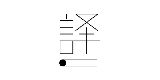
A piece of paper is recognized as evidence of Kramer's typeface design (Figure 1). On this sheet, some of the capital letters of the Futura font are shown with their outlines crossed out, while their alternative versions are also attached. Many publications attribute the paper to Kramer.
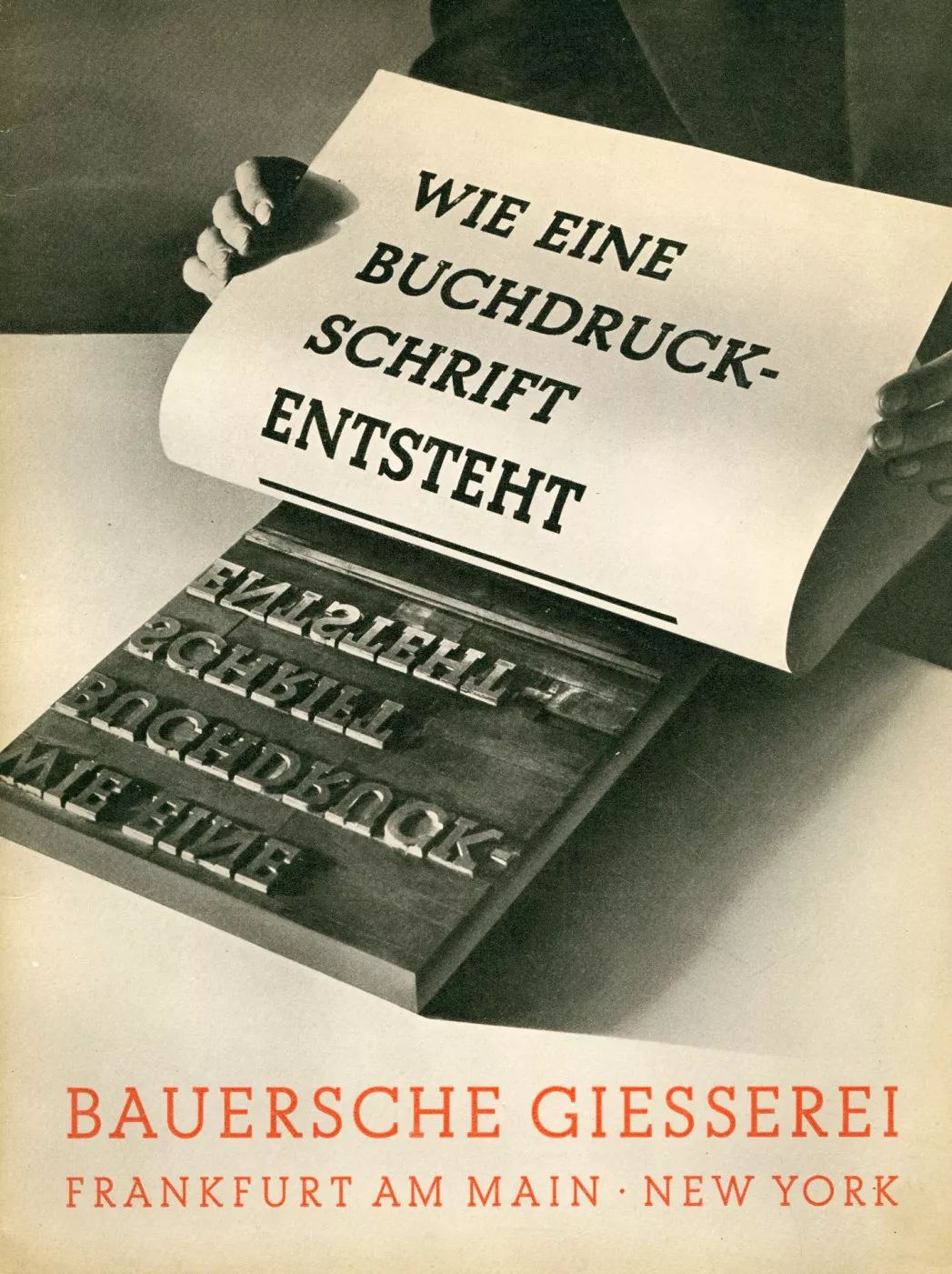
▲ Figure 1Published in 1958
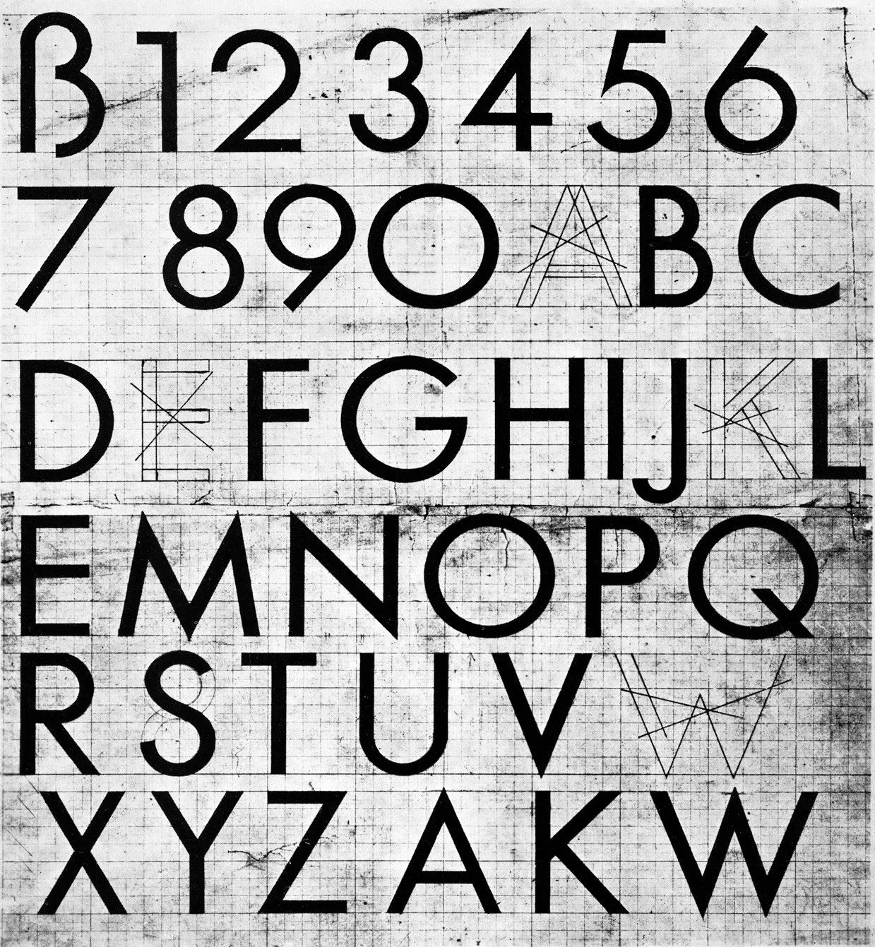
So I had to find out when this design was first published, and why it was credited to Kramer. Most of the Bauer Type Foundry material was destroyed in World War II, so I started with some pre-war publications. Among them, an article published by Denis Megaw in the "Typography 7" magazine in 1938 is particularly important. On page 34 of the magazine, the first version of the Futura font designed by Renner is clearly displayed, including uppercase letters, lowercase letters, and numbers. , symbol (Figure 2). Arranged left and right in the upper half is the first version of Futura designed by Renner, and the final version is in the lower half. And it is clearly stated that the final version of Futura was published by the Bauer type foundry in 1927 (without additional replacement letters).
▲ Figure 2 Typography 7, 1938
The black letters in this draft design (Fig. 1) establish the form of the capital letters of the Futura font, and those outlines verify the A and K mentioned in Megaw's article in 1924. design. Another invitation to a lecture dated July 3, 1925 (Fig. 3) was printed using a trial Futura typeface from the Bauer Type Foundry. It can be seen that the shape of the capital letters here is a form between the first version of Futura mentioned in the Megaw article and the final version.

▲ Figure 3
Also observe the letters M, N and R. The same experimental Futura typeface was used in an article by F.H.Ehmke published by Schrift Verlag on July 9, 1925 (Fig. 4).
▲ Figure 4
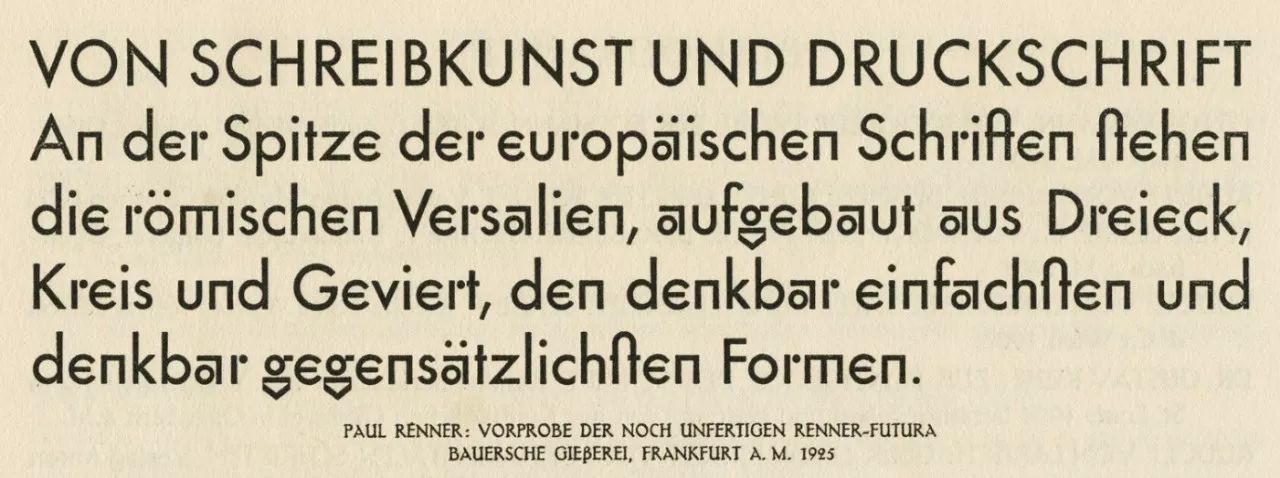
Be aware that in those days it usually took months to produce a book (from concept to final print). In a book by Renner, published in 1940, he reported on the presentation of the Futura typeface by the Bauer type foundry at the 1925 conference of large printing companies in Cologne and Mönchengladbach.
Renner meets Kramer
-
In May 1925, Renner traveled from Munich to Frankfurt to teach at the Fritz Wicherts Art School (the predecessor of the Städel-Schule). There he met Ernst May, head of Frankfurt's city construction department. The other person he knew was Kramer, who, as mentioned, was working in the department as an architect at the time. Ernst May's ambitious plan to reshape the city of Frankfurt drew much of its inspiration from the Bauhaus design school and Dutch De Stijl. An example of this was published in the magazine 'Das Neue Frankfurt (New Frankfurt)', signed by the architect Oud of the Union of Rotterdam. The geometric sans-serif typeface became an important part of the building that appeared in the magazine, and it was clear and unambiguous. Ernst May commissioned Renner to develop a typeface that could be used on shops, advertisements and small buildings like bus stops. I think this sample typeface designed by Renner for the Frankfurt City Construction Department can also be found in Jochem Jourdan's 'Werkkatalog Ferdinand Kramer 1923-1974' (Fig. 5).
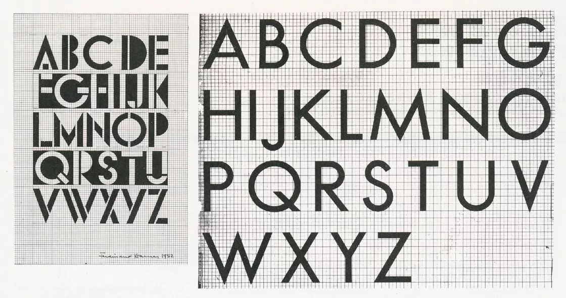
▲ Figure 5
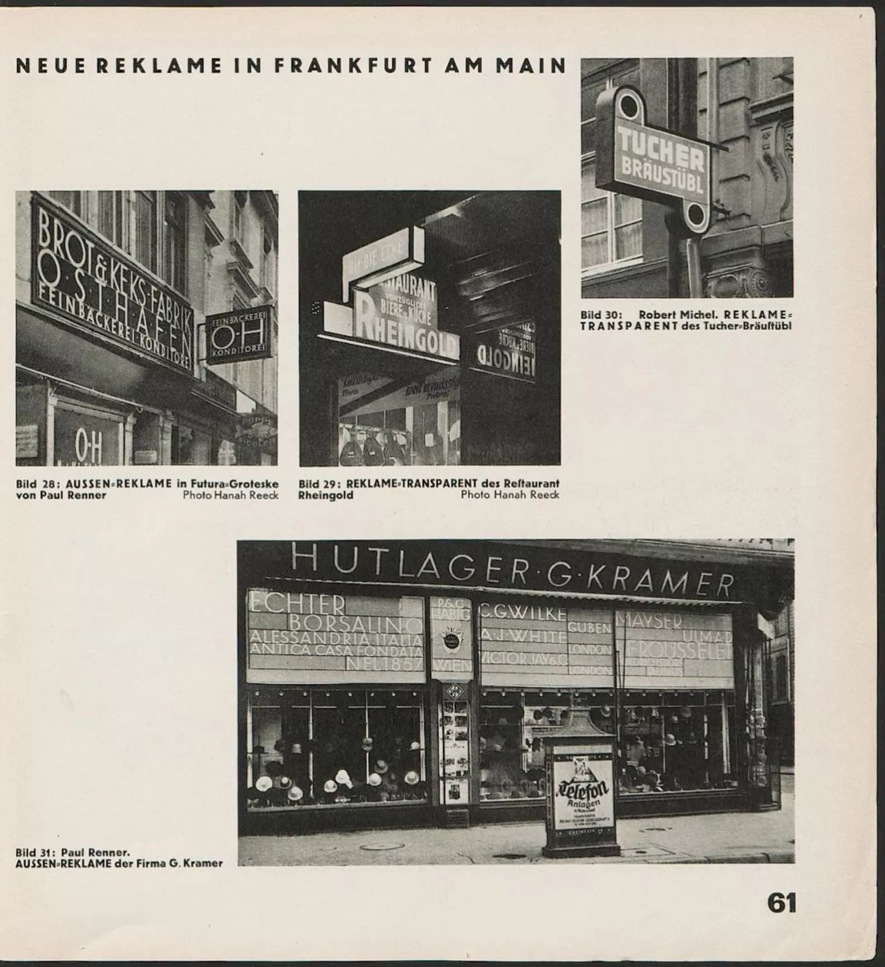
In 'Werkkatalog' the year 1925 is stamped on the back of this letter design. The font dated 1952 on the left of Figure 5 is not considered the original version, it was designed by Kramer. As the discussion of Kramer's typefaces begins, the typeface design sample on the right also differs from what most publications believe to be Kramer's designs. Publishers such as Baseline ("Creator of Futura" by Chistopher Burke), as well as many others, recognize the design sample in Figure 1 as this one. I feel that this design sample from 'Werkkatalog' is simply considered Kramer's simply because it was found in Kramer's archives. But I personally think that this is just a copy file or an attachment to the original file of Renner's font design for the Frankfurt City Construction Department. The typeface here differs from the trial version of Futura released by the Bauer Type Foundry in 1925 in several obvious ways (such as the letters J and S), and the uppercase letters may be Renner's design attempts for some architectural characters. The January 1927 issue of 'Das Neue Frankfurt (New Frankfurt)' magazine (Fig. 6) published a hat shop run by Kramer's parents in Frankfurt, with Futura fonts on the door. The pages on which these pictures are published are marked as belonging to Renner, and the name of the font (Futura-Groteske) is also marked on another page. Some of the letters that were replaced were made by sign makers based on Renner's design draft. It was a time before computers, scanners or printers.
▲ Figure 6
Renner's Design Process
-
I think it's easy to see that the so-called Kramer boldface is just a fiction, just by looking at the consistency with which Renner designed Futura. The sketch in Figure 1 clearly shows the three stages of the design. The first step was the statement in 'Die Schrift unserer Zeit' in 1924 (could not find source, but it is mentioned in the article written by Renner); the second step was in the journal 'Typography 7 (Fig. 2)' Design draft; the third step is the points I put forward in Figure 1. The capital letters crossed out in Figure 1 correspond to an earlier version of the design in the upper half of Figure 2. The trial version launched in 1925 (Figures 3 and 4) can be regarded as a continuation of this logic. The design draft found in Kramer's archives can be seen as a separate design by Renner, but it is also related to the Futura version designed during that period. Whether it is me or other professional type designers, it is very clear that a person like Kramer who has little experience in graphic design can't design such a typeface with extremely high quality and integrity. Although Renner is not a "professional" type designer, he is 23 years older than Kramer, has extensive experience in the field of graphic design, also teaches graphic design as a teacher at his own school, and has published a quite Critically acclaimed typography book. The design draft found in Kramer's archives (Figure 5), the font on the left seems to be designed by an architect: drawing on the drawing table with a ruler and compass, the upper and lower parts of the letter B The upper part adopts the same arc, the upper part of the letter S is too large, and the O, Q, and G are equally thick in the horizontal and vertical directions. What's more, that set of fonts is dated to 1952, a quarter of a century after Renner's design. Of course, there are also precedents for architects to design typefaces, such as Peter Behrens (Peter Behrens). But architects don't do much more than Kramer in graphic design or typography, or always with the help of experienced foundry employees. On the contrary, Kramer did not have relevant professional personnel to help when designing the typeface.
▲ Figure 7
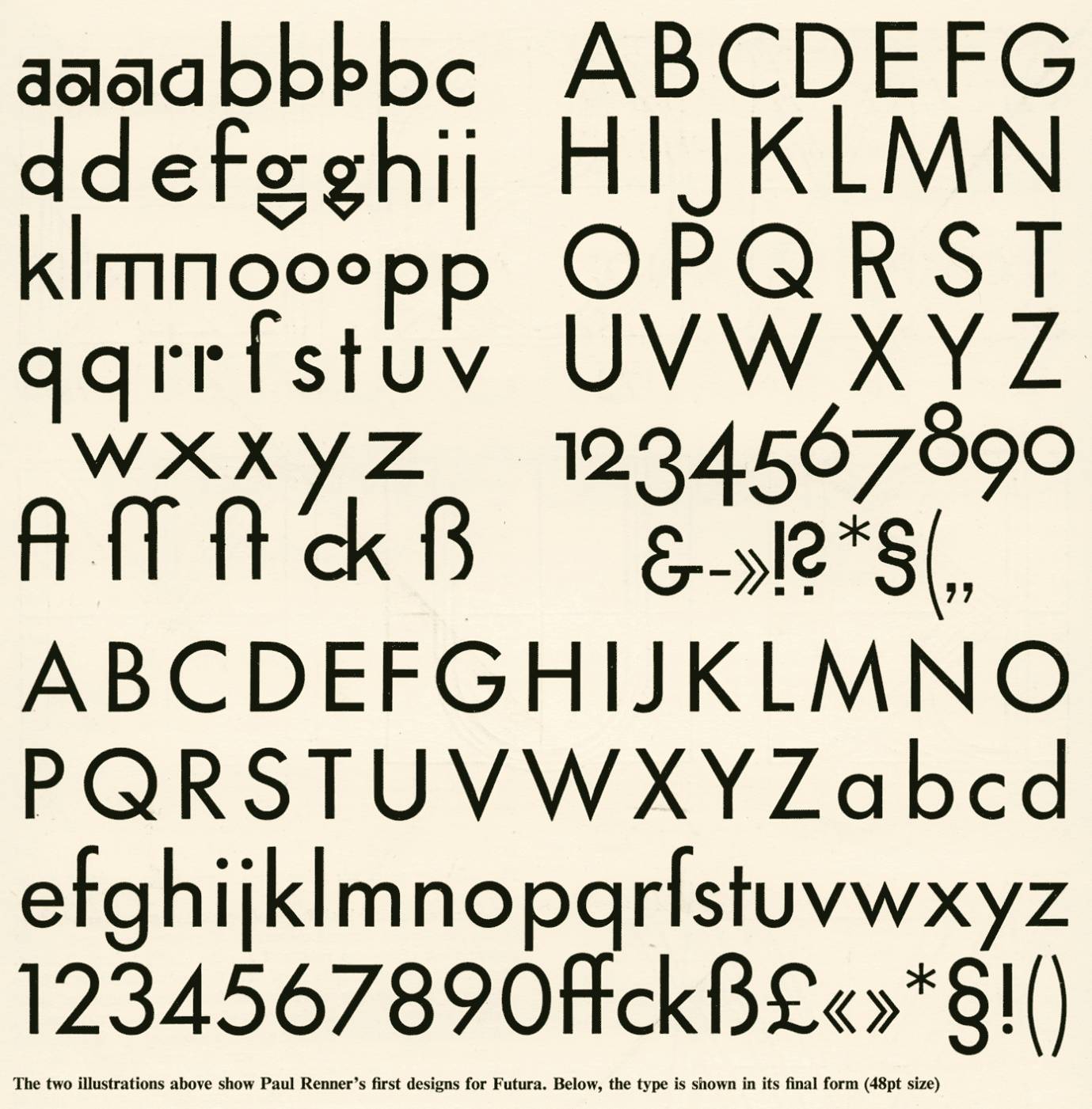
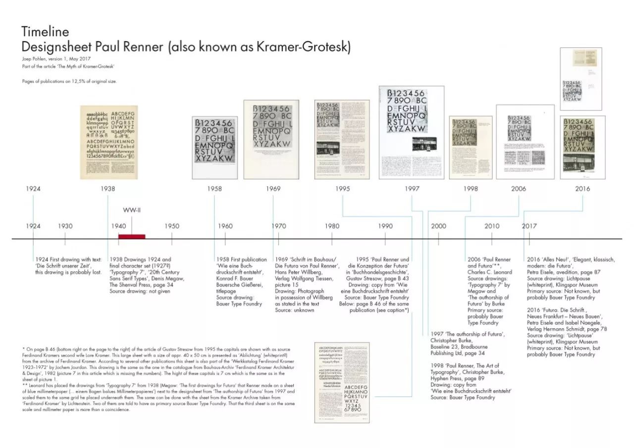
One book that has served me well in my research is Paul Renner and Futura: Implications for Culture, Society, and Typographic Design by Charles C. Leonard, published in During 2005/2006. Leonard thoroughly investigated the designs published in 'Typography 7', as well as the controversial design samples that appeared in How to Make a Typographic Typeface (Figure 8), published by the Bauer Type Foundry in 1958 .
▲ Figure 8
It was interesting to see the extensive research he did to compare Renner's various designs. The capital letters in Kramer's bold design draft in Figure 5 have the same height, which can be easily compared. But there is one thing Leonard guessed wrong, that is, the design draft marked in 1958 in Figure 1 is actually a reproduction of a book published by Bauer Type Foundry in 1931 (Figure 9).
▲ Figure 9
This book is very special. In 1931, the Bauer Type Foundry used the book to promote Beton, a new typeface brand designed for them by Heinrich Jost. All illustrations and articles revolve around that font. By 1958, Futura became Bauer's long-selling product, so the design draft of Futura was also published. As far as I know this is its first public publication. Therefore, I believe that this design draft has never had any relationship with Kramer before, and has been kept as Renner's design archives in the Bauer type foundry (until World War II). A 1958 publication by Bauer says that the Futura designs were dated to 1925 because Renner first showed them at a printing company exchange in January 1925 (see above). And Burke also writes that Bauer's first Futura trial typeface was completed in the winter of 1924/25. So I think the exact design time should be earlier than this date.
Recent Publications
-
Recent publications since 2016, the books 'Futura. Die Schrift' and 'Alles Neu!' publishers have discussed the design sample in Figure 1. So many font samples and real objects printed with Futura font constitute a visual feast. But something strange happened, in Emcke's 'Futura. Die Schrift', the trial version of Futura was marked as 1926/27, even though the picture clearly says July 9, 1925. And in the same way, this design draft first published in 1958 clearly belonged to Renner, and suddenly it was crowned and worn by Kramer. An article written by Katherina Pennoyer is subtitled "Still Unknown Truth and Details", according to some of the details she gave, pushing Kramer as the inspiration for the Futura font design. She again mentions that Kramer studied at the Städel-Schule in Frankfurt, which Willberg misrepresented in 1969. I can't find any evidence of this (see Figure 8, Renner vs. Kramer timeline). Renner published between 1940 and 1943 some reminiscences of his own design of the Futura typeface, for which Pennoyer wrote "the man who wrote the story seemed to owe it money". Therefore, she believes that Renner did not write this kind of article. Nevertheless, I think some credit should be kept for Pennoyer and 'Alles Neu!' publishers. She mentions that there is no evidence that Renner and Kramer both lived in Munich in 1919 and knew each other. Kramer came to Munich in 1919, and Renner just left in this year (see timeline in Figure 10). And since Renner is 23 years older than Kramer, it's unlikely they share the same circle of friends. But it can't be too absolute. Later, Renner sometimes came to Munich because of his work with the publishing house Georg Müller. I would also like to get some information about their meetings at that time.
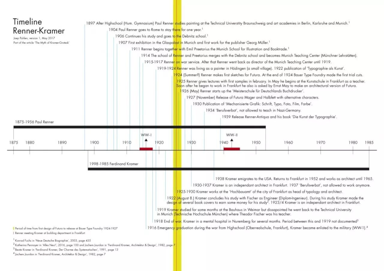
▲ Figure 10
▲ Figure 11
The book titled 'Futura. Die Schrift (Futura, The Masterpiece)' is an in-depth investigation. Of course, the famous design draft (Figure 1) was quoted again. Interestingly, the whiteprints were obtained from the Klingspor Museum. The author Petra Eisele believes that the whiteprints are 98% of the original manuscript. White-printing is a drawing process in which copy paper is in contact with the original, and ammonia is used to fumigate the drawing, which can be as close as possible to the original (usually 100% copy). I consulted with an expert named Ed Kemmerling, who has 28 years of experience in the architectural drawing reproduction industry. He also thinks 98% copy is unusual. Usually the target is 100%, because construction workers have to measure it through drawings. It is also unlikely that this error is due to the equipment. I emailed the Klingspor museum to try to find out how they got the drawing. But the reply is that I don't know, because too much time has passed. But they showed me another design where some letters were glued on and covered the letters below. These drawings appear as examples on pages 38-41 of 'Futura. Die Schrift'. I think these designs came from the Bauer type foundry studio because that's a typical way to perfect a design. In the book, they are dated from 1926 to 1928. The design draft in Figure 1 should have been sent to the archives of the Klingspor Museum like these draft papers. Of course, this is just my speculation.
Conclusion
-
It is not easy to understand why when Kramer was still alive, he did not protest against the design of the so-called Kramer black body that was published in many important publications. As an architect and product designer with a good reputation, Kramer does not need an unwarranted design to gild his face. The uppercase letters of the Furtura font had been designed in 1925, but the lowercase letters still took a long time to finalize. Perhaps Renner had discussions with Kramer when designing the lowercase letters, but Renner had discussions with many others as well. I've also read elsewhere that Jan Tschichold's wife said he believed he contributed to the design of Futura as well, citing that he had also discussed the design with Renner. Neumann mentioned in an article he wrote in 1991 titled "Ferdinand Kramer" that Kramer had stated that he considered himself one of Futura's fathers. These are all speculations, but I really can't find a reason why Kramer didn't reject the media that reported on Kramer's black body.
These stories about Kramer moved me a lot. In my limited knowledge, I don't think Kramer ever wrote that he ever designed a Kramer black body. But maybe there are other people who can read some subtext from it.
All content comes from typography.guru, click「Read the original」to browse the website
Translate the first-hand design information from overseas, and implement the in-depth reading form combining pictures and text. | To translate the 1st-hand information of design all over the Internet.
- Past Review -
Reshaping North Korea's visual image
Credit: Wolfgang Weingart - In-depth interview from the summer of 1991
The graphic design team behind MoMA
Swiss designer Felix Pfäffli's new website is online, as well as new works and design explanations (first translation in China)
An interview with Dutch graphic design studio “Experimental Jetset”. (First domestic translation)
Articles are uploaded by users and are for non-commercial browsing only. Posted by: Lomu, please indicate the source: https://www.daogebangong.com/en/articles/detail/The%20past%20and%20present%20of%20Futura%20fonts.html
 支付宝扫一扫
评论列表(196条)
测试