In the previous content, we also talked about the content of fonts. Today, let’s talk about serif fonts and sans serif fonts in detail. Rules about fonts, style, placement, bold versus thin, large versus small, etc., all affect the intended expression of text.

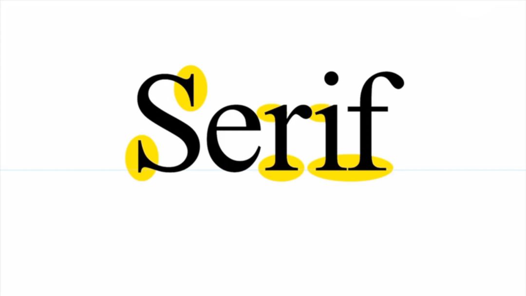
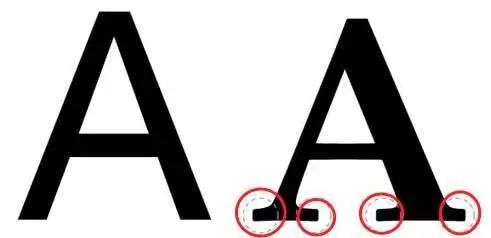
Serifs refer to decorative strokes other than the structural strokes of letters.
Fonts with serifs are called serifs;
Fonts without serifs are called sans serifs.

Serif
Features:

There are additional decorations where the strokes of the characters begin and end
and the thickness of the strokes will vary
Purpose:
Serif fonts are easily recognizable, it emphasizes the start and end of each letter stroke
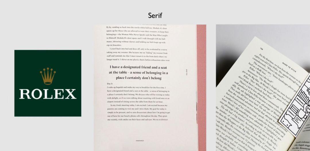
Therefore, the readability is relatively high. In the case of reading the whole text, it is suitable to use serif fonts for typesetting, which is easy to read on line breaks and avoid reading errors between lines.

Song Ti in Chinese fonts is one of the most standard serif fonts
The characteristics of the serif are very obvious, and the font structure is also consistent with the handwritten regular script
Therefore, Arial has always been regarded as one of the most suitable body fonts

Usually serif fonts are used for copying or emphasizing traditions, paper books, literary works, historical works, etc. These fonts are used more often, partly because they are much more complicated
Sans serif
Features:
sans serif is a sans serif font, without these additional decorations and strokes of similar thickness, such fonts are usually mechanical and uniform lines, they often have the same curvature, straight lines, sharp corners

use:
Sans serif fonts are eye-catching, suitable for headlines, DMs, posters, etc., where you need to be eye-catching but do not need to be read for a long time, sans serifs are considered more modern and can be used for screens or logos because sans serif fonts are more minimalist, Fresh and more artistic

The sans-serif font corresponds to the black body in the font. In order to play a striking role, the strokes are relatively thick and not suitable for long-term reading. The sans-serif fonts used are basically evolved from the thin black body, which is no longer as heavy as the traditional sans-serif fonts, so the legibility is also very high when used as body fonts
But in a modern design
Sometimes you can mix and match the two

Sans-serif headings can be added with serif chapter numbers
It's an associative combination with practicality in mind.
The chapter number is large and has a large area of white only this one number

but generally avoid mixing two fonts on the same background

But you can use two weights of one font
This match is reasonable
The purpose of this is to emphasize one of the

In general serif fonts are more attractive and richer than sans serif fonts. Especially in long-paragraph articles, serifs add visual reference to the letters when reading. If you use serif fonts, you have to trade off practicality, serif fonts are not easy to read
Sans-serifs are often used in titles, DMs, or some popular reading materials. Compared with serious and serious serifs, sans-serifs give people a casual and relaxed feeling. With fashion trends and changes in modern life, people prefer to use sans serifs because they look "cleaner"

Articles are uploaded by users and are for non-commercial browsing only. Posted by: Lomu, please indicate the source: https://www.daogebangong.com/en/articles/detail/The%20most%20detailed%20on%20the%20whole%20network%20%20Help%20you%20distinguish%20between%20serif%20fonts%20and%20sans%20serif%20fonts.html

 支付宝扫一扫
评论列表(196条)
测试