This tutorial is mainly for PM and BA students, and it is also suitable for beginners who need to do PPT.
Recently, I have done several PPT training sessions, and decided to output the entire training content to everyone. The tutorial is divided into six chapters.
One. The importance of PPT
2. Three elements of PPT
3. Experience Sharing
Four. Top Studio
V. Visual Design
6. Various pages
One. The importance of PPT
Talking about the importance of PPT, many people will think of a user experience conference a few years ago, when Baidu’s design director made a presentation PPT, let’s take a look at his “work” first.

How do you feel?
Everyone knows the result after that, he was kicked out of office, due to public opinion in the design circle and other reasons, he was fired by Baidu soon after (it is rumored that his annual salary is 1.3 million+).
Share with you a thought, no matter which industry or occupation you are in, in addition to learning the basic entry-level skills first, the second thing you have to do is: what is the best in this field in this industry? Find him and imitate him, this is undoubtedly the fastest learning path.
1. Let's first take a look at the PPT of Kenya Hara, the design director of MUJI:
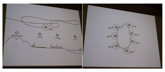
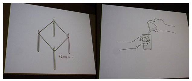
Exquisite and delicate graphic design, good at explaining problems visually, and using very restrained colors;
2. Musk's Hyperloop
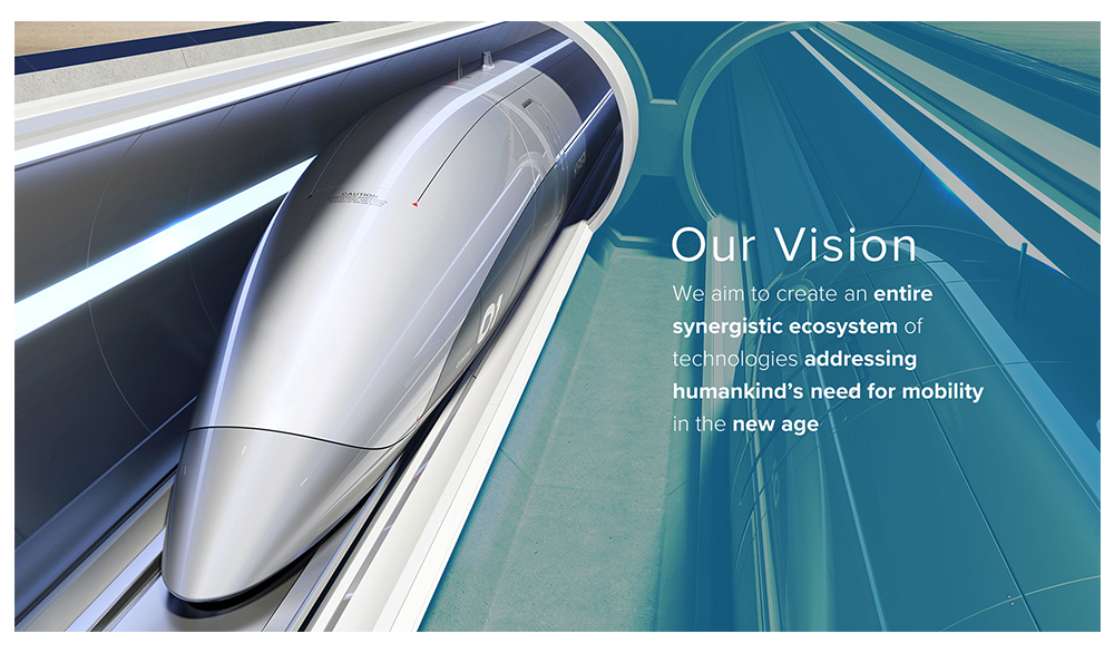
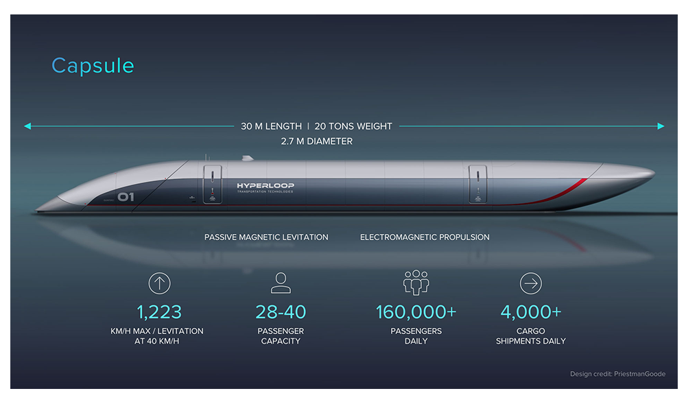
The main vision is the industrial model, plus the icon array, and the processing of light and shadow, which has a strong sense of hierarchy and great visual impact.
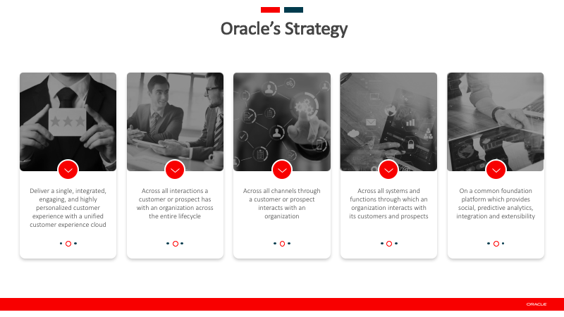
3. Oracle

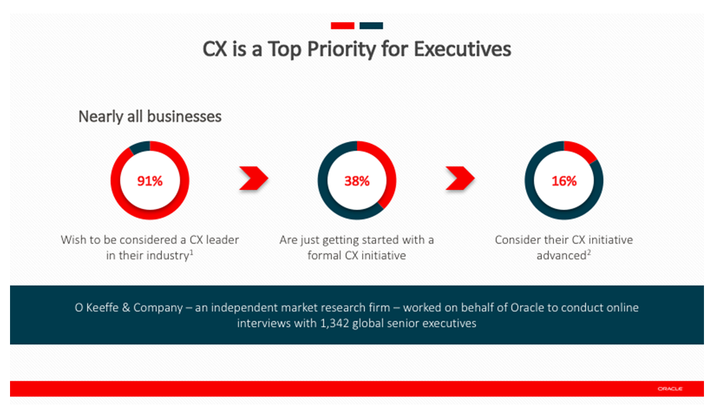
The use of large images in business photography is closer to monochromatic color schemes;
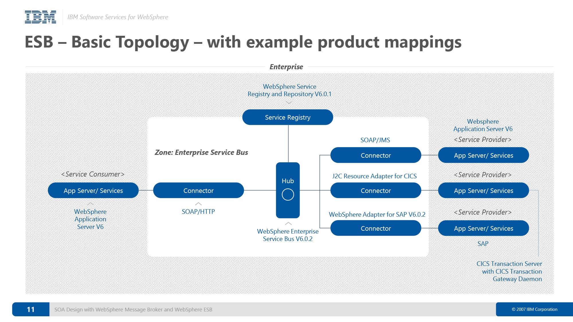
4.IBM
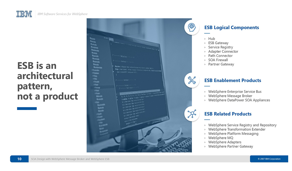
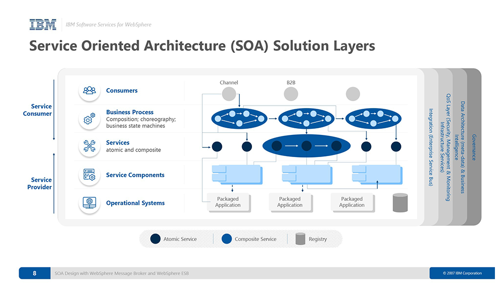
Did you notice that most of the PPT color schemes use a single color system or adjacent color systems. This is a very practical and advanced color scheme, and I will continue to explain it later. Finally, I would like to give you a word, I hope everyone can be vigilant when doing PPT:
Leaders or customers will judge your ability based on your PPT vision!
2. Three elements of PPT
PPT has three major elements: content, logic and vision, just like a person's flesh and blood, skeleton and appearance.
1. Content
There is not much to say in this part, what industry are you in, what topic do you want to talk about, that is your content;
2. Logic
The logic is actually not very mysterious. There are just a few big and commonly used structures: such as total score total, narrative according to the process, etc.
3. Vision
The visual part is what we'll mostly be talking about.
3. Experience Sharing
This part is to give you a method, how to deal with the requirements, or how to find a good reference.
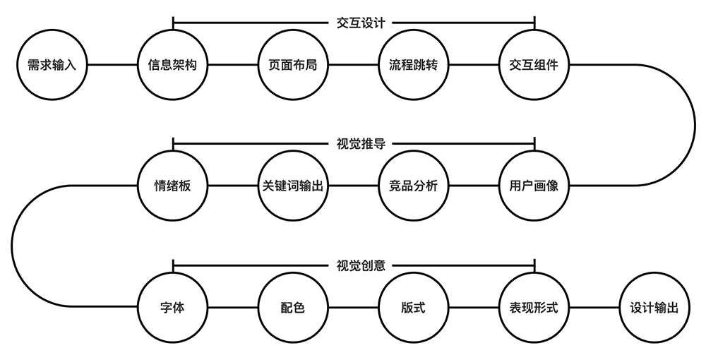
As shown in the figure, this is the entire process designed by our team. We got a requirement and did a preliminary analysis until "keyword output", for example:
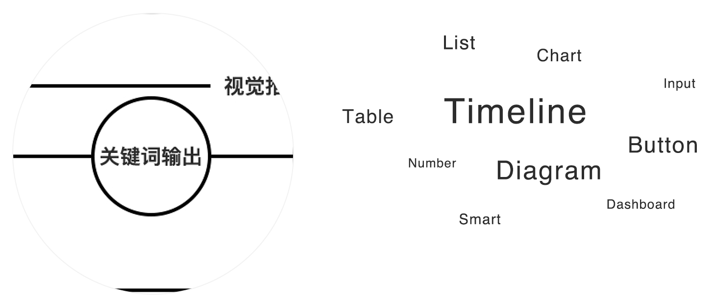
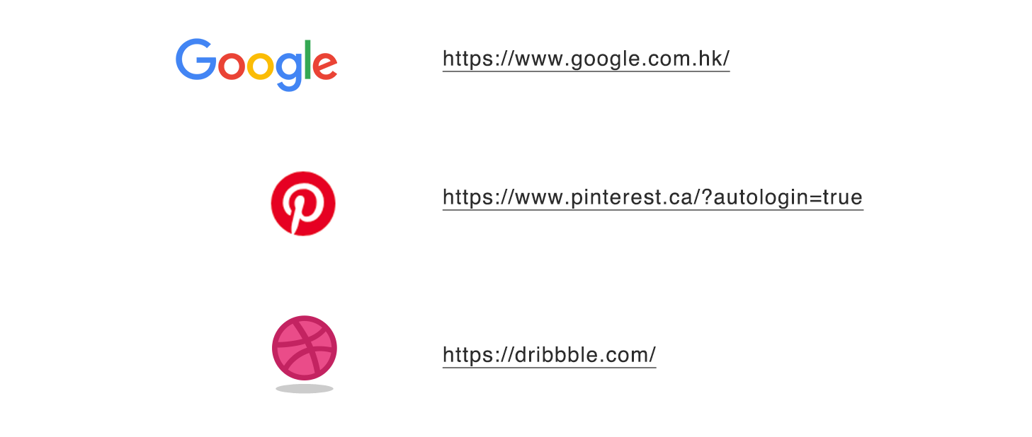
Before exporting Moodboard, we will check the information and collect references. Here, we recommend three powerful tools:
Let me explain roughly,
1. Google
Google search engine, I feel pure! It’s very fast. For example, sometimes when we look for a company’s logo, you can even find png directly on Google, which is very conscientious.
2. Pinterest
No matter what design industry you are engaged in, you can find a lot of good references here, home architecture, graphics, UI and so on. In short, it is the most comprehensive design website. Of course, like Google, it must go over the wall.
3. Chasing waves
This is relatively subdivided, focusing on the Internet industry, and is called the designer’s kitchen. Many top designers will upload their own ideas, which are very fragmented but also very fresh.
I personally think that the most important thing in design is the visual derivation in the early stage, and the key words, analysis and understanding of requirements are the most important.
Four. Top Studio
The fastest path to learning a new skill is to imitate the number one.
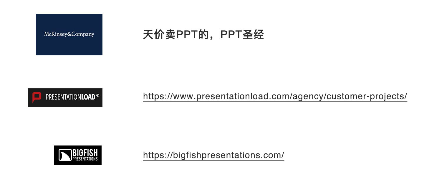
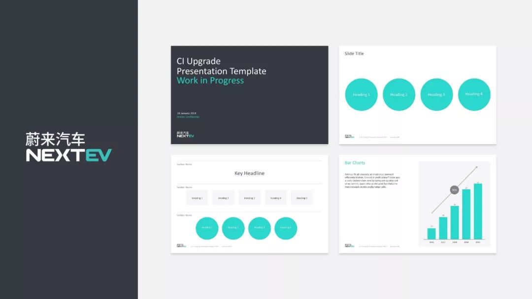
In the field of PPT, the best among all companies is McKinsey, which is called the "PPT Bible" and "sells PPT at sky-high prices", not only because of its vision, but also because of its logic and content. Beauty is reflected in all kinds of logical diagrams, and I will attach a 300-page McKinsey template to everyone, which is definitely worth collecting!
In addition, I recommend two world-renowned PPT design studios, and the above cases are all produced by this studio.
V. Visual Design
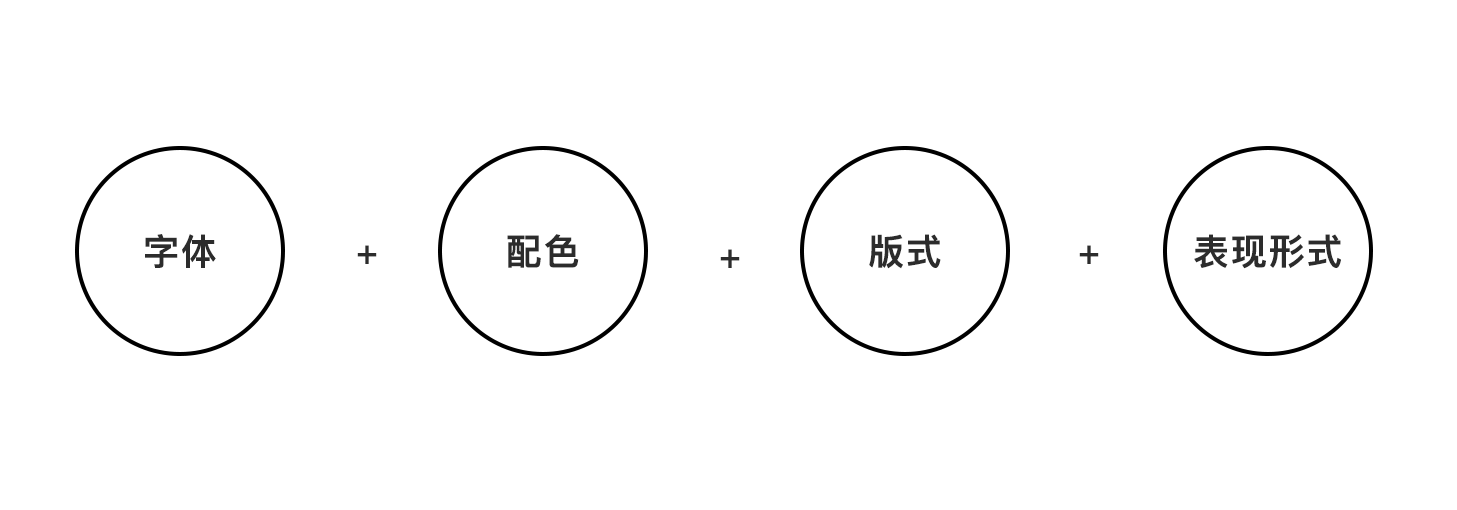
Visual design is nothing more than these four aspects. Whether it is doing PPT, webpage or graphic design, I will elaborate and explain these four aspects for PPT:
1. Font
I believe that many students have installed many fonts, but the truth is that there are only a dozen commonly used fonts.
I am talking about two situations here:
The first type: we use the font specified by the customer, which is understandable to everyone.
Second: Choose fonts by yourself. Here, you should choose according to the customer’s brand tonality. Whether it is serif or non-serif. Note that most of the Internet industry is sans-serif or bold, which is even more important. Simple and direct, eye-catching, with a sense of technology.
There is a problem here, when you select a font on your computer and send it to your client or sponsor, but the font is not installed on the computer of the client and the sponsor, after opening it, It could all be messed up! This is the problem of font embedding. By embedding the font into the PPT, the font will be attached to the PPT, which perfectly solves this problem.
Keywords for everyone: Embedded PPT fonts, the first few operations of Baidu search. I won't elaborate too much here.
2. Color matching
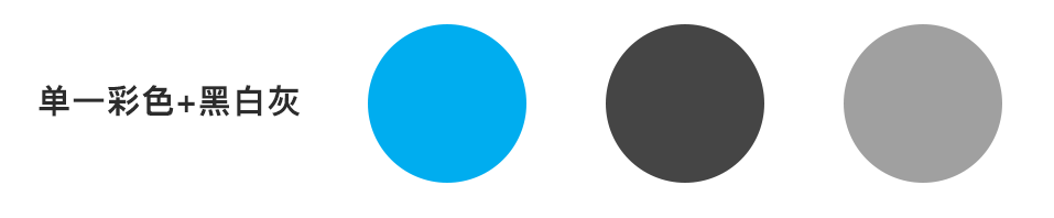
Color matching is a very important aspect of vision, especially in the current flat and minimalist trend, being able to control color matching is a very advanced skill.
So the most commonly used PPT is monochromatic color matching: one color + black, white and gray. The biggest advantage of this color matching is to avoid "matching", because there is only one color, especially for students who are not professionally engaged in design It is a very practical skill. For example:
Look carefully:
3. Layout
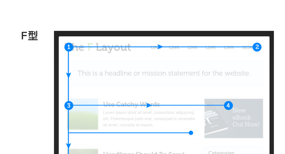
Before talking about layout, let me share a concept: Browsing mode, simply means how users browse?
According to the observation of the eye tracker and a large number of experiments, it is concluded that there are two browsing modes for users with a high probability:
"F" type, the most common one, as shown,
"Z" type, followed by Z type, as shown
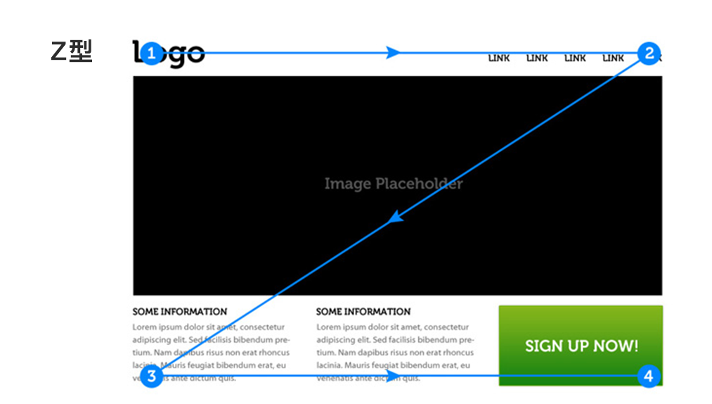
The reason why we talk about browsing mode is to tell everyone that when we typesetting, we should arrange according to browsing mode, that is to say: users scan and browse from left to right, and the weight of information decreases from left to right.
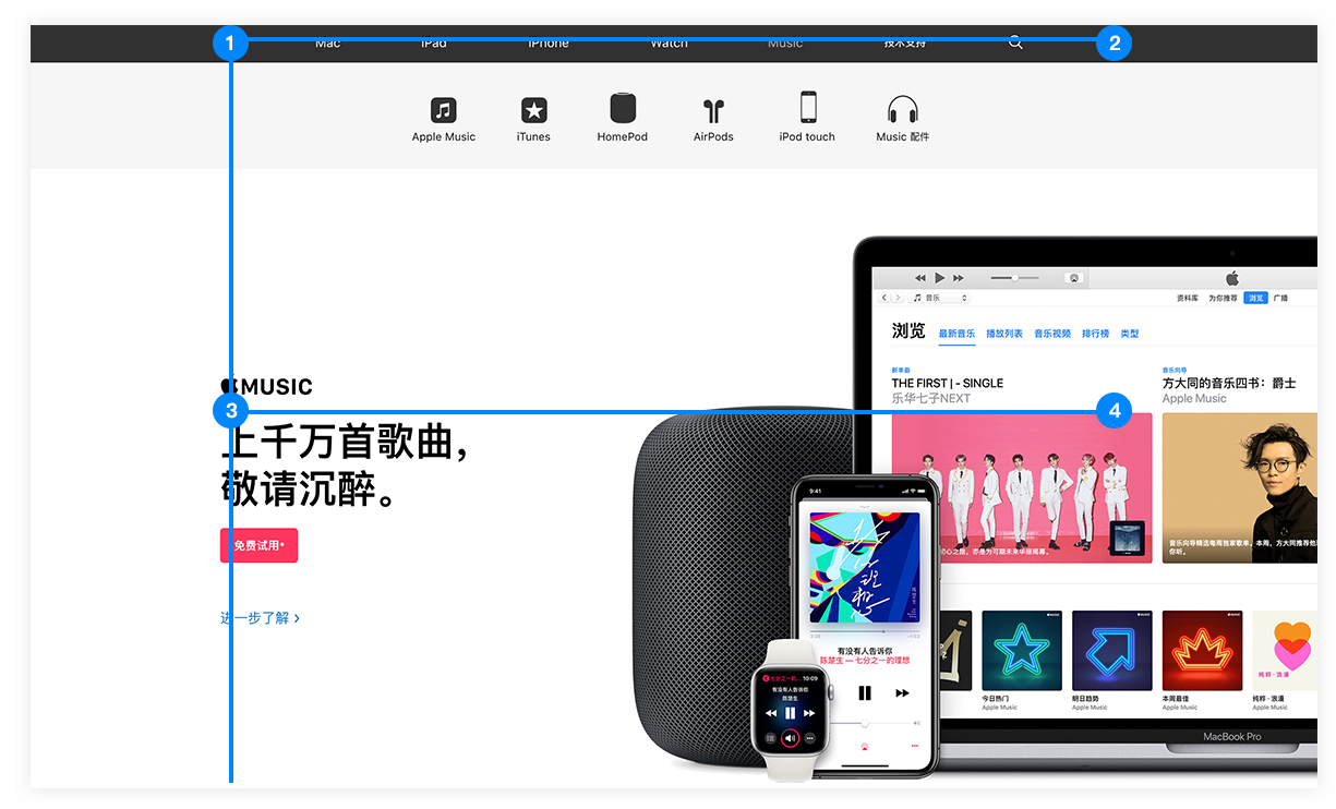
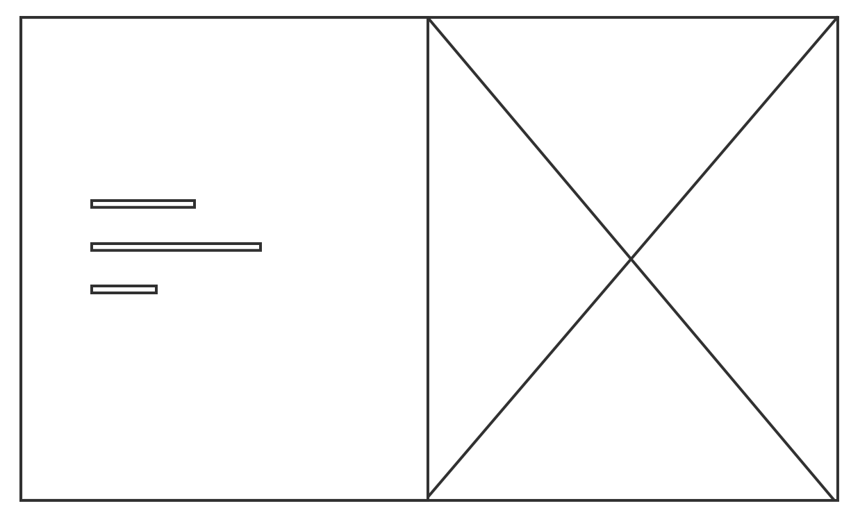
From here, it is not difficult to conclude that the fast and efficient typesetting is: split screen left and right. It is not difficult to explain why most Internet companies adopt this typesetting mode, and they are more efficient.
6. Various pages
Everyone knows that word is a job to deal with large paragraphs of text, so PPT, The most valuable place is all kinds of graphic layout, diagram.
There are three types of PPT pages, namely: cover, table of contents and content pages. Next, we will introduce PPT according to this idea.
1. Cover
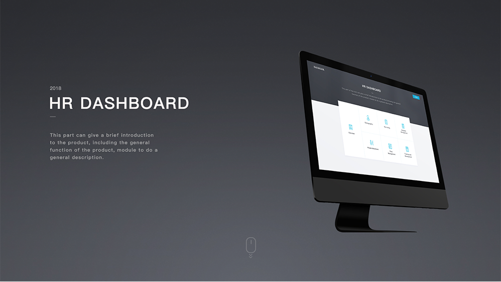
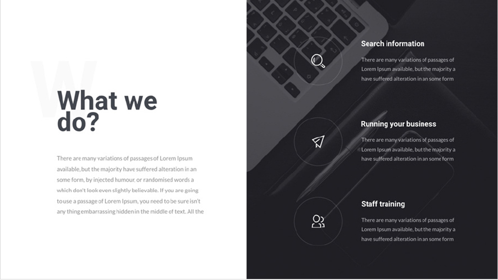
The cover is the most important part of PPT, and it takes some thought to do it well. As mentioned above, in terms of typesetting, the most practical and efficient way for us is to split the screen left and right. So, according to my experience, there are several commonly used ones:
Type 1: Add product model.
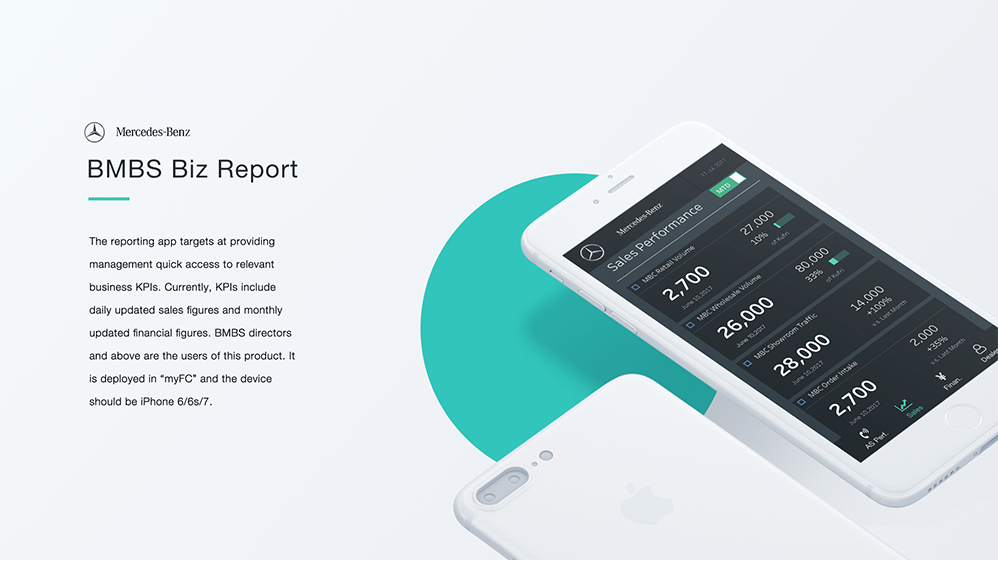
Second type: background superimposed photography big picture.

2. Directory
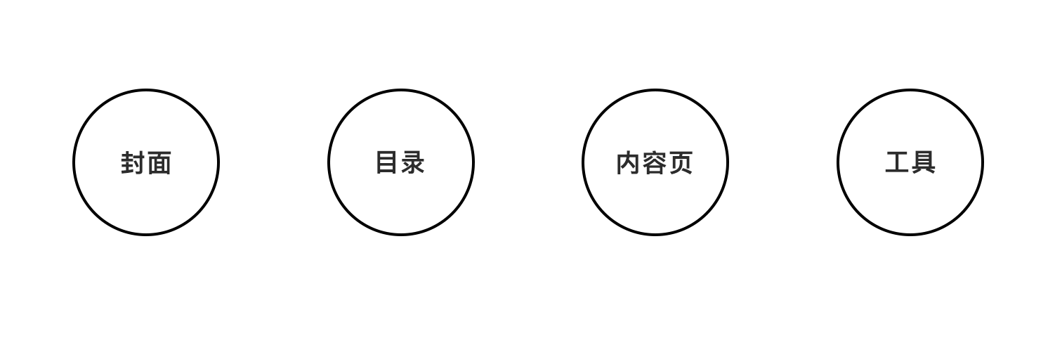
When making a catalog page, if we want to improve the visual expression, we can generally add an icon. Let's take a look at the case.
By the way, I would like to recommend a domestic icon website: iconfont is produced by Ali, and the most used ones do not need to go over the wall.
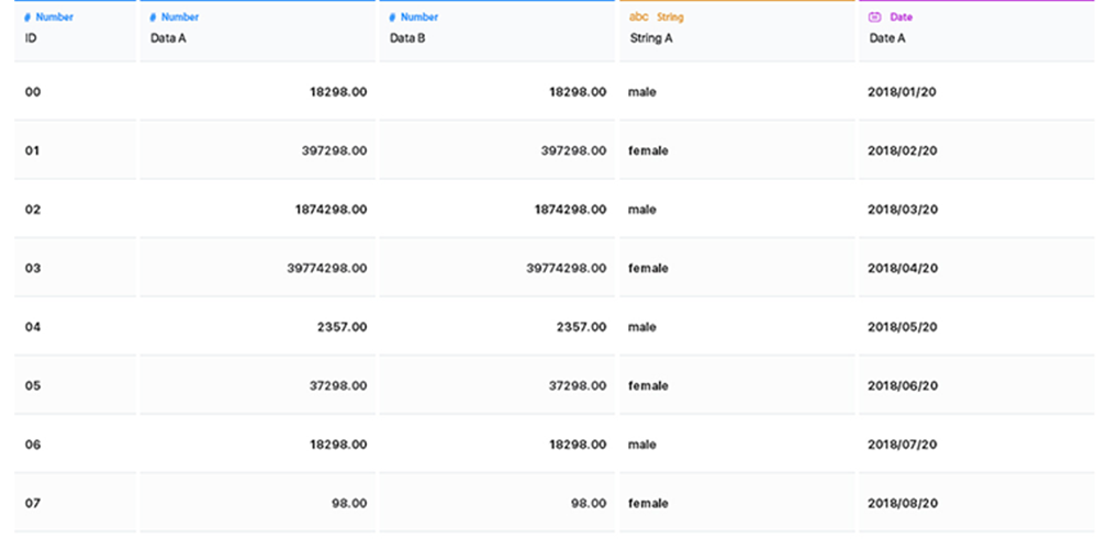
3. Form
Students who work with data may see tables every day, but if you don’t pay attention to many details of the table design, you will make people think you are unprofessional.
The first one: distinguish between odd and even numbers. Often the table is too long and the user reads the wrong line when reading it. The background parity distinction can solve this problem.
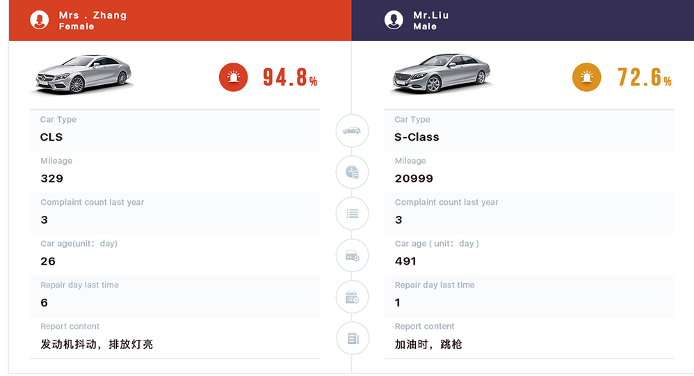
The second one: the whole is left-aligned, and the quantized value is right-aligned, which is convenient for up-and-down comparison.
4. Process class
In this part, I will tell you a conclusion from my experience:
All effects that look more regular and cool are basically done by plug-ins without exception.
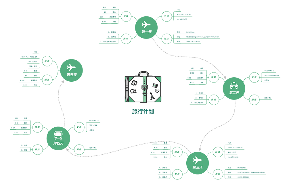
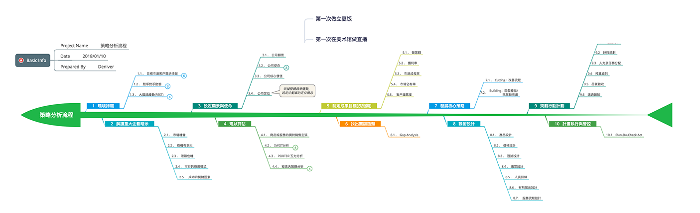
Using a plug-in can probably save more than 80% of your time. Such a picture can be completed in about 10 minutes. By the way, this plug-in is called: Xmind.
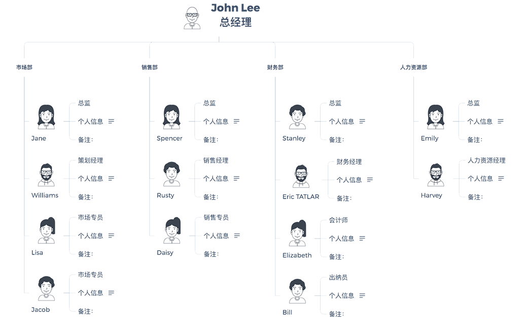
5. Organization Chart
Also use Xmind...
Okay, this is the end of the tutorial, because there are too many contents, I cut a part, and I will continue to write this topic when I have the opportunity. My collection will be attached downstairs: a large number of PPT references, icon sets (enough for work), and plug-ins.
Articles are uploaded by users and are for non-commercial browsing only. Posted by: Lomu, please indicate the source: https://www.daogebangong.com/en/articles/detail/The%20most%20complete%20PPT%20tutorial.html
 支付宝扫一扫
评论列表(196条)
测试