Hey everyone, I'm Yu, Visual Designer of iSlide
First let’s clarify To answer a question, PPT design is a very important part in reporting and other related occasions, presenting the best results to readers, and at the same time increasing others' attention to your PPT.
This issue starts from From the perspective of minimalist design, let’s talk about the important factors of a beautiful, comfortable and design-oriented PPT.
PPT style There are many kinds, and the scope of application is also very wide, including event interviews, work summaries, research reports, marketing, business plans, training courseware, job competition reports, graduation defenses, press conferences, etc., covering everyone's daily work and study all needs.
Specially prepared A simple, good-looking and easy-to-use PPT case,Remember to bookmark it first< /strong>, you can arrange it at any time when you need it, and the resource library has everything you expect.
Note: All the cases in this article include source files.
01. What is minimalist design
Minimalism itself is a design concept, vertical to the field of UI and graphic design, design Every element in has its meaning of existence. And the minimalist design has a long history, so you don't have to worry about the style being outdated at any time.
When we talk When it comes to minimalist design, minimalism itself is a design concept, and when it is vertical to the field of flat web design, every element in the design has its own meaning. Clean lines, simple style, a lot of white space, monochrome design, "less is more", etc. At the same time, the minimalist models of MUJI and Apple are the first things that come to mind.

Image from network
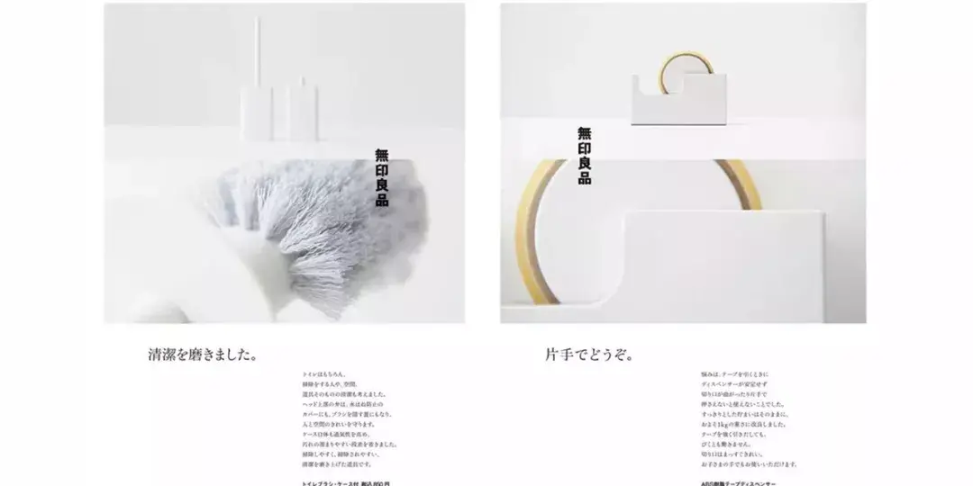
Image from network
for minimalism Now that we have a basic understanding of minimalism, let's look at the history of the development of minimalism.
02. History of Minimalist Design
Minimalist design appeared in Western countries in the 20th century. More" is a phrase from the legendary German architect Ludwig Mies van der Rohe, who responded to the availability of new materials by creating minimalist structures, advocates of function as the primary. These structures have been around for decades, and they still don't look outdated.
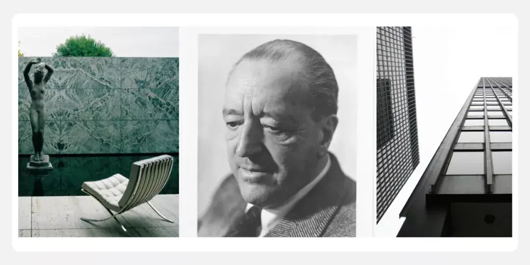
Image from network
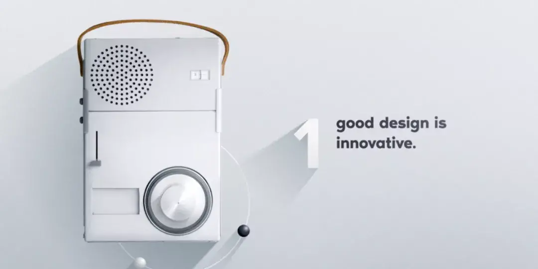
Image from network
This extreme Minimalism came into its own in graphic design, art, theater and fashion in the 1960s. In the field of product design, legendary figures such as German industrial designer Dieter Rams led many industrial design products with the slogan of "less but better", opening a new world of minimalist product design.
Minimalism The design abandons complicated decoration, uses limited and simple elements to complete the design, and avoids excessive decoration to achieve pure elegance.
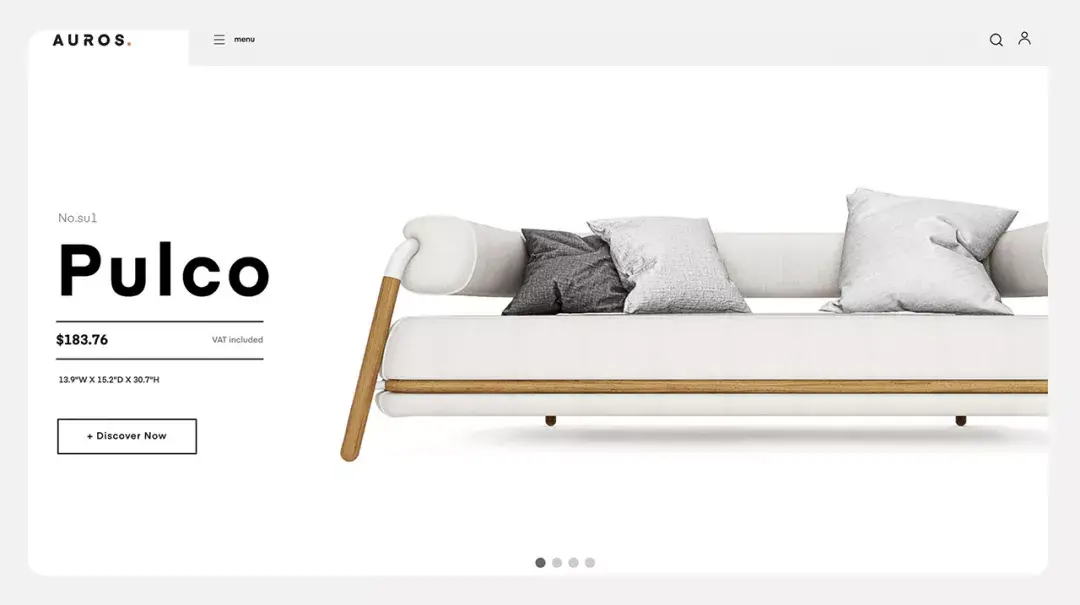
Image from network
Minimalism The core concept is "less is more, form follows function". We see that most foreign minimalist style web designs use simple colors, and a lot of white space is used in layout and layout.
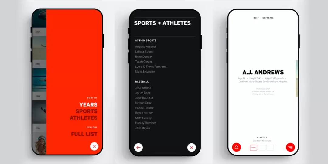
Image from network
Minimalist style It is not simply a subtraction, but also to ensure that the design has quality and details. How can the concept of "less is more" be practiced in practice?
Combine resources below Library PPT design to chat together
03. Application of minimalist design in PPT
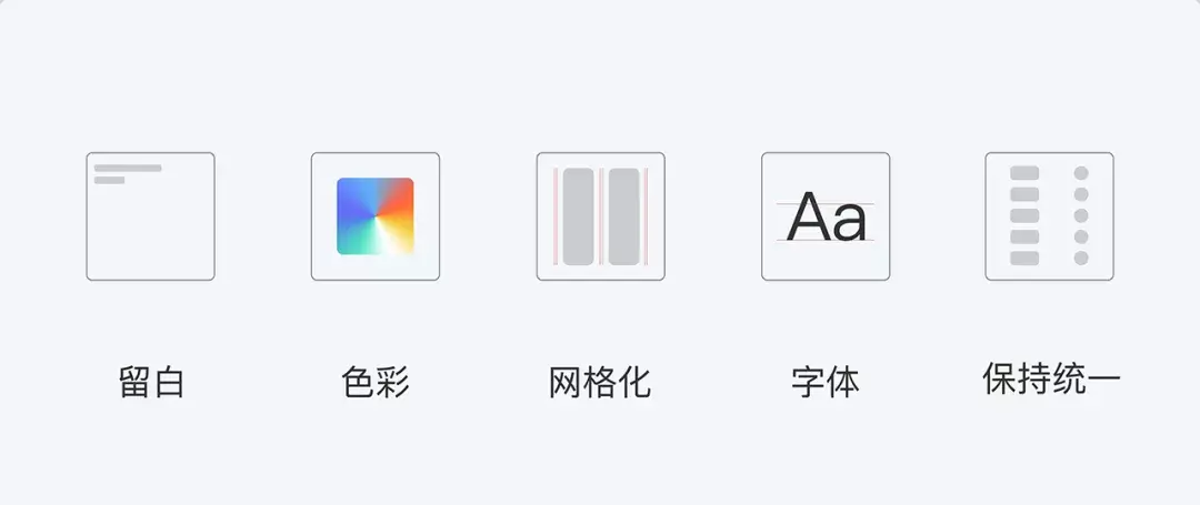
The following is simple Colors, a lot of white space, grid layout, uniform elements, fonts, etc., we select a few theme cases to see their practical application effects, to help you get a real minimalist design.
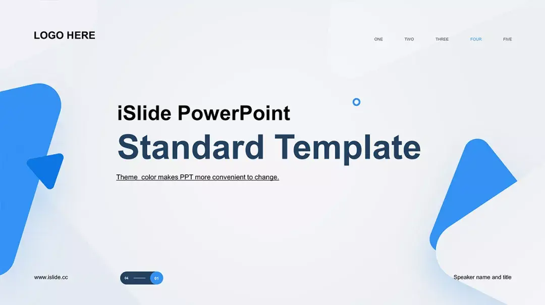
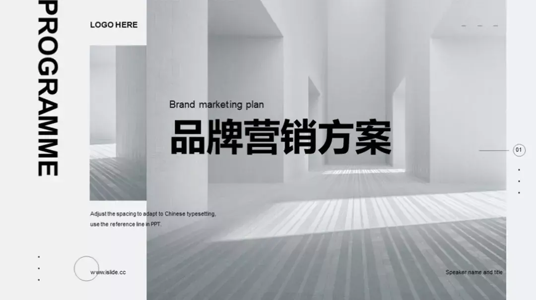
1. A lot of white space
in minimalist In minimalist design, white space is an essential part. Blank space can focus on the content, while the information is simpler, and the cost of information display and understanding is low. Create the necessary information and visual focus, and then use white space to surround them. In this way, the core information is highlighted, allowing users to focus on the necessary information.
How to add How about using blank space in the design to create a sense of breathing and make the page clean and orderly?
Blank space grant It allows the page to breathe, and it doesn't have to be white space itself, it can be any color, texture, pattern or background.
You can leave it blank It can be a background image or a photo of a product. This design looks clear, orderly, and full of breath.
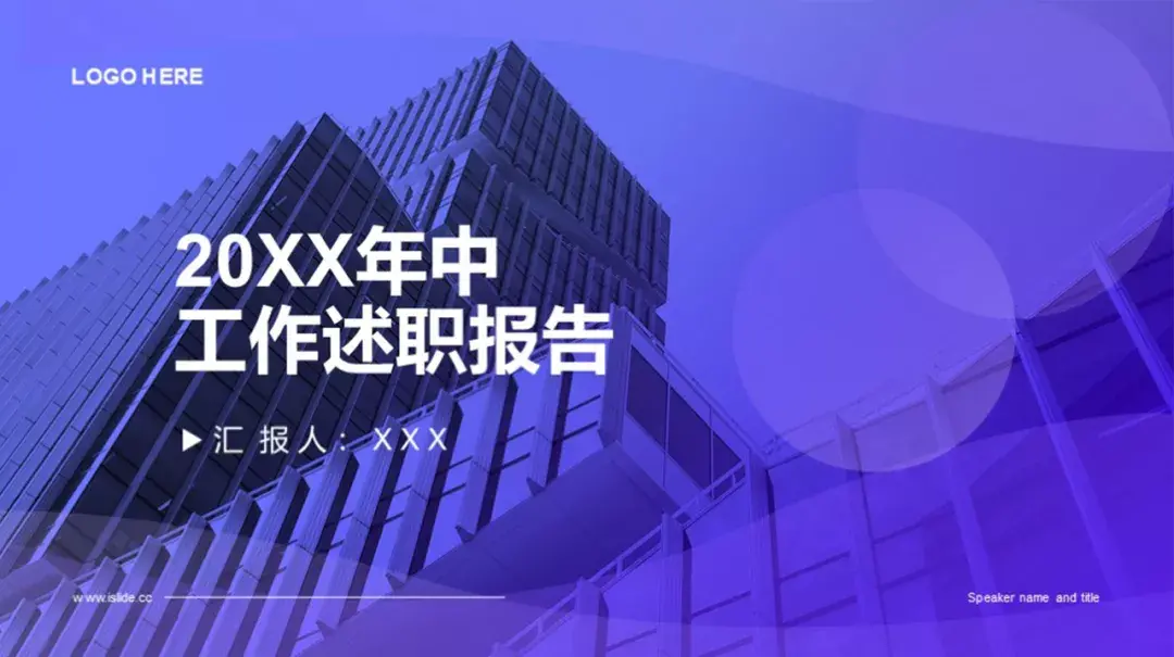
[case library 】Search ID: #528255 Get source file
Leave blank It can be a design that renders the atmosphere.
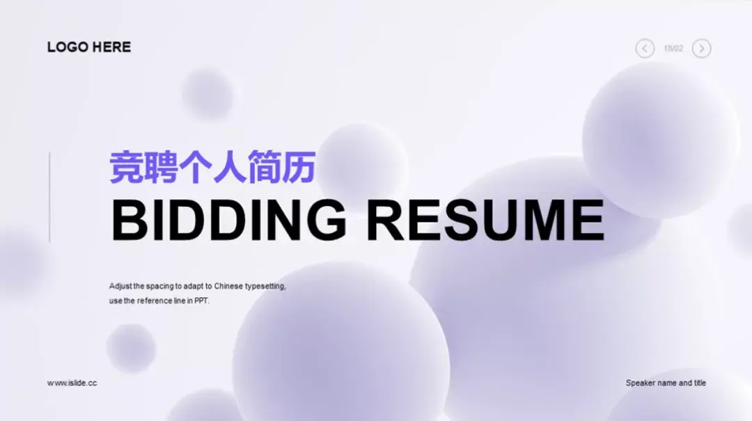
[case library 】Search ID: #554774 Get source file
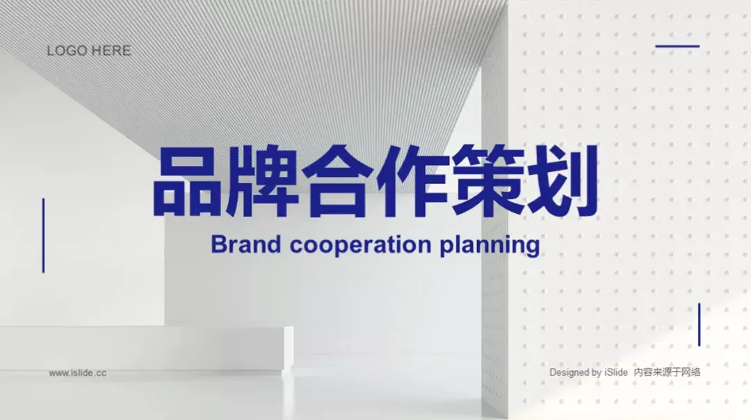
Leave blank Can be a gradient color effect, not necessarily white.

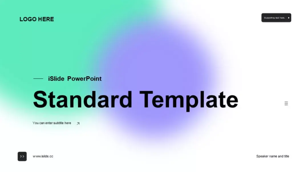
[case library 】Search ID: #589789 Get source file
Leave blank It can be a light-textured pattern design. When applied to our design, space is like the air that is indispensable in our life. Air is very important to us. In other words, the air in the design is the space left blank.
[case library 】Search ID: #577250 Get source file
You can leave it blank It is said to be invisible, but it is also a very important factor in the design. If there is not enough space and white space, it will be easy to distract and make it difficult to find the information you really want. Make simple but not simple PPT presentations to make reading easier.
2. Use the grid to regularize elements
grid system It can make the simple design more organized. It itself is used to build regularity and give information and elements a sense of order and order. On this basis, it can make the logic of elements smoother.
even in In the minimalist design works, the PPT design has a logical pattern that is easier to follow. Limited elements can also establish a correct enough spatial relationship in the entire space, making the entire design work more natural.
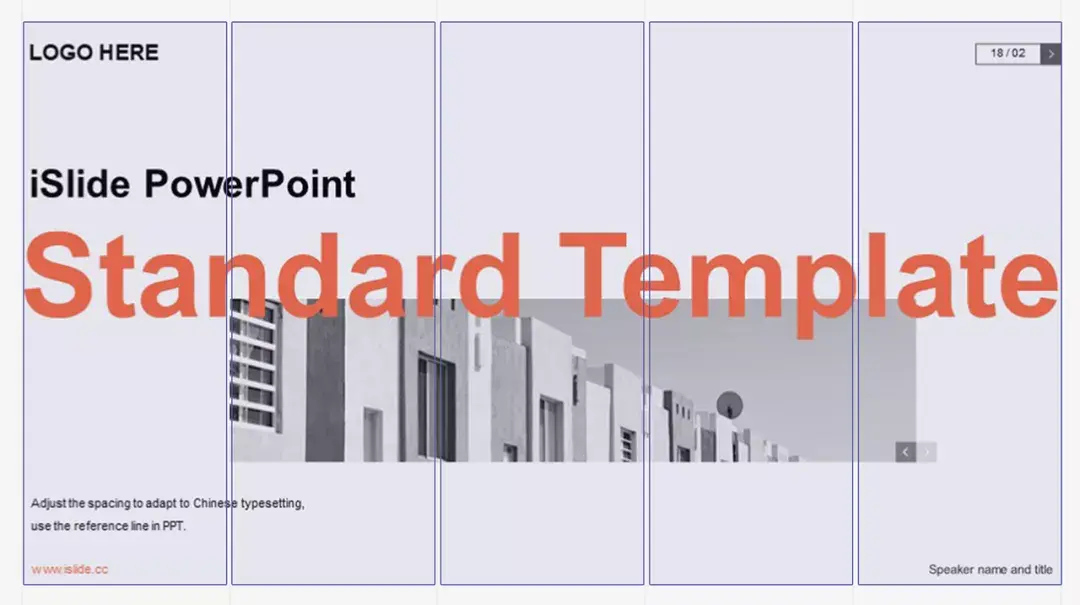
【Theme library 】Search ID: #569108 Get source file
The grid is The hidden auxiliary lines help align elements, making the design look more concise and comfortable, and better arrange the information of graphics and texts, making the content of the layout more refined and rigorous.
3. Keep it simple
Simple design In fact, it is often the most effective.
【Theme library 】Search ID: #606732 Get source file
In minimalist In socialist design, the rule that less is more is moderately applicable.
As much as possible Strip away the purely decorative design to ensure that the core information is clear at a glance. Like the design above, the bright colors are eye-catching but won’t overwhelm the main text.
4. Choose a font with high readability
Minimalism The design hopes that the graphic elements should be clear and easy to distinguish, and the same requirements apply to text fonts.
Choose the easiest Readable fonts ensure users can scan quickly. Whether it is a serif or a sans serif font, the font style should not be too decorative, and a sans serif classic font will be better. The word weight, line height, and spacing are all controlled within a reasonable range. Do not deliberately use small font size to "create a sense of luxury", and appropriately enlarge the font size to ensure that users can understand it at a glance.
in the resource library Among them, the sans-serif English Arial and Chinese Microsoft Yahei are used, simple and modern sans-serif fonts, and different design types are very eye-catching, easy to read and easy to understand.
Note: above Both serif and sans serif fonts are free commercial fonts, and Microsoft Yahei can only be used on Windows platform.
【Theme library 】Search ID: #561426 Get source file
【Case Library 】Search ID: #621648 Get source file
5. Simple color matching
Black and white like this The palette is more functional, neutral, and elegant, but it's not the only option. In terms of color matching, minimalism is also very particular. Usually one or two brightening colors are selected and run through the entire design.
[case library 】Search ID: #589791 Get source file
Like above This picture, in addition to the classic black and white gray, uses bright red as a brightening color, which runs through the entire design and exists as a key point for emphasis. It gives the whole design a sense of simplicity and layering.
Method of color matching There are many, very rich resources to look at and use.
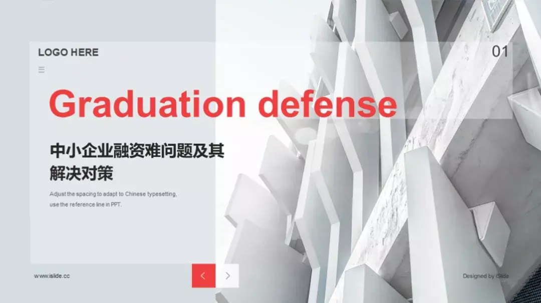
6. Maintain a unified style
Design for PPT Like digital web pages and apps, all elements should be consistent in a minimalist style. Clutter can make the viewer feel uncomfortable.
Although there are The content of the page may need to carry more content, but under the constraints of the minimalist design style, the style of the content and the unity of elements cannot be broken.
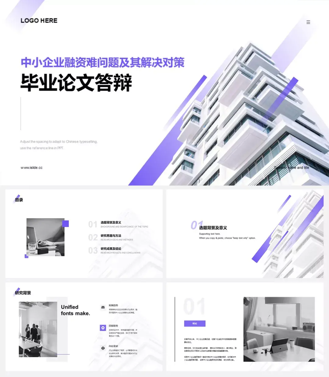
[case library 】Search ID: #577327 Get source file
This graduation thesis The design pattern of white background+decorative elements+title runs through the whole design, and the highlighted colored text is different in different demos, but this "variation" is also a reflection of the overall consistency. The entire design is in line with the spirit of minimalism in terms of style and consistency.
04. Summary
Minimalist design Style PPT is to fully highlight the key points of the content and de-decorate the design. It is simple, clear, direct and highlights the theme, focusing more attention on the content itself.
The essence of PPT design It is the arrangement and reorganization of information, so that the audience can understand what you express more clearly.
Finally, hopefully The minimalist style PPT design in the resource library can make everyone stand out in various occasions, see you next time~

Articles are uploaded by users and are for non-commercial browsing only. Posted by: Lomu, please indicate the source: https://www.daogebangong.com/en/articles/detail/The%20minimalist%20style%20PPT%20tutorial%20that%20everyone%20has%20been%20thinking%20about%20is%20finally%20here.html
 支付宝扫一扫
评论列表(196条)
测试