Author: @刘柏坤
Recently, the Brand New website voted and selected a series of lists of brand upgrades last year, including the best and worst rankings. The following is a list of the 10 best brand upgrades for you. Let’s take a look at which foreign brands’ upgrades were the most exciting last year. .
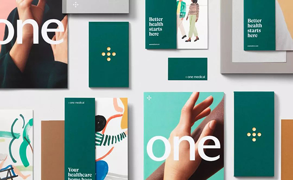
10. One Medical / Medical
The previous old logo is simple and elegant, which is already very good, but the new logo has taken a big step forward. The relationship between the size of the graphics and the text is more appropriate, making the graphics look more elegant and solemn; the lush dark green also presents a higher sense of quality.
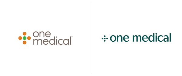
Comparison of old and new logo

New logo designed by Moniker
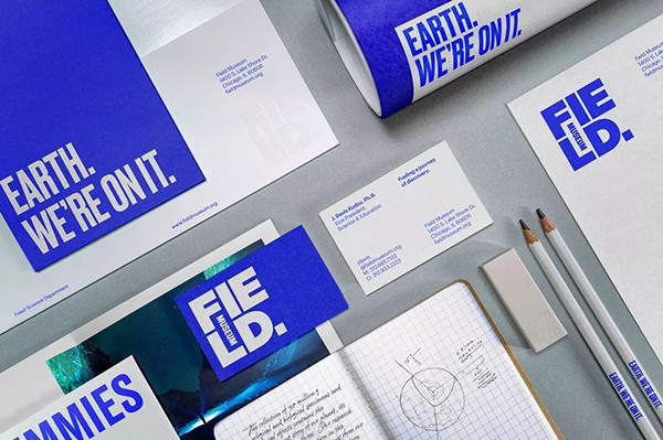
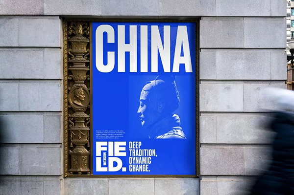
09. Field Museum / Museum
Field Museum was founded in 1893 and is one of the largest natural history museums in the world, with a collection of about 30 million cultural relics and specimen.
The old logo was pretty bad, clinging to a serif on a clumsy line, and the three word size differences felt too casual. The new logo is bold and impressive, with two squares: the small square represents a small part of the museum collection on display, while the square shape of the logo itself represents the entire large collection of the museum; blue reflects optimism and continuous effort Discover solutions for a better world.
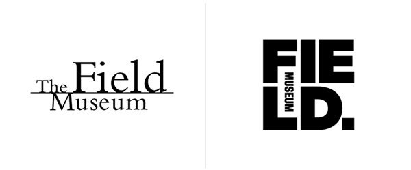
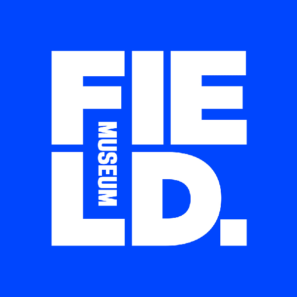
New logo designed by Leo Burnett in Chicago
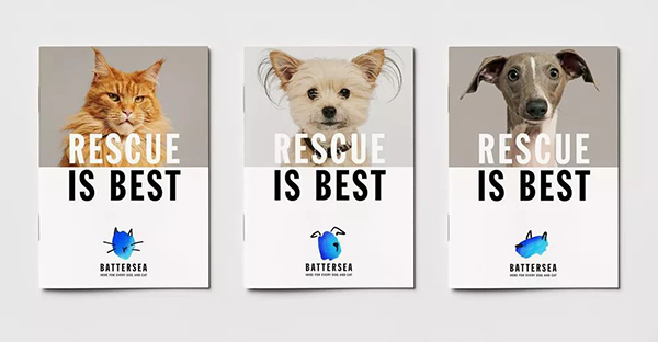
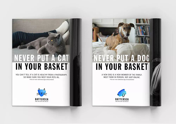
08, Battersea / Animal Shelter
The old logo was a straightforward description of dogs and cats, placed within a nice typographic circle; Much better logos than other related fields, but still forgettable.
By contrast, the new logo breaks away from the usual tropes of this segment with very charming watercolor paintings of dogs and cats, with black ears, whiskers, and noses for a touch of whimsy. The pen, the uppercase text expresses serious meaning, and the whole is cute and different.
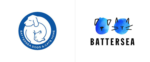
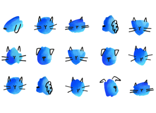
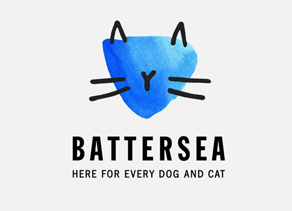
Designed by pentagram in London, UK
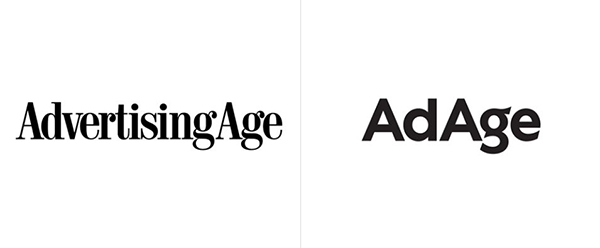
07, AdAge/Media
The old logo wasn't bad, but it wasn't good enough either. It looks like a representative of the old-school advertising industry, which makes people feel fresh and modern. Although the new logo is designed based on the old logo in the 1990s, it is full of vitality and modernity. The change of the letter "g" is very unique. The overall logo has good applicability and can be vertical or even stacked.
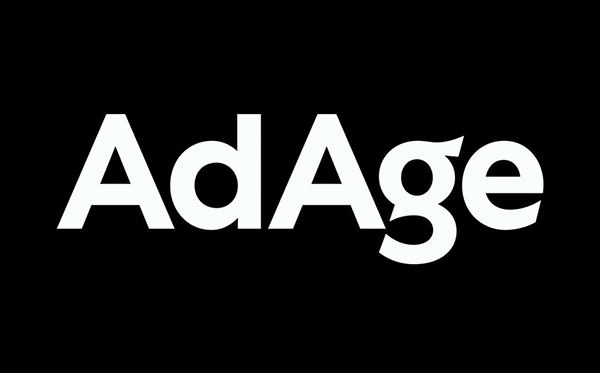
New Logo
06, Raaka/Chocolate
The previous logo used a more handwritten form, but it was still too hard and looked more like some title graffiti, while Not a deliciously tempting chocolate logo.
The new logo retains the original basic structure, but the lines adopt clean and neat isolines, which feels more modern, and the connection and fluency between letters are also better.
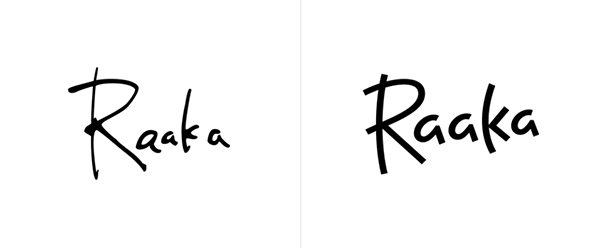
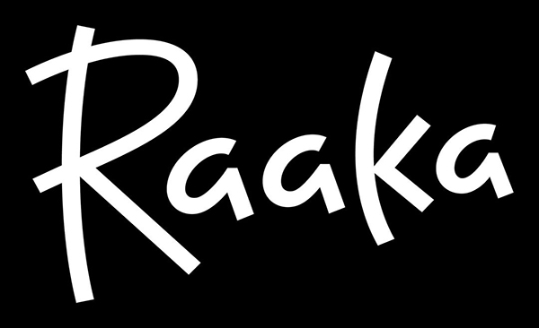
New logo and packaging designed by Simon Blockley of San Francisco
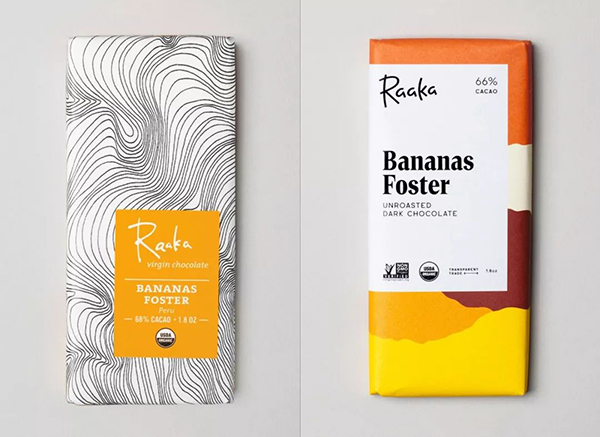
Old and new packaging
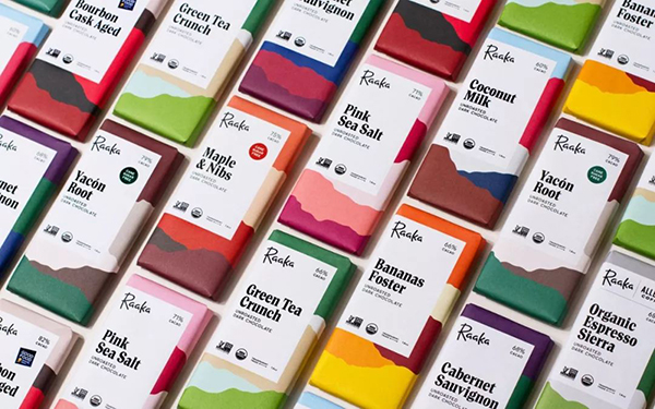
new packaging
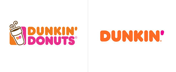
05, Dunkin' / fast food
Founded in 1950, Dunkin' Donuts is the world's largest baked goods and coffee chain, with more than 11,300 restaurants worldwide. This year, the company announced it was changing its name to Dunkin', ditching the Donuts portion.
The new logotype retains the familiar pink and orange colors and iconic font introduced in 1973, in keeping with its predecessor.

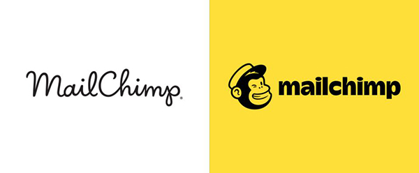
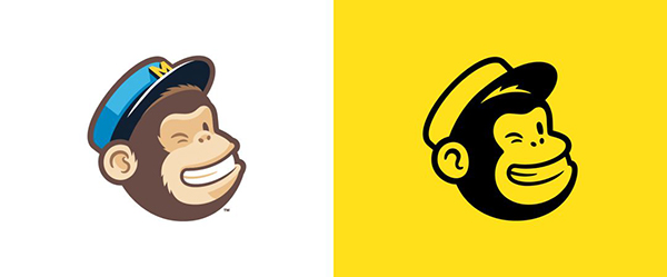
04, Mailchimp / Marketing
The Freddie icon has always been the main symbol of the brand, this update has simplified it, its shape and details have been adjusted to Make sure it looks great at any size. And developed a wordmark that is consistent with the Freddie icon, so that the two look more balanced.
In terms of color choice, in part because bananas are yellow and monkeys eat bananas, this deep yellow feels interesting and sophisticated, especially when paired with black.
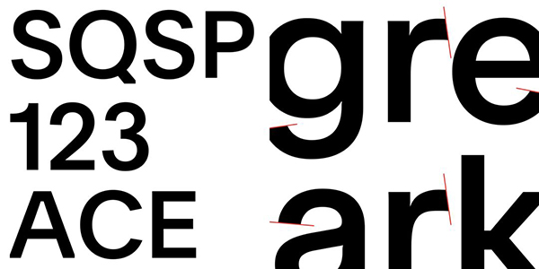
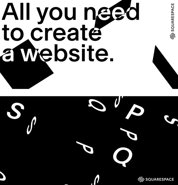
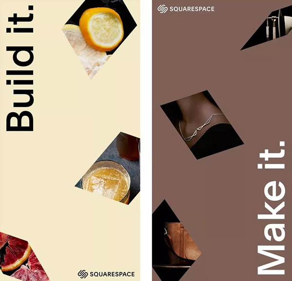
03, Squarespace/Internet
It's a relatively modest update, but the effect you can see is significant. It’s interesting that the rounded ends of the old logo looked friendly, while the flatter new logo exudes a serious, formal air. The flat-headed endpoints will make the "SS" look more recognizable, while maintaining the previous abstraction.
In addition, the new font is really great. It has become more detailed, more commercial and mainstream, and the relationship with the thickness of the graphics has also become more coordinated.
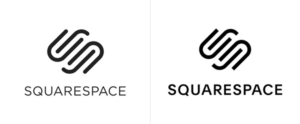
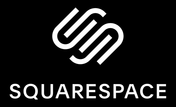
Graphics designed by NY-based DIA
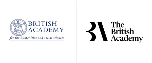
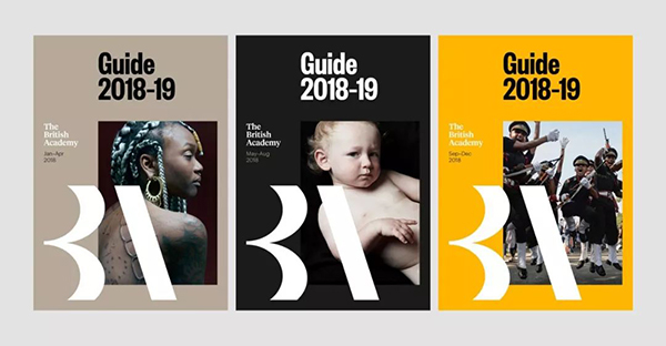
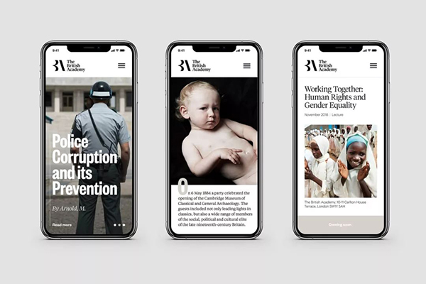
02, The British Academy / Science and Education
The ancient logo is displayed in the form of a seal, depicting the historical muse Cleo in Greek mythology, which is not uncommon OK, but the problem is that it's not a very practical logo.
The new logo is much more flexible, and has established a graphic that is easier to remember, recognize and have higher relevance. The selection of fonts also retains the academic sense of the old logo, and there will be more modern feel.
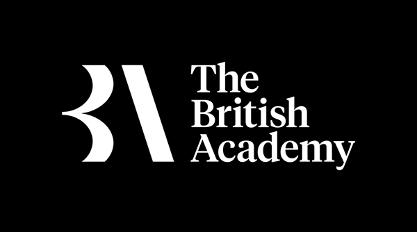
New Logo
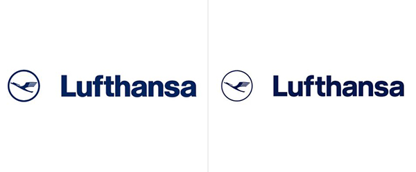
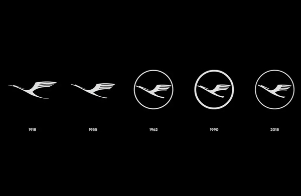
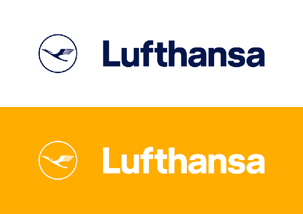
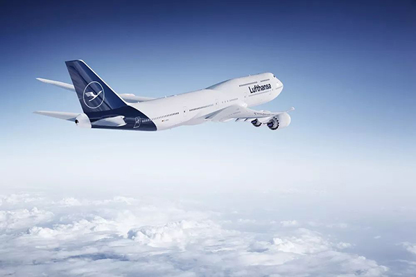
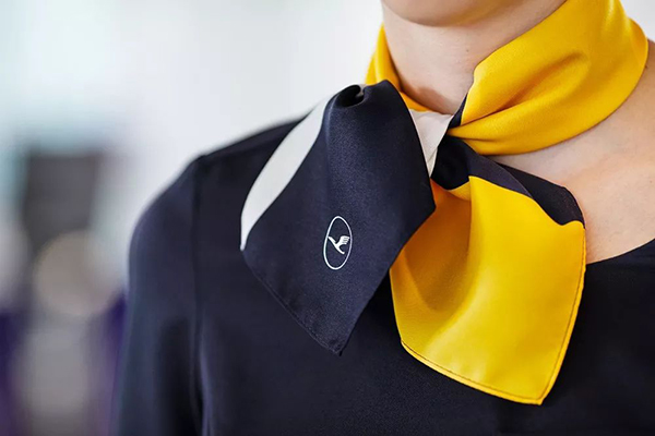
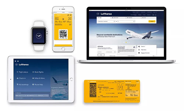
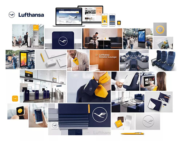
01, Lufthansa / Aviation
Founded in 1955, Lufthansa is one of the world's leading airlines and is headquartered in Germany.
Its original graphics are 100 years old, designed in 1918. The new graphics are essentially the same as they have been since 1962, but have been redrawn to perform better with the aid of computer software. The biggest changes are the thinning of the outer ring, which, although subtle, makes it feel more elegant; the wing feathers open slightly to make the icons easier to read. While the changes are small, each change provides even more powerful performance improvements.
Graphic changes over the years

Before and after graphics change
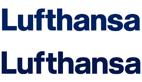
Change before and after the font
Articles are uploaded by users and are for non-commercial browsing only. Posted by: Lomu, please indicate the source: https://www.daogebangong.com/en/articles/detail/The%20logos%20of%20these%2010%20foreign%20brands%20are%20amazing%20after%20the%20upgrade.html
 支付宝扫一扫
评论列表(196条)
测试