Among luxury brands, some of the fonts that are commonly used include: 1. Didot: This is a classic serif font with high-thickness contrast strokes. Didot fonts are often considered to represent luxury and elegance. 2. Bodoni: This is also a serif font, si
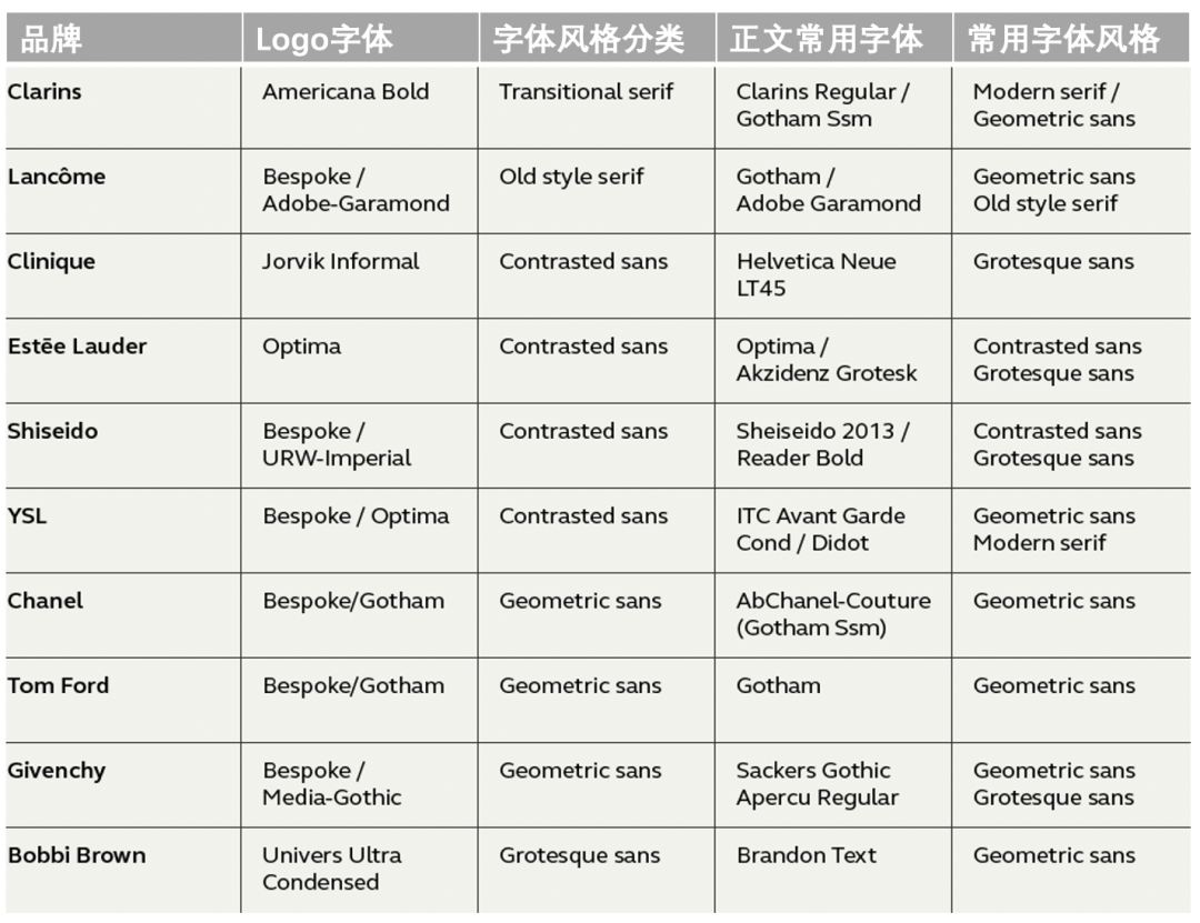
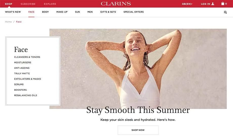
Source: zcool Author:Monotype Mona font library< /span> Some font features have traditionally been considered luxurious, such as serifs and strokes with high-thin-weight contrast. We did some research on the top brands in beauty, fashion, and automotive to explore what types of fonts they use and how they use them. First introduces fonts for beauty brands, and will continue to write articles about fonts for fashion and automotive. All beauty brands really Are you using Optima font? We researched ten of the top beauty brands and came to some startling conclusions. Clarins's common font is a high stroke thickness contrast serif font, similar to Baskerville font. This is an elegant typeface that perfectly characterizes beauty products. The Clarins brand uses a lot of white space, with Clarins for headlines and Gotham SmartScreen for text content and body copy. Lancome Fonts with high contrast between stroke weights are also used. Thin strokes are added to the Garamond font, giving it a sense of quality and elegance. The Garamond font on the website navigation bar only uses uppercase letters, but the large title under the navigation bar uses both lowercase letters. The Gotham font is used in the body text of the web page. The use of black on the front page further increases the contrast, with less use of other colors. 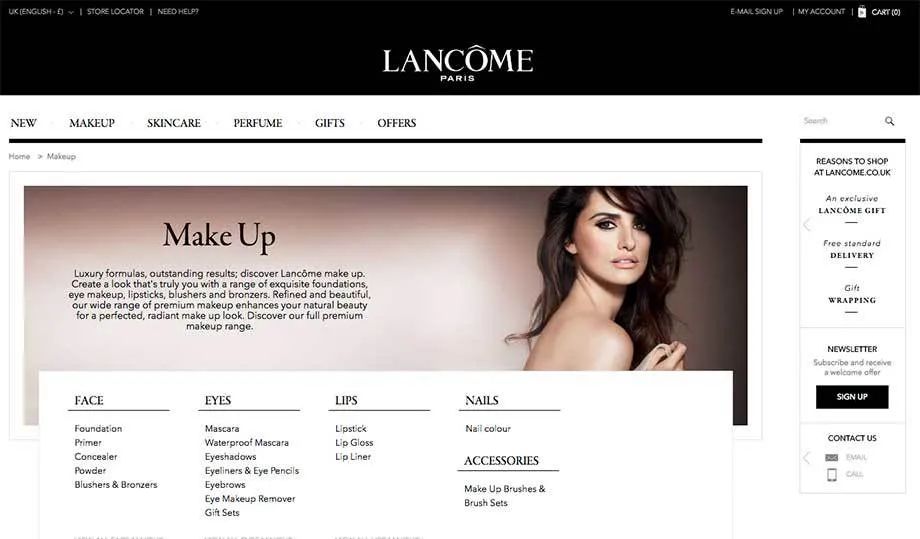 The style of Clinique is slightly different, and its Logo font is unstable The serif Jorvik Informal font has a certain contrast in stroke thickness, which is a relatively rare font. Exquisite space design, appropriate selection of soft colors and reasonable use of Helvetica fonts jointly cast this high-quality brand in the cosmetics industry. Simple yet modern, stylish and eye-catching. Although the design of the font is simple, the effect of conveying is very effective.
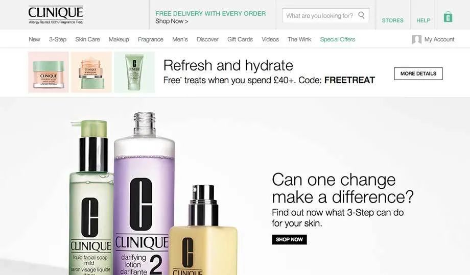
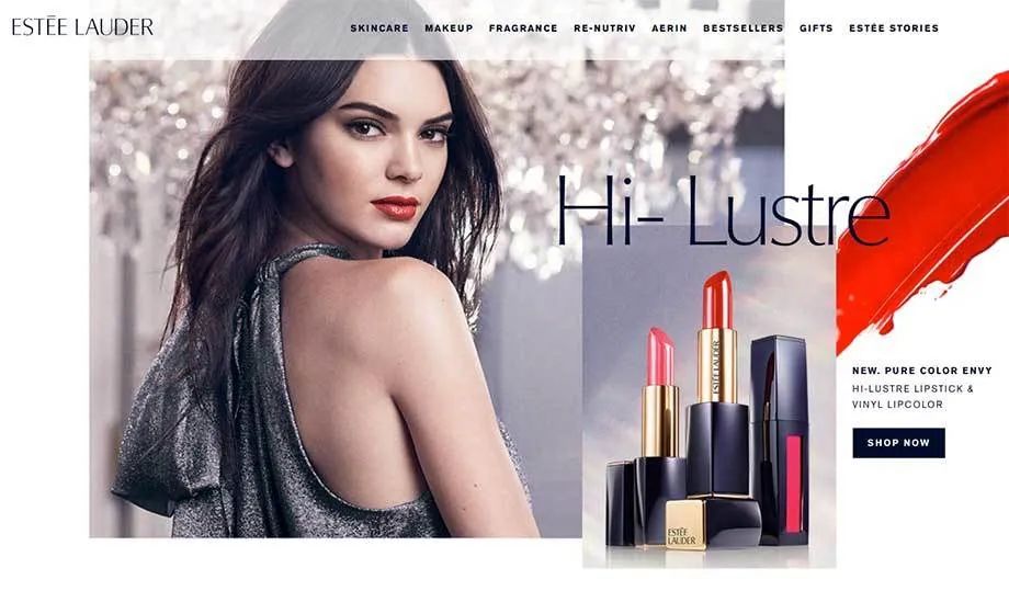
Optima is a high stroke thickness Contrasting sans serif font with elegant style and beautiful design. It is characterized by classic design proportions, high definition, high recognition, elegant appearance, and the height of the lowercase letter x is relatively high. Estee Lauder uses a font with a lower weight to enhance the fineness, and at the same time uses a large picture and dark blue as the brand color, which is formal, rigorous but not lacking in profound fashion sense.
Shiseido website navigation menu uses Reader Bold font for all capital letters, which is the same style as Gotham font. In addition, the contrasting color of black and white is also one of the theme features. Shiseido uses the custom font Shiseido2013 in both the body and details of the website content. Shiseido2013, similar to Optima, is a sans-serif typeface with high stroke-weight contrast, with a high height for the lowercase x, relatively large valleys, and suitable for multiple tones. Also, we noticed some text alignment issues on the Shiseido website, such as large amounts of whitespace in aligned text, confusion between centered, aligned, and left aligned text, and misalignment of titles with body text. 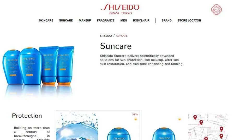
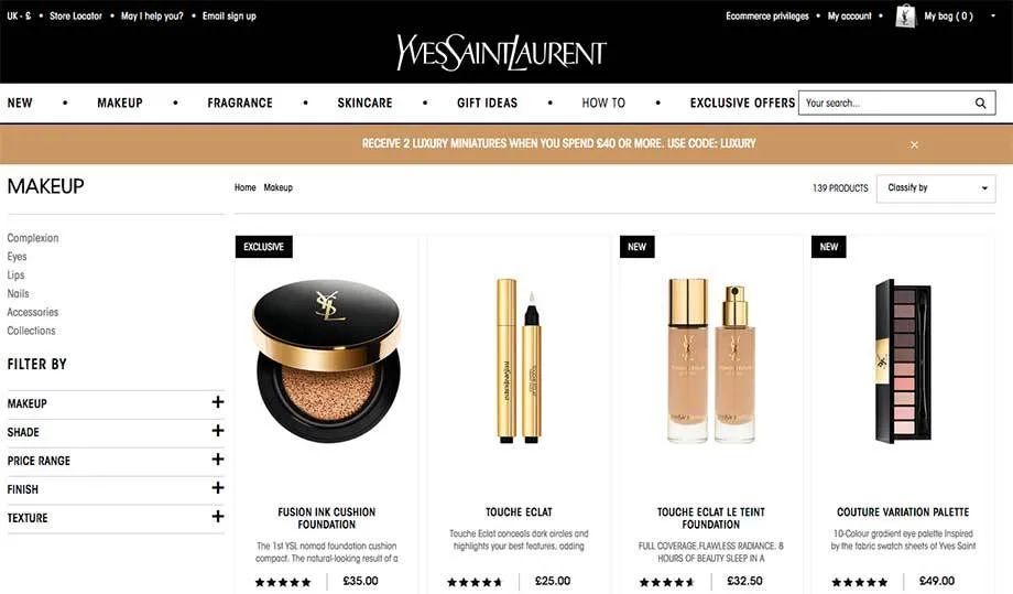
Yves Saint Laurent is the only beauty brand that uses narrow fonts. Different from the Gotham font, which is often used in large quantities, the ITC Avant Garde Gothic Condensed used by Saint Laurent is a narrower and denser font with less legibility. The Saint Laurent website also uses the ITC Avant Garde Gothic Standard font, which is a font featuring geometric and rectilinear styles in a relatively large font size. This font can bring a strong sense of dominance. Compared with the subtlety of the Logo or brand, the use of this font is slightly unsatisfactory.
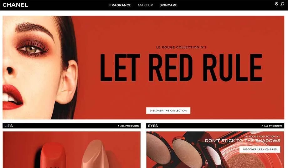
All letters in the Chanel Logo are capitalized, and the bold Geometric sans-serif font is used, which not only improves the grade but also highlights the elegant quality of the brand . The fonts on the Chanel website use a renamed Gotham font, which is popular with the brand, and the letters are all capitalized and bold. The main text uses Helvetica font, and the font size is small. The website uses colors and images to distinguish between different styles of strength and softness.
On Tom Ford's website, we found that all copy is in all capital letters, no lowercase letters at all, and in black and white for the color theme. The bold and enlarged font brings a strong modern atmosphere, highlighting the brand's pursuit of momentum and fashion, which is very attractive to the young market. The use of capital letters shows the brand's strong sense of strength and fashion, and once again demonstrates the brand's market dominance. 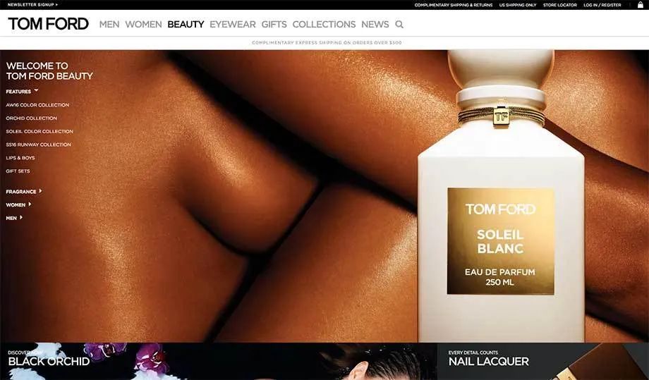
Givenchy is a French luxury brand, famous for its fashion and creative design. The brand's website features a mixture of graphics and text, and the headline and part of the text of the webpage use the design of all capital letters. Additionally, Sackers Gothic Light, a wider, isometric typeface, is used in the horizontally stretched headings. The Apercu font of the main text is also basically in the form of all capital letters. Compared with Givenchy’s square brand logo, the Apercu font has a narrower width ratio, but it does not lose the trendy style. 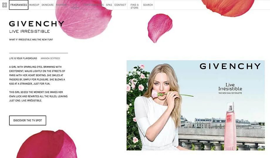
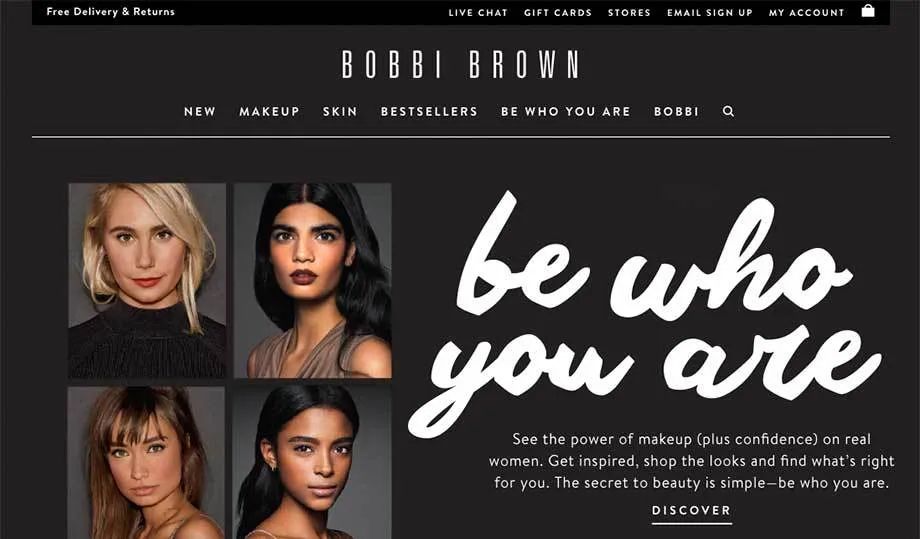
Barbie Brown used Univers Ultra Condensed font in Logo, which is the only font used in Logo Brands with fonts with narrower width ratios. Bobbi Brown’s webpage has a lot of black background space, and only white fonts are displayed, which not only brings a sharp contrast, but also highlights the momentum of the brand. Some random and loose handwritten fonts on the webpage are bolded, which is a little clumsy and fuzzy, and lacks a sense of delicacy. The body text uses Brandon Text, a Geometric rounded sans-serif font. The use of this font adds visual softness, but the current font size looks a bit blurry, which needs to be considered. Some believe that beauty brands should use fine serifs, feminine tones and stylish typography in their brand visual design. This is a misconception, as we see that many beauty brands use monochromatic, bold fonts and all-caps letters—a feature that can be seen in brand logos, website navigation bars, and even body copy. The use of capital letters is prone to many problems in terms of comprehension and legibility. Not only does it make readers unable to focus visually, it is also slightly exaggerated. It's kind of weird that a brand like Tom Ford doesn't use lowercase letters at all on their website. Interestingly, almost every brand logo uses capital letters. With such a premise, Tom Ford's website design is not so surprising. More than half of the brands we studied used a high stroke weight in their logo Contrasting fonts (similar to Optima fonts), this phenomenon is not surprising, and another 40% of brands use bold Geometric fonts or Grotesque fonts in Logo , giving people a different feeling. In terms of body fonts, 40% of brands use serif fonts or sans serif fonts with stroke thickness contrast as the main font, while 70% of brands use a Geometric font. Gotham and Optima sans serif with high stroke-weight contrast are the most popular typefaces for beauty brands. It's surprising how similar the brands are at this point. Only 3 of the 10 brands above (Shiseido, Clarins, and Chanel) use custom typefaces, which is surprising in today's market that promotes differentiation. The use of off-the-shelf fonts by big brands can lead to a lack of proprietary brand identity, and it also brings convenience for smaller brands to imitate the use (look and feel) of their fonts. At this point, thebeauty market is clearly divided into two camps: those who strive to create a new style by using serifs and high stroke-weight contrast fonts Brands that create a traditional feel, while the other school tends to use Geometric typefaces and Grotesque typefaces for bolder and more modern designs. The latter can still achieve a luxurious effect by employing good design practices and clear typography, but it may take a lot of effort to differentiate itself from its less expensive competitors. Although it is often assumed that luxury brands tend to use serif fonts, in fact, in the luxury brand field , serif fonts are used very rarely (only 20% of Logo and 20% of commonly used fonts use serif fonts). Clarins and Lancôme have developed a unique brand identity and a sense of heritage through the use of high-weight-contrast serif fonts, which sets them apart from brands that use bold, powerful sans-serif fonts. When used properly, a sans-serif typeface with high stroke-weight contrast can be just as elegant as a serif typeface, as Estée Lauder’s Optima typeface is a good example. In a mature market, it is difficult to stand out, so fonts and The choice of trademark is extremely important. In beauty, every brand has an opportunity to differentiate itself from lower-priced alternatives and carve out a niche in the market. -------------------------< /span>
Guide to previous articles:
Let the text wrap around!
Teach you how to make a pixel map in minutes!
Make a Japanese master poster by hand! !
Articles are uploaded by users and are for non-commercial browsing only. Posted by: Lomu, please indicate the source: https://www.daogebangong.com/en/articles/detail/The%20highend%20atmosphere%20is%20upscale%20The%20fonts%20most%20used%20by%20luxury%20brands.html


 支付宝扫一扫
评论列表(196条)
测试