“If there is a certain font that can trigger a certain feeling through the visual senses, then the purpose of that font is achieved. For example, the words on the logo of an imported sports car make people look very The sense of speed and style, you feel this feeling, then this typeface is very successful; or the text on the high-end cosmetics packaging box in the department store cosmetics store, they attract people because they seem to exude some kind of adult atmosphere Look forward to it. This is the type of fonts that can evoke a certain feeling. —— "Unbelievable Fonts", written by Akira Kobayashi
There are still a few days before 2019, today's article continues to talk about fonts with you.
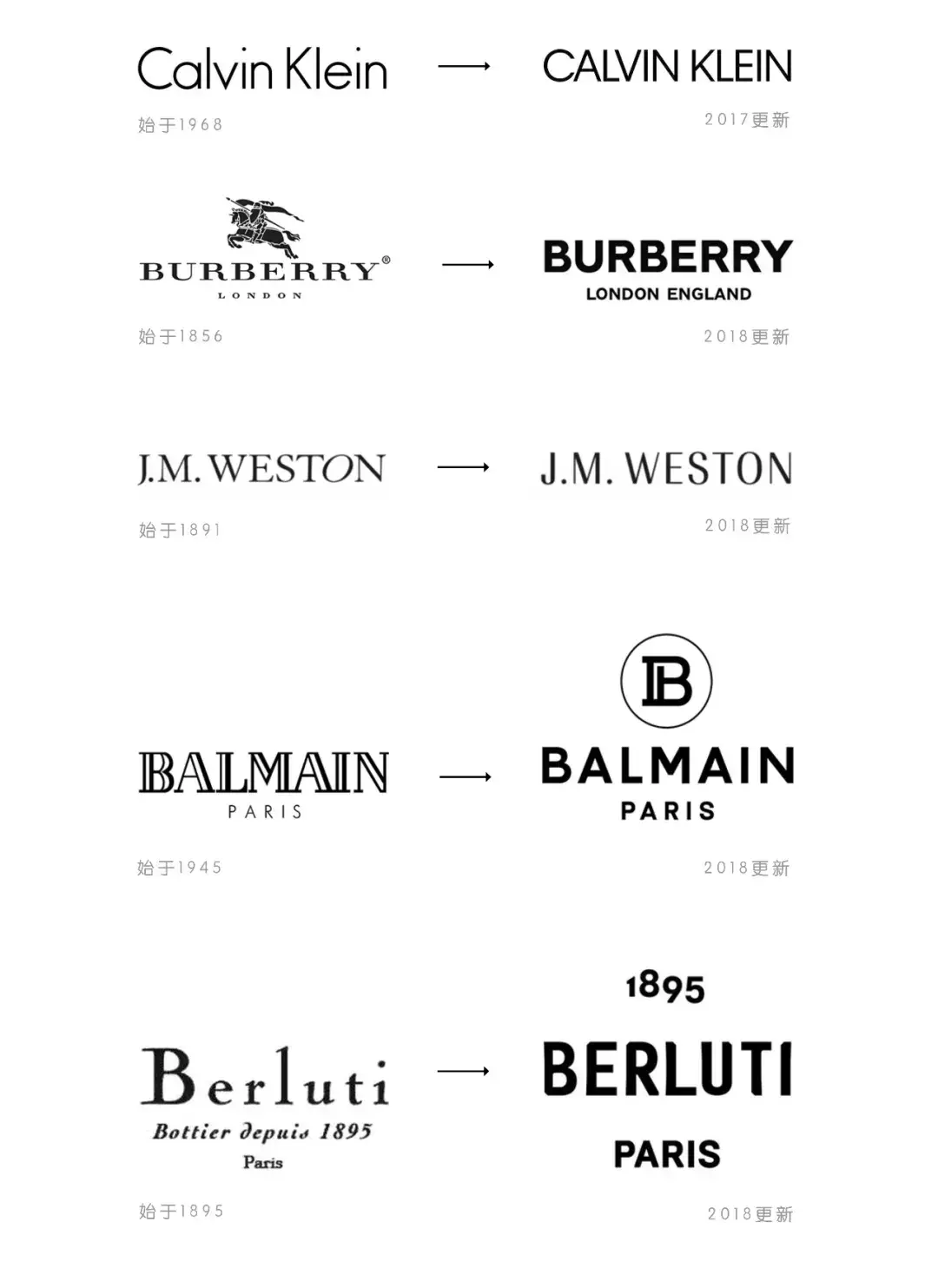
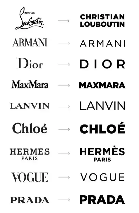
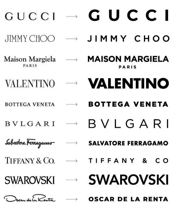
There is an interesting phenomenon in 2018. Many fashion and luxury brands have replaced the century-old classic logo that has stood the test of time with a minimalist version, that is, the serif font "serif" has become Sans serif "sans serif". These fashion luxury brands have one thing in common except that they are expensive to death, and they all have a century-old brand history. In recent years, in order to show their youthfulness, they have successively updated their brand logos,
This year, fashion luxury brands that have chosen sans serif fonts include Burberry (Burberry), Balmain (Balmain), Berluti (Burberry), and J.M. Weston (Weston).
Is it a coincidence or intentional?
The data comes from the network
More and more brands like to use words directly as logos. Compared with graphic design, font design not only expresses the corporate brand intuitively, but also includes the function of graphics. Among them, the Burberry (Burberry) logo has changed the most. In addition to the sans-serif fonts, the classic Burberry knight with more than one hundred years old has also been removed.
"sans" means "none" in French, and "sans serif" is a font without serifs, which appeared in the 19th century, which is different from the serif font "serif" , Sans-serif fonts are widely used because of their concise fonts and easier identification as headlines and street signs. The popularity of the sans serif font "sans serif" in recent years can be seen as a derivative of the digital information age. Concise, clear and easy-to-read fonts are suitable for the current digital age of rapid development and pursuit of efficiency.

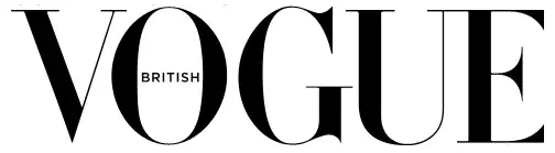
Once upon a time, serif fonts with tiny claws at the end of the strokes were a favorite of the fashion world.
It is generally believed that serifs originated from the Latin alphabet carved on stone in ancient Rome. Classical music can create a historical temperament. The serif font, formerly known as "Roman font", just has the temperament of "advanced", "traditional" and "stable", although it cannot be said that "with serif" is equivalent to "advanced". , but this kind of "little claws" derived from the capital letters of ancient Roman inscriptions does have a heavy sense of history.
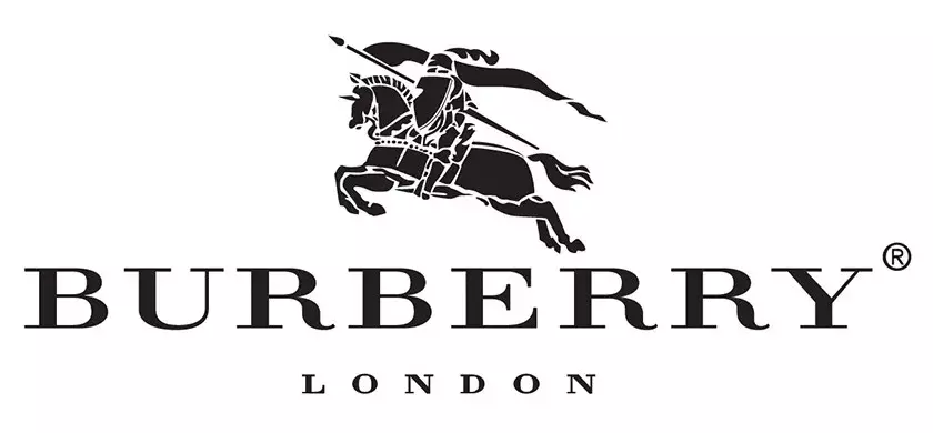
The original Burberry logo
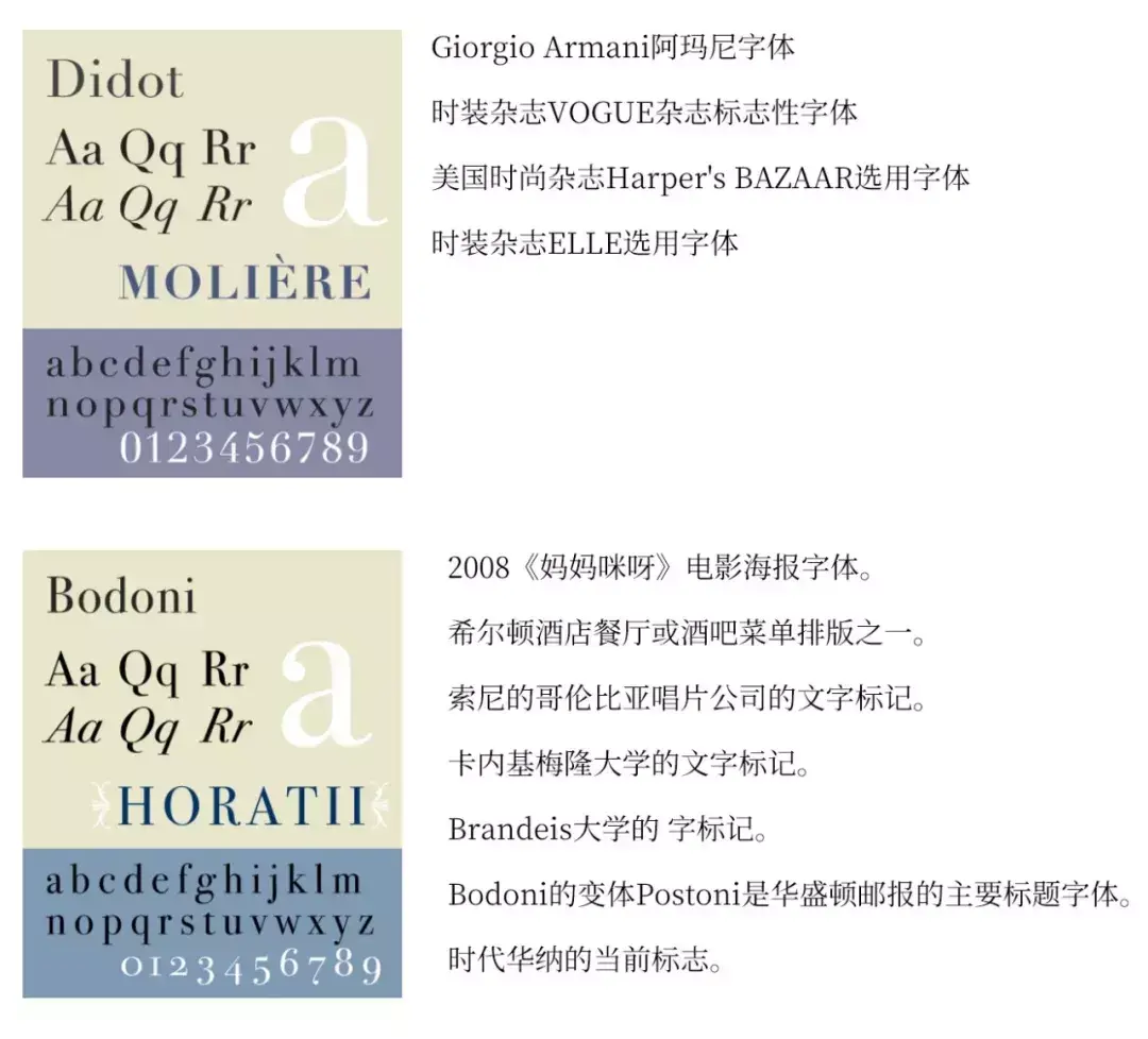
For example, the original Burberry (Burberry) logo, some people say that the prototype of its font is Didot (1784-1811) font, but some people say it is more like Bodoni (1740-1813) ) font.
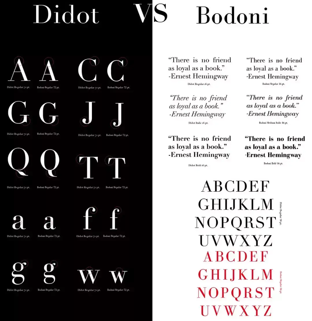
Didot and Bodoni already had an amazing acquaintance.
The picture comes from google
As regards the method of identifying them, such as the top of the "W", "V" and "l", Didot is a horizontal thin line, while Bodoni is a tapered shape; Bodoni's "J" Below the baseline; Bodoni's "Q" is a dog's tail, and Didot has a French feather. The difference in lowercase is even more indistinguishable to the naked eye.
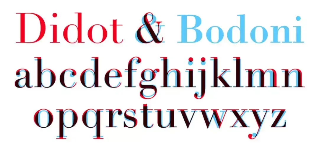
The difference between Didot and Bodoni
However, in terms of probability of use, the three-hundred-year-old Didot font is almost a fashionable logo.


The data comes from wikipedia
You can see Didot and Bodoni in many fashion magazines and popular movies. Like the Bodoni font in the 1968 Playboy ad for Gilbey vodka.
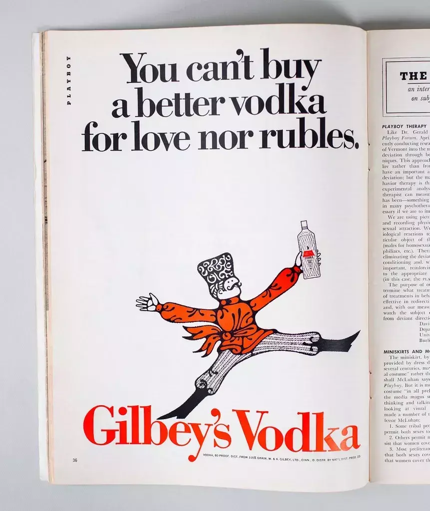
Photograph by Gerardo Ortiz
and the font Didot in the movie Interstellar poster.

Ascend Studio used Bodoni's for its design work.
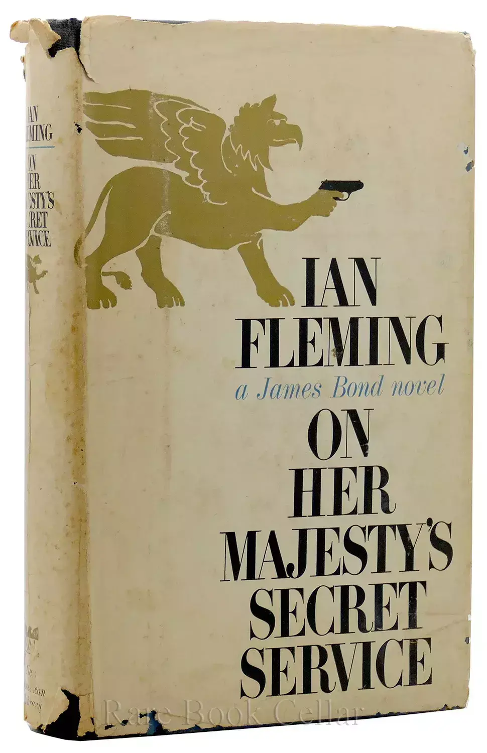
James Bond "007" first American version of the novel cover.
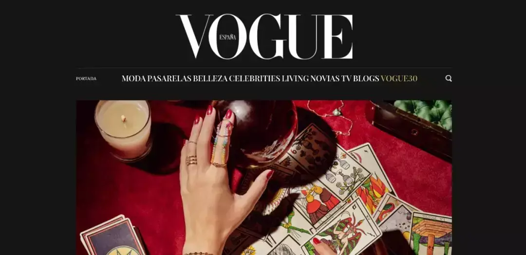
Vogue Españawan website
A foreign designer who did not want to be named contributed to DesignTAXI, predicting the sans-serif design trend of the logos of the following 19 fashion brands in the form of jokes:
No graphics
Serif becomes sans serif
Is this the future of luxury fashion logos?
Articles are uploaded by users and are for non-commercial browsing only. Posted by: Lomu, please indicate the source: https://www.daogebangong.com/en/articles/detail/The%20future%20of%20stylish%20luxury%20brand%20typography%20logos.html
 支付宝扫一扫
评论列表(196条)
测试