Editor's Note: Learn font characters while watching beauties and handsome guys! Today, Dao Shi from Ali, in an interesting way, gave the students a popular science on the character characteristics of Chinese fonts. They all said that the characters are like their own. What type of font are you? After reading this article, you will understand it in seconds!
Road stone>
But I don’t know why, it’s not always easy for me to associate characters with people’s personalities, but it’s always easy to connect characters to people’s appearance characteristics. For example, when I suddenly saw a text with soft, fresh, elegant, meaningful and slender handwriting, I subconsciously felt that the owner of this word should be a delicate and sweet girl. And when a middle-aged macho man with a rough face, a beard, and an occasional fitness man next to me picked up a pen and was about to write, I had a premonition that he would write strong, sharp, and even irregular words. .
Why do I feel this way? How did this feeling come about? I think it is determined by the innate attributes of our Chinese characters. As we all know, the earliest origin of Chinese characters is oracle bone inscriptions, which are pictographic characters. In other words, the origin of writing is pictures, and pictures are simplified into symbols, and after thousands of years of evolution, symbols have become the current writing.

For us, text is still a kind of graphics, so it is normal for us to think of shape features through text. Our prediction of a person's handwriting is actually that we have transplanted the person's appearance features (especially facial features) into the text.
Let's look at a specific example. First of all, what does a normal male look like in our impression?
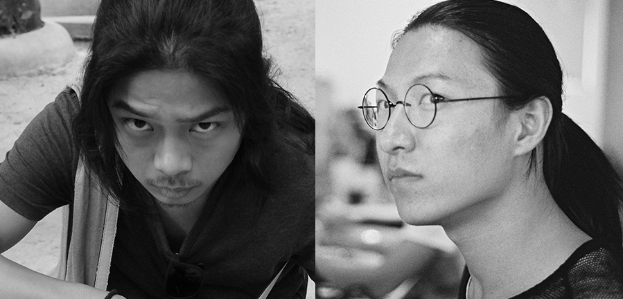
They all have thick and straight eyebrows, big and straight nose bridges, hard eyelids, angular facial contours, and some even have some tough wrinkles like knives. Look at a small legend:
The picture above shows two beautiful long-haired designers of our team, one of whom makes everyone feel masculine, while the other is often called a gun girl. The reason is that men have more and less graphic features. These graphical features, we can use the following words to describe:
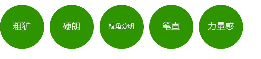
Therefore, some graphic expressions about men will definitely have these characteristics. The picture below shows different manga men in the United States, Japan and Hong Kong, all of which have the characteristics of these keywords we mentioned.
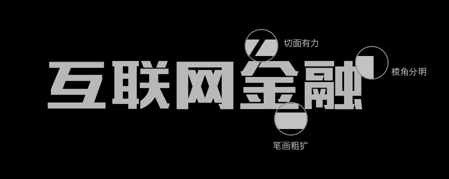
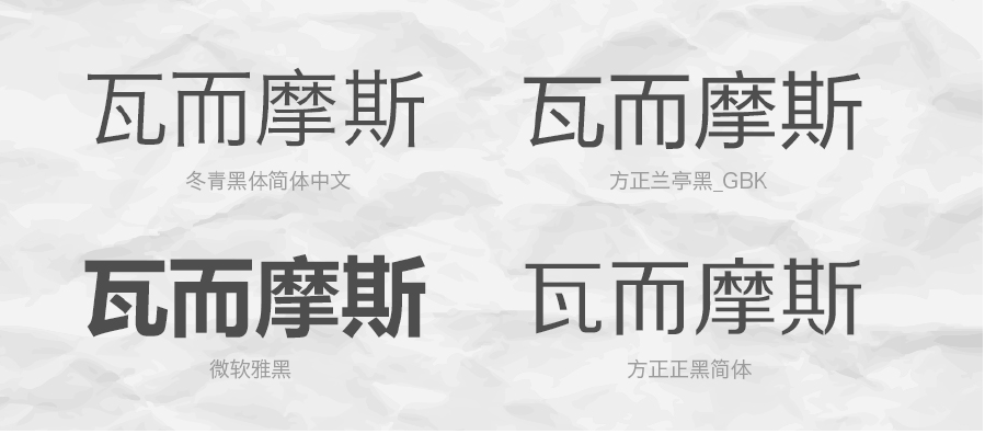
This graphic feature can also be applied to text, as long as the text has graphic features such as rough, hard, strong, sharp corners, and a sense of power, it is masculine text. For example, the following font has these characteristics:
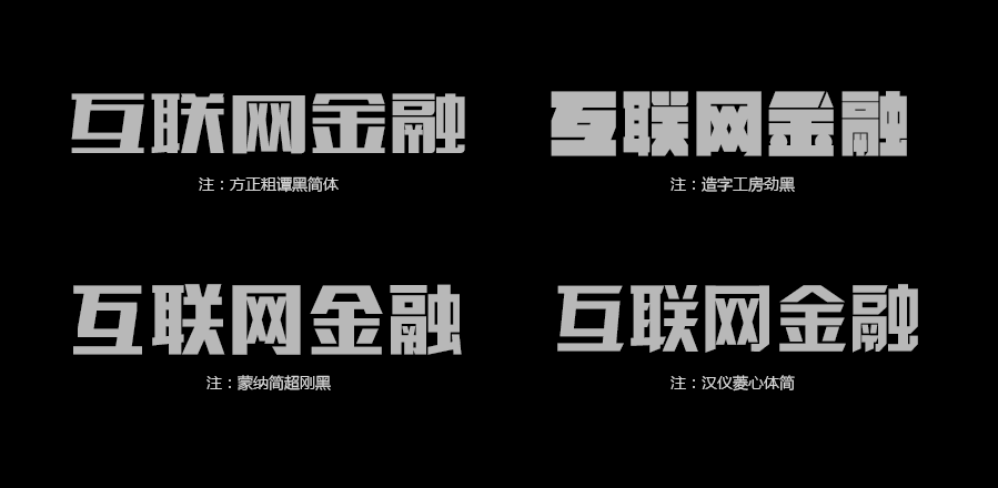
There are also these fonts recommended below, which actually have the graphic features we mentioned, and they are all male-oriented fonts.

Of course, the recommended fonts are not complete. They just belong to me and I usually think they look better and I use them a lot. Other fonts with the graphic features we mentioned are also masculine. You can use them by analogy.
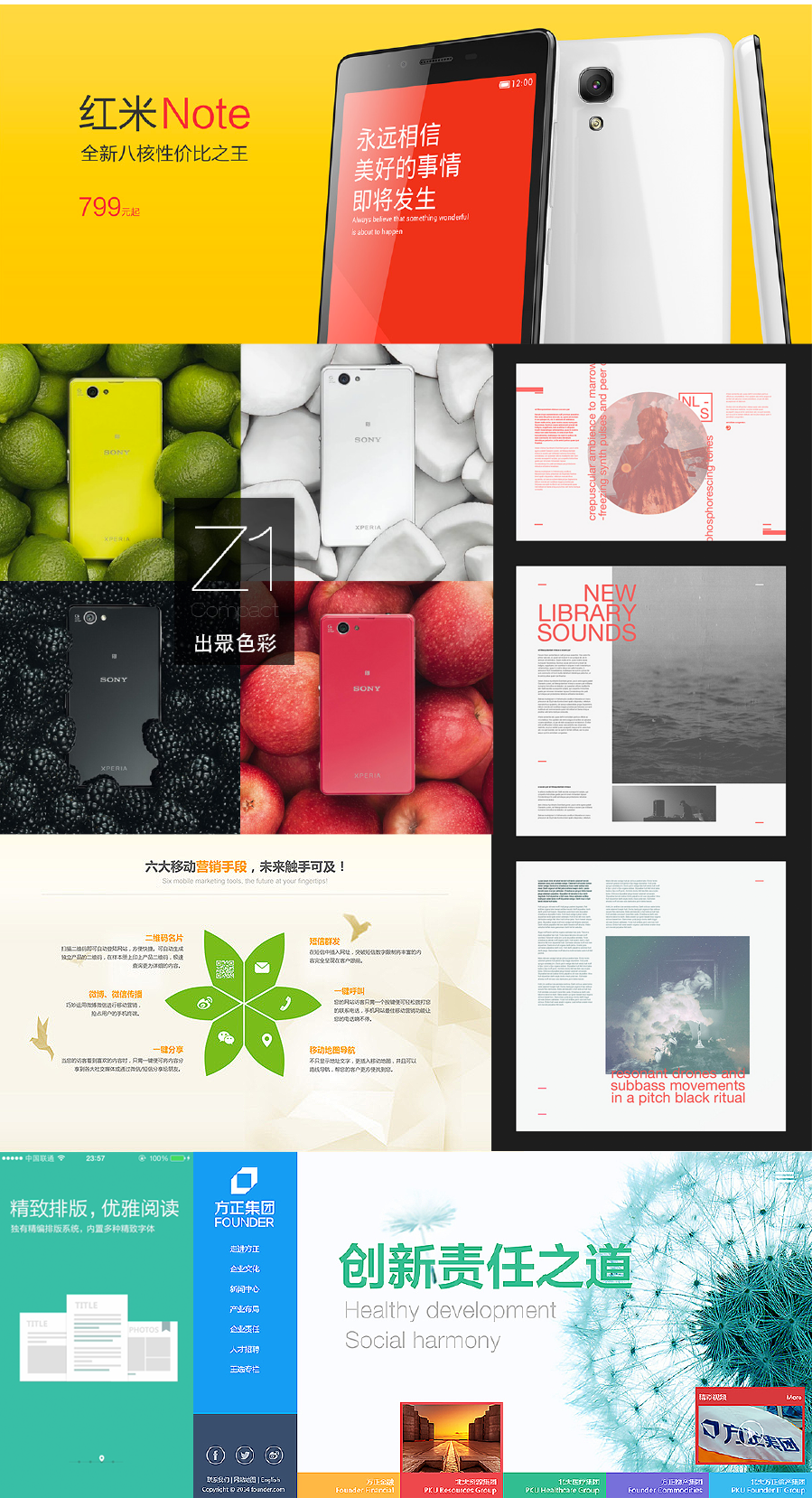
Now that you know what types of fonts are masculine, how should they be used? Masculine fonts will be widely used in designs where men are the mainstream practitioners or consumers. This will make the whole design more masculine, and have the effect of one plus one greater than two. For example, in the World Cup held in Brazil this year, football is a male-dominated sport, and all the designs related to the World Cup are basically all male-style fonts.
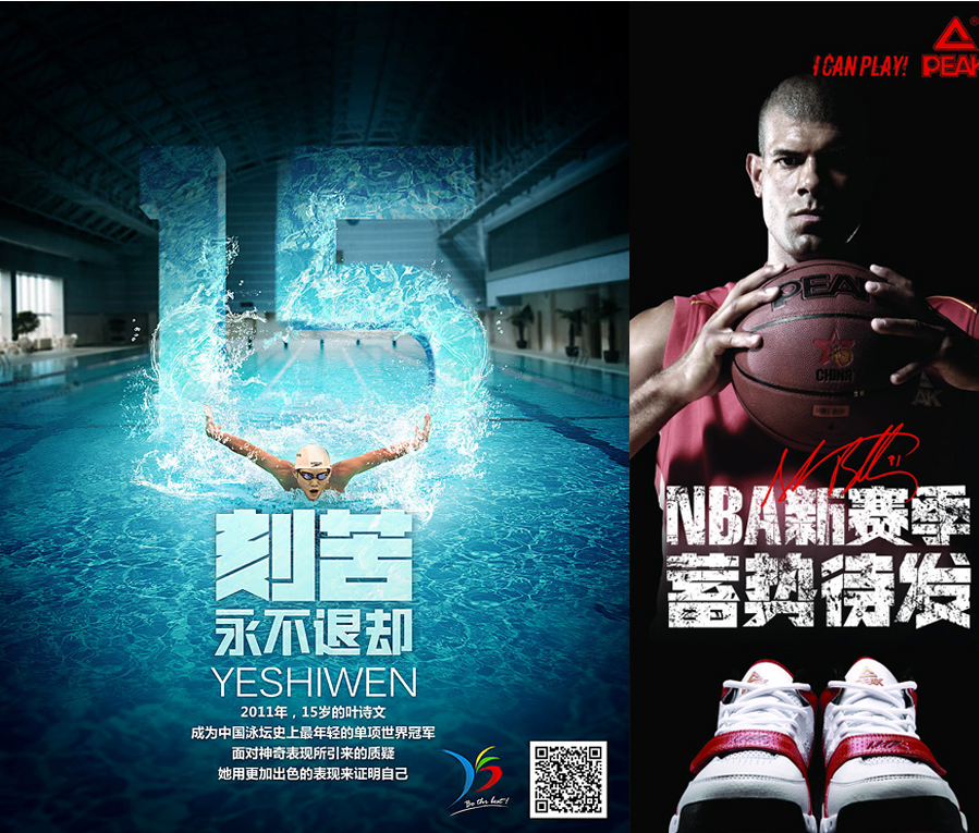
Aside from football as a single event, in fact, most sports will give people a very masculine feeling of intense male competition, so a large number of masculine fonts are used in most sports designs.

Therefore, as long as the masculine attribute is very strong, or in the design with male as the mainstream consumer group, fonts with this attribute can be widely used. Such as competitive games, PK games, rock, men's products (cars, razors), metal, etc...
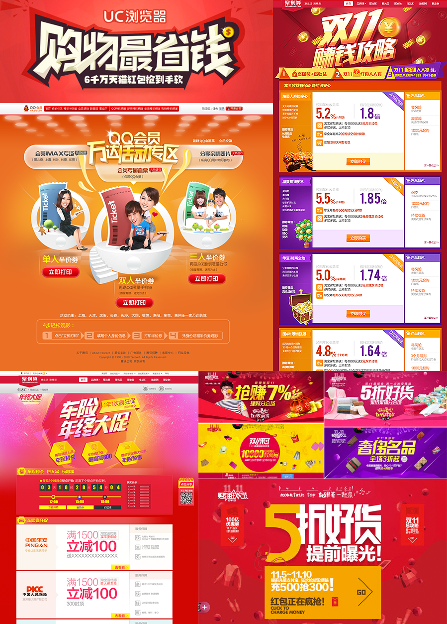
In addition, this type of font is also widely used in marketing design, because marketing usually needs to convey very excited and intense emotions to users. This emotion has strong masculine attributes, and most of the male characteristics They are all impulsive and exciting, so this typeface is commonly used in the design of activities such as fierce promotions and snap-ups.
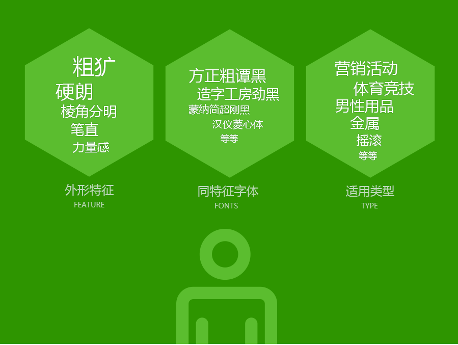
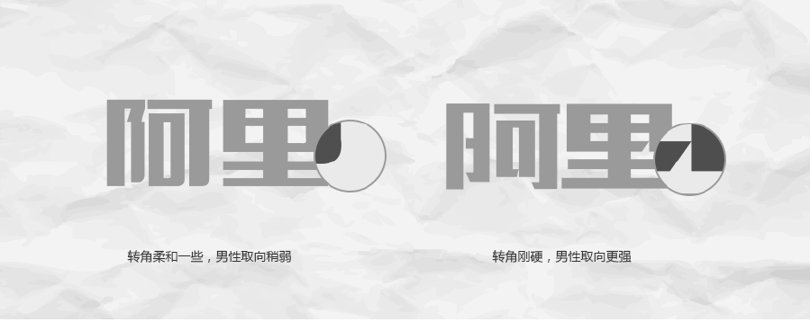
Finally, use a chart to briefly explain the sexual orientation of male fonts:

Women
Just taking masculine fonts as a specific case, we have thrown out our point of view on the sexual orientation of fonts. The analysis of female fonts in the following is actually exactly the same as the above method.
The picture above is a few sweet-looking beautiful girls in our team. Their appearance characteristics have the following commonalities.

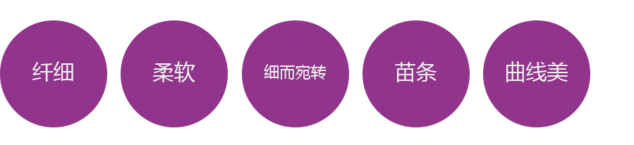
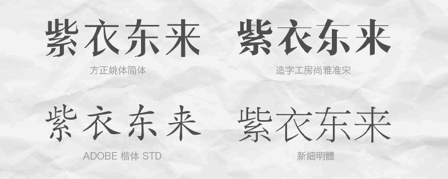
The following fonts can easily connect us to the appearance characteristics of women, and their sexual orientation is female.
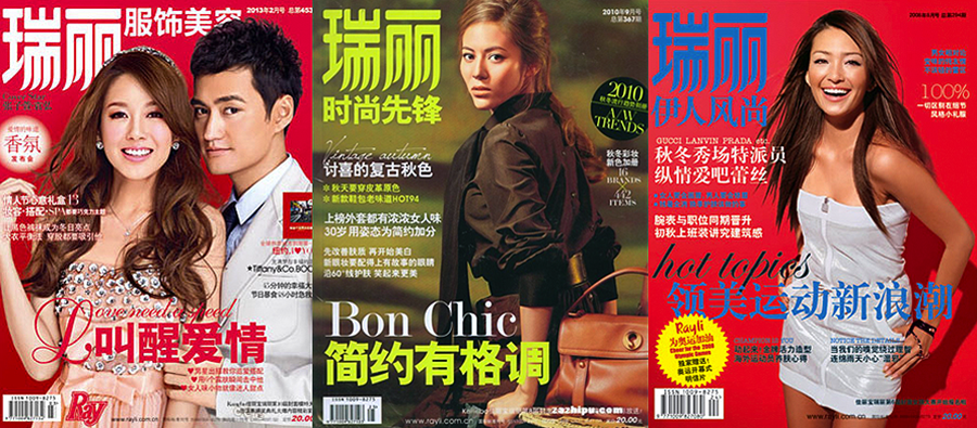
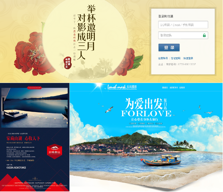
In terms of scope of use, as long as the design is related to women, a large number of feminine fonts will be used. For example, the logo of the women's magazine Ruili in the picture below uses a typical feminine font.

Therefore, as long as the feminine attribute is very strong, or the design is based on women as the mainstream consumer group, fonts with this attribute can be widely used. Such as love, flowers, jewelry accessories, women's products, skin care products, cosmetics, etc...
Children
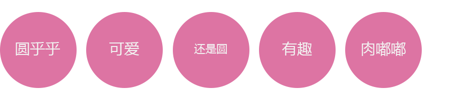
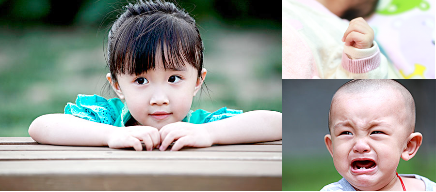
Let's take a look at the appearance characteristics of children again. No matter whether boys or girls grow up, their appearances are actually similar. Basically, they can be summarized as follows:
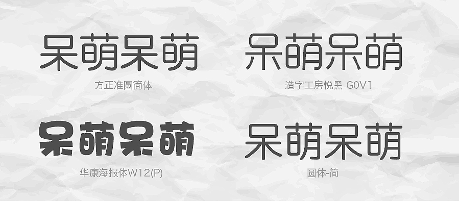
The following fonts are similar to the keywords we mentioned, which easily remind us of children's appearance characteristics.

Therefore, fonts with these characteristics will be widely used in children-related designs. Such as fun games, casual games, baby products, amusement parks, snacks, toys, etc...
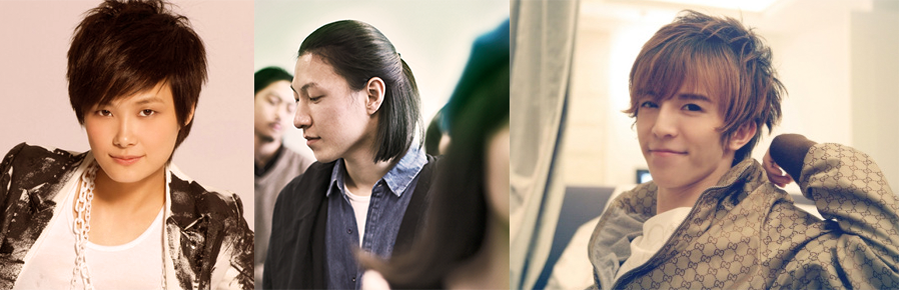
Neutral
Now let's discuss a more exciting topic, what are the characteristics of a neutral appearance?
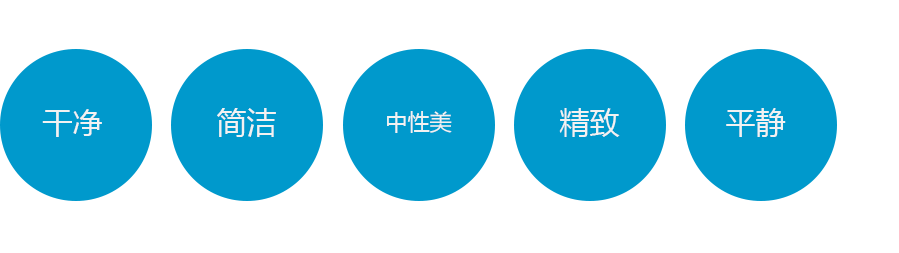
You will find that these looks that make us feel neutral are actually part of the graphic characteristics of both men and women. Although it is said that they have the graphic characteristics of both men and women, they do not have a certain graphic feature of a certain gender that is particularly obvious (if it is obvious, it is not neutral), they belong to the middle level. Summarize their appearance with adjectives, roughly like this:
The following types of characters have this neutral graphic feature.
Therefore, this type of font is very suitable for use in designs that are not strong in gender, do not require strong emotional characteristics, and are neutral. Such as product descriptions, platforms, technologies, mobile phones, computers, etc.
More
1. In addition to the fonts with obvious sexual orientation we mentioned above, there are actually many fonts whose sexual orientation is not particularly obvious, such as the following:

These words don’t quite remind us of a certain group of people directly, but their entire graphic structure reminds us of our history and past stories:
Therefore, they will be widely used in designs with strong narrative and statement, and strong historical meaning. For example, some story packaging of real estate companies and some traditional festival designs.
2. Each type of glyph includes many kinds of fonts, and each font has different details. The difference in details is like the appearance of a person. Although they are all men, some are more delicate and suitable for endorsement of men's skin care products. And a bit rough is suitable for endorsement of a certain boxing column. You should choose the most suitable font according to the details and attributes.

3. It cannot be said that masculine designs must only use masculine fonts. When using them, use other types of fonts for contrast, which can have special effects. In fact, using fonts of the same type can easily make the atmosphere more intense and unified, and it is easy to produce stronger visual effects.
4. The sexual orientation of the font is purely an article that I have occasionally thought about and summed up over the years of my work. Everyone is welcome to correct it.
Original address: alipayifed Daoshi
【UTS contribution: 2650232288@qq.com】
Articles are uploaded by users and are for non-commercial browsing only. Posted by: Lomu, please indicate the source: https://www.daogebangong.com/en/articles/detail/The%20font%20tutorial%20can%20still%20play%20like%20this%20chat%20text%20sexual%20orientation.html
 支付宝扫一扫
评论列表(196条)
测试