Written in the front: The days of learning font design with the master, continue to share font design today, hoping to make progress together with everyone on the road of learning font design.
Font Name: Fluttering
The following are two font effects made by the editor, expressing the injured person, fluttering in the illusory wind.
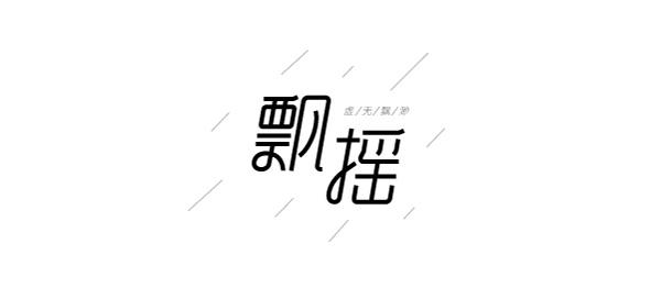
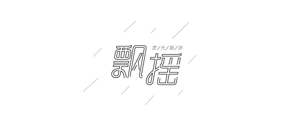
Design method:
1. In the AI software, first input a boldface "flutter", and use the pen tool to draw the basic glyph according to the font shape of the boldface. When sketching, you can use the reference line to ensure the precise structure and proportion of the font.
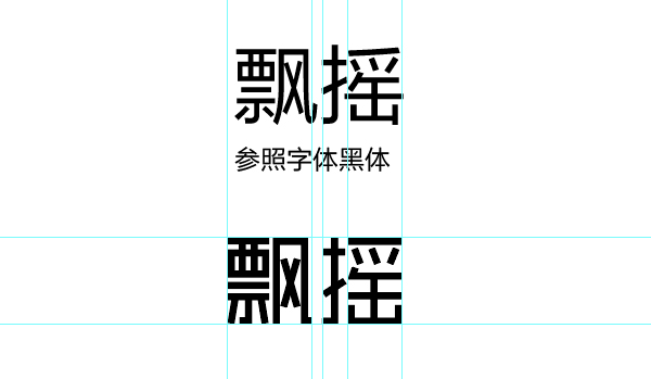
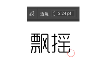
2. Adjust the corners of the font to make the shape of the font round. If you think the stroke of the font is thick, you can adjust the thickness at any time.
3. Continue to use the pen tool to deform the font to make the font feel smooth. When deforming try to use subtraction to shape the font, without destroying the structure of the original font, to ensure the recognition and visual beauty of the font.
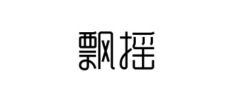
4. Adjust the strokes in the word "wind", leaving only one stroke to express the feeling of drifting away, and then adjust the inclination and placement of the font.
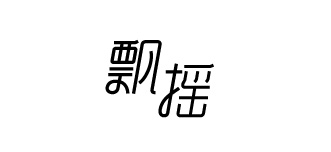
5. Finally, add decorative text to the font and the scene of wind and rain is completed.

Finally, let’s talk about the method of making the hollow font effect in the effect picture 2
To shape the above-made font, click Object-Extend to make the font editable. And turn off the Fill color, turn on the Stroke, and set the Stroke to 0.75 px.
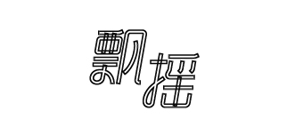
The graphics above look messy, you need to merge the stroke paths, open the path finder, and click merge.
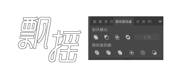
Finally do a typography and it's ok.
Articles are uploaded by users and are for non-commercial browsing only. Posted by: Lomu, please indicate the source: https://www.daogebangong.com/en/articles/detail/The%20font%20design%20of%20Floating%20depicts%20the%20illusory%20people%20on%20the%20road%20of%20life.html

 支付宝扫一扫
评论列表(196条)
测试