
From industrialization to commercial globalization, from the era of metal type to the era of electronic typesetting, why has Helvetica been able to maintain its vitality?
"If you don't know what font to use, just Use Helvetica."
This sentence is widely circulated in the graphic design world. It is of course a joke, but It also expresses the wide applicability of Helvetica in society.
In May 2010, New York type designer Cyrus Highsmith did an experiment: how to Living a day without Helvetica, with the restriction of avoiding any occasion where Helvetica appears, may not seem like a difficult challenge at first glance, but on that day, he could barely move.
He thought of avoiding the use of the Internet, and even deleted the built-in Helvetica in the computer system He also warned himself not to take the New York subway and bus (because the signs of the subway station and bus station use Helvetica), including some of the brands he is familiar with that use Helvetica, which he has included in the "restricted zone" of the day "inside.

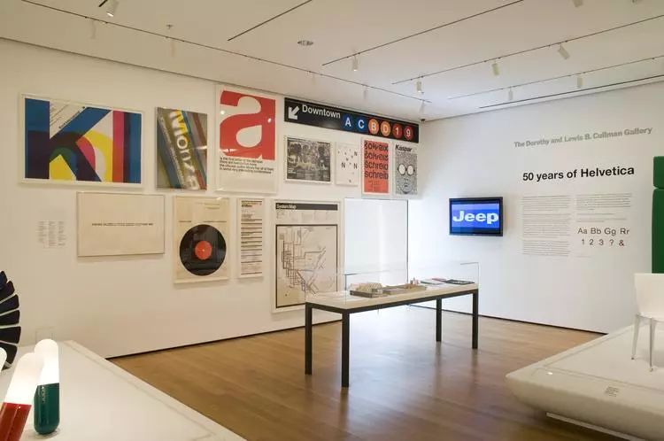
Helvetica is used for the guidance signs of the New York subway system, image source: The New York Times
But Helvetica appears more frequently than he expected more frequently.
Washing instructions on most clothes, box of yogurt for breakfast, New York Times The stock section on ", the TV remote control... all have Helvetica, so he had to rummage through the box to find old T-shirts and army pants to wear, give up yogurt to eat fruit, and turn on the Electra body instead of watching TV when he goes home at night. A print of Raymond Chandler's The Long Farewell.
When he was shopping, he even found that the credit card and the US dollar bill were all Helvetica. Feel yourself in an era ruled by Helvetica.
As Pentagram Pentagram design partner Michael Bierut said: "Wherever you look, You see fonts all the time. But one of them is probably the one you see the most, and that’s Helvetica. They’re there, as if they’re part of the environment, they’re like air, or gravity.”
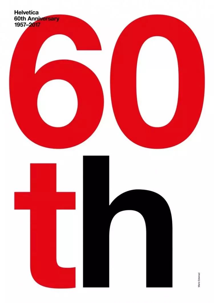
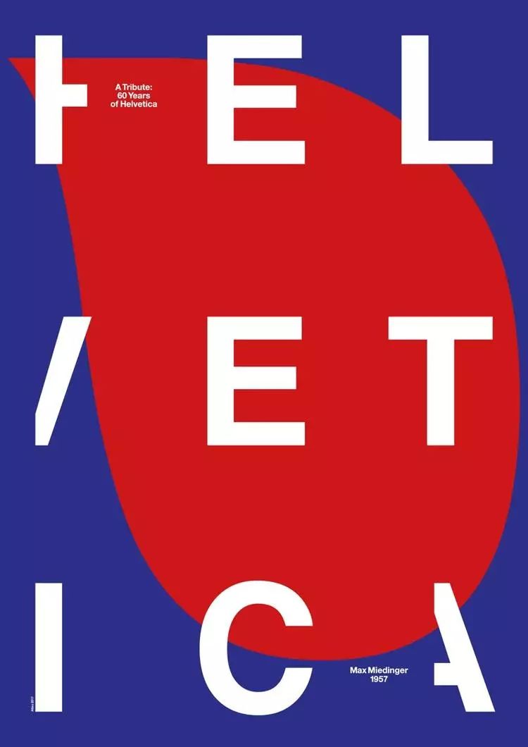
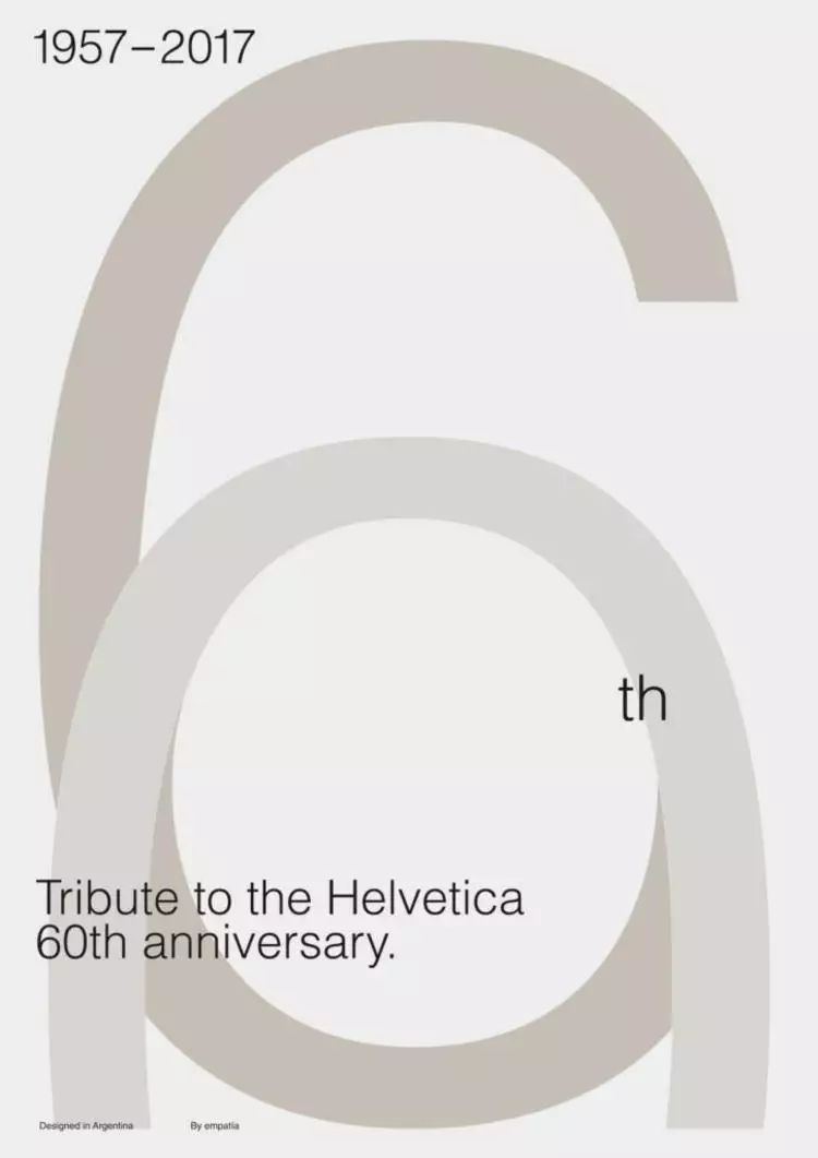
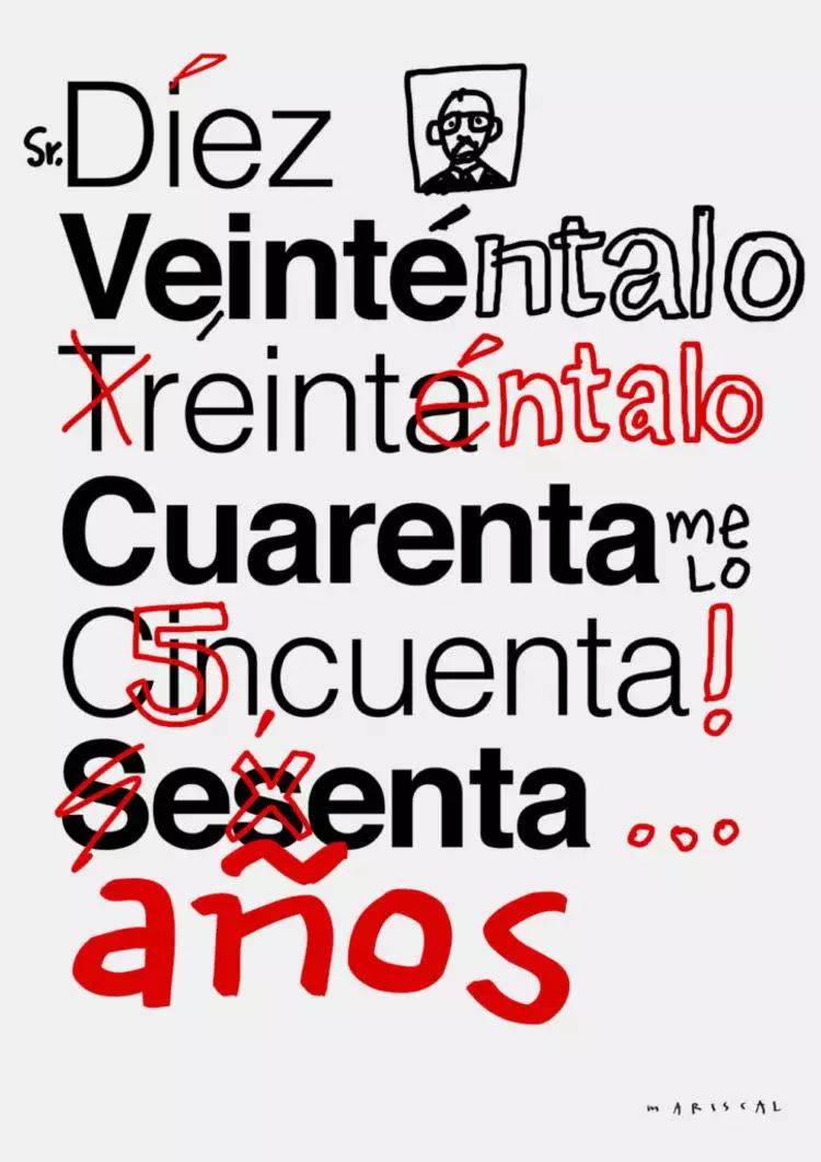
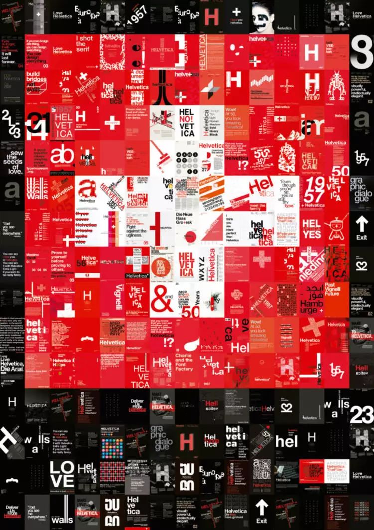
It has become the default font for countless occasions, and even someone has written a book and filmed a documentary about it The story of Helvetica taking the world by storm. This year marks the 60th anniversary of the birth of Helvetica, and Spanish studio Husmee, in collaboration with paper company Arjowiggins, invited 19 graphic designers to launch a series of posters that pay tribute to Helvetica.
So why is it this font? Why did it hit the market so quickly when it first came out, and why has it remained fresh and enduring for the past 60 years?
It is not a pioneer of sans-serif fonts, but it has achieved success in the market as soon as it came out
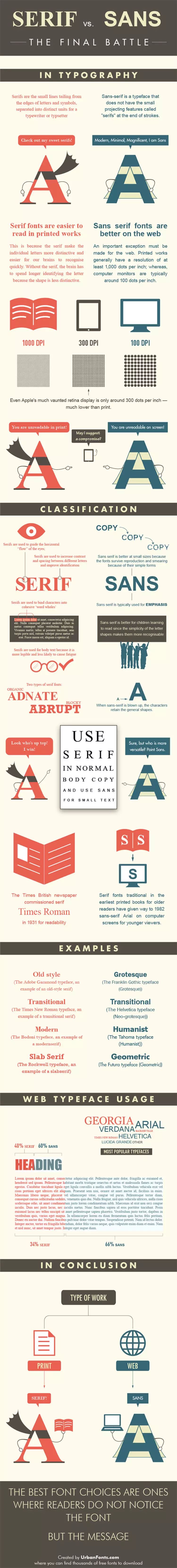
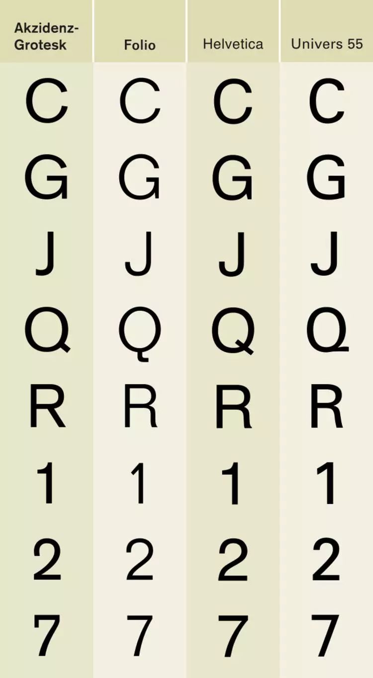
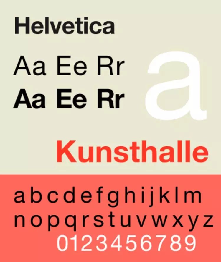
Here you need to clarify the difference between serif fonts and sans serif fonts. It is the two major categories of Western fonts. Times New Roman, which is the most commonly used when we write papers, is a serif font, and Helvetica is a representative of sans serif fonts. The distinction between sans serifs mainly refers to the decorative details at the end of glyphs. To put it bluntly, the end of each stroke of a serif font looks like a small tail, while the end of a stroke of a sans serif font looks bare , without decoration.
As early as the early 19th century, sans-serif fonts appeared. At first, they were regarded as "ugly monsters" after a poor transformation of serif fonts. They were mainly used by masters and stonemasons who painted billboards .
But with the development of industrialization, the frequency of use of sans serif fonts is also increasing significantly , Those old-fashioned and traditional classical serif fonts are no longer suitable for the needs of advertising, because sans serif fonts are easier to draw and make plates.
But until a century later, the wave of "Bauhausism" originated in Germany, Sweeping across Europe and then affecting the United States, sans-serif fonts that emphasize "clear purpose and can effectively convey information" really began to exert social influence.
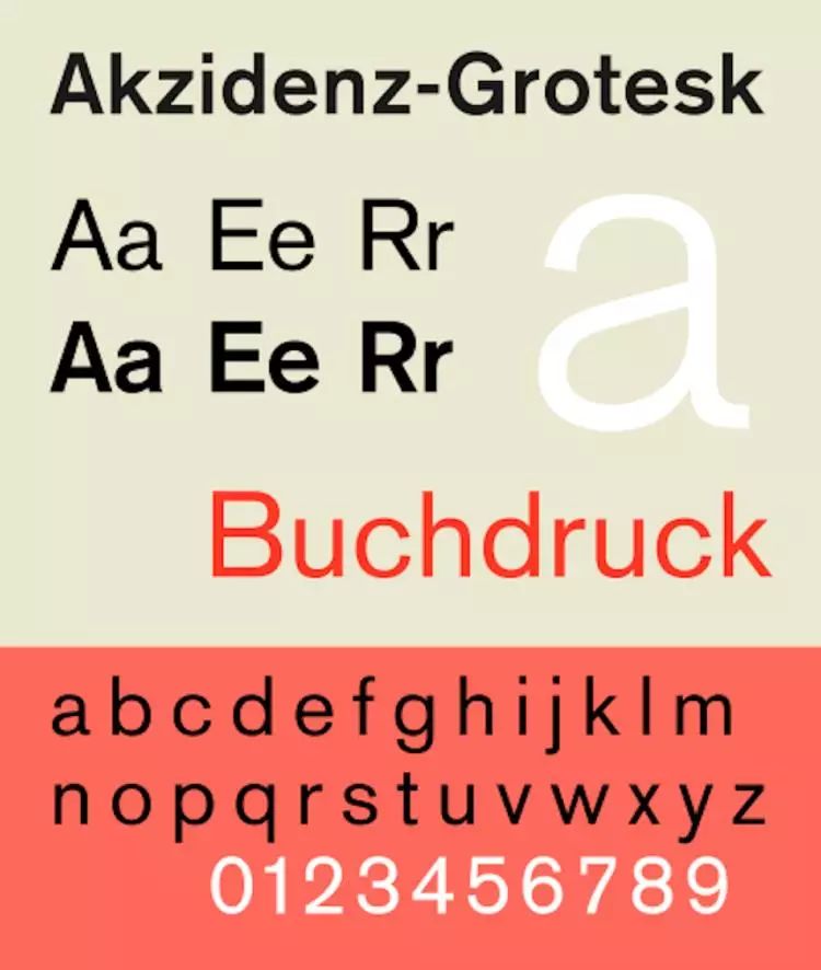
The most popular in the first half of the 20th century, created by the Berlin font company H. Berthold AG The developed sans-serif font Akzidenz Grotesk has achieved great commercial success and is also very popular in the design circle. Graphic designers have recommended this font to publishing and printing institutions.
Haas' sche Schriftgiesserei AG, which issued Helvetica, was also developed in 1943 A sans-serif font, Normal Grotesk, also had a big market after World War II. Many other small companies also saw the market potential of sans-serif fonts and tried to get a share of it.
That is to say, Helvetica did not appear as a pioneer at that time, and not only did it not face a blank market, but it even called it fierce competition.
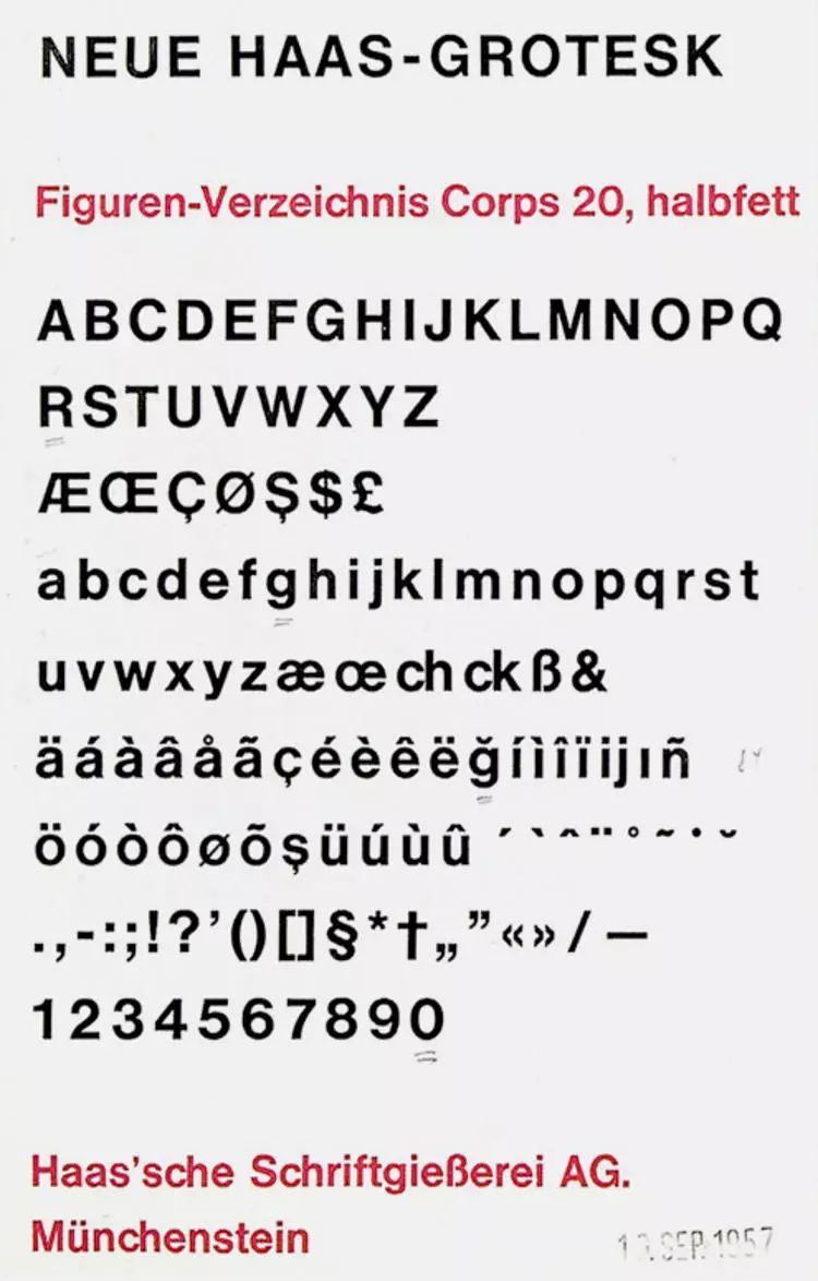
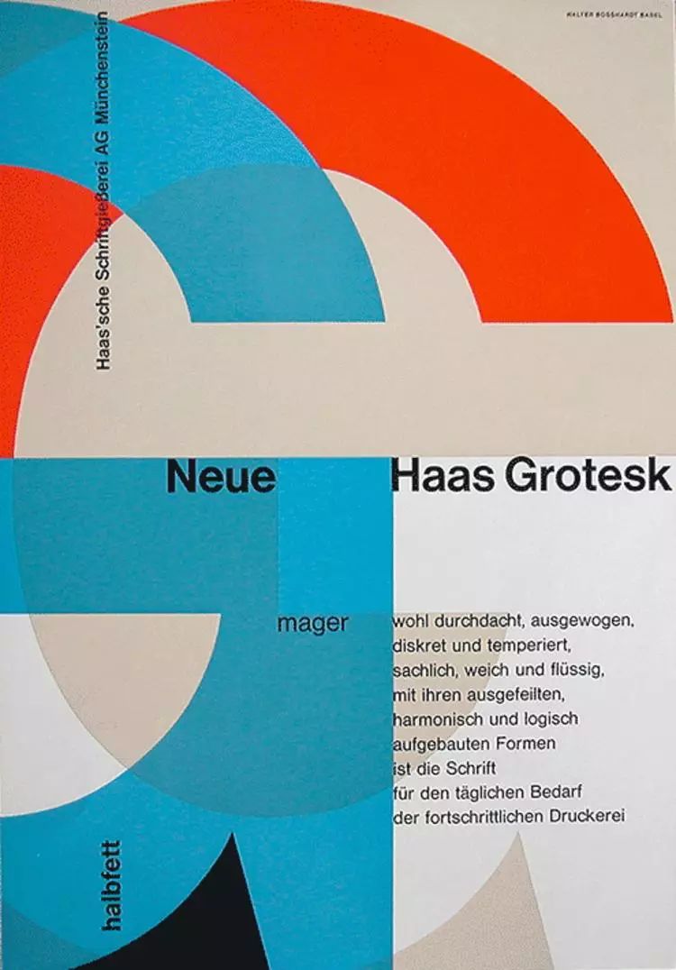
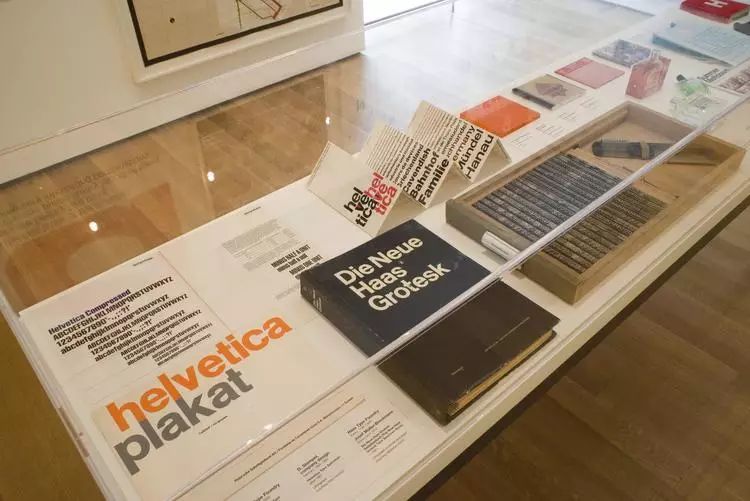
Eduard Hoffmann, general manager of Haas' sche Schriftgiesserei AG, in order to protect his market share, Invite designer Max Miedinger to design a new font for the company. After consulting many professional opinions in the industry, Eduard Hoffmann is sure to develop a completely plain font without any decoration, which will definitely be popular among designers It will have the opportunity to become a special typeface for printing advertisements of large companies.

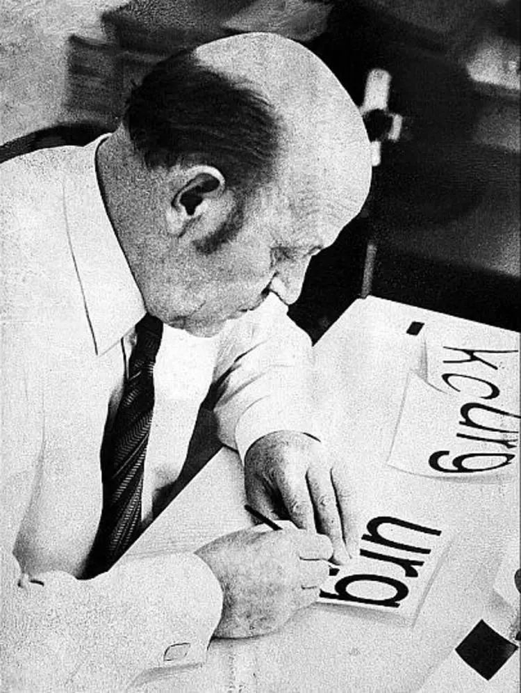
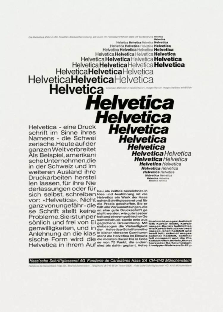
1957 In June 2010, Helvetica (the earliest version was called New Haas Grotesk) was officially launched at the "Plane 57" fair in Lucerne.
Afterwards, Hoffmann devoted his energy to convincing the advertising departments of the chemical giants in Basel to accept Helvetica. He invited many heavyweight graphic designers and layout designers to specialize in Production of advertising leaflets and marketing brochures for Helvetica, which has become a new favorite in the printing industry and has successfully filled the order of Haas' sche Schriftgiesserei AG.
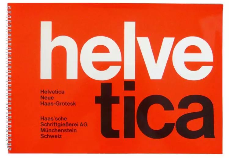
It is only published A year and a half later, it became the strongest competitor of Akzidenz Grotesk, the overlord of sans serif fonts at the time.
Birth of Helvetica: From Bauhaus to Swiss Internationalism
Helvetica was born in Switzerland after World War II.
Post-war Europe badly needed rebuilding, and graphic design went through a short period of stagnation. By the 1950s, a new graphic design style began to appear in the Federal Republic of Germany and Switzerland. It emphasized cleanness, objectivity, readability, simple and clear style, and precise communication functions. It quickly became popular all over the world, so it was also called " International Typographic Style".
The root of the internationalist style should be said to be in line with the modernist design movement. Two key figures in the graphic design movement, Theo Balmer and Max Beer, were both Swiss graphic designers who graduated from the Bauhaus.
The birth, development and wide adoption of Helvetica echoes modern design's desire for a more central The need for revolutionary sans serif typefaces is a typical product of the Internationalist style. It caught up with the golden age of Swiss typography, and was born in Europe, which had just undergone political reform and entered a period of rapid economic development. There is a saying that Helvetica's success was rooted in this pragmatism at the time.
It looks like A font that has no style and has nothing to do with emotional expression. It is concise, straightforward, and clear. This is also the original intention of Eduard Hoffmann and Max Miedinger to create this font. Abandon the unique font shape and take a relatively simple, simple, and low-key route. The two did not intentionally present the idea of an international perspective, nor did they force a certain value into it. It just accurately conveyed the core concept of the Swiss spirit: neutrality.
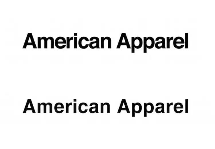
From airlines to technology giants, from multinational corporations to street shops, Helvetica is the most popular first choice< /strong>
A set of fonts can only be tested in social applications Its value, especially when it has become more and more popular in the business field, has driven it to exert its influence step by step from Switzerland, Europe to the United States and the world.
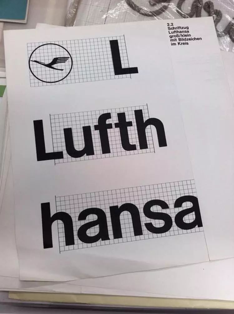
Otl Aicher, one of the most influential designers in Germany in the 20th century, can be regarded as Helvetica Bole. In 1962, he chose Helvetica when designing a new visual identity for Lufthansa with the fifth project team at the Ulm Academy of Design. This is the first time a company has chosen Helvetica as their standard font for business.
includes American Airlines The company, British Airways, and European airlines followed Otl Aicher's example and used Helvetica, perhaps because it seemed safe and reliable, which is precisely the most basic appeal of consumers to airlines.
In addition to the above-mentioned airlines, a large number of multinational companies are enthusiastic about Helvetica, which is equivalent to Transforming a Swiss typeface into a global typeface contributed to its success in global markets.
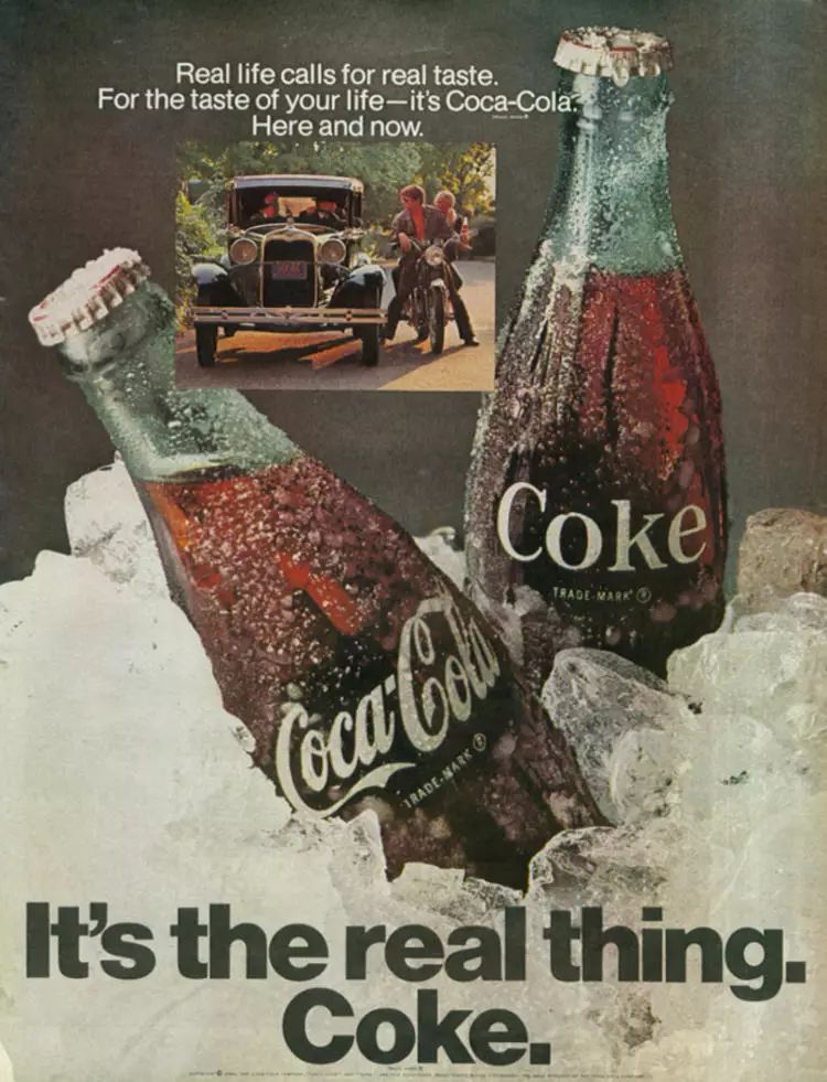
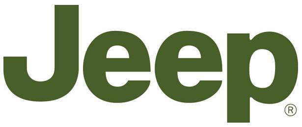
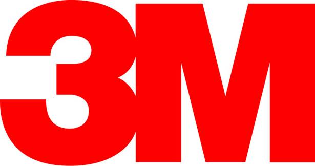
For example, technology giants such as Apple, Microsoft and Intel, automobile industries such as BMW and Toyota Big names, as well as Nestle milk powder, Coca-Cola, BASF, 3M, Motorola, Samsung, Panasonic and other brands familiar to most people, are included in Helvetica's brand list.
These companies value it Its neutral characteristics can be applied to any environment, and it will not conflict with various regional cultures in the globalization system, and it can meet the different external and internal needs of multinational companies at the same time.
But it is worth noting that these multinational companies did not give this favor to Helvetica It can be used in the advertisements of multinational companies, suitable for various high-end brands, and often appears in the promotion of local fast food restaurants, barber shops or barbecue restaurants, and is widely used in the small business market .
After all, no matter in any form of advertisement or brochure, fonts are just As a content carrier, the biggest mission is to convey information and let people read comfortably and naturally. Helvetica is the competent role of "not stealing the show".
Some people compare it to jeans, others compare it to Coca-Cola. But overall, these reviews speak volumes about how popular Helvetica is, and how it embodies democratic and egalitarian values. It presents a versatile appearance that can be applied to anyone and anything. Perhaps the most telling thing is that many companies choose Helvetica as their logo font. The intuitive and clear shape is suitable for various functional symbols. Or combine it with buildings and public facilities.
It is completely unaffected by fashion trends
There are countless smash trends, but Helvetica is one example that can participate in the popular culture of each era.
This is the advantage given to it by neutrality, just like the Dutch modernist design master Wim Crouwel Said: "Neutralism is a word we love. It should not contain any meaning by itself. The meaning should come from the content of the text, not the appearance of the font. This is why we love Helvetica so much."
It is in the global Very popular in the market, it is widely used in image production, typography, posters, advertisements or books, but if you pay attention, you may find that very few people will give Helvetica a "perfect" evaluation.
Yes, it's not perfect, type "I hate Helvetica" on Google and you You'll even see a lot of tirades about Helvetica's negative reviews.
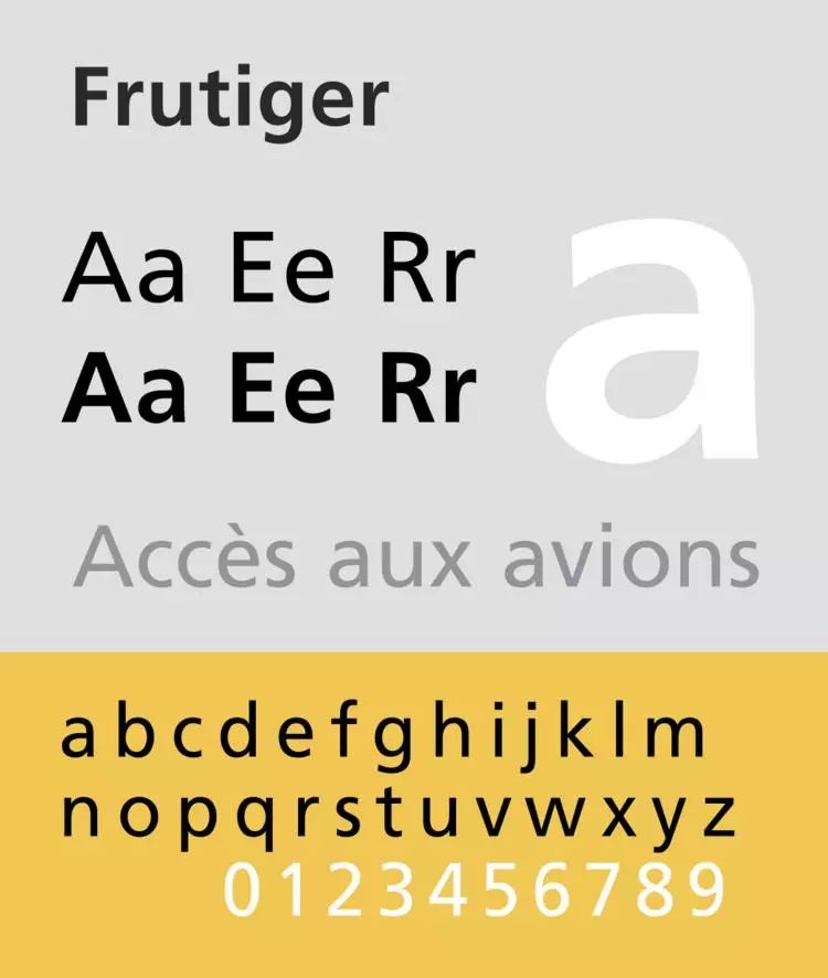
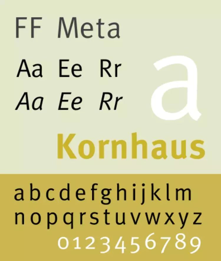
An interesting phenomenon is that in the late 1980s and early 1990s, because it It appears too frequently in public spaces. In order to get rid of this boring, rigid, and uniform routine, many designers have deliberately avoided using Helvetica fonts. It does not look so standardized and serious. Frutiger fonts, Rotis fonts and Meta The body has briefly replaced Helvetica in advertising and official image design. But by the mid-1990s, designers' favor and trust in Helvetica had returned to a more stable level.
For designers, Helvetica is like a very practical tool. Designers have enough freedom to express their ideas. It's designed for everyday use, it's stable, and it represents a sense of the ordinary.
Helvetica was introduced in the mid-1950s, at the end of the metal type era. Perhaps because Helvetica gained a reputation quickly, it survived the subsequent technological revolution in the printing industry, fortunately surviving the advent of phototypesetting in the mid-1960s. Until the electronic typesetting came onto the stage of history in the late 1980s, Helvetica remained extremely active.
From industrialization to business globalization, From the era of metal movable type to the era of electronic typesetting, why Helvetica has been able to maintain its vitality, there is a sentence in a business magazine Graphia published in 1964 that may be the answer: Helvetica's appearance is stable and balanced, which makes it look neither too Trendy, but not too dated, it does everything typographers and graphic designers could ask for in a sans serif typeface.
The U.S. market is the biggest fan of Helvetica. This font started in Switzerland and eventually went global in the U.S.
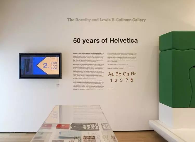
In 2007, the New York Museum of Modern Art (MoMA) held the birth of Helvetica The 50th Anniversary Special Exhibition shows how this typeface has permeated the daily life of Americans.
and Helvetica released in the same year with the same name In the documentary, designer Michael Beirut also described the scene when Helvetica first entered the US market.
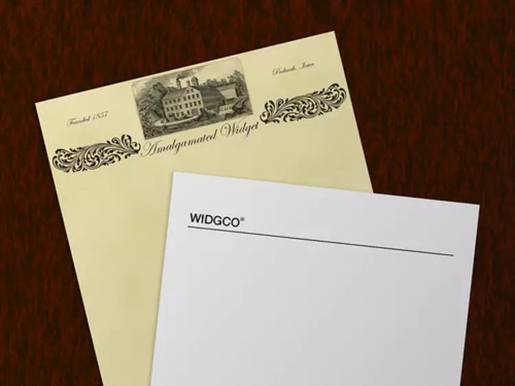
At that time, various media in the United States were full of casual and weird handwritten fonts and colorful Design drawings for line drawing combinations, and suddenly, one company ditched the kitsch fad for plain white, minimal envelopes with just the word Widgco printed in Helvetica font, "Can you imagine how terrific that is?" Is it exhilarating and thrilling? It’s like when you’re crawling through a desert with dirty sand in your mouth and someone gives you a glass of crystal clear ice water, it’s amazing,” says Michael Beirut.
Slowly, this The typeface first became popular among designers in Chicago and MIT, and was gradually adopted by designers in New York. It wasn't until 1969 that the universality of Helvetica was truly recognized by Americans.
Many government departments in the United States have found that Helvetica can convey a reliable security Feeling and trust, began to use it as an official font.
American Airlines, which uses Helvetica font as its logo, has not updated its logo in 50 years.

In New York, Helvetica is the New York Mets The official logotype of the Metropolitan Transportation Authority subway system. The typeface is also used in the subway and mass transit systems of Washington and Boston.
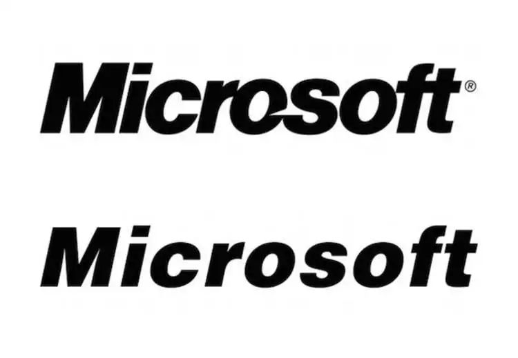
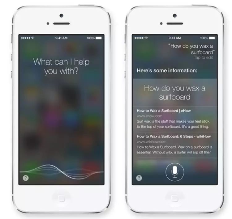
Even in Apple, where Jobs advocated internal teams to design fonts, Helvetica Neue font It has also been Apple's preferred system font on iOS and Mac for many years. With the global sales of iPhone, iPad and Mac, it has become a daily life in people's hands.
such as Apple The promotion of multinational companies has become the best help for Helvetica to expand its market, and with the free ride of business globalization, Helvetica has been able to blossom all over the world.

Title image source: Creative Review


The market value of JD.com is about to catch up with Baidu, 10 pictures tell you the ebb and flow of Chinese Internet companies

Advertisers are blind at Cannes, and 8 of the issues they rave about

The whole world is worried that there will be no good movies in the future. People in the Shanghai Film Festival are also talking about this, but there is no answer
- Pay attention to the Institute of Curiosity, share noble taste with you with temperament -
Articles are uploaded by users and are for non-commercial browsing only. Posted by: Lomu, please indicate the source: https://www.daogebangong.com/en/articles/detail/The%20font%20Helvetica%20turns%2060%20how%20has%20it%20become%20a%20part%20of%20peoples%20everyday%20lives.html
 支付宝扫一扫
评论列表(196条)
测试