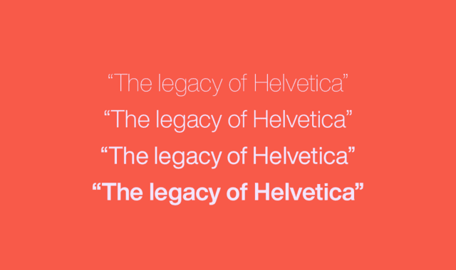
According to The Verge, the widely used Helvetica font has been redesigned and now has a new style "Helvetica Now". In the new font series, nearly 40,000 letters, symbols, codes, etc. in the Helvetica font have been redrawn; in order to adapt to different reading scenarios, more choices are provided in the shape details, thickness, obliqueness and size of the font.

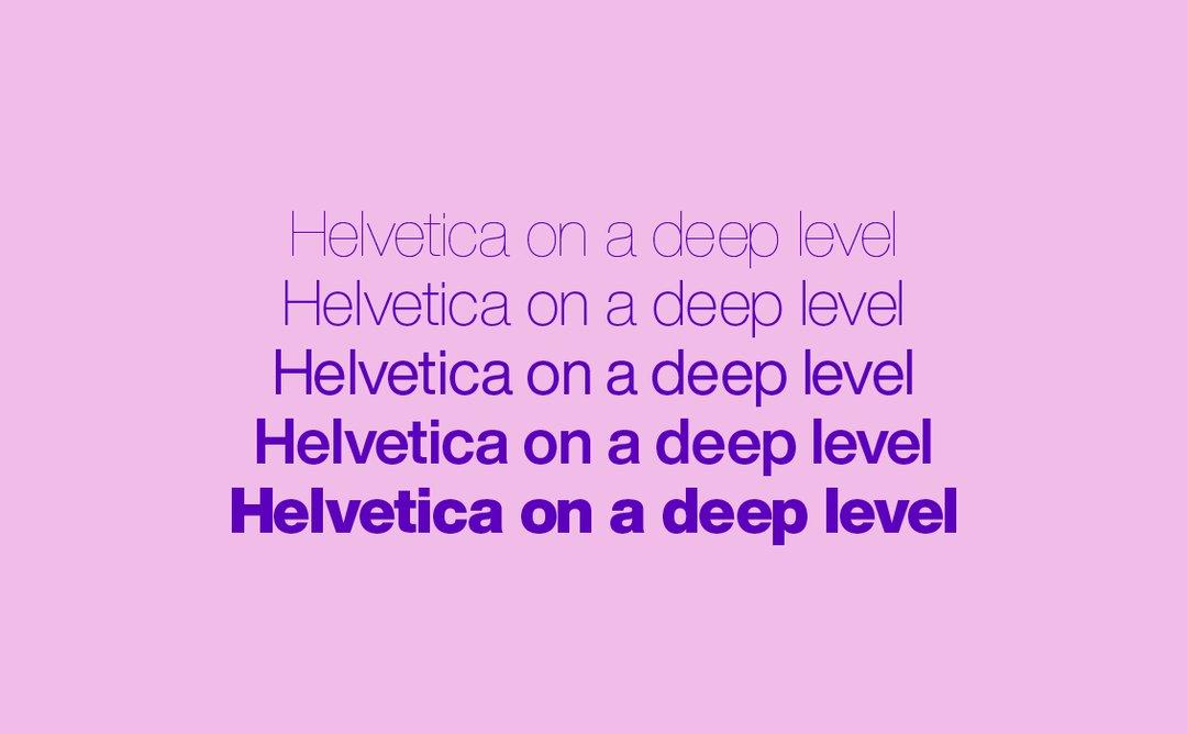
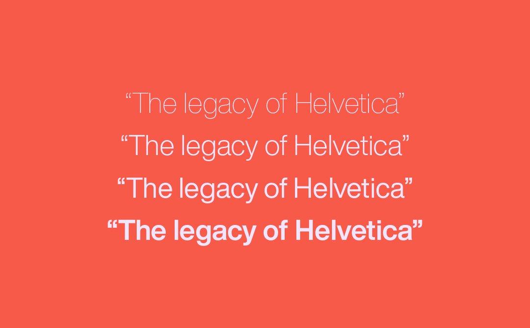
Even if you are not familiar with the name of the Helvetica font, you must have seen it somewhere. It is a sans-serif font used in Latin letters. It was born in 1957. At that time, its mission was to "express all kinds of information and be used everywhere", allowing viewers and readers to focus on the content expressed by the text. "Typefaces are like transparent containers". It looks unadorned, but conveys information simply and quickly.
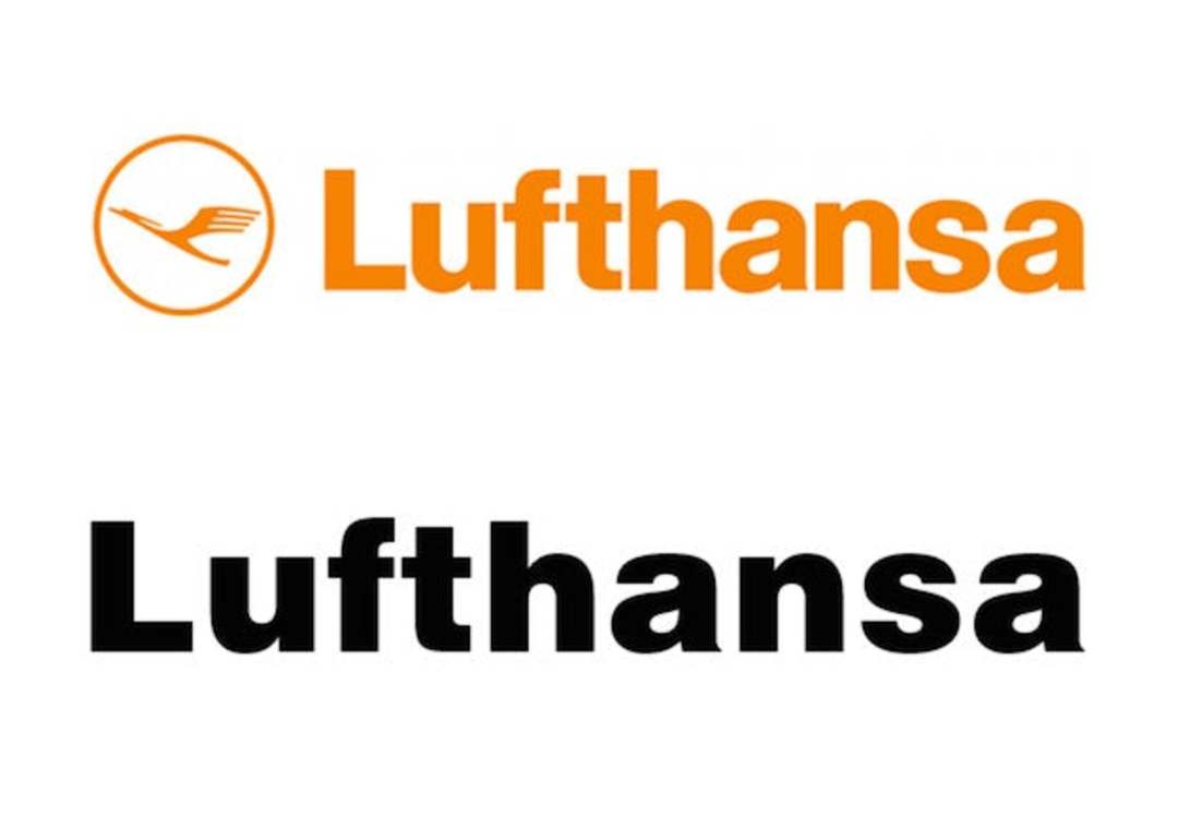
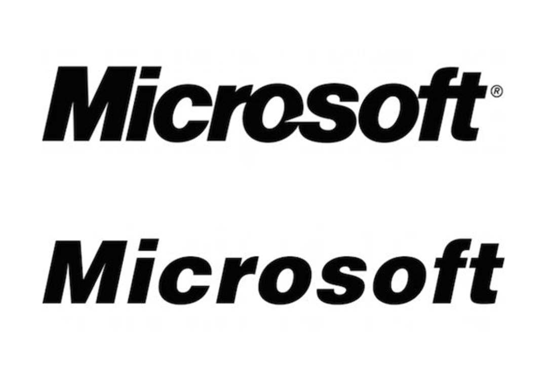
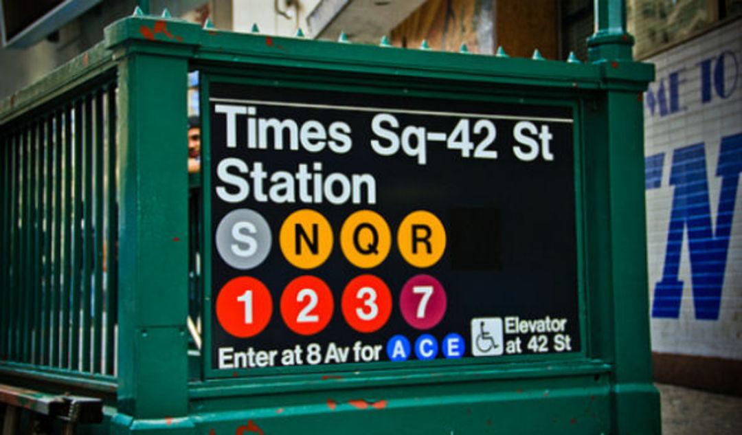
After its birth, it appeared in news headlines, on trademarks, and in public transportation systems. Familiar cases include the logos in the New York subway, as well as the trademarks of MUJI, Microsoft, and Lufthansa; the system default fonts of iOS7 and iOS8 are also Helvetica.
It is a representative of minimalist aesthetics to a certain extent. The New York Times once published an article titled "How Helvetica Is Taking Over the Subway", which tells the story of this font in the New York subway. Helvetica began to be used in the New York subway as a representative of the universal font in the 1960s, because of its easy recognition and easy readability. But the change didn't happen instantaneously, gradually replacing the classicist decoration of the early 20th century and the ill-categorized lettering on the walls of the collage mosaics designed by Squire J. Vickers later.
The change of people's reading habits is one of the most important reasons for the evolution of fonts. The 1957 version of the Helvetica font was redesigned in 1983 with the "Neue Helvetica" font, because the carrier of the font began to expand from metal and images to more digital screens. Changes at the time included options to increase font weights, italicize; adjust heights so they looked the same regardless of weight. These are all to make the text carried by the font more readable.
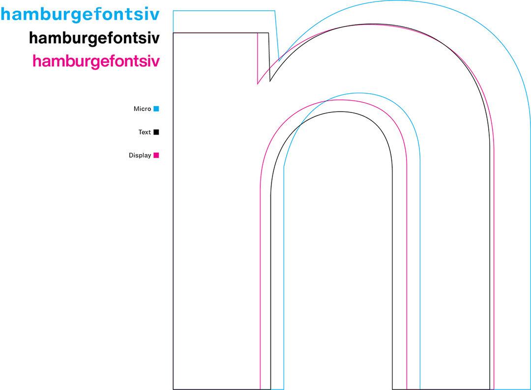
However, looking back now, Neue Helvetica is indeed a bit outdated. In terms of font size, Neue Helvetica only digitized fonts of one optical size at the time. As a result, no matter whether it is the large characters on the billboard or the small characters on the mobile phone screen, the shape is the same, and there is no way to modify the style of the characters for large or small characters. If Neue Helvetica is printed on a cigarette case, the small characters on it will not have thicker strokes and thicker serifs, which may not be so easy to recognize; if it is on a newspaper, Neue Helvetica does not have a slightly thinner version, This can cause newspaper type to look extra heavy, as the ink spreads slightly on the paper.
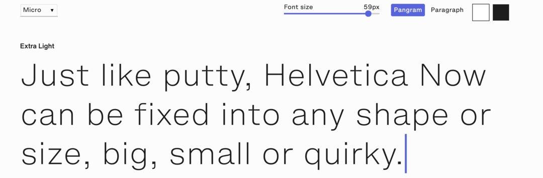
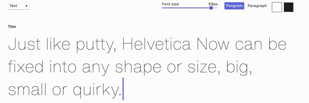
This is why 35 years later, Helvetica fonts still need to be improved. After all, 35 years ago, few people used e-books and mobile phones to read, and the materials and styles of billboards have also undergone major changes. For the problem of optical size, the new Helvetica Now provides options for three sizes, namely "text (text)", "display (Display)" and "micro (Micro)" for smaller sizes. As we expected, the "miniature" letters adapted to be printed on small objects will be thicker, thicker, wider and wider, making it a small print friendly font.
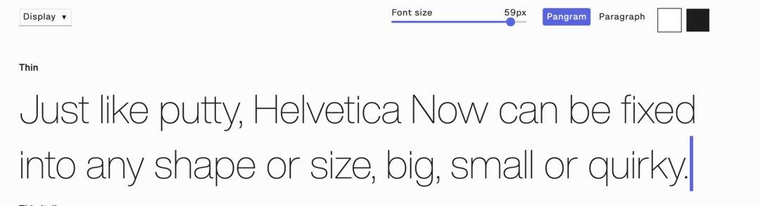
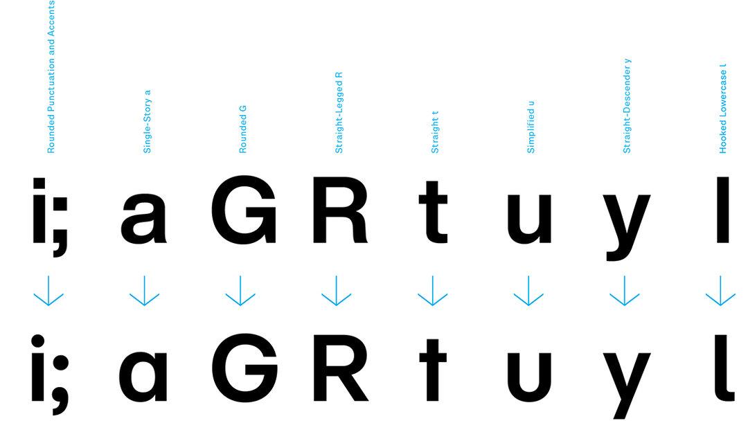
Overall, Helvetica Now wants to give more detailed options to different design environments. In addition to 3 optical sizes, Helvetica Now also includes 48 glyphs, and in order to accommodate them, the corresponding punctuation, symbols, etc. have also been redesigned. The variety of options even eliminates the need for the user to manually adjust spacing and select the appropriate symbol. It seems that in order to continue to realize the original vision of this font "can be used everywhere", there is still a lot to do besides the general style.
The title picture is from it's nice that.
Articles are uploaded by users and are for non-commercial browsing only. Posted by: Lomu, please indicate the source: https://www.daogebangong.com/en/articles/detail/The%20everywhere%20font%20Helvetica%20is%20new%20and%20the%20last%20update%20was%2035%20years%20ago.html
 支付宝扫一扫
评论列表(196条)
测试