
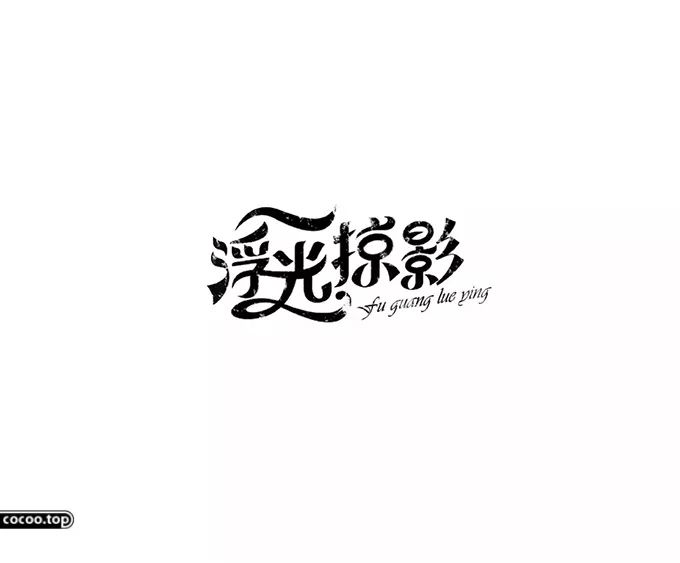
Written by Zheng Xiaoren and Yang Lixuan
Chinese characters are beautiful in shape, ingenious in structure, rich in meaning, and pleasant in pronunciation. The structural beauty of Chinese characters lies in their stability, dignity and elegance. The use of different fonts in the design will bring different psychological feelings to the viewers, and it is also a reflection of the designer's different psychological feelings. Fonts and emotions are integrated, so we need to analyze the emotions revealed in the shape of Chinese characters. Accurately communicate design information. 
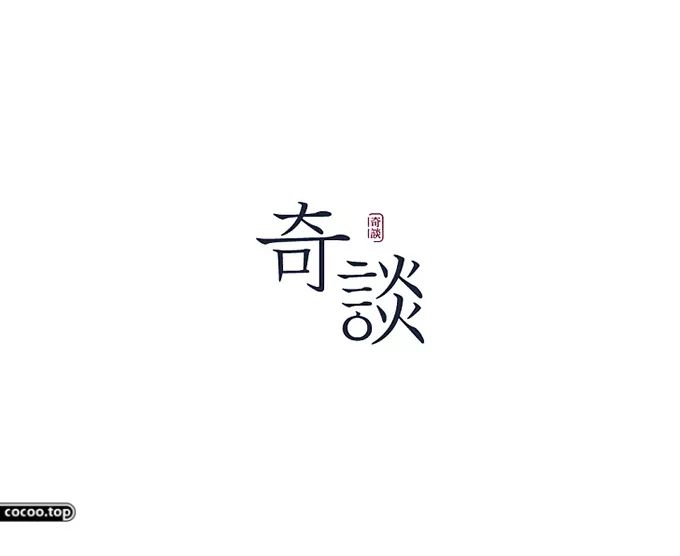
Clerical script, regular script, Song typeface, and black typeface are common in today's visual media manuscripts. Because the fonts are neat, clear, simple and generous, they are suitable for reading, so they often appear in the text of books, newspapers, magazines, etc. , but the emotions of different fonts are always different, which is determined by the structure of the font itself. Precipitated crystals. 
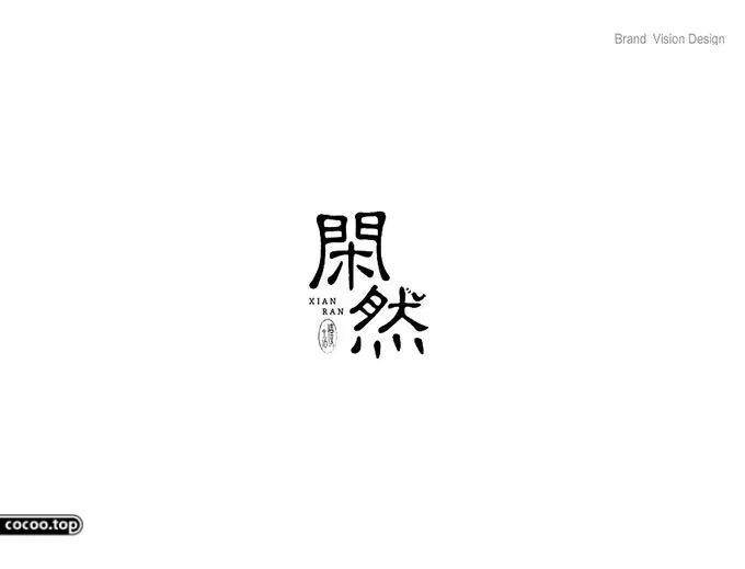
Official script has a gentle and elegant appearance, neat and lively beauty. It is commonly used in product names and explanatory texts in packaging design. This is due to its unique intimacy. The sales ability of the product has been improved, and it has contributed a lot to the sales of the product. The official script, "Silkworm Head and Swallow Tail", has a gentle and strong style of writing, which is a blend of softness and rigidity. It is suitable for conveying the beauty of neutrality in the design, unyielding but not curvaceous, and impartial. This is the inherent temperament revealed in the stroke trend of the font, so the proper use of this font in the design will achieve unexpected emotional fluctuations. 
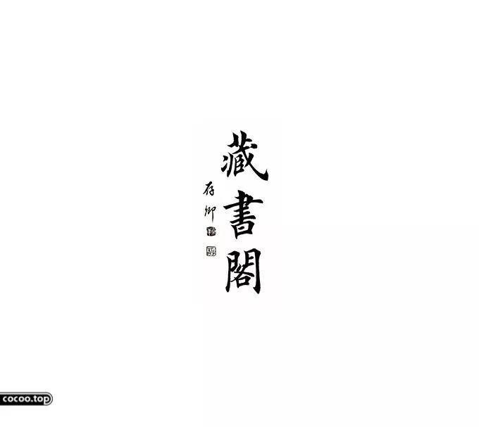
Regular script simplifies the official script, enriches the strokes such as the left and right sides, and has the characteristics of standard shape and rigorous structure, so it is regarded as the standard font of Chinese characters and has been inherited to this day. Regular script pays attention to "low cost" and "variation", and uses the length of strokes of large and small radicals and the randomness of structure to obtain changes. It has the characteristics of orderly and rigorous changes and is easy to recognize. Therefore, regular script also gave birth to printed Chinese characters. Regular script is influenced by traditional Chinese Confucianism, and "gentle and gentle" is the incisive description of it. This is reflected in the subtlety and finesse of regular script, without the heaviness of official script, and the balance between form and content. Recommended reading:Interpretation! The method and practice of font design
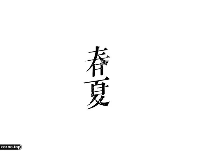
Song typeface is characterized by its square and regular shape, thick vertical strokes and thin horizontal strokes. The modified pen shape feels kind and friendly. The structure of this font pays attention to "taking momentum" and emphasizes the length and contraction of strokes. It is often intended to be "sideways and slanted", showing its charm, rigorous structure, straight strokes, stable center of gravity, echoing points and lines, cohesive strokes, and squareness. Strong, solemn and dignified." This font is widely used, and it is more common in the text of books, newspapers, magazines, etc. It is widely used because of its beautiful font and easy viewing. 
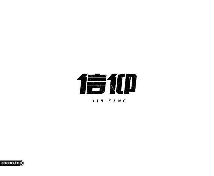
Heiti is influenced by Western sans-serif fonts. This type of font is often found in title columns and modern graphic design. Because of its steady and eye-catching strokes, it highlights the theme and best reflects the international Sense of simplicity and fashion. Judging from its own shape, it has its unique charm: the font is square, horizontal and vertical, and the main strokes are moderately highlighted; "Long right short" tries to break the stable pattern, break through the lower right part or a certain stroke, so as to dilute the sense of stacking. This type of font has a beautiful and clear structure, suitable for layout of many characters, and suitable for long-term viewing. 
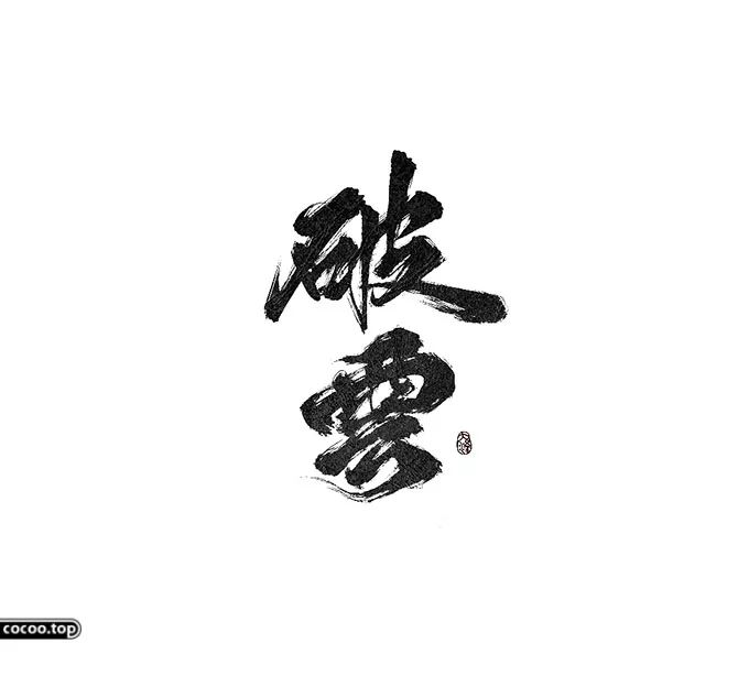
Calligraphy fonts have become a separate system in the branch of modern art, but the application of calligraphy art in design has a unique charm. Calligraphy has different shapes, rich changes, and graceful postures. The stroke lines, component layouts, and overall shapes of various shapes are different. It can be said that the shapes are diverse and beautiful. The stippling and composition of calligraphy can be described as varied, orderly, varied, uneven, and swaying. Every stroke in calligraphy can resonate with the viewer, and every stroke is also the shaping of emotion. The round strokes are full, the square strokes are solemn, the thin strokes are light, the thick strokes are dignified, and the strokes are ecstatic. 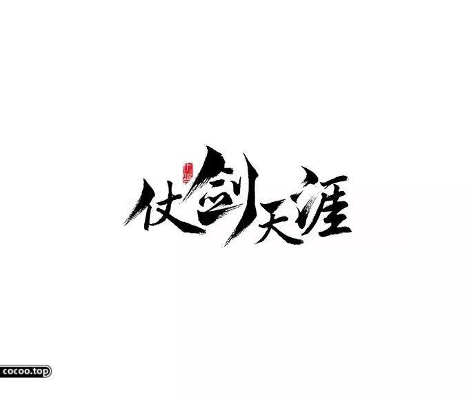
Calligraphy writing is fast and simplified, free and easy, twists and turns, free and flexible. This font is mostly used in packaging design and cultural publicity design, with vivid connotations, showing the noble, elegant and extraordinary feeling of the work. 
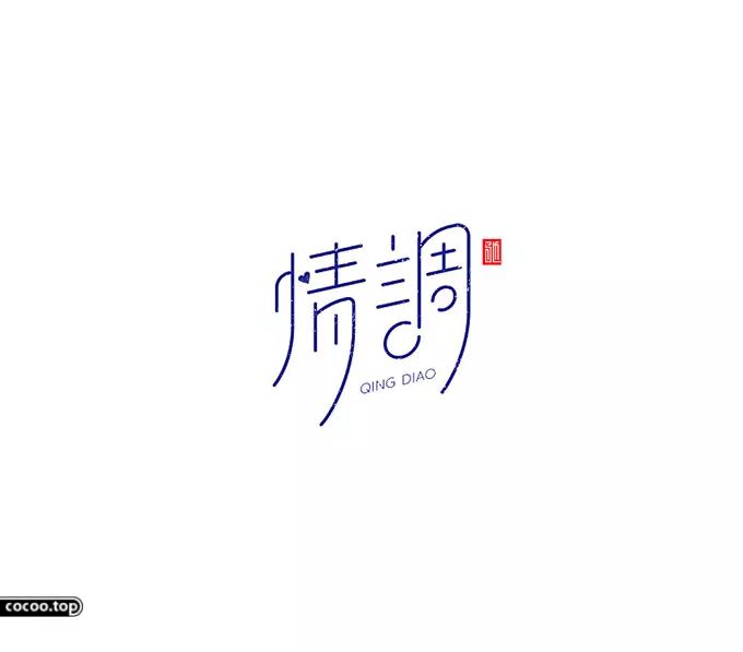
The emotional expression of Chinese characters refers to the emotional color shown when Chinese characters are used as language symbols on the basis of pictographic and ideographic functions to convey text information. 
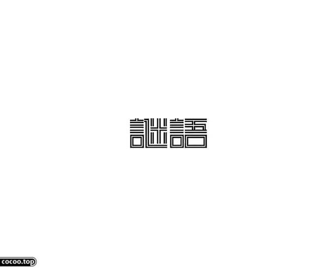
Chinese characters are pictographic and ideographic characters, and modern Chinese characters are abstract and symbolic. The words formed by the combination of characters have complex meanings due to the combination of double meanings, and the combination of Chinese characters is flexible and changeable, the structure is unique, the meaning is conveyed vaguely, and metaphors are used to empathize. 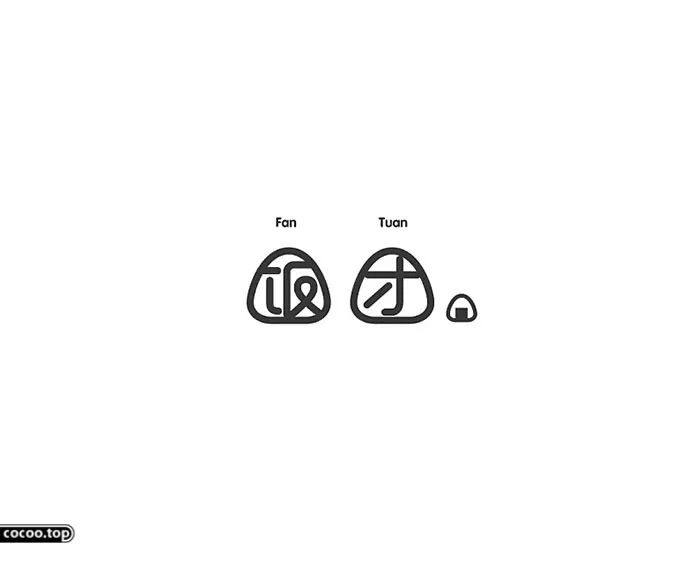
When designing fonts for Chinese characters that directly represent the theme and have specific referents, using the visual image of the text to express the meaning of the font is one of the most important design techniques. This method has many ways of expression, the most direct way of expression is the replacement of specific object images for words or their parts; the combination of related things and words through association is a further form of expression; the characteristics of object images are extracted, combined with the font Deformation conveys conceptual features is the most ingenious way of expression. 
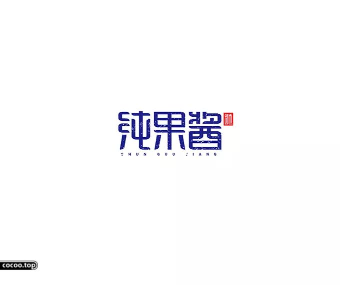
In terms of text modeling, if the embodiment of pictograms is more about shape, then the embodiment of expressiveness is more about spirit. Through the influence of the thickness, straightness, smoothness, point, line, surface, color, texture and other aspects of the strokes, it forms a soothing, steep, restrained, flying, simple, or beautiful visual experience, conveying depression, lightness, and liveliness , publicity and other visual information. 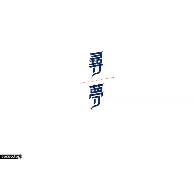
For example: soft and beautiful Chinese characters, elegant, slender, and full of affinity; tough Chinese characters, with obvious visual impact, thick and powerful strokes, clear rhythm, and full of tension; sad font design, with a sense of powerlessness, and The font is restrained. 
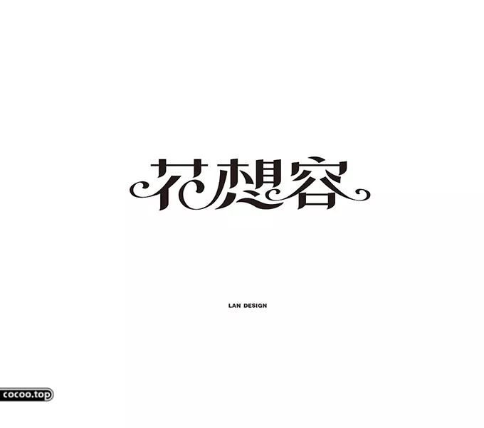
The form of Chinese characters is divided into two types: single-body characters and composite characters. Single-body characters have no radicals, while compound characters are composed of more than two monomers, and the combination forms are rich, which can be divided into upper and lower combinations, upper middle and upper middle. Down combination, left and right combination, left, middle and right combination, full package combination, upper package combination, lower package combination, left package combination, right package combination, half package combination, and point, horizontal, vertical, left, right, lift, hook, Folds are the basic strokes of Chinese characters. 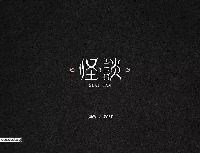
Aiming at the expression of emotions in the design of Chinese character fonts, from the perspective of visual perception, Chinese characters are regarded as graphics for design. While following the basic stroke structure and combination form of Chinese characters, the combination structure should also be deformed according to the needs of the design. Exaggeration, reduction, simplification, displacement, sharing, and replacement; changes in stroke thickness, stretching, shortening, deformation, and sharing will all cause differences in the emotions conveyed by Chinese characters through vision. Consciously changing certain strokes and structural characteristics can achieve the purpose of conveying emotions from a visual perspective. 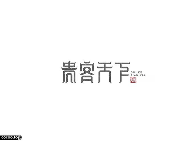
For example, generalize daily-used strokes such as dots, horizontal, vertical, apostrophe, and folded hooks into common geometric figures such as circles, straight lines, curves, squares, and triangles, or their deformed forms. By means of superimposition, merging, breaking and other means, using the difference in force field, volume, space, and light, combined with specific performance requirements, supplemented by corresponding colors and mechanisms, to carry out generalized combination or refined processing. Choose different forms of expression according to the content, themes, emotions and objects embodied in the font design of Chinese characters. In this way, the purpose of conveying the emotion of Chinese characters through visual experience is achieved. Recommended reading: Change and invariance of font design! 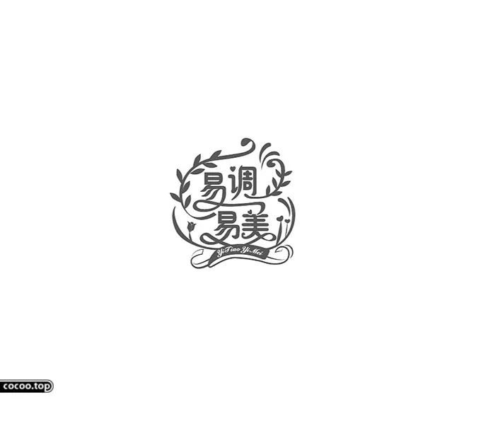
The above expression methods do not appear alone in font design. In the specific design process, a certain method is often the main method. The designer uses other methods as auxiliary intentionally or unintentionally to better Expressive theme. These methods are combined and used alternately to design fonts that are visually more emotionally expressive. 

Articles are uploaded by users and are for non-commercial browsing only. Posted by: Lomu, please indicate the source: https://www.daogebangong.com/en/articles/detail/The%20emotional%20beauty%20of%20typography%20Both%20love%20and%20intention.html

 支付宝扫一扫
评论列表(196条)
测试