The development of Chinese characters is so comprehensive that it is necessary for teaching!
The Chinese nation is a great nation, and the Chinese civilization is also the most unique civilization. Among all the countries in the world, only our Chinese culture has been passed down without interruption, and only our "Chinese characters" are the only writing form in the world that has evolved from ancient times without interruption. From about the 14th century BC, the "Oracle Bone Inscriptions" in the late Yin and Shang Dynasties were considered the first form of "Chinese characters". etc. This is a concrete manifestation of the cultural prosperity of the motherland and an inevitable result of the development of Chinese characters.
development path
Since ancient times, there has been a saying in China that "calligraphy and painting have the same origin". This is because the earliest source of text is pictures. Calligraphy and painting are like brothers, born from the same root, and have many internal connections. The origin of Chinese characters is the original picture, the form of "picture" used by primitive people to express themselves in life. Slowly from the original picture into a kind of "ideogram".
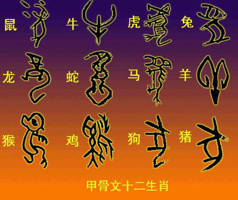
Around the 14th century BC, in the late Yin and Shang Dynasties. "Ideographic symbols" evolved into more stereotyped "Oracle Bone Inscriptions". This is considered the first form of "Chinese characters". The characters carved on the bones of animals and the turtle plates of tortoises, and the characters found in Yin Ruins, are considered to be the direct ancestors of "modern Chinese characters". This can prove the continuity of Chinese civilization. For thousands of years, the Middle East No one can decipher the hieroglyphs of their ancestors. Only modern Chinese can understand some "Oracle Bone Inscriptions" from the Yin and Shang Dynasties. These characters on the tortoise shells were first used for divination. Ancient people believed that some questions about diseases, dreams, hunting, weather, etc. were engraved on the tortoise shells, and then these tortoise shells and animal bones were roasted with fire. , the cracks produced by it, fortune tellers can judge the good or bad of the things they occupy according to the shape and direction of these cracks. This is the ancestor of modern Chinese characters "Oracle Bone Inscriptions". There are more than 5,000 kinds of "Oracle Bone Inscriptions" discovered so far. And there are more than a thousand that can be interpreted.
Western Zhou Dynasty
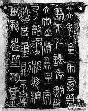
Bronze ware is widely used, and the characters engraved on bronze bells, tripods and stone drums are "golden characters". It is also known as Zhongdingwen and Shiguwen. According to legend, it was created and written by Tai Shi during the reign of King Xuan of Zhou. So far, there are ten stone drums of the Zhou Dynasty in the Palace Museum, on which ten four-character poems are engraved. Because of the feudal separatism, they were fragmented and did their own thing, and the characters were not the same. Until the Qin Dynasty. Qin Shi Huang unified China. To unify the text.
Qin Dynasty
Qin Shihuang unified writing and unified measurement. The one who made the most outstanding achievements was Li Si, the prime minister at that time. After Li Si collected and sorted out the characters at that time, and then deleted and simplified and beautified them, the unified characters were called "Xiaozhuan", also known as "Qinzhuan". The writing at this time has almost no trace of pictographs at all.
The writing of "Xiaozhuan" in the Qin Dynasty was too standardized, and the writing speed was very slow, so many simple fonts appeared among the people. The characteristic of this font is to change the circle of "Xiaozhuan" into a square. The song of "Xiaozhuan" was changed to straight, and some radicals were separated, which were called "Qinli".
Han Dynasty
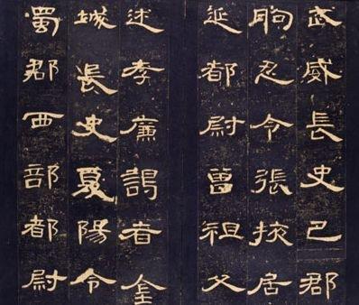
Official script is very popular, "Qin Li" has not completely got rid of the structural characteristics of "Xiaozhuan", it is basically a square shape, while "Han Li" has fully utilized the characteristics of the brush, and the twists and turns of "silkworm head and wild goose tail" appeared. Get up with ease. This official script was popular in the Western Han Dynasty. It is called "Han Li".
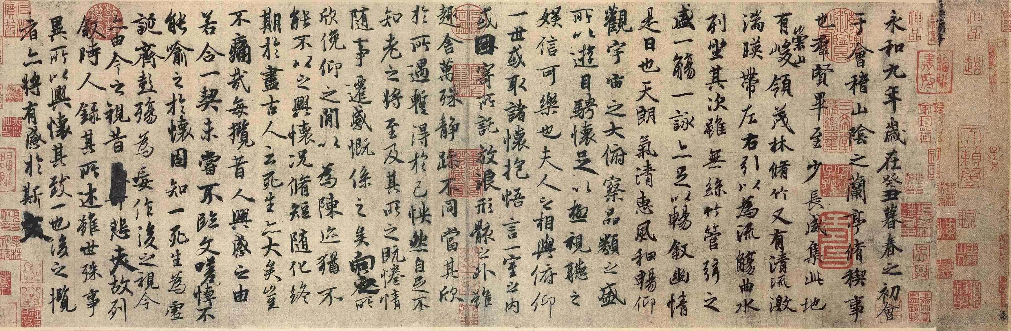
While "Han Li" was popular in the Han Dynasty, "Kingshu" was in its infancy. It was very popular during the Wei, Jin, Southern and Northern Dynasties. Wang Xizhi and Wang Xianzhi in the Jin Dynasty were the real founders of regular script. At the same time, they absorbed the round and round strokes of seal script, and also retained the square and straight of official script, removing the "silkworm head and swallow tail". The structure of Chinese characters is generally fixed. It was called "true script" at that time, and later generations changed it to "regular script" because they used this font as a model for learning calligraphy.
Tang Dynasty
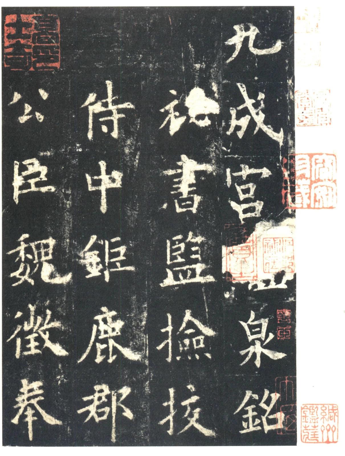
"Regular script" was particularly popular, and calligraphers such as Yan Zhenqing, Liu Gongquan, and Ouyang Xun were all outstanding at that time, and their calligraphy works are still studied by people as examples.
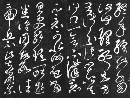
The origin of "cursive script", like running script, or other script styles, cannot be pinpointed when it started. According to historical records: "During the Warring States Period, King Huai of Chu sent Qu Yuan to make a constitutional decree. Before the draft was uploaded, the Shangguan family saw it and wanted to seize it. The ancestor of the cursive script originated from it." According to this, there are words that the cursive script originated from the draft. That is, the cursive script has been formed. Because the font that started from the draft, in order to play the function of sketching, it is relatively omitted and sloppy. Naturally, it cannot be neat and neat, and it is written in a rough manner. But this kind of cursive script can only be said to be the draft of Xituan seal script (the font used at that time). The discovery of real cursive script began in the early Han Dynasty. Grass", and then there are grass styles such as "crazy grass". Due to the neatness of regular script, for the need of fast writing, and for the writer to express his feelings, he put his love on the creation of the pen, resulting in a font that flows smoothly, in one go, and has great rhythm and artistic appeal - "cursive script".
Between regular script and cursive script is "running script". Running script is not as strict as regular script, nor is it unrestrained and unrecognizable as cursive script. It is also the most popular and commonly used font.
Song Dynasty
One of the four great inventions of China, woodblock printing was improved by Bi Sheng into movable type printing, and "Song typeface" was born accordingly. It was first produced in the Northern Song Dynasty, and it came from the change of regular script. There are fat bodies and thin bodies, but no matter whether they are fat or thin, they are all thin horizontally and thick vertically, square and square. It looks simple and dignified.
"Imitation Song Style" is also a font produced by imitating "Song Style". This type of font has only appeared for seven or eighty years, but it has developed very rapidly. It is a standard font that people like to use most, and it has been widely used in printed matter and various occasions.
At the same time, "Hei Ti" was also born. This type of font is eye-catching and generous. The handwriting is all the same thickness. The structure is eye-catching and rigorous. Because of its eye-catching features, it is often used in titles, lead lines, logos and more. Enriched the form of expression of Chinese characters.
new china period
Variety body, block body, floating cloud body, variant and so on appeared. This is a concrete manifestation of the cultural prosperity of the motherland, and it is also the inevitable result of the development of Chinese characters. Chinese characters, also known as Chinese characters, Chinese characters, and national characters, are widely used in the cultural circle of Chinese characters. They belong to the morpheme-syllable characters of ideographic characters. They were invented, created and improved by the Han people in ancient times. The exact history can be traced back to about Oracle bone inscriptions from the Shang Dynasty, 1300 BC. It was not until the Qin Dynasty that Xiaozhuan was developed into the Han Dynasty that it was named "Chinese characters", and it was not until the Tang Dynasty that Kaihua became the standard handwritten font used today - regular script. Chinese characters are the main characters that have been used continuously for the longest time so far. They are also the only characters that have been passed down to the present among the major writing systems in ancient times. Some scholars believe that Chinese characters are one of the key elements that maintain the long-term unity of the north and the south of China. It is the fifth largest invention in China. Chinese characters have been used as the main official script in all dynasties of China.
In addition to the font, there is also a problem of pronunciation. At some point, the pronunciation of characters becomes the only means of expressing the meaning of characters. In addition, there are many homophones in Chinese, which have the same pronunciation but different shapes and meanings. The homonym of Chinese is the ingenious application of these Chinese characters with the same pronunciation but different shapes and meanings, expressing intriguing meanings.
In the past, ordinary people were oppressed and bullied, and felt pain and confrontation, but they dared not speak out directly, so they often wrote many ballads related to current affairs with homonyms of Chinese characters. For example, a popular ballad in the Song Dynasty:
Break the tube, sprinkle vegetables, and it will be a good world on earth.
Killed, cut the vegetables, and ate the lamb in lotus leaves.
The homonym technique was used in the ballad to scold the treacherous officials and thieves Tong Guan, Cai Jing, Gao Qiu, He Zhizhong and others at that time. "Tong" is homophonic to "Tong", "Cai" is homophonic to "Cai", "Lamb" is homophonic to "Gao", and "Lotus" is homophonic to "He". Express feelings that are sworn to death with them.
After the homophony of Chinese characters is used repeatedly, a rhetorical method is formed, which is the homophonic body. It has been used continuously since Ziyege. For example: "Beginning to know a man's heart, two hearts are as one, and the reason is broken, how can we not be a match." This song describes the ups and downs of love. They fell in love with each other, but the situation changed later, just like the straightened silk entered the loom, it was neither a silk nor a bundle. Its "silk" and "si" are homophonic, and "si" is used to imply "si", and "horse" is harmonious with the matching "horse", which means that they cannot be paired. Commonly used in love songs are "Furong" as "Fu Rong", "Lian" as "Pity" or "Lian", "Ou" as "I", "Si" as "Thinking", and "Pear" as "Pear". " is " from ", and "qing" is "feeling" and so on.
Homophony is not only reflected in folk songs, but also widely used in people's daily life and folk life.
For example, among the folks, since happiness is regarded as auspicious and the goal pursued by families or individuals, the word "Fu" will be pasted on the gate every Chinese New Year. Sometimes the word "福" is pasted upside down on purpose to take the mouth color of "Fu has arrived". Here "to" and "down" are homophonic. For another example, fish is the most popular theme in folk New Year paintings. Generally, a chubby doll with a body outside holds a big fish in both hands, and there are lotus ponds and lotus flowers. "Fish" harmonizes with "Yu" (indicating surplus), and "Lotus" harmonizes with "Lian". The theme of this painting is "more than one year after another", which means: I hope that I can live in abundance every year. rich.
The National Social Science Foundation Project "Outline of the History of Chinese Character Development" under the charge of Professor Liu Youxin from the Chinese Department of Southwest Normal University, the final result is the monograph "Outline of the History of Chinese Character Development" published by Encyclopedia of China Publishing House. This achievement consists of the following Some new points of view are worth noting.
1. About the three stages of the development history of Chinese characters
The first stage is the pictograph stage. The characters before the Shang Dynasty should belong to this stage. The second stage is based on pictographs, with phonograms as the main body. The characters from oracle bone inscriptions to the Qin Dynasty belong to this stage. The third stage is the stage of pictophonetic characters with pictophonetic characters as the main body, and some pictophonetic characters and pictophonetic characters are retained. From the Qin and Han Dynasties to modern Chinese characters belong to this stage.
2. Advantages and disadvantages of Chinese characters
Advantages of Chinese characters:
The biggest advantage of Chinese characters is its super-dialect nature. China is a country with a vast territory and complex dialects. It was impossible to standardize the language in ancient times, and even the popularization of Putonghua cannot be completed in a short period of time. But Chinese characters are a written language communication tool that is widely used in the whole country. The language is different, and the words are written with a pen instead of the mouth, but they are exactly the same. If the characters are phoneticized, there will be Cantonese, Hokkien, Shanghai, Beijing, etc., hindering people's exchange of ideas. Another advantage of Chinese characters is its rationality. Writing is a kind of symbol system, which can be divided into two categories: rational writing and irrational writing. The so-called irrationality refers to pure phonetic characters, such as borrowed characters, syllable characters, alphabetic characters, etc., which are purely symbols and have no direct connection with the things to be expressed. The so-called rational characters such as Chinese characters, in addition to expressing the pronunciation of words, are also signs representing the shape of things. For example, the word "water" evolved from the shape of water in the pictograph. It has two functions of form and sound. Another example is the two characters "Wang" and "Yang". "Shui" is used to indicate the category, and "Wang" and "Yang" are used to indicate the pronunciation. They are called phonetic characters, which are the main body of Chinese characters. memory.
Disadvantages of Chinese characters in phonetic representation:
Among the pictographs of Chinese characters, a small part has been used as borrowed characters for a long time, which are phonetic characters in Chinese characters. Since the number of them is not large, and most of them are commonly used characters, we don't need to talk about them. Here, only the phonetic function of pictophonetic characters is discussed. The phonetic symbols of pictophonetic characters are mostly pictographs that can be used alone, and are used as phonetic symbols, which are not as accurate as alphabetic phonetics. Chinese characters have many shortcomings in the phonetic function, but mainly in the following three points: a. The phonetic symbols of pictophonetic characters cannot distinguish the difference of tones, and the same phonetic symbol often indicates different tones. For example, the character "Hu" is a Yangping character, But the word "paste" in "confused" is pronounced Yangping, and the word "paste" in "confused" is pronounced Qusheng. b. The phonetic symbols of pictophonetic characters often lose or weaken their phonetic function due to language changes. For example, "尚" reads the fourth tone of "shang", but "何" and "lie" with "尚" as the phonetic symbol read the third tone of "tang", and "党" pronounces the third tone of "dang". "浪" and "常" read the second sound of "chang", and "昂" read the third sound of "chang". c, the stress phenomenon of Chinese characters that are read more than one word. Such as "ginseng", the first sound of "can" is read in the words "participate" and "visit", the first sound of "shen" is read in the word "ginseng", and the first sound of "shen" is read in the word "uneven". The first sound of "cen" is pronounced in middle, and there are three stresses in total.
3. About the simplification of Chinese characters
Chinese characters are evolved from pictorial characters. If they are painted into their objects, they will have more strokes. From the perspective of the development history of Chinese characters, simplification of strokes has always been an obvious trend in the evolution of Chinese characters. In 1956, a plan to simplify Chinese characters was announced, and in 1964, the scope and number of simplified characters were expanded. This was the first large-scale reform of Chinese characters in more than two thousand years. After more than 40 years of practice, it has played a great role in popularizing education and writing. On the other hand, the simplification of characters is not entirely without controversy. Such as "Deng", "Huan", "Nan", "Tree", "Xi", "Dui" and other characters, the component "you" replaces the phonetic symbols with different sounds such as "Deng", and some cursive regularization The writing method is different from the structure of regular script, and some homophonic substitutions can also be considered. But once the norms of writing are determined, they cannot be changed overnight, nor can they go their own way and let things go their own way. Chinese characters are the carrier of Chinese excellent culture and an important aspect of Chinese culture. Treating Chinese characters should be the same as treating traditional Chinese culture. One is to inherit the tradition without breaking it, and the other is to reform it according to the development law of Chinese characters themselves, so as to make them a better communication tool. Due to the improvement of China's international status and economic development, more and more people are learning Chinese characters. Among the teachers who teach Chinese in various countries, some are from Taiwan, and some are from the mainland. When teaching Chinese characters, there will naturally be two sets of teaching methods, traditional and simplified. Whether or not the two sets of religious laws should be unified, or how to unify them, needs to be discussed and resolved by relevant people, experts and scholars from both sides of the Taiwan Strait and overseas.
4. Regarding Chinese characters, you cannot follow the path of pinyin writing
In 1958, the state announced the Chinese Pinyin program. Its role is as a tool to promote Mandarin, and to phoneticize Chinese characters. There is also the possibility of expanding the scope of application of the phonetic scheme. For example, when an elementary school student encounters a Chinese character that he does not know how to write when writing a composition, he can use pinyin to write the character. The difficult and rare words in books and periodicals can be added with pinyin. When citing foreign names and place names, some people advocate using the pinyin scheme for spelling wait. It can be predicted that this set of programs will survive for a long time like Chinese characters. However, some people once believed that all written symbols of human language should go to the road of phonetic writing, and the writing that does not meet this standard will be regarded as backward writing. This is prejudice with no scientific basis.
5. Questions about the teaching of Chinese characters
It is correct to teach Chinese characters according to the teaching method of Chinese characters. However, the outdated "six books" theory (the six methods of making characters referring to things, pictograms, pictophonetics, understanding, Zhuanzhu, and borrowing) must be reformed. Based on the research of comparative philology, and on the basis of Mr. Tang Lan's theory of "Three Books", this achievement puts forward the "New Three Books" theory of appearance, borrowed sound, and phonetic sound. It includes the reasonable part of "Six Books" and eliminates "Transfer". Pictographs include the three books of "Six Books", which are pictographs, referring to things, and understanding; borrowed phonetic characters are borrowed under the guise of words. The reason for changing the name to borrowed phonetic characters or phonetic characters is because some people think that there is another kind of borrowed characters in the false loan, which is created out of nothing and confuses people's wishes. In Mr. Tang Lan's "Three Books", it is not appropriate to exclude the borrowed characters and forcefully divide the characters created by the superficial method into pictographic and pictographic. The "New Three Books" not only absorbed the research results of the predecessors, but also corrected the deficiencies of the predecessors. Mastering the classification criteria of the "New Three Books" can play a great role in teaching Chinese characters.
Oracle

Oracle bone inscriptions are the earliest and relatively complete script among the ancient scripts discovered in China. Oracle bone inscriptions mainly refer to oracle bone inscriptions in Yin Ruins, also known as "Yin Ruins characters" and "Yin Qi", which are characters carved on tortoise shells and animal bones in the Yin and Shang Dynasties. At the end of the 19th century, the site of the capital of the Yin Dynasty was discovered in Xiaotun, Anyang, Henan. It inherited the method of making characters from pottery inscriptions. It was engraved (or written) on tortoise shells by the royal family in the late Shang Dynasty (14th to 11th centuries BC) for divination. and the writing on the animal bones. After the fall of the Yin and Shang Dynasties and the rise of the Zhou Dynasty, oracle bone inscriptions continued to be used for a period of time.
Gold text
Bronze inscriptions refer to inscriptions cast and engraved on Yin and Zhou bronzes, also called Zhong Dingwen. The Shang and Zhou dynasties were the age of bronze wares. The ritual vessels of bronze wares were represented by tripods, and musical instruments were represented by bells. "Zhong Ding" is synonymous with bronze wares. Bronze is an alloy of copper and tin. China entered the Bronze Age in the Xia Dynasty, and the technology of copper smelting and copper ware manufacturing was very developed. Because copper was also called gold before the Zhou Dynasty, the inscriptions on the bronze wares were called "Jin Wen" or "Auspicious Jin Characters"; ". The age of the application of bronze inscriptions, from the early Shang Dynasty to the Qin Dynasty's destruction of the six kingdoms, is about 1,200 years old. According to Rong Geng's "Jin Wen Bian", the number of characters in the bronze inscriptions is 3,722 in total, of which 2,420 are identifiable characters.
big seal
Dazhuan is a font commonly used in the Western Zhou Dynasty, and it is said that it was created by Boyi of the Xia Dynasty. According to different writing media, there are also bronze scripts (or "Zhong Ding script") and seal scripts.
Xiao Zhuan
Xiaozhuan was implemented after Qin Shihuang unified China (221 BC) and implemented the policy of "books with the same text, cars with the same track" and unified weights and measures. Prime Minister Li Si was in charge. On the basis of the original seal script used by the Qin State, it was simplified and canceled. The variant characters of the other six countries created a unified writing form of Chinese characters. It was popular in China until the end of the Western Han Dynasty (about 8 AD), when it was gradually replaced by Lishu. But because of its beautiful font, it has always been favored by calligraphers. And because of its complex strokes, strange and ancient forms, and the possibility to add twists and turns at will, seal engraving, especially official seals that require anti-counterfeiting, has been using seal script until the fall of the feudal dynasty and the emergence of new anti-counterfeiting technology in modern times.
official script
Lishu, also known as Han Li, is a solemn font commonly used in Chinese characters. Its writing effect is slightly wide and flat. It is long horizontally and short vertically. The official script originated in the Qin Dynasty and was formed by Cheng Miao. It reached its peak in the Eastern Han Dynasty, and it is known as "Han Li Tang Kai" in the calligraphy circle.
Cursive
A calligraphy style of Chinese characters, characterized by simple structure and continuous strokes. Formed in the Han Dynasty, it evolved on the basis of official script for the convenience of writing. There are Zhangcao, Jincao and Kuangcao.
regular script
Regular script, also known as Zhengkai, Kaiti, Zhengshu or Zhenshu, is a common font in Chinese calligraphy. Its font is relatively square, unlike the flat shape of official script. Regular script is still the reference standard of modern Chinese handwriting, and another handwriting style-pen calligraphy has also been developed.
running script
Running script was created on the basis of regular script, a typeface between regular script and cursive script, and was created to make up for the slow writing speed of regular script and the difficulty in identifying cursive script. "Xing" means "walking", so it is not as sloppy as cursive script, nor as correct as regular script. In essence, it is the cursive of regular script or the regularization of cursive script. Those with more regular script than regular script are called "Xing Kai", and those with more cursive script than regular script are called "Xing Cao".
Song Dynasty
Song Ti, is a Chinese printing font invented in the Song Dynasty of China. The strokes vary in thickness, and are generally thinner and thicker vertically, with decorative parts at the end (that is, "foot" or "serif"). The strokes of dots, skimming, pressing, and hooks have sharp points, which belong to white body, and are often used in books, Text typesetting for magazine and newspaper printing. Because it was introduced to Japan from the Ming Dynasty, it is also called Ming style and Ming Dynasty style.
Imitation Song
A type of printed font, modeled after the fonts engraved on Song edition books, with uniform strokes and three styles: long, square, and flat. Also called imitation Song style, imitation Song characters. This involves another typeface——Arial. What are the characteristics of Song Dynasty? Horizontal flat and vertical, horizontal strokes are thin and vertical strokes are thick, and the endpoints of each stroke are also thick. These are not the characteristics of the handwriting of You? Chuanbi.
Note: Why does Arial have these characteristics? Of course it is because of printing needs. In the Song Dynasty, when woodblock printing flourished, woodblocks were mostly used for engraving and plate making, that is to say, rectangular wooden boards were used for engraving and plate making. There are grains on the wooden boards, and the plate making is generally horizontal, so that the horizontal lines of engraved characters are consistent with the wood grain and are relatively strong; while the vertical lines of engraved characters cross the wood grain and are easy to break. Therefore, the vertical lines of the font are thicker and the horizontal lines are thinner. Horizontal lines, even though they are stronger, tend to fray at the ends, so they are thicker at the ends. Horizontal and vertical, of course, it is engraved for the convenience of the knife craftsman who engraves the plate. Engraving plate-making is a very laborious work. If you want to express the characteristics of handwriting, the lettering must be much larger than the horizontal and vertical. You can know this by doing a simple experiment. Entering or pasting a Chinese character in the Windows Notepad , set the fonts to Song 9 and Kai 9 respectively, and see which one is easier to read. Due to the grain of the wood, it is also more difficult to carve changing curves. Moreover, only two pages can be printed on each board, and many boards must be carved for a book. If the characters are engraved too large, not only will the carving work take a lot of work, but also more wood boards will be used, so the characters carved on the wood boards will not be too large. As you can imagine, it is difficult to show the varied, round and delicate characteristics of handwriting on such a small reverse lettering. Of course, horizontal and vertical are the best choices. It can be seen from the above that all these characteristics of Song typeface are produced by printing, which adapt to the needs of printing, and are quite different from handwriting with brush.
Later, people imitated the structure and brushwork of Song typeface, and changed it into a printed font with uniform stroke thickness, beautiful and long, which is imitation Song typeface.
black body
Black typeface, also known as square type or isoline type, has no serif decoration, dignified font shape, horizontal and vertical strokes, and all handwritings are of the same thickness. The black body of Chinese characters was created based on the black body in Western sans serif after modern printing was introduced to the East. Due to the large number of strokes in Chinese characters and the poor clarity of small fonts, it was mainly used for article titles at first. However, with the improvement of character making technology, there are many bold fonts suitable for text. In Chinese, fonts without serifs are usually called HeiTi, and the category of this word is similar to sans-serif fonts. Therefore, "Hei Ti" is often used in Chinese fonts, and the name "sans-serif" is often used in Western texts. The Song typeface can be called a serif font. "Black body" is called Goshikku-tai (literally translated as "滒特体") in Japanese.
variety show
Variety style is a variant of black body and a type of artistic word. The characteristic is that the strokes are thicker and try to fill the space. At the same time, for the sake of aesthetics, the treatment of corners is more rounded. Founder, Microsoft and other major fonts have been developed, and are often used in the titles of advertisements and newspapers. Variety is a commonly used art font, (HeiTi, SongTi, Variety, KaiTi, etc.).
colorful cloud body
Caiyunti is an artistic font. The feature is surrounded by smooth curves, the strokes are hollow, like clouds. Originally developed by SinoType, Changzhou, China, and distributed with the Simplified Chinese version of Microsoft Office under the name "SinoType". Later, other fonts were also developed, and are now often used for eye-catching titles.
Chinese New Wei
The Chinese New Wei style is majestic and generous, solemn and beautiful, full of momentum, and full of strong artistic atmosphere at the same time. Chinese Xinwei style is used by many media, institutions and websites as a trademark or logo or as a note in pictures. The Chinese New Wei Style integrates fonts and beauty, showing the high degree of unity of art and culture.
amber body
The font is round and full, novel and lively, the structure is scattered and orderly, thick but not heavy, fat but not bloated, suitable for titles and advertising decorations of books, newspapers, magazines and various printed materials.
Chinese fine black
SinoType is a TrueType computer font produced and copyrighted by China Changzhou SinoType Printing Technology Co., Ltd. (SinoType). The name displayed in an environment without Chinese is STHeitiLight or STXihei, which belongs to one of the Chinese black body series fonts. In terms of design, it belongs to bold or sans serif.
Yao body
Yao style is a Chinese calligraphy style created by Yao Zhutian, former director of the Juzhen Department of Zhonghua Book Company, and it was used by Yao Zhutian when making movable type copper molds and other utensils. Yao Ti is similar to Song Ti, but thinner and longer. The standardized Yao font has been collected by Fangzheng, Jinqiao and other major computer fonts and used for printing.
Shu body
The Shu style is elegant and round, with a bow and a horse, steep and majestic, unrestrained and free, suddenly like a strong man like a cow, with muscles and bones emerging. Learning from the ancients without following the ancients, respecting the law and seeking new changes, this has formed "Shu Ti", also known as "seven and a half books", that is, Kai, Xing, Cao, Li, and Zhuan each take one point, and Yan and Liu each take one point. points, He Shaoji takes half points.
Microsoft Yahei
Microsoft Yahei is a font that fully supports ClearType technology and is designed by China Peking University Founder Electronics Co., Ltd. entrusted by Microsoft Corporation of the United States. Monotype is responsible for font Hinting. It belongs to the OpenType type, the file name is MSYH.TTF, and the font design belongs to sans serif and bold. The font costs around $100 per character. The font family also includes "Microsoft Yahei Bold" (bold), and the file name is MSYHBD.TTF. This bold font is not simply to thicken ordinary characters, but to deal with specific strokes separately, so it is an independent font. Microsoft Yahei is released together with the Simplified Chinese version of Windows Vista and is the default font of Windows Vista. In addition, the Simplified Chinese version of Microsoft Office 2007 also comes with this font.
Young round body
Youyuan, called Youyuan for short, is a variant of the round body. Since the round body is a variant of the black body, the young round body is also derived from the black body.
Articles are uploaded by users and are for non-commercial browsing only. Posted by: Lomu, please indicate the source: https://www.daogebangong.com/en/articles/detail/The%20development%20of%20Chinese%20characters%20is%20so%20complete%20that%20it%20is%20a%20must%20for%20teaching.html
 支付宝扫一扫
评论列表(196条)
测试