It’s lunch time, Fanshi Jun is here to report! First of all, I wish you all a happy Mooncake Festival~

On the eve of the traditional festive season, let's talk about the importance of Chinese font design for catering brands. We all know that Chinese fonts are a must-have visual element for any restaurant in our country, from small signboards in the streets and alleys to the names of top restaurants, all must have Chinese font designs.
So how does Chinese font design play a role in catering brands? The most straightforward function is to tell you the existence of the restaurant, for example:
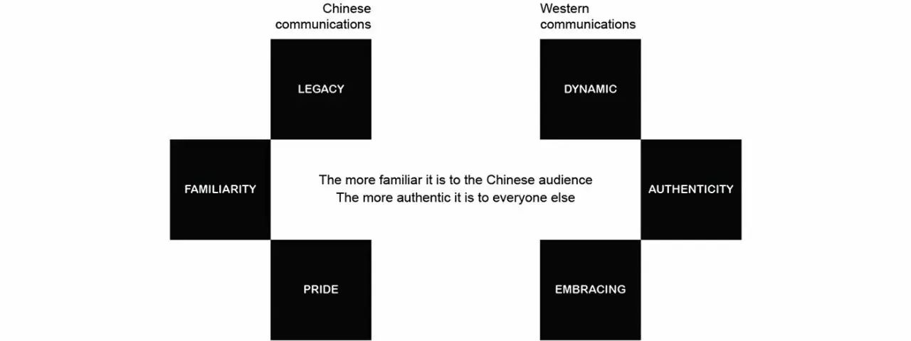
Is it hot eyes? That's right! Not to mention the level of color matching, the rough use of fonts is enough to blind the eyes, so! The more exquisite the font design, the higher the visual comfort. Next, let’s appreciate a few good Chinese character cases of catering brands. Of course, there are also places worth complaining about. Let’s take a look:
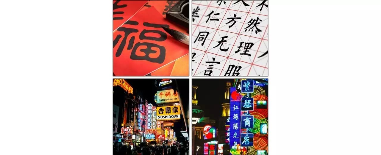
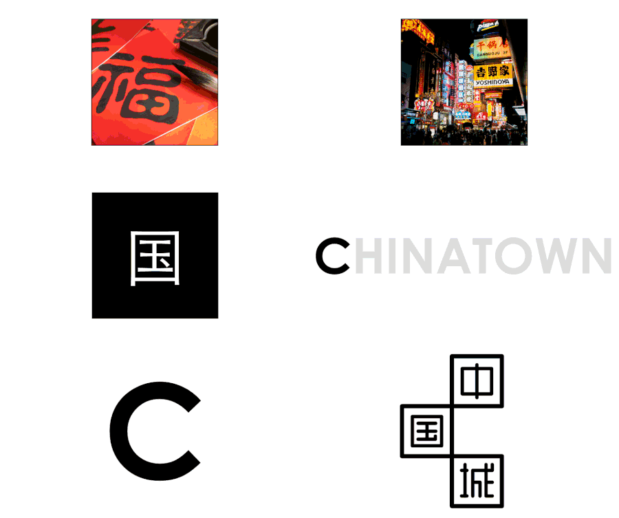
This is the brand image design of a Chinese gourmet restaurant in New York. From the perspective of the level of element integration, it is indeed quite Chinese, and the font can also appreciate the ingenuity of the design. /span>
The part that really involves Chinese fonts is still a little rusty:
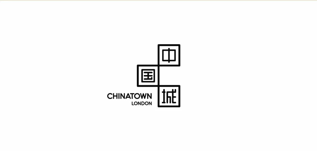
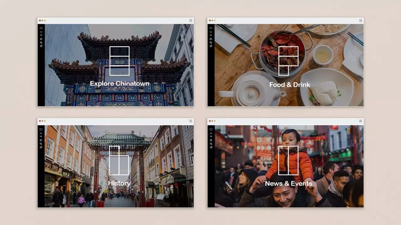
Founderization of graphics and fonts is just like a general understanding of Chinese culture by Chinese Americans:
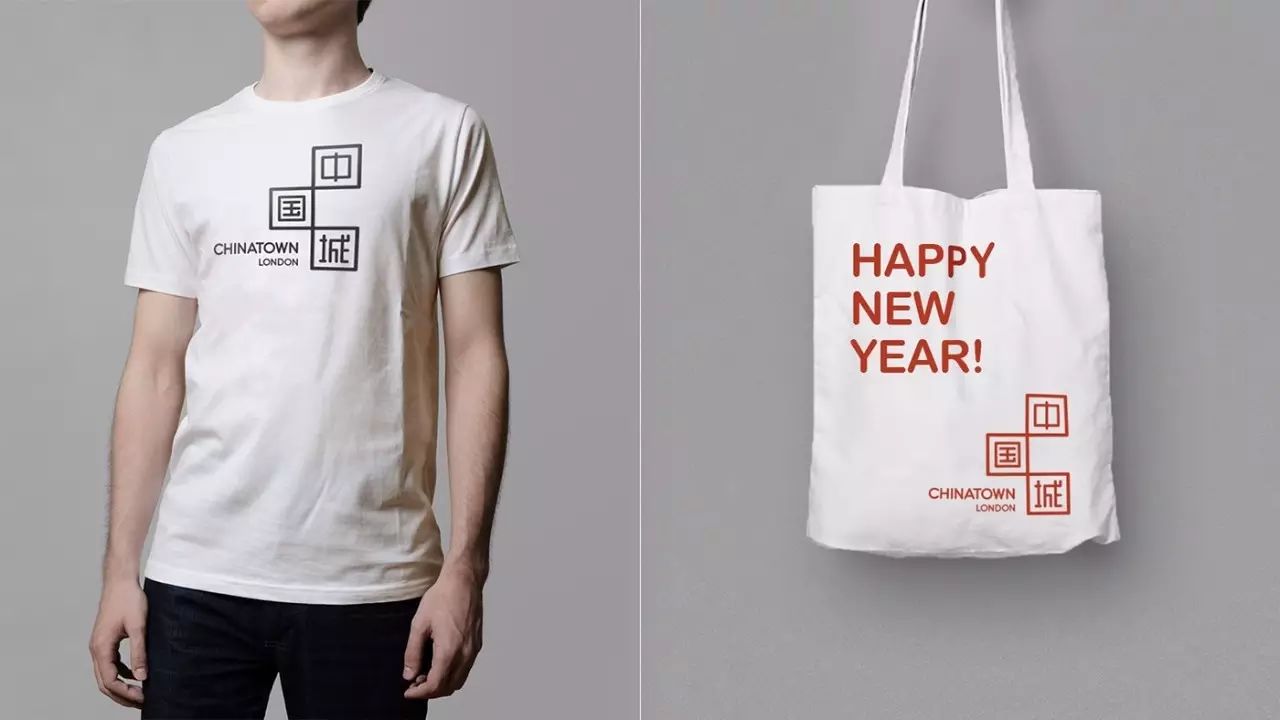

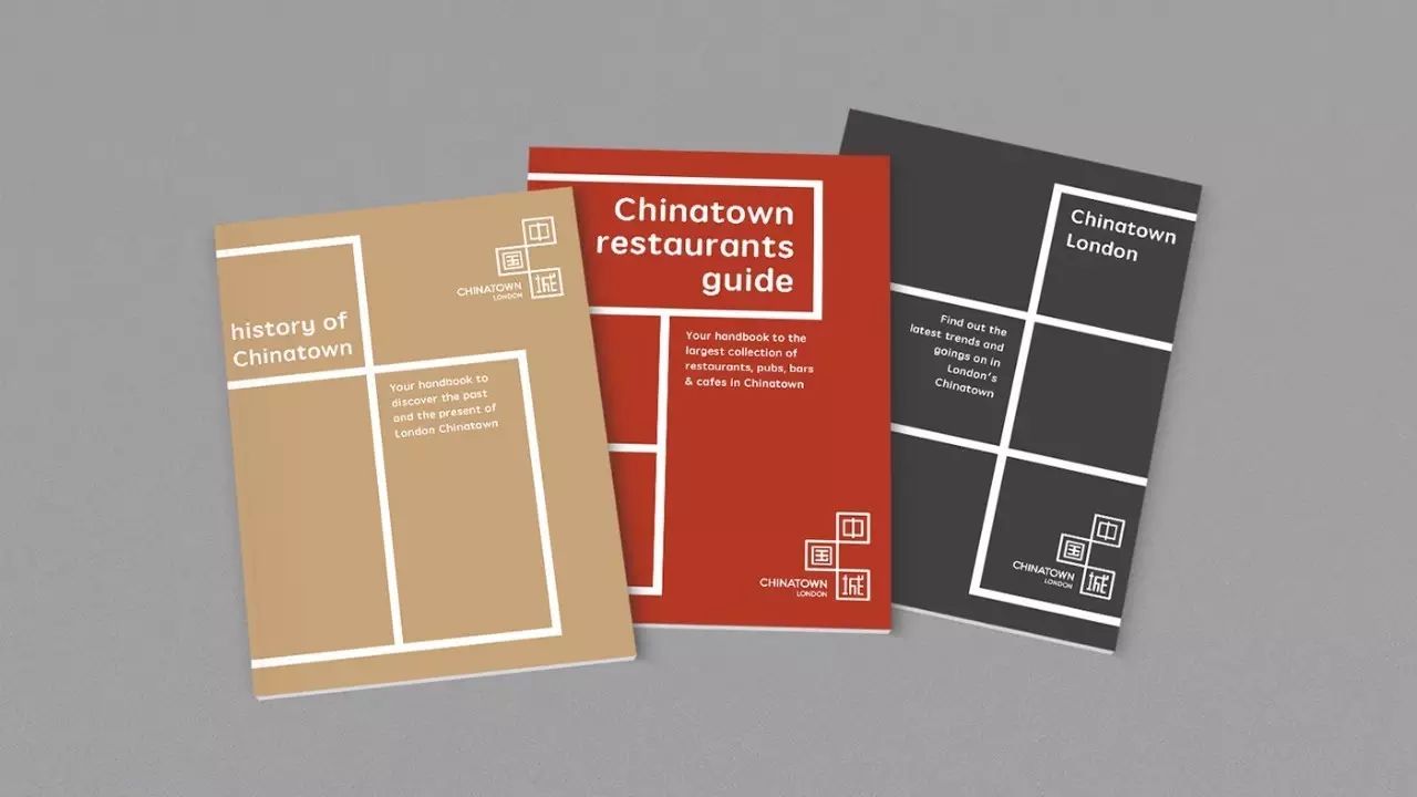
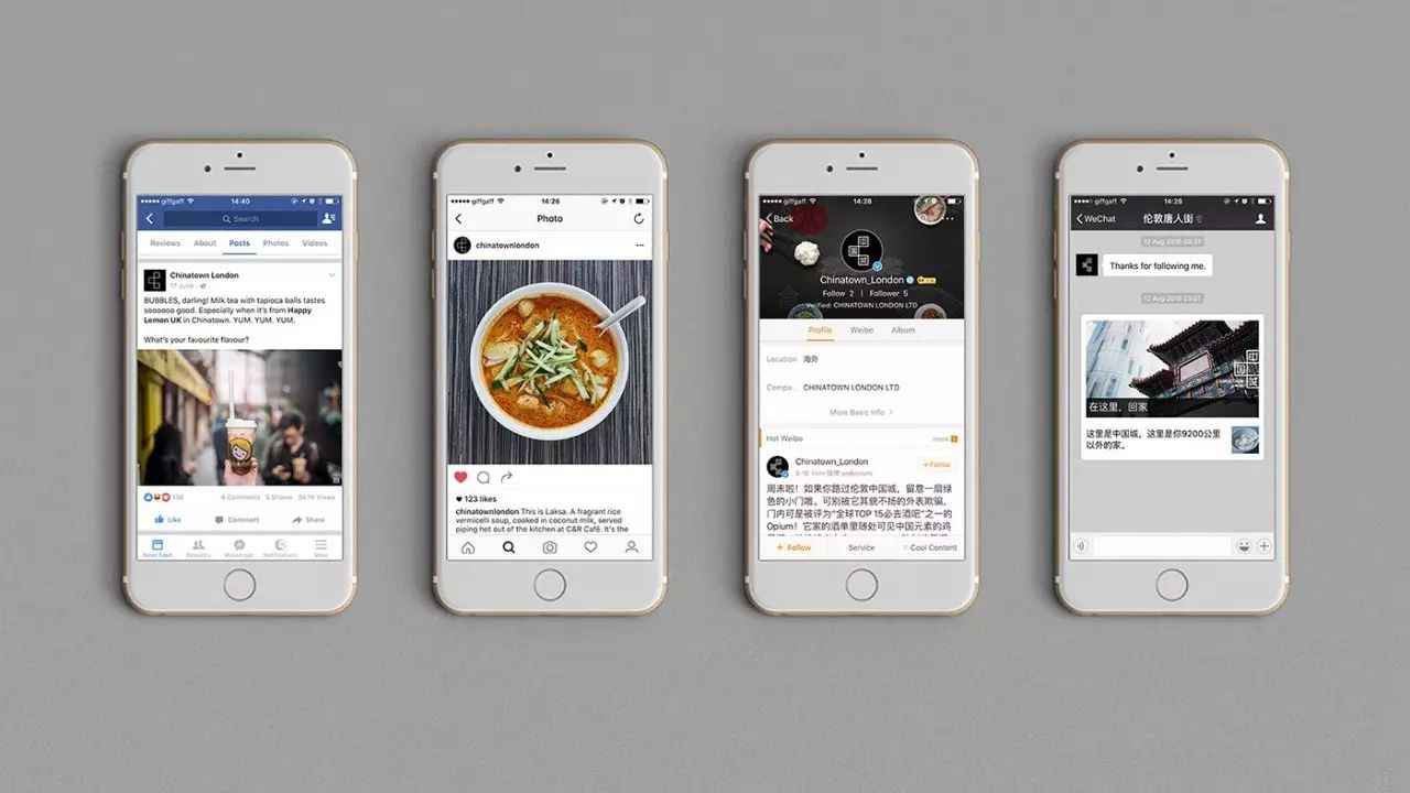


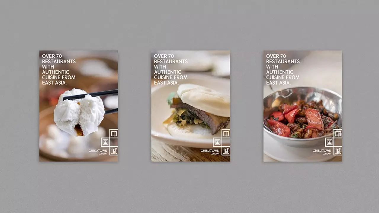
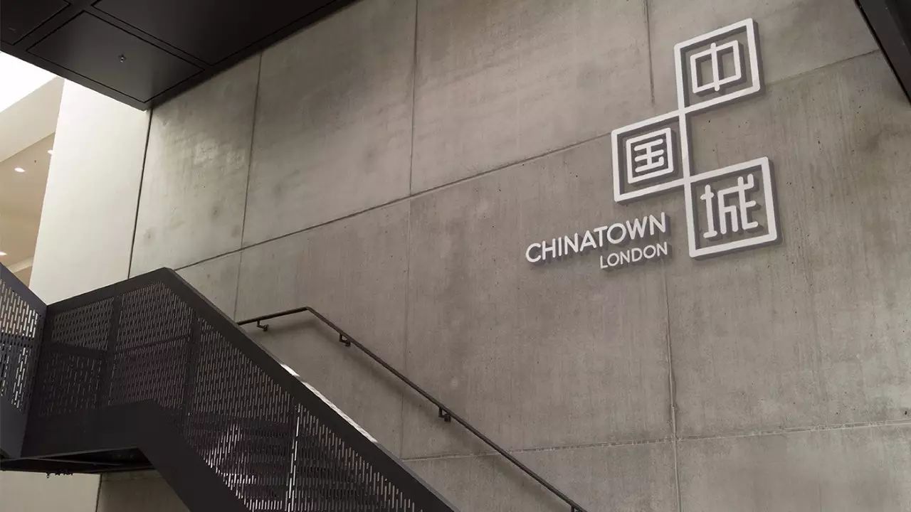

Although there is still room for improvement in the flexible use of font design, but in terms of overall image production, it is already a superior work!
Next, the brand image of the Yuhuating Catering Club is designed by a Chinese designer from Singapore. Let’s look at its font design first, using the calligraphy font design method to improve the flexibility and attractiveness of the brand’s Chinese font Sex:


It is a little regrettable that the font design on the menu is relatively sloppy, which cannot fully reflect the high-end Chinese positioning of the restaurant.
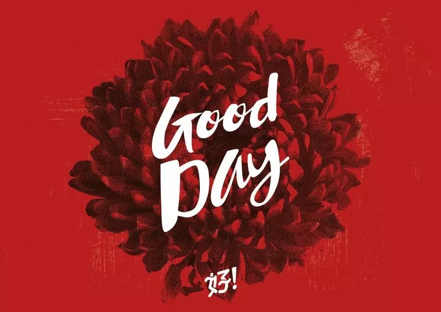
The following is a design case of a restaurant brand that tends to be younger. We can smell the sense of fashion from the intuitive color matching and rounded font design, but from the perspective of the balance between Chinese and Western, the concept of Chinese restaurant has already Very weakened, of course, it is still a brilliant case overall:
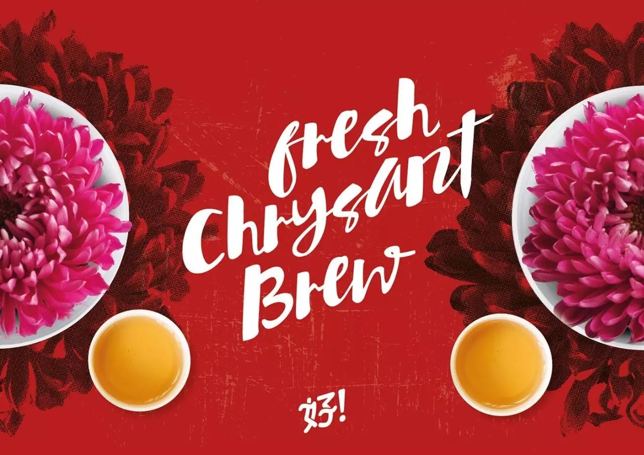
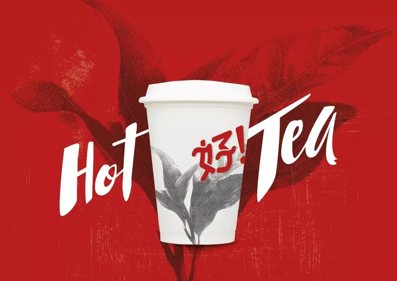
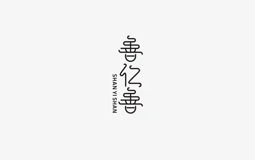
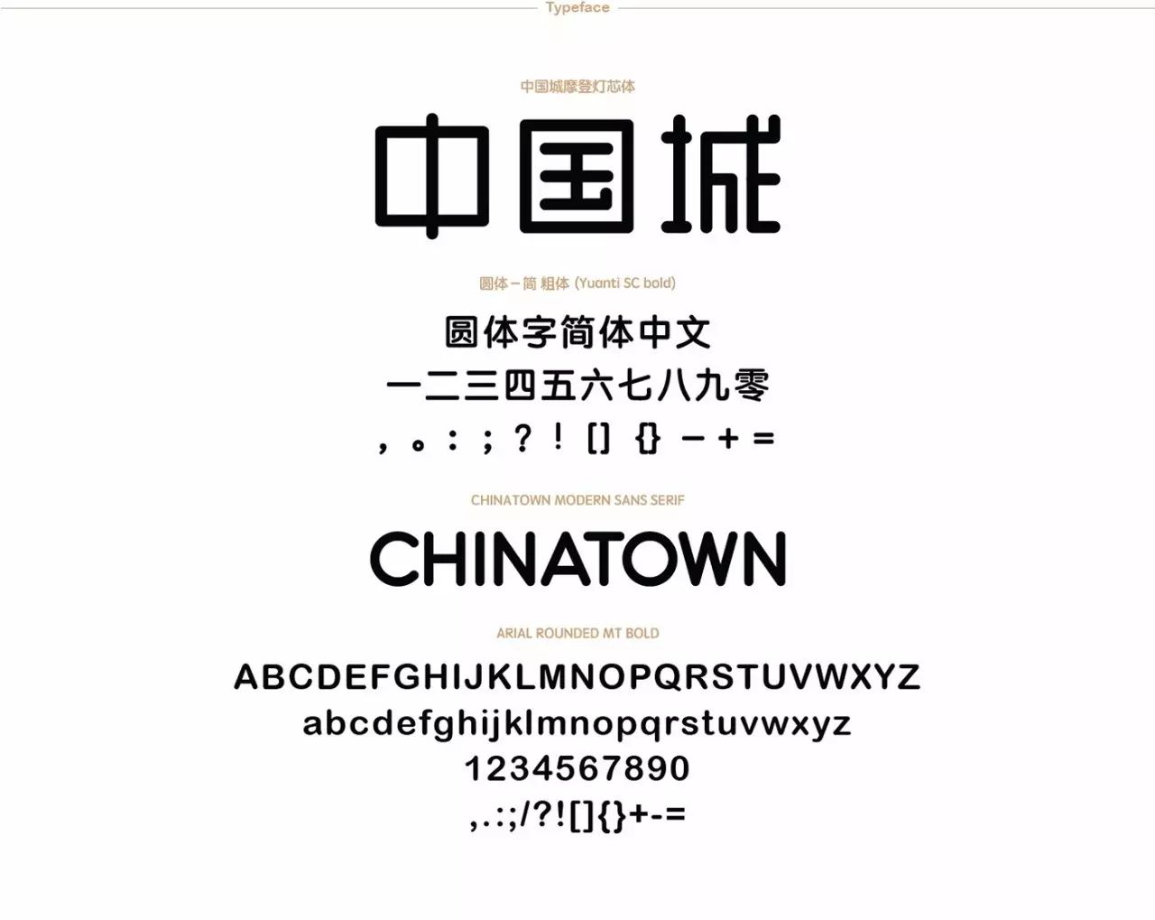
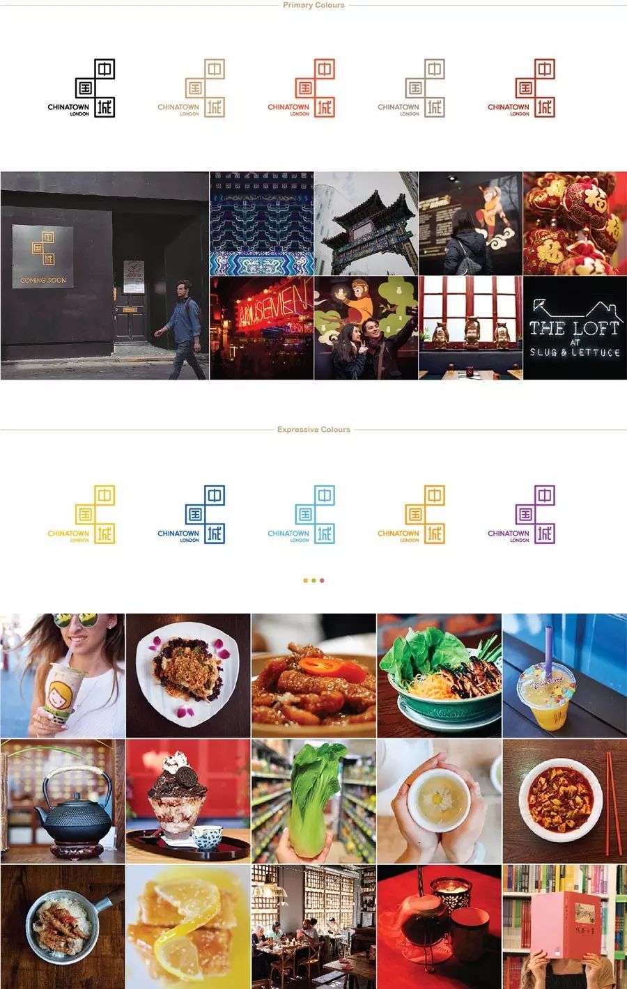
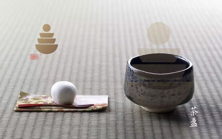
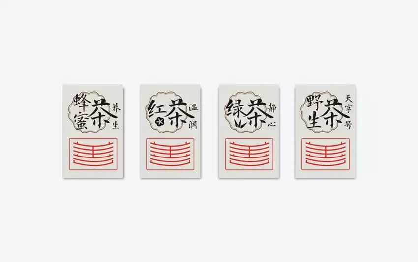
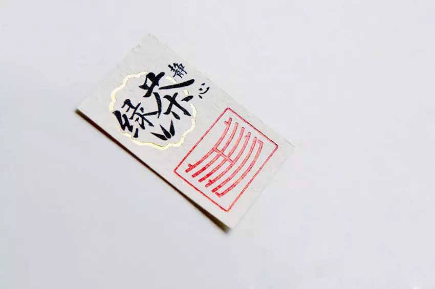
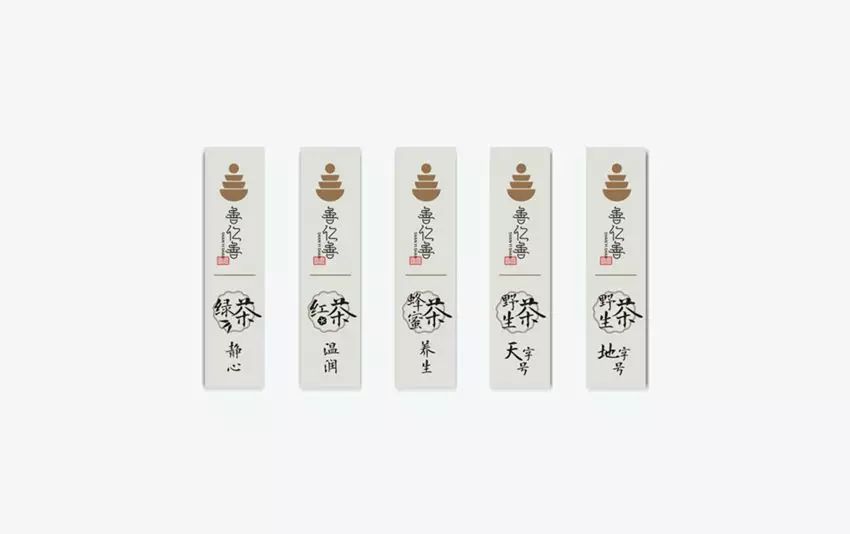
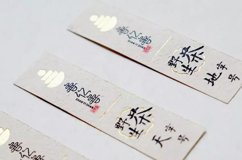
The finale case is the brand image design of a local teahouse. Their Chinese character LOGO is a special sample designed after refining Chinese imagery elements:


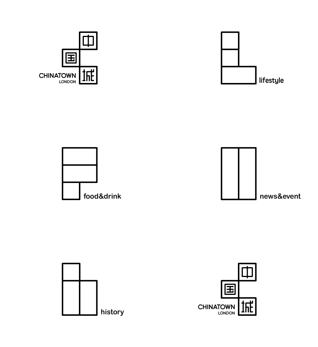
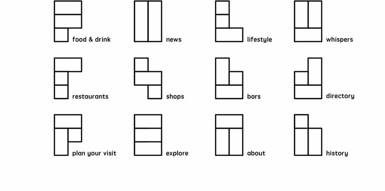
Local designers pay special attention to the combination of words and shapes, so the details of font design can also reveal a contextual relevance:





Okay, this is the end of today's meal review (what the hell), see you on the Mid-Autumn Festival!
Picture Chen Song Design
Original editor of Catering Vision Lab (ID:cysjstudio)
Please specify the source for reprinting, thank you
Director WeChat: jdviper
Articles are uploaded by users and are for non-commercial browsing only. Posted by: Lomu, please indicate the source: https://www.daogebangong.com/en/articles/detail/The%20design%20of%20Chinese%20fonts%20is%20the%20key%20for%20Chinese%20catering%20brands%20to%20have%20a%20cultural%20flavor.html

 支付宝扫一扫
评论列表(196条)
测试