Article: Yansen Lab: Do you really know how to use artistic fonts?
From the official account: study set


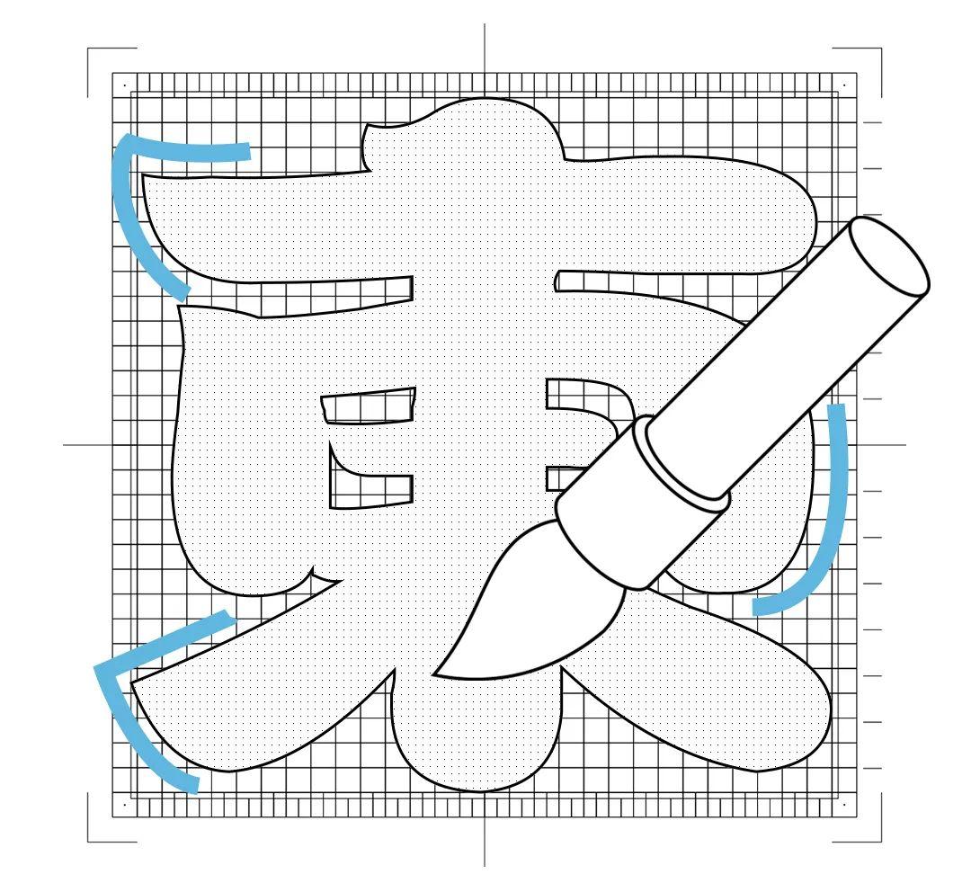
Fangzheng fat baby body, when we try from the name "fat baby" Once you experience it, you will easily feel a kind of childishness and intimacy in it. You may think that it is a so-called "child body". If you think the same way, then you are really misunderstanding it. Calligraphic brushstrokes and thick strokes, these modeling languages are highly recognizable and very suitable for application in advertisements or signboards. On the streets of Japan during the Edo period, such glyphs can be seen everywhere. In the era when there was no bold bold, thick calligraphy characters were very eye-catching and prominent.
The writing method of Kanting Fluid is similar to that of Fat Baby, with thick brush writing marks. Of course, they are completely different fonts. In comparison, the fat baby will be more dynamic.
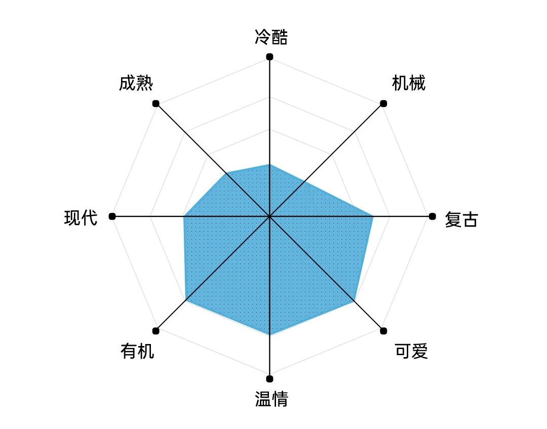
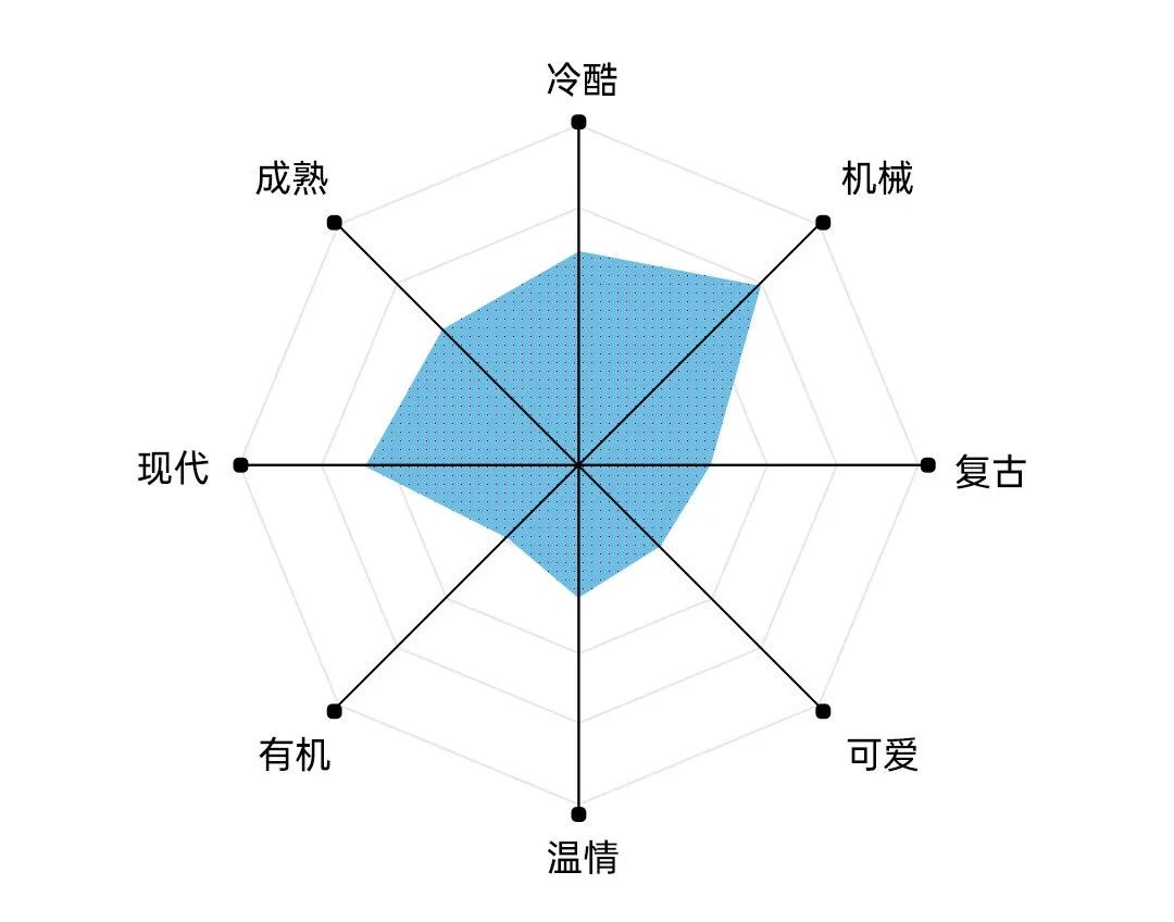
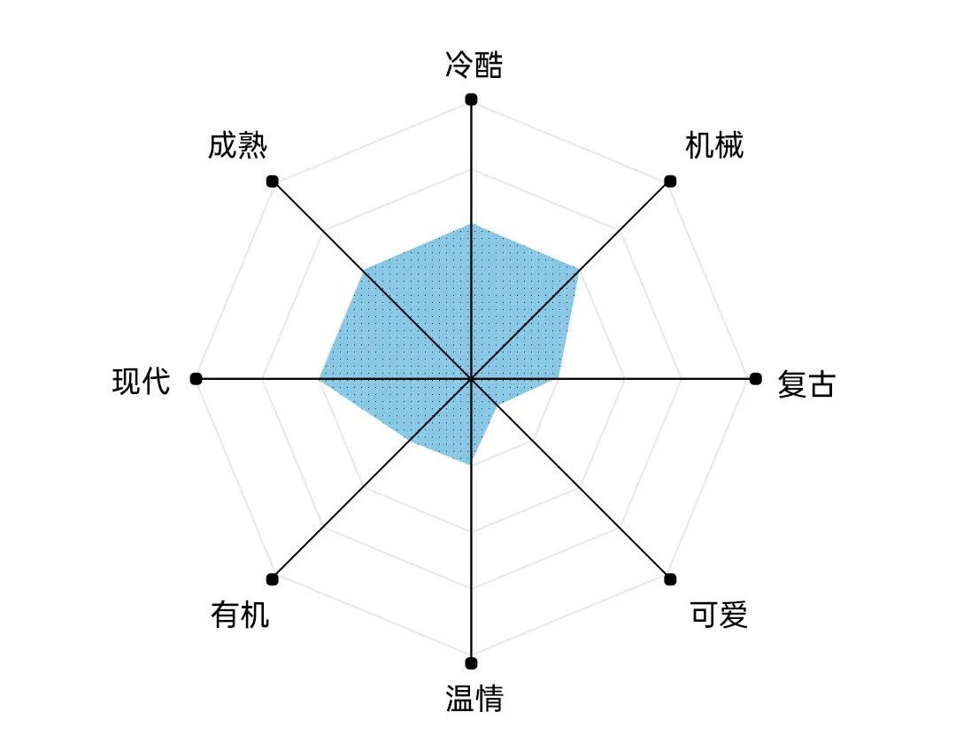
According to the chart listed above, we can know that this font It is very suitable to be applied in the design that is biased towards the humanistic field. It is full of emotion and also has a high degree of recognition. In addition, in addition to the above, we also need to consider the application size of the font. For such a thick and black font, its readability is very poor in a small-sized text environment. But if you switch to a title environment with a larger size and fewer words, this problem will not exist.

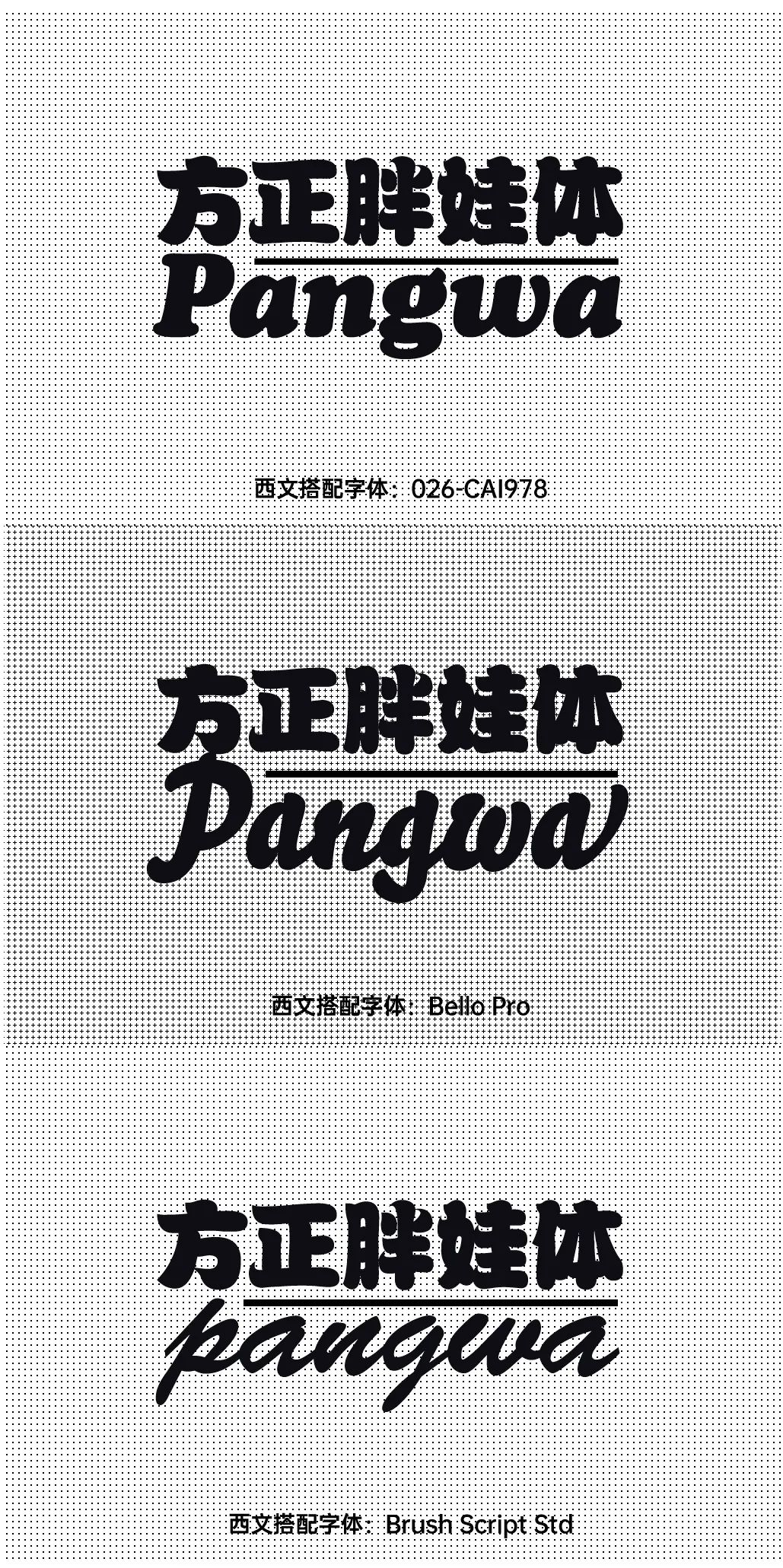
Although the quality of Western language built into Fangzheng Fat Baby's body is not bad, there are always In some cases, it is necessary to match other Western languages, such as adjusting the visual experience of the picture, or adjusting the rhythm between information. What needs to be reminded here is that among the three fonts provided below, the last two are handwritten with continuous strokes, so when matching, it is not recommended to use all capital letters, because this will destroy the original smooth strokes.

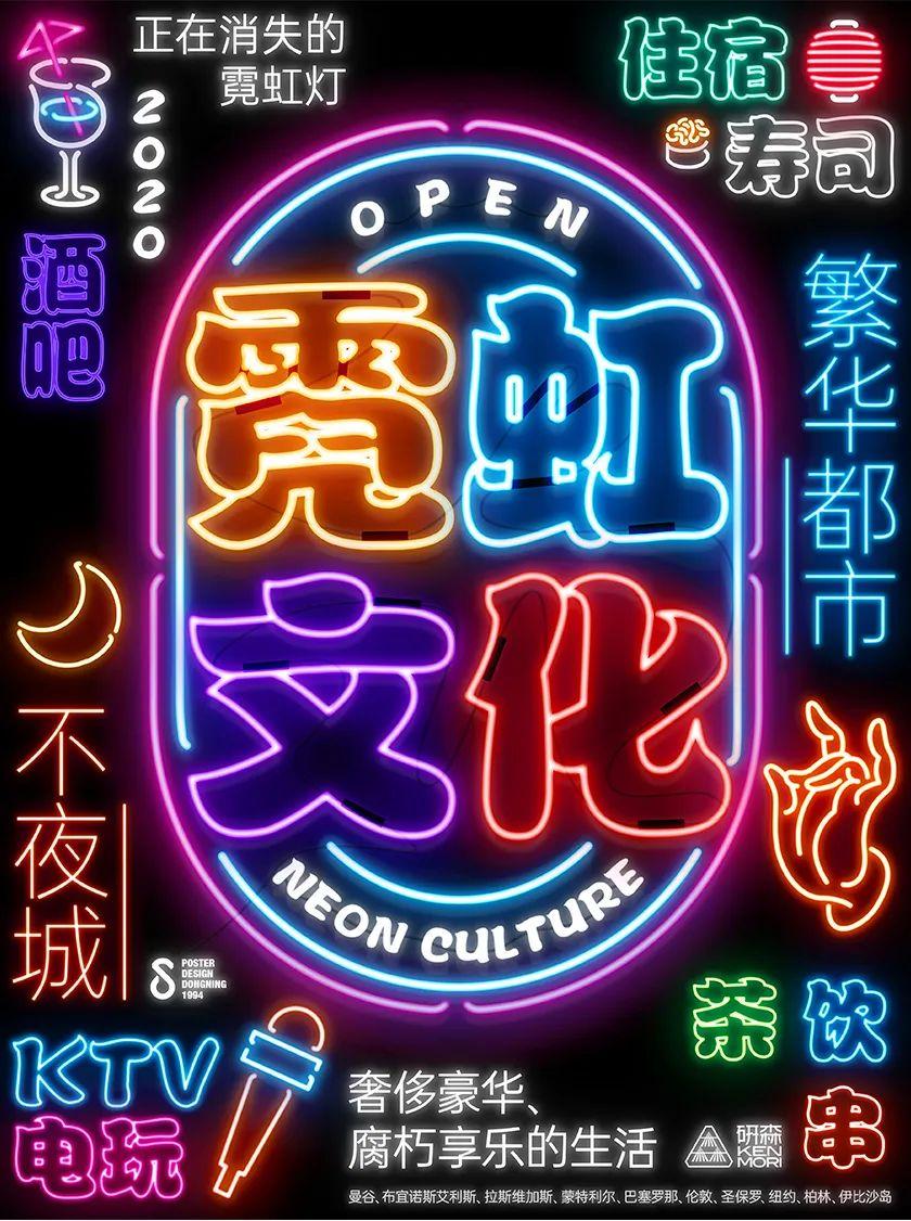
As a form of advertising at night, neon lights are gradually being replaced by LEDs. Whenever one thinks of the city that never sleeps or the bustling urban scene, it will remind people of the era of neon lights. Against the background of the lighting atmosphere, the whole block will appear dreamy, and as a common font type for advertising signs, Fangzheng Fat Baby is obviously a good choice.
In the layout of the layout, all the information is given the effect of lighting, And the full-page composition hopes to convey the dazzling street style. In addition, in the main visual depiction, the outer contour of the fat baby is used as the basic skeleton of the light tube, and on top of this, the strokes are split The structure allows the presentation of the central part to have more details.
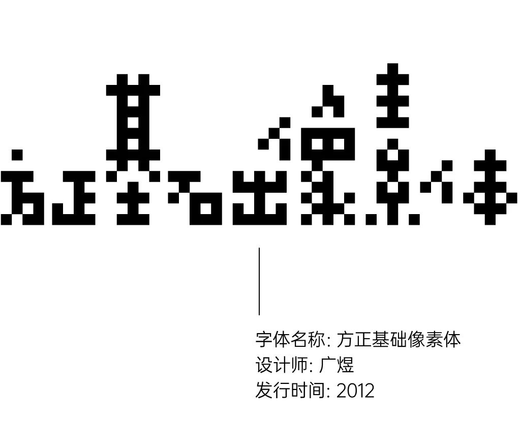

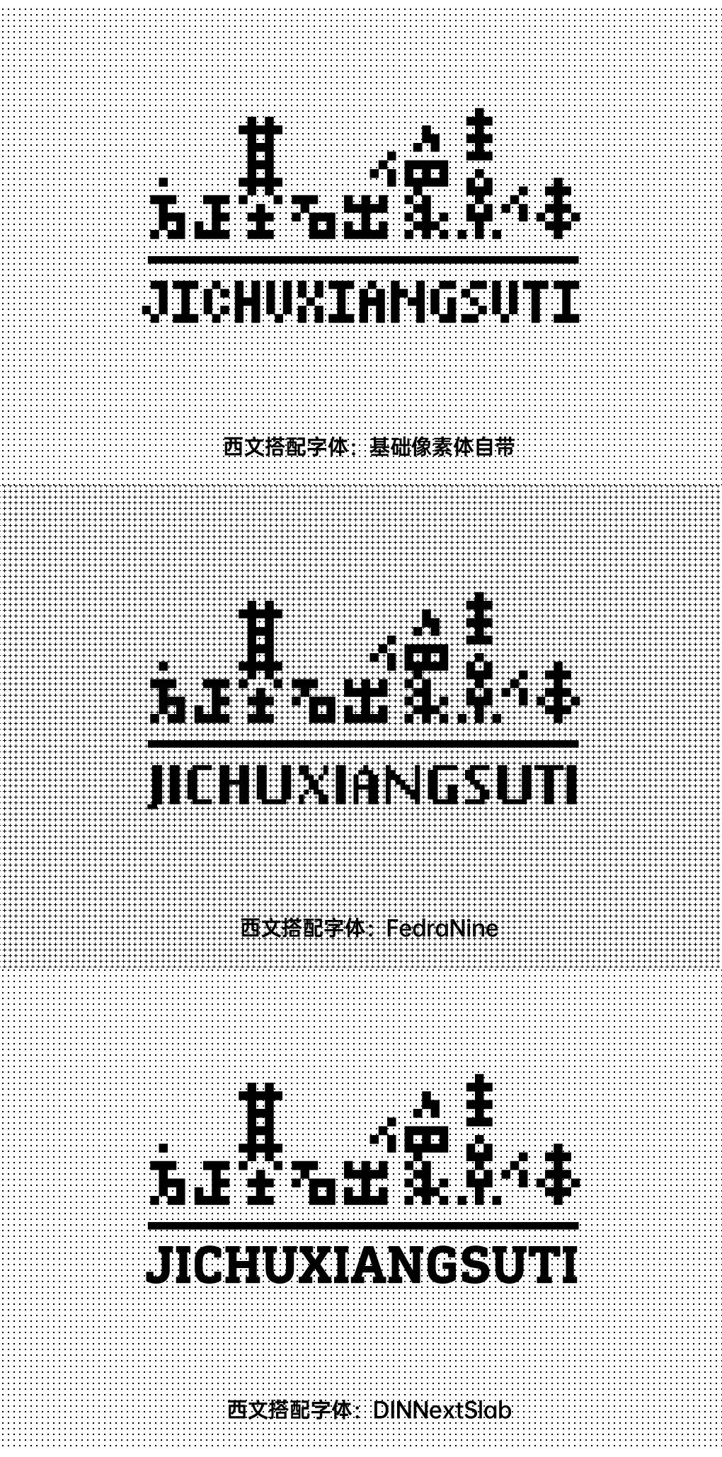
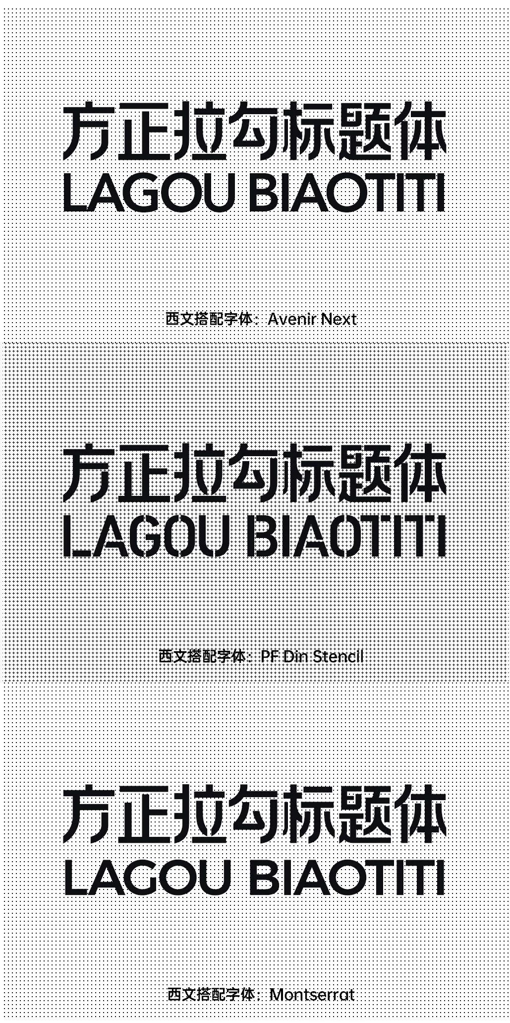
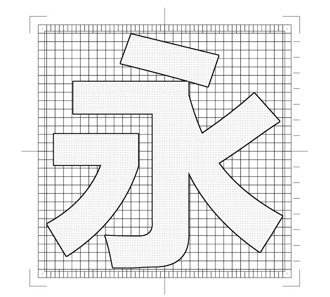
This font is said to be created by the famous designer Guang Yu in 2005 for the "First Visual image designed for the Shenzhen Biennale of Urbanism/Architecture. The font library extended by Founder. From the above analysis diagram, we can intuitively see that this font has done a lot of abstraction to the existing Chinese character structure. In order to achieve the purpose of piecing together Chinese characters with the fewest color blocks, we will find that the characters with more strokes and the characters with fewer strokes are actually not the same size. This is very rare in the font library of Chinese characters. Similar to it, only calligraphy characters have literal characters The proportions have changed.
Due to the highly abstract shape, we have inherent "wiping"/" In fact, there is no clear corresponding relationship with this avant-garde design. Of course, in the process of designing text, the designer is absolutely proficient in this way. For this word, the first recommendation is that it can be applied in the fields of digital, technology and fashion. Of course, for pixels, in today's era, it also has a certain retro feeling in it.

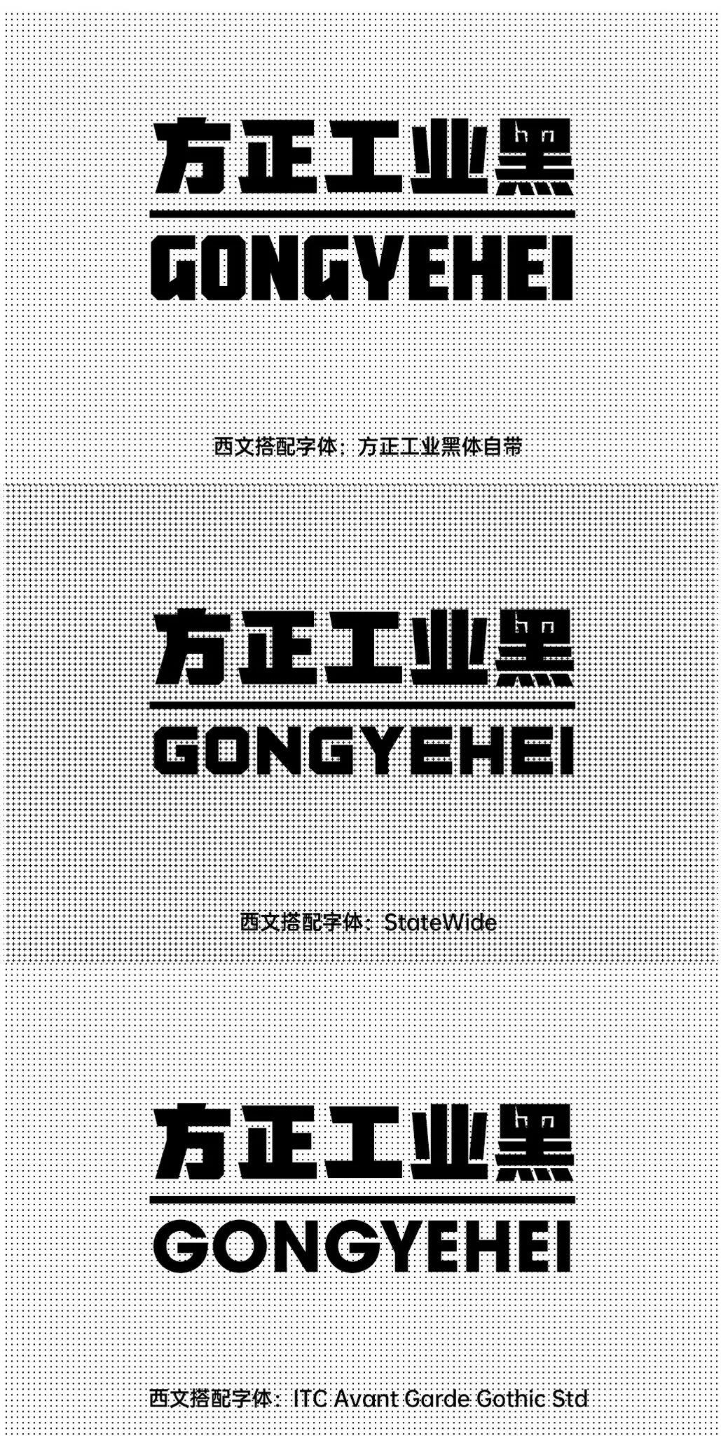
For the Western collocation of this font, it is recommended to use the original version first part of the built-in. Because after all, it is designed with the same set of concepts. However, in the face of ever-changing layout requirements, there will still be situations where other forms of Western language need to be matched. So below I have compiled some other collocations for you.
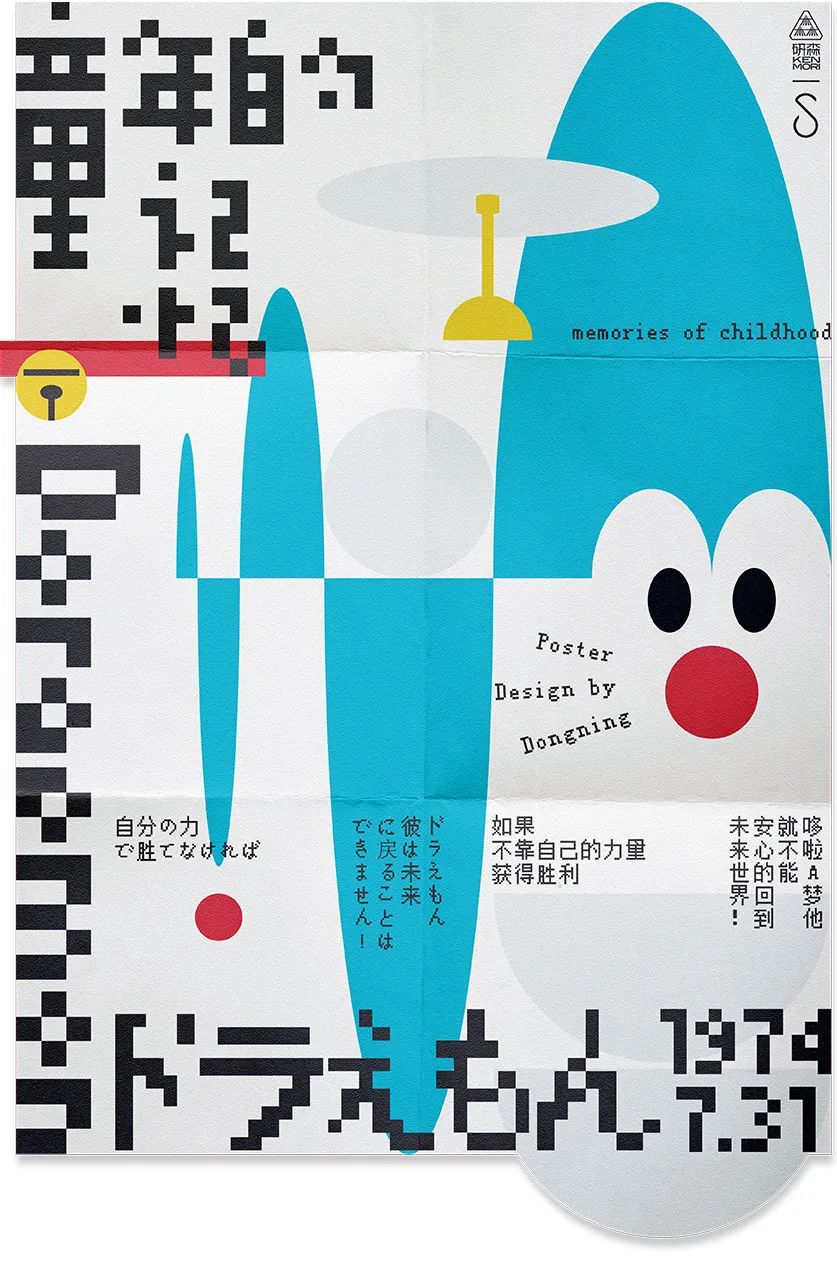
Mention to Doraemon A dream, I believe it is not absent in everyone's childhood. This poster presents the cartoon image of Doraemon in the form of patchwork of "memory fragments" through deconstruction design techniques. The reason for this design is that, in Gestalt psychology, it describes a physiological phenomenon in which the human brain recognizes the surrounding things. Simply put, our brains always make up for what we see in front of us. By comparing the visual experience to complete cognition. When we identify the basic pixel volume of Founder, we are actually comparing it with the memory in our mind. When a familiar image is broken up and reorganized, in fact, we can still recognize them through details and shapes, just like two words in the sentence just now were swapped, the brain's cognition The process is always more inclined to cognition as a whole. If you discover this problem at the first time, it means that you belong to the smart minority.
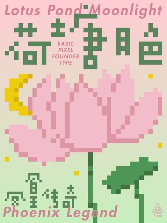
The theme of this poster is the moonlight in the lotus pond, which originated from an internal activity of Yansen . For friends who live in the north and have never seen the moonlight in the lotus pond, the first reaction when they hear the moonlight in the lotus pond is probably the song from Legend of Phoenix, or the spoof of this song from Weibo and Station B and ghosts.
It seems that modern young people are used to getting all kinds of information from the Internet. opinions, and even feelings. After watching the movie, go to the movie review, and take the things in the movie review as your own understanding and feelings. So this digitized lotus pond moonlight that only exists in the Internet was born, and the basic pixel volume is the element that best represents the Internet.
The main image of the poster is also drawn on this basis, because the pixel body It is composed of grids one by one, so simply fill the entire layout with the four characters of Moonlight in the Lotus Pond horizontally, use the small squares of the font to determine the grid of the layout, and then use the same small squares to Draw pixel patterns such as lotus, lotus leaf and moon.
The background color here does not use blue or green to symbolize the water surface, or use black to It symbolizes the night, but uses a pink-green gradient, hoping that the picture can be more abstract, and can express "we can see all kinds of strange beauty on the Internet, and we don't need to search and experience it." I hope that everyone can get rid of the comfort zone of the Internet, to feel and experience, instead of plagiarizing life from the Internet.


This is a font of "grandparents" in Song Dynasty, if you zoom in If you look at it, you will find that there are no curves in the outline of this font. Seeing this, maybe you will think that such a word is a defective product? Really not, first of all, such details are not obvious in the small size of the text, but the basic qualities such as the skeleton and internal white balance that determine the quality of the font are very good in Song Sanshang. The reason why the outline is not smooth is caused by the low storage and computing power of early equipment. The professional term is 96 base vector polygons. Moreover, the resolution of the imagesetter can't actually see such details at all. We put this type of character today, but it is still an excellent font library that is easy to read.
Fangzheng Song San is a traditional Song typeface with the characteristics of The middle palace is retracted, and the pen shape is beautiful. It is very suitable for large-scale text layout in the text environment. It has the unique orthodox temperament and cultural attributes of Song style. It is very suitable for arranging literary books, as well as works that require a sense of trust and a humanistic atmosphere.

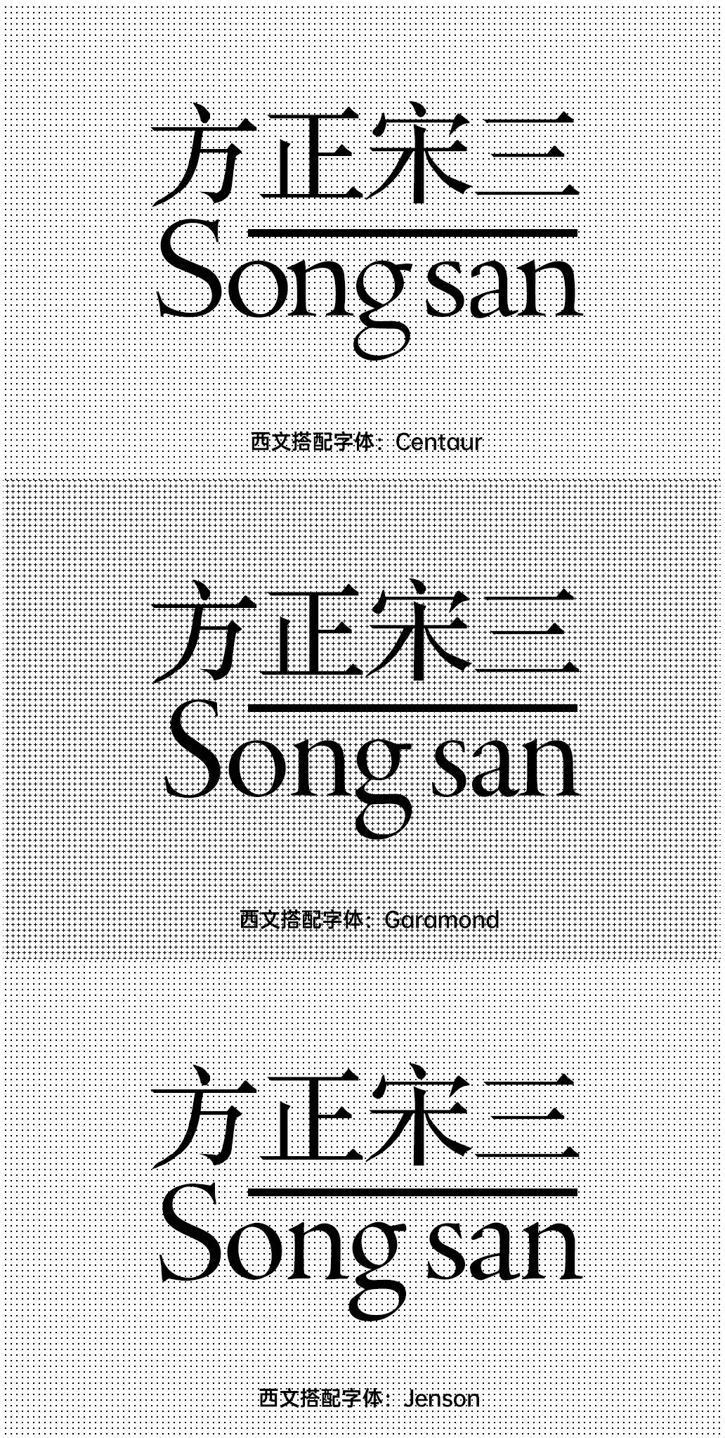
In the direction of matching Western text, it is recommended to use the old one with a smaller x-height style serif body. This type of Western language has a more obvious feature, that is, the letter O has obvious traces of writing with a flat-tip pen. In addition, in terms of stroke thickness, it is also necessary to match as much as possible. Models with lighter weights will be more harmonious in grayscale.

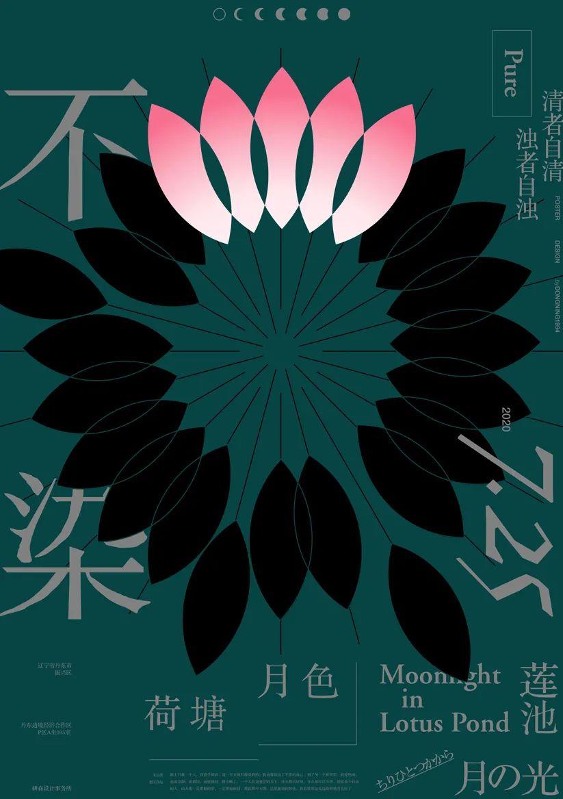
The theme of this poster is the moonlight in the lotus pond. It can be traced back to an essay written by Zhu Ziqing, which tells the author's wandering in the predicament at that time and his yearning for beauty. Regardless of this framework, in fact, "Moonlight in the Lotus Pond" can be understood as a small world isolated from the world, which represents the beauty in everyone's heart.
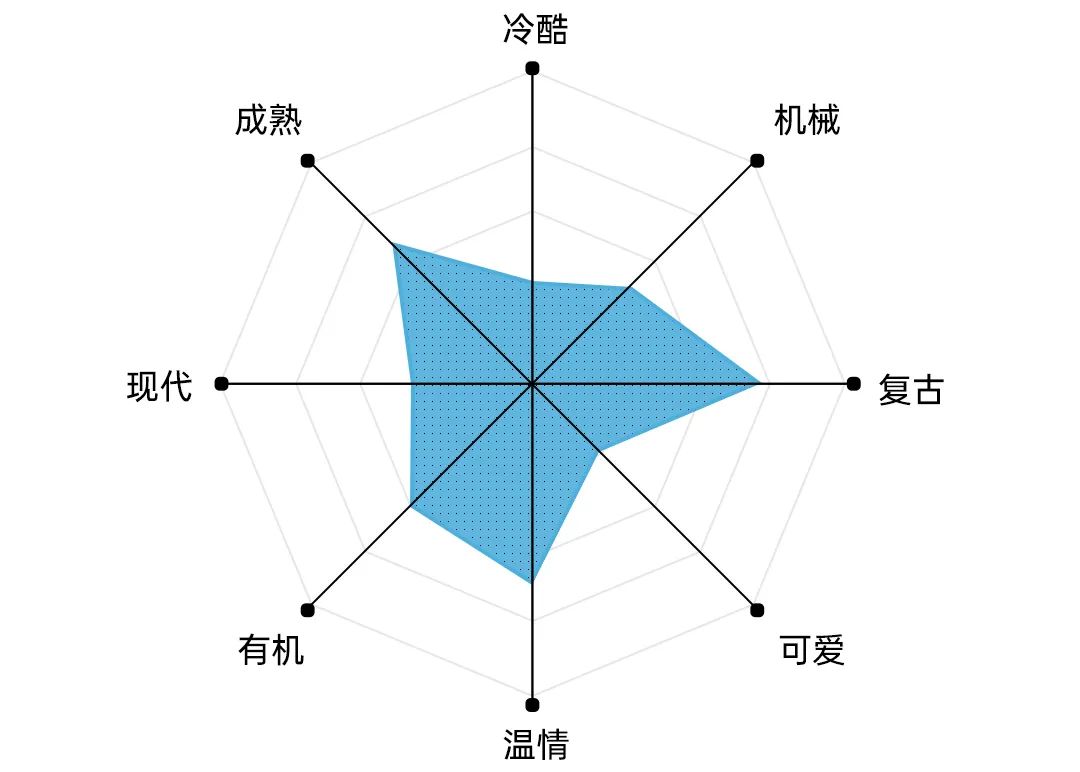
But the reality is that this kind of beauty is often set off by many bad things from. Song San's vector polygonal outline is also very suitable for expressing the concept of "skinny reality". In order to match it, the western part uses the skeleton of Garamond and adjusts a similar appearance to match it.
In this environment, the lotus's The spirit can well entrust this kind of vision in people's hearts. The element of petals is extracted here as the composition figure of the lotus, and through the distinction of colors, this very few "beautiful spaces" are compared, and the withered black petals also correspond to those that are close to vermilion and black, and those close to ink are black image.
In reality, how difficult is it to be unstained? , so this is also the reason why the word "not dyed" will be hidden behind the petals. This may be a kind of escape, only in the small world in the dead of night, can I feel a state of peace of mind, or maybe, the lotus is a safe haven, and it carries the belief of resisting the bad.


Fangzheng Rui Shuiyun font is a font with distinctive features as its name suggests. Among them, "sharp" represents the strong right angle at the starting, closing and folding points of the brush; "water cloud" is reflected in the trend of strokes such as left and right. The overall rigidity is soft, the font is gentle, and the legibility is high. And the font family includes 6 font weights, which can meet various typesetting needs.
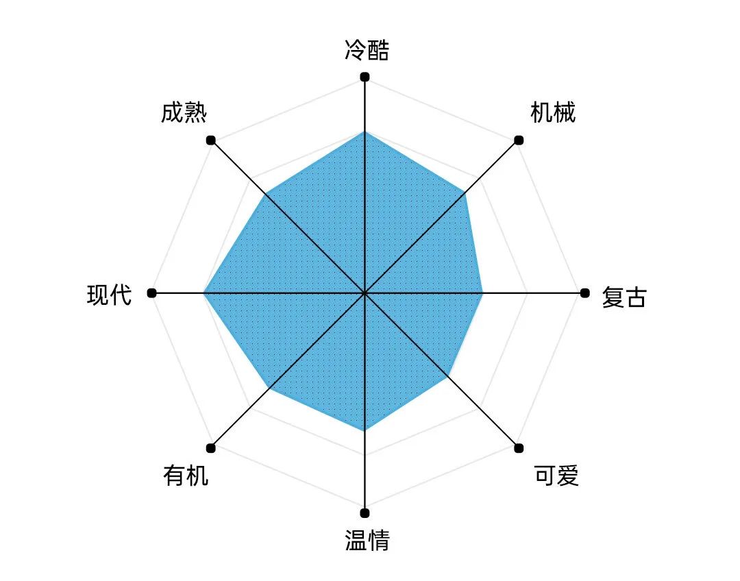
Fangzhengrui Shuiyun itself belongs to the type of "hardness and softness", so the font The adaptability will be stronger. In contrast, there will be no obvious features, and generally speaking, it will be more modern and simple.

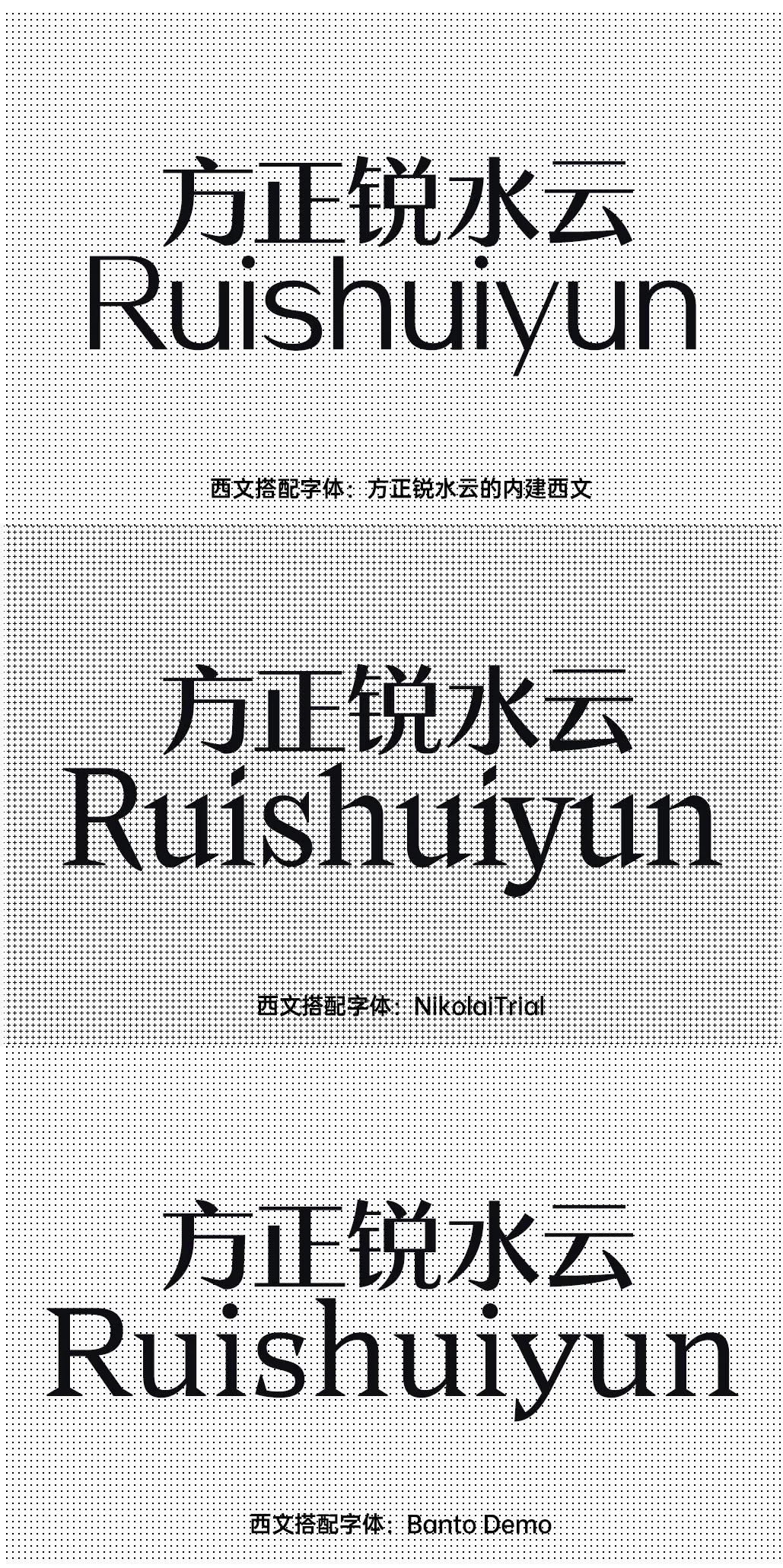
In terms of Western language collocation, you can still find some trendy fonts to match match. The built-in Western characters of Fangzheng Rui Shuiyun are also very good, and the contrast of stroke thickness matches Chinese. If you are looking for decorative matching, you can also try to mix and match some serifs with straight lines in the curve from the perspective of stroke details.


This poster chooses the second font combination above to complete an application poster . Everyone should have experienced toothache, and during the creation of this poster, the author had some problems with his mouth, so he simply used this as the theme of the poster, and created it in one breath with this unbearable pain finished. Fangzheng Rui Shuiyun and the selected Western fonts happen to have some small sharp corners in the strokes. These sharp corners will not appear all the time. Once they appear, they are very eye-catching. This is like a toothache. It will come up all the time, and when it does, it will make us say "this is terrible".

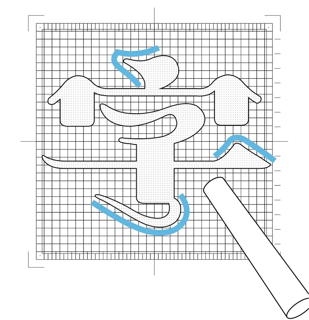
Fangzhengxianrenti is a font created by street artist Cui Xianren with chalk. This font can be regarded as an artistic font of Song typeface. Because it has several characteristics of Song style, namely: the end of the horizontal painting has a triangular lining; the horizontal is flat and vertical, and the horizontal is thin and the vertical is thick. The font of this font is flat, the central palace is relatively large, and the thickness contrast of the font is very strong. There are many decorative body decorations on the strokes, so it is a proper font for titles.
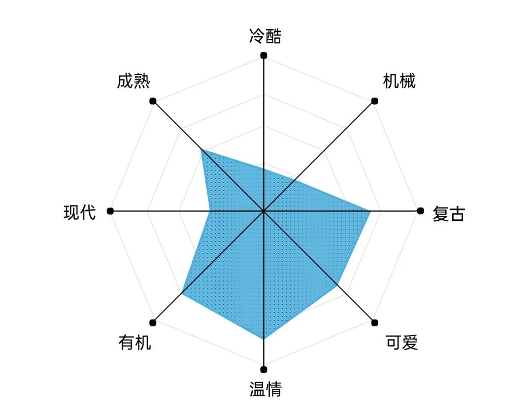
The Xianren style is different from the traditional Song style in its beautiful temperament. Its temperament It should be more down-to-earth, but it also has some handwritten curves, which makes it have a literary and artistic temperament while being vulgar.

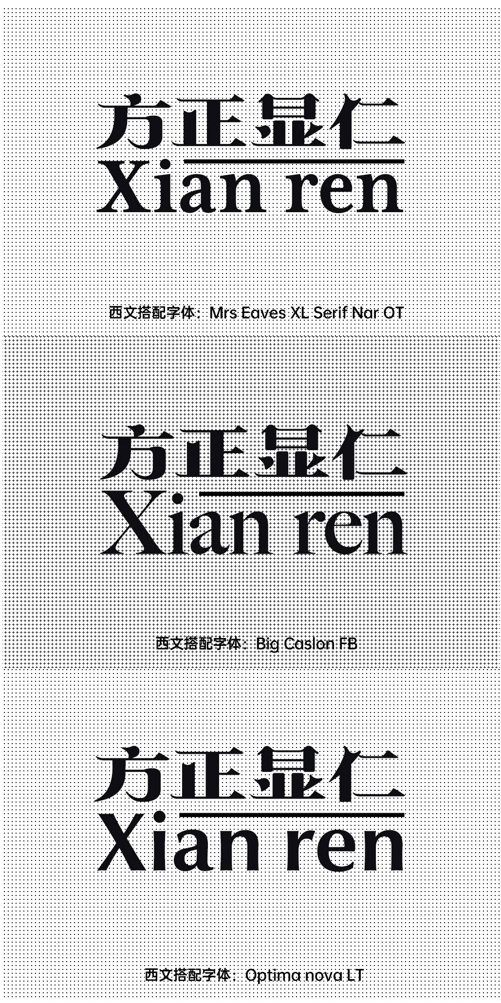
Xianren typeface is a Song typeface art font, which is naturally matched with serif typeface. And Xianren body strokes have a very strong contrast in thickness, so you can choose a serif body with strokes that vary in thickness as a match. The middle palace of the human body is relatively large, and the English x word height can be relatively high. In addition, sans serifs with classical temperament can also be matched.

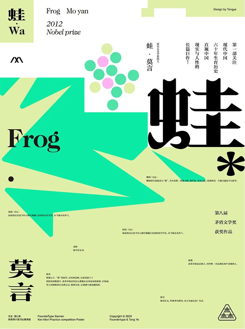
The inspiration for this poster came from when colleagues saw Mr. Cui Xianren’s words Just a little joke, some people think that the curved and curved places look like little "tadpoles", so I made a theme related to "tadpoles".
So I think of Mr. Mo Yan's book "Frog", which uses the ups and downs The birth history of rural areas is the background, which truly reflects the national policy of family planning. The elders who lived through that era recalled that in that special period, anyone who wanted more had to "hide".
So in terms of screen performance, this poster uses "hidden" as the starting point , by overlapping the color blocks to simulate the hiding situation, and the small dot above the color block represents the "frog egg", which is intended to explain the reason why the "frog" hides.

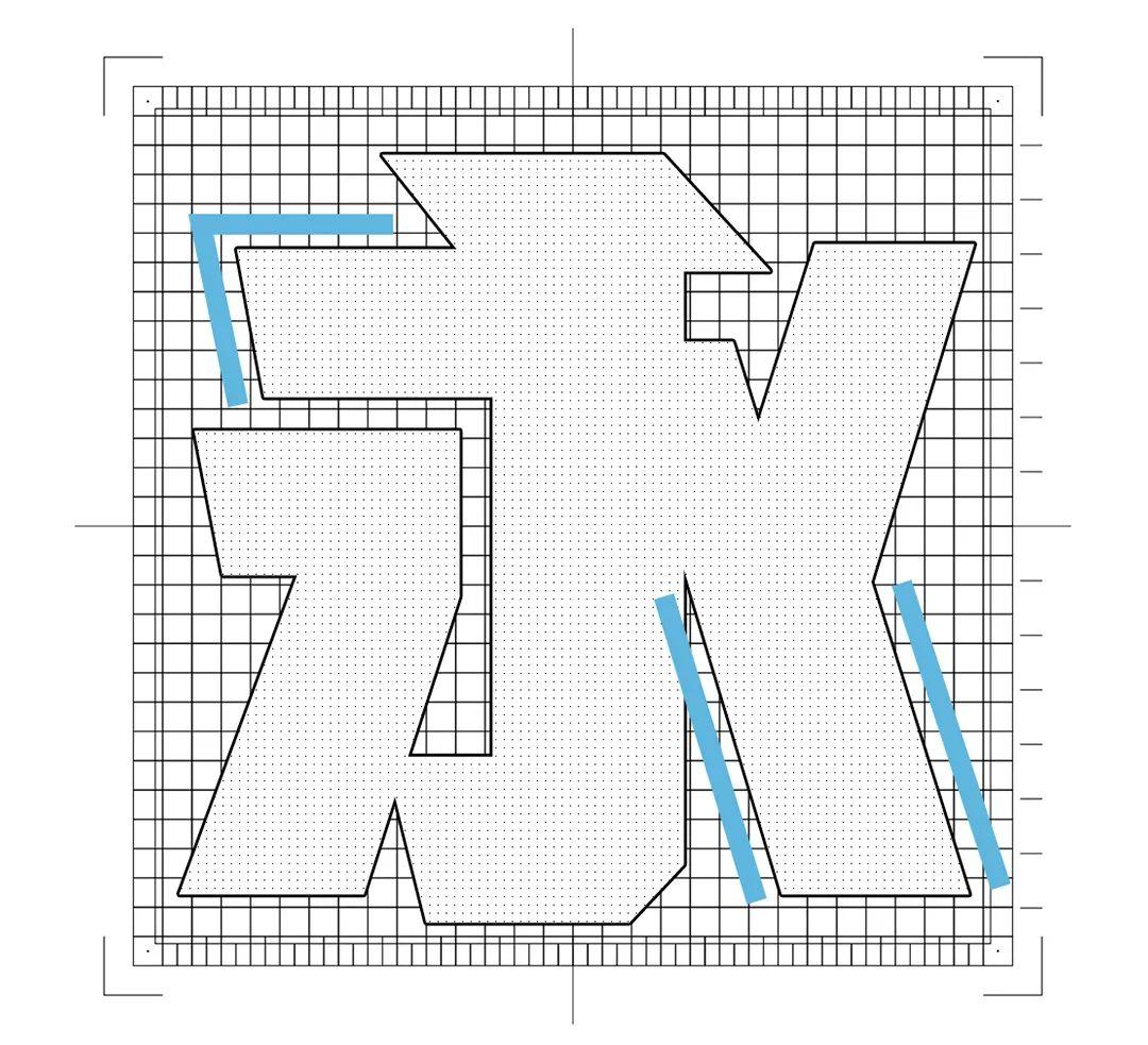
This is a variant of black body, the stroke lines are straight lines, and the strokes It is very thick, and the central palace is very large, the text almost occupies the entire text, and there is a cropping process on the left side of the horizontal painting, which enriches the details of the font and makes the text not too dull as a whole.
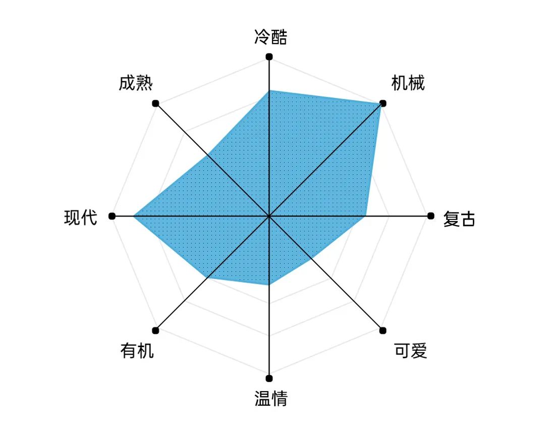
This typeface has a modern and mechanical feel thanks to the geometric shape of industrial black . In addition, the strokes are relatively thick, so it can also reflect the sense of strength.

Industrial black has some geometric mechanical sense, we can also choose mechanical sense The display-type western language is matched with it, and the western language that comes with industrial black itself is this type. Or it can be paired with a geometric sans serif with a heavier font weight.

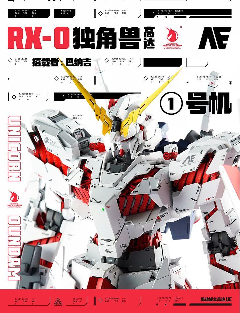
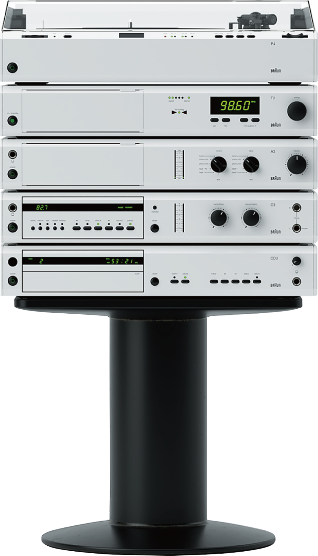
This is a Looking at the name, it looks like a "heavy industry" font, so this poster uses "Mechanical Future Wind" as the starting point, and chooses Mobile Suit Gundam as the theme. The difficulty in the typesetting of this work is how to create a "mechanical" feeling. After looking at many modern electronic products, I finally found inspiration on a music player, and the way the text is arranged in this poster and the feeling of the pictures are derived from it.
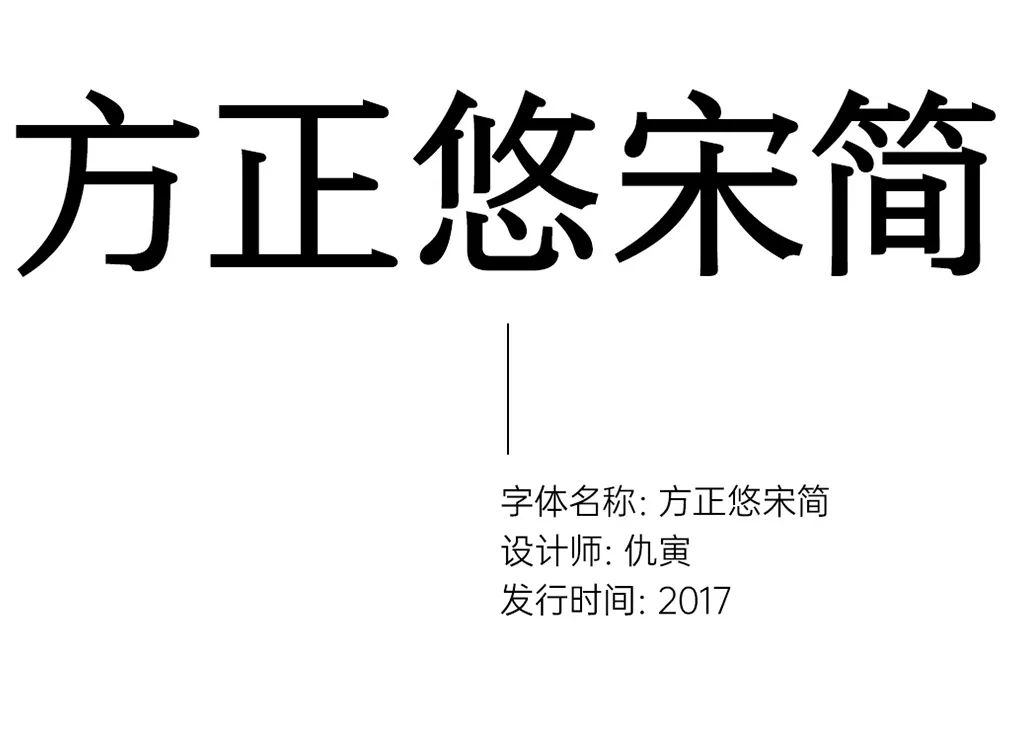

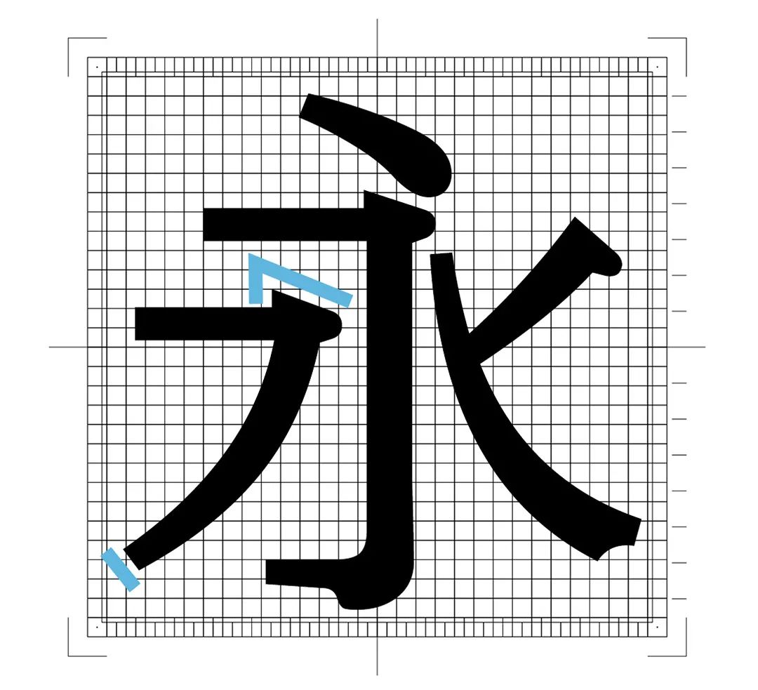
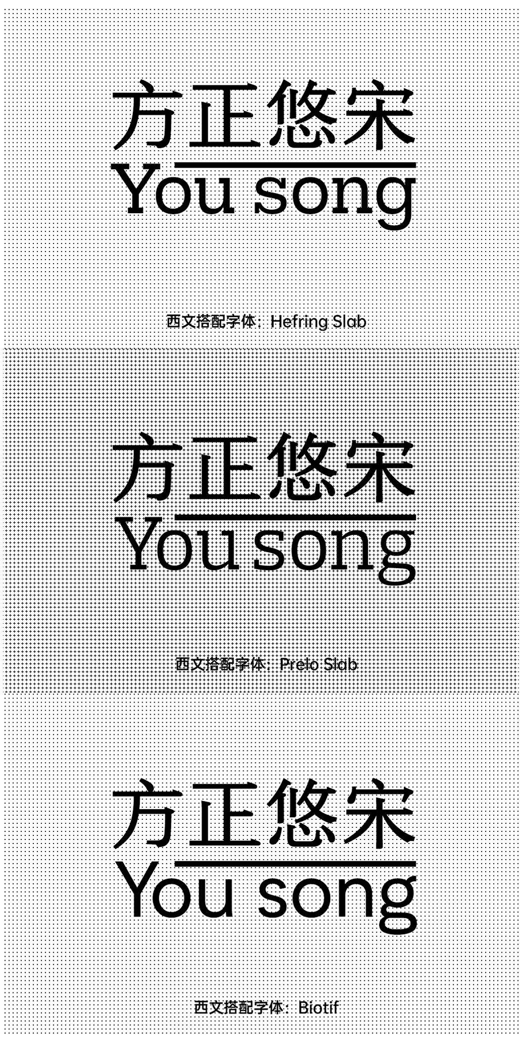
Fangzheng Yousong is a Song typeface designed by Founder for electronic screen display. The body decoration on the strokes is different from the triangles of the traditional Song typeface. The flat lining angle is to fit the distribution of pixels, so that the font can still be recognized well even at extremely low resolution. Similarly, the designer also cuts off the tips of skimmers, dots, etc., to avoid too sharp corners that affect recognition.
In addition, the thickness of the horizontal and vertical paintings of this Song typeface is similar, so He has the neatness of boldface and the delicacy of Song typeface, which is similar to the rough serif typeface in Western languages.

Because You Song is a song typeface with almost the same thickness horizontally and vertically, plus a relatively large Zhonggong, so the most suitable for You Song is the thick serif Western script (Slab font) with a high x-height. Or it can be paired with a more modern sans serif.

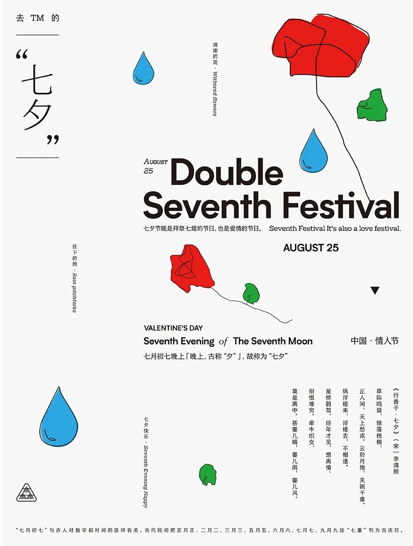
This is an internal competition poster of Yansen, in order to catch up with the popularity of Cowherd and Weaver Girl The theme of "Chinese Valentine's Day" was formulated. This poster was originally called "I wish you a happy Qixi Festival in XX", after much thought and thinking, it was finally changed to "Go to Qixi Festival in XX", but the heart of blessing has not changed. The three drops of water in the picture are respectively arranged in Tianjin No. 4, On Vega and Altair, the intention is to "pray for the wind and rain and keep you safe", and the roses in the layout are also carefully selected to shop around. Only such a gesture can reflect the "thick" atmosphere of Qixi Festival.
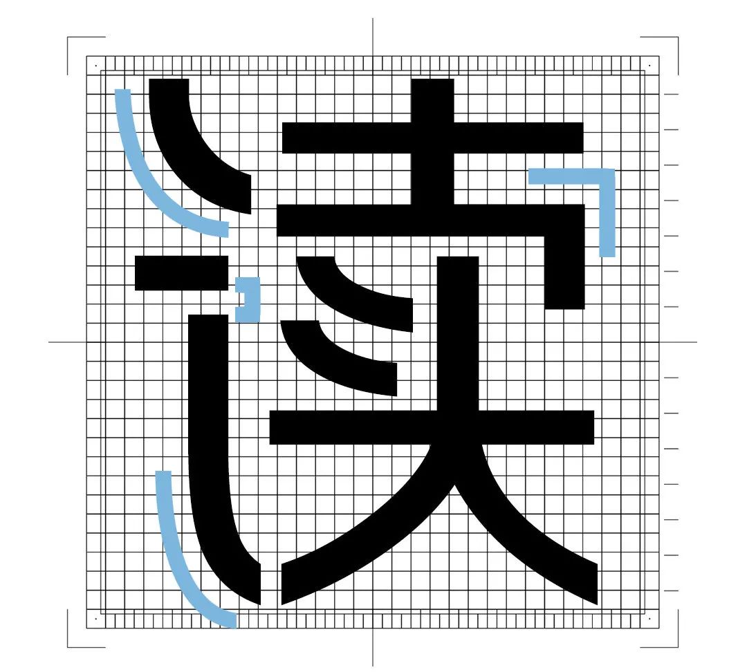
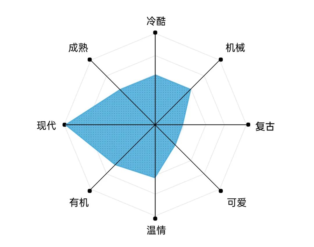
The overall font of this font absorbs the characteristics of the old fonts of the Republic of China, and the overall impression is bold , At the same time, some strokes are processed with a lot of arcs. Straight cuts with stiff endpoints and use of broken pens.
Because it absorbed the characteristics of the old fonts of the Republic of China, coupled with modern trimming, it retains Its charm is injected with the vitality of the new era. On top of this, because of the overall impression of the black body, although the addition of the arc adds a little more warmth, the font is cold and mechanical.
The title body of the Founder pull hook is bold as a whole, and the matching English is also I chose sans serif. The first Avenir is geometric English, and the standard arc just matches the arc design in Chinese. The second English broken pen matches the Chinese broken pen. The third Montserrat is similar to Avenir, but there are differences in some details, such as the treatment of G.


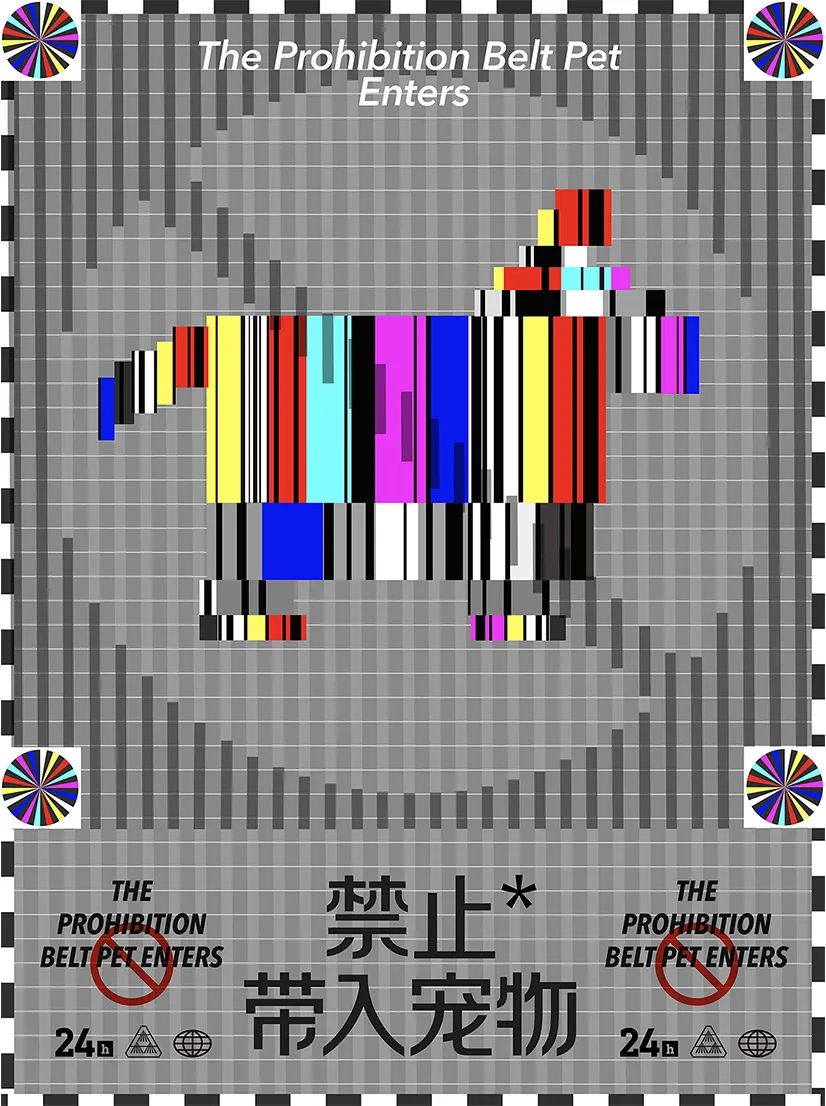
The general process of creating a poster is to determine the content of the poster before choosing the right one font, and so is this poster. In our impression, the prohibited icons are all red letters and white backgrounds, so in some informal occasions it will appear too deterrent and serious, so why not try it once?
The poster in the picture above comes from this, and the main image is from a well-known TV An abstract figure made of a patchwork of signal-free visual impressions. The contradiction between rigidity and flexibility of fonts is suitable for this theme. The most important thing is that its broken pen reminds people of warning words that also have the characteristics of broken pen.
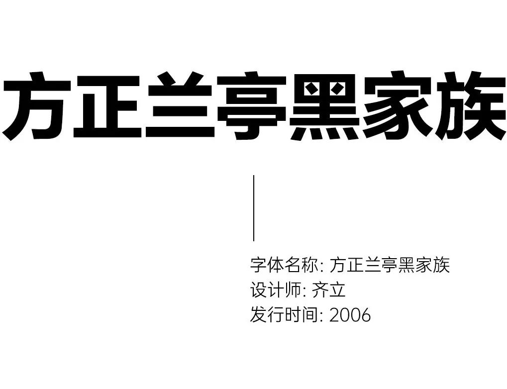

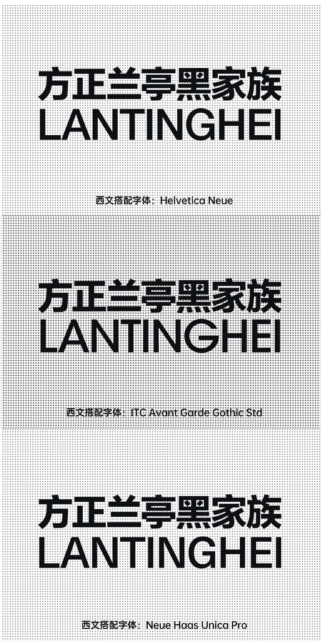
Lantinghei family is the earliest font specially designed for screen reading in China. Its strokes are well made and its lines are clean and powerful.
As a bold font with strong readability, it tends to be modern and mature.

The first match is the well-known Helvetica, this font is also very Simple and clean, I think it goes well with Lanting Black. The other two collocations are also commonly used sans serifs.

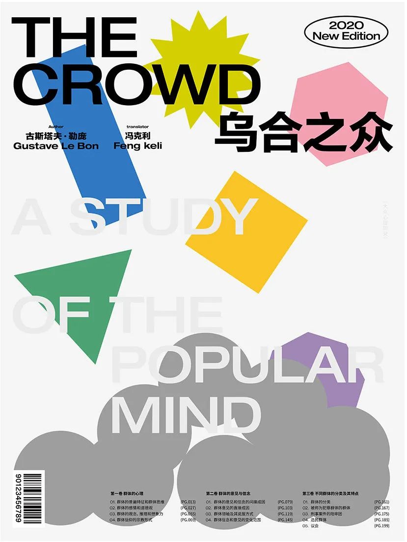
The mob is a study of mass psychology, using color blocks to assimilate the crowd into abstraction. Use the converging gray circles below to suggest the final result of the falling graphics with different colors and shapes. Based on the nature of its research, it finally chose Helvetica and Helvetica as the main text used.

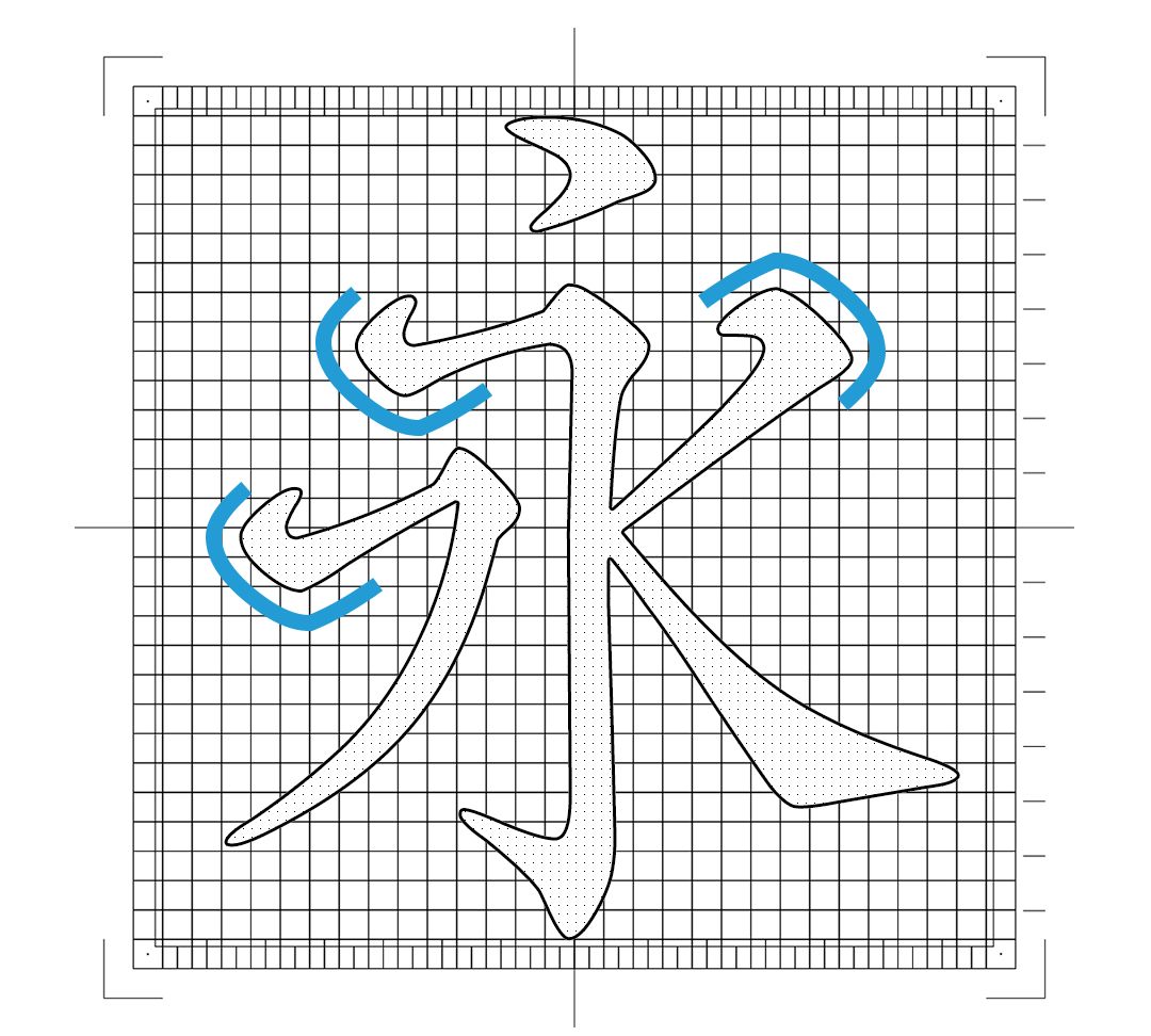
Fang Zhengzhi Anti is an engraved body of Yuan Dynasty, which is a replica of Yu Zhi Anqin There is a Shutang engraved edition of "Classification Supplementary Notes to Li Taibai's Poems", because the style of the original edition was influenced by Zhao Mengfu's calligraphy style, so you can feel that the strokes are round in appearance and strong in bones.

This font has a strong sense of handwriting, and the characteristics of the pen shape are very prominent. If you use In the brand or packaging design with simple, classic and charming temperament, the effect will be very good.

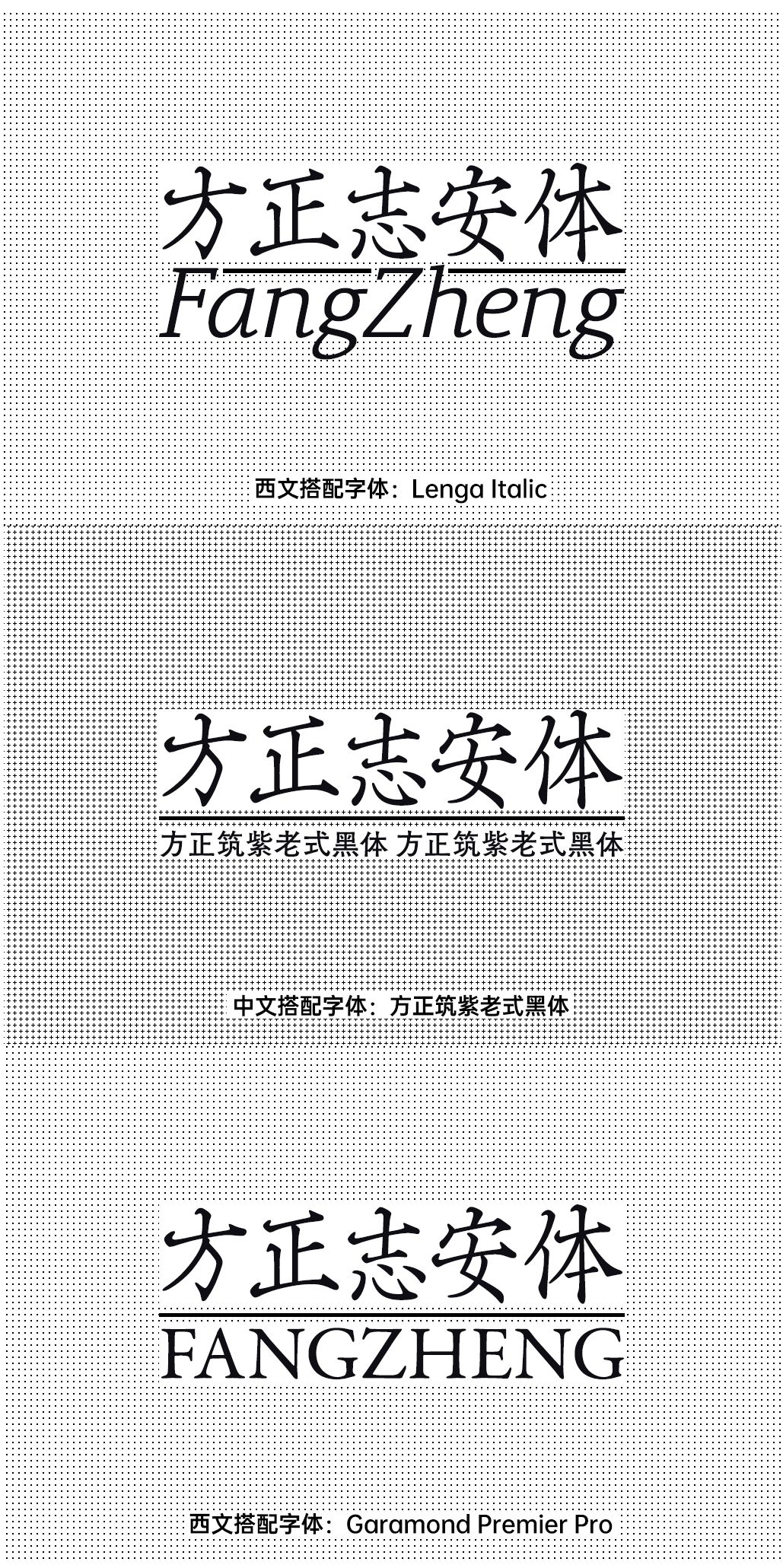
Fang Zhengzhi Anti is a title word, generally it can be in medium size or large It is used in the case of font size. If there is text that needs to be read, it needs to be matched with a suitable Chinese font. Therefore, in addition to Western languages, we also recommend the matching of Chinese fonts here.

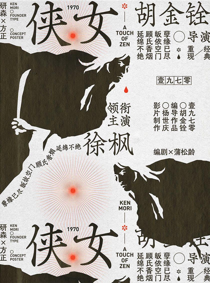
This font has a quaint atmosphere, reminiscent of some old Martial arts movies and Japanese sword and halberd movies, VCDs and DVDs were not yet popular in that era, and video recorders and video tapes were the mainstream of the era. And each tape is printed with the full cover of the movie.
At that time, due to the limitation of production technology, the words used in posters and credits , did not use such exaggerated calligraphy characters, although it looks a bit rough now, but it also has a special charm, and Zhi'an style is very suitable to reproduce the restrained and charming picture temperament of old martial arts movies.
In the layout of the screen, some posters and advertisements in the period of the Republic of China were used. The Zhi'an typeface is used as the large-size title as a whole, and the Chikushi old-fashioned black typeface is used as the readable text with DIN fonts. The back of the silhouette of the chivalrous woman above is a picture of a sunset mountain peak, because at the end of some martial arts movies, the chivalrous men solve the incident Will ride a horse and face the sun gradually away, or retreat to the mountains, or start the next adventure.
In order to make the graphic concentration of the screen stronger, plum blossoms are specially added to the text group And the graphics of blood drops are also symbols of heroines and rivers and lakes. That's all I want to say, thank you for reading, I hope everyone can get it.
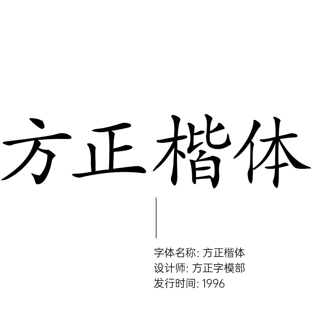

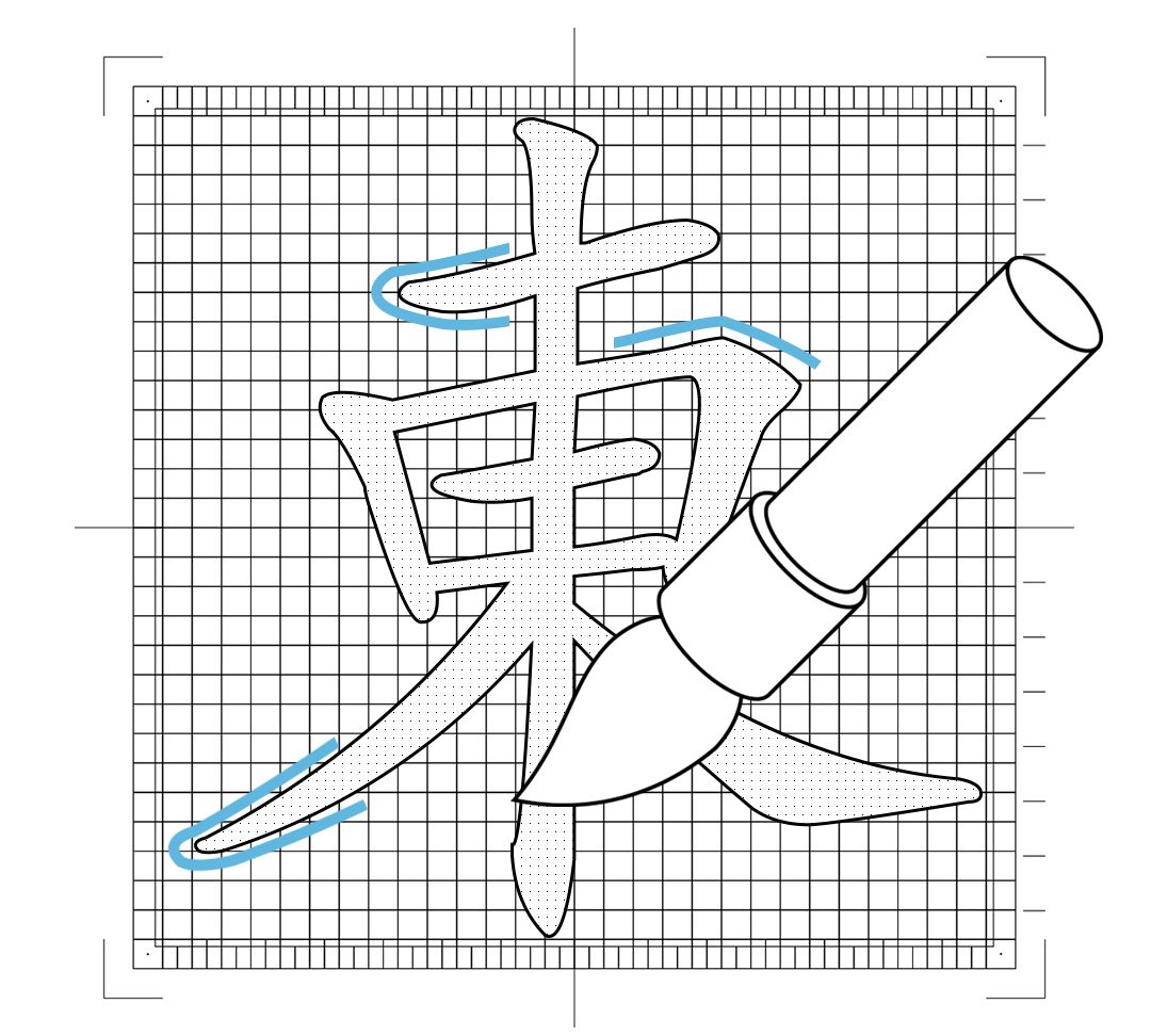
Fang Zhengkai is derived from the "Chinese KaiScript" script of Shanghai Printing Technology Research Institute. The original "Chinese script" was born in the 1940s, and has been the main type of script since the founding of New China. During this period, Shanghai Type Model No. 1 Factory, Shanghai Printing Technology Research Institute and other units made several improvements and added simplified characters. The structure of square regular script is beautiful and well-proportioned, the strokes are round and soft, and the thickness of horizontal and vertical strokes does not change much.
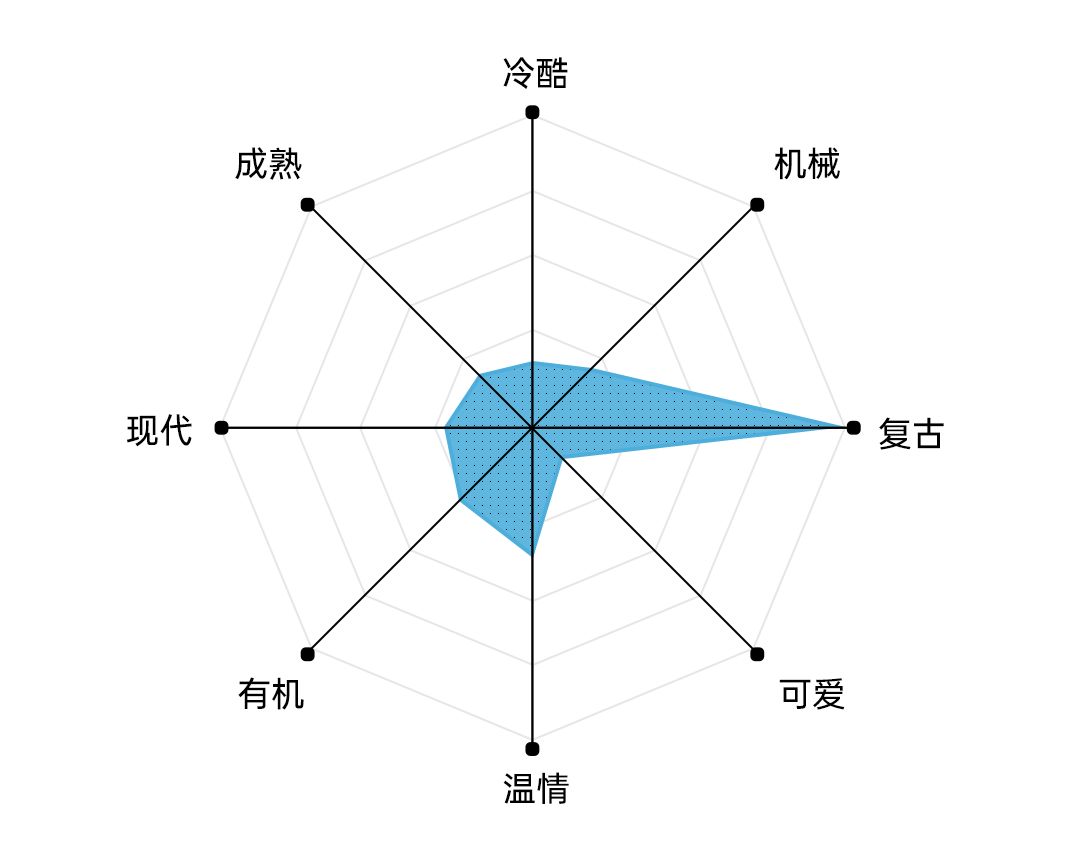
Founder block script has traditional, classic and dignified characteristics, very suitable for traditional and cultural , art-related design, is heavily used in the text of newspapers, magazines and books, and is most commonly found in textbooks.

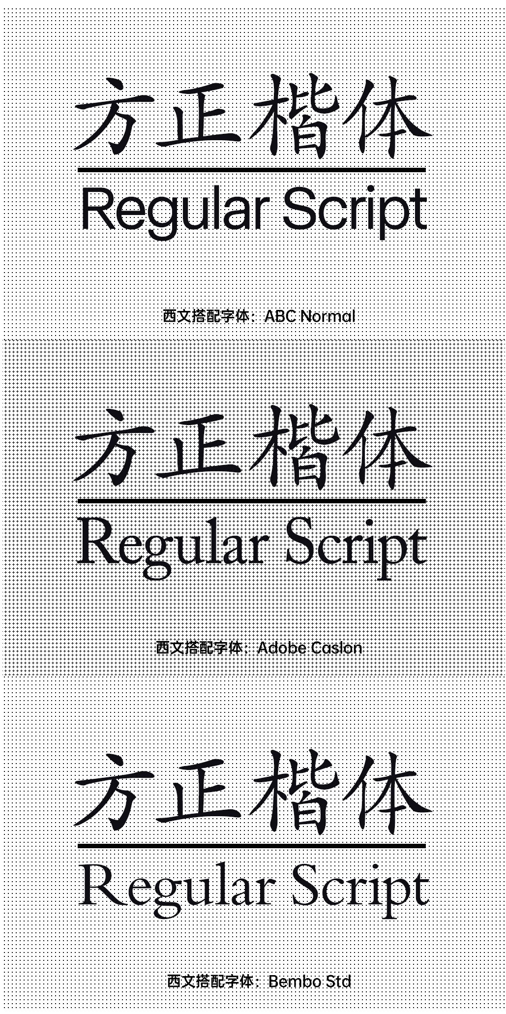
From a design point of view, due to the characteristics of the strokes of the script itself, it can be matched with it You can usually choose conventional serif or sans-serif fonts, but it should be noted that you should try to avoid choosing fonts with large variability. Since there are no Western fonts with stroke characteristics similar to italics, try to avoid choosing the built-in English in italics to match.
 支付宝扫一扫
评论列表(196条)
测试