 In my book "Make Characters: Using Font Design Method", there is a method of copying fonts, and many readers ask where to download the grids used in the book? This time, the files will be provided for everyone to learn and use! !
We should learn all new knowledge (new content) from the basics, and fonts are of course no exception. Copying is a necessary foundational stage, and even some experienced teachers have been copying fonts (such as Teacher Yue Xin), but many new students will be eager to skip this stage and make it directly in the software. Use less pen to feel the font. This way of cutting corners will bring you a lot of trouble in the future. So this article will introduce to you in more detail the method of copying fonts.
Purpose of copying fonts
-
1. Familiar with software and operation methods
2. Perceived font structure
3. Understand the details of strokes
4. Feel the elasticity of the curve
5. Understand the layout method
6. Distinguish the pros and cons of fonts
These contents will be of great help to everyone in learning and designing fonts.
What is "copying"
-
Imitation refers to the process of imitating calligraphy and painting works according to the original works. Lin, is to write or draw according to the original work; copy, is to write or draw on the original work with thin paper (silk).
Copying and imitation each have their strengths and weaknesses. This is especially reflected in the fact that copying and copying have their own advantages and disadvantages. Especially reflected in calligraphy, the ancients said: "It is easy to lose the position of the ancients when reading a book, but more of the meaning of the ancients; "It means that it is easy to learn strokes in Lin, but not easy to learninterframe structure; it is easy to learn interframe structure in imitation, but it is not easy to learn strokes. In terms of difficulty, imitation is easy but difficult. No matter copying or imitating, the goal should be "similar" to Fan characters, and gradually transition from "similar in shape" to "similar in spirit".
——Quoted from "Baidu Encyclopedia"
"copying" is actually interpreted separately. The common goal of the two is to try to be as close as possible to of the model word, so as to gain something. As far as today is concerned, "copying" may be more targeted at software, so I roughly divide copying fonts into two categories: software copying and hand-painted copying.
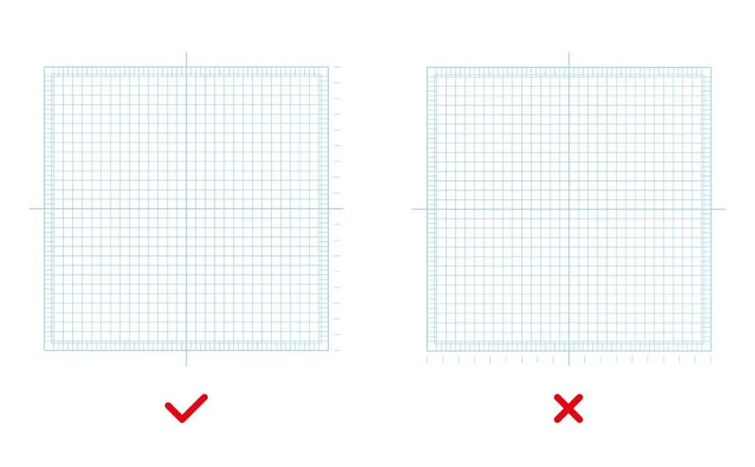
Trace Grid
-
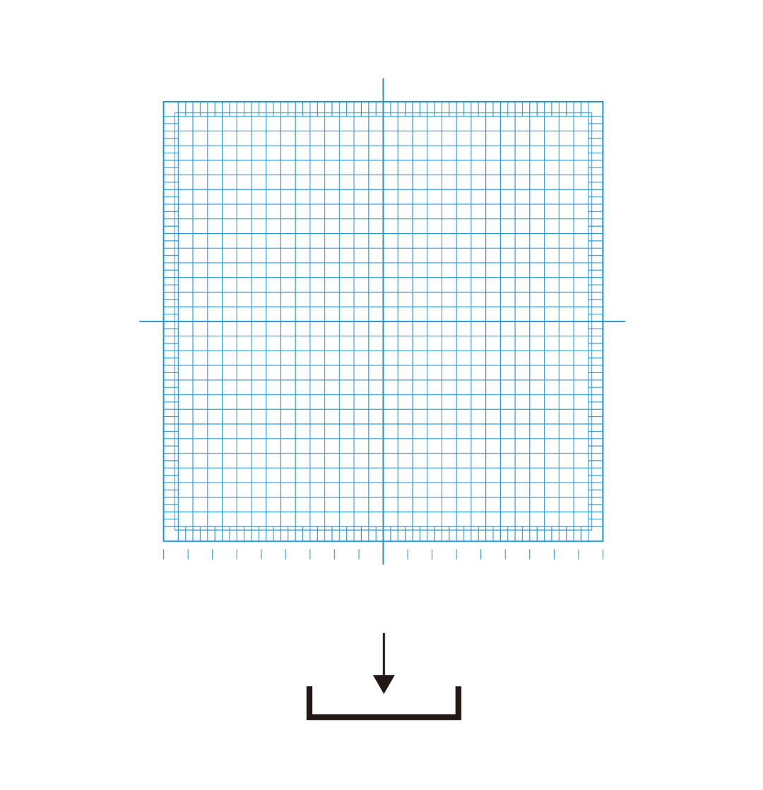
Before you start, you need to print out the grid, which is mentioned in my book and can be downloaded at the end of the article.
I found that the direction of the grid was used incorrectly in the Zhou Lian of "Zi Xue Tang". Here is a special explanation: because there are many Chinese characters drawn horizontally, there are separate marks on the right side of the grid, which is convenient, fast and accurate Determine the horizontal drawing position (as shown in the figure below).

Font
-
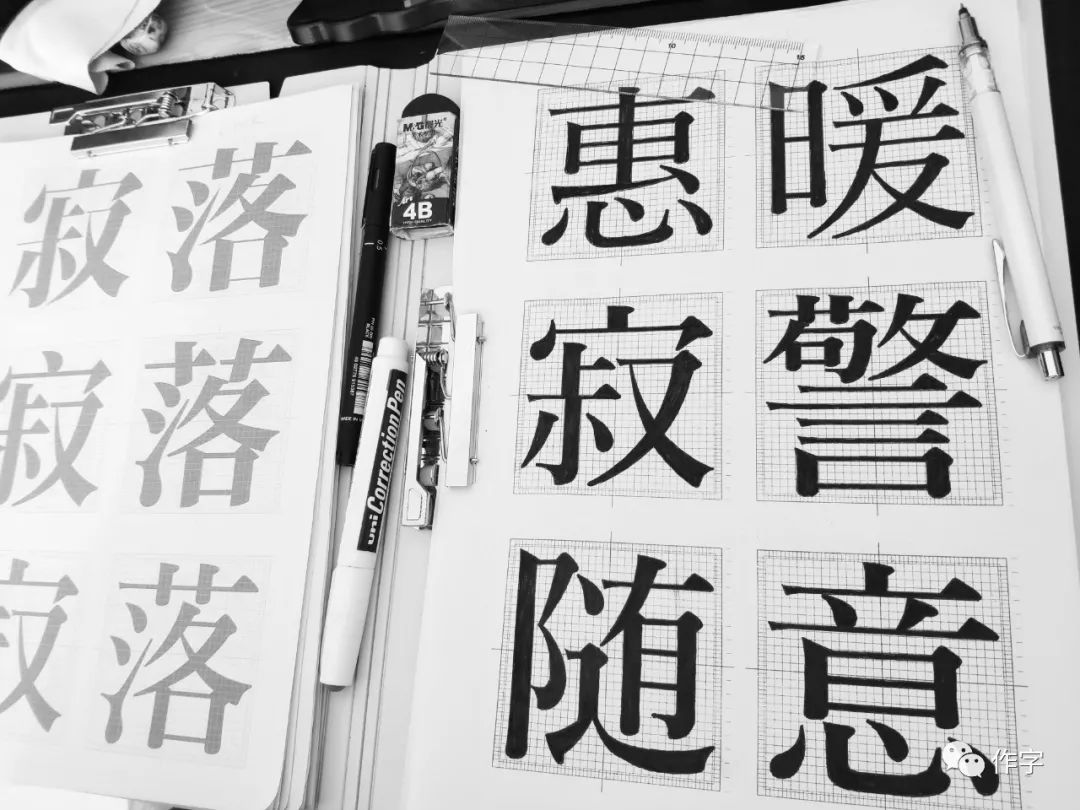
Choose a font
If the foundation is poor, you can use general-purpose fonts for copying. Currently there are many such fonts. It is recommendedZaozi Gongfang Dianhei< span> This one can be copied by using the stroke function in the software. After understanding the general font structure, you can choose fonts with thickness contrast or even curves for copying. It is not recommended to use the Morisawa grid when copying general fonts have less details, and use a square font frame.

The fonts selected for hand-painted copying are more focused on the detailed Japanese text fonts (Heiti, Ming Dynasty fonts). I personally recommend copying Ming Dynasty fonts. Here are a few recommendations.

font size
The size of the font in the grid is also very important in copying. First, you must understand the conversion formula between the size of the font frame and the size of the font:

In this way, the outer frame of the converted font just coincides with the grid frame, so that the size of the font can be determined, and the literal ratio of the font can also be calculated. (The grid provided to you this time can be converted into a font size of 222.8pt)

Software copy
-
Software copying is only for students with poor foundations. This method can help master the basic operation and proficiency of the software, and pay attention to improving the ability to arrange points and adjust curves. I have written several articles about curves before. Click the image below to read and learn.
This process is only a mechanized tracing, and the feeling of the lines in the font is still not good, but understanding the way of dot layout will be of great help to hand-painted tracing.
Because I have written related articles before, I will not introduce them here.
hand-painted copy
-
"Hand-drawn copying", as the name suggests, requires paper and pen to copy by hand-painting, which is the best way to appreciate the beauty of fonts.
First, introduce the following tools:
1. Mechanical pencil (preferably 0.3mm)
2. A4 thickened printing paper (500 sheets of 80g thickened)
3. Transparent ruler
4. Eraser
5. Needle hook pen
6. Correction fluid

After the preparation work is completed, the following steps are required for hand-painted copying:
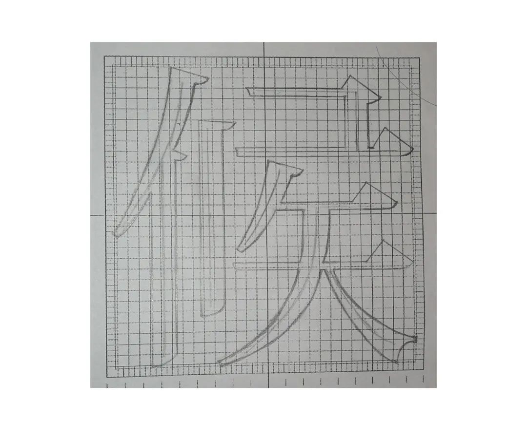
①Draw skeleton
Draw the structural skeleton of the font in the grid first, if you can’t determine the position, don’t estimate it, just count the grids directly.
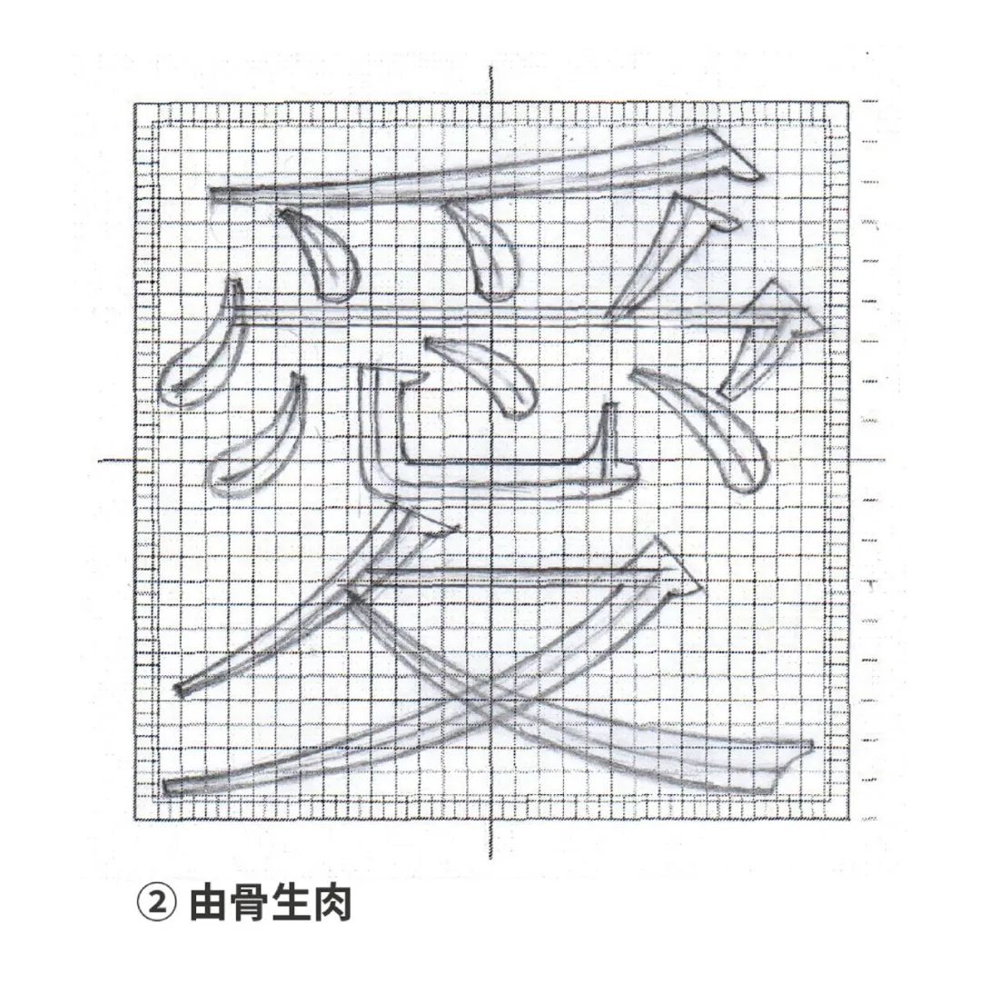
②From bone to meat
This step is more difficult, because the radian of the stroke curve is not easy to control, and it is difficult to confirm with one stroke, so do not use solid lines when drawing, otherwise the paper here will become more blurred after many revisions. become thinner and may even tear. The correct method is to draw the sketch of the curve stroke with a dotted line first, and then use a solid line after confirmation.

When drawing curve strokes, you can use the point layout rules, first use points to mark the extreme points, and then connect and draw.
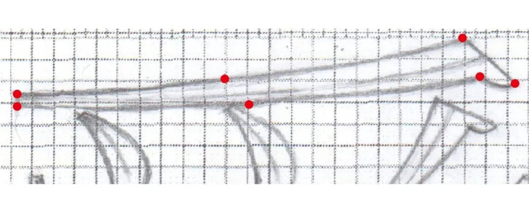
If the strokes are long, you can add dots in the middle to determine the position, which can save time to achieve the radian of the strokes of Fan characters, and can also exercise the ability of point layout.

③Inking correction
Nowadays, fonts are almost all done in software. Inking is no longer a necessary step. You don’t need to ink, but the outline still needs to be drawn with a needle pen. If you make a mistake, you can use correction fluid to correct it.

After these few steps, it is expected to take about 50 minutes to copy a word. Although it takes a long time, it will benefit from it.
You will discover the details of the fonts in copying and you can note them, so that over time you will make a qualitative leap in the fonts, and gradually you will have the ability to distinguish the fonts.
The wrong way to copy
-
Here are examples of mistakes that everyone made when copying before, so as not to make the same mistakes again.
sloppy
You can say that you have no drawing foundation, but it cannot be used as an excuse for copying fonts. You only need to be careful and patient, and it has nothing to do with whether you have a drawing foundation. It would be better to use this part of the time to do more meaningful things if it is too hasty.
Draw outline
The purpose of copying fonts is not to cultivate Internet celebrities who draw hollow characters like Douyin, but to perceive strokes and structural details, and you need to use basic strokes to stitch together fonts.
The above is a more detailed introduction to the method of copying fonts. Although the process will be boring, it will benefit a lot. To this day, Morisawa Bunken in Japan still uses this hand-painted method to draw each character to develop font products, and the grid we use also comes from this company.
Finally, salute to everyone who is passionate about font design!
LITTLEBENEFITS
Small benefits at the end of the article
—
For those who want to download “ Morisawa Manuscript Grid”, please reply in the background
"Grid"
▼

You can get the download link, hurry up and share the good things with more friends!

Advertise yourself!
Everyone vote for my book
Strive for rankings and exposure!
Three votes per day
Thanks? Thanks❤
⇩

*
The new book is online
"Doing Typeface:A Practical Typeface Design Method"
Jingdong.com and Dangdang.com are now on the shelves, with super dry content, and many well-known design masters strongly recommend good books!

Click "Read the original text" below to purchase the book directly
Articles are uploaded by users and are for non-commercial browsing only. Posted by: Lomu, please indicate the source: https://www.daogebangong.com/en/articles/detail/The%20correct%20way%20to%20copy%20fonts.html
 支付宝扫一扫
评论列表(196条)
测试