
Words are the inevitable product of the exchange of human thoughts and feelings. With the progress of human civilization, it has gradually formed a perfect and standardized scientific program from simple to complex. Beautification of words, as a medium to transmit thoughts and feelings, has become an important research topic with the progress of human civilization.
The font should be correct
The composition of different Chinese characters or Latin alphabets, the strokes are legal, as long as there is a slight discrepancy, it becomes a different character, and the meaning of the word is different, and the meaning is not the same, and no one can recognize it. This completely loses the character itself role. Therefore, the glyph must be accurate, and strokes cannot be increased arbitrarily, nor can they be reduced or changed arbitrarily. Recommended reading:A comprehensive interpretation of the mystery of Chinese fonts!
The style should be unified
Regardless of Latin letters or Chinese characters, the font strokes must be uniform. For example, when writing Chinese characters, it is not suitable to use three strokes of Li style, and two strokes to imitate Song Dynasty. It is not suitable to write Latin alphabets with mixed characters of broadcast script, small script, and flower script. Printed script and handwritten script cannot be mixed in a single character. Recommended reading:How fonts break silence? ! Glyphs
Font expression should adapt to the spirit of text content
Each font has its own expression. For example, the black body has a striking and serious feeling, the old Song and regular script have dignified and upright expressions; , with a sense of luxury and simplicity; the printed style is equivalent to the old Song regular script, which has a dignified and clear feeling. Recommended reading:Help you get it done easily! The character of Chinese font
Handwriting is equivalent to imitating Song, Xing, and Cao, with a relaxed and lively posture. Therefore, when choosing a certain font as the keynote of designing artistic characters, it should be determined according to the spirit of the text content. Only in this way can the outside and the inside be consistent, and the maximum function of the text's appeal can be exerted. As for the form of change, there is no sticking to one pattern, and the length, fatness, straightness of all strokes can be adjusted freely."It can be regulated freely, as long as it is changed according to the inherent structure of the text, and even further according to perspective, three-dimensional projection, Hollow changes and other methods can strengthen its decorative meaning and beautify it.

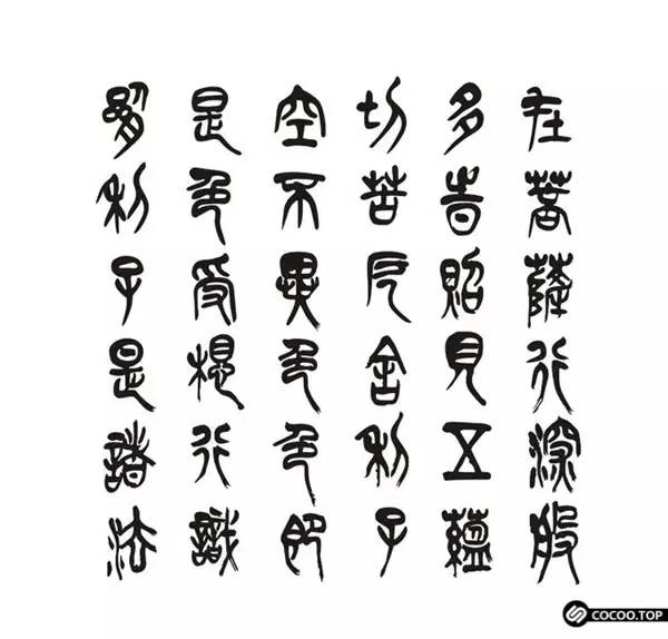
In terms of the evolution of Chinese fonts from pure paintings to line symbols, they can be roughly divided into the following six bodies:
Ancient Chinese
The hieroglyphs of ancient times include the oracle bone inscriptions of the Shang Dynasty and the bronze inscriptions of the Three Dynasties.
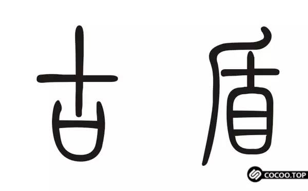
Seal script
There are two styles of big seal script in the late Western Zhou Dynasty and small seal script in Qin Dynasty. Seal script has the simplicity of ancient hieroglyphics, and the abstract interest of its graphics is often artisticized in modern seal cutting. In modern applied art, especially in the domestic design circle, seal script is often used in the design of greeting cards, invitations, badge patterns and so on.
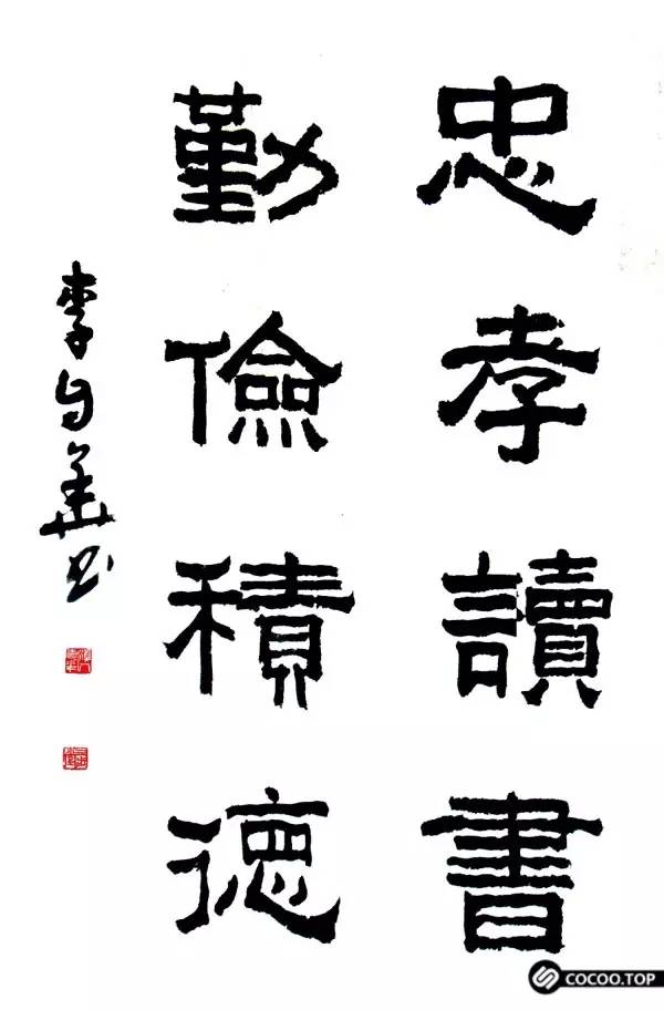
Lishu
Originated in the Qin Dynasty, it is formed by taking the strokes of Dazhuan and Xiaozhuan and reducing them. The official script not only changed the curve of the font before the Qin Dynasty into a straight line, changed the line into a dot, changed the circle into a square, and gradually separated from the shape and entered the meaning symbol. A decorative pen with waves. 2. The horizontal stroke is written with a right slanted pen. In advertising design, where the company. The full name design (composite characters) of the business number or exhibition is often used in official script, which can express the traditional sense of authority.
cursive
A short font with an organized system. Created in the early Han Dynasty, its evolution process is first "Zhangcao", then "Jincao" and then "Kangcao". The shape of general cursive script is difficult for the public to understand, and it lacks practicality and legibility, so it is not suitable for general text design. However, when it is necessary to express a friendly impression such as thanks, cursive script has personality, that is, trust, kindness, elegance and other characteristics. It is also a good material.
Authentic
Also known as "regular script", it is a style of calligraphy combined with official script and cursive script, which has become the most popular standard character for general books and letters. The "Zhengcao" used to print movable type is the traditional "Zhengshu style", which has strong handwriting, clear strokes and the highest readability.
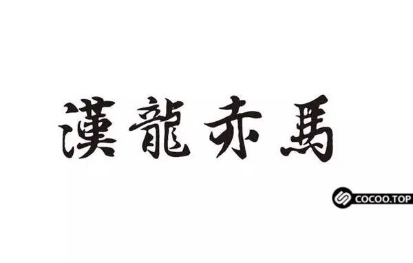
Run Script
is a variant of the main script. Chinese characters have changed little since the Tang Dynasty; running script is considered the most popular font, and it has been used until now, and still maintains a high status in applied arts. Running script is easy to read and write, and has a wide range of applications. At present, except for printed and important characters that must be written in official script, daily documents are generally written in cursive script.
The design of modern Chinese characters is basically derived from the evolution and processing of the above six types and the printed styles of Laosong, Fangsong, Heiti, etc. The key point is to master the basic strokes and regular organization of each character Changes, considering the balance of the space between the strokes to make the design of the trademark; advertisement, title, both decent and beautiful.


Articles are uploaded by users and are for non-commercial browsing only. Posted by: Lomu, please indicate the source: https://www.daogebangong.com/en/articles/detail/The%20beauty%20of%20Chinese%20characters%20Chinese%20font%20design%20principles.html
 支付宝扫一扫
评论列表(196条)
测试