Editor: Scallion Author: Word Beauty
Do you still remember the Qingming Festival-style shop signs that were crazily complained some time ago?
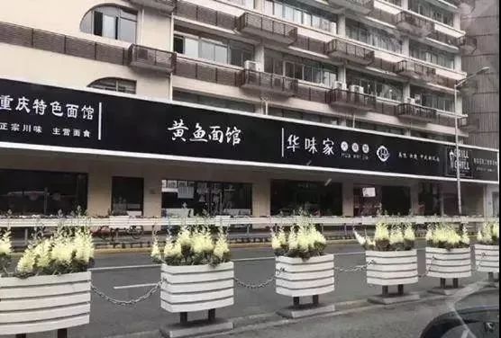
That's right, walking on the streets of Chinese cities in 2019, you can feel this unique Chinese-style landscape. Almost no city is spared. Even Beijing, a first-tier city with a strong historical and cultural heritage, has been destroyed by unified signs The tolerance and beauty that the city should have.
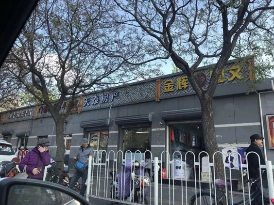
Feel free to post some pictures in other cities:
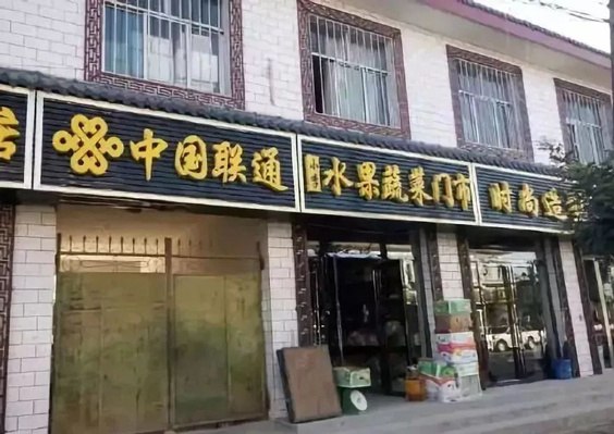
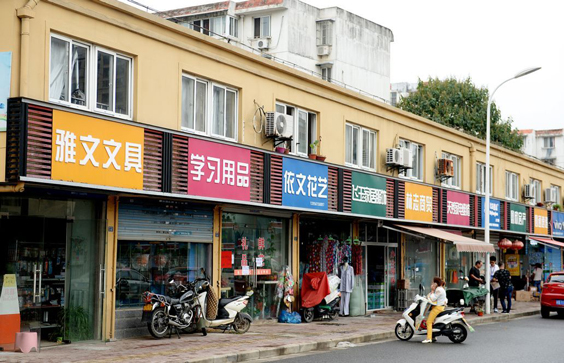
OMG! My eyes are going blind! To sum it up in one sentence: the city has unified shop signs and lost its soul.
Compared with the same ugly shop signs, look at those extremely creative street fonts, even the rusty hand-made fonts, they are much more lively. Next, let us feel the charm of street fonts .
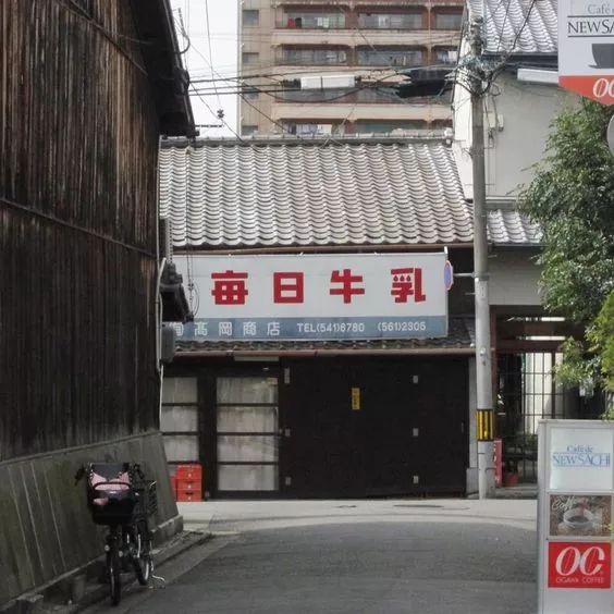
【Daily Milk】
The ancient buildings are matched with simple and eye-catching fonts, but they do not feel out of place, but can be integrated into one.
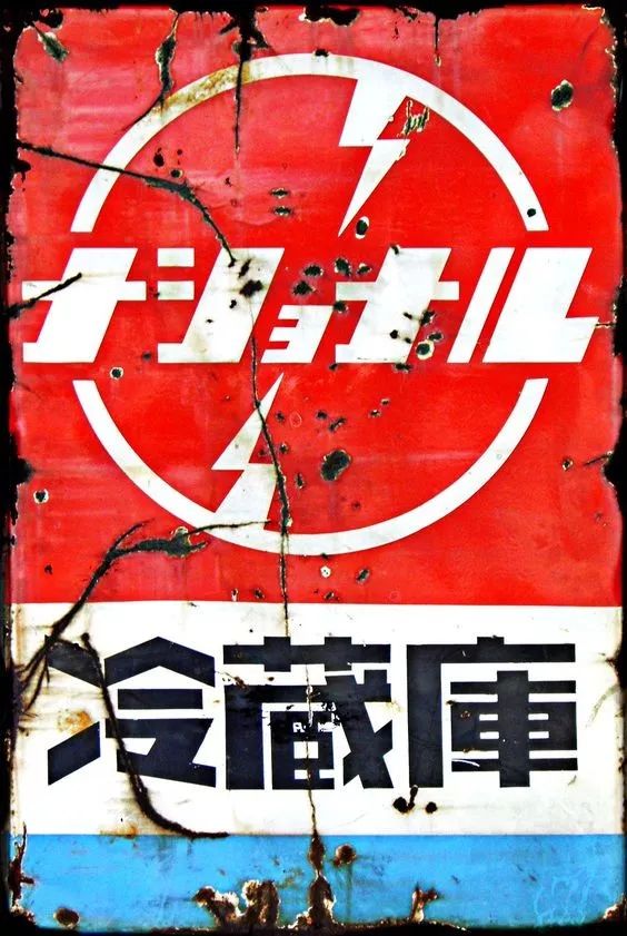
【 Cold Storage 】
Simple and Powerful Fonts
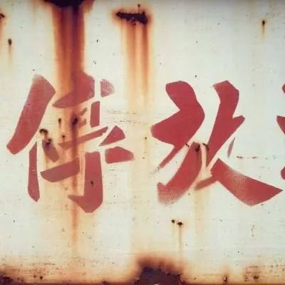
【Park】
It is full of rust, but it has more stories and souls
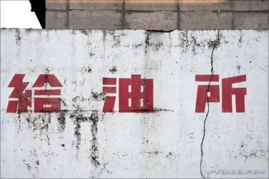
【 Oil station】
Both the name and the font are so down-to-earth
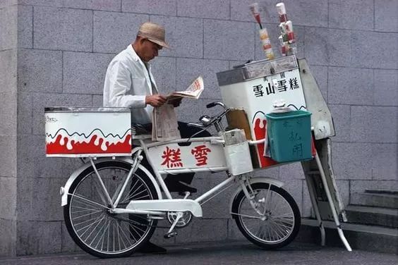
【Ice cream】
At that time, you didn’t need to go to the supermarket to buy ice cream. There would always be an old man riding a bicycle to deliver the ice cream to your door.
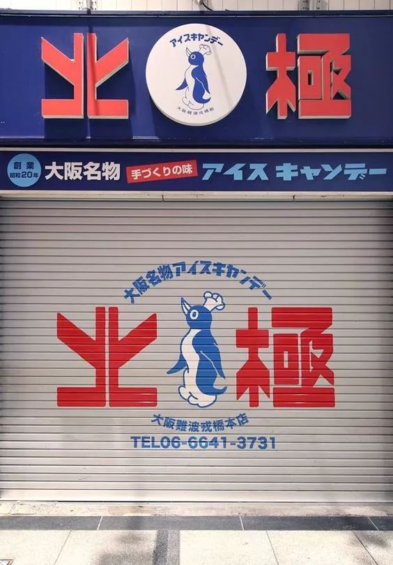
【Arctic】
Geometric fonts, symmetrical structures, strong sense of form and strength
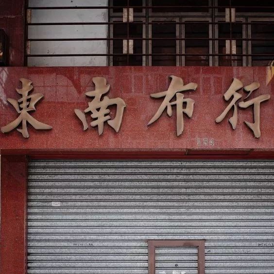
【 Southeast Clothing 】
A cloth store sign, the text looks like the work of a famous calligrapher, not the fake calligraphy with strong computer-like traces that are all over the street now.
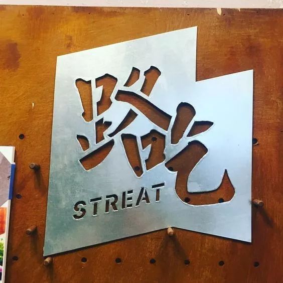
[Road eating]
An inadvertent little idea will make people smile.
【 Shop 】
Are the strokes curved on purpose? Look carefully, it turns out that there is an apple hidden in the store words.

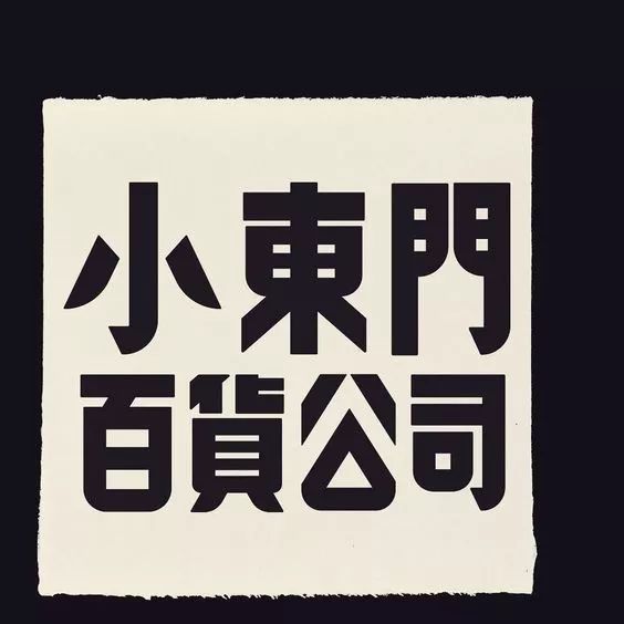
【 Xiaodongmen Department Store 】
Just looking at the font design, you can feel that it is a very interesting department store/.
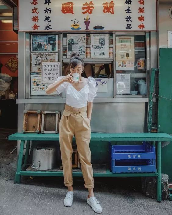
【 Lanfang Garden 】
Does this kind of shop sign have more feeling than those acrylic light boxes?
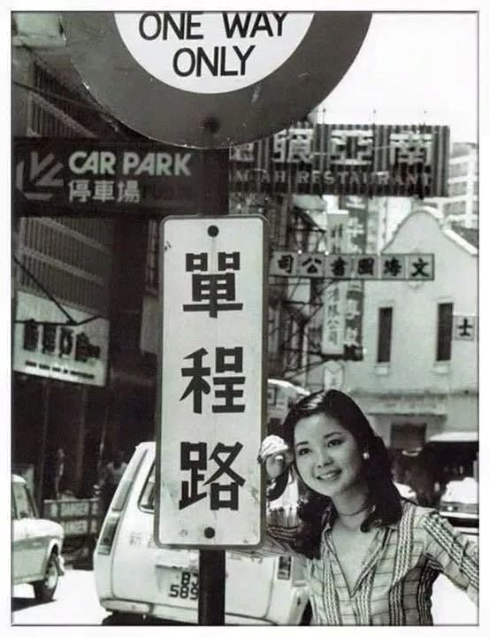
【One way road】
The place where a generation of superstar Teresa Teng waited for the car
【Driver Lounge】
The font design at that time was so avant-garde, and the use of geometric forms was very skillful.

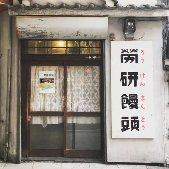
【 Labor Research Mantou 】
A shop that sells steamed buns pays so much attention to font design
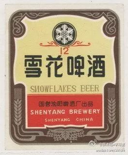
【Snow Beer】
Isn't the snowflakes back then worse than now?
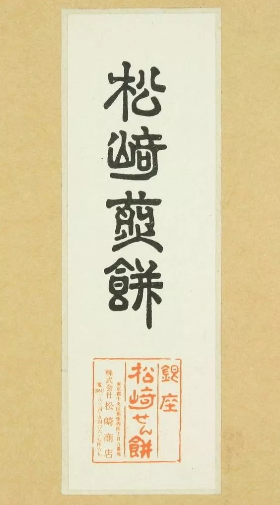
【Matsuzaki Pancake】
I swear, this is the most sentient pancake font I've ever seen
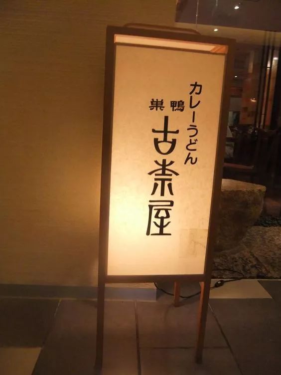
【 Ancient Tea House 】
Very characteristic glyphs, retaining some characteristics of seal script
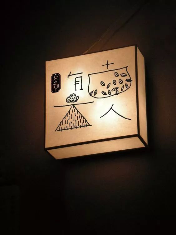
【The ancients have clouds】
Relaxed and at ease, like being in a field under the clouds.
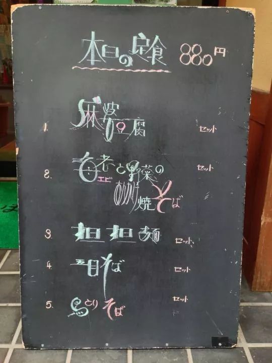
【Today's meal】
Even the writing on the small blackboard at the entrance of the store is so interesting that passers-by will definitely stop for it.
【Old Phone】
The phone number marked in Chinese characters has a special flavor

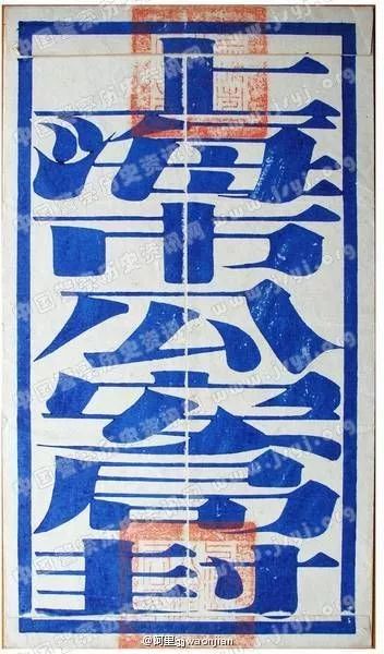
[Sealed by Shanghai Public Security Bureau]
This old Song typeface is so tense.
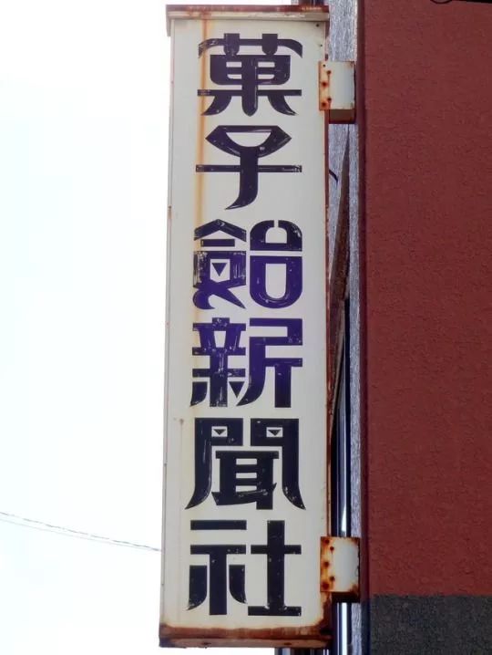
【 Guoziju News Agency 】
Must be some interesting news about food
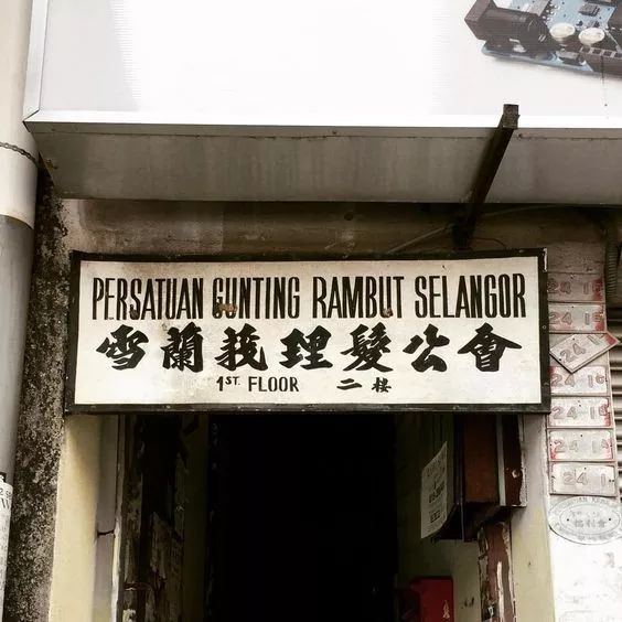
【Selangor Barbers Union】
Barber Guild? This is the first time I heard that there is such an institution, but the signature font is really impressive.
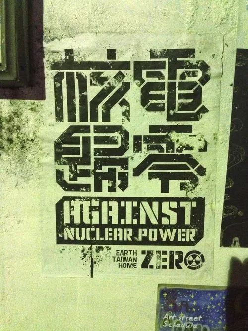
【Nuclear power zero】
Appropriate oblique cuts and just-right broken pens perfectly reflect the theme of the word.
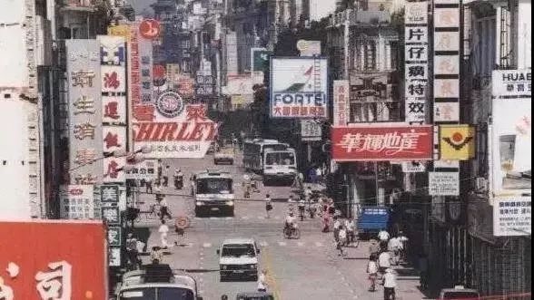
Finally, let’s take a look at Zhongshan Road in Xiamen in the 1990s. The shop signs at that time reflected the diversity and vitality of a city.
Articles are uploaded by users and are for non-commercial browsing only. Posted by: Lomu, please indicate the source: https://www.daogebangong.com/en/articles/detail/The%20allure%20of%20street%20fonts.html

 支付宝扫一扫
评论列表(196条)
测试