
 Apple’s new English font——SanFrancisco
A short book
Written by: Terry>
It seems a little numb to Apple's recent trends, the new system seems to have little change, and there is nothing amazing about 6S, that is, the application of ForceTouch to mobile phones adds more possibilities (ma) (fan) to future design work. However, the application of the new font this time has made many designers a little excited. However, in the domestic environment, everyone is naturally paying more attention to Pingfang. So what about the new English font this time? The following translation will take you through an in-depth analysis.
iOS has been released publicly. Although it has changed little compared to the previous version, the system font of iOS9 adopts a new font——SanFrancisco, which replaces the previous HelveticaNeue.
Helvetica (left) v.s.SanFrancisco (right)
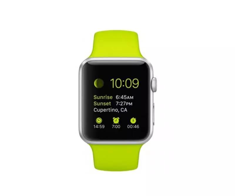
In fact, the SanFrancisco font has been used on AppleWatch earlier. In this update of iOS9, Apple has unified it as a system font for all platforms: including AppleWatch, iPhone, iPad and Mac.
Apple Watch
Apple has been using the Helvetica font since the first generation of iPhone, and since Yosemite10.10, the Mac system font has also been changed from the original LucidaGrande to Helvetica. So why did Apple abandon Helvetica, which is almost the most popular font in the world this time?
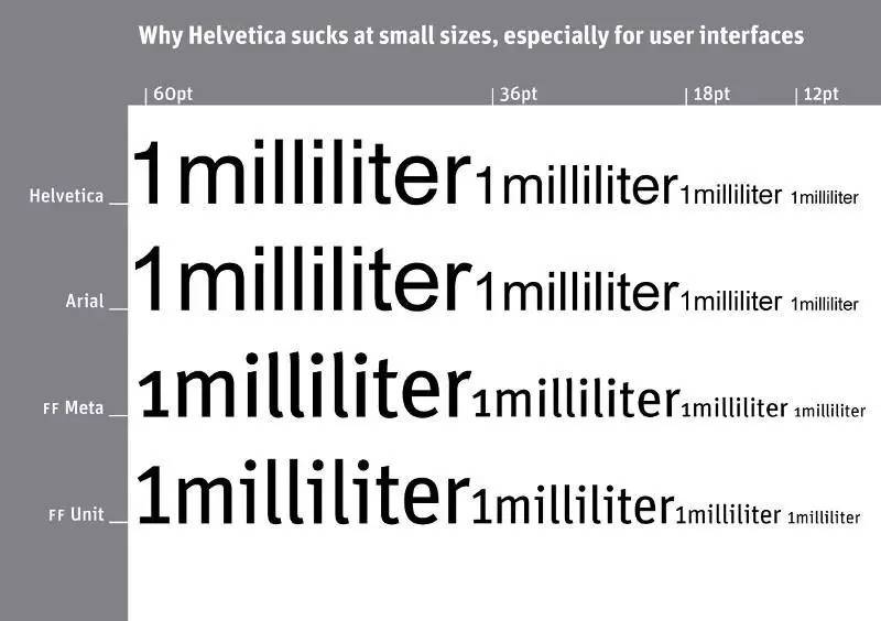
There are theories that Helvetica is not suitable for small fonts. When the Mac font was changed to Helvetica, many designers complained that Helvetica was not suitable.
"Helvetica sucks!" - said famous German font designer Erik>nn. As can be seen in the comparison in the image above, when entering Helvetica at a small font size, the readability is low and it starts to blur. Some letters are even mixed together, making it difficult to make out. It is said that the SanFrancisco font appeared because Apple wanted the small text on the Apple Watch to be easier to read.

Some letters get mixed up at small font sizes.
But today, smart devices have higher resolution than traditional paper prints, and the text on the iPhone is not always small like the Apple Watch, so why does Apple change the font of the iPhone and even the Mac to SanFrancisco instead of just SanFrancisco? What about the app on AppleWatch?
SanFrancisco has many highly readable features. In fact, the SanFrancisco used on AppleWatch and iOS/Mac is not the same.
SanFrancisco font (hereinafter referred to as SF) is used on iOS/Mac, and SanFranciscoCompact (hereinafter referred to as SFCompact) is used on AppleWatch. You can see the difference between the two fonts on some letters that have a rounded appearance, such as "o" and "e", SFcompact is flatter than SF in the vertical direction.

SFv.s.SFCompact
This subtle difference allows SFCompact to have a larger kerning, so that when used on the small-sized device AppleWatch, the letters will not be mixed together, thereby achieving higher legibility.
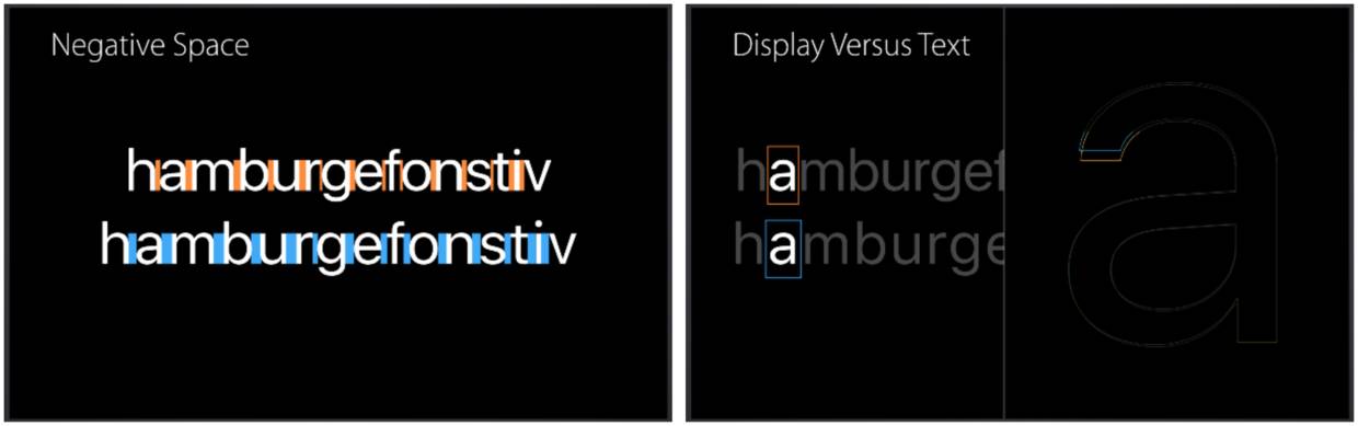
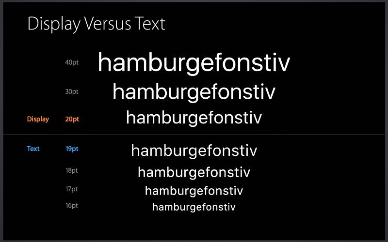
In addition, SF and SFCompact are respectively divided into two sets of sub-fonts - "Text (input type text)" and "Display (display type text)". This is what Apple calls "visual size." Text is applied in small font size, and Display is applied in large font size.
SanFrancisco font family tree
As mentioned above, in sans-serif fonts such as Helvetica, when the font size is small, two adjacent letters are easy to mix together, and letters like "a", "e" and "o" look very similar.
Display font v.s.Text font
The Text font applied to the small font size has a wider character spacing, and the design of the letter opening is also wider, all of which are for the legibility of the small font size.
The most notable feature of the SanFrancisco font is that it dynamically adjusts the typeface as the font size changes. The system will automatically switch between Text and Display according to the font size. Specifically, 20pt is exactly the tipping point.
The system will automatically switch the font according to the font size
Neither designers nor developers need to worry about font selection. You only need to apply the system fonts to the interface, and then leave it to the system.
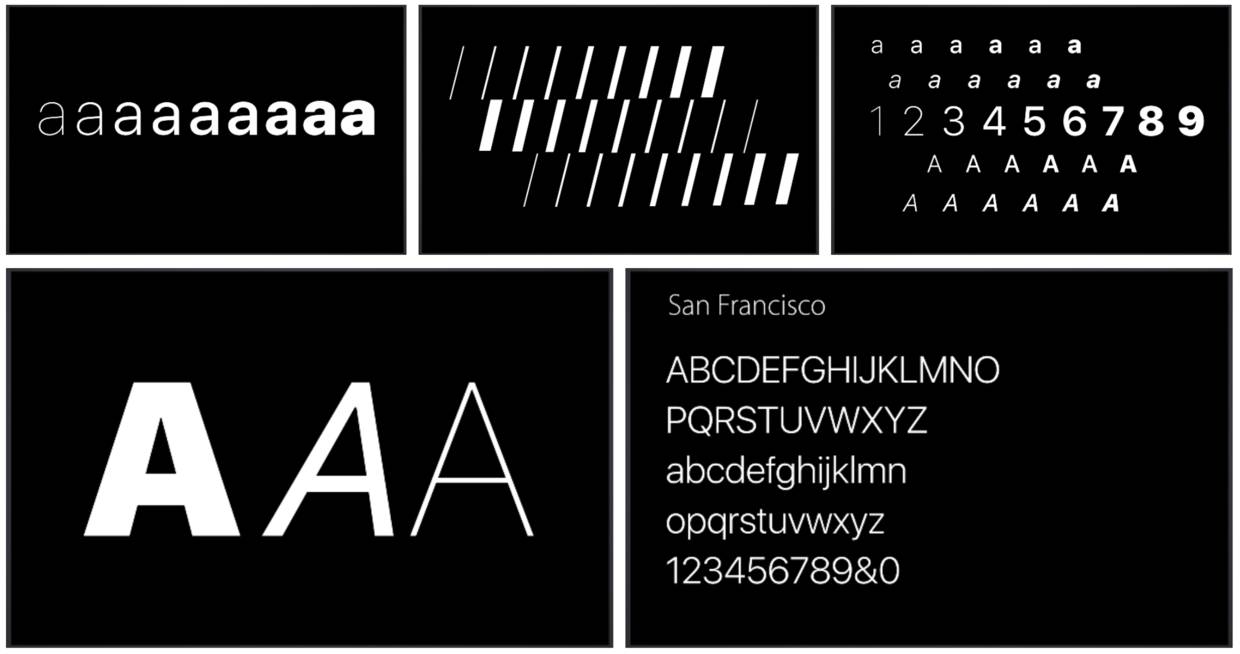
Another feature that impresses me is that the SanFrancisco font pays special attention to the display of colons. Usually, colons are displayed on the font baseline, so when applied between numbers, they are not visually centered vertically. The SanFrancisco font will automatically center the colon at this time.
As you can see , SanFrancisco font has been carefully designed to be easy to read on any device at any size.
Helvetica, which was replaced by SanFrancisco, was born in Switzerland in 1957, and there were no electronic devices at that time. Even now, Helvetica is still widely used by many companies, and there is no doubt that it will remain a classic in the future.
SanFrancisco is, relatively speaking, a modern typeface. It will automatically change the font according to the usage scene. It has to be said that he was born for the digital age.

Articles are uploaded by users and are for non-commercial browsing only. Posted by: Lomu, please indicate the source: https://www.daogebangong.com/en/articles/detail/The%20Secret%20of%20Apples%20New%20English%20Typeface%20San%20Francisco%20%20Featured.html
 支付宝扫一扫
评论列表(196条)
测试