In yesterday's post, I told you about the principles of color matching in design. If you haven't read it yet, remember to read it, it will be more convenient for you to fully understand! Today, let's talk aboutwhat foolish ways are there to get these color schemes?
End of article resource pack
End of article resource pack
After reading the text, even if you are a novice, you can easily get the PPT color matching and do a good job of PPT!
Okay, here comes the question again, where can I find a ready-made color scheme?
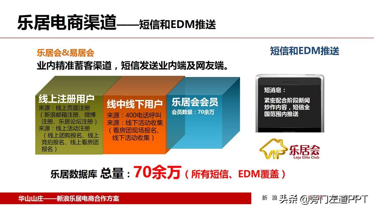
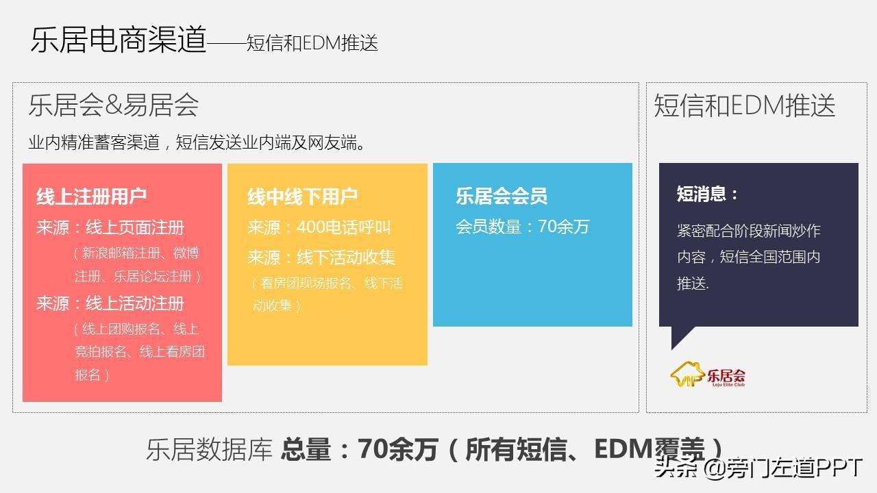
1, Go to the excellent color scheme sharing community.
In these types of communities, many people will share some excellent color matching schemes, which can be ready-to-use. Let me share with you two color matching communities that I know.
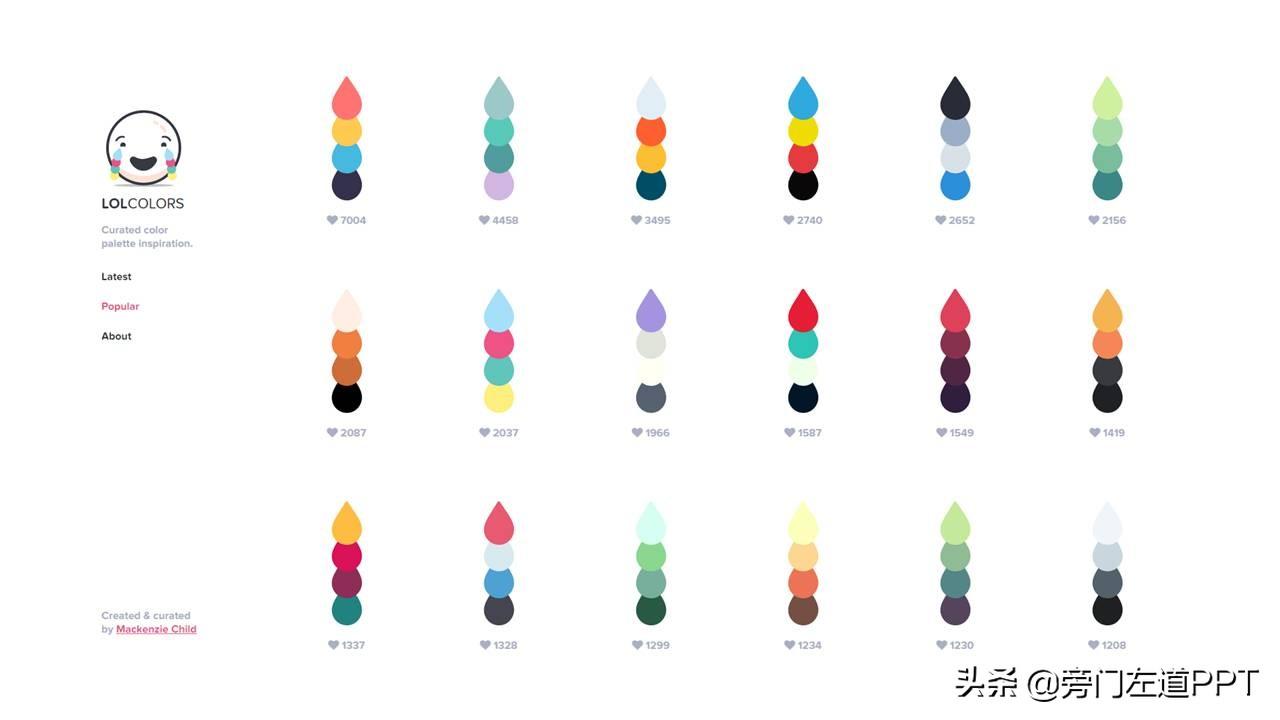
http://www.lolcolors.com
The color scheme shared on the website looks like this:
Another one is http://colorhunt.co
The color schemes provided by the site are also very nice.

So, in the face of so many sets of excellent color schemes, how to use them?
Let me give you an example.
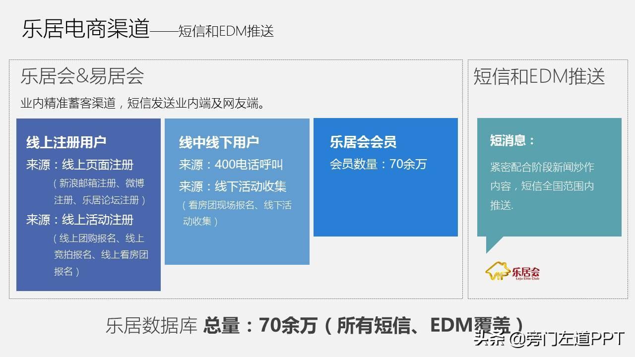
For example, let's take such a page of ppt as an example.
The page looks dirty because the colors used add shadows.
Then, in the website just now, we randomly choose a group of colors (the overall tone is not considered here, just think from the ppt of this page).
For example, the first group, I circled it in red:
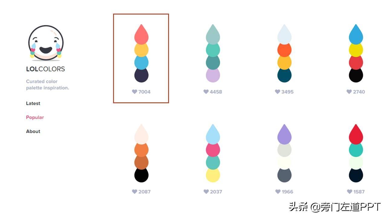
Then, apply it to the ppt page accordingly. Let's see the effect:
Isn't it refreshing and clean?
2, extract the color value in graphic design works.
Some excellent graphic design works, such as posters, brochures, etc., and they are often excellent in many aspects, such as excellent typography, excellent composition, etc., of course , and the color matching is also excellent. Therefore, we can use some picture color value tools to extract the colors used in the picture and use them as the color matching scheme of PPT.
What does it mean? Let me give you a few examples.
For example, we can use the color picker tool to extract the color matching scheme in UI design.
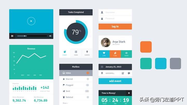
It can also be a color scheme in illustration design.


When these colors are extracted, we can directly apply them to the ppt.
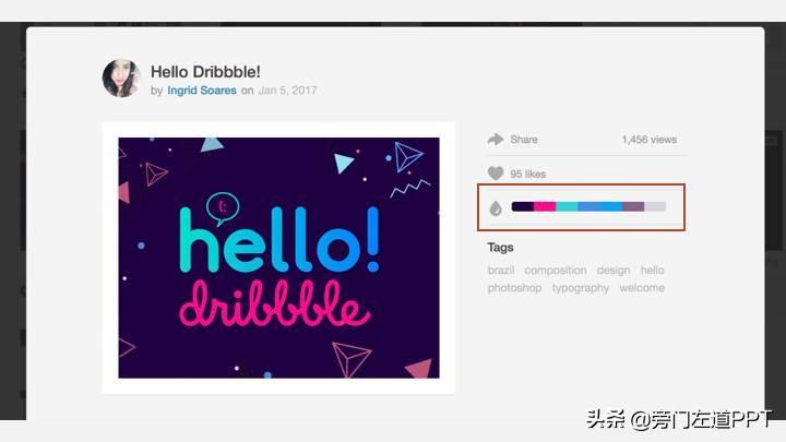
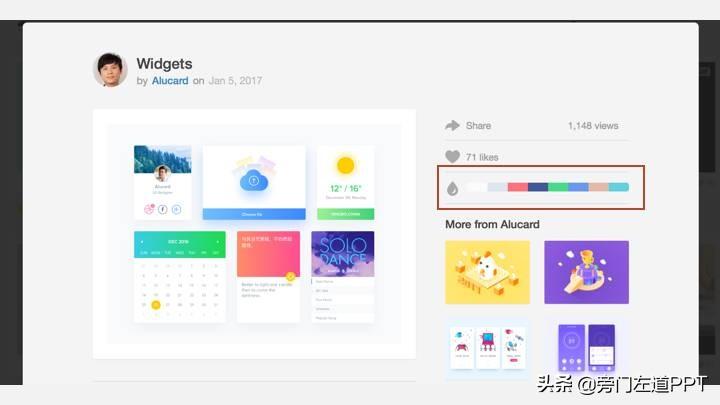
Of course, there are some websites, like dribbble.com,We can see the corresponding color scheme on the right side of each graphic design work, or use it directly .
Let me show you two examples:
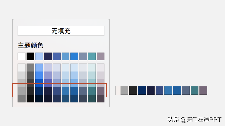
3, Directly use several sets of color schemes that come with PowerPoint.
The color scheme that comes with the PowerPoint software itself is also very good, but many people don’t use it well. Why do you say it is excellent? Because it is a beautiful and complete color matching system.
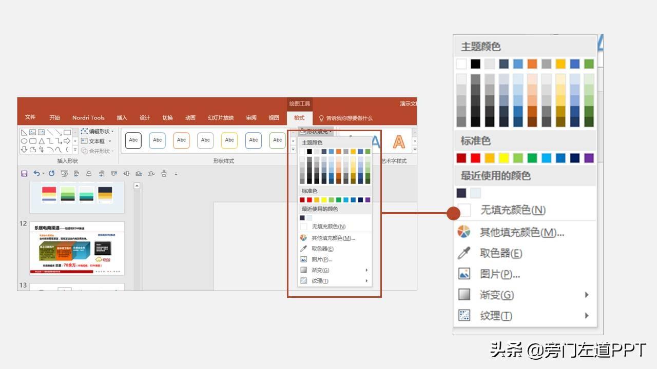
As we can see in the Variants of the Design tab, it not only includes various color systems, red Both yellow and blue. In addition, all levels of color are readily available, including dark blue and light blue.
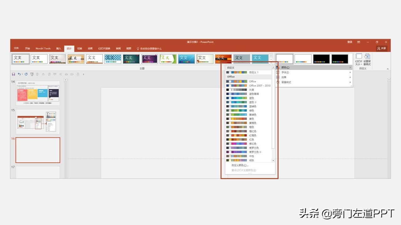
For example, we use a random set of colors.
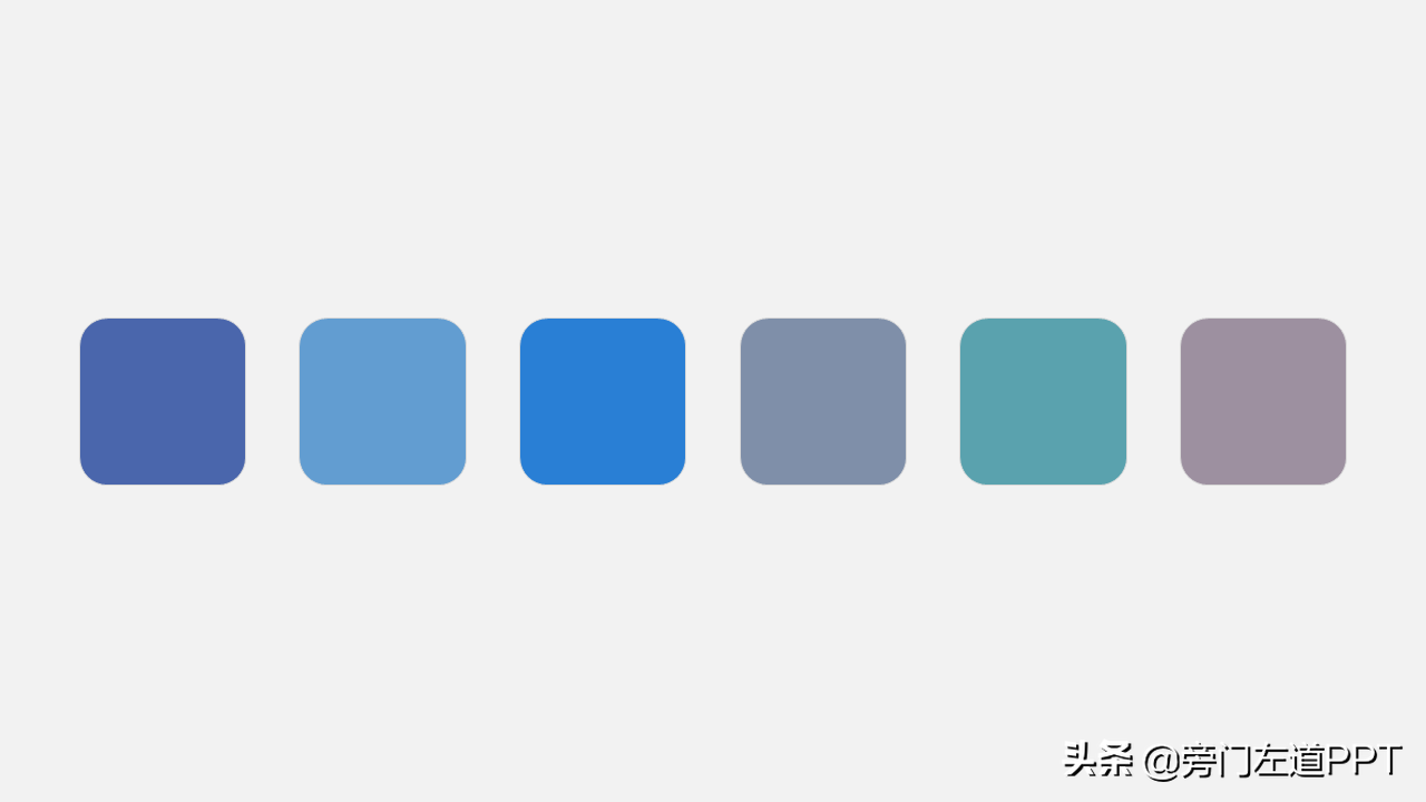
Then insert it into the page just now, the effect is also good.
So, why are many people not using it well?
Because, in many people's minds, since the software comes with so many colors, the range of colors for PPT is so wide. So, just randomly match them in these colors. The use of color in this way is definitely not aesthetically pleasing.
If you choose from the color wheel arbitrarily, the rendering effect of the page will be messy.
So, what should be the correct way to use it? My answer is to color match within the same line.
What is peer matching? That is to say, when we select a certain color in one of the rows, then, correspondingly, the matching color used is also selected in the same row.
So, why are the colors selected in the same row more beautiful when matched? Considering the length of the article, I will not go into details here. If you are interested, you can learn about the theory of approximate color matching.
Okay, here, this article has been written. Let me sum up, there are 3 options that can be considered for fool-style color matching:
- Directly go to the color scheme community to choose
- In excellent
- Use the color scheme that comes with powerpoint software
If you have something you don't understand when reading the article, you can leave a message to ask questions, and I will answer them.
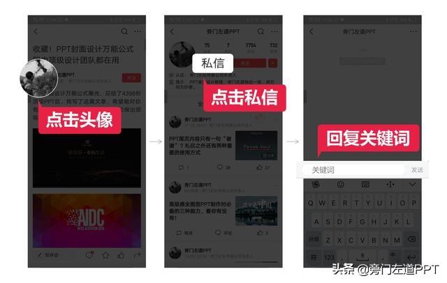
Click on my avatar, private message keyword [PPT], I have prepared an original PPT resource pack for you!
Includes versatile PPT templates, PPT materials, and PPT learning materials. I hope it will be useful to you! The specific operation is as follows:
Remember to comment and like it!
Articles are uploaded by users and are for non-commercial browsing only. Posted by: Lomu, please indicate the source: https://www.daogebangong.com/en/articles/detail/The%20PPT%20that%20makes%20the%20leaders%20eyes%20shine%20These%20three%20color%20matching%20methods%20are%20indispensable.html
 支付宝扫一扫
评论列表(196条)
测试