It is impossible to have no text in a PPT. Choosing the right font can instantly improve the texture of the entire work. However, regarding the use of fonts, many friends have similar troubles:
"What are the useful fonts in PPT?"
"I have hundreds of fonts installed and have no idea which one to use!"
What to do?
Today we will talk about how to use the least amount of fonts to achieve the strongest effect when designing PPT.
01
Basic knowledge of fonts
Before actually learning how to use fonts, let’s first get to know the basics of fonts. The use of PPT fonts can only be accurate under the framework of “common sense”.
❶Serif and Sans-serif
Fonts are divided into serif and sans serif. Serif fonts refer to fonts with decorations at the beginning and end of strokes. Serif fonts are characterized by inconsistent thickness of strokes, such as TimesNewRoman, Georgia, SongTi, etc. are all serif fonts. The sans-serif body does not have too much modification, and the stroke thickness remains the same, such as Verdana, Arial, black body, etc. are sans-serif body.
As shown in the figure below, it is the difference between a serif body and a sans serif body.

When making PPT, it is recommended to choose a sans-serif font. Because the sans serif font has the same thickness, it looks simple and clean. When projecting, the sans-serif body will be displayed more clearly because it does not have too fine strokes, which is convenient for long-distance audiences to watch.
In the two-page PPT shown in the figure below, the first page uses a serif font, which makes it difficult to recognize the text. After changing to sans-serif on the second page, the text is much clearer.

❷Font display problem
After selecting certain fonts for the text in the PPT, the text becomes blank or cannot be displayed normally. This is not a problem with the computer, but some fonts are only designed to display specific characters. When the input characters are not in the fonts in the font library, the display will be abnormal. So when choosing fonts, you should choose those fonts that can ensure that the text is displayed clearly, instead of choosing uncommon fonts for the sake of innovation.
In addition to the above, the PPT file may not be displayed normally because the computer has not installed the corresponding font. In this case, there are three solutions, one is to embed the fonts in the file, the other is to convert the fonts into pictures and put them on the slide page, and the third is to save the PPT as a PDF file. The third method only needs to select the file type when saving, and the other two methods are introduced below.
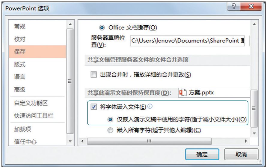
Open the [PowerPoint Options] dialog box, switch to the [Save] tab, select the [Embed fonts into the file] check box and the first radio button below to embed the fonts used in the file into the file , as shown in the figure below.
If you want to convert fonts into pictures when making PPT, you can do it through the following steps.
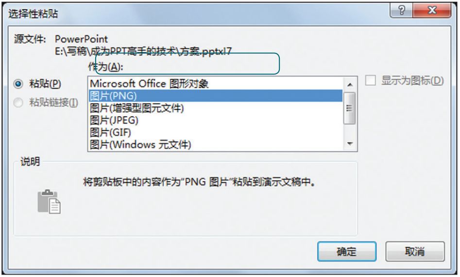
Step 01Select the set font and press [Ctrl+C] to copy it.
Step 02Select [Paste] → [Paste Special] option, open the dialog box shown in the figure below, select [Picture (PNG)] option, and finally Click the [OK] button to close the dialog box.

Step 03 At this time, the font will be copied and pasted in the form of a picture, delete the original text font, and keep the picture font, the effect is as shown in the figure below .
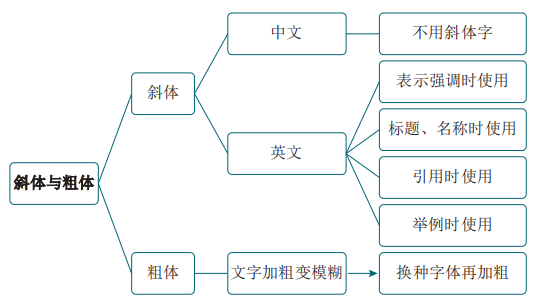
❸ Italics and Bold
Remember two principles:Do not use Chinese italic characters, and the bold font cannot appear blurred.
First take the italics as an example, some people use italics in order to highlight the uniqueness of Chinese fonts, but this is actually wrong. The origin of italics is handwriting, which is used in Western fonts. With the popularization of computers, computers in Chinese-speaking countries can also set the inclination of characters. However, the tilted Chinese characters simply change the square text into a parallelogram "false tilted body". In fact, the tilted Chinese characters not only have no specific meaning, but also make the characters difficult to read.
Secondly, let’s talk about bold fonts, the computer will simply and roughly pull the text to make it slanted, and it will also simply and roughly make the text bold. However, the ratio and weight of different fonts are also different. If it is only bolded like a formula, some fonts will become blurred. If a certain type of font becomes blurred after being bolded, it means that the font is not suitable for bolding. The correct way at this time is to change another font and add boldness.
The principles of using italics and bold in PPT are summarized in the figure below.
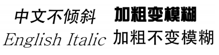
Improper bolding will make the font blurred, and the inclination of Chinese characters will destroy the original structure and beauty of the font. The specific effect is shown in the figure below. What needs to be explained is that the bold and blurred text refers to the "pasting" of certain structures of the font. For example, after the word "Mo" is inappropriately bolded, the strokes below the word "木" on the left have been "sticky" Together, but after changing the font and bolding, there is no such phenomenon.

02
Typeface
When designing a PPT, in order to highlight the theme, enhance the performance effect, or have artistic quality, it is necessary to choose a font that matches the theme and text content. Let's look at a few typical examples.
❶ Tough and vigorous temperament——Heiti, Microsoft Yahei
Simple sans-serif fonts such as Blackbody and Microsoft Yahei have a tough and vigorous temperament. It is usually used as a title font, or in the PPT of technology companies. This temperamental font reveals rationality and persistence, and can sublimate themes representing strength, hope, and determination.

As shown in the picture above, it is a PPT page of a technology company. The text uses Microsoft Yahei font, which is concise and powerful, and the content of the text and the temperament of the font complement each other.
❷ Romantic, literary and artistic temperament——Youyuan, Hanyi
In order to set off a romantic theme, you can choose a serif font without affecting the reading, because the serif font is more artistic. The strokes of this type of font are often not horizontal and vertical, but their unique design can enhance the atmosphere.

As shown in the picture above, Hanyi fonts are used, and the text matches the theme very well. But if the text is changed to bold, it will lose its dreamy color.
❸ Classical, elegant temperament - calligraphy brush font
Brush type fonts have a classical and elegant temperament, suitable for use in ink-and-wash style PPTs, and are often used to highlight ancient-style themes.
As shown in the picture above, select brush fonts for PPT, and the text and content match each other.
03
Classic Font Match
A complete PPT is often matched with less than 3 fonts, font matching is the same as color matching, and proper matching can make the page play its best good effect.
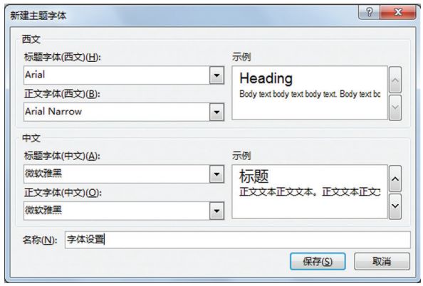
In order to improve the production efficiency of PPT, font matching can be set in advance. The method is to select the [Custom Font] option in the [Font] drop-down menu in the [Variation] group under the [Design] tab in the PowerPoint2016 work interface, and open the [New Theme Font] dialog box as shown in the figure below. In this dialog box, set the Chinese and English titles and body fonts of this PPT to avoid repeated font adjustments during the production process.

The following summarizes some commonly used collocation methods with better results.
❶ Microsoft Yahei (Bold) + Microsoft Yahei (Regular) - Business PPT
Microsoft Yahei is a beautiful and concise font that comes with the system. This font is a sans-serif font, and the text is displayed clearly, and it is not too ordinary like Song typeface. The combination of thickness and thickness of Microsoft Yahei font can be used in business PPT, presenting a simple and elegant aesthetic feeling. For novices, it is safe to use this kind of font collocation without good aesthetics. As shown in the figure below, the Chinese title and text are in Microsoft Yahei fonts, maintaining a high degree of uniformity.
❷ Founder Zheng Zheng Hei Simplified+Fang Zheng Zheng He Si Simplified—Government PPT
Founder Zhengzheng Hei Simplified and Founder Zheng Hei Simplified can make the PPT interface clear, neat and clear. It is very suitable for PPT in more serious occasions such as government reports and public institution reports. The effect is shown in the figure below.
❸ Hanyi Variety Show Style + Microsoft Yahei - Academic PPT
The combination of Hanyi Variety Simplified and Microsoft Yahei fonts is rigorous and not too rigid. It is suitable for use in academic reports, papers, teaching courseware and other types of PPT. As shown in the figure below, it is an academic report PPT. The title and text use Hanyi Variety Simplified and Microsoft Yahei fonts respectively.
❹ Founder Zhenghei Simplified+Arial——Fashion PPT
Adding English to PPT can effectively enhance the sense of fashion. In this case, using Fangzhengzhenghei Simplified for Chinese and using the Arial font that comes with the Windows system for English can make the PPT page stylish and elegant. As shown in the figure below, it is the effect of using these two fonts together. After using the Arial font in English, it will become rounded, while the Simplified Chinese in Fangzhengzhenghei will appear angular. The combination of the two presents a Artistic sense.

---------------------------------------------------------------------
▼
Recommend new books
《Sophisticated Series》

Make Word/Excel/PPT a real office tool!
Purchase address:
Click "Read the original text" at the end of the left bottom, and you can go to Jingdong Books to buy online.
Articles are uploaded by users and are for non-commercial browsing only. Posted by: Lomu, please indicate the source: https://www.daogebangong.com/en/articles/detail/The%20PPT%20font%20this%20person%20uses%20is%20so%20ugly.html
 支付宝扫一扫
评论列表(196条)
测试