A reader asked me before,How can I make the PPT in the new energy industry more brilliant?
In the previous live broadcast, I modified a PPT on this topic:

How to do it? Let's look at it page by page.
Because it is a new energy industry, the colors are blue and green.


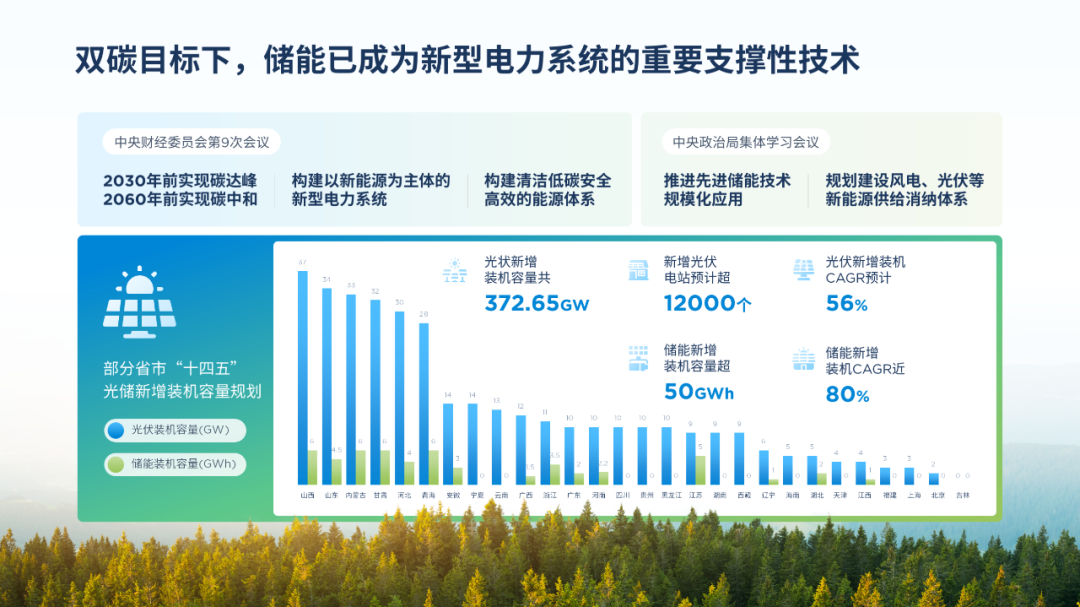
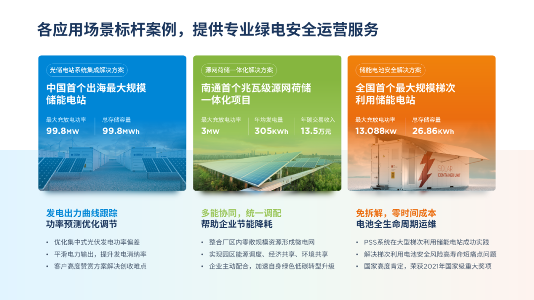
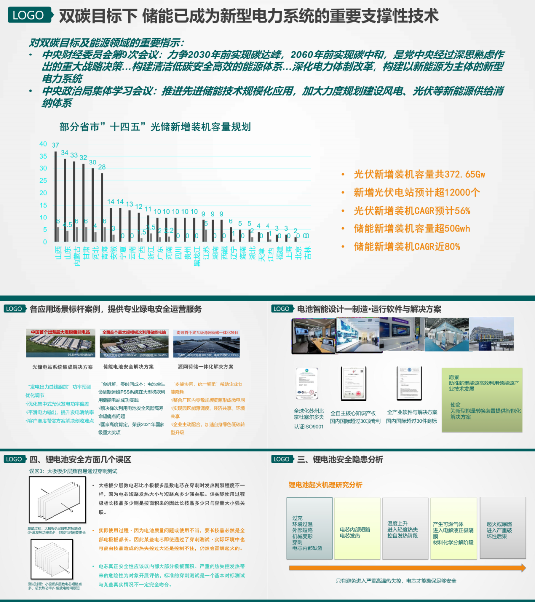
First Look at the first page
The text is crowded together and looks out of focus, and the graphics are not clear enough.
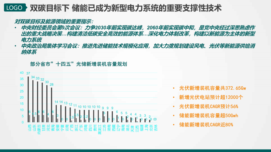
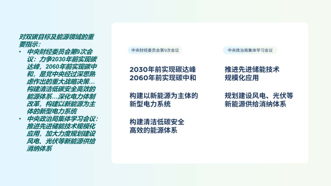
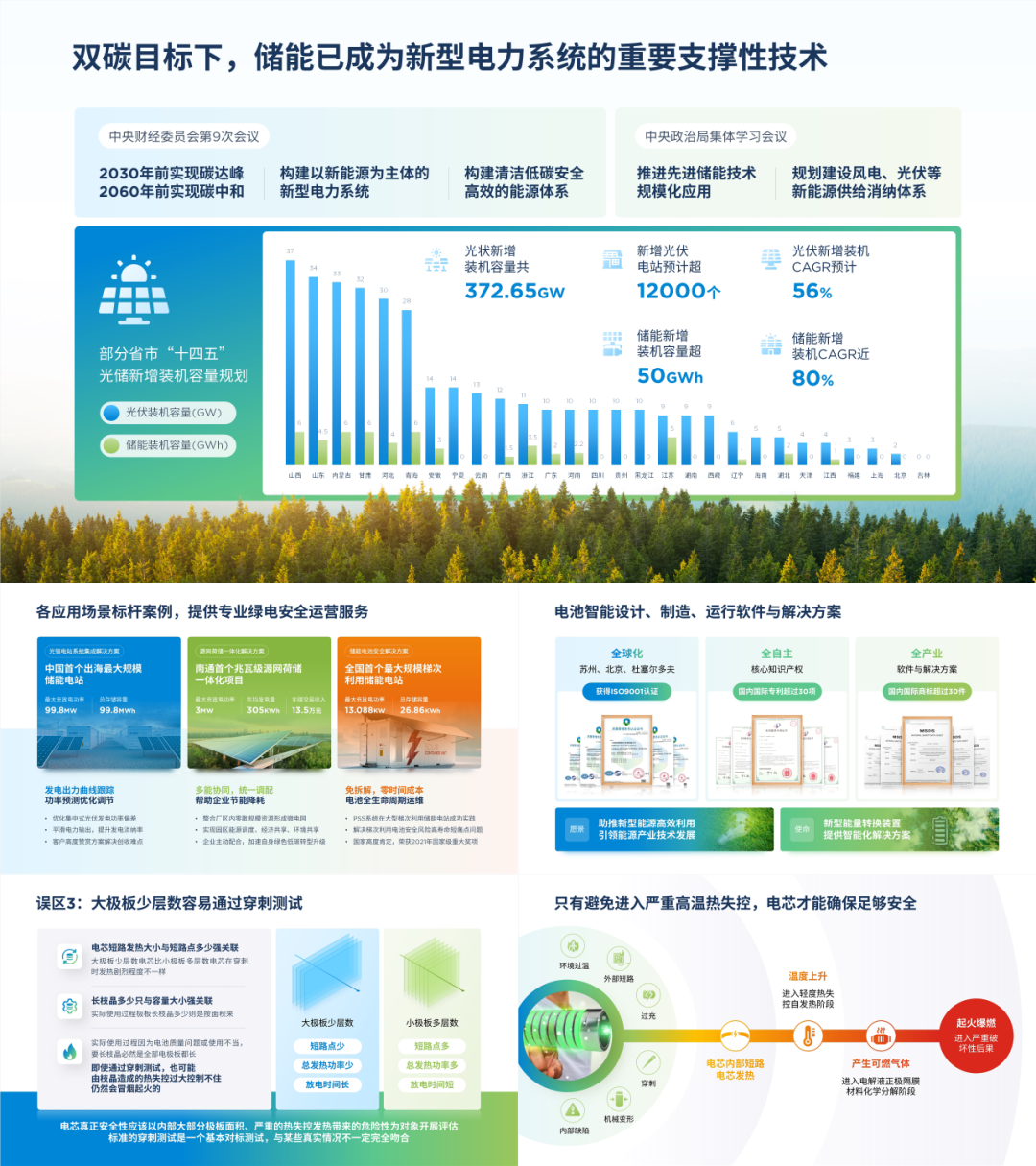
Let’s deal with the above text first, which can be divided into two meetings, and arrange the goals and measures proposed in the meeting in sections , it will look more organized.
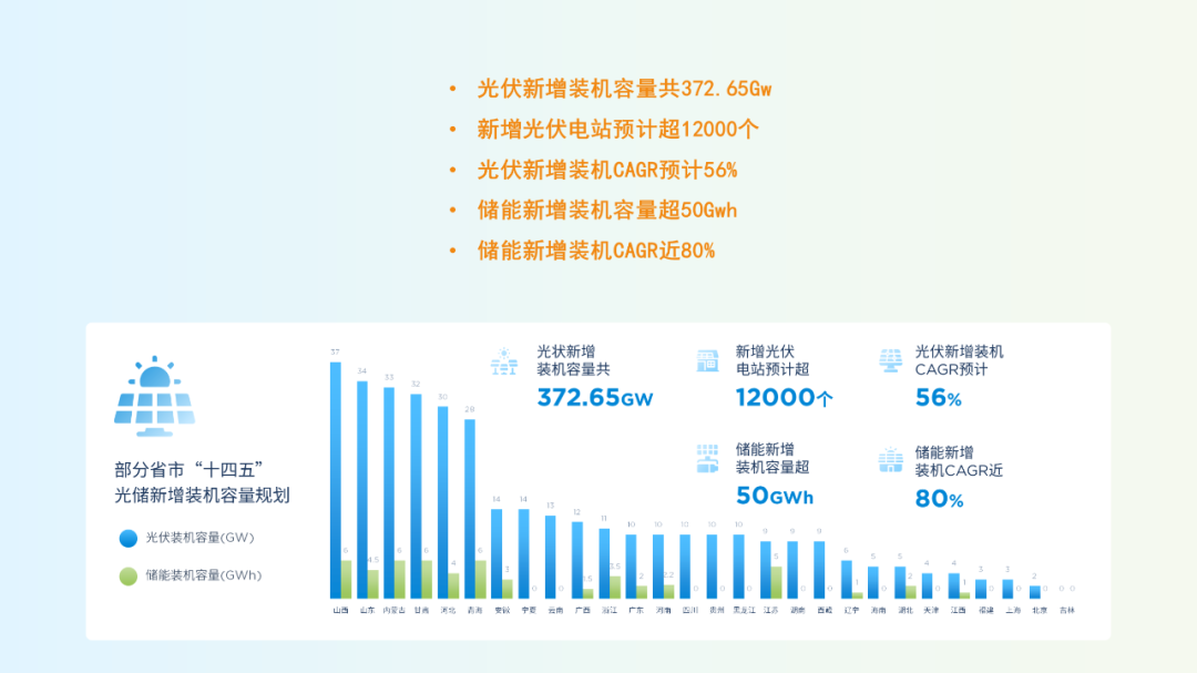
Then optimize the histogram, widen the overall chart, and adjust the gap width and color, let the chart The data are presented more clearly.
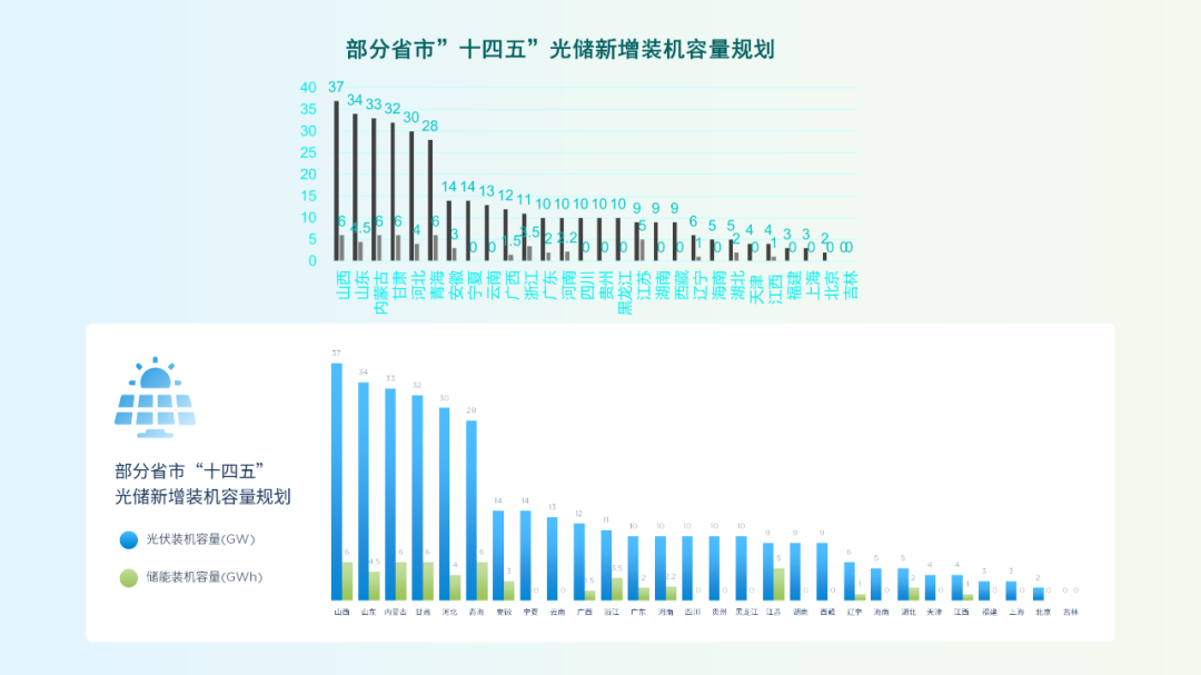
In order to use page space more efficiently, key data can be placed on the upper right of the chart.
Finally, use a modular layout, to divide the page into three sections:
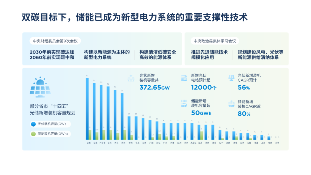
Modify the color of the color block to avoid visual monotony.
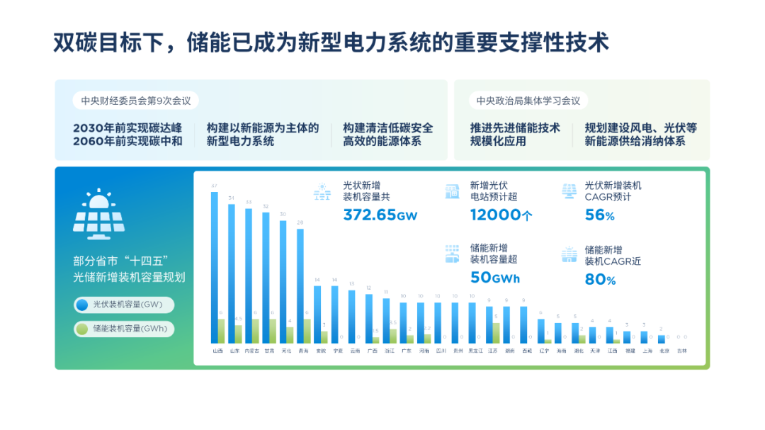
In addition, you can add a forest chart at the bottom of the page to further enrich the layering and scene sense of the page.

Then the second page
The problem on this page is mainly in the layout of the information, and the visual hierarchy is not clearly defined.
Before we typeset,We need to sort the content according to the importance.
Then use size, thickness, color, background, spacing comparison:

Let the hierarchical relationship between information stand out.
For project images, you can use gradients to blend perfectly with the color blocks:
If you want to make the page more colorful, you can also do this.
For example, add auxiliary color for visual distinction:

By increasing the number of "layers",enrich the page hierarchy:

Finally, you can also use image shadows, to increase the distance between elements:

Then comes the third page
As an honor page, there are too few pictures of the certificate, which is not convincing.

The problem I want to solve is very simple. Let's make a few more copies of the certificate:

Then use 3D rotation to adjust the inward tilt of the pictures on both sides.
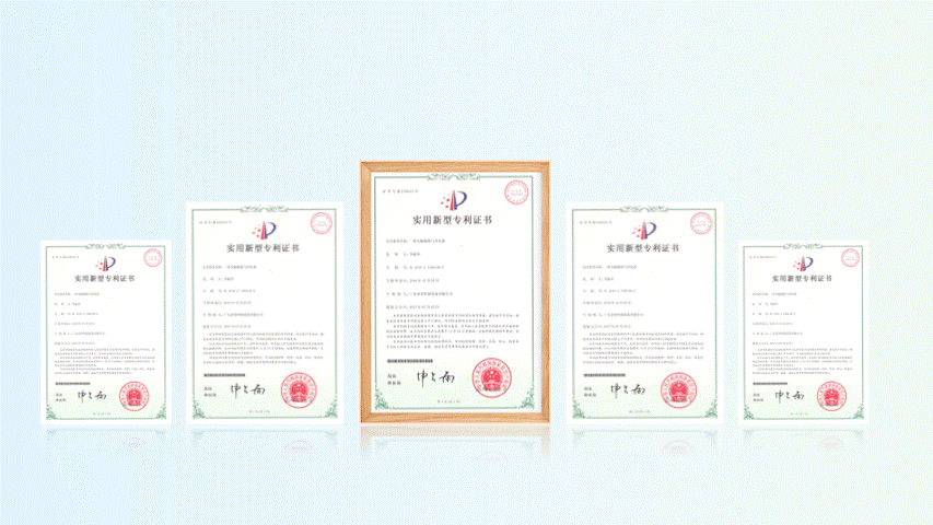
Next, use color blocks to layout the content.
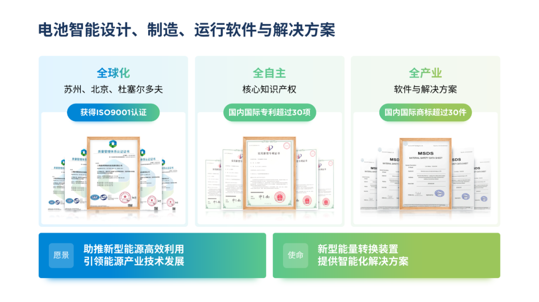
Finally, include relevant images in your vision and mission:
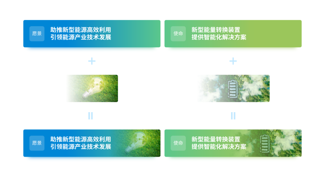
This can not only fill the gap, but also increase the expressiveness of the page:


come again Look at the fourth page
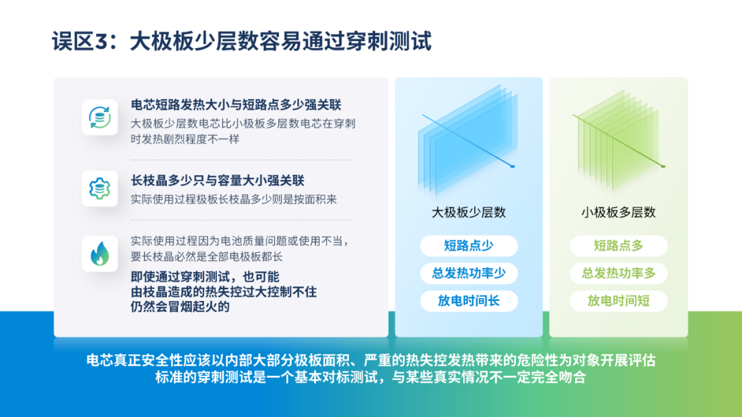
There are too many texts and no focus, and the contrast of the test on the left is not obvious enough.
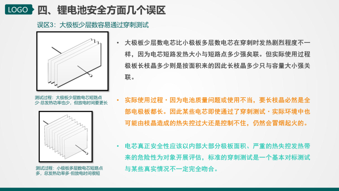
Let’s deal with a large piece of text first, and find the test analysis and conclusion through information sorting.

Then optimize the test image,You can use the shape to redraw, so that the color tone can match the page.

Then present the test results in point form to ensure a clear comparison.

Finally, analyze the left and right layout with the test, and place the conclusion at the bottom of the page.
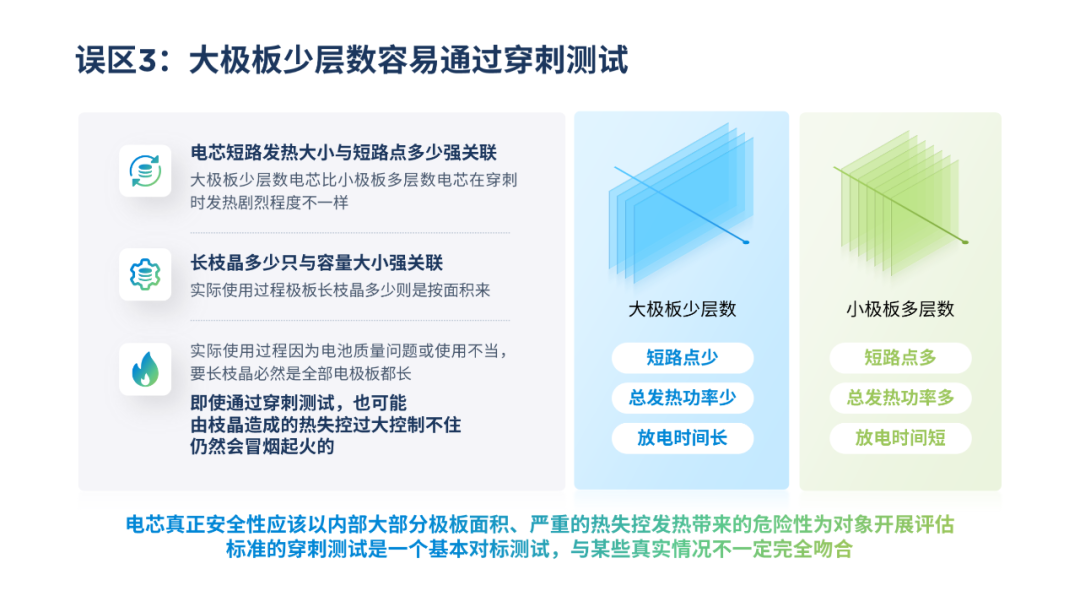
To make the conclusion stand out, consider inserting a gradient color block.

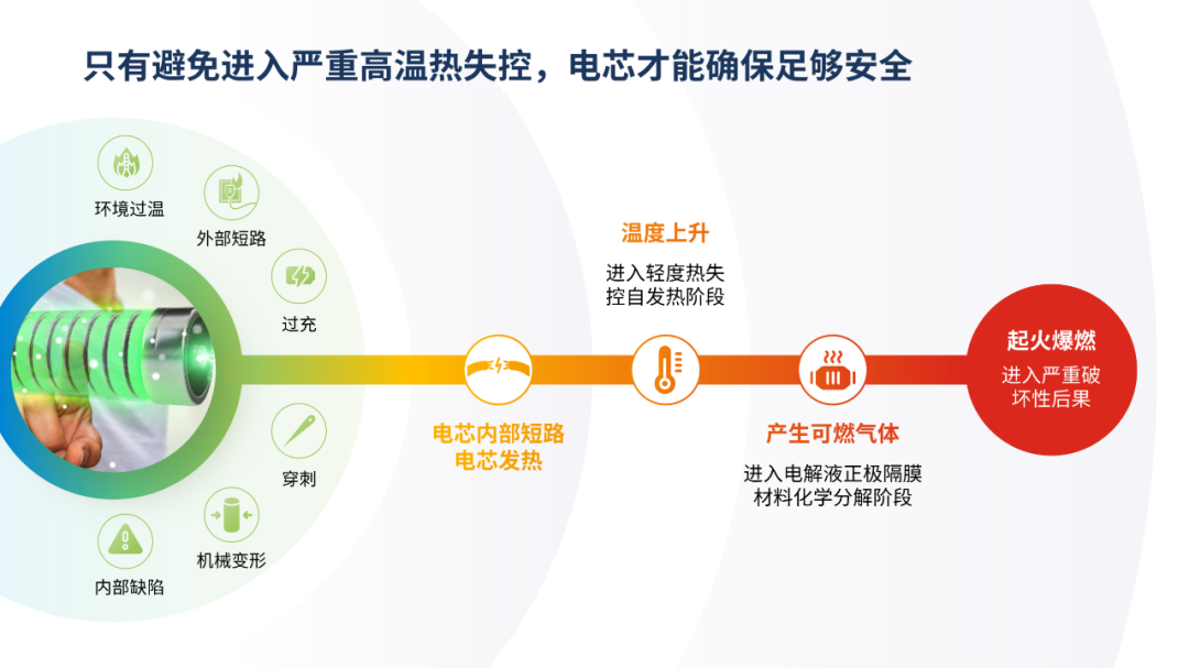
The fifth page at the end
Obviously, this is a process diagram, but it is still lacking in terms of visualization.

Reformat the content first:
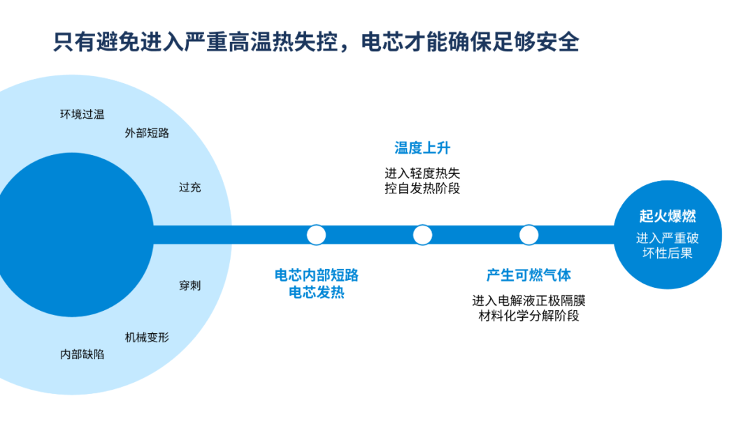
In order to show the process relationship, you can add some diffusion rings at the bottom of the page:

If you want to reflect the visualization, most readers can think of adding pictures and icons:

Actually, We can also start with the color,Use the gradient from blue-green to orange-red to show that the battery is out of control The whole process of bursting photos.
Let's review it as a whole.

In order to facilitate the disassembly practice, I have included the case source files of this tutorial and Fonts and other material packages are ready, friends in need can click on my avatar, enter my homepage, and in the chat dialog box between us, send the secret code [New Energy] to receive it for free~#新能源##PPT##design ##creative#
Articles are uploaded by users and are for non-commercial browsing only. Posted by: Lomu, please indicate the source: https://www.daogebangong.com/en/articles/detail/The%20PPT%20flow%20chart%20of%20new%20energy%20is%20too%20hot%20for%20the%20eyes%20After%20adding%20the%20circle%20it%20is%20super%20refreshing.html
 支付宝扫一扫
评论列表(196条)
测试