
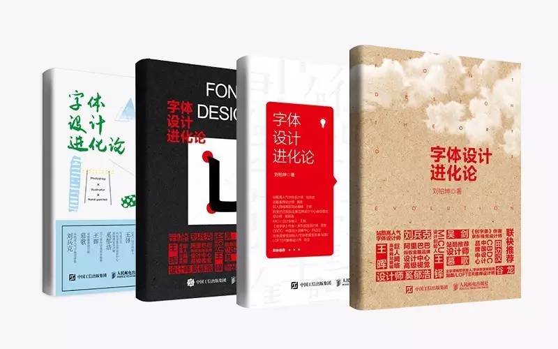
After 356 days of waiting for the new book "The Evolution of Typeface Design" is finally on the market, the little secret hidden in my heart can finally be unlocked. It seems to have received a good response within a week of listing. On Friday, the editor called and said that he was preparing to reprint. It seems that he has withstood the cruel test of the market. Wow~ Who said it was not? !
As soon as the news of the release of the new book was released, I got the support of many friends. Of course, I was also surprised. I still heard a little bit of wind: Hey, he just published a book, so I can do it too! Since I was a child, I felt that my life was a novel, and I wanted to write a book! So the question is, is it really difficult to write a book? How does a book come from nothing?
Next, I will show you the first time without reservation.

One. Create an opportunity for yourself
Writing this book in the first place was completely out of my schedule, a fortuitous consequence of a certain event. I like to make characters, and I also like to share. I wrote the first sharing tutorial on font design two years ago. God knows why I named it "The Evolution of Font Design" at that time. Maybe I just thought it sounded cool. You will find that there are only 9 articles in total from two years ago to the present, which is pitifully small. In fact, I did not regard each article as a task that must be completed. I just tried some interesting font designs at each stage. Take it out and share it with everyone, that's all.
Until the end of May 2015, an unfamiliar QQ account asked to add me as a friend. He claimed to be the editor of People’s Posts and Telecommunications Publishing House. He said that he saw my article on Zaku and thought it was good, and asked me if I had any plans to publish a book. . My first reaction was that these swindlers would not let the designers off, except to lie to grandpas and aunts! But in the end I was "in the trap". Later, through in-depth understanding and "reconnaissance", I found it to be a reliable thing, and even called Bing Ke to inquire about it. Later, I learned that it was the same publishing house as Bing Ge's "Freedom" Words", so I did it. Take it easy.
Of course I have to seize the opportunity when it comes, and finally I agreed. In fact, I still have a solid foundation in my heart. I feel that I have the ability to do this. One is that I have accumulated a lot of font works before, and the other is that I have written some tutorials, which can be regarded as practice in advance. So do what you like, stick to it, he will give you infinite possibilities and surprises.

Two.出书那点事
To preliminarily finalize this matter, it is necessary to draw up the outline of the catalog first. For me, I think this is the most difficult part of the whole book. How should I start if I don’t have anything? So I browsed through various encyclopedias and libraries on the Internet, first to see how similar books are structured, and second, to see what I have to write, and to summarize my own characteristics. After going on like this for a month, the catalog is finally passed.
Send the contract to sign and press your thumbprint, and it will be considered done. The contract is mainly to clarify the three major points of rights and obligations, profit sharing, and delivery time. Here I would like to tell you that there are roughly two types of dividends for publishing a book in China. One is to choose a one-time payment of the author’s remuneration without any dividends; The more you earn, the more you earn. Then I agreed on the delivery time. Since it was the first time that I had no concept of time, I dug myself a big hole of "three months"!
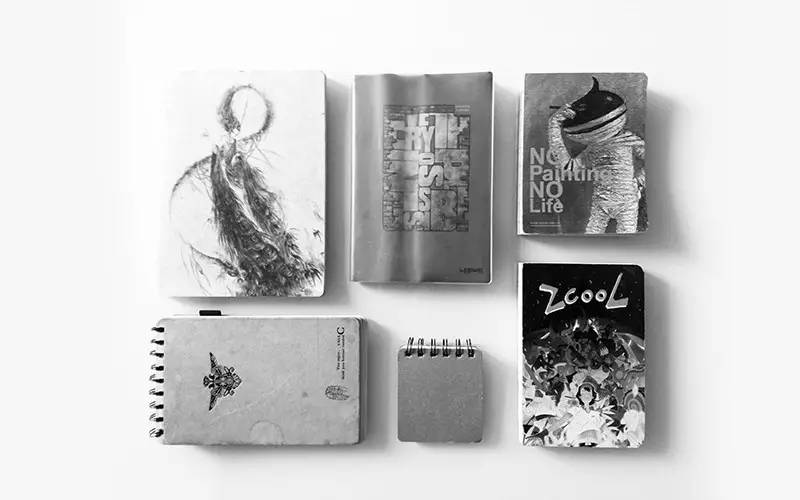
3. Write something different
Just like the mentality of writing a small tutorial before, I don’t write a book for the sake of writing a book, I just want to write something useful to everyone, and it’s better to be different. Looking out of the window with such a small longing, I thought that readers and friends would be moved by my sincerity. I was a little excited when I thought about it, but the reality is that I opened the document on the first day and typed the title of the book "The Evolution of Font Design". With these seven words, I dug another big hole of "three months". At the beginning, I confidently told the editor that two months would be enough, but I lost to my own naivety and ignorance.
It is always difficult at the beginning, just like when I tried to make the first word, I had nowhere to start, so I simply listed all my words and sorted them into categories, so that the whole idea would be clear, even though the directory outline was set before , but as I write, there will be new ideas to share with you, so the catalog has also been changed several times.
In fact, writing this book is a happy thing. The book involves a large number of cases, and I also took out some representative glyphs I made a few years ago, and found the previous hand-drawn manuscripts, just like flipping through an old diary, every word is interesting.

Three months have come and gone, the text part, picture matching and step decomposition are all done, and all kinds of staying up late finally filled the pit. If you think this is the end, then you are very wrong. The manuscript needs meticulous proofreading and error correction by the editors, and then expert review. Fortunately, except for some new cases added later, there are not many revisions. I really appreciate the tens of gigabytes of manuscripts I wrote in the student union before, and I didn't write them in vain.
The whole book has theories, inductions, cases, and appreciations. You will never talk nonsense about what you don’t understand, and you will never say too much if it is not beneficial. something different.
Four. "Party A" is hard to be
After the manuscript is completed, the rest of the work is handed over to the publisher. I thought I could finally be free, but it was not. At first I thought about doing typesetting and cover by myself, but the past few months are really a bit tiring, so let's be "Party A" turned serf and sing once.
First, I made a few demonstrations of the content pages. I was very mean as a "Party A" for the first time, and I forgot to modify it a few times. I even learned Id now, and directly Come to modify, this place is tiring to think about, so I won’t say more. As a designer, I always feel that designing things for myself is a very tangled thing. I don’t know if you have this experience.
After that, it was a long wait until mid-April this year, finally came the news.
The book number has been approved, and it is entering the preheating promotion stage, but the cover is not yet available, so hurry up. So I briefly talked about my thoughts on the cover, and got four cover designs a few days later. In fact, they looked quite eye-catching at first glance, but there was still some deviation from my expectations.
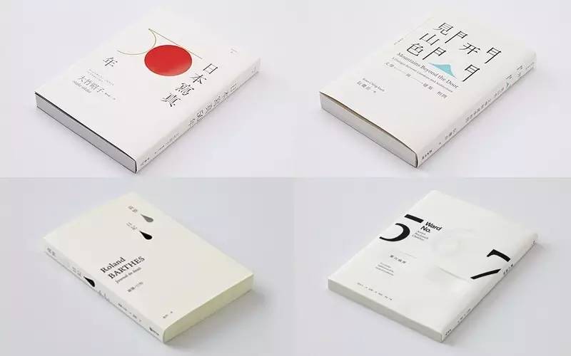
I found a few cover designs in the picture below for the designer to use as a reference. I felt that my heart was broken at the time of the design, and I vaguely heard: You can do it yourself! So after changing it a few times, I felt that it was not very ideal, and finally resolutely gave up the noble status of "Party A" and went on my own.
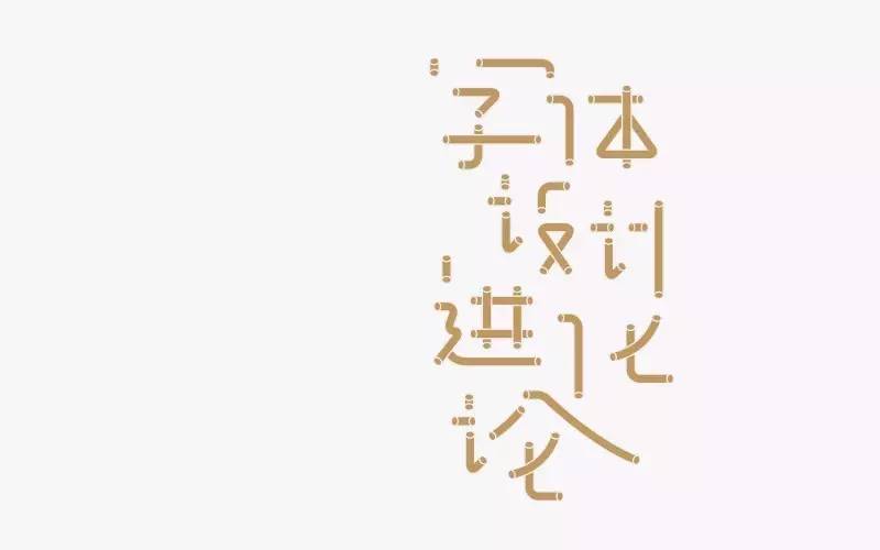 I don't want to put too much on the cover, the cleaner the better, and no graphics. Therefore, the design of the title of the book becomes more and more important. At the beginning, I made such a set of characters, but the more I read it, the more I felt cumbersome and deliberate, lacking some "connotation" and lightness. So it was abandoned.
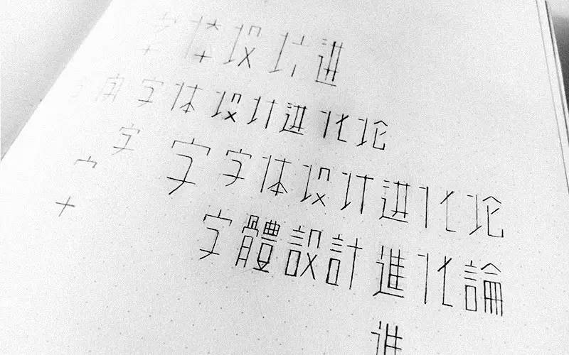
Then I tried to find some feeling on the paper. I tried the feeling of waiting for the line to go straight. The structure of the strokes was exaggerated. .
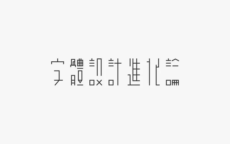
The font is roughly drawn in the computer according to the draft, and some details have been adjusted and modified. In particular, some strokes are as horizontal and vertical as possible, and the "hua" word processing is particularly obvious.
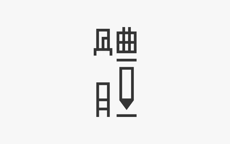
Not enough. The entire group of characters are all line segments, lacking the adjustment of "surface", so the closed lines in the font are directly replaced with block surfaces. Of course, not all of them do this, it is selective. For example, the "body" character selects the strokes A triangle, after filling, this stroke forms a "pencil" figure, which increases the memory and interest of the whole group of words.
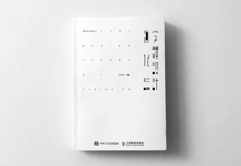
The horizontal row is changed to vertical row, one line is changed to two lines, and the right side of the cover is embellished with a loose English title. Later, I learned that the cover must have a simplified title, so I added a simplified title on the upper left, and put the recommender information. to the gray girdle, to keep the cover as clean as possible. In the end, it was the appearance that everyone saw later. In fact, I still like the final appearance, and the more I look at it, the more I love it, and I am a bit narcissistic. At this point, the book is finally complete, and my heart finally calmed down when I got the sample booklet.
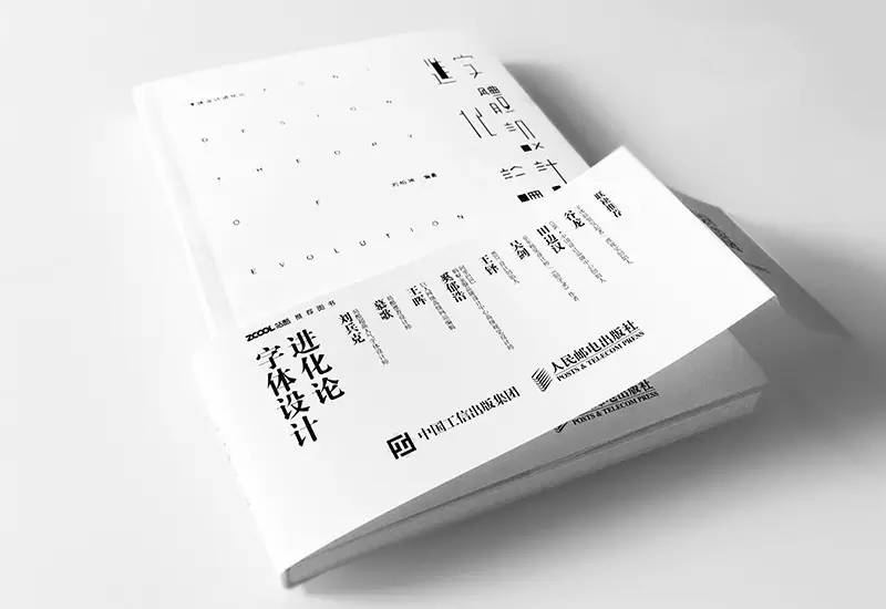

There are many imperfections in the first time, but it is fresh enough. I am very happy to have such an experience. A book is not the end, but a summary of the past and a new starting point. I will keep going! Thank you friends and teachers for your concern and help, thank you editors for your hard work, and thank you for your recommendation! In addition, if you find any problems in the book, please leave a message to me, and we will correct them in the next edition.
Finally, I would like to say one more thing: I am not a master, nor a master, nor have I won numerous awards. I just have a little more love and persistence for fonts.
↓↓↓Click "Read the original text" to place an order directly on Jingdong~
Articles are uploaded by users and are for non-commercial browsing only. Posted by: Lomu, please indicate the source: https://www.daogebangong.com/en/articles/detail/The%20Birth%20of%20a%20Font%20Design%20Book.html

 支付宝扫一扫
评论列表(196条)
测试