Apple's annual WWDC conference will be held in the early morning of tomorrow. Many domestic self-media workers have been invited to the conference site. I heard that there will be a long-awaited VR event this year. The device is released, so excited!
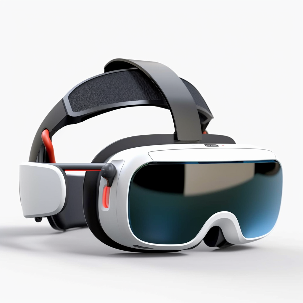
AI painting thinks Apple VR looks like this
Combined with previous channel news, this new product may reach RMB 25000! Since you can’t afford it, it’s always okay to look at the PPT~
Today we will take stock, from 2007 to now, 16 years of Apple conference Evolution history, including changes in presentation slides, and stage design. Through this article, you can not only evoke the memories of staying up late, but also understand the professionalism and details of the design of the Apple conference.
According to stage layout and slide design , so many press conferences can be divided into five stages, which are the press conferences during the Jobs period, the early stage of Cook's succession, the mid-term of Cook's succession, the full-screen period, and the epidemic period.
NO.1 Jobs period
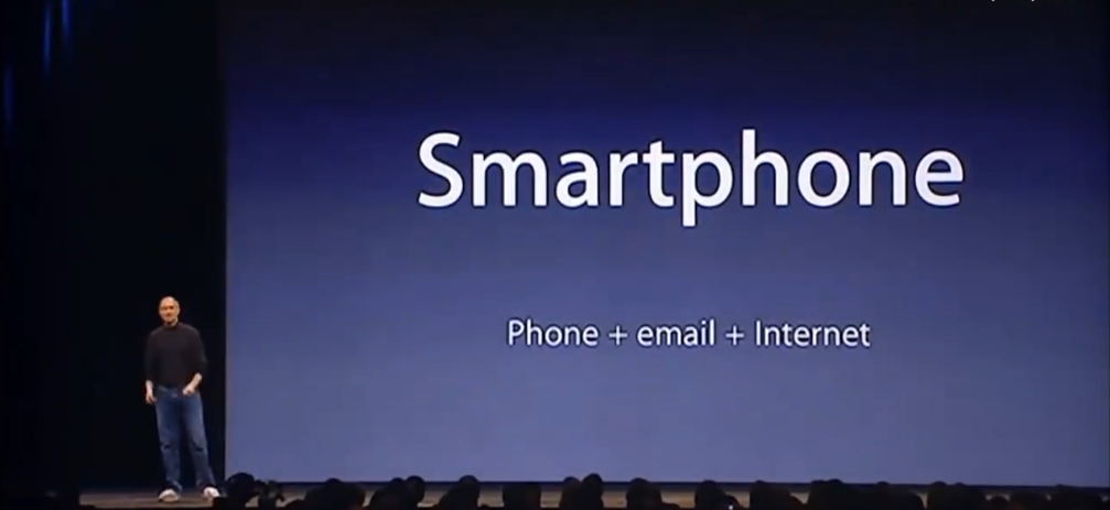
The press conferences during the Jobs period were from the original iPhone in 2007 to the iCloud conference in 2011, a total of 15 conferences. In fact, before 2007, Apple held many press conferences, such as the iPod series conference, but no matter in terms of stage design or slideshow style, they can all be classified as this period, so what are the characteristics of this period? To sum it up:
- Bright Stage
- Blue gradient background
- Strict typography< /strong>
1. Bright stage
First is the bright stage. If you pay attention to the current Apple press conference, you will find that the projection lamp on the top is smaller than the projection lamp in the Jobs era. The conference stage in the Jobs era is relatively bright.

Compare the bright stage with the dark auditorium, The line of sight is subtly controlled within the scope of the stage, the audience can concentrate on the stage for a long time, and will not be easily distracted. On the other hand, the speaker can easily hold the product, allowing the product to be fully displayed in a well-lit environment, which is crucial for some cross-generational product launches. You must know that in those days, the audience could not use a magnifying glass to see the new product, because it was the first generation product, and it was not enough to convince the audience only through renderings.
The bright stage allows the audience to see Jobs holding a product for a live demonstration
There is no absolute right or wrong for the lightness and darkness of the stage, but it depends on the needs Set off. For example, at the Apple press conference after Cook took over, the brightness of the stage was significantly reduced. This is because the masses have already had psychological expectations for Apple products and designs, rather than the anxiety when the first-generation iPhone was released. Videos can also be a great way to showcase a product. The darker stage also has its advantages, and we will talk about this in the middle of Cook's takeover.
After finishing the lighting arrangement, the stage part There are 2 more places worth mentioning.
first< strong>The distance between the first row of auditorium, Apple has held press conferences for so many years, no matter what venue it chooses, the distance between the first row and the stage has basically remained the same. Physically shorten the distance between the speaker and the audience, making the audience feel like they are in it and reducing the sense of fragmentation. Another thing that hasn't changed much is the demo console next to the screen, sometimes on the left, sometimes on the right. And the latest demonstration console supports lifting, which undoubtedly improves the degree of freedom of the stage.
2. Blue gradient background
After the stage, let’s talk about One LectureSlide Background, I believe everyone is familiar with the background of this slideshow. Friends who have used Apple computers are more familiar, because this background is one of Keynote's template presets. It is precisely because of Apple's early press conference that this background can be spread, and even the software Keynote is widely spread and used.
Why did Apple choose this in the first place What about a background? Why is it a gradient from top to bottom? Is it okay if the top is light and the bottom is dark?
To answer these questions, use We need to go back to the big principle of Apple's press conference - to convey Apple's philosophy to the audience in the audience and us in front of the screen in a simple and vivid way.
As I said before, Apple The reason for choosing a bright stage is to consider the display of the product, so the stage effect is higher than the slide background. It is right to decide the lighting effect of the stage first.
The stage lights are controlled by the Provided by a row of projection lights, this row of projection lights directly hits the flat ground in front of the screen, so when the audience looks at the stage, the ground is bright, while the above ground is dark. In order to match the physical light intensity, the background of the slideshow must also be bright at the bottom and dark at the top, so there is a gradient from top to bottom, otherwise the bottom half of the screen will be out of place with the stage.
Figure out why Jobs wanted Using this gradient, you can also understand why the current Apple conference no longer uses this gradient template. On the one hand, the current screen quality is higher, and the color restoration is more realistic. On the other hand, Apple has changed the row of projection lights at the top of the screen to a smaller model, and the light is softer, so that there will be no obvious bright and dark sides on the ground and the ground, and it is better to choose a solid color for the background.
3. Rigorous typesetting
The template for the keynote of the presentation , Let me talk about some layouts of the slides of the press conference during the Jobs period.
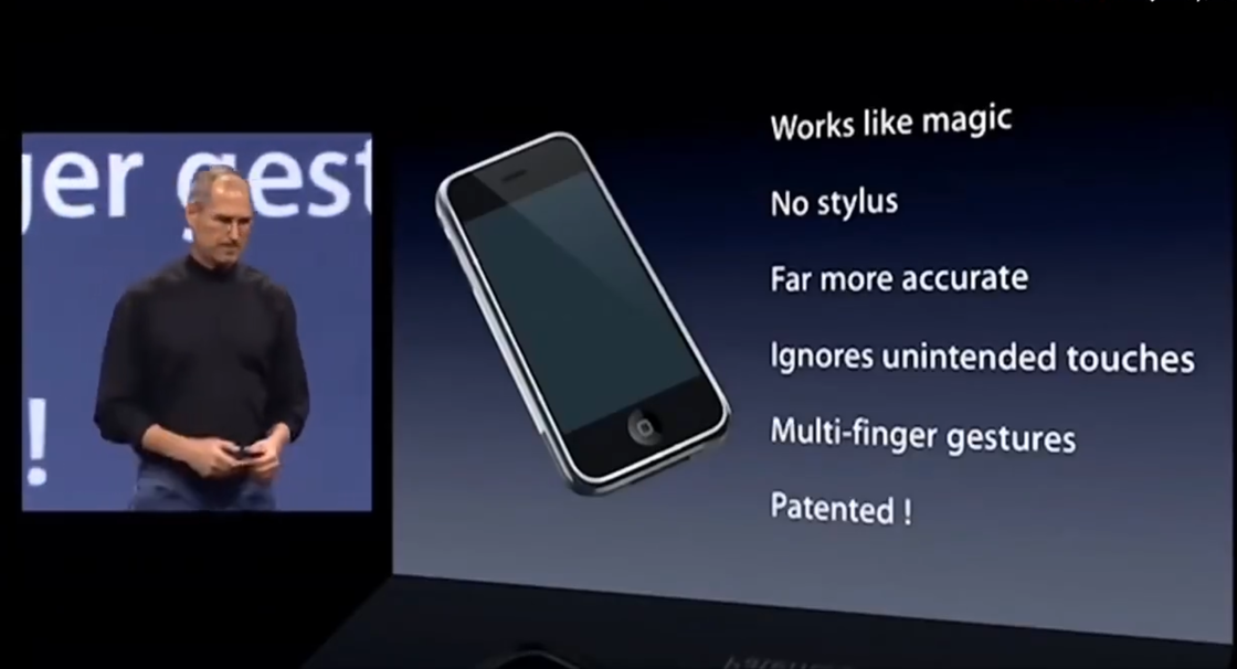
To know the distance from the first generation iPhone Nearly 16 years have passed since the press conference. During these 16 years, the mainstream style of design has been changing. For example, the style of iOS has undergone earth-shaking changes. But looking back at the first-generation iPhone conference slides, I couldn’t find any mistakes in typography, and the typography was very rigorous. Although the page layout was not as varied as it is today, the slides strictly followed the basic design principles of alignment, repetition, proximity, and contrast.
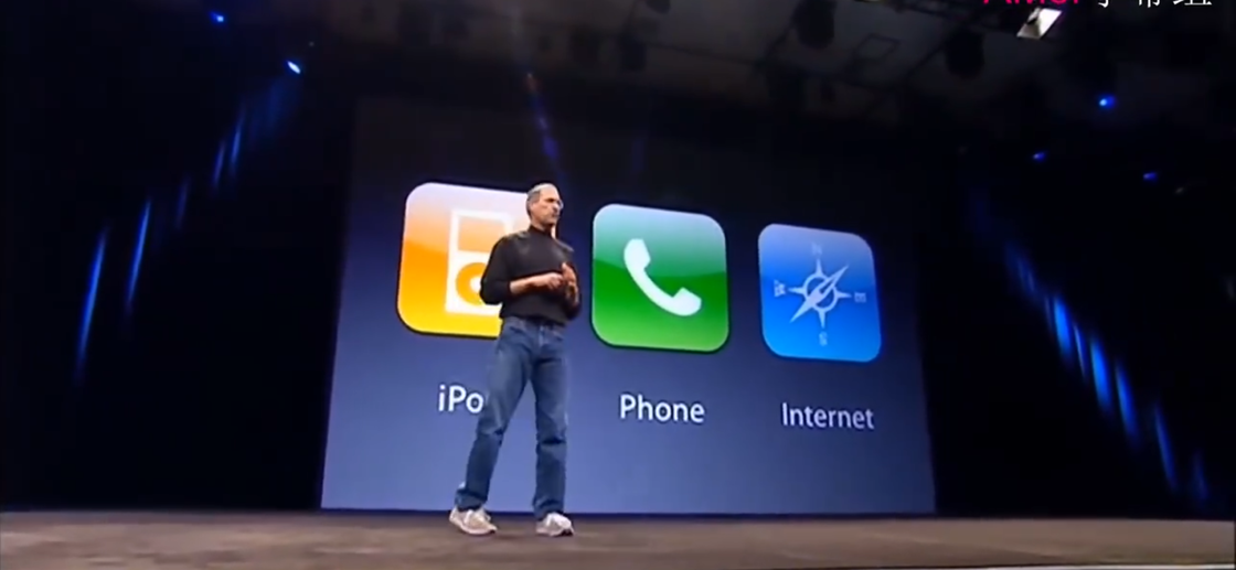
For example, in the slide above, the three icons are the same size and aligned at the top, and the three The light sources of each icon are on the top, the three English words are horizontally aligned and centered horizontally with the three icons, the large icon is matched with the small English to achieve a contrasting level, and the distance between the icons is also exactly the same.
Try to be restrained in the choice of layout. Just imagine, if the layout of a press conference is fancy, it is impossible for the audience to focus on the product. Therefore, before the typesetting design, you must figure out in your heart whether it is a product launch event or a display of typesetting skills.
The layout used for the entire press conference It is also as few as possible, such as "icon + text" in the above picture, "big characters + small characters" and "left picture + right word" in the picture below
A press conference should say at least 300 slides, and ensure that each page The text spacing and line spacing are the same, and the margins and icon sizes between different pages are the same. It is easier to say, but it is very difficult to do, especially for teamwork. So in that era, it was very important to be able to ensure that there were no typographical errors in the slides of the entire press conference.
NO.2 Early stage of Cook's succession
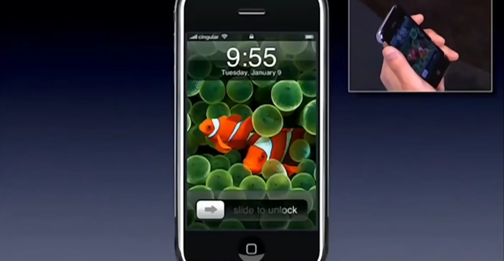
The first press conference after Cook took over was held in October 2011, and the new product released was iPhone 4S. Everyone knows that digital products are planned in advance, so the iPhone 4S must have been planned during Jobs’ tenure. Not only the product has the shadow of Jobs, but even the slides of the press conference have the style of Jobs.
The picture below is a conference venue In the front view, it can be seen that there is no strong projection light on the top of the speaker, so the ground is dark, so if you continue to use the blue gradient template in the Jobs era, it will appear that the lower half of the screen is out of place, like a color cast .
Cook’s early press conferences were from October 2011 to October 2012 6 press conferences in total. The press conference during this period can also be summarized into three characteristics:
- Dark stage
- Still blue gradient background
- Add a lot of charts< span>
Why put How about the early stage of Cook’s taking over as a separate time period? This period is actually very special. People will compare Cook and Jobs in all aspects. What Cook has to do first is not product design, his top priority is to appease the emotions of Apple fans and tell the audience that "Apple is very good and is still on the right path." How to prove that Apple is okay? The data will not lie, and this is exactly what Cook is good at, so there will be many charts on the slides during this period.
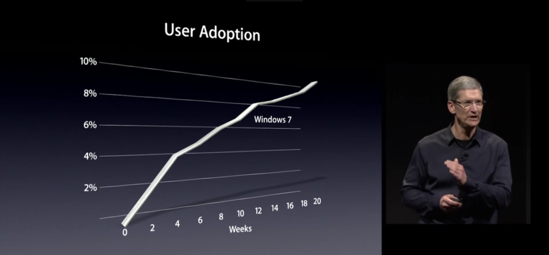
Looking back now, Cook's approach is very appropriate. If there are too many changes at the beginning, consumers will feel that this is no longer the familiar Apple, which will affect the sales of iPhone 4S and later. When the press conference begins, the audience will feel that everything is still there when they see the blue gradient background and the familiar Keynote layout of the Jobs era again.
NO.3 Cook takes over midterm
From the spring conference in 2013 to the release of the iPhone X in November 2017, this period can be the mid-term of Cook’s succession. There are 15 presentations. During this period, Cook already has a certain confidence in his heart, and he can add some personal considerations to the press conference. So the characteristics of the press conference in this period are:
- Dark Stage & Black Gradient Background< /strong>
- Add technical explanation
- Change product appearance image< span>
1. Scene dark stage & black gradient background
Cook’s early press conference A darker lighting environment was used, but the color cast problem caused by the replacement of the blue gradient template was not changed, and it was improved in the middle of the succession. The background of the press conference in this period was changed to a black gradient, which can better integrate into the entire venue and environment without the illusion of color cast caused by the blue gradient.
Cook’s press conference at the beginning of his succession was indeed like a work report, but in the middle of his succession, it was not When these problems reappear, there are finally fewer charts. Even if there are charts, they will be developed around the product instead of focusing more on the market.
2, more
In the past Jobs period, when it comes to A certain technology will spend a lot of time describing how this technology can better serve human beings. When it comes to a certain technology in this period, more attention is paid to the implementation methods and principles of the technology. It can be understood that Apple's product strength has been somewhat weakened, but this explanation also has its benefits, allowing the audience to know everything about Apple and giving the audience the right to know. From another perspective, this is an inevitable choice for large companies.
3. Changed the product appearance image
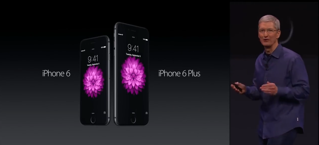
In previous product launches, the debut of new products was often positive or The angle of the oblique surface, such as the iPhone6 series:
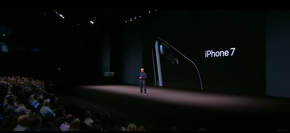
Why change the appearance angle of the product? There are two reasons. First of all, the appearance of Apple mobile phones has not changed much in those years, so the display at the same angle will make the audience feel that there is not enough novelty. Secondly, if the material of the new product has changed, such as the all-metal material used in the iPhone 7, then the partial image can highlight the new material through the high-gloss edge.
Of course, many aspects of the press conference still have the shadow of Jobs. For example, the style of typesetting "large characters + small characters" "left image + right characters"
If you summarize the library in one sentence In the early and mid-terms of Ke's succession, it is "seeking change while remaining unchanged".
Due to the prosperity of Apple during the Jobs era, So it is very inappropriate to replace them all at the beginning of the succession. What Cook and Apple have to do is to adapt slowly, because they have a good foundation and can spend a few years to slowly develop their own style, whether it is a product or a conference design.
NO.4 full screen era
Apple released the iPhone X at the end of 2017, so it has entered the era of full screen since 2018. Therefore, from March 2018 to September 2019, it will be divided into a full-screen period, during which there will be 7 conferences.
There are 3 conferences in this period feature.
1. Screen size Scale changed
apple pass< strong>Screen size for slideshowDistinguish WWDC from new product launches. Because the purpose of holding WWDC is to cater to and appeal to developers, the more people there, the better, so Apple chose a larger venue, and the small screen that has been used is no longer practical for a large venue, so it simply uses super Widescreen design.
The large screen not only brings visual impact, but also can carry more of information:

Someone may ask why the product Why not use widescreen to develop the conference?
For so many years, Apple's new product launch The screen size has not changed much, basically around 16:9. The reason for choosing this size is that this size is currently the mainstream size of monitors in the world. You must know that many people around the world watch Apple’s press conference online. , this size can ensure that the video is played in full screen as much as possible. What's more, there are many product renderings and rendering videos in the press conference. When the director cuts the screen, the audience can also go full screen, which is not much different from what they saw on the spot.
2. Complete Product animation
In fact, as early as Jobs and library There were some animations at the press conference at the beginning of Ke's taking over, but those animations were all Keynote single-page animations or transition effects between pages. In the middle of Cook’s succession, there were some product animations. For example, there were some simple product animations at the launch of the iPhone 5C in September 2013, but the dimensions of the animations were limited to the X-axis and Y-axis. In the conference of the full-screen era, the product animation of Apple's conference is more complete.
Involving some operations and internal parts of the product, the complete dynamic display of the product is better than the static Comes intuitively. From this we can also see the evolution of Keynote's role in the conferences over the years. In the early days of Jobs, limited by the development of computer technology, there were only pictures and text on Keynote, so the workload of typesetting was heavy. In order to make the page not so rigid as turning over page by page, Jobs took the animation of Keynote to the extreme according to his own speech ideas and expression techniques.
At the beginning of Cook's succession and In the mid-term, computer technology has made great progress, and some fragmentary product animations have begun to help demonstrate. At this time, Keynote carries some pictures, videos and a small amount of text. At the press conference in the full-screen era, Apple has been able to integrate product animations into Keynote to better assist the speaker. At this time, Keynote is almost just a container for videos and a small amount of text.
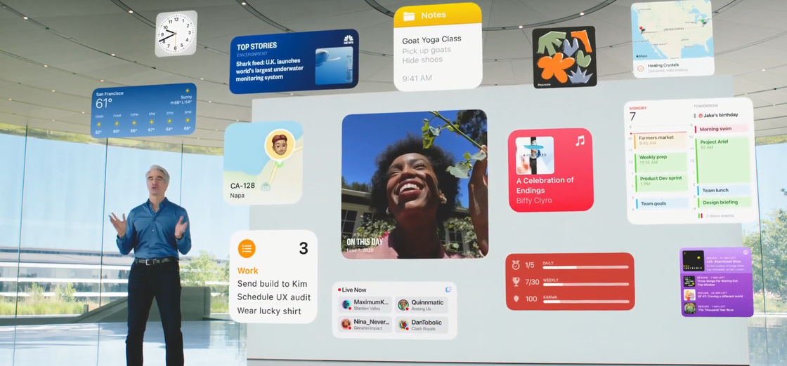
3. Cardization Summary page for
This design is not without reason Yes, on iOS 14, some small cards can be added to the desktop, so this summary page at the press conference maintains the unity with iOS 14.
For the press conference in the full screen period , the boundary between WWDC and product launches is more obvious, the dynamic display is more complete, and the card-based summary page is a very obvious feature, and it is a highly unified style with software and hardware. If there is no full screen, maybe the animation of the product will not be so shocking. If there is no iOS 14 card desktop, maybe the card summary page is just a one-page layout on a whim. During this period of Apple’s conference, it has been able to customize the design of the conference according to the product characteristics in the next few years, making the product and the conference more integrated.
NO.5 Epidemic period
Apple has always bundled the press conference with the product for design, coupled with the original Apple conference style, blended in At the same time, it has both Apple's minimalist design and small innovations in style once every few years.
From 2020, because the US The epidemic has been out of control, and as a result, the style of Apple's press conference was completely changed by accident, and the method of pre-recording was adopted to hold it.
Apple’s focus on video and music Precipitation is very deep, pre-recording and then online regular broadcast, on the surface it seems to be a form of restricting the press conference, but in fact it loosens the "on-site" restrictions on the press conference. Apple no longer needs to be limited by time, number of people, venue, screen size, climate, product cycle and many other factors.
On the premise of having a press conference script Next, different products have different development cycles. Products that are developed first can record the release screen in advance, products that are developed later can be recorded later, and finally make storyboards to connect all the screens according to the script. In this way, Apple is equivalent to When making a movie, there are no on-site accidents, no audience being late during the press conference, and everyone in front of the screen can easily spread the best quality images through screenshots.
So the conference of this period is Starting at WWDC in June 2020. There are 5 characteristics of the press conference in this period, namely:
- Scene< /li>
- Three-dimensional< /li>
- Fun< /li>
- Colorful< /li>
- Intimacy< /li>
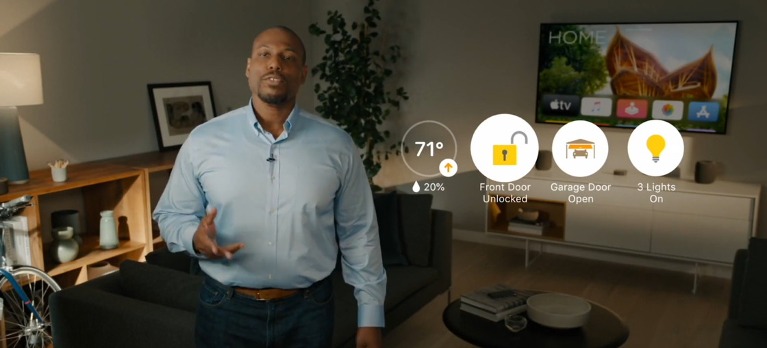
1. Scene
No matter what product you talked about before, the speech Everyone can only show Keynote to the audience in front of the big screen, but it is different now. For example, explaining that Apple TV can be at home:
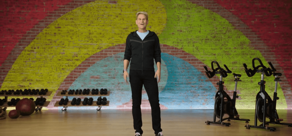
Apple Watch can be at the gym:
Because the audience is no longer present, So Apple can't control the audience's attention. But frequent switching of scenes can continue to bring excitement and curiosity to the audience in front of the screen, so that the audience's high concentration can be maintained. Although Apple has also realized some scenes before this, for example, the picture below is the screen when Apple Watch was introduced in 2018, but this is not a real scene.
2. Three-dimensional
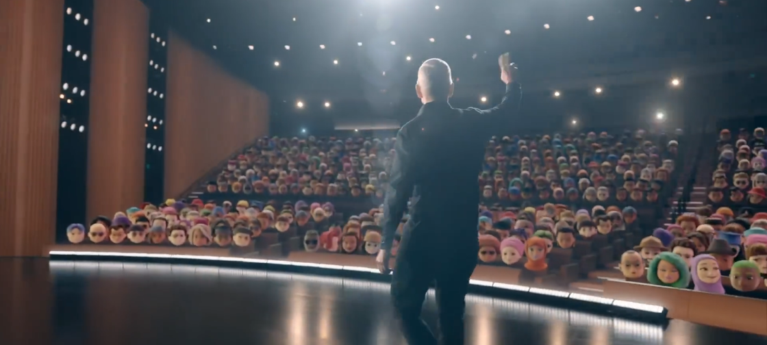
Because they are all pre-recorded videos, they can be synthesized in real scene and post-processed. It makes the explanation more vivid and mobile, and also enhances the visual impact.
In the first few press conferences in 2020, Apple gradually made the shots Switching and articulation of each section. Starting in 2021, Apple began to try to make some innovations within a single part of the content, using technical means to make the video content more integrated.
3. Fun
Because of live-action compositing and pre-recording, There are infinite possibilities for the final presentation of the video, and it can be different every time, and it can simulate real people on the scene:
The camera switching of different parts also played a lot of tricks, you can pass through the screen, You can dive across floors, and you can fly drones for long distances. Each switch is not without reason. These need to set up the script and camera at the beginning, and choose the most suitable camera switch animation according to the progress of the speech.
4. Colorful
After so many years, Apple still has such a page: there is only one sentence in English. Under the premise of ensuring that the overall style is not damaged, how can the design not appear monotonous? Apple's processing method is "fluid gradient + Boolean operation":
This color is not fixed, different Some parts may be in different colors. The specific color will be selected according to the tonality of the product. Sometimes this color still flows, so it is called a fluid gradient.
5. Intimacy
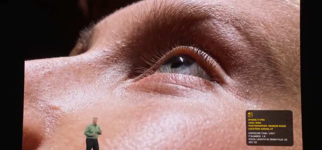
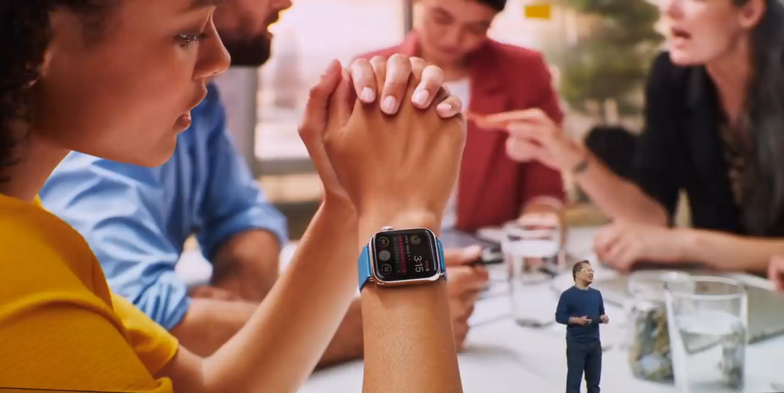
Remember what live demos were like before the pandemic? The speaker is displayed on the stage, and the audience in the audience can only watch the speaker and the changes on the screen at the same time. But the current presentation is the most direct and objective way:
This way of presentation directly removes the medium loss in the middle, just like there is a person Standing next to you and teaching you how to operate, the demonstration cost is lower and the efficiency is much higher.
After watching the Apple conference during the epidemic Not only can we see that Apple is still strong in products, but we should also know that Apple's strength is in all aspects, including content production, streaming media and so on.
Summary
Through this article, I will lead you to understand in detail the evolution history of Apple's conferences in the past 16 years from 2007 to the present, and you can see the rigor of the Jobs period , Cook took over the initial adaptation, Cook took over the micro-innovation in the mid-term, the integration of products and press conferences during the full-screen period, and the immersive press conference during the current epidemic.
Maybe Apple no longer has The world-shattering innovations like the original iPhone, but looking back over the past decade or so, Apple's innovations are all-round. Through the form and evolution of the press conference, we can know that Apple is still grateful to users.
Finally, let’s predict Apple’s release will be the future. If a brand new VR product is really released tonight, then considering that Apple will have a rendered product model every time, it would be a better way to use AR + real scene synthesis. The speaker is still standing in the real venue, but there is no need to play Keynote on the big screen. The 3D model of the product appears directly through AR, and the part of the product that needs to be explained can be displayed directly. However, the biggest difficulty in this operation lies in the cooperation of the speakers. You must know that they are not actors, and they cannot explain to the green screen like Marvel movie performers.
From 2007 to now 2023 In 2019, it can be said that Apple fans have survived many days and nights and witnessed many miracles. There is excitement about One More Thing, but there are also gaps. In any case, this has become a habit every year. I will watch the Apple conference with you tonight Let's see if Apple can start a new era again~
Articles are uploaded by users and are for non-commercial browsing only. Posted by: Lomu, please indicate the source: https://www.daogebangong.com/en/articles/detail/The%20Apple%20conference%20is%20coming%20soon%20Netizens%20It%20doesnt%20cost%20money%20to%20watch%20PPT.html
 支付宝扫一扫
评论列表(196条)
测试