
Today is Thanksgiving, the DATS team thanks everyone for their support over the past year, bow!
Our members are actually ordinary cool friends. Most of them are design majors with poor English or non-design English majors. The translation is inevitably not professional enough. Thank you for your tolerance all the time. Please continue to take care of us in the future, and welcome more friends to join us, to bb with us, learn English, and learn design.
Today’s article comes from the recommendation of Tony from the DATS team. If other cool friends have articles or websites that you really want to translate, please send us a private message to recommend to us~ Currently, Japanese and English are supported. As long as you still give us likes, we will continue to work hard!
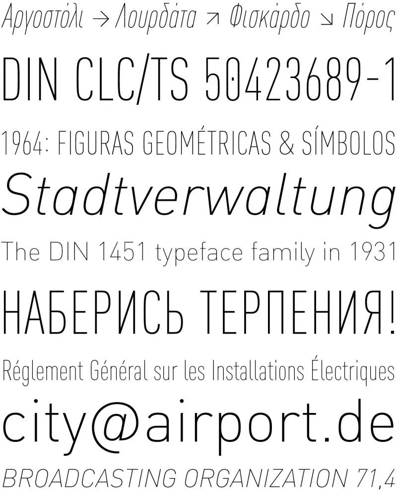
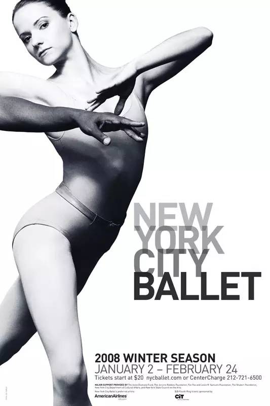
As a German autobahn, the FFDIN® family fonts used by the Pompidou Art Center and the Eiffel Tower signage system are undoubtedly the most popular and well-received fonts in the world. This article interviews Albert-Jan and Inka Strotmann, key figures in the creation of the font. Take you to understand the birth of a popular English font.
Font Tips
What is DIN?
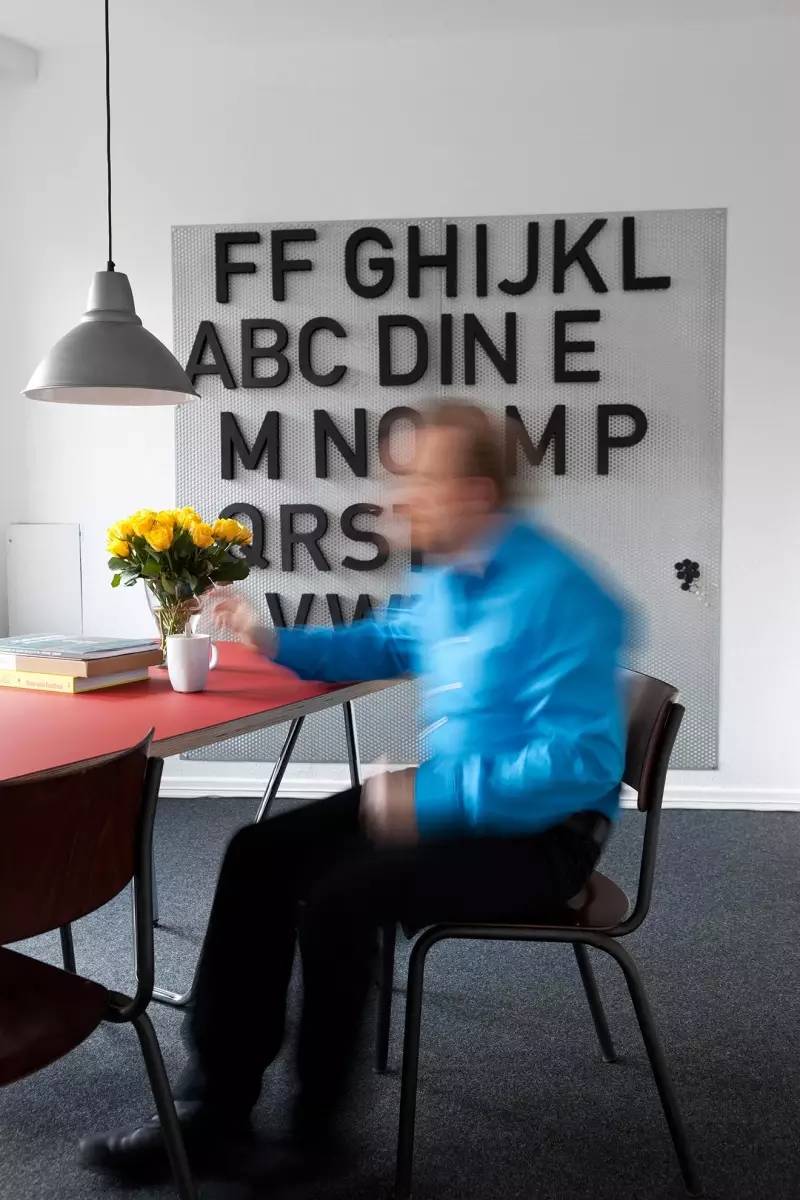
DIN is an acronym for the German Standards Institute, Deutsches Institut für Normung. Since 1975, the German government has regarded DIN as the national standard system, and DIN is also the competent authority of German standards. The German Standards Association was founded in 1917 and is headquartered in Berlin. DIN standards are widely used internationally and in Europe and represent German interests. DIN fonts are an alternative to Western fonts. It is not just a font, but also belongs to a huge national standard system, representing an idea of standardizing simple solutions.
(See "The Story of DINhttp://www.typeisbeautiful.com/2008/12/560/, thetype's most professional font website in China, five-star recommendation.)
FFDIN's story Albert-Jan>
1994, San Francisco, Albert-Jan>
Knowing that Pool's boss was broke, Spiekermann told Pool that if he wanted to do some type design for a living, he should first look at OCR and DIN fonts. At the same time, he invited Pool to go to Berlin to discuss the details. A year later, Fontshop released the typeface designed by Pool: FF>
Up text:
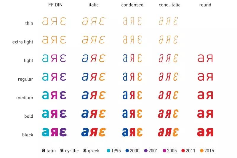
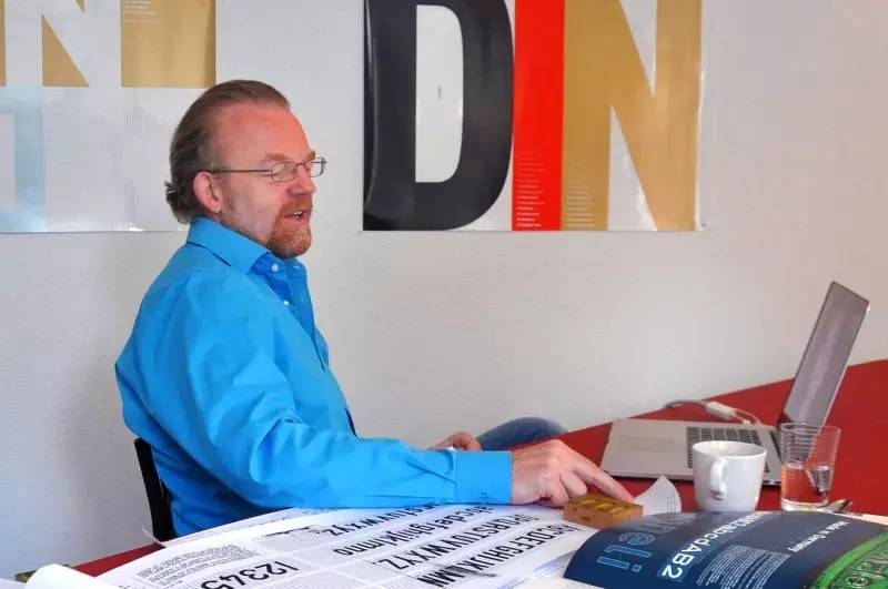
It is undeniable thatAlbert-JanPool's FFDIN® family font is an iconic family font in the FontFont font library. The birth of this font occurred after a communication between ErikSpiekermann and Albert-Jan in a taxi together. After listening toErikSpiekermann’s opinions, Albert-Jan re-examined the serious and rigid DIN1451mittelschrift and engschrift font. With the recent addition of two new weights – Slim and UltraLight, FFDIN has become an authentic European family font supporting Greek, Latin and Cyrillic scripts. I interviewed Albert-Jan and InkaStrotmann,InkaStrotmannhe likes to call herself "the invisible little helper", but both of them contributed to this typeface key to production and development.
Albert-Janpool interviewed
Albert-Janpool, when you first started working on the FFDIN® font family, did you know it would become very popular?
Albert-Janpool: “Of course I don’t know. However, what most people don’t realize is that FF>
"Inka, when did you start participating in FFDIN font development?"
InkaStrotmann:“I first came into contact with FFDIN about 15 years ago, when I was still working at FontShop in charge of Albert Basic font design work. The ATypl conference held in St. Petersburg in 2008 was an opportunity, and the participants were mainly from the FontFont department of FontShop. This conference gave me a chance to meet Albert. Because Albert is very busy, we Wanted to help him expedite his design work on FFDIN for a faster release. Since we had worked together before and got along well, he decided to take me on as his invisible little helper.”
Inka Strotmann (née Menne,1972) was born in the east of Frisia and is a professional font designer
What was your initial role in the collaboration?
InkaStrotmann:“In the beginning I was responsible for expanding missing letters in the font, and I also drew narrow italics. Albert often made some minor adjustments to my typeface. All in all, my main job was to assist him with the projects we were working on at the time, and stubbornly looking for feedback. Basically I was the one who made sure everything was done on time. In order to realize our projects, I Started visiting Albert at his office in Hamburg, and these meetings were always fruitful, we discussed the work we did, cleared up possible problems, and solved many difficult problems together."
Has your role changed since the start-up period?
InkaStrotmann: " After working together for many years, I have absorbed a lot of FFDIN's nutrients, and now I can help Albert more and better. He has been promoted to Art Director, And I, as the designer, was in charge of executing his idea. It was a bit like Erik Spiekermann working with other type designers to complete his type family. Our collaboration started with a high-volume textualization job at FFDIN, printing a bunch of experimental Proofing (our interns know it best, they print all the samples and send them to Albert). Albert will review almost every word, and then draft the design rules for drawing new typefaces. Our cooperation has become very close, often in the He met at his office in Hamburg, corrected typographical errors by email, and had frequent phone calls.
I am honored to participate in the latest font expansion of FFDIN. I draw new slim and ultra-light fonts according to Albert's instructions and specifications. This work led us to decide to update the entire font family and optimize many things. Currently I am free to make new proposals to FFDIN, but it is always Albert who reviews all proposals and makes the final decision. "
Albert-Jan Pool, regarding the expansion of FFDIN, how far can we go to expand the font family?
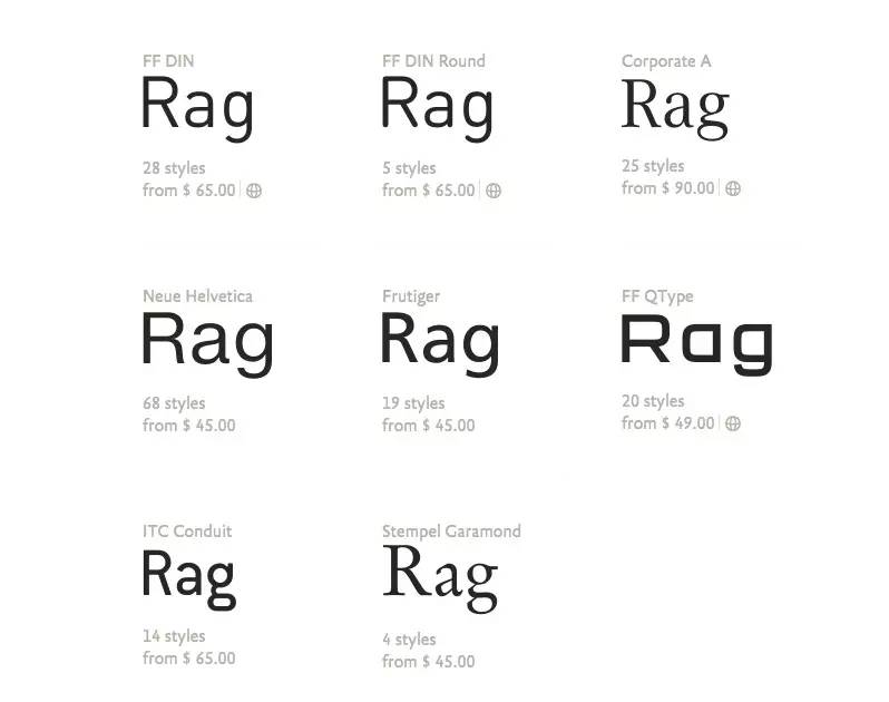
Albert-JanPool:"Theoretically you can add fonts infinitely. Please take a look at Corporate™ A·S·E, Kurt Weidemann (German design guru Kurt Weide Mann) is a super family font designed for Daimler Benz. It has serif (CorporateA, western bold), sans serif (CorporateS, non serif), and thick serif (CorporateE, thick serif). Likewise, you can add a serif version, a rounded serif version, etc...there's a lot of font variation potential, you can really go very far.”
So you don't feel like stretching it too far is deviating from the core concept of FFDIN?
Albert-JanPool:“Not entirely concerned, as long as the basic structure of a given font is relatively conventional and the skeleton of the letters allows for expansion, anything is possible. Of course , due to the aesthetics of the original FFDIN, the serif version would be rather rigid and only applicable within certain limits, like FFDIN itself."
What do you think of the modern take on the DIN Mittelschrift typeface?
Albert-Jan Pool: "It is very interesting to see that Apple has tried to capitalize on the popularity of FFDIN font. Of course, replacing NeueHelvetica thin font is very important. Sensible. Simply adding weights to text wrapping can improve legibility somewhat, but they often create new family fonts. The new San Fransisco font family is a clear example of this, although it is optimizing There is not much advantage in reading. In this series, in the design of some letters, such as a, e, s, and some numbers 3, 6, 8, 9, in order to be easily recognized, the aperture is partially changed. Small, and NeueHelvetica fonts are not such optimized. For Apple users, mobile phone reading often means smaller fonts and poor reading environment, which is an important opportunity for designers. Apple has always been a design achievement drivers, but in this case, they prefer to use generic solutions rather than pursue unique innovations in function and form. A more human-friendly sans serif font such as Verdana or Frutiger is tantamount to being more readable , which is more suitable as a system font."
Your work at FFDIN became your doctoral thesis.
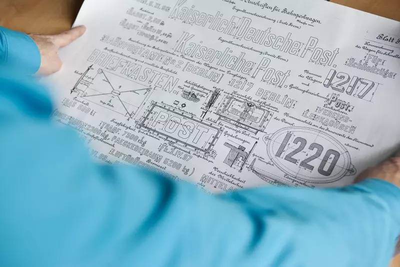
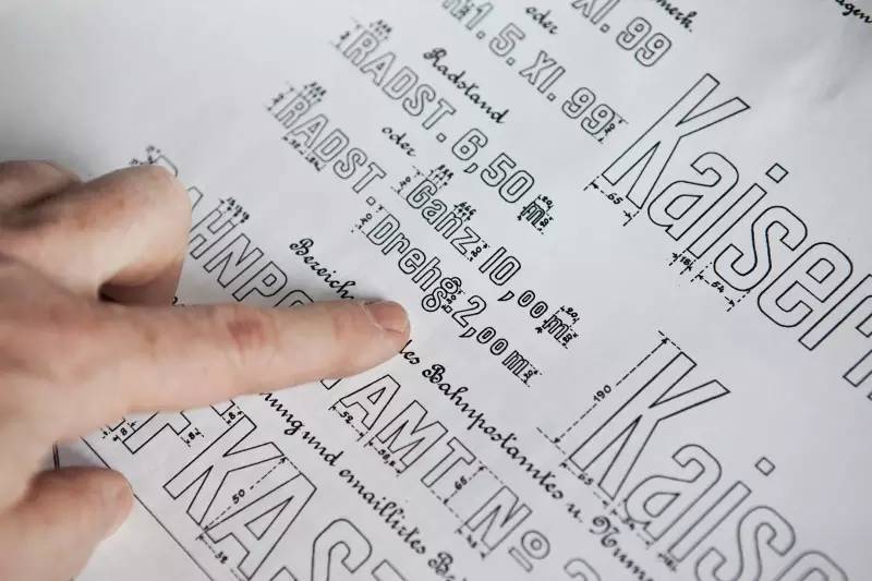
Albert-JanPool:“I have been working on my dissertation since 2008. It contains research on the historical roots of DIN typefaces. Many people- Including myself - everyone wants to know where it originated from, and I am often asked, but no one knows. In January 2004, I was invited to speak at LeipzigerTypotage, where there were 26 designers including me Got to speak about fonts. The meeting was in July, and since I still have half a year left, I thought: "Well, I can work on DIN Mittelschrift (medium weight) and make a nice presentation". However, I am very Quickly found out that this is very difficult as there is almost no information available. The result is like a joke: "Dutch typefaces made in Germany" - ironic about ignorant engineers turning to type design. Luckily Indra Kupferschmidand and Martin Binder told me they Knowing some font history is enough for me to tell an interesting story with more in-depth information at TYPO Berlin in 2005. This is the source of thought that made me start serious research."
In 2006 I submitted a resume to KABK. But I was told that I couldn't be a graduate student at the Type&MediaType Design Center because it requires full time. You can't learn remotely: this research can only happen when all students are present and working together. But they said there are other channels to get in, and they asked me to wait a few more months. Until 2008, Gerard Unger was assigned as a professor of type design course, and I officially joined the research. Of course, I am mainly interested in history, but Leiden does not study history, so I also need to add some artistic elements to my research. Because it involves the shape of the letters and the beauty of the font, I also researched some technical parts.
Has this research changed your view of DIN and made you look at your digital work with new eyes?
Albert-JanPool: "Nope. When starting FF>FFQType®and Nivea Corporate IdentityAchazReusscompleted this Thin font, and I designed the bold. I joined them in the middle, made small adjustments to the font family, did things such as adjusting the kerning. The whole design is mixed with some of my style, although I have Try not to add too much of my personality in it. If you want to achieve an eternal classic font, you have to remove your personality. I seldom add my own things in the process of depicting, otherwise there will be redundant comments-such as LikeITC Conduit® font, you need to give it a different name. ITC Conduit itself is an interesting font, but it has nothing in common with DIN. Every fantasy, crazy character of it is Exaggerated, which makes it perfect for some time-applied headlines, but also allows it to be automatically ignored when people get a little bored. Keeping a clean, regular, and "normal" look and feel has always been in the design An important constraint, so it was a great pleasure to work with Inka in this way. I also worked in a similar way with the designers on the extended language script, PanosHarantzopoulos and YiannisKarlopoulos for the Greek words, AlexeiChekulaev and AlexeyGunin For the Cyrillic alphabet, we managed to find a delicate balance between being loyal to the conventions of other languages and the FFDIN font philosophy.”
DIN looks remote and technical to me. How did you approach letter shape design?
Albert-JanPool: "We see what we want to see. People who love industrial archaeology, trains and highways and similar typefaces and We look at fonts differently. For these people DIN is a symbol. This phenomenon puts me in a very favorable position, they will recognize my font because it is called DIN. But if you are concerned about aesthetics , the stiffness of the lines and curves in an engineer's manuscript, then things are different. For these people, such as Cornel Windlin and Stephan Müller from lineto, only the original DIN font is ideal. What I elaborated is more general, Almost every digital font is far from their ideal typeface. Also, we now have the DINNext font. It takes more or less possible ways to try to be a "human" DIN.
DINNext still benefits from DIN's reputation, but it has little in common with the original version. Looks a bit like ITC Garamond font, you will find that it is a good font, but it has little connection with its originator Claude Garamond. From this point of view, StempelGaramond and especially SabonNext fonts are also better explained. "
How to interpret DIN fonts from a cultural perspective?
Albert-JanPool: "In Germany, you will find that some people like the DIN font, and some people have a slightly complicated positioning and meaning of the font. The French are proud of their country, the Dutch are the same, the Belgians are a little too (laughs), and of course the Americans think their country is the greatest country in the world, but the Germans It's not that strong, it's a bit vague. What surprises me is that the European countries around Germany, especially France, which has historically had a very unfriendly relationship with Germany - from Waterloo in 1815 to the Second World War in 1945 There were four wars between the Great Wars, and some of their well-known institutions like to use FFDIN as their identity, such as the Center Pompidou and the Eiffel Tower. Fifty years ago or even thirty years ago, no one predicted that France would actually German fonts are used, and so is the Netherlands. If you ask the Dutch about their impressions of the Germans, they think it’s okay to have trade contacts, and the rest of the history has a certain psychological shadow. However, even so, the National Library of the Netherlands uses FFDIN fonts As a corporate identity font, and orange (laughs), when Queen Beatrix (Beatrix) married Prince Claus (Claus), there was a lot of discussion and opinions. Fortunately, these Things don't matter much now, it's interesting to see how cultures evolve over time. During World War II, the Germans wanted to promote the use of DIN1451 typefaces for traffic signs in the Netherlands, Jan van Kleinpen (Janvan Krimpen) and Ovink blocked them, but if it happened now, most people would say: 'Hey, that's an interesting proposal!' It's an incredible turn of events.”
Fonts mentioned in this article

Support genuine, not bad companies and individuals, please go to the original link to buy!
Original text provided by: Tony
Translation: Tony, Filoki, chubby sparrow, June, Kentoness, lemon, juey, Darren, lynn_dash, jojo, zero
Designed by: Darwin
Proofreading: Connie, zoey
———————————————————————————————————
We are the DATS translation team. We love design and love English. We learn and progress together by translating and designing articles. Although we still have many shortcomings, as long as we gather everyone's tiny strengths, we will shine brightly one day~ Welcome Follow us on the home page.
This work was designed and translated by DATS>
Excellent original designs all in one go!
Like the most IN original design information?
Follow Zcool.com public account: zcool-com-cn
Click 【Read the original text】 Learn more exciting content
↓↓↓
Articles are uploaded by users and are for non-commercial browsing only. Posted by: Lomu, please indicate the source: https://www.daogebangong.com/en/articles/detail/Thanksgiving%20Gives%20Back%20Take%20you%20to%20understand%20the%20birth%20of%20a%20popular%20English%20font.html
 支付宝扫一扫
评论列表(196条)
测试