
We live in an era of rapid technological development and ever-changing life. Technology affects each of us and brings great convenience to our lives. At the same time, it also inspires people to explore and imagine more possibilities of the future world , This is why sci-fi movies are always very popular. In addition to sci-fi movies, we also frequently receive information about technology in the real world. When many companies promote their products, they will spare no effort to introduce the use of their products. So-and-so's latest black technology, because mastering the core technology means mastering the future, then the question is, how to reflect the sense of technology in fonts, I think this is a problem that many designers are concerned about, this article I will pass Two cases explain how to design fonts with a sense of technology.
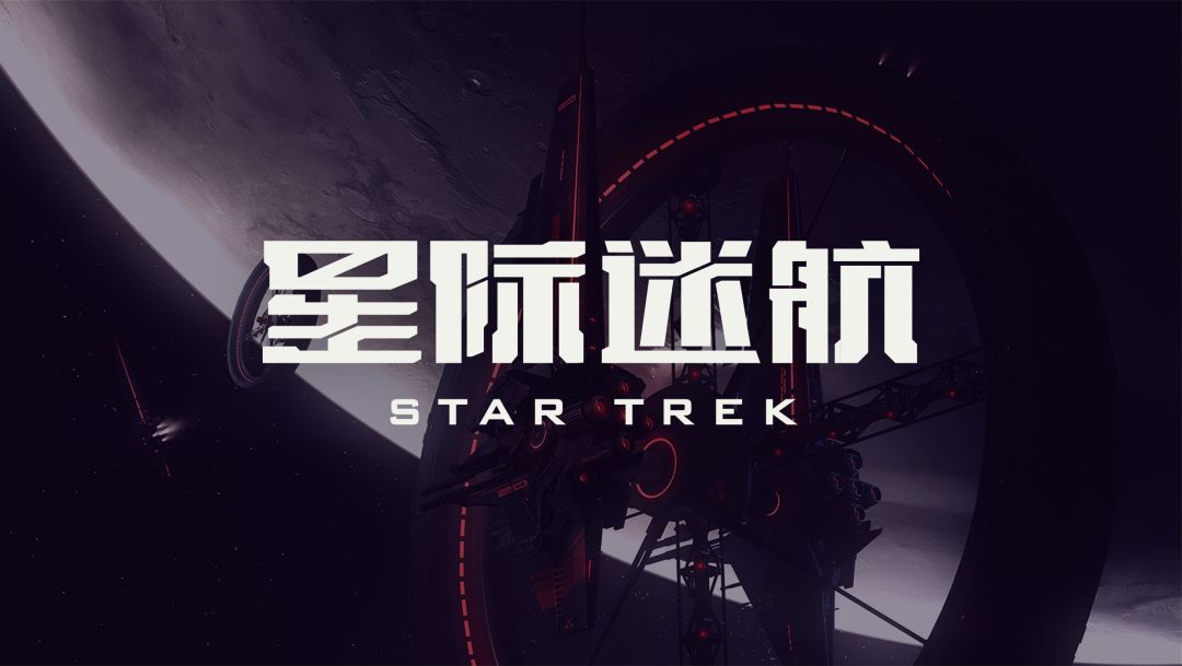
▲ The poster design of some sci-fi movies, the fonts are very technological
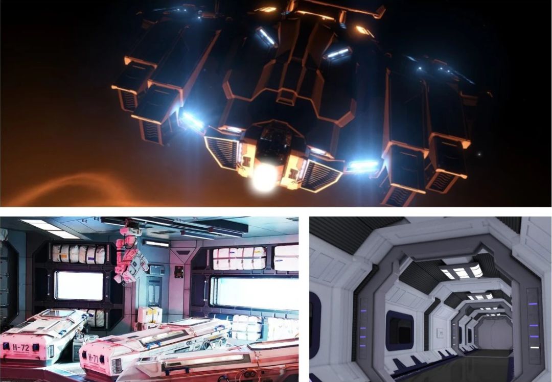
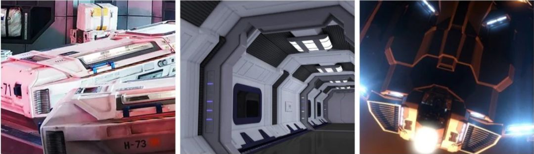
When it comes to the sense of technology, I believe that many people, like me, will think of the scenes in science fiction films, especially the space battleships and spaceships in the film. The sense of science and technology and the sense of the future provide a good visual clue for us to design fonts with a sense of science and technology. In fact, the imagination of vehicles in the future universe in these sci-fi movies is similar, and we can find some common features, as our inspiration for designing sci-fi fonts.
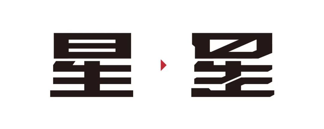
[Case One: Star Trek>
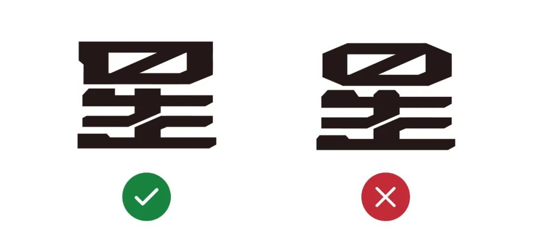
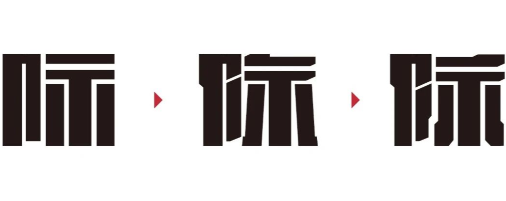
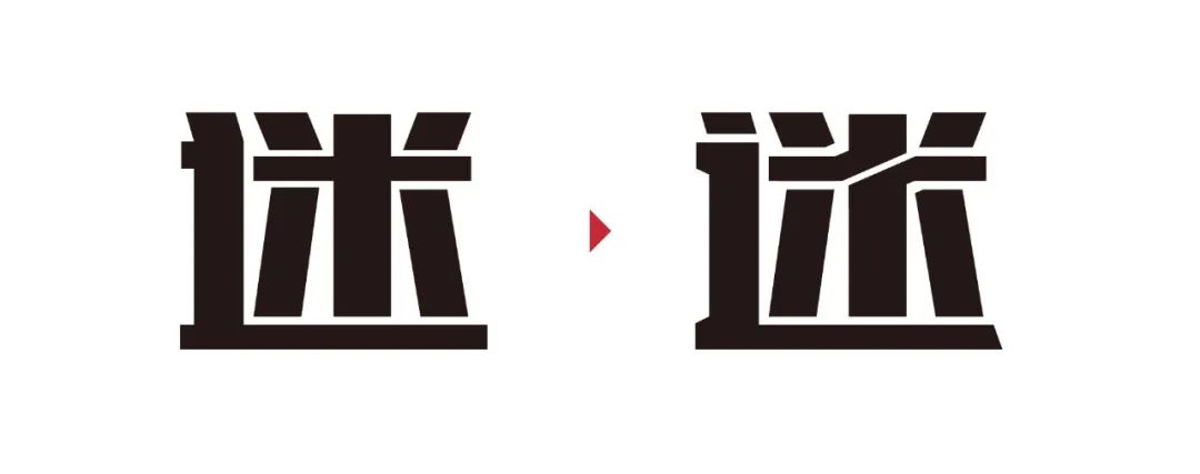
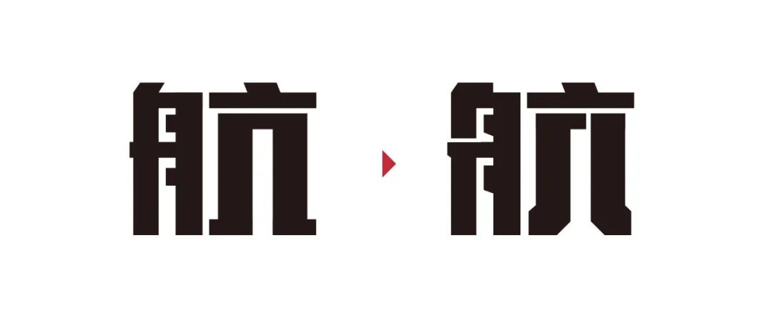
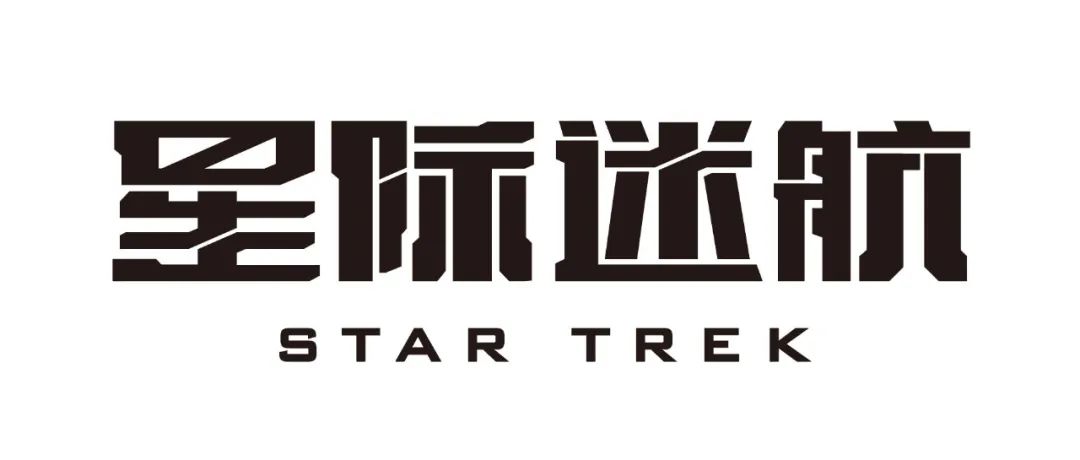
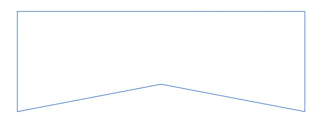
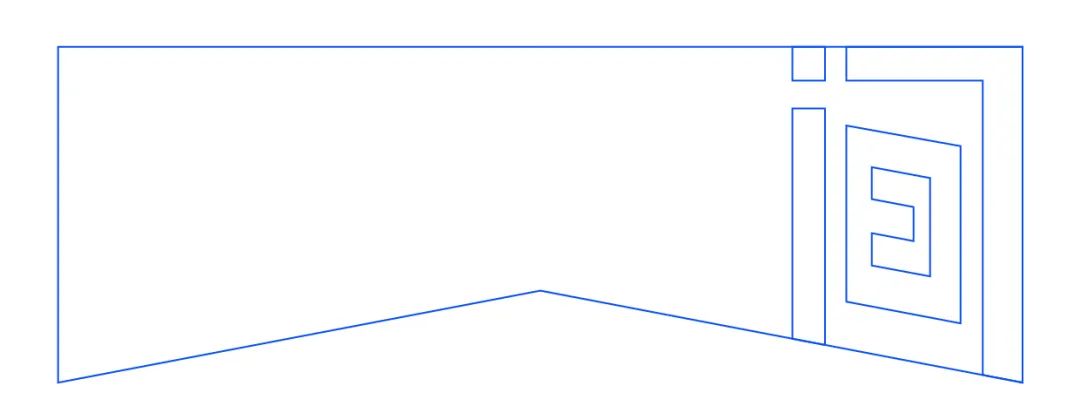
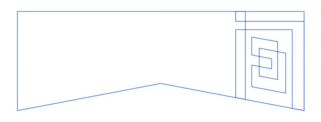
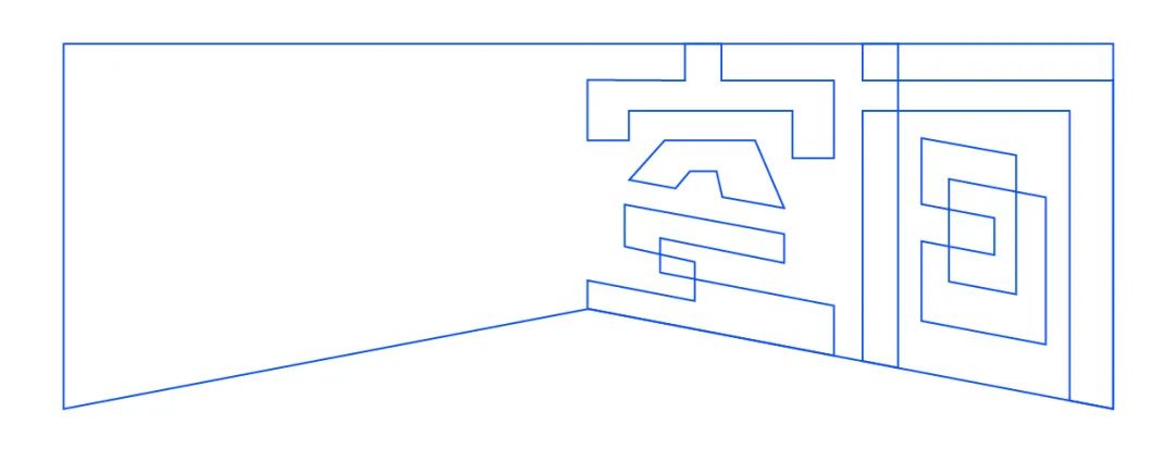
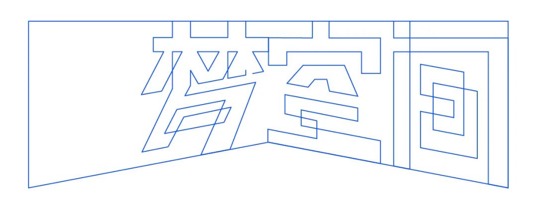
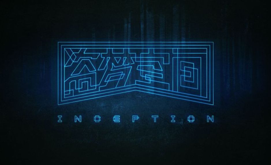
The theme of the four words Star Trek itself is related to elements such as space, universe and flight, so In terms of font design, we can completely integrate the shape characteristics of the spaceship into the strokes of the font, which can not only make the font present a sense of technology, but also match the theme of our four characters. First of all, we use a rectangle to make the basic strokes of these four characters, and follow the horizontal, thin and vertical strokes when doing it The rough rule, as shown in the figure below:We can see that the glyphs of these four characters are basically qualified at present, and it is also possible to use them directly. In reality, we often see such commercial fonts, but such fonts If there are too many, it will make people feel unimpressed, because there is no personality, and it is difficult to reflect the theme of the font well. Therefore, the next thing we need to do is to integrate elements that can reflect the sense of technology into the strokes of the font . Through the observation of spaceships and space capsules, we found that their common feature is that there are many slashes on the shape , cutting elements, we can apply this feature to font design. Then let's start with the word "star" and integrate the slash and cutting elements into the font. As shown in the picture below: You can see that the strokes of the star on the right incorporate many slash and cut elements. These elements are all derived from our spaceship inspiration picture, and the horizontal strokes in the "day" above the star are also oblique strokes However, it does not affect the recognition of the font, but makes the font look more technological. Of course, when adding these elements to the font, you must grasp a certain degree. First, ensure that the recognition of the font is not affected, and the added elements conform to the original Chinese characters as much as possible. The characteristics of strokes, and the positive and negative space of the font formed by adding elements at the same time should be harmonious and beautiful. Following the same idea, let's make the word "Ji". It’s too rigid. If you use oblique strokes, the negative space formed will be out of tune with the surroundings. You need to keep trying to find a solution. Next is the word "fan". I am very restrained when incorporating slashes and cutting elements into this word, because if it is not handled properly, it will appear very In the process of writing, I encourage you to try more, but in the end you must know how to choose. The last is the word "hang", the word "boat" on the left is appropriately added with oblique elements, and the "kang" structure on the right The lower part is treated in a similar way to the two points of the word "Ji", which makes the fonts more unified. Finally, we put the four words together and match them with a suitable English font, and the work is completed. < span>【 Case 2:InceptionOf course, There are many ways to reflect the sense of technology, such as multi-dimensional space. Human beings can only perceive space in three dimensions, but Einstein proposed the concept of four-dimensional space in his theory of relativity. Our universe is composed of time and space, and the latest The scientific argument holds that there are at least eleven-dimensional space in the universe, and the eleven-dimensional space is composed of time, space, memory and perception. And our dreams are also a multi-dimensional space formed by overlapping factors such as subconsciousness and memory. There is a movie called Inception. In the dream of Erxi, the story of trying to change his subconscious mind, I believe that people who have watched this film are deeply impressed by the multi-dimensional dream space in the film. In this case, let us try to use font design techniques to reflect this. theme of the video. ▲ Multidimensional space is also a way to reflect the sense of technologyFirst of all Let's set the overall outline of these four characters. This outline will directly affect the stroke arrangement of the font. At first, I wanted to make a symmetrical outline with a sense of perspective. Later, I chose a parallel structure on the top. The following is the shape of the perspective structure, which will give a more chaotic feeling, and then we arrange the strokes of the font in this outline space. In this case, we use lines as elements to create characters, so as to reflect the overlap and confusion of dreams. When making this font, we need to split and deconstruct the original stroke structure of the font to create a new structure with a sense of multi-dimensional space, and this structure must be unconventional, with a kind of cross There is a sense of contradictory space in the overlapping relationship. 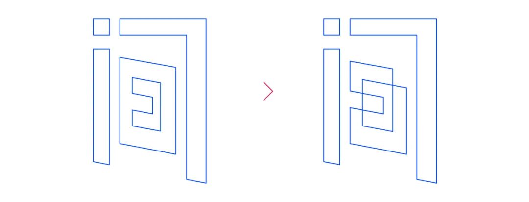 In this case, when I was doing it, I started with the word "between", just like many people are drawing When drawing, I like to start from the part first. The advantage of doing this is that I can quickly find the feeling. I choose to start with the character "between" because the structure of this character makes it easy for me to quickly find overlapping inspiration. Let's use the normal The stroked and hollowed out characters make the characters between, as shown below: Then we will start to transform this word, starting with the structure of the word "日" inside , we want to make the lines that do not intersect and are in a two-dimensional plane produce the feeling of spatial overlap, as shown in the following figure:After such a transformation, the lines form a closed-loop body of wireless circulation, and produce a multi-dimensional sense of spatial interlacing, and this interlacing has some Dreamy feeling, it is hard to tell which line is in the front and which line is in the back. This feeling is in line with the theme of our film. After confirming this form, we can use the same thinking and form to make the following parts . We use the same idea to complete the "door" structure of the character "between". Through simple transformation, the structure of the word "door" also realizes the visual effect of overlapping front and rear:It should be noted that when transforming, the lines of the outer contour and the lines of the characters should be considered as a whole. The lines of the font and the surrounding lines will form a new relationship. It is for this reason that the stronger the sense of spatial confusion in the font. Next we will make the word "empty". Through observation, we find that the structure of "工" under the empty word is very suitable for structure To disassemble and reorganize, we use the same idea as Jianzi to try to make the structure of the space interlaced. The strokes in other places are designed according to the original structure, as shown in the figure::::::In the process of doing it, pay attention to the horizontal strokes. Choice, reasonable choice, for all inclined horizontal strokes, the angle of inclination must be consistent with the angle of the oblique line below the outer outline. Let's do this for the empty word for now, and then make the dream word. The structure of the "Xi" part under the word "Meng" can completely learn from the "Day" part of the word "Jian" The overlapping form of the lines, the general idea is to create a multi-dimensional visual space, break the original two-dimensional structure, and make the lines interspersed and connected in series. One end is interspersed with the vertical strokes, and at the same time, the vertical strokes on the left side of the word Lin are connected with the strokes of Xi, so that the word Meng is basically completed, as shown in the picture:< section>
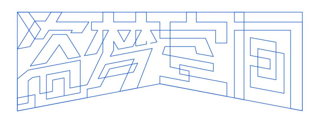 The last is the stolen word, this word is the most difficult to deal with, so it is put at the end, and we also choose the following structure of the dish character for spatial processing, the dish The structure of the characters is relatively complicated, and it needs to reflect the sense of multi-dimensional interspersed overlap, while maintaining the recognition and looking comfortable. The specific idea is: Think of the interior of the character “盐” as a city, in which there are many high-rise buildings overlapping front and back, and these high-rise buildings are all transparent, and the buildings behind can be seen through the front buildings. Under the guidance of this idea , through the careful arrangement of the lines, a multi-layered and overlapping city-like space is formed in the structure of the character “Dan”, so that the feeling of the word comes out, and it also echoes the theme of the film. As for the above times, we can Follow the trend of strokes, use lines to connect a structure similar to contradictory spaces, and the stolen characters are completed, as shown in the figure:
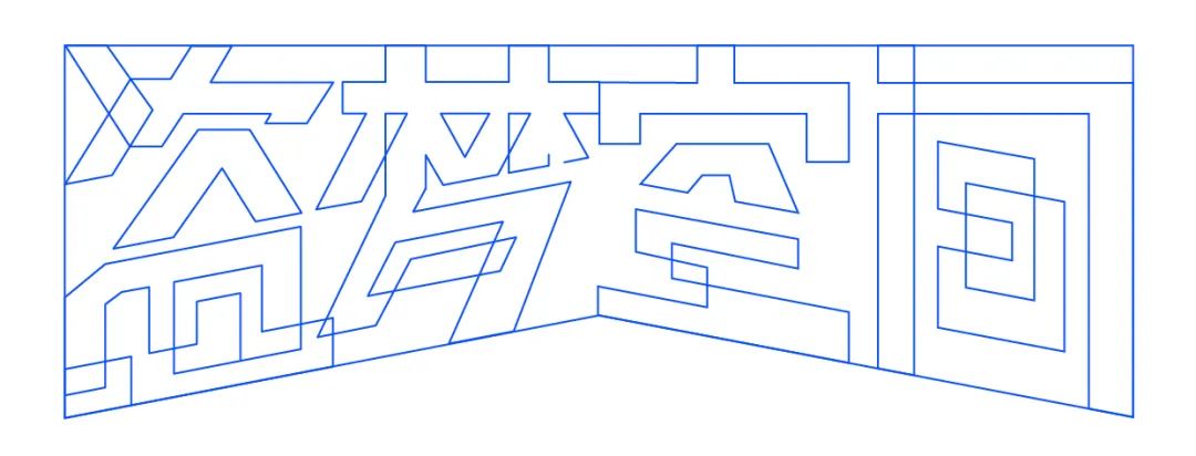
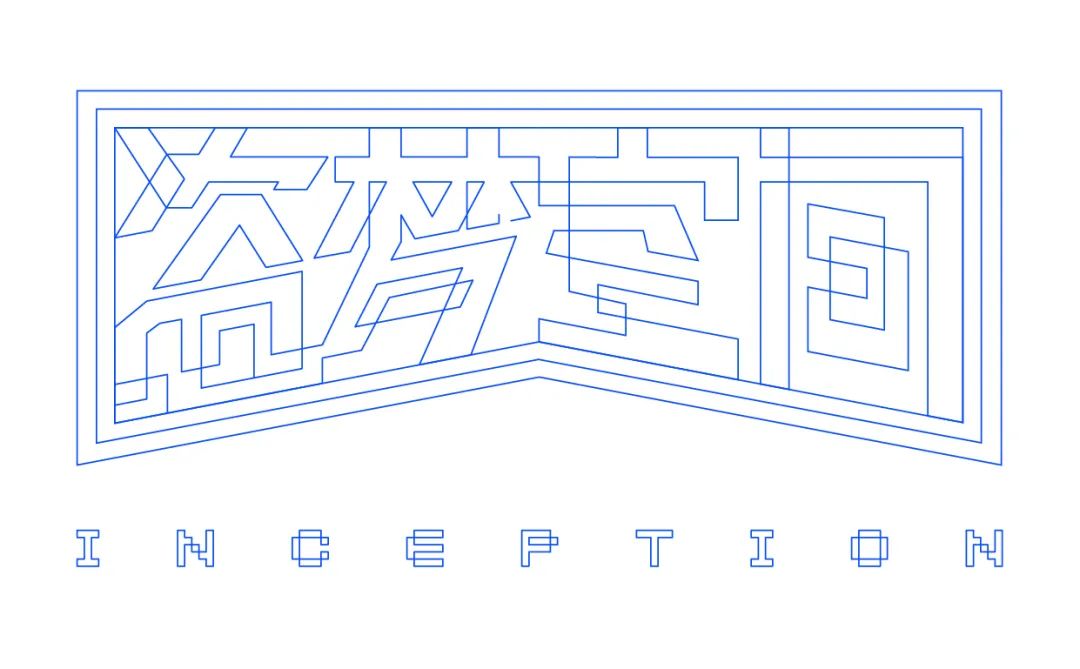 After the four words are completed, we need to further optimize the relationship between words and make these four words more relevant. First of all, we Seeing that the current shape of the empty character is not very ideal, and it looks very isolated and unnatural when it is next to the dream character on the left, so I decided to open up the lines between the empty character and the dream character, and re-deconstruct the upper part of the empty character. Interrupt and reconnect the original lines to create a new shape with chaotic overlapping relationship, and then open up the strokes of Meng and the horizontal strokes at the bottom of Pirates, so that the shape of the characters is completed. Finally, in order to make the whole more visually layered, I added two layers of outer contour lines outside the glyphs, and added With an English font consistent with the Chinese style, this case is finally completed. Okay, let’s stop here about the technological fonts first, if you have learned it, help Dao brother to click on it.
 The Way of Word Beauty (id: zimeizhidao)
Wen Liangdao
Keyword reply: (see the corresponding knowledge article)
Printing, business card, poster, logo design, tea packaging, color spectrum, folding page, BANNER, Tucao video, takeaway, AV, quotation, Japanese poster, layout, Republic of China, software, Olympics , benefits, resume, moon cakes, Tmall, Double Eleven, recipes, red envelopes...
Articles are uploaded by users and are for non-commercial browsing only. Posted by: Lomu, please indicate the source: https://www.daogebangong.com/en/articles/detail/Technological%20font%20design%20ideas.html


 支付宝扫一扫
评论列表(196条)
测试