"Xiaoxiao is clear in autumn, and the distant mountains are facing yellow flowers", borrowing this sentence, I will share with you a simple font design idea - Qingqiu.

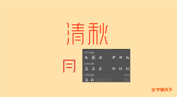
1. In the AI software, keep the color fill as a stroke, and use the pen tool to outline the basic structure of the font. Copy the same strokes directly, and then open the alignment panel. For example, to align the strokes under the word "Qing", you need to select these three strokes, and then click the horizontal center alignment in the panel. The resulting font is more standardized.
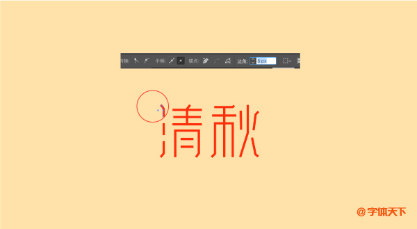
2. On the ticked font, select the stroke node with a turning point, and adjust the value of the corner. The value of the corner here is 10 pixels, not all the corners are set to 10 pixels. Some strokes with relatively small turning points can be relatively reduced by a little value in proportion.
Step 3. After adjusting the corners, add a vertical English to the font, adjust the word spacing of the English font, and the font design after typesetting has a sense of rhythm. Finish off by drawing some decorative elements with a pen.

Articles are uploaded by users and are for non-commercial browsing only. Posted by: Lomu, please indicate the source: https://www.daogebangong.com/en/articles/detail/Teach%20you%20to%20design%20a%20simple%20and%20artistic%20early%20autumn%20font%20%20Qingqiu.html
 支付宝扫一扫
评论列表(196条)
测试