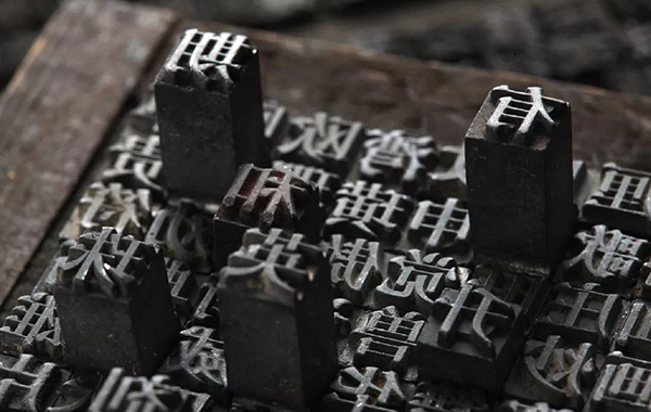
Author: Little Hedgehog Source: I am Design Wet
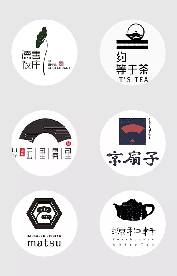
Key points of Guofeng LOGO
Let's first look at the meaning of "national style". Chinoiserie, that is, Chinese style, is an art form or lifestyle based on traditional Chinese culture, containing a large number of Chinese elements and adapting to global trends. Extract two core points, "Chinese traditional culture" and "traditional elements", and integrate these two elements into your LOGO, it will blow a strong national style.
After reading this paragraph, it is not difficult to understand why the seal-style logo gives people a strong sense of national style. One is that Chinese characters themselves are typical representatives of Chinese elements, and the other is that seals are also common traditional elements in China. So the first two skills are related to Chinese characters.
Four major skills of Guofeng LOGO
Stamp style;
Graphic Chinese characters;
Borrow from traditional elements;
Mottled texture overlay.
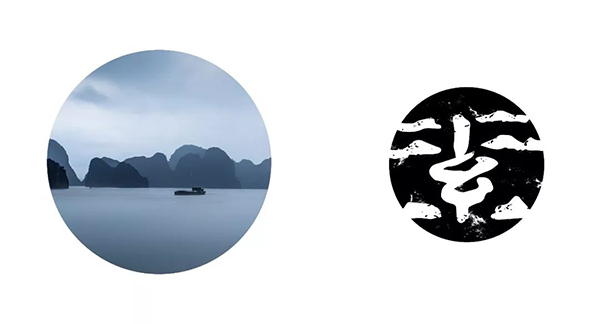
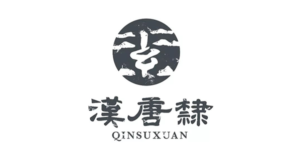
1. Stamp style
Stamp style. In the last article, we subdivided the seal style into three categories, straight line composition; past for present use; Chinese character geometric composition. Most of the students’ problems lie in the composition of internal Chinese characters, so we will use a few cases to analyze the main points of the internal Chinese character composition of the seal-style LOGO and how to extract the combination of national style elements.
1. Use the past for the present
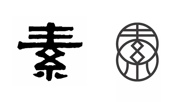
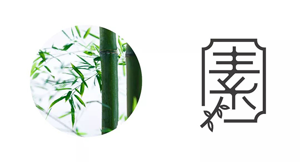
Many students have committed the problem of copying the ancient characters directly, although the ancient characters in seal script are good. But we need to extract the core points, combined with the actual situation and take into account the identification and reasonable reference. Taking the word "素" as an example, I will make a demonstration.
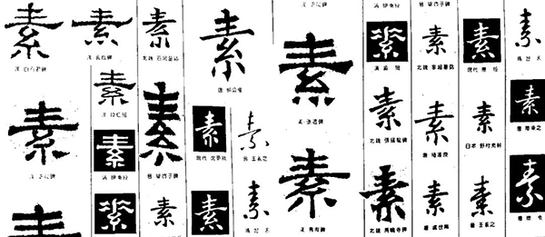
First of all, I found a large number of ancient characters as a reference source, not limited to a certain font, official script, seal script, etc. and even cursive script. Then I selected some ancient characters with reference significance, and carried out a second redesign. In this part, I will focus on processing the composition of Chinese characters and weakening the outline form.
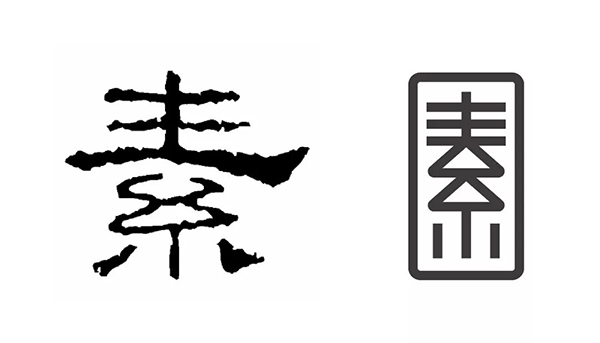
In this scheme, the ancient meaning of seal script is too strong, and the recognition is too low. So I extracted the processing method of the middle circle, and in order to make the overall glyph not too thin and tall, I superimposed the two circles. The three horizontal lines above are combined with modern glyphs in order to improve the recognition of glyphs. The outer contour conforms to the shape of the glyph and is superimposed with double circles. The design technique of the outline is described in detail in the previous article. Generally speaking, the outline needs to be ingeniously coordinated with the composition of Chinese characters.
The inspiration of this scheme is obvious. I directly extracted the treatment method of the triangle, and made a straight treatment as a whole. Other points are similar to the above. It should be noted that you need to control the stability of the font and the coordination of the proportional relationship, so as to basically meet the large structural relationship of Chinese characters and not violate the writing rules.
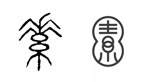
This solution combines the inspiration of the ancient rhombus processing method and an addition of the above two. The idea at the beginning is also relatively simple, extract the rhombus and build the glyph. Then I tried to conform to the structure and put in two circles. The reason why I tried to put circles directly was that I was inspired by the first seal script. You can see that there are only two horizontal strokes on the first seal script, while the modern glyphs are plain. On the top are three horizontal lines. So I keep the two horizontal strokes and weaken the combination of the third horizontal stroke and the circle, and then I have a third plan.
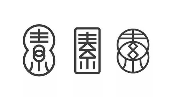
It can be seen that the inspiration sources of the three schemes are all ancient characters, and the extracted points are relatively intuitive. This is why I said in the last article that using the past for the present is a less difficult form. Based on everyone's practice, there are several pitfalls to avoid:
Avoid copying ancient characters directly;
Taking into account the integrity after the inspiration is extracted;
The positive and negative spaces are well-proportioned and the overall proportion is coordinated;
Comply with the basic structure and writing rules of Chinese characters.
2. The geometric composition of Chinese characters
Compared with the way of borrowing ancient characters, the geometric composition will be more difficult. The main reason is that your structure and space need to be dealt with more subjectively. But there are also some tricks and difficulties. Master the skills, and you can master the basics after avoiding common problems. Still take the word "Su" as an example.
Since it is a national style LOGO, can the stroke processing and interspersed form be borrowed from traditional elements? There are only two examples listed in the picture, if you search [traditional patterns] on the material network, your source of inspiration will explode. Whether it is cloud pattern, fret pattern, clothing pattern, ethnic pattern, etc., it is your source of inspiration. I extracted the most commonly used moiré form for the word "素".
The characteristic point of the processing core of this scheme is that the stroke connection is done in the form of moiré. The difficulty mainly lies in the interspersed rhythm and the overall rhythm balance. At the beginning, I made sure that the strokes were in the form of interspersed moiré patterns. Then build the whole glyph, in the process of adjustment. Let the two strokes in the middle connect the circle to stabilize the overall structure and balance the messy and unbalanced feeling caused by the interspersed upper and lower strokes. The bottom two points also tried the form of disconnection, and finally adopted the method shown above. The two points are straightened and connected with the vertical line in the middle, supporting the glyph like the backbone. Even if there are interspersed changes, the whole still gives people a relatively stable visual experience of chaos and order. There are other ways to form this direction, you can read the content of the previous article. Then we summarize the skills and difficulties.
Strokes and interspersed forms can learn from traditional patterns;
Pay attention to the symmetry of positive and negative spaces and the appropriate thickness of strokes;
Even graphics should be relatively recognizable;
Lines and interspersed forms should not be too complicated.
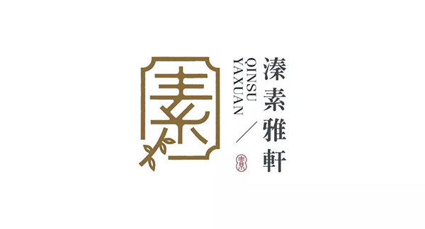
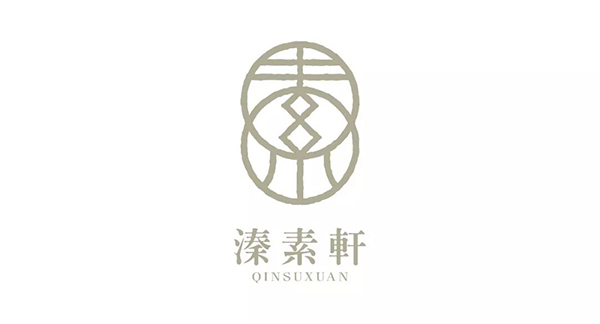
2. Graphical Chinese characters
Graphical Chinese characters. More precisely, it should be a graphic treatment of traditional elements combined with Chinese characters. If the shape and elements are not highly related to traditional elements, it is difficult to have a sense of national style. There are usually two major ways to visualize Chinese characters, one is based on graphics, and Chinese characters are integrated into it. The other is that Chinese characters are the main body, and traditional elements are used as embellishments, which is also a graphic design technique. Below we still use "Su" as two cases.
1. The graphic is the main body
The plain characters in this scheme are actually more graphical, but it can still be seen that the plain fonts are integrated into it. When designing this scheme, the large skeleton glyphs are also the source of ancient characters, but I integrated the strokes with the shape of ancient landscapes. After designing the glyph map, I found that the whole is a bit scattered and broken, so I added a circle as the bottom and reversed it. In this design technique, you need to find the relationship between graphics and glyphs, so combine them skillfully. Whether the combination is ingenious mainly lies in the fact that the overall form of the stroke trend of the characters and graphics must match.
2. Chinese characters are the main body
When the graphics become auxiliary, you only need to integrate the graphics into the glyph reasonably and skillfully. The graphics need to meet the shape suitable for the strokes, and the trend conforms to the strokes. requirements. You can see that in this scheme, the structural form of the elements is very common. You can directly extract the structure of the bold or Song typeface and combine the graphic elements.
Third, traditional elements for reference
In fact, the style of the seal and the graphics of Chinese characters both use traditional elements for reference. The part that is singled out is borrowed from the traditional elements that tend to be figurative. So what are the traditional Chinese elements? I randomly list some for your reference.
Chinese Calligraphy, Seal Cutting, Chinese Knot, Beijing Opera Mask, Shadow Puppetry, Chinese Martial Arts, Tai Chi
Terracotta warriors, peach blossom fans, cloisonné, jade carvings, Chinese lacquerware, red lanterns (palace lanterns, gauze lanterns)
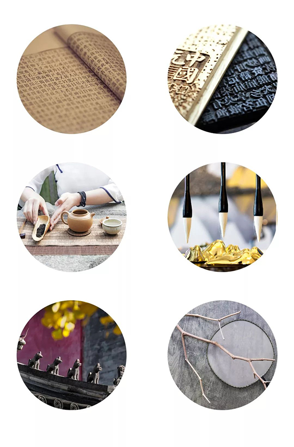
Woodblock watermarks, oracle bone inscriptions, Zhong Dingwen, bamboo slips of the Han Dynasty, tea, traditional Chinese medicine, four treasures of the study (inkstone, brush, rice paper, ink), four great inventions of vertical thread-bound books, paper-cutting, kites
Buddhism, Taoism, Confucianism, magic weapon, Tai Chi, Yin and Yang, five elements, gossip, Zen, Avalokitesvara hand, filial piety, paper money
Musical instruments (dizi, erhu, drum, guqin, pipa, zither, etc.)
Dragon and phoenix patterns (taotie pattern, ruyi pattern, thunder pattern, Hui pattern, Ba pattern), auspicious cloud pattern, Chinese weaving and embroidery (embroidery, etc.), phoenix eye painted pottery, purple sand pot, batik, Chinese porcelain
Ancient weapons (armor, sword, etc.), bronzes, tripods
Chinese painting (ink painting) (meticulous brushwork, freehand brushwork) (flowers and birds, figures, landscapes), Dunhuang murals, stone lions, flying apsaras
Couplets, door gods, New Year pictures, firecrackers, riddles, dumplings, lion dance, moon cakes for Mid-Autumn Festival, rice dumplings for Dragon Boat Festival, Lantern Festival for Lantern Festival, Laba porridge for Laba Festival, beans for Spring Dragon Festival on February 2
Bird cage, bonsai, five-needle pine, moso bamboo, peony, plum blossom, lotus, giant panda, carp, plantain fan, bellows
There are really too many traditional elements, all of which can be a source of inspiration for your LOGO. The scheme of graphical Chinese characters above is already biased towards figurative forms, but the core composition is still Chinese characters. For this part of the content, we will take the above scheme as an example, and then analyze a few cases to get something.
1. Traditional elements are supplemented
Traditional elements are used as auxiliary elements, such as brushes, stamps, plum, orchid, bamboo and chrysanthemum. Generally speaking, it is to set off the overall national style atmosphere or to harmonize, and it is also often used to balance and activate the entire LOGO layout.
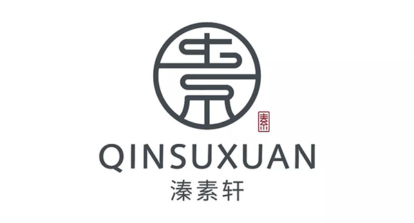
In this plan, I reduced Su’s seal LOGO and used it as an auxiliary Chinese element. Many national style LOGOs will use small seals to set off the atmosphere and stabilize the layout. A little bit about the word selection and layout of this LOGO. The symmetrical typesetting of the LOGO is solemn and serious, and the overall is more stable. This is the most commonly used method. Here I choose Syntax in English, humanistic sans serif. The choice was mainly made out of trade-offs. In order to coordinate with the composition of graphic lines, a sans-serif font was chosen. But on the other hand, I also hope that English can have a sense of culture in line with the feeling of the new national style. The Syntax curve and the processing of details retain some traces of handwork, with a touch of humanistic warmth, which is perfect. For symmetrical typesetting, choose fonts that are similar to the details of graphic lines, and pay attention to the balance of proportion and weight. Generally a very conservative approach.
2. Mainly traditional elements
The dominance of traditional elements is obvious. Directly extract traditional elements as the source of inspiration for LOGO. Let's look at a few cases below. Don’t the lotus, tea ceremony, cattail leaf fan, and window grilles all correspond to the traditional Chinese elements above? As for the form of expression of traditional elements, it is a long story. We have the opportunity to start with a separate chapter.
Fourth, mottled texture overlay
The effect of mottled texture superposition is actually to make old. It can make the LOGO appear more detailed and retro, and self-heating can also enhance the effect of national style. There are three commonly used methods.
1. Vector mottled material
This is a relatively simple way, just use mottled materials directly. But avoid directly stacking mottled materials. It is necessary to reasonably control the proportion and size relationship of mottled spots, and the overall effect shall prevail. This is just a little trick for icing on the cake.
2. Special brush stroke
If you want your pure line LOGO, the line can have a mottled ink feeling. Then you can try this way. Modify strokes to special brushes. The following example uses the "charcoal-feather" brush that comes with ai.
3. Roughening
Ai's own functions, select: Effects > Distortion and Transformation > Roughening. Remember to choose the absolute value, and adjust the appropriate value to produce natural rough changes in the shape of the line.
Summary review
Stamp style
Use the past for the present:
1. Avoid copying ancient characters directly;
2. Take into account the integrity after the inspiration is extracted;
3. The positive and negative spaces are well-proportioned and the overall proportion is coordinated;
4. Comply with the basic structure and writing rules of Chinese characters.
Geometric composition of Chinese characters:
1. The strokes and interspersed forms can learn from traditional patterns;
2. Pay attention to the symmetry of the positive and negative spaces and the appropriate thickness of the strokes;
3. Even the graphics should be relatively recognizable;
4. The lines and interspersed forms should not be too complicated.
Graphic Chinese characters
Graphics as the main body
Chinese characters are the main body
Traditional elements are used for reference
Traditional elements are the main body
Traditional elements are secondary
Mottled texture overlay
Vector mottled material
Special brush stroke
Roughening
Articles are uploaded by users and are for non-commercial browsing only. Posted by: Lomu, please indicate the source: https://www.daogebangong.com/en/articles/detail/Teach%20you%204%20tricks%20you%20can%20also%20learn%20the%20national%20style%20LOGO%20with%20zero%20foundation.html
 支付宝扫一扫
评论列表(196条)
测试