It is not so much that MUJI is a brand, but rather that it builds a philosophy of life. The seemingly ordinary and simple design of MUJI embodies the wisdom of the designers' systematic design research and observation. MUJI has found a daily way to solve life problems, which is a way of behavior, and it is also a way of life that comforts and awakens people's feelings based on the behavior of use.

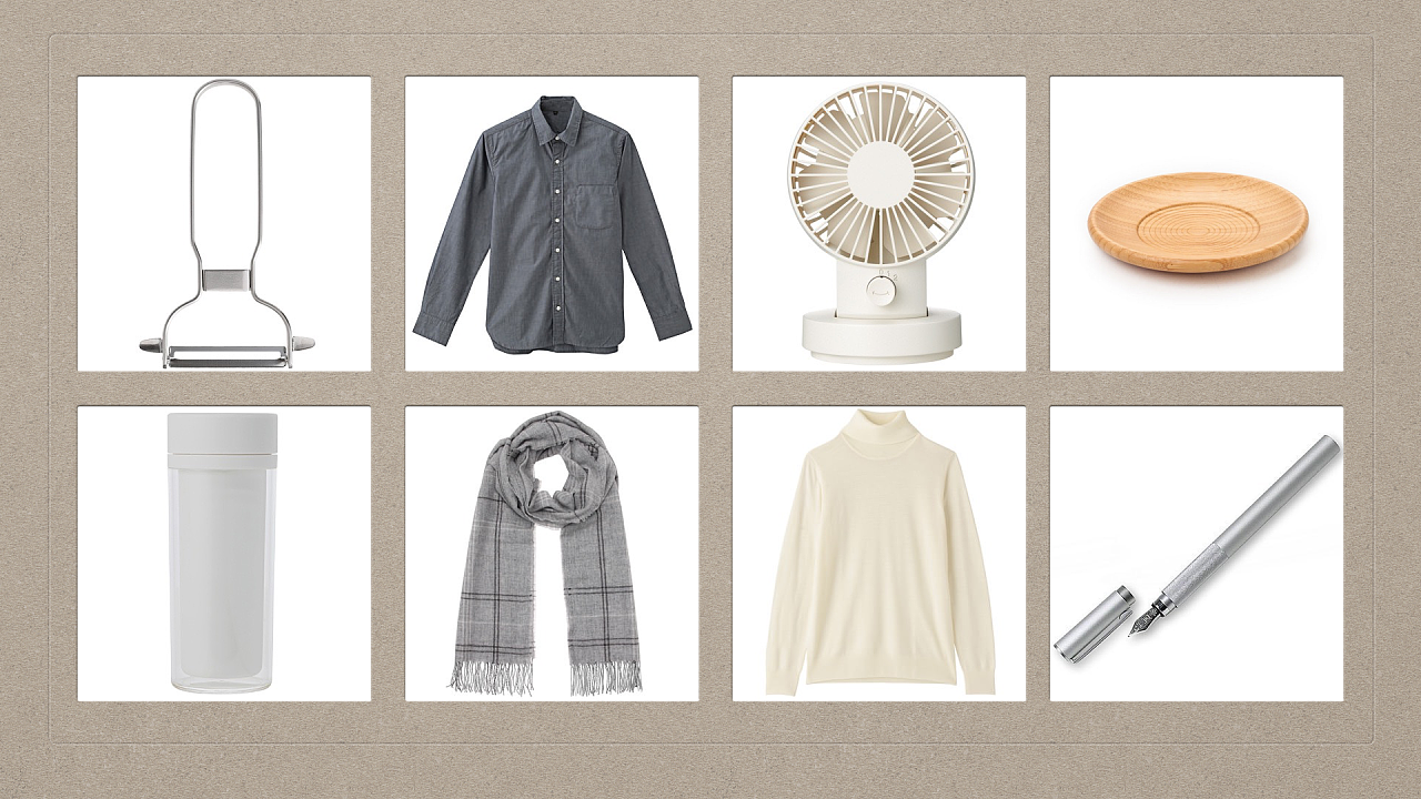
MUJI is a Japanese grocery brand, meaning a good product without a brand logo. The product categories are mainly daily necessities. The products focus on the concepts of simplicity, simplicity, environmental protection, and people-oriented, and there is no brand logo on packaging and product design. Product categories range from pencils, notebooks, food items to basic kitchen utensils.

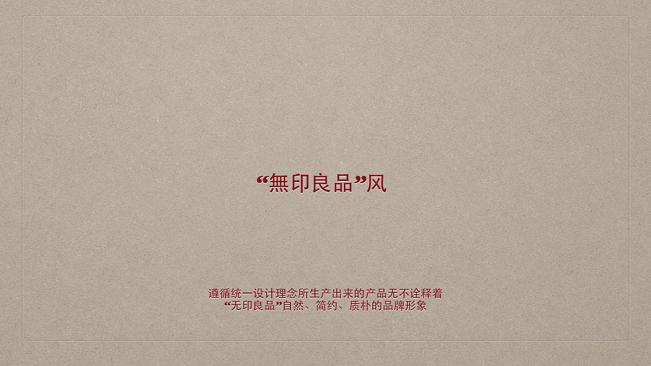
When it comes to MUJI, the keywords that everyone can think of are roughly: no trademark, high quality, natural, people-oriented, freedom, and frigidity. . And so on vocabulary.
So we're talking about symbol design for a brand that doesn't like symbols. Before discussing MUJI's brand symbol design, let's take a look at MUJI's brand design strategy through some advertisements and posters.
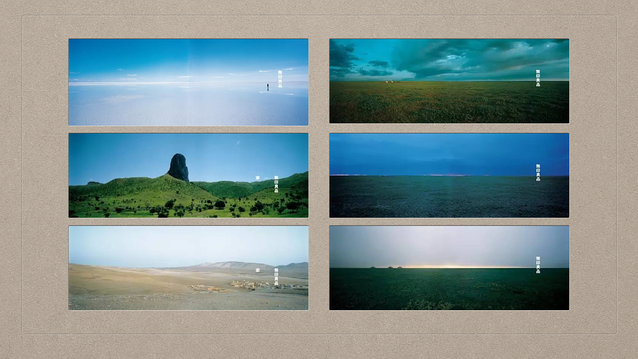
This is a set of promotional posters for MUJI's "Horizon" event in 2003. This set of posters highlights the brand concept of completely abandoning all cumbersomeness and pursuing the ultimate simplicity. This omission is not without design thinking, but in the The brand image of MUJI was conceived by repeatedly polishing the degree of completion in pursuit of an ultimate design. I also hope that it can become a carrier that absorbs the ideas of various people on MUJI.
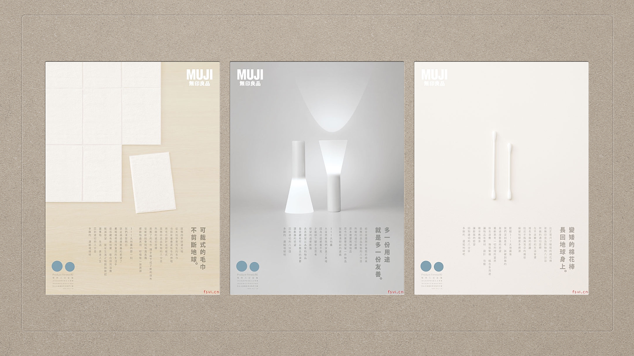
This is a group of advertising posters for products. Its feature is that the layout of the page makes full use of the characteristics of geometric figures and product appearance. The corresponding products of these three posters are: towels, flashlights and cotton swabs. The towel is a portable towel that can be torn off and used; the flashlight is dual-purpose, it can be used as a flashlight in the forward direction, and it can be used as a desk lamp in the reverse direction; the cotton swab is environmentally friendly and shorter than normal cotton swabs.
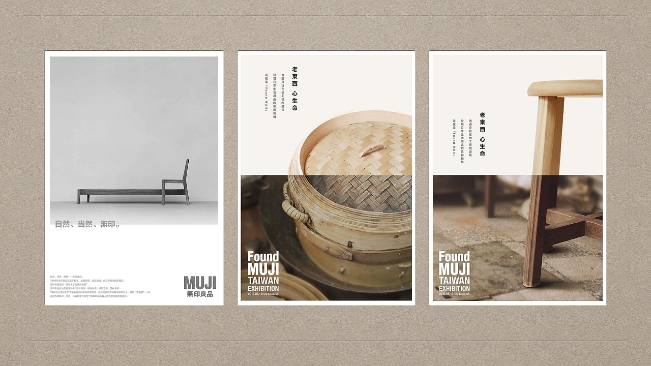
This group of posters are product posters about medium-sized furniture products. The details and quality of the product are shown in a magnified and prominent way. This design method allows users to focus on the product itself and discover the quality characteristics of the product.
This design method is similar to the common means of photography. By describing the subject of the picture in detail and blurring the background, the subject is highlighted, the characteristics of the subject are expressed, and a strong sense of quality is given.
The design method of simplifying everything, highlighting the main body and emphasizing details is the common design method of MUJI. The products produced following such a unified design concept all interpret MUJI's "natural, simple, Simple” brand image.
Through this design method, the item is regarded as a symbol, which is embodied in the symbol of the item itself. When the user wants to see an item, he can completely see enough information about the item he cares about by looking at the symbol.
Articles are uploaded by users and are for non-commercial browsing only. Posted by: Lomu, please indicate the source: https://www.daogebangong.com/en/articles/detail/Talking%20about%20MUJI%20brand%20symbol%20design%20with%20PPT%20attached.html
 支付宝扫一扫
评论列表(196条)
测试