Every movie contains a lot of painstaking efforts of the producers, from screenwriter to director, from props to costumes, and of course posters are no exception. Today, we will explain to you those font-based posters>>>
According to:movie poster in English font style,movie poster in Chinese font style and font style in The order of movie posters will be shared with you one by one. There are 20 movie posters for each type, and the editor’s evaluation, a total of 60. Please read slowly and carefully experience.
English font style
Movie posters with English fonts as the main body have the largest proportion in foreign countries. There are 26 letters plus numbers, but the changes are endless. Some echo the plot, and some are metaphorical themes. The performance is very good, very good.

BigFish2003
Ghost director Tim Burton completed a fantasy film in 2003. The title of the movie "BIGFISH" in the poster occupies the main position, and the tree of fonts growing out of the ground gives rise to strange branches (students who know Tim Burton's puppet series movies must be very familiar with this circle), fantasy and mystery It echoes with the story in the film, and it has a lot of flavor.
The Departed2006
In the American version of Infernal Affairs, regardless of whether the movie itself is good or bad, the poster font and screen use a positive and negative complementary technique, just like an undercover agent, it is difficult to be seen through at a glance.
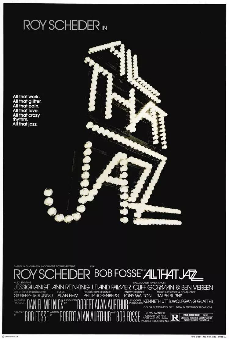
AllThatJazz1979
A song and dance movie "Jazz Spring and Autumn" in 1979. The main body of the screen is the name of the film composed of stage lights. The exaggerated perspective effect creates a strong sense of presence, and on the other hand, it also sets off the stage performance. The loneliness behind it, yes it's all jazz.
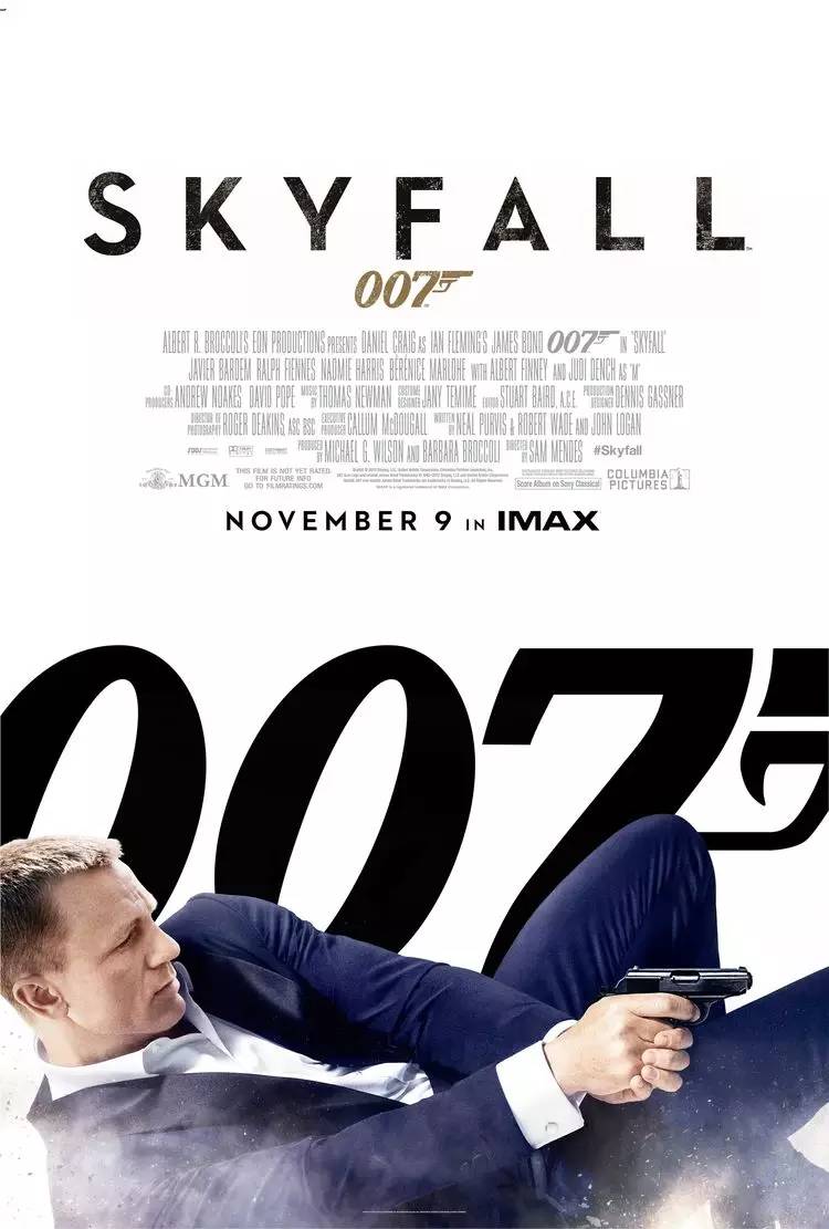
007: Skyfall 2012
It is estimated that crooked nuts are not popular. In the 2012 007 series film "007: Skyfall", the deliberately strengthened "series sense" and weakened title in the poster indicate the attributes of the film, but After watching the movie, students will exclaim "the sky is falling"!
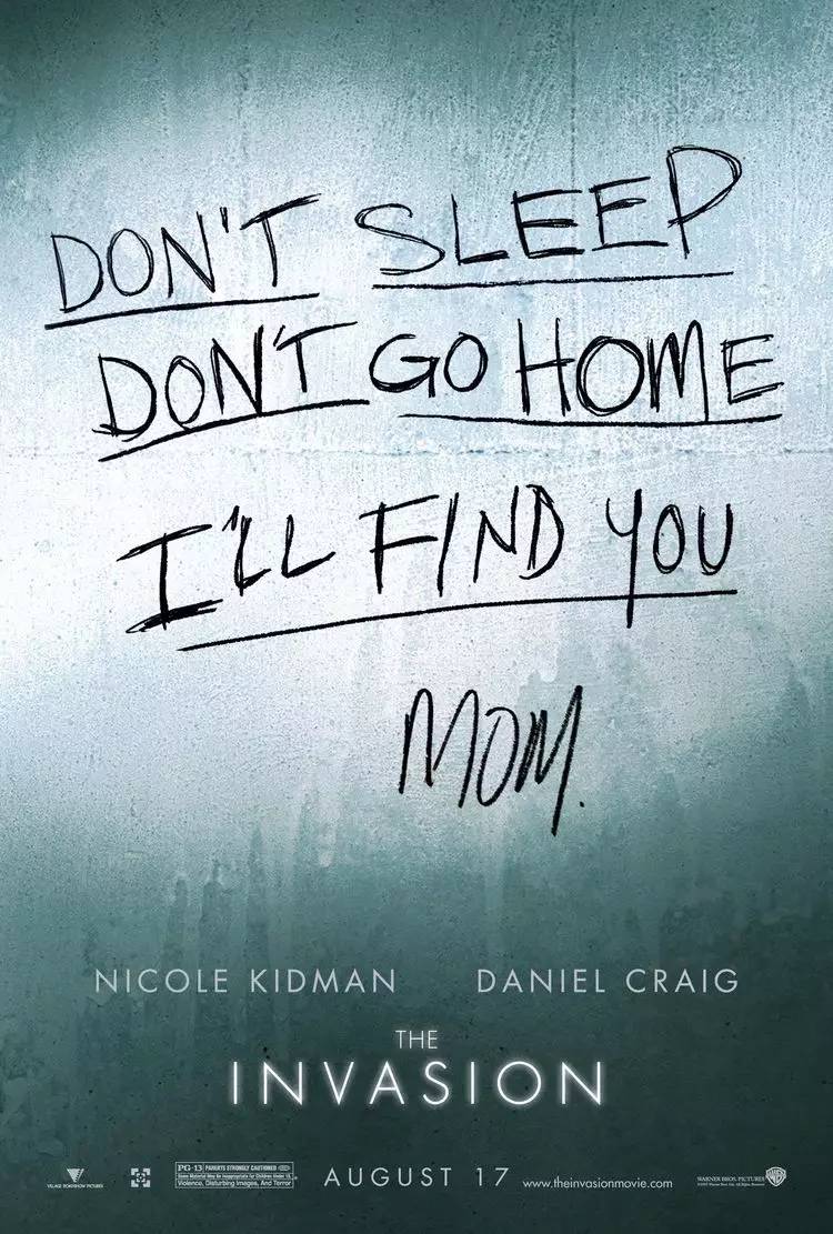
The Invasion2007
Nicole Kidman and Daniel Craig collaborated on a thriller movie in 2007. The handwriting in the middle of the screen directly hits people’s hearts and prints suspense. Such dialogue techniques are more common in horror movies (Blood Book, note, etc.).
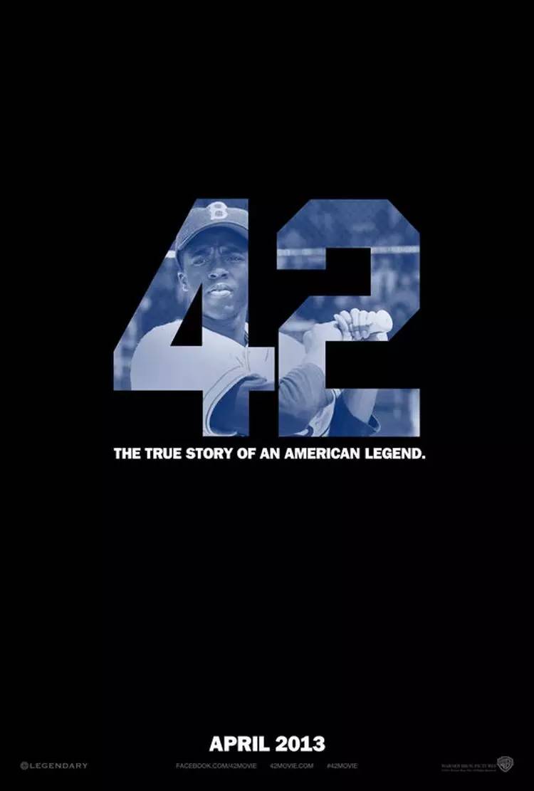
Legend No. 42 (2013)
A biographical movie based on the famous baseball player Jackie Robinson in 2013, 42 can guess what it is with his knees.
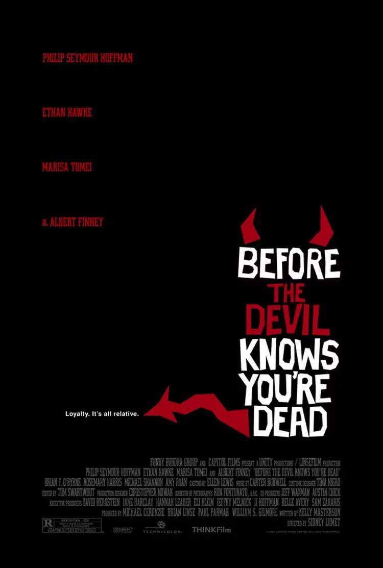
Before the Devil Knows You’re Dead (2007)
Thriller is not necessarily bloody. Westerners generally think of two types of ghosts, one is Ghost (ghost) and the other is Devil (devil). Different from the indeterminate form of Chinese ghosts, Western ghosts are iconic. , such as the horns and tail of the demon in the picture.
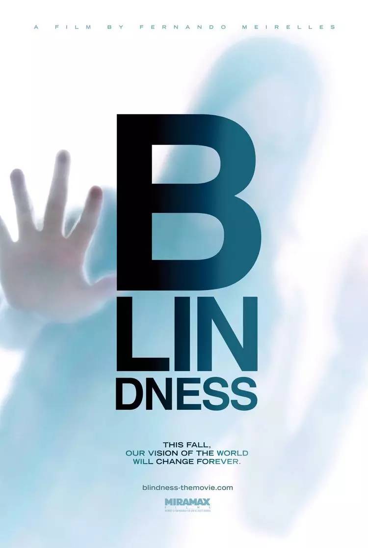
Blindness (2008)
The city fell into panic, and people suddenly couldn't see clearly. The simple fonts in the posters were clearly identifiable, leaving only the helpless people behind.
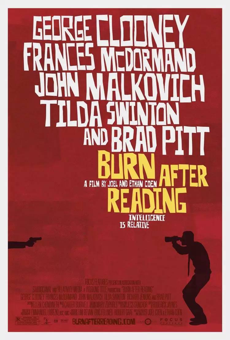
BurnAfterReading (2008)
The hand-made typeface throughout, including other parts of the poster, strongly hints at important plots in the story, and the random combination reflects that the plot of the movie itself is full of coincidences.
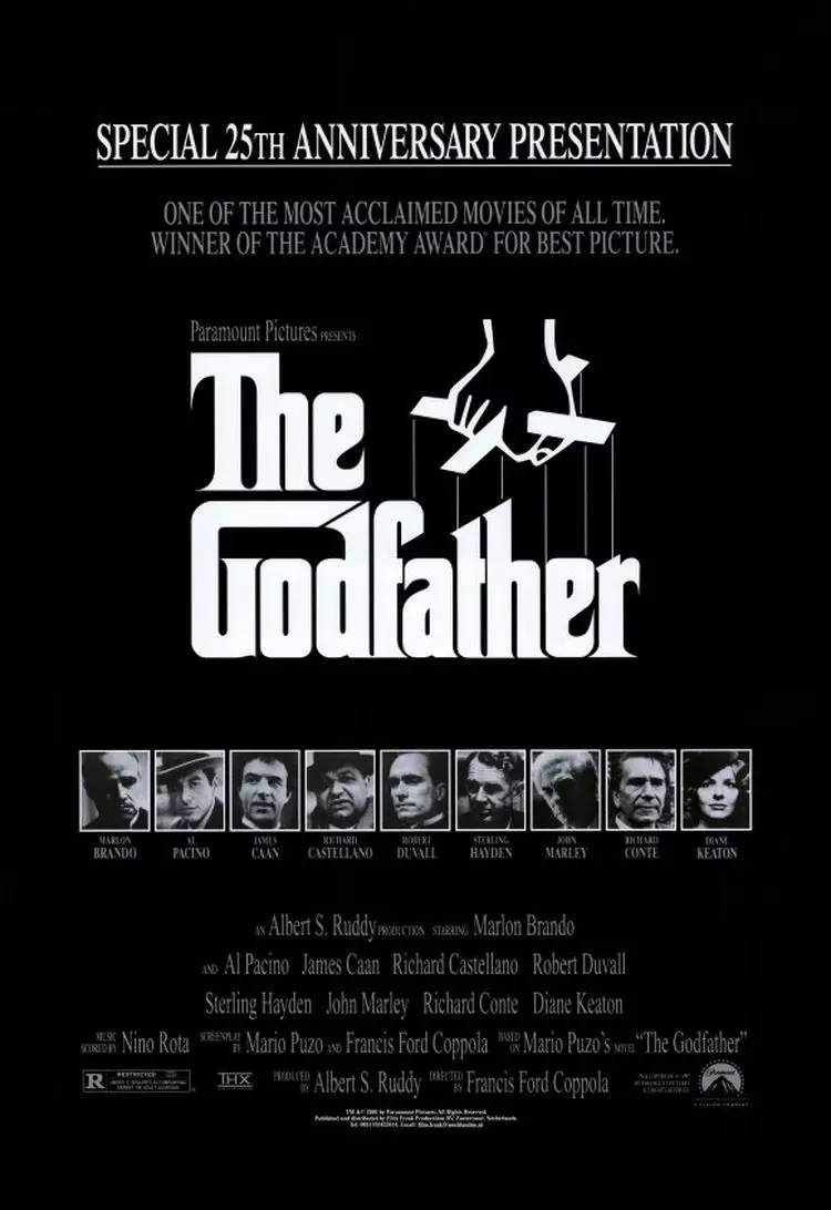
The Godfather (1972)
Classic among the classics, the fonts in the poster are full of strong flavor of the times, and the puppets are manipulated, everything is controlled and controlled.
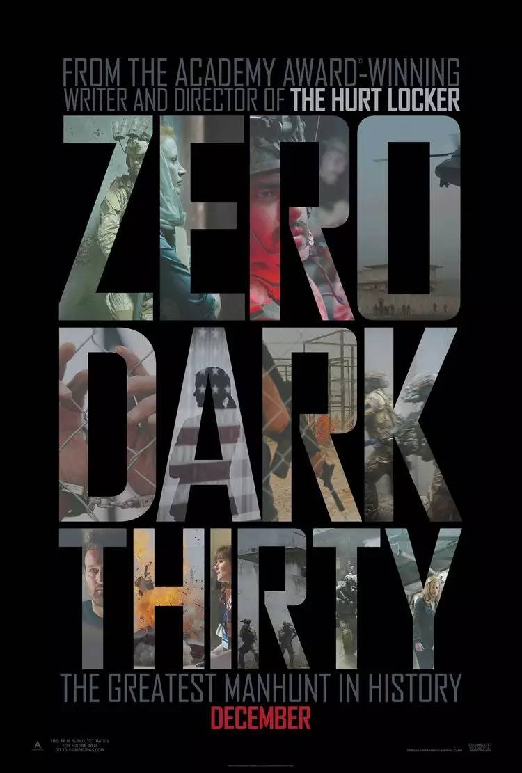
Hunting Bin Laden ZeroDarkThirty (2012)
Oscar-winning film, I have to mention that the poster of this film reveals a lot of plots through the gaps in the fonts. Perhaps war is always some pictures and moments in the eyes of future generations.
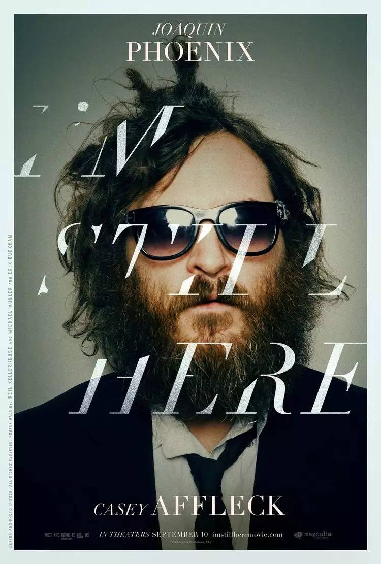
I'm still here I'mStillHere: The Lost Year of JoaquinPhoenix (2010)
Music type comedy, the messy fonts in the screen are cut irregularly, symbolizing the chaotic life of the hero.
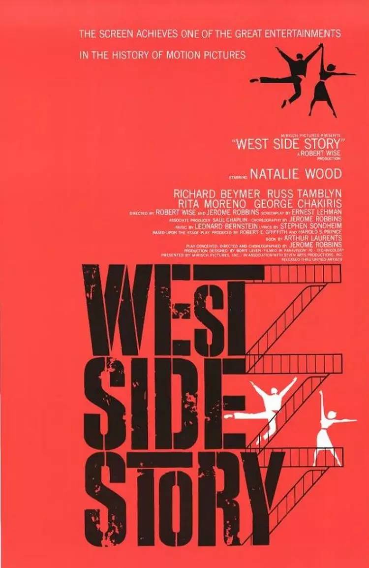
West Side Story (1961)
Because the age is relatively early, the design technique of the poster is also relatively old, and the response to the plot is relatively simple and direct, but this simplicity and directness just reflect the bold and natural love of the hero and heroine in the story.
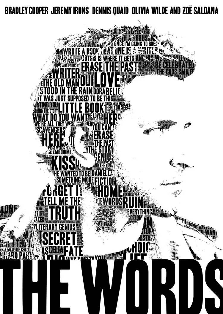
The Words (2012)
Some people and some things are destined to be composed of a series of stories. The head portrait of the protagonist in the picture is composed of countless keywords, which are both clues and plots, and the echoes are just right.
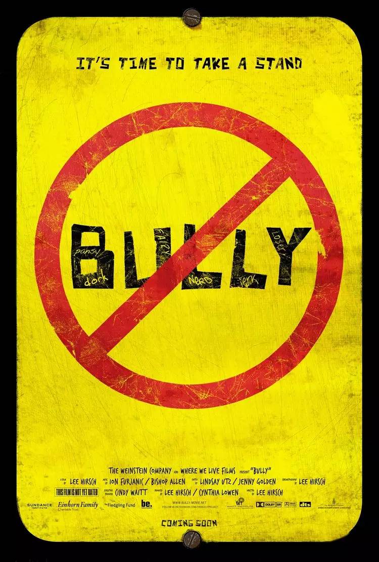
Bullying Bully (2011)
Warning slogans, hand-painted graffiti, and posters undoubtedly imply that this is a film that reflects problems, and the story behind it is even more intriguing.
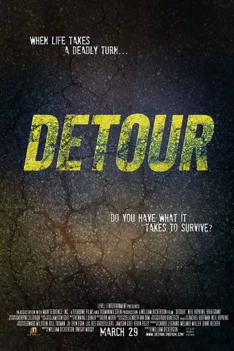
Detour (2013)
Thriller movies usually win with their plots. The road surface in the background of the poster and the traces of repeated grinding on the road surface reveal that this is a road movie, simple and direct.
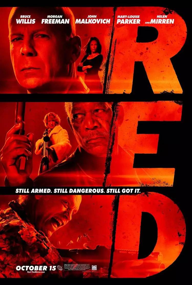
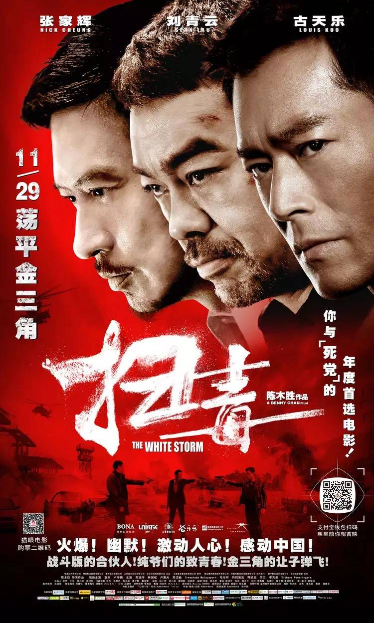
Red (2010)
Several retired old agents, each with their own personalities, the red-toned pictures combined with freehand fonts, rough and natural, with outstanding style.
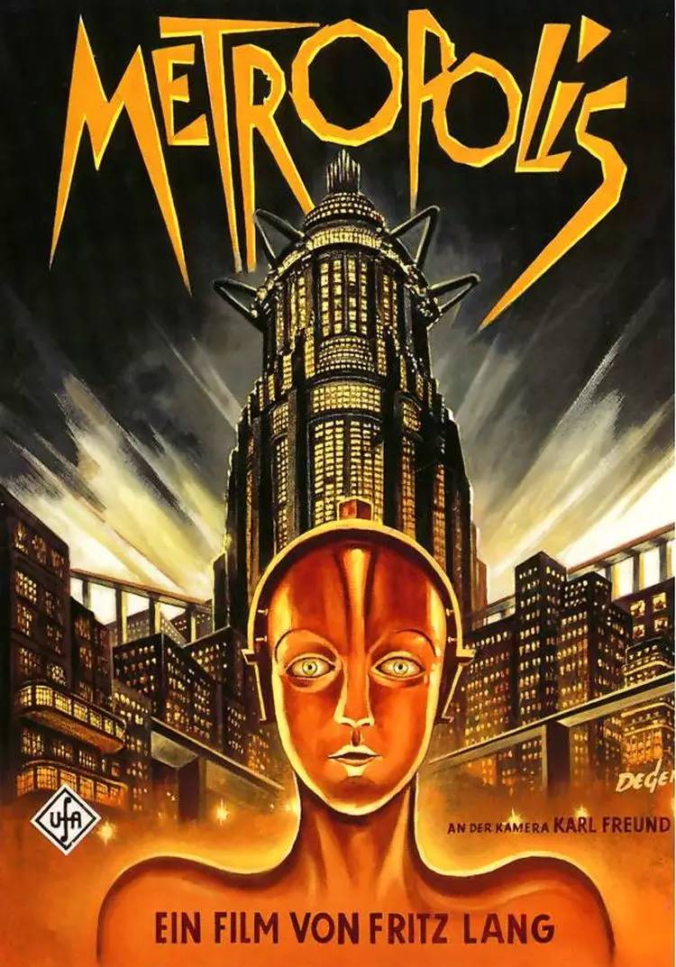
Metropolis (1927)
A very forward-thinking movie, it seems that it does not belong to that era at all, and the poster looks cool even today, and font design is also very eye-catching, just cool To have no friends.
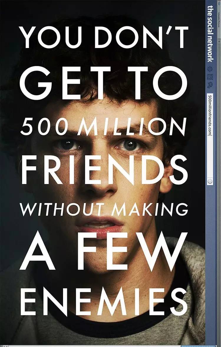
The Social Network (2010)
The posters of biographical movies seem to be unable to escape those "fixed patterns", with big heads, big faces and big fonts, and social networks are no exception. The screen is almost completely covered by inner monologues, and the ambition to conquer the world covers the entire screen .
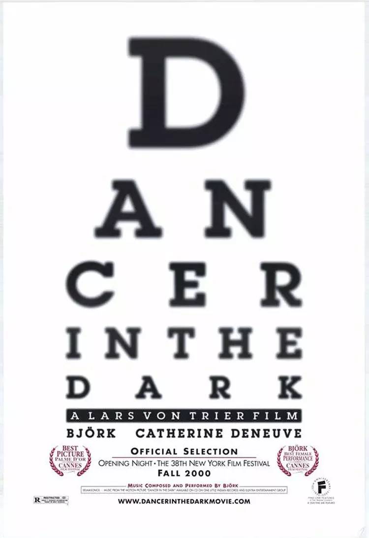
DancerintheDark (2000)
Due to a congenital disease, the heroine's vision is becoming increasingly blurred. The font arrangement of the main body of the screen is like a vision checklist, echoing the important plots in the movie.
Movie posters with Chinese characters
is more common in domestic movies (except for Chinese posters of exterior movies). Changes in Chinese fonts can also echo the overall mood of the movie to a certain extent, exaggerate the atmosphere, and strengthen the theme. Good Chinese movie posters can indeed do it. Point through, its meaning has reached the advanced state.
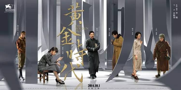
Golden Age (2014)
Wrong choice of actors, procrastinated plot, and departure from the original novel seem to be unable to cover up the light of the poster. The rare poster technique in domestic movies, whether it is a single poster or a multi-person poster, huge Chinese character strokes and space for characters The comparison of the relationship has a strong sense of visual impact. On the other hand, the version of the words "Golden Age" is more attractive than the version of the word making workshop.
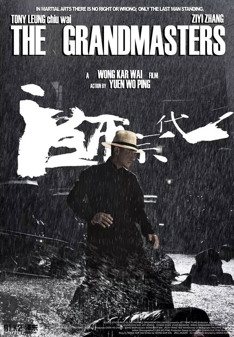
Grandmaster (2013)
Regardless of whether the 3D re-screening is cheating money or not, we can capture the essence of "Kung Fu" from the font design in the poster. There are details in the group, It can be retracted freely, and the slightly perspective font combination looks very dynamic, and the visual effect is very different.
Certificate of Voting (2007)
The designer of the poster carefully extracted these words from the Cuanbaozi stele, which is much better than some of those words.
The Thief of Time (2010)
The movie is worth recommending, and the poster is also very careful. Constructed a picture in a fairy tale, with matts, watercolor pens and unfinished graffiti fonts, perhaps not washed off the lead, but moving with the most natural calmness.
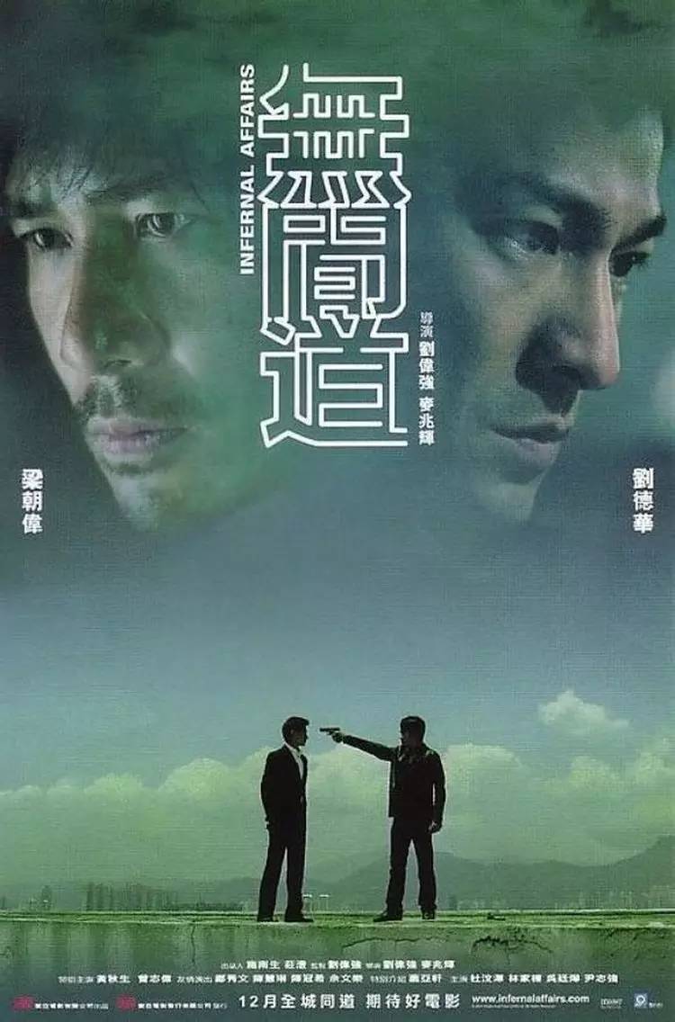
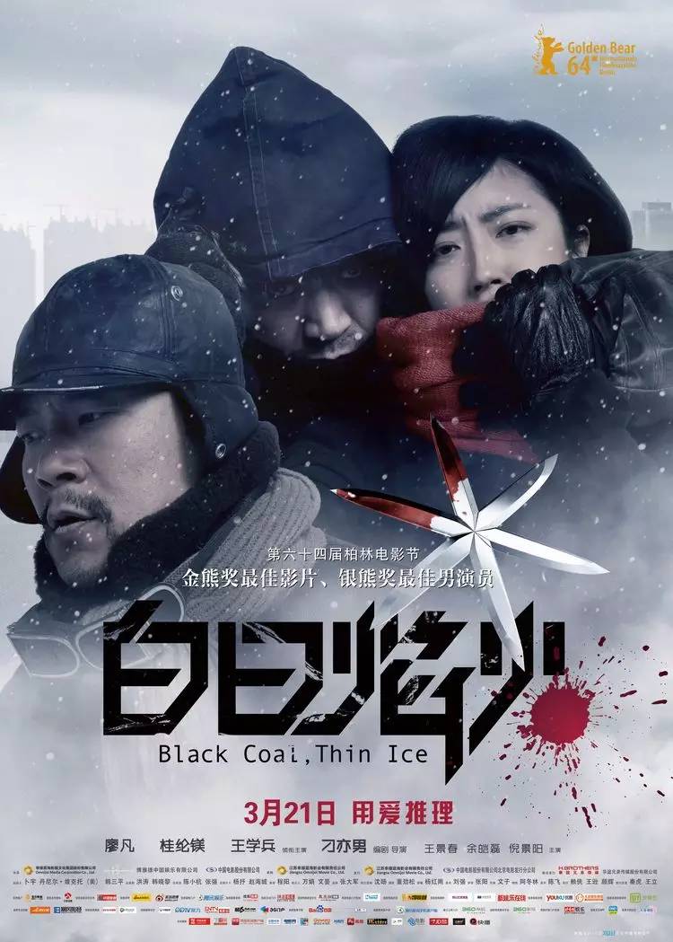
Infernal Affairs (2002)
The turnaround of Hong Kong police and gangster movies is very gorgeous. The design of the typography in the poster is like a maze, but the world is connected, and good and evil have always been incompatible.
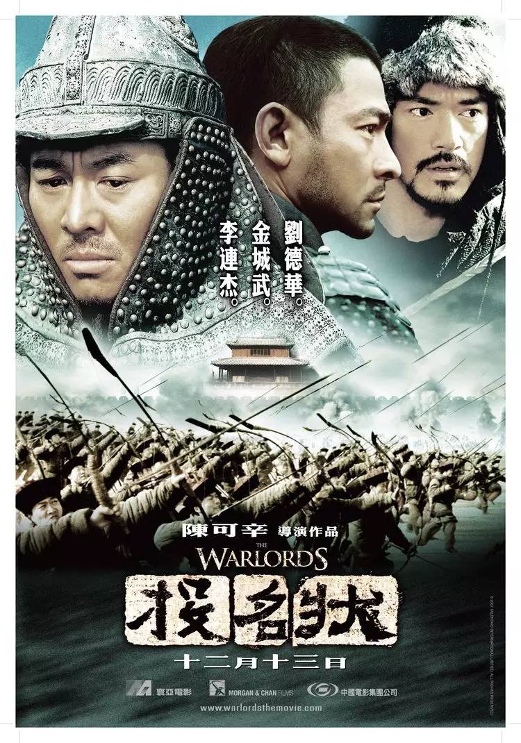
Let the Bullets Fly (2010)
Jiang Wen didn’t have many movies that passed the review, and Let the Bullets Fly is one of them. Although the font of the poster looks so shoddy, but fortunately, the bullet passing through the heart is far-fetched but not too much. Movie.
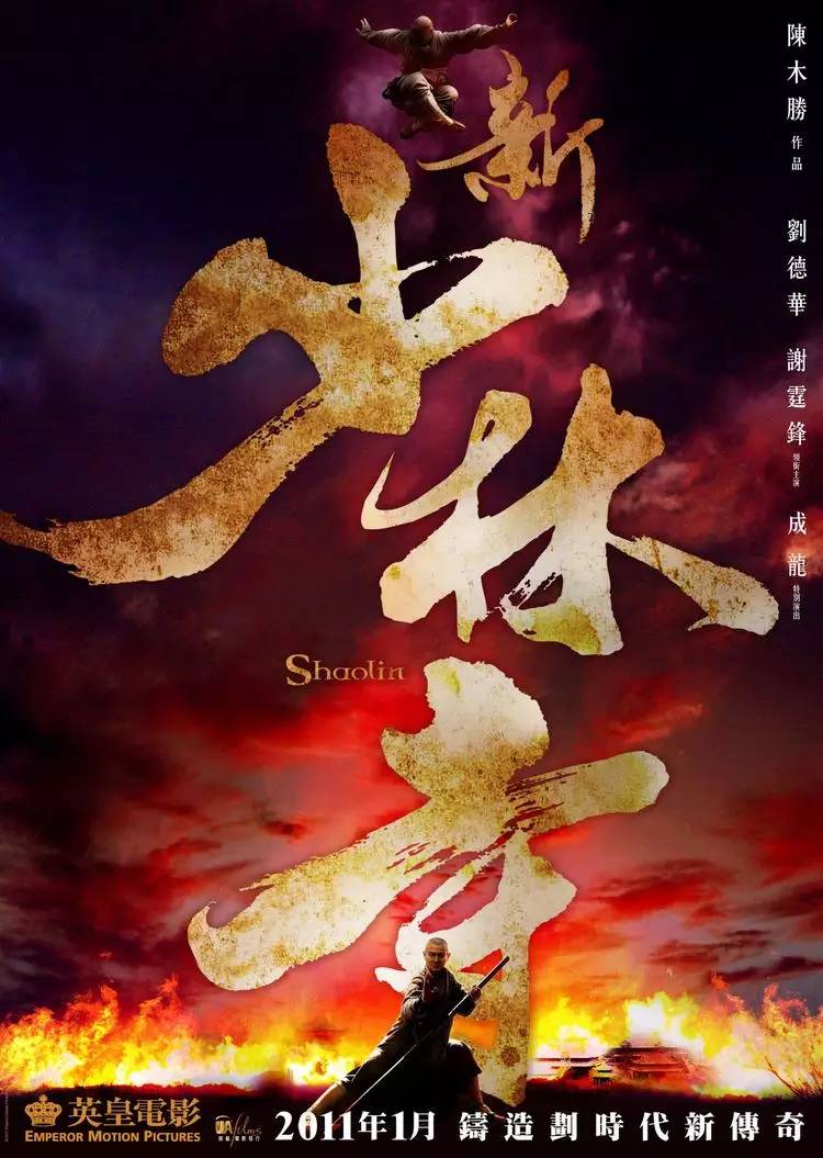
New Shaolin Temple (2011)
The contrast between the huge font and the characters in the screen, the calligraphy font is very suitable, and the stretch is in place, just like Shaolin Kungfu, one piece of one is relaxed, and the big characters are powerful.
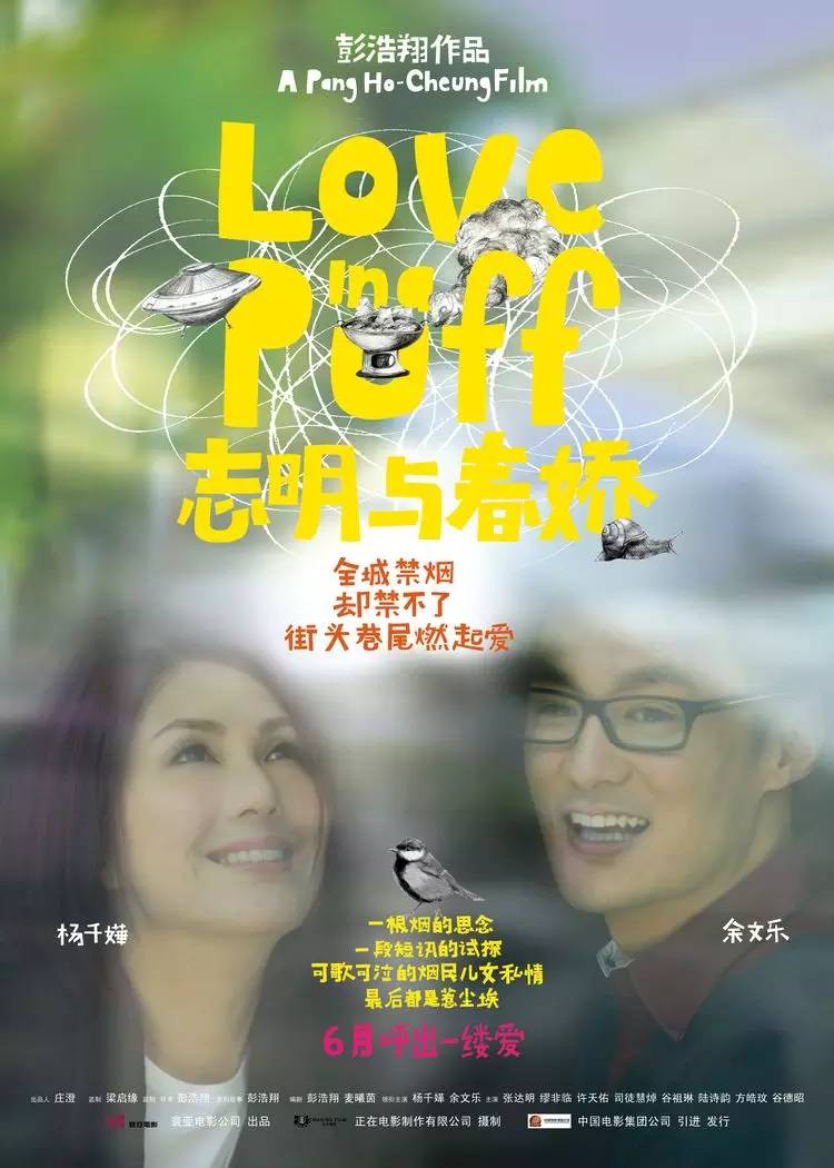
Zhiming and Chunjiao (2010)
The trifles and anxieties in life are always frowning and worrying. Love is actually a complex chemical reaction. The fonts in the screen are handwritten casually, implying the hot pot flying saucer and fonts in the plot to form an urban nonsensical love drama.
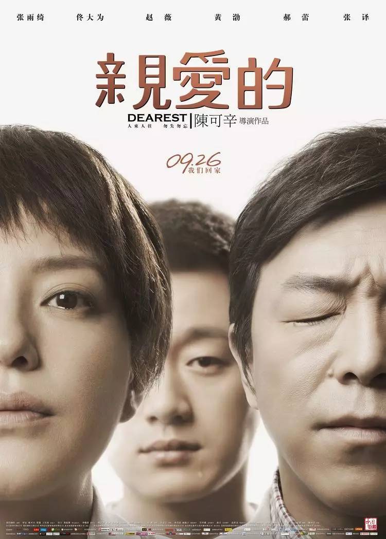
Dear (2014)
I can’t see how to kiss. Faced with the theme of the film, the poster should not be too monotonous. The seemingly simple technique contains the power of Chinese characters.
Heroes of Heaven (2015)
The pianist at sea meets the king of life after the catastrophe, plus the big brother from duang, the movie is the same, the font design in the poster is also the same, there is nothing wrong with it, and it is not a high-end product, It's a type.
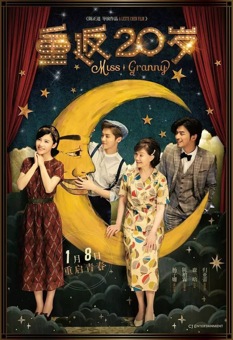
Back to 20 (2015)
A movie that tastes like a fairy tale. The font design is cute and cute, decorated with flashing lights on the stage. Relaxation is the theme of the movie. Leave the reasonable things to others.
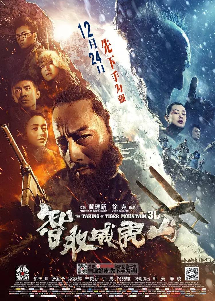
Taking Tiger Mountain by Strategy (2014)
The integrity of the film is very high. In every aspect, including the poster, although it is a calligraphy font, the strokes are handled with each other. It can be described as a Chinese-style spy war.
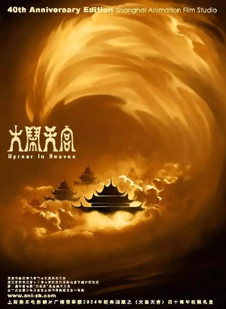
Havoc in Heaven (1961)
The classic among the classics, it can be seen that the artists at that time put a lot of energy into designing the poster. I have to say that people in the past were more focused on things, and did not cut corners or cut corners. There are also "Tian Shu Qi Tan", "Fishing Pot" and so on.
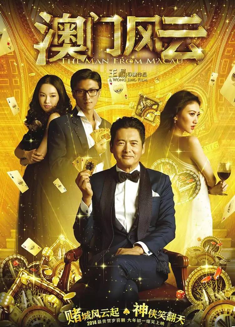
Macao (2014)
Although it is not a classic, the font rendering style really complements the flashyness embodied in the movie. The classic scenes in the movie can be restored through a poster, which is considered to be done.
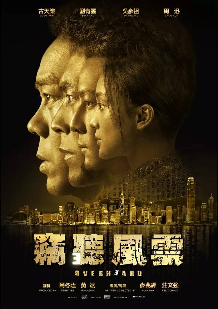
Eavesdropping 3 (2014)
The movies are getting worse and worse, but the posters are getting more and more stylish. The rustling spots between the fonts are like clutter signals in the sound waves. The 3 marked by the sequel is hidden in it, which can be regarded as a bit of thought. up.
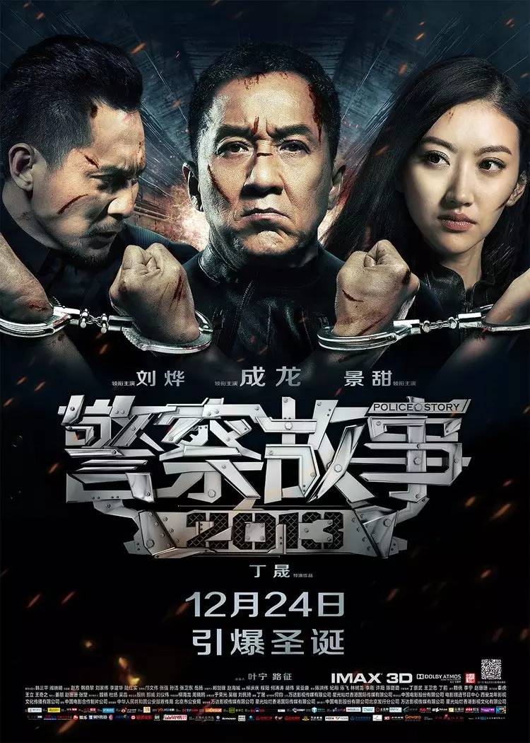
Police Story 2013 (2013)
Leaving aside the movie, the design of the font including the special effects is quite careful. Although the style is still a little bit out of tune, the overall effect is still good.
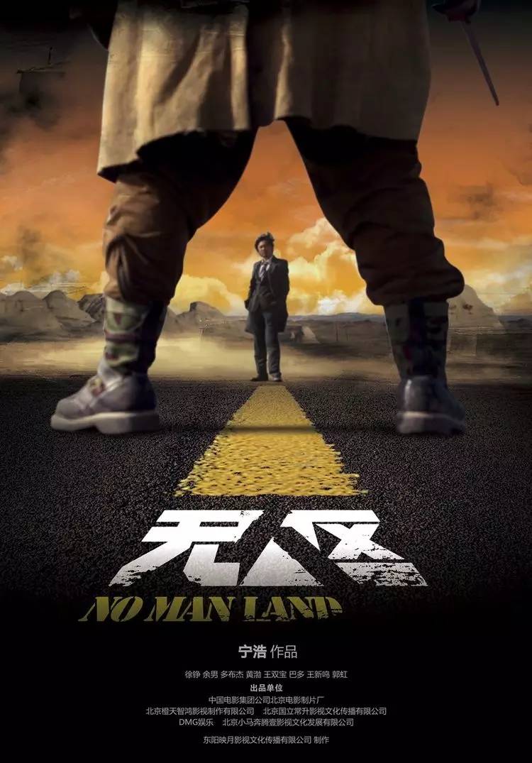
No Man's Land (2013)
The location of the story takes place in the Gobi Desert, that is, no man's land. The font design of the poster is rough, and the people use negative shapes. Human nature is also the most important hidden thread in the whole movie.
Anti-drug (2013)
The font is composed of white powder. It can be seen that it is in a hurry and can be seen as vigorous and vigorous. Although we still have many problems in terms of fonts, sometimes a good idea, if it encounters a general level of execution, it will be another matter. Never mind.
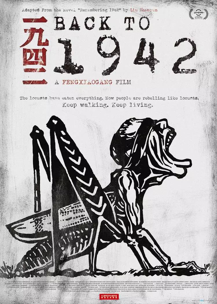
1942 (2012)
We, who are struggling to thrive, seem to have been afraid to face certain historical issues, so movies have become the only choice for our descendants to understand history. The documentary-style fonts in the screen have been reminding that this is true History is history that has happened.
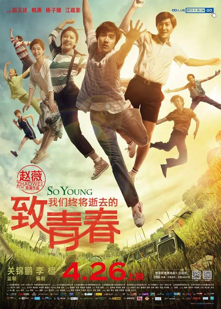
To our dying youth (2013)
Leaving aside the plagiarism of the posters in the early stage of the movie, To Youth has indeed earned a lot of attention. Although the font processing is a bit simple, the visual effect is not bad, not too far-fetched.
I don’t know when the word “taste” became popular in the design circle. It’s not that the font design is not beautiful, but that the word-making technique is too smooth and lacks emotion. Such movie posters are also lackluster, and there are too many For example, we have the right to use this as a negative teaching material, just to remind everyone.
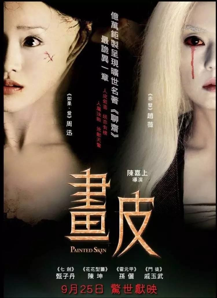
Painted Skin (2008)
The designer of the movie poster is estimated to be from the county seat, and the font processing has no rhythm, which can be said to be too watery.
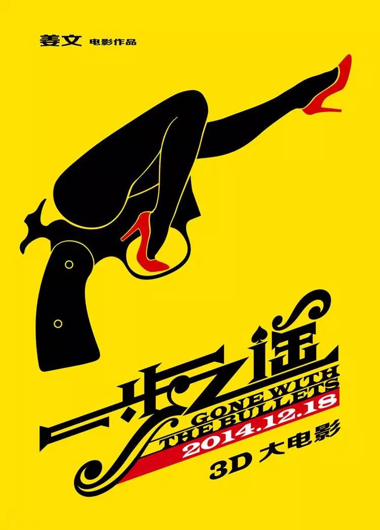
One step away (2014)
It can be seen that the poster was designed with great care, but such care did not achieve the desired effect. With a certain typeface of the bad street, this movie is probably going to be bad.
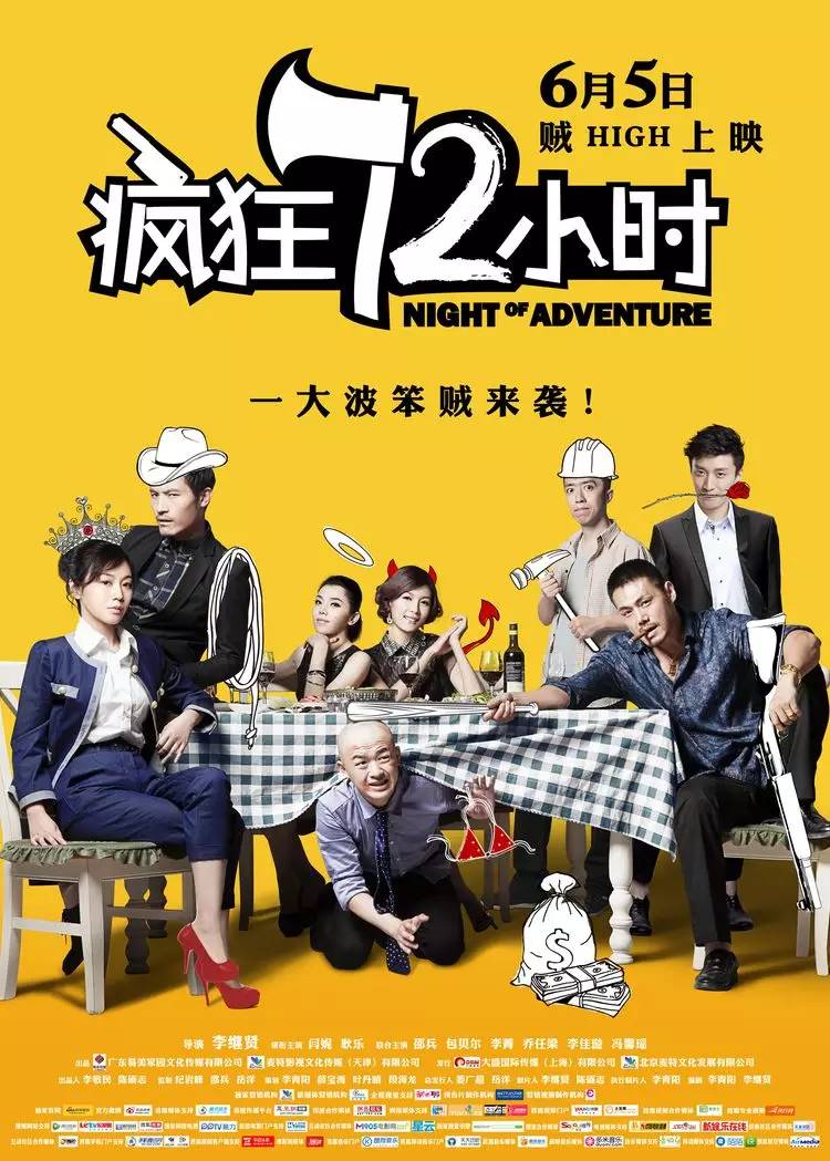
Crazy 72 Hours (2014)
Leaving aside movies, fonts for posters are also very common based on fonts. The question is, does the designer really think this is a children’s film? A large wave of stupid audience is coming.
Fireworks in the Day (2014)
Movies can win awards, but it’s the designer’s fault that the irrelevant fonts are placed there abruptly. If the person who designed the fonts doesn’t even know what the movie is about, isn’t it just playing the piano inappropriately?
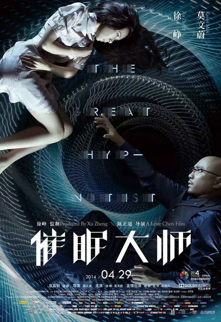
Master of Hypnotism (2014)
The evaluation of the film is very high, and the fonts at the beginning of the period also left a deep impression on the editor, but the flaws in the fonts are enough to show that the degree of care is not enough, the structure is still the structure, if the incomplete style cannot be continued, it is not enough coordinated.
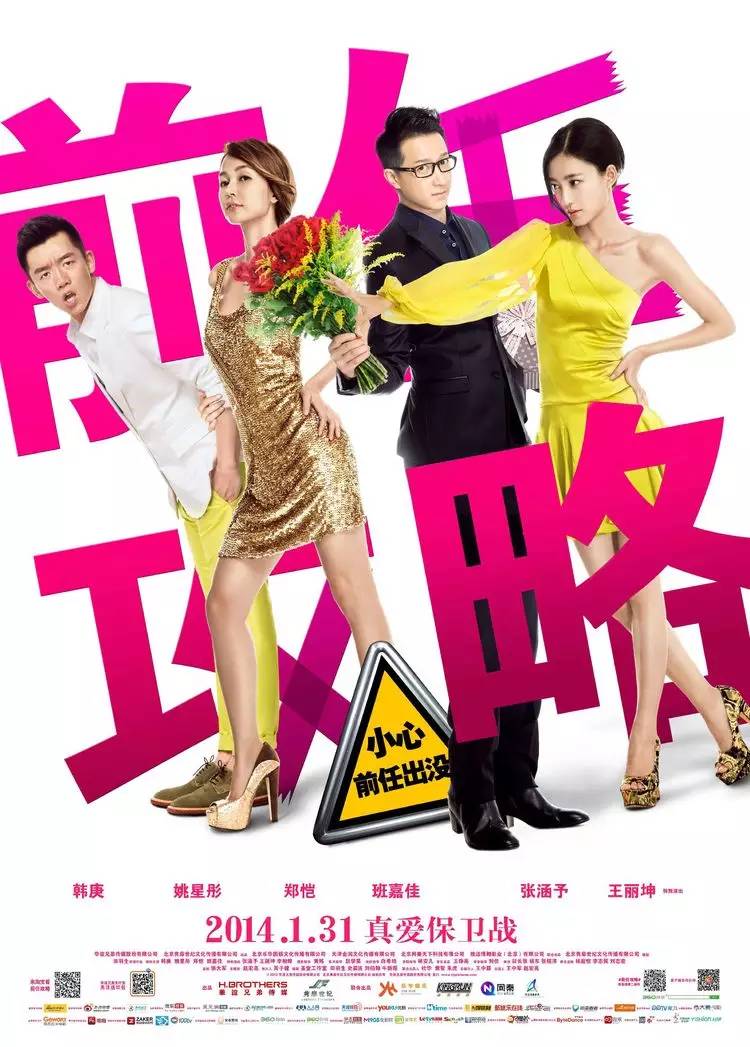
Predecessor Raiders (2014)
The style of Hong Kong films in the 1970s and 1980s, with borderless fonts combined with characters, looks lively, but in fact it is very rustic, killing Matt, and the main style has gone far.

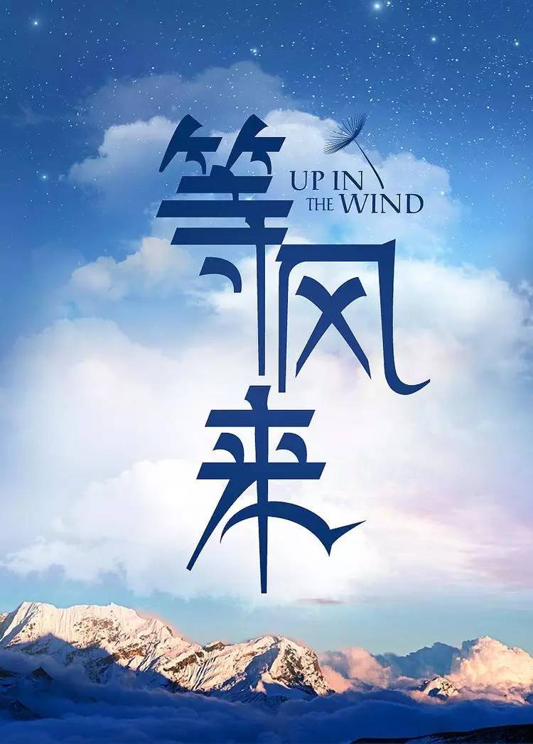
Wait for the Wind (2013)
Laziness is the fault of the designer, just use the font library directly, and the Chinese and English are not modified, not at all.
Personal Customization (2013)
I can’t vomit anymore, maybe my attention is on the movie, the font design is already very casual, but looking back, the important part of understanding a movie before going to the cinema is the trailer + poster, after all Word of mouth is a very subjective thing.
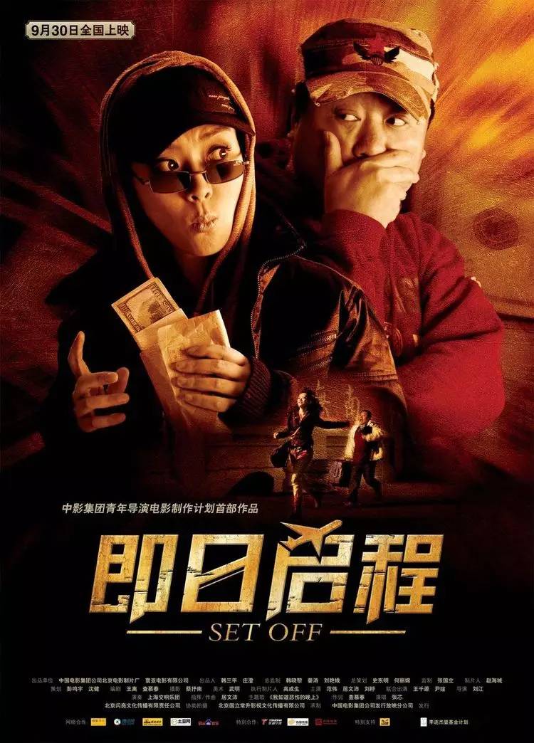
Depart today (2008)
Standard style, nothing more to say.
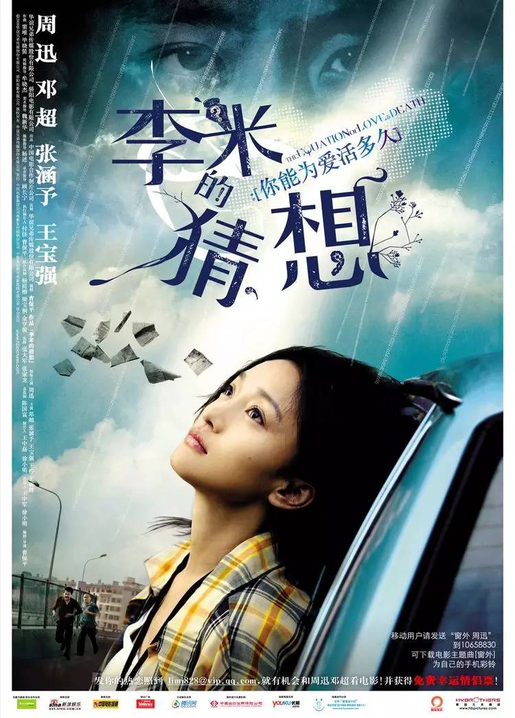
Li Mi's Conjecture (2008)
It's better than the designers who waited for the wind to come, at least they have changed it, but it's only at the level of an intern.
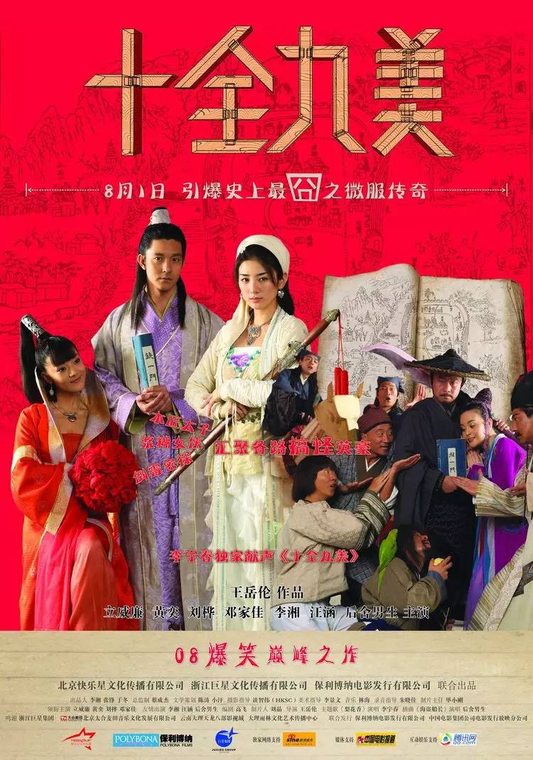
Perfect (2008)
It's irrelevant, it's so ugly, who wants to go to the movies after looking at such a poster?
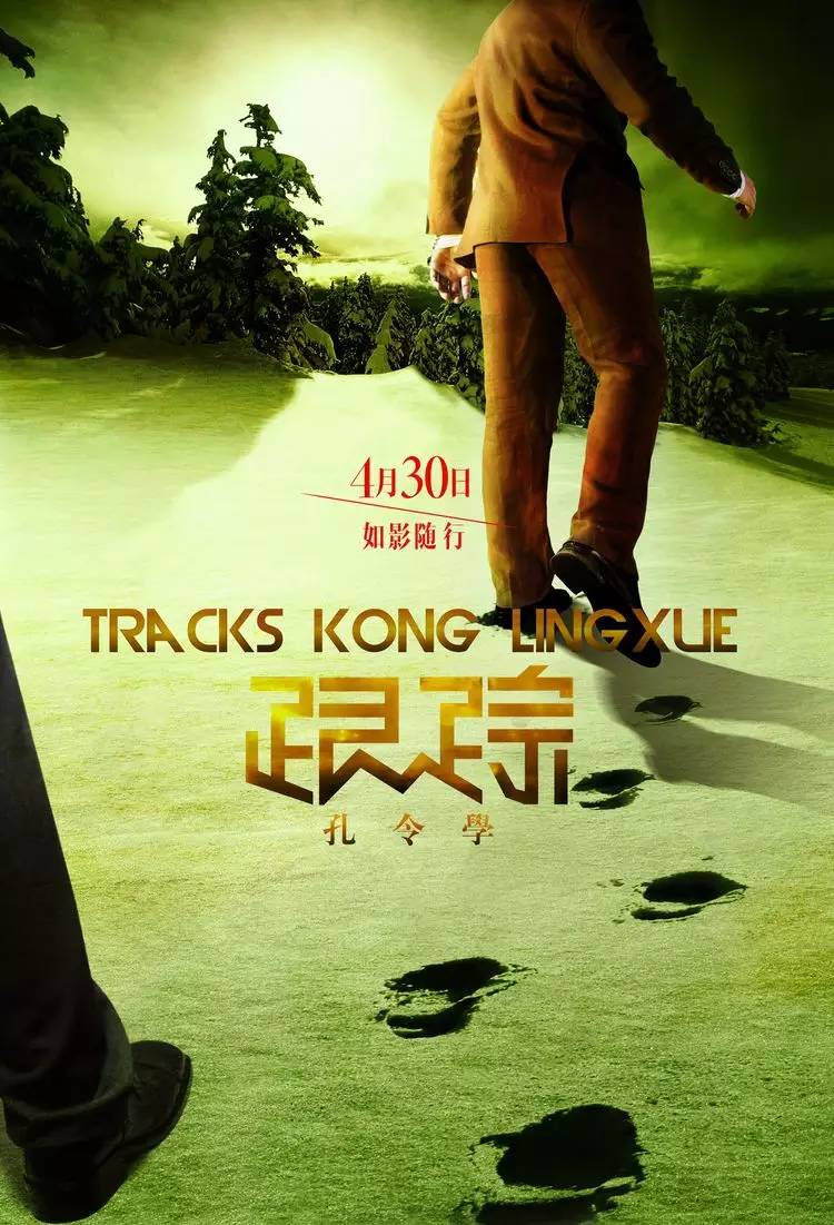
Tracking Kong Lingxue (2011)
Standard style 2, nothing more to say.
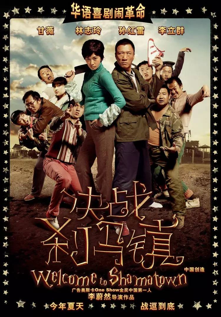
Battle in Shama Town (2010)
It was designed with great care, but it went in the wrong direction. The style of the English font was combined with Chinese. The logic is wrong, and it has almost nothing to do with the movie. It is really designed for design.
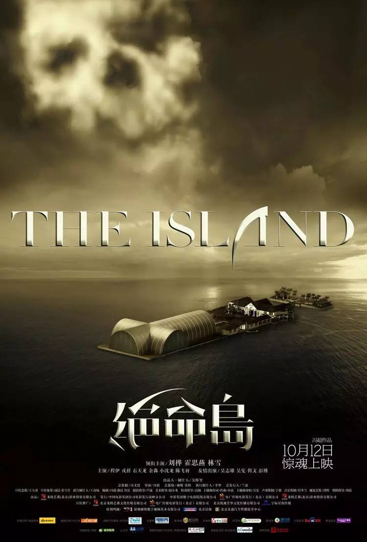
Desperate Island (2010)
Standard style 3, nothing more to say.
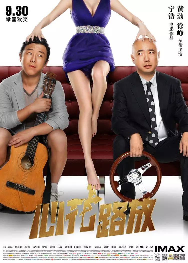
Blossoming Heart (2014)
Standard wind4.
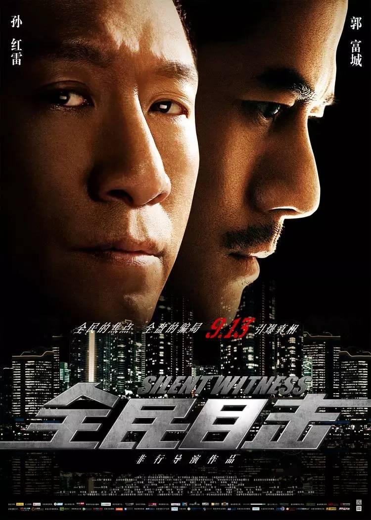
National Witnessing (2013)
Standard Wind5.
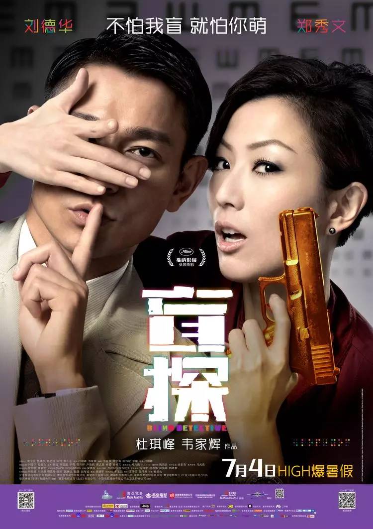
Blind Detective (2013)
Very individual font, but I chose the wrong movie.
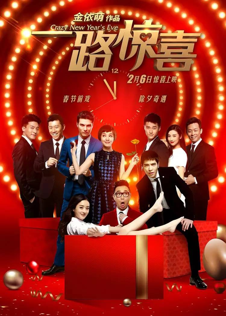
Surprise along the way (2015)
Standard wind6.
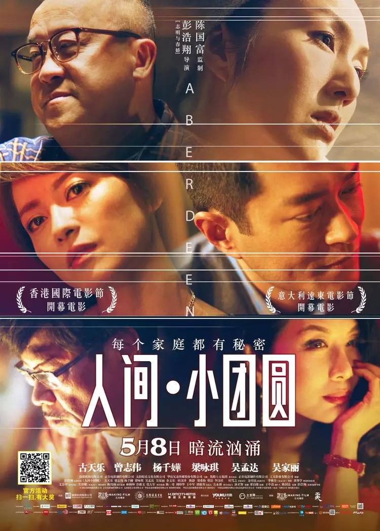
Human World·Little Reunion in Aberdeen (2014)
At first glance, the fonts are still very different, but if there is any connection with the movie, there is no connection at all, and the font style is not uniform, and the structure is problematic. It is obvious that the airplane draft is used as the original draft.

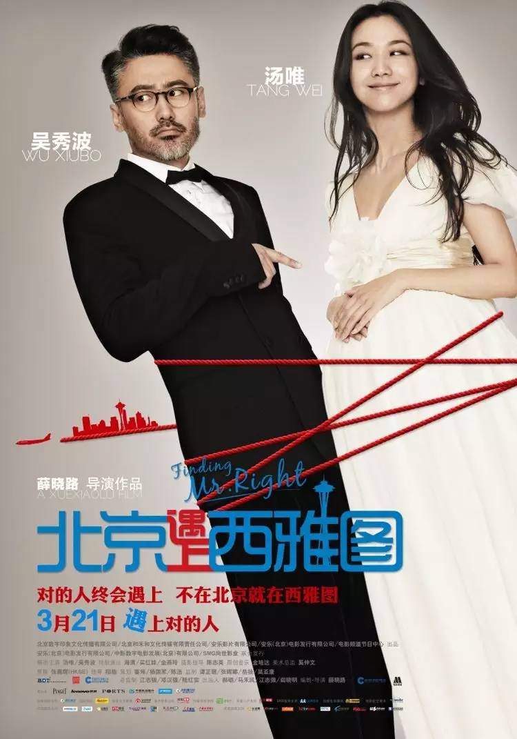
Beijing meets Seattle (2013)
Designers are really trainees.
uisdc original text: iyeslogo
LOGO keyword reply
[coffee, catering, popular, fish, Japanese style, cat, plant, color, pepper, travel, hand, art gallery, similar, orangutan, Wukong, flat, compass, golden ratio, tea, experience, sister Paper, lion, chain, VI, business card, fake big name, TV station, blue feather, menu board, signboard, calendar, fashion, animal, Taiwan, aviation, barber shop, mobile phone logo, baby, Lu Zhisheng, Chinese style, Lenovo, door head, tea vi, monthly salary, clothing, food, restaurant, rooster, club]
Director WeChat:logodashiWeibo:@logomaster
LOGO and Brand Creation Lab|www.logodashi.com
Articles are uploaded by users and are for non-commercial browsing only. Posted by: Lomu, please indicate the source: https://www.daogebangong.com/en/articles/detail/Talk%20about%20the%20font%20design%20in%20those%20movie%20posters.html
 支付宝扫一扫
评论列表(196条)
测试