Author: Liu Baikun
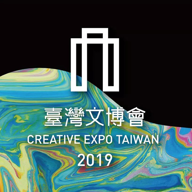
Not long ago, the 2019 Taiwan Cultural Expo ended, and a series of activities under the theme "Cultural Dynamics" set off a movement to find Taiwan's "contemporary cultural landscape" and rekindled many people's enthusiasm for culture.
At the end of the exhibition, we revisited the main visual group of this ICIF, invited designers to personally analyze how to convey the curatorial concept, and relive the unforgettable touches of this year.
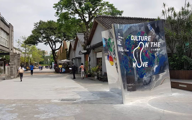
The main vision of the 2019 Taiwan International Cultural Expo - Cultural Dynamics
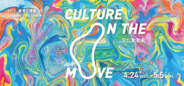
The theme of the 2019 Taiwan Cultural and Cultural Expo is "Culture On the Move". It is an open and dynamic experiment, emphasizing cultural changes and diversity, hoping to lead everyone to see the connection between the new and the old in culture and cross-field cooperation .
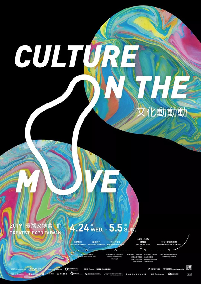
Sequential planning and design invites Maria Lezhnina, an artist who is good at interpreting natural landforms and environments, to use the floating water painting method to drop colors one by one on the water surface, flowing and mixing freely; every time a new color is added, the power of disturbance increases. It can make the whole painting change into a new look, just like the 10,000 possibilities created by the collision of people, things and thinking in culture.
Then, according to the colors extended from this flowing spectrum, blue, green, orange, pink, yellow and other representative colors of the major exhibition areas were established, and a series of visual applications were developed by using the liquid shapes and textures naturally presented by the colors.
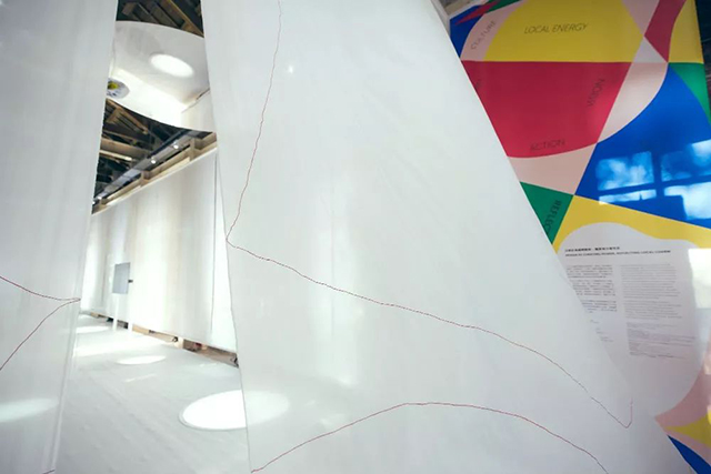
Main vision of Taoyuan Pavilion—Taohuayuan Design Office
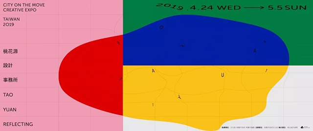
The exhibition planning of the Taoyuan Pavilion, through the creation of a virtual unit "Taohuayuan Design Office", brings fresh views and creates a more contemporary outline for Taoyuan. The overall picture of the main visual design is based on "Taoyuan" and "Taohuayuan "Two key points cut in.

Taoyuan is the "Hometown of Thousands of Pis", and the pond ecology formed by early agricultural irrigation is a major feature. The imagery of the picture is based on the landscape from a bird's-eye view, using organic shapes—water ripples, plus block cuts , so that the key words are scattered in various places, as if overlooking what is happening in various parts of the city.
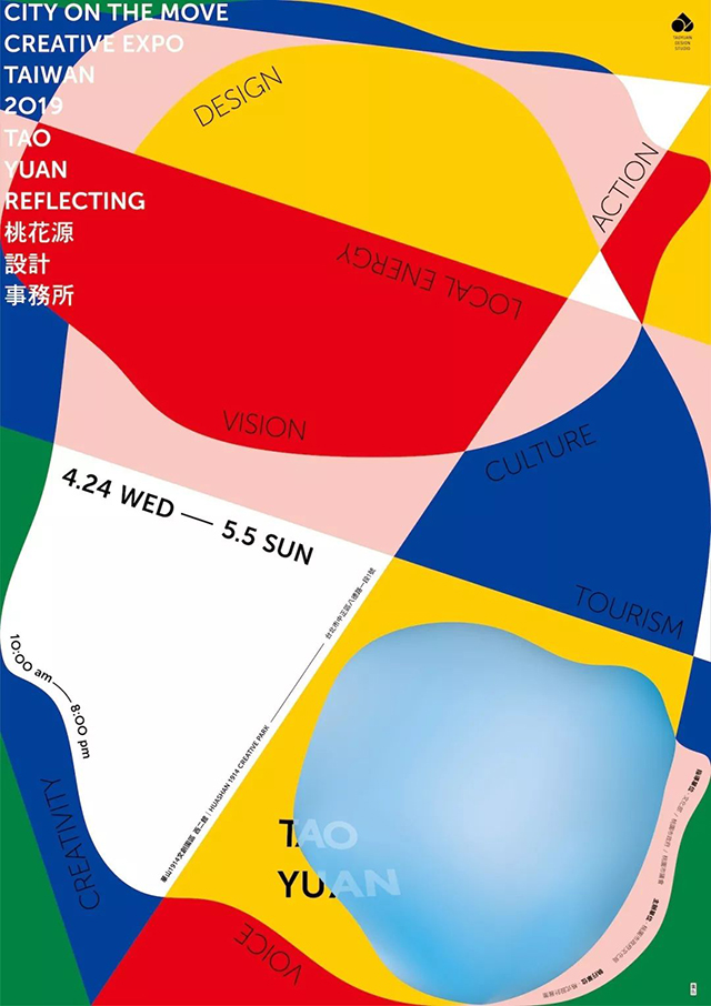
The interpretation of "Peach Blossom Spring" is fantasy and beautiful imagination. The strong and pure original four colors create a colorful tone. These colors can be combined into a variety of colors, just like the different fields implanted in the exhibition: music, sports , cities, industries... seem to be unique, but after blending with each other, they can produce infinite possibilities. In the design, more time was spent on screen cutting and color configuration, hoping to make people feel full of power and energy.
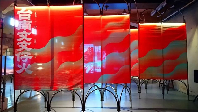
The main visual of the Tainan Pavilion—Wen Wenzi Fire
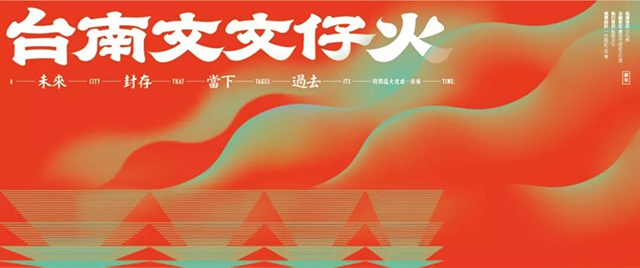
Tainan Fucheng, which has been built for more than 400 years, can be said to be the starting point of the prosperity of the island of Taiwan. Fire is the origin of civilization. Traveling through the long river of time, let us explore together what kind of fire gave birth to the city's current appearance.
Divide the abstract time into four pieces "past, present, storage, and future". The form and connotation of the four fires.
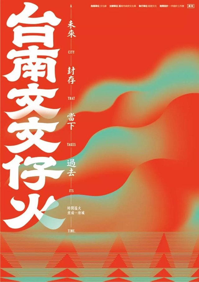
In terms of standard character design, if you carefully observe the signboards on the streets of Tainan, it is not difficult to find that many shops still retain the traditional handwriting, especially the brush strokes. The thick and round strokes bring out the temperament and rhyme of Fucheng, and add upward strokes at the end of the strokes. The deformation echoes the theme and triggers the viewer's imagination of the burning rhythm of the warm fire.
The large and small food utensils and the curling smoke that appear in the vision stimulate the taste buds of the old gourmets, and let people extract the food spectrum of Tainan from their memory. The color uses a large area of red to reflect the image of a warm fire, and the contrasting blue-green color increases the visual intensity and conveys the level changes of the temperature during the combustion process.
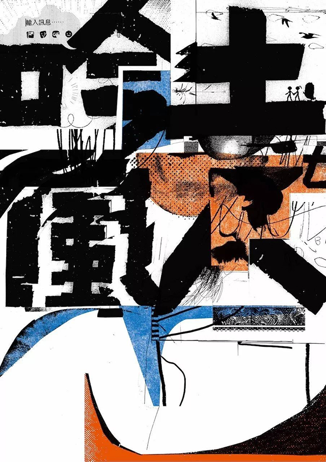
The main visual of Pingtung Pavilion - Yin Tufengren
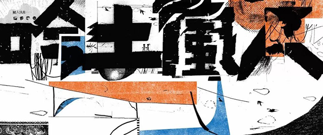
Fang Xuzhong: The theme of the Pingtung Pavilion is "Song. Soil. Wind. People". When developing the main visual together with designer Yang Shiqing, they started from these four characters and used some images and symbols to express the unique characteristics of Pingtung. characteristic. For example, in the presentation of text, the traces of time are shown through black and white or texture changes; you can also see some new and old fusion and impact parts, like computer dialogue-like symbols, mixed with Pingtung's local landscape images At the same time, if you look carefully, you can find some small ideas that belong to Pingtung, such as the "Little Green Man" traffic signal in Pingtung.
After visualizing the four characters "Yin. Earth. Wind. People", the full page shows enthusiasm. When combining text and patterns, we added orange and blue to convey the blending personality of Pingtung. Orange represents the enthusiasm of people and the tolerance of the land, and blue represents the openness and nature of Pingtung. In addition, we chose a main color close to the earth color, which together form the main color of the Pingtung Pavilion.
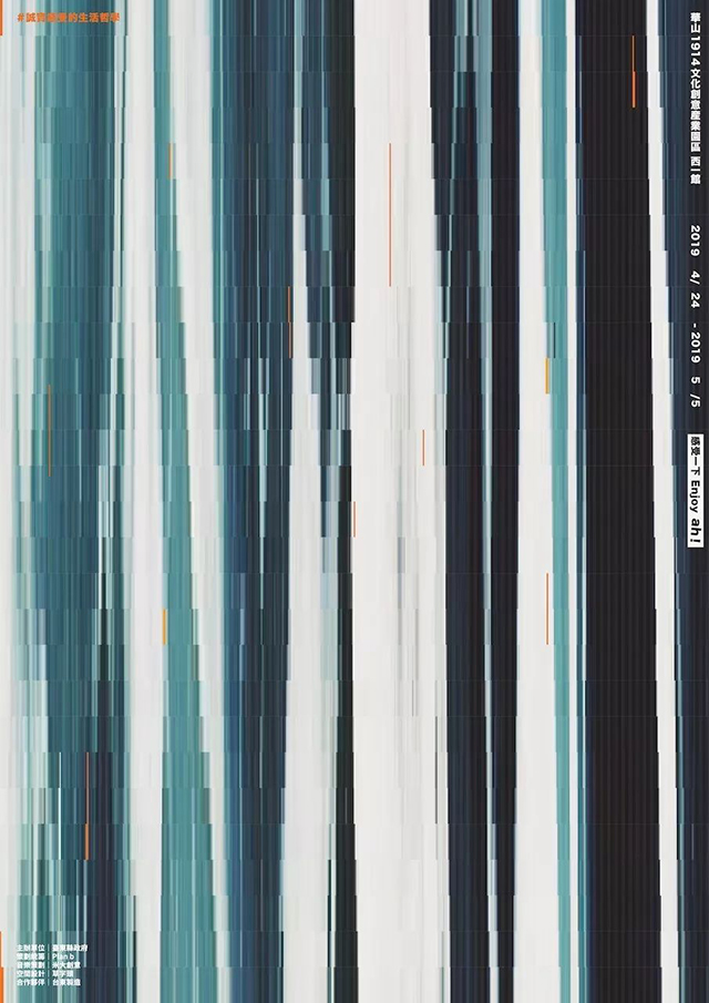
The main visual of the Taito Pavilion—Feel the Enjoy ah!
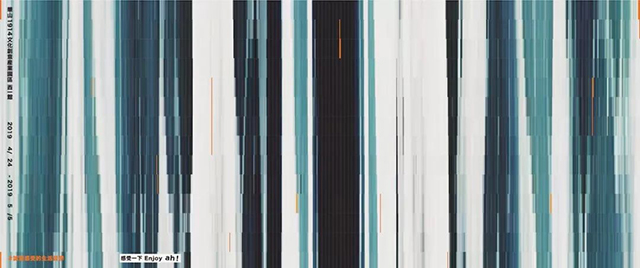
Spread out the mountains, seas and sky in Taitung, and disassemble the rhythm of each moment into the feeling.
This time, the theme of the Taitung Pavilion is "Feel Enjoy ah!", and at the same time use "the life philosophy of honest feeling" as the main axis of planning. In addition to collecting all kinds of utensils representing Taitung culture, it tries to interpret Taitung in a new way by combining and arranging objects. Moreover, the rhythm of "music" runs through the entire planning experience, showing that the real Taitung must be experienced in order to understand.
Therefore, this time the main vision will be like extending a whole natural image fragment of mountains, seas and sky, turning the bands and colors that seem to be waves, tree waves, and cloud waves into a vibrating melody. In the wave band, each faint orange line represents the temperature of a person, and at the same time, it is constructed into a beating image of the screen, symbolizing the rhythm that runs through the Taitung Pavilion. The rhythm of the anticipation waves is woven together, and a huge shock can be felt through the vision.
Editing place: "Local" publication
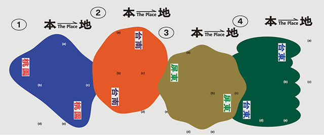
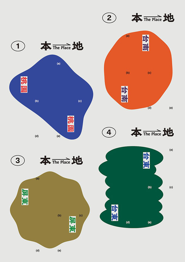
Ye Zhongyi: The publications that explore local collections often use regional outlines, product characteristics, and local colors as an extension of inspiration materials. Although such a visual concept is an established routine, it is easy for readers to integrate and participate deeply. So I thought, under this kind of long-established visual interaction with readers, what other ways can I further extend my thoughts and make people novel in a non-subversive way.
In the color blocks on the themed publications of the 4 counties and cities, in addition to using colors with local impression connections, in terms of shape, I want to use the "perception" of life to present geographical outlines, rather than concrete geographical boundaries. I reinterpret the shape and outline of the place from four directions: the organic shape of the pond in Taoyuan, the roundness of time in Tainan, the vastness of the living area in Pingtung, and the richness of the landform in Taitung.
From the color configuration and images, it can also be directly triggered: Taoyuan’s pond and aviation impression, Tainan’s ancient wall and Wanggui impression, Pingtung’s sand blowing and grassland impression, Taitung’s green and ocean impression. As the most important and continuous title logo, in terms of shape, it means getting on the train of in-depth local collection. In addition, I invited font designer Zhang Xuanhao to help me create an organic black body that can better convey the strong sense of the local culture in the past to echo the concept I want to convey.
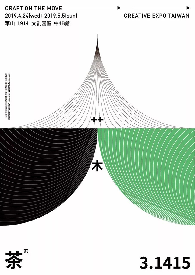
Craft Museum—Tea 3.1415
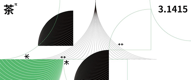
Pili: Before curating the exhibition, the Arts and Crafts Institute has set a direction, hoping to discuss the relationship between tea culture and craftsmanship. According to this direction, Gina curated and I developed the theme. We thought about finding the existence of "tea" between crafts and crafts. Tea is a very important part of Chinese culture, and crafts are like an extended radius. Tea Taking the craft as the center and the craft as the radius, draw a circle of life, and you can see the appearance of the culture, thus setting the theme of the craft museum - "tea 3.1415".
Based on the development of the main visual, the word "tea" is disassembled, and the three characters "艸, person, and wood" are used to explain how tea and crafts draw the appearance of life and culture. Using dark green as the representative color, many circles and semicircles are used to present the two characters "艸、木". "艸" represents leaves and tea leaves; "wood" is the material, representing craftsmanship, and the "person" in the middle finds a relationship between the two. The tea art and flower arrangement related to tea culture... are all through The aesthetics represented by "human" is what makes culture and art come into being between the Cottage and the Wood.
Therefore, in terms of the geometric relationship of the main vision, it is found between the two semicircles that "cottage and wood" show "people", like a roof and a mountain top, gathering two elements. There are people who have ideas, so that there is value between the two.
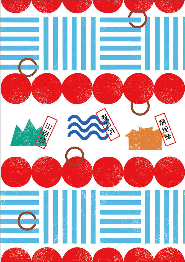
Shanhai Temple Collection
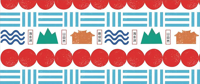
Mi Li: "Night Market and Temple Town" has left the common ideas of Taiwanese people. It is a folk cultural connotation formed by a consensus, and it has been rooted and grown in everyone's heart. The design concept this time makes extensive use of the principles of semiotics, trying to create, deconstruct, and condense the emotional abundance and consciousness transmission of this ordinary culture. Through simple symbols, marks, and colors, we convey our common understanding. The red lanterns hanging high at the entrance of the temple, the blue and white canvas, the surging delicacies of mountains and seas on the desk seats, and the brick walls of the palace all show the atmosphere of the entrance of the temple in detail.
The night market is not only hot fried snacks, it is one of the favorite childhood memories of everyone in the night market. In the design, through the circles of the circles, the presentation of the behavior pattern is formed, and a lively temple is connected in series. landscape.
Mi Li also mentioned that he is good at intuitive design, and he wants to convey the feeling of "Ah! It's very Taiwanese", which can be best expressed with geometric elements. In addition, she lives in the area of Taipei Bridge and Daqiaotou. The most down-to-earth place in the area is not high-end dining, but to go to the temple to have a snack, because the main visual design also wants to convey the idea of "turning the square in front of Huashan into a temple" Sense of Flavor".
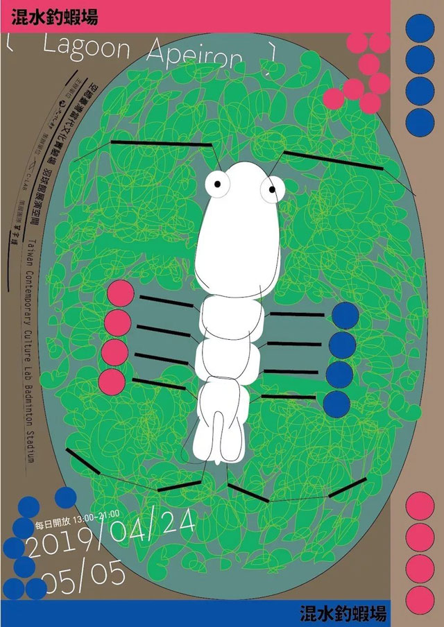
Cultural University Hall: Shrimp fishing in muddy water
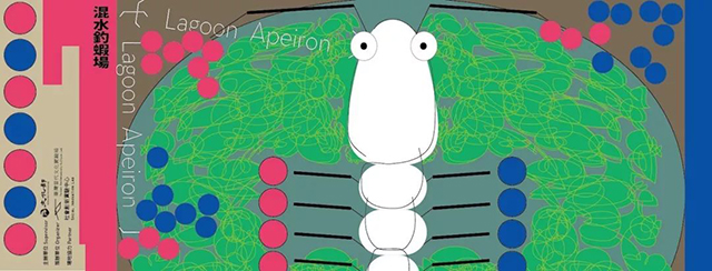
Li Junci: When I knew that I wanted to use the shrimp fishing field as the theme, I was thinking of other possibilities besides a very cool and cool way of presentation, and then I wanted to present it based on the "shrimp fishing pond", and at the same time I wanted to express it richly The sense of nature brought by life, so complex and random lines are used to express it like a lagoon rich in species, and then the shrimp is concretely placed in the center.
The overall vision is divided into two views: one is that the first one is to see the eye-catching prawns in the pond, and the second is to see that the shrimp fisherman is fishing for shrimps in the muddy water. Also use the shrimp leg lines as a view of the jumping pole. Then there has always been a concept that the shrimp in the visual center will be left blank when printing, providing imagination for coloring and painting, making people feel that the shrimp belongs to them.
Next, let’s review the themes and main visuals of the Taiwan Cultural Expo over the years.
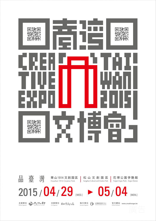
Taiwan 2015 - a window to observe the quality life of Chinese people
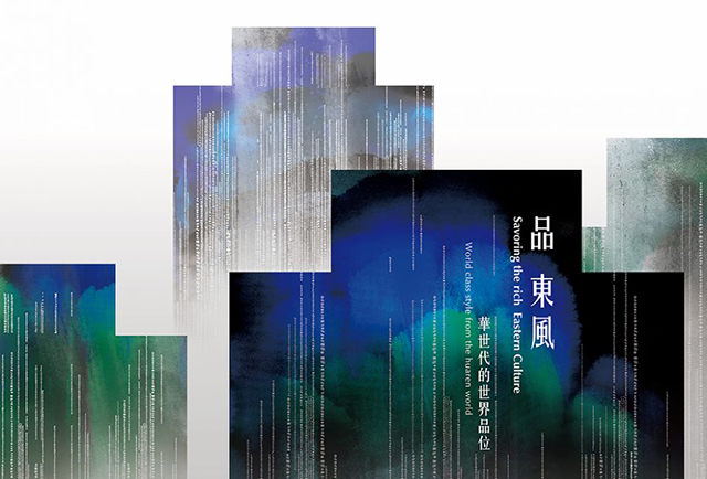
2016 Pindongfeng - World Taste of Huashijie
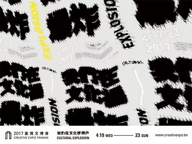
2017 We Exploded in Culture - Creating Meaning in the Process
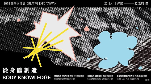
2018 Creation from the Body-Body/Culture/Creativity|Our body is an important channel to stimulate originality and change generations
Articles are uploaded by users and are for non-commercial browsing only. Posted by: Lomu, please indicate the source: https://www.daogebangong.com/en/articles/detail/Take%20a%20look%20at%20the%20main%20visual%20design%20of%20a%20Taiwan%20Cultural%20Expo.html
 支付宝扫一扫
评论列表(196条)
测试