Yesterday in "Font | Hei Ti Song Ti Bold Italic, what else do you know?"One article
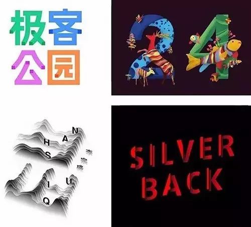
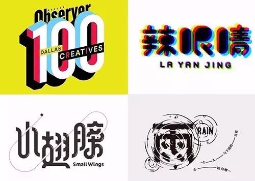
Shared with you 5 common types of design fonts
Today, Xiao A wants to share with you the details of these design fonts
How to Design
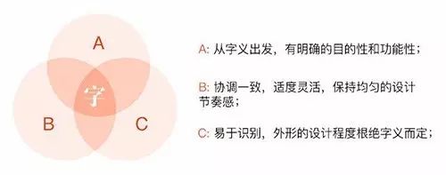
Chinese characters as square characters generally have three structures in terms of visual sensesbalance Form of expression:
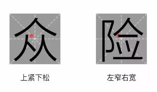
Tight at the top and loose at the bottom, thinner at the horizontal and thicker at the vertical, narrower at the left and wider at the right
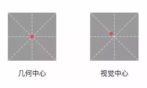
And The center of gravity of the font is the focus of the font design
The center of gravity of Chinese characters is different from the geometric center of gravity. It refers to the center of gravity of a character that attracts the most attention, also known as the visual center of gravity. It is upper left of the geometric centerThe location of a point
For example, in the Mizi grid, the intersection point of the diagonal lines is the geometric center, and the upper left point of the intersection point is the visual center
In order to achieve the overall balance of the font in the design, the heavier part of a word should be close to the center of gravity of the font, and the lighter part should be slightly farther away from the center of gravity
Generally, in order to achieve visual balance, we layout the main and secondary components of the font according to the golden ratio
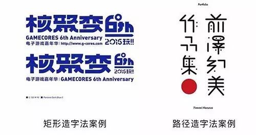
For font design practice, we usually start with the rigorous Hei typeface and Song typeface
There are two basic implementation methods: rectangular character creation method and path character creation method
Rectangular character making method: draw a rectangle in AI, according to the basic shape of the font, stroke by stroke Piece it together, it's easy
Path character creation method: draw the path with a pen in AI, after confirming the shape, stroke span>
With the glyphs, we also need to distort according to the meaning of the words
The design process from word meaning to font shape is a thinking process from inside to outside, from imaginary to real
These 8 simple methods can make the basic font become a good font for both internal and external

On the basis of the original font, after deleting one or more strokes, use other forms to replace
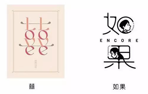
According to font theme, carry out targeted design modification
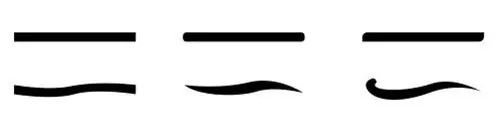
Anchor point addition or breakpoint processing is often performed at the end points of the horizontal and vertical strokes
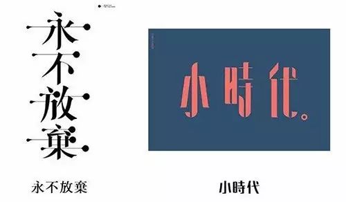
Take the horizontal line as an example:
In addition to making the strokes thicker for masculine characters, you can also do this:
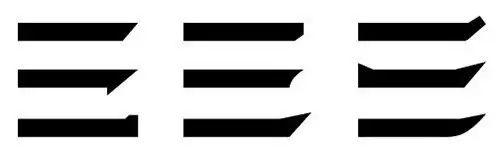
In addition to making the strokes thinner, female characters can also be like this:
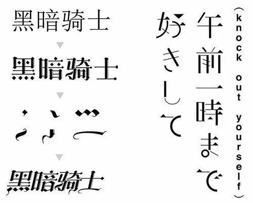
On the premise of ensuring the recognition of the font, the strokes are subtractive and blankprocessing
The fonts processed by this method have the charm of oriental painting, artistic temperamentstrong
Use a series of tools such as rounded corners, strokes, and tilts to make significant shape changes to the strokes of the original font
The round corner tool can straighten the turning point of the stroke into a curve, and the stroke tool can make the font bold or thin
The tilt tool can enhance the power and dynamics of the font

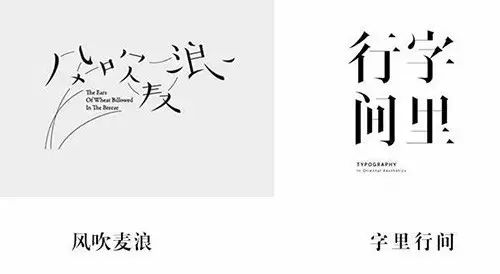
DismantlingThe unique stroke decoration of foreign language or punctuation marks, according to the structure of Chinese characters to combine
Gothic fonts, Tibetan, medieval cursives, etc. are commonly used
Add geometric shapes such as radial lines, polka dots, or flower patterns around the designed basic font
To set off the atmosphere and play an auxiliary role in expressing the meaning of the font
Through rich colors, light and shadow, texture overlay
Figurative or abstract patterns and textures make fonts lively
Perspective, virtual and real (depth of field), feathering blur, visual illusion, dotted clusters, overlapping occlusion, projection, positive and negative reverse and other techniques to Shaping the Richness of Space

After reading this article
What do you guys think about font design?Feelings?
Also tell Xiao A in the message area below
Say something off topic:
This week's Design Movie what do you guys want to see
(Color? Composition? Creativity? Or continue font?)
Tell little A quietly
Designed movie recommendations last week《 Friday Movie|7 font design movie recommendations, with resource links!!!》
Articles are uploaded by users and are for non-commercial browsing only. Posted by: Lomu, please indicate the source: https://www.daogebangong.com/en/articles/detail/Take%20a%20look%20A%20summary%20of%208%20font%20design%20methods%20simple%20and%20clear.html
 支付宝扫一扫
评论列表(196条)
测试