>>>
One thousand and one nights | Two hundred and sixty-eighth nights
<<<

@Giraffe's long long eyelashes-
In addition to hand-painting and stickers, the facade of the handbook is probably the title, so how to write a beautiful title is very important.
Today, I would like to share some tips that a certain deer used when writing titles, let’s take a look!
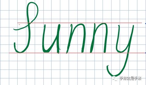
main content:
① How to write good-looking fonts
② How to decorate fonts
Let's first take a look at how a certain deer writes the title~
The first step is to draw the shape of the letters first. If you think of it as a painting, it is almost a sketch~
The two pink bars in the picture are to tell everyone that you must pay attention to it. It will look better if the letters are as flush as possible.
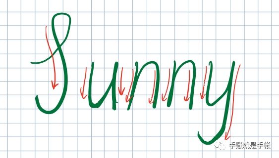
Second step, find the part we want to bold

The red line represents the part where we force downward when writing a letter, while the unmarked place we generally write upward with the pen.
The third step, widen the part marked in red by one layer
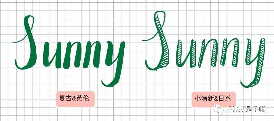
Note: The direction of letter widening should be as consistent as possible. Like u, there are two places to widen, so either go to the right like me, or both go to the left.
Step 4, fill the widened area, or draw a line in the widened area.
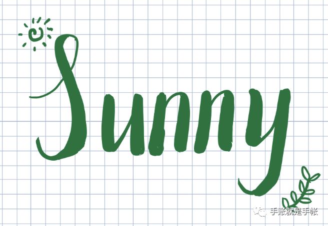
It’s not as difficult as imagined to write such a good-looking title~
Let's talk about some small ways to decorate fonts of a certain deer~
Method one, draw some small patterns that match the meaning of the word itself. For example, sunny will remind us of the sun, spring, green plants and so on.
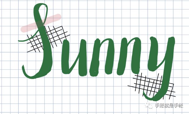
Method 2, draw some small grids or thick lines as a base (if the font is covered, you can paint it again after decoration)

Method 3, fill the base
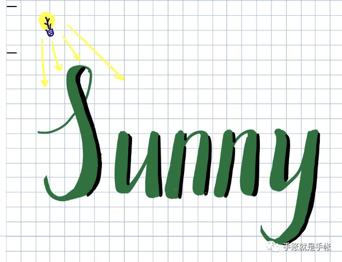
Method 4, give shadows to calligraphy and painting
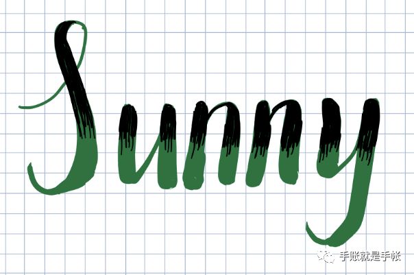
Note that when the light hits, there will be shadows on the back of the object!
Method five, give calligraphy and painting "bangs"
The heart of the word: stay away from baldness, start with me!
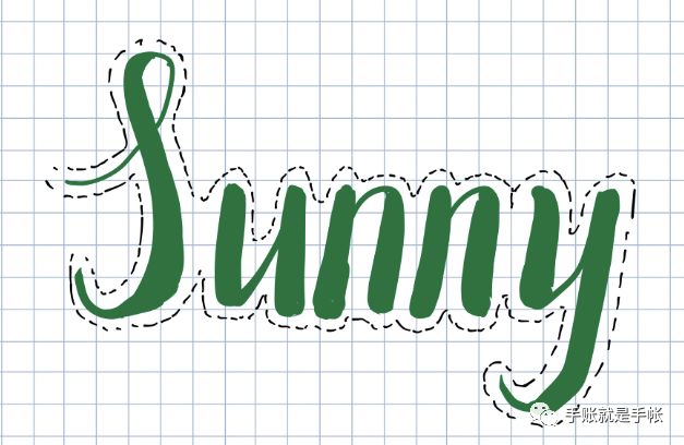
Method 6, draw a dotted line and sew the words on the paper
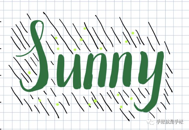
Method 7, let the words rain

Word heart: I'm green, isn't it miserable enough! !
Method 8, draw something to accompany it
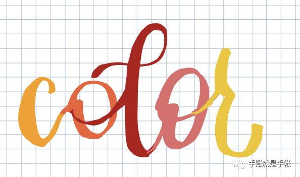
Here are several decoration methods that a certain deer thought of, I hope it can bring you some help and inspiration! If you also have some good ideas, welcome to Weibo private message or comment to add~
Of course, in addition to this font, there are some other styles of fonts:
Such as this random wind
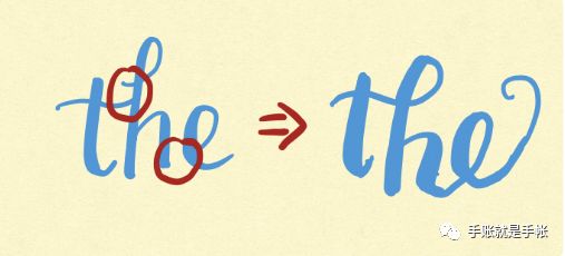
This is actually very easy to write, you just need to study the fonts we have learned just now, find out if there are any parts that can be connected, and connect them~ Just like this:

Another example

This one is also well written. First use a computer or mobile phone to type out the printed letters, WHAT, and then twist each letter, arrange the thickness of each stroke, and that's it! ! !
So a certain deer thinks it is not so difficult to write a beautiful title font! Hurry up and try it out!
I am a certain deer who always likes to share some tutorials and my own accounts on Weibo. You can ask questions by private message or visit the homepage~~Welcome to play!
Hope you enjoy this simple tutorial!
-END-

Articles are uploaded by users and are for non-commercial browsing only. Posted by: Lomu, please indicate the source: https://www.daogebangong.com/en/articles/detail/Super%20simple%20heading%20font%20writing%20tutorial.html

 支付宝扫一扫
评论列表(196条)
测试