Editor's Note: Basics of Typography Design! Today, Ali’s classmates shared the grafting technology of font design with everyone. Not only are there awesome examples and exercises, but also the transformation process is clear and clear. Baoxuebaohui>>>
Boost your morale before starting the war: font design is like an unknown battle, we need to explore and patiently ponder and adjust repeatedly, only in this way can we create personalized text, so as to show our strengths in this battle .
Why do font design
The appearance of fonts has a long-term evolution process, and has formed a fixed pattern until now. However, with the development of human culture to a certain extent, conventional fonts are becoming more and more rigid. However, breaking the routine and changing the font from a flexible perspective Deformation, giving it new meaning and vitality, has become one of the directions of modern design. At the same time, the main purpose of our font design is to convey accurate and clear information to users. Therefore, the key point of font design is to meet the requirements of the theme, reach agreement with the theme content, and not separate from each other, let alone conflict with each other. , if the theme is determined, then you can consider the aesthetic feeling of the font, that is, to make the font more expressive and appealing, not only to convey the theme to the user, but also to move the user and arouse the user's feeling of beauty, so Transforming the font is the last word. Here I will share the grafting technology of font design with everyone, including the learning package meeting, if there is someone who doesn’t take good care of it, please ask Haihan... Hehe, let’s not talk nonsense, then I will start to teach others!
Before the start of the war, let's start with an idea.
What is embedding
Embedding flowers and grafting trees is a more euphemistic term. To put it bluntly, it is grafting, which is to graft the branches of one plant onto the branches of another plant. Living prickly pears (spheres with various colors on top) and rhododendrons (flowers of several colors) are common examples.

What is the relationship between plant branch grafting and font stroke grafting?
The purpose of plant branch grafting and font gesture grafting is to make it unique, and they are both grafted from a to b, so the principle is the same.
How to make a difference
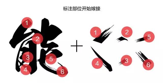
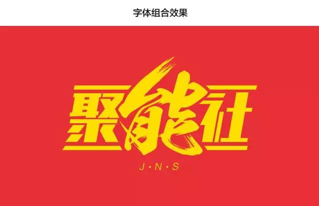
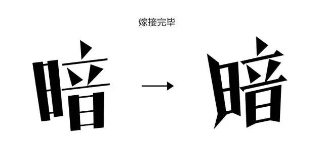
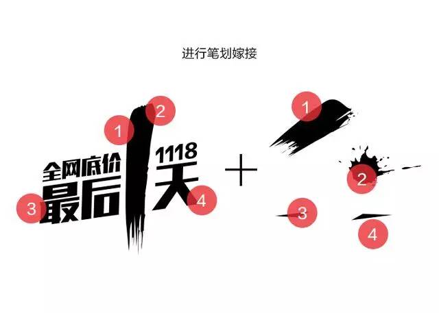
Font grafting must first understand its structure and combination form, that is, the ins and outs of strokes. The main parts of grafting are generally at the beginning and end of character strokes, so that the font will be more in line with the logic of the composition, and it will also make it appear more The tension and the middle area can also be slightly modified, which depends on the glyph. Take the calligraphy font "Neng" as an example. Before giving an example, I will complain. Many students asked me why handwritten calligraphy is different from the calligraphy in the special posters. In fact, the calligraphy-like fonts we often use are not real in the real sense. Calligraphy, calligraphy in the true sense has rules to follow. The fonts we use have been modified, just to feel like them. The purpose is to make them more tense and appealing. Let me go, I have said so much again, please see the example. I believe that everyone can understand this diagram at a glance.

The calligraphy font on the top is RiWenMaoBi font, which is a relatively beautiful font. It can become more impactful after a little grafting. Many students will ask me what kind of strokes I prefer to use. I usually use materials in AI format. Strokes (ink) or strokes captured after converting calligraphy fonts into shapes. If conditions permit, you can also draw strokes by hand. As for strokes and brushes, is this a thing! Believe me, it really doesn't work.
Specific case analysis
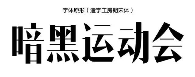
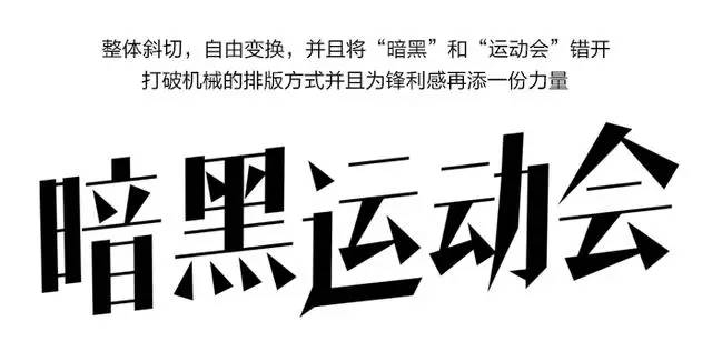
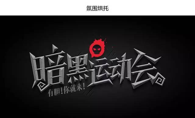
Next, I will analyze the cases I have done in my daily work. The first small case is a font design for the dark part of the team fun sports meeting. Therefore, it must be transformed before it can be used. It is best to change it so that even its own father does not know it, haha, and the font looks very flat, and it is far from the dark style, which prompts our desire to transform the font. Hehe... There is still a process of transformation before grafting!
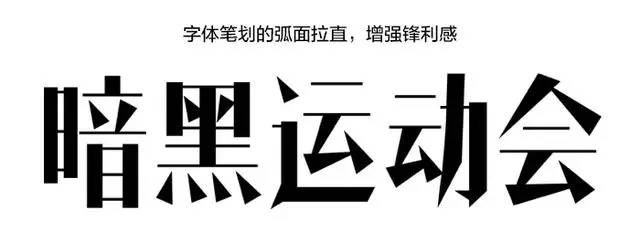
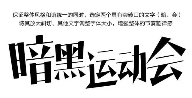


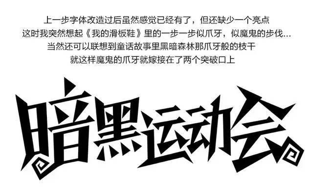
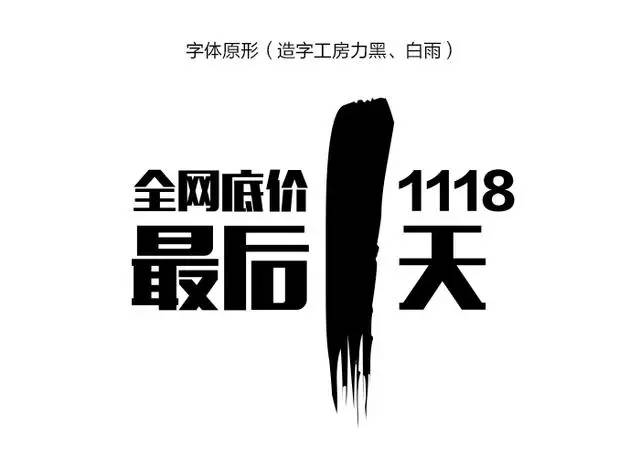
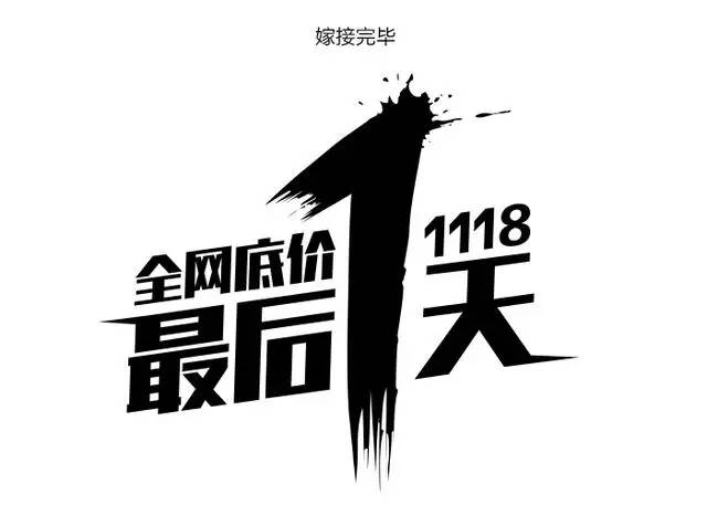
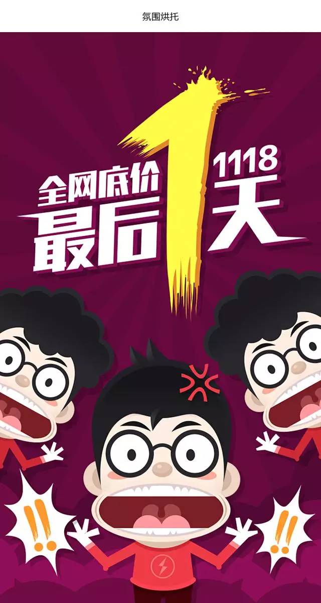
This case is not a pure grafting, there will be some deformation process before, but to make the font design reach a certain depth, it must go through a lot of twists and turns, only after thinking and continuous adjustment of the font will be more agile. The second case is the font design of the startup page of the big promotion. Compared with the previous case, this font grafting will be purer and simpler. To leave a deep impression on users, it is necessary to transform the original font to make the font more tense, and at the same time create a sense of urgency for users, so as to arouse their desire to rush to buy.

Let’s stop here first. Of course, there are a lot of topics about font design now, and the latitude and entry point of designers’ thinking are different, so my point of view is not absolute. I just hope to bring you a little help. If you can't reach it, please feel free to shoot bricks.
The battle has just begun, and I am always ready and waiting for the next battle.

Original address: aliued
super king
【U-design contribution: 2650232288@qq.com】
Articles are uploaded by users and are for non-commercial browsing only. Posted by: Lomu, please indicate the source: https://www.daogebangong.com/en/articles/detail/Super%20practical%20tutorial%20The%20first%20battle%20of%20font%20design%20is%20to%20move%20forward.html
 支付宝扫一扫
评论列表(196条)
测试