Why do we do font design? First of all, because of copyright issues, when doing commercial design, there may not be so many copyrighted fonts that can be used. In order not to get into unnecessary copyright disputes, you need to do the font design yourself.
Of course, the most important thing is to use the fonts designed by ourselves to make the fonts graphical, improve the interest of the screen, and better attract users to browse and express the theme atmosphere.
Rough classification of glyphs
The glyphs of Chinese fonts are ever-changing. In order to facilitate understanding, we roughly divide the deformation methods of fonts into four categories. Under each category, many different font styles can be extended according to different designs.
1. Cute cartoon font design
Font features: round, free strokes, thickness changes, handwriting feel

2. Literary type
Font features: slim, free, handwriting

3. Sharp hard air type
4. Brush type
Font features: rigid, angular, exaggerated and impactful
Corresponding to the four types of font design, we have also sorted out the tricks of four font design, so that everyone can quickly improve the font design ability. (The following operations are all performed in AI CC)
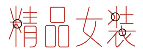
The first trick: brush tool + width tool to create a cute font
Step 1. Brush tool handwriting font
First use the AI brush tool (B) to draw the general shape of the font on the canvas. Don't pay too much attention to the beauty and ugliness at this stage, try to make the font as neat as possible, and some strokes can be written in a playful way with some turns and the like.
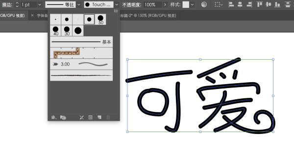
Step 2. Adjust the path beautification line
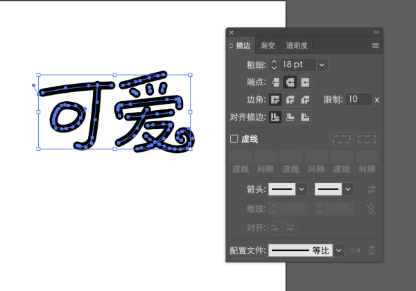
Select all the fonts in the first step and press the D key. The function of the D key is to change the selected object to the default stroke and color (for the convenience of using the width tool later).
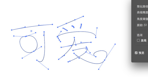
Use the anchor point tool to adjust the nodes on the text and adjust the shape of the text. If there are too many anchor points on the text, you can use Object>Path>to simplify the path and adjust it.
Step 3. Adjust line thickness and endpoints
Make the current stroke bolder. Adjust the stroke, which is currently 1, to a suitable thickness. Make thin typefaces look fuller. Pick the Direct Selection Tool (A). Properly adjust the anchor point of the font so that the strokes do not squeeze together. After adjustment, the following font effect is obtained.
Step 4. Width tool to quickly create font thickness changes
In the CC version, a very useful feature has been added - the width tool. In the process of making the strokes of this font, the operation can be greatly simplified. After using this width tool, dragging a certain part of the line segment will make the line segment thicker or thinner evenly.
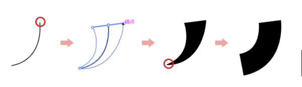
Use the width tool to quickly change the thickness of the stroke to make the font more cute.
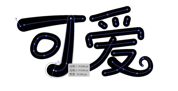
Step 5. Fine-tuning the details
After obtaining the above effects, we select all fonts. Then find the "Extended Appearance" option in the "Object" work bar to convert the entire font.
Use the Direct Selection Tool (A) for the anchor point for fine-tuning.
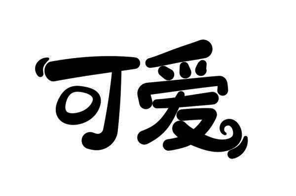
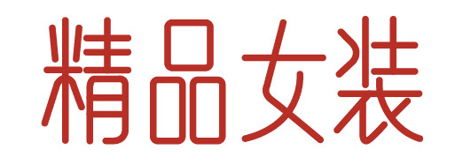
Final effect:
The second method: stroke tool to make literary text
Step 1. Select the font frame and use the pen tool to outline the font
First, we create a new template and choose one of the most common fonts - Arial.
Make text longer. This kind of text has a sense of sight of a tall and slender beauty. You can also keep the original shape or squeeze the font, or choose other thin fonts as templates according to the actual needs of the font to be made, which can be adjusted by yourself. Don't stick to a certain font, just think it looks good and fits well.

Use the pen tool (P) in AI. Adjust the appropriate stroke thickness to ensure slender and delicate lines.

Put the Song typeface at the bottom, and draw the general frame of 4 characters.
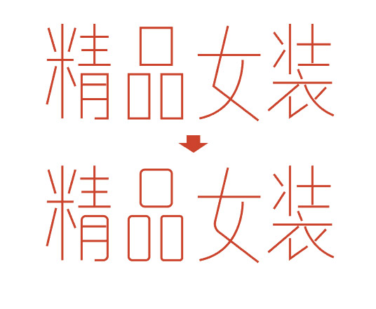
Step 2. Round corner tool processing stroke corner
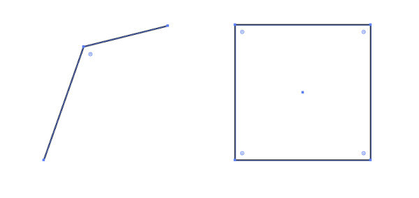
In the AI CC version, a very useful chamfering tool has been added. Choose a sharp shape. You'll see small circles at the chamfers that you can use to chamfer. The picture shows a chamfer with 2 sides and a square. Put the mouse on the small circle of the chamfer and drag to chamfer the two sides directly. The square shape is more convenient, and the four corners can be changed together.
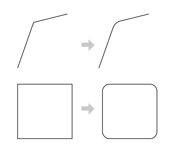
Using this little trick to smooth the interface at the corners will make the corners smoother and more natural, and the processing process will be more convenient.
Step 3. Change strokes for detailed design
You can do some personalized processing according to the detailed areas such as the intersection of your own feeling and the creative line, such as connecting two lines, or adding some small decorations with circles at the ends.
The font can be bolded according to the requirements of the design environment, which will present another feeling.
PS: You can also change the breakpoint of the line according to this method, and make some lines compare the effect of the straight font.
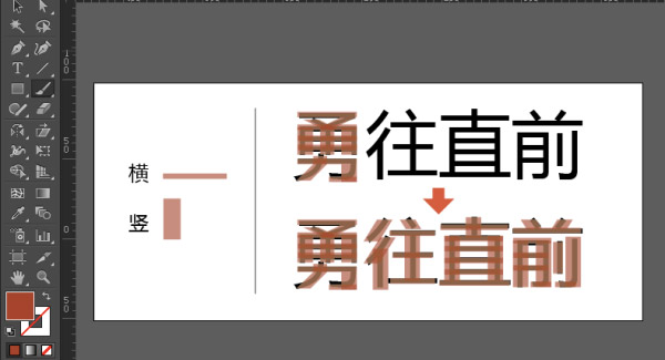
Third method: Rectangular character creation method
Use the rectangle tool of AI tools to create a font design direction with a relatively tough structure
Step 1. Use rectangles to build font skeleton
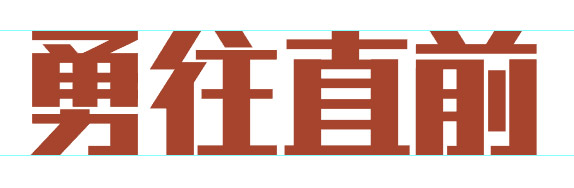
Here we take the words "go forward bravely" as an example.
First choose a suitable font as the "skeleton". Here I choose one of the most common Microsoft Yahei as an example. Use the font tool to type these 4 words. (You can choose more personalized fonts as a structural reference. Microsoft Yahei is used here because of its universality. Please infer other cases from one instance.)
Then we first determine the basic thickness of the strokes according to the density of the strokes of the font and the desired feeling of the font. The strokes of "vertical" are generally slightly thicker than "horizontal". Take out two basic strokes "horizontal" and "vertical" as the building blocks for splicing the font, and splice the four characters to be made with these two basic strokes. In order to see the basic font below clearly, when drawing a rectangle, you can adjust the transparency appropriately.
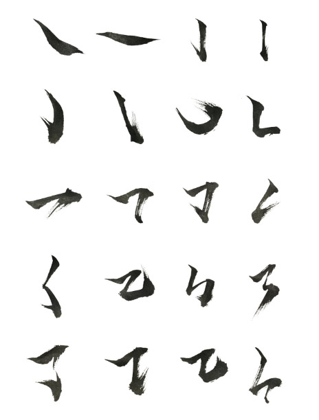
If you encounter oblique strokes such as "dot" or "ti". We can use the direct selection tool (A) in AI to select a side for random adjustment. It can also be deformed with the Warp Tool (E).
During the production process, please do not piece together completely based on the thickness of the two basic strokes. Some font processing is also required. If it remains the same, it will only make the font more dull. Moreover, if two very thick strokes keep the same thickness in a crowded structure, they will also be squeezed together.
Step 2. Adjust shape + standard font size and shape

This first draft has the general shape of the font. But the upper and lower structures are not very neat. The entire font looks a little rigid because it is still in its preliminary production.
Now we adjust the transparency of the shape to 100%, and add 2 auxiliary lines up and down. We adjust the font shape to make the upper and lower outlines more neat and horizontal. Also adjust the thickness of the lines and the internal structure again. Let the font as a whole be more coordinated.
Step 3. Change the font angle, add anchor points to enrich the stroke structure details
After obtaining such a glyph, in order to make the font more speedy and powerful. We use the (E) Warp tool to make the font slightly slanted.

And continue to add some details to the strokes. There are basic glyphs here, and designers can adjust the stroke glyphs according to their own ideas. As long as it is properly coordinated.

Use the pen tool to add anchor points to the rectangle, allowing for more detail and structure on the glyph.
For example, we add a protruding small oblique tip to the endpoint of the stroke. And do some "broken" treatment of the strokes, so that the inside of the font can breathe more smoothly. In this way, the sense of speed and strength of the font is more intense.
Step 4. Change element details to enhance design sense
Observing the structure between fonts, we can make some interesting designs, such as making some strokes into structures such as lightning. Such a font is roughly done.

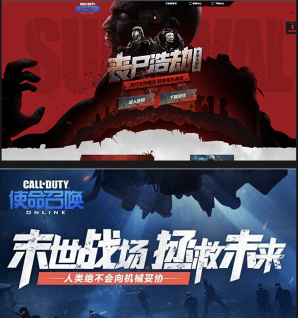
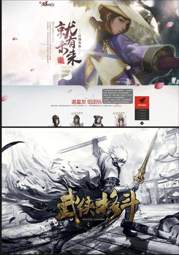
The fourth trick: brush strokes to change the calligraphy
The design of calligraphy fonts is mostly used in Chinese style design or some game pages. The fastest way to make calligraphy fonts is to transform existing calligraphy fonts. In order to avoid copyright issues, and to make the calligraphy font more majestic, we use the following methods to make it.
Step 1. Brush character generator generates brush characters for simple typesetting
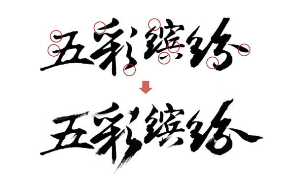
Now there are many calligraphy fonts generated online. Through the search engine, search for "online calligraphy generation", and you can find many websites that generate calligraphy fonts. Find a suitable font for yourself on the website. Here we choose "colorful" as an example. We generate it online on the website, download the vector file of the font, and perform simple typesetting.

Step2. Optimize the overall feeling of brush writing through different brush stroke materials
Because of the initial font, there is not much artistic modification, and the curve is still relatively blunt. Use some brush stroke vector files to process the basic shape of the brush characters above.
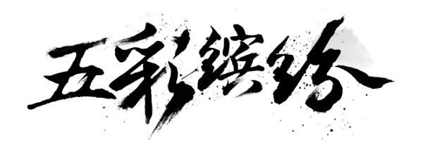
Step3. Add some ink dot details
We can add some ink dots and ink materials below. Make the picture more full and full of atmosphere.
Author: Blue Lake Product Design Collaborative
Source: Jianshu
Articles are uploaded by users and are for non-commercial browsing only. Posted by: Lomu, please indicate the source: https://www.daogebangong.com/en/articles/detail/Super%20practical%20Four%20ways%20to%20quickly%20improve%20font%20design%20ability.html
 支付宝扫一扫
评论列表(196条)
测试