
Hand-drawn font is a very common font design method. According to the style of hand-drawing, it can be applied in a wide range. For novices, this style is not easy to use, and requires the designer to have a certain hand-painting foundation. The following hand-painted poster font tutorial is produced by the excellent practitioner of Baituji「Megan」.
Megan’s personal homepage:https://www.
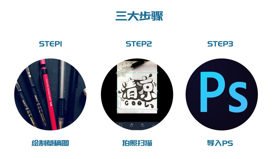
This tutorial mainly uses three major steps to explain the design process of hand-painted poster fonts in detail, including drafting, taking photos and scanning, and importing into PS for processing. Now let's get into this tutorial officially.
You only need to forward "this article" to WeChat Moments and send a screenshot to the administrator, the administrator will send you the PSD file of this tutorial , Administrator WeChat ID, please scan the QR code and send the verification application "Tutorial Learning" < /strong>
Hand-painted poster font tutorial
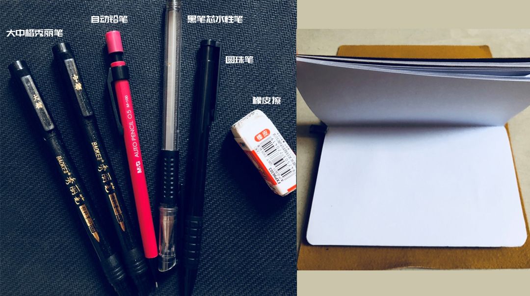
In the early stage of preparing hand-painted poster fonts, it is of course necessary to prepare tools. Here are some tools I usually use (different tools have different effects, you can try to think about it)
After the preliminary work is ready, we can start to enter our creation~
I like the hand-painted poster font because it is very unique, and everyone’s handwriting is unique, maybe the effect of each writing is the same Not quite the same, which coincides with the originality and flexibility required by the design.
Before starting to create, you must first think about the content of the text (the advantage of free play is that you don’t have too many constraints, think of any interesting words or you can find them in your daily life).
Next I will share my actual combat case

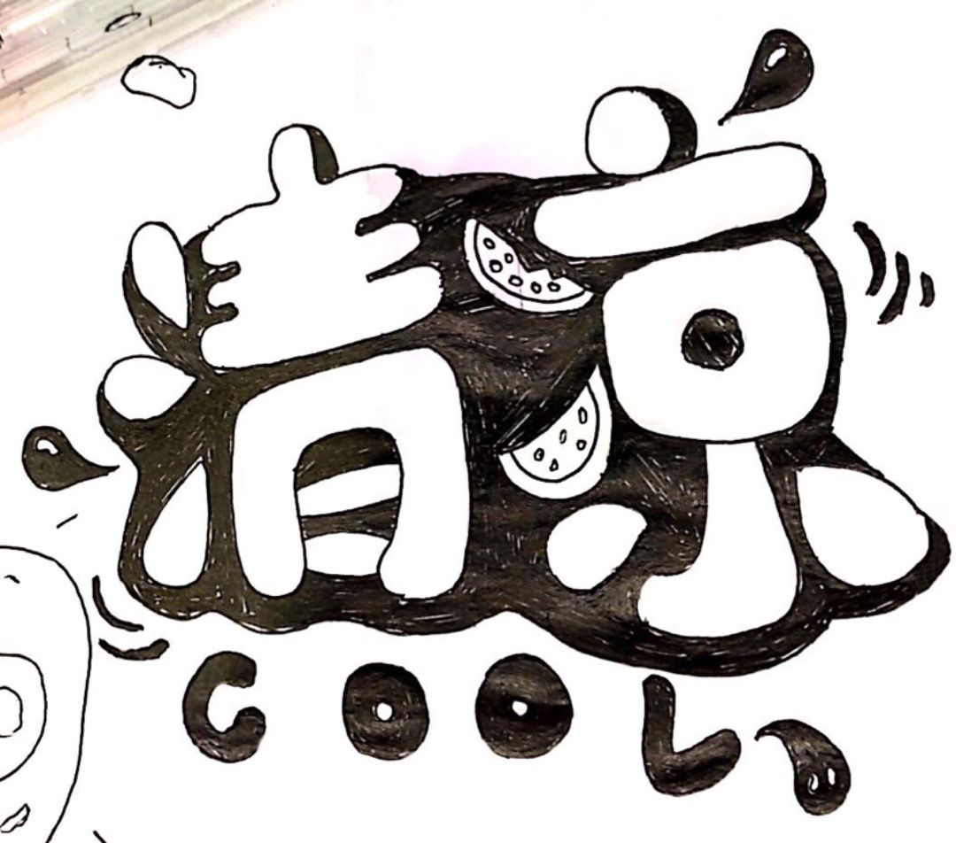
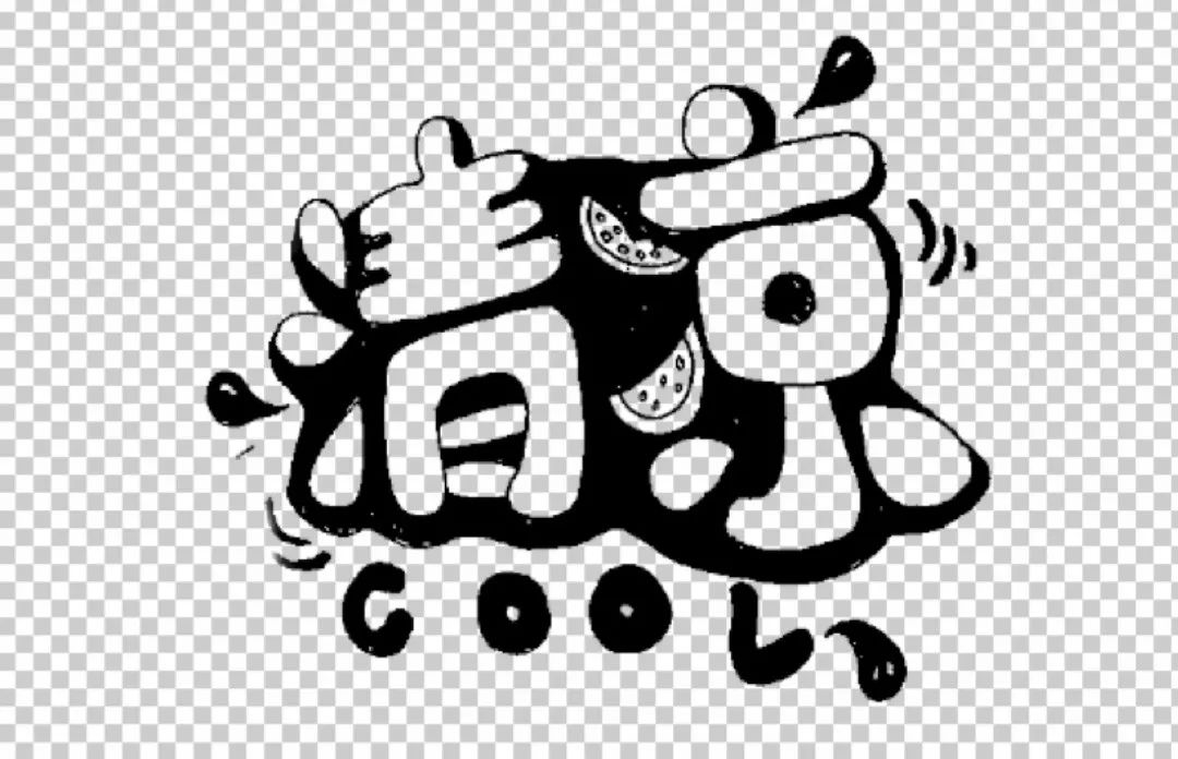
Final Rendering
Description of font inspiration: In the hot summer, I just want to find a cool summer resort, around "cool The words " can be brainstormed: water, water droplets, ice, watermelon, swimming, swimming ring, fresh and other words.
After determining the content of the font, start to determine the style of the font. Summer feels more lively and enthusiastic. After you have the direction, start to make it~
Summed up three major steps: first draw the first draft of the draft map——secondly take pictures and scan——Finally import ps for processing.
Enter the topic: first, a draft image.
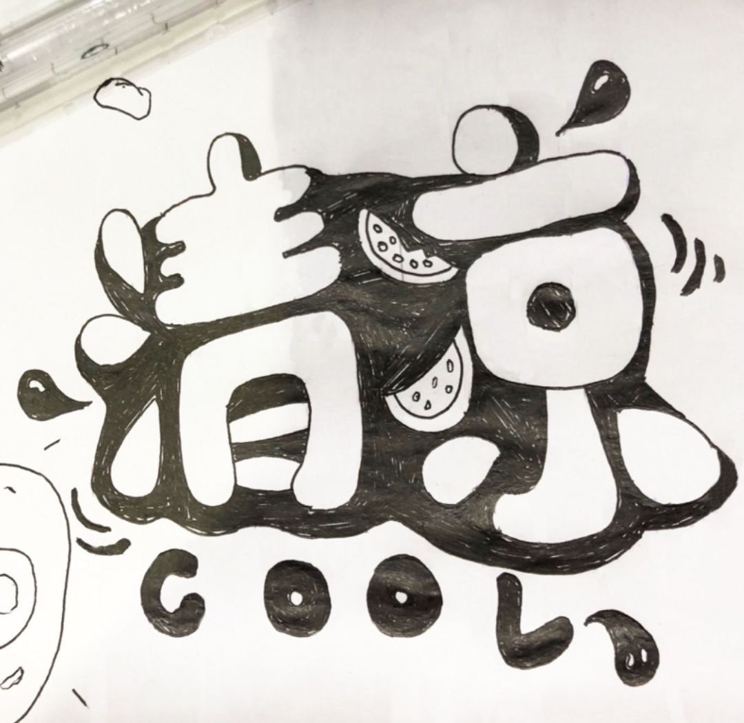
Creative idea:The font is relatively round and full, which looks cute and lively. Combined with the typeface of the font, some strokes are appropriately replaced with a summer atmosphere. For example, the three dots of water next to the word "Qing" can be replaced with drops, and the two dots of water next to the word "Cool" can be replaced with watermelon, which is necessary in summer. , so that the font will appear more flexible, in line with the summer atmosphere.
After the draft is done, it will be scanned into the computer. The method I choose here is to use a scanning software on the mobile phone to take pictures and scan them and then transfer them to the computer.
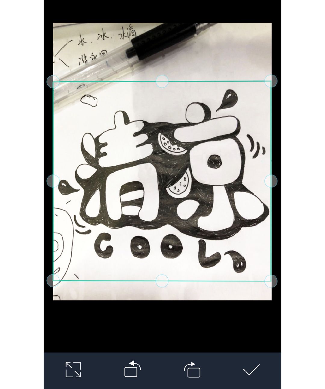
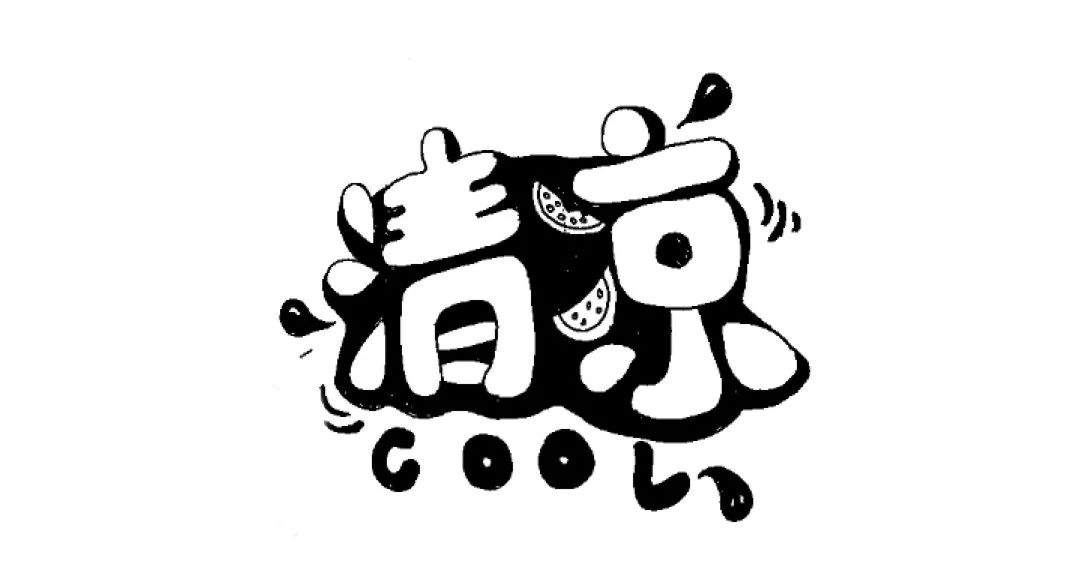
Crop the size, adjust the angle, and click OK to generate a scanned image.
Get the scanned picture, you can import it intops.
Step1. Import into ps
Create a new800*600px canvas , import the picture intops, and adjust the appropriate size. Every time I make a typeface I make a copy so I don't make a mistake and have a backup.

Step2. Image-Adjustment-Threshold
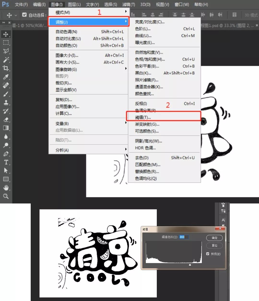
You can drag to an appropriate value according to your actual situation to make the font contrast stronger. This step is to prepare for the next cutout.
Step3. Remove blemishes
At this time, you will find that there are still some redundant strokes and blemishes next to it. You can choose to use the brush tool to fill#ffffffto remove the blemishes. (The purpose of filling with a brush is to remove the whole white background conveniently)
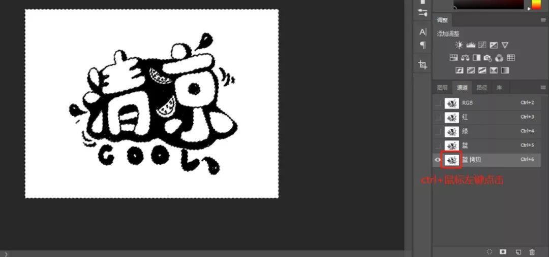
Step4. Remove white background
Duplicate another layer, select the channel, I selected the blue channel here, copy a layer of blue channel, ctrl + left click the newly copied blue channel small window, then the white part in the screen will be selected.
At this time, we return to the RGB layer, and then return to the normal layer interface, press the delete key to delete the white background, and then we can get a transparent base map with the white background removed.
Step5. Lay out big colors
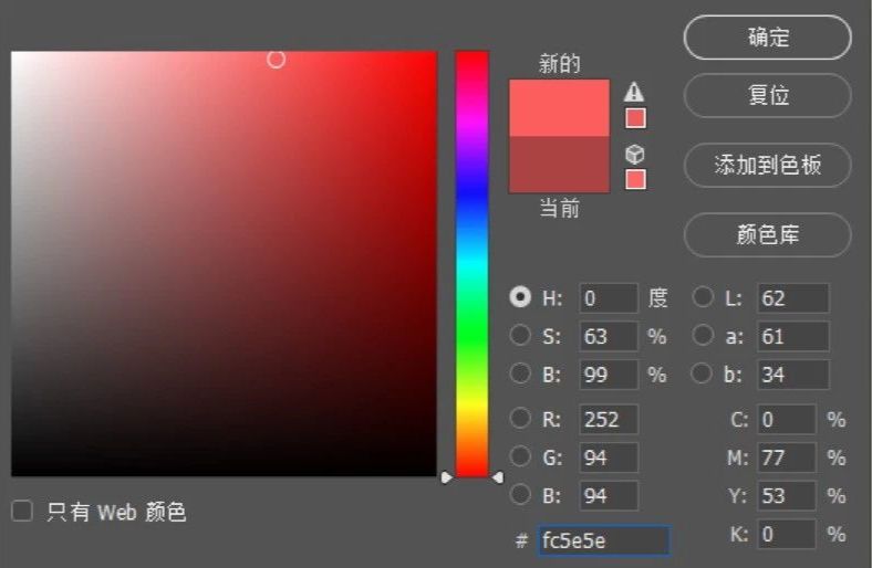
Then start coloring the font. First of all, I think that summer is warm and lively, so the main color of the font is #fc5e5e.
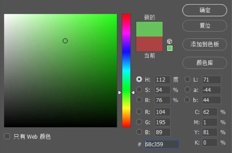
Create a new layer under the font, use the brush tool to draw and fill. Same as above, watermelon rind color value#68c359.
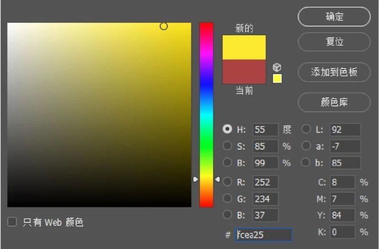
Watermelon seed color value# fcea25.
The method is the same as above.

The effect after filling
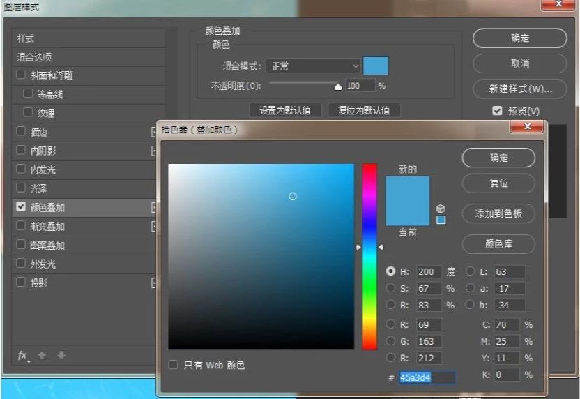
Step6. Background color adjustment
The scene I set is a swimming pool, so the background is filled with blue# 65cafe, and the font color is superimposed to white span>#>

Step7. Add swimming circle elements
When we got to this step, I had some new ideas, and I felt that I could add a swimming ring, so I replaced the dot in the upper left corner of the Qing characters with a swimming ring.

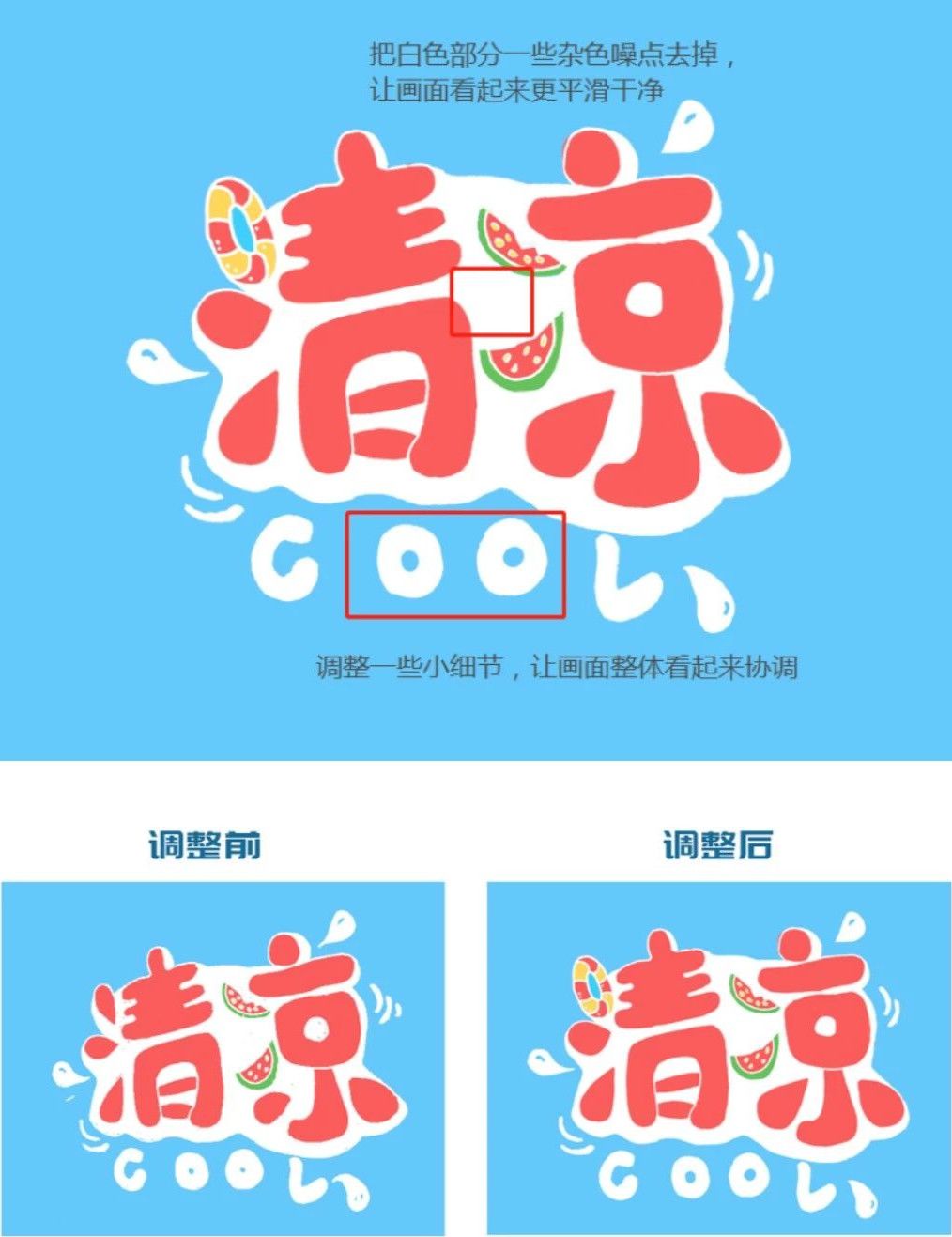
Step8. Adjustment screen
Because in the hand-painting process, some strokes were not handled particularly harmoniously, so some adjustments were made in the later stage.
Step9. Add details
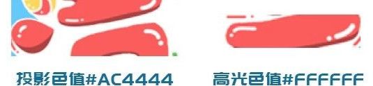
Once the font details are fine-tuned, it's time to add drop shadows, highlights, and support elements.
Then you can make some auxiliary dotted stroke elements around the font, color value #fc5e5e.

This way the picture looks richer. Ps: You must create a new layer under the font for filling and drawing.
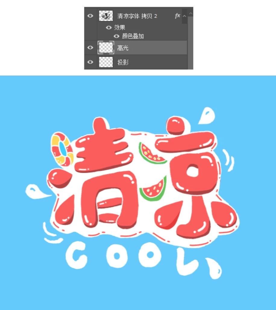
At this time, the font has formed a sense of hierarchy, which is relatively full and thick.
Step10. Add the material of the water pattern.
Now the picture is still a bit monotonous. At this time, I added some water ripples to the backgroundeffect, and searched for some water wave materials from the Internet.
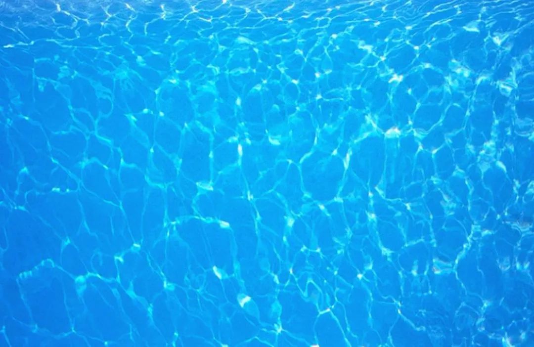
After finding the material, place it on the blue background, adjust the image blending mode to soft light, and adjust the opacity to 64%.
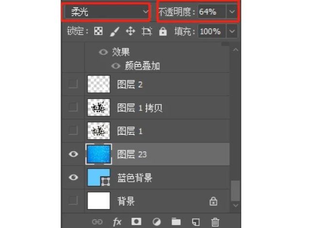
Get the following effect.

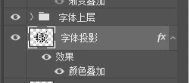
Step11. Give the font a floating effect.
Because the bottom layer is water ripples, to make the font look like it is floating on the water, at this time, combine the font as a whole and name it as the upper layer of the font, copy a group and name it font projection, and superimpose the color as#45a3d4.
is placed below the upper layer of the font.
Put it out of position and adjust it to a suitable position.

Step12. Add noise
Finally stamp the layer as a whole (shortcut keyctrl+alt+shift+e), then add noise texture to the layer, filter-noise- Add noise.
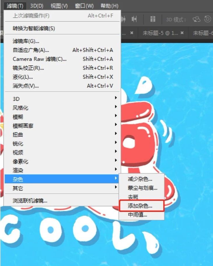
The value does not need to be too large, about 3-5, if it is too large, it will affect the pictureeffect.
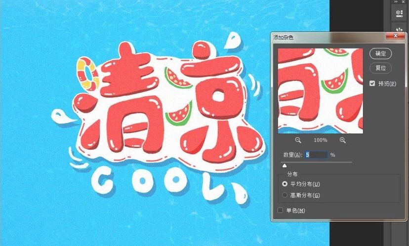

This screen is done~
The above are the ideas and steps of hand-painted font design, thank you for watching~

Articles are uploaded by users and are for non-commercial browsing only. Posted by: Lomu, please indicate the source: https://www.daogebangong.com/en/articles/detail/Super%20feeling%20handpainted%20poster%20font%20tutorial%20with%20psd%20source%20file.html
 支付宝扫一扫
评论列表(196条)
测试