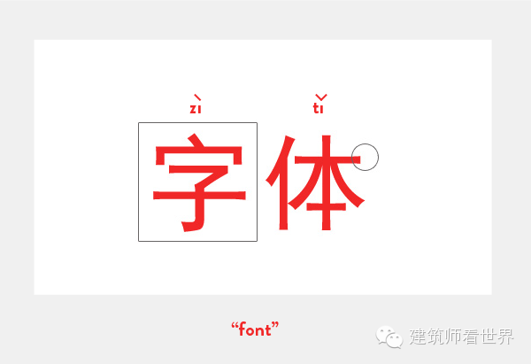
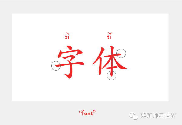
How many fonts are there in China? Does Chinese also have "serifs" and "sans-serifs"? Is there also a replacement for Helvetica in Chinese fonts? We will explore in depth and answer these questions in detail with examples of typography in China.
Extended reading (translator's note): General comparison of Serif and Sans-Serif In typography, serifs refer to decorative strokes other than the structural strokes of letters. Fonts with serifs are called serifs; fonts without serifs are called sans-serifs. Serif fonts are easily recognizable, so legibility is high. On the contrary, SansSerif is more eye-catching, but in the case of text reading, Sans-Serif is likely to cause troubles in letter recognition, and there are often cases of rereading back and forth and confusion of upper and lower lines. Serif emphasizes the beginning and end of letter strokes, so it is easier to recognize the continuity. Serif emphasizes a word, rather than a single letter, whereas Sans-Serif emphasizes individual letters. In small fonts, Sans-Serif is usually clearer than Serif. Applicable purposes: Usually the inner text and main text of the article use Serif fonts with better readability, which can increase the readability, and it is less likely to get tired after reading for a long time because it will be read in word units. The words used in the headings and tables use a more eye-catching SansSerif font. It needs to be prominent and eye-catching, but you don’t have to stare at these words for a long time to read. Like publicity materials and posters, in order to be eye-catching, the paragraphs of its short stories will also use Sans-Serif fonts. However, in the case of books, newspapers and magazines, where the text has a considerable length, Serif fonts should be used to reduce the burden on readers. This principle should also be followed in web design and browser settings. Helvetica is a widely used sans-serif font in Western languages, created by Swiss graphic designer Max. Designed by Miedinger in 1957.
From a practical point of view, recently more and more websites and graphic design projects require me to design a Chinese version. Maybe you will also face these needs soon.
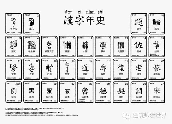
From a learner's point of view, Chinese characters are really cool! As we all know, Chinese is the oldest writing system still in use. Not only that, but the writing languages in the entire East Asia region are like a branch of Chinese. Although these languages have evolved into other distinctive forms, you can still see Chinese characters in them.
Of course, there is another indispensable reason: Chinese is very beautiful. Who can refuse to appreciate beautiful things?
Did you know that there are two standards for the writing system in Chinese.
To make a long story short, after Chairman Mao led the Communist Party to power in 1949, he found that the literacy rate of the people could be improved by reducing the complexity of characters, so he organized many linguists to revise and start the word simplification movement. Wikipedia (English version) tells us:
"The Chinese Communist Party issued the first official simplified documents in 1956 and 1964"
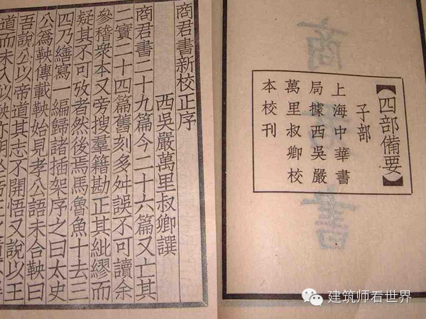
At that time, Hong Kong, Taiwan, and Macau were not controlled by the mainland, so they did not change the font, but continued to retain the original traditional Chinese. Before Simplified was officially released, there were already a large number of Chinese immigrants and Chinatowns around the world, so they still use Traditional Chinese in these places.

Where Simplified Chinese is used:
As the official written language of mainland China, it has appeared everywhere since its official publication in 1954.
Where Traditional Chinese is used:
Official written language of Hong Kong, Taiwan and Macau
Chinatowns established outside of China
Antique texts in mainland China before 1954
On some very official place names or plaques in mainland China
Those languages that have branched before the simplification of Chinese, such as: Japanese, Korean and early Vietnamese
ah! Really drunk!
Just imagine what this history means for font development studios: in order to release a professional typeface, they not only need to create a character set containing more than 20,000 characters, they also need to repeat the work twice, once for Simplified and once for Traditional of. And that's not even taking into account multiple text weights!
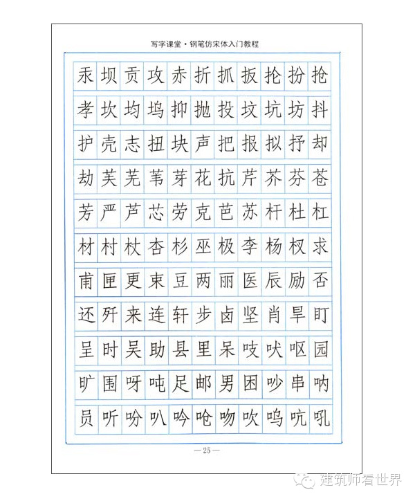
Are you scared to pee? Despite the simplifications, a professional Chinese font must contain around 20,000 glyphs, sometimes a few thousand more, sometimes less. This also includes English letters, Chinese and English IPA letters, and a huge set of Chinese punctuation marks. The character set of Traditional Chinese must contain at least 30,000 glyphs. Some non-professional fonts may only contain about 2000 commonly used glyphs, but these fonts should not be selected as the main font, because sometimes you will find that it does not have the text you need.
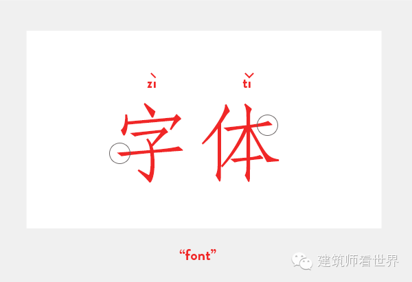
How to use @font-face and web fonts?
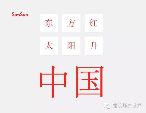
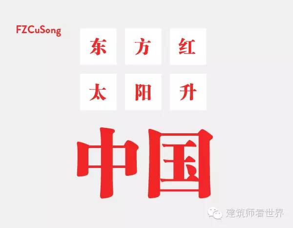
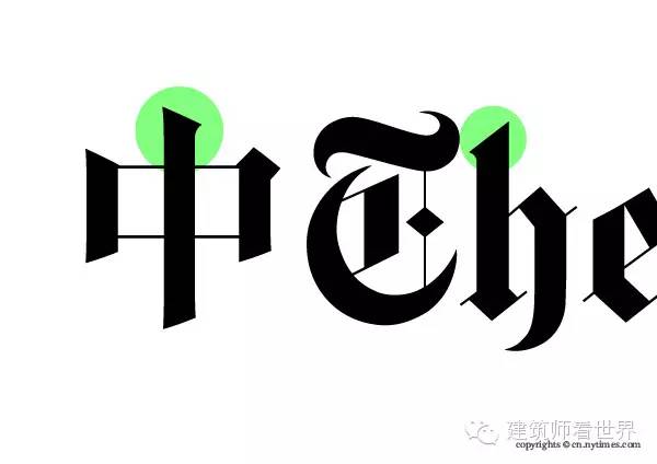
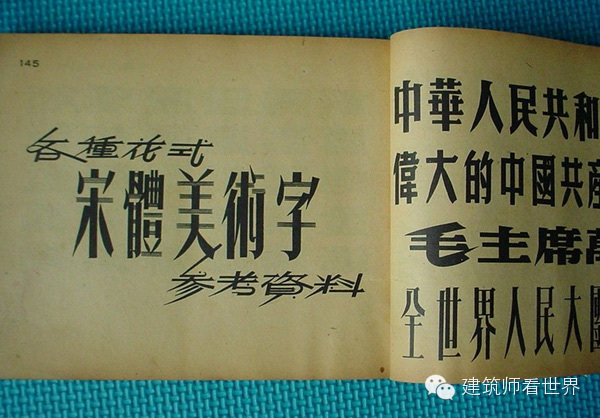
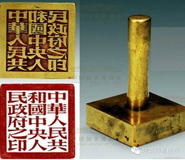
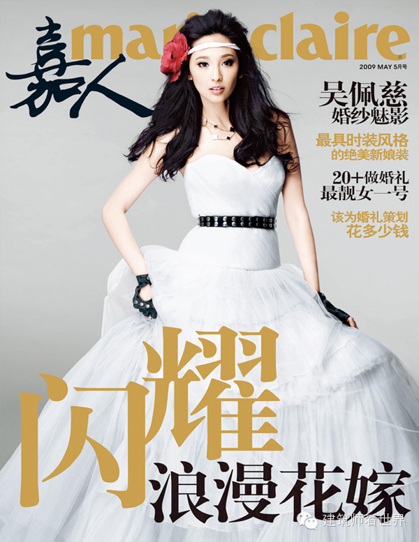
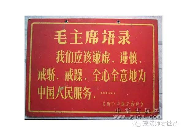
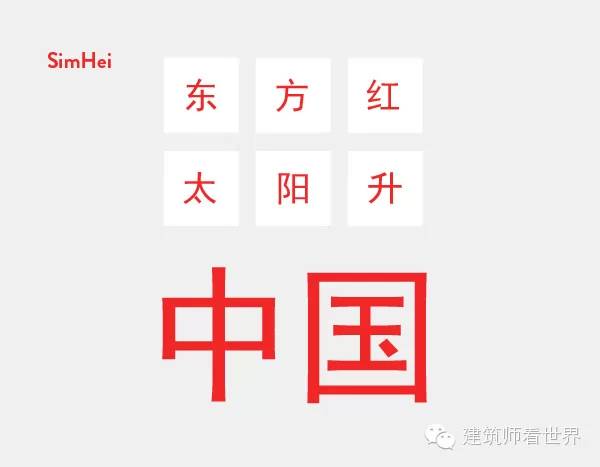
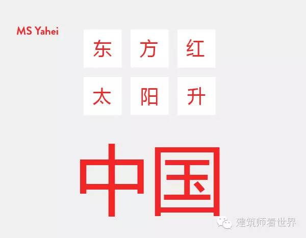
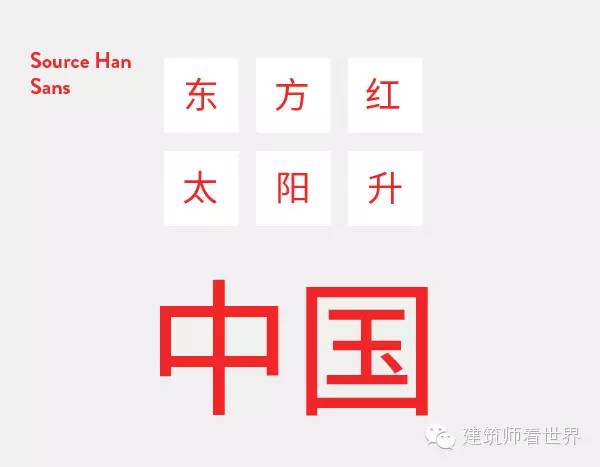
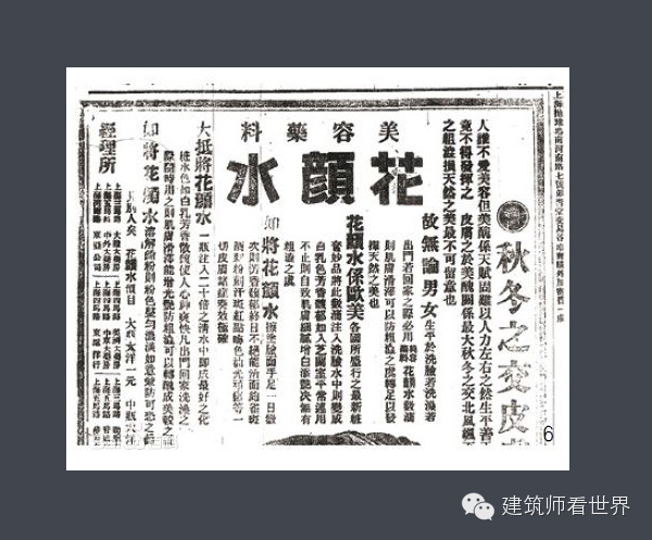
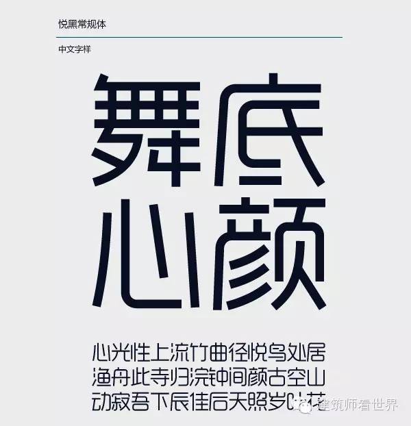
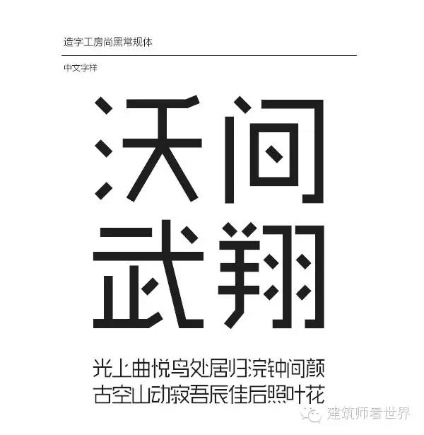
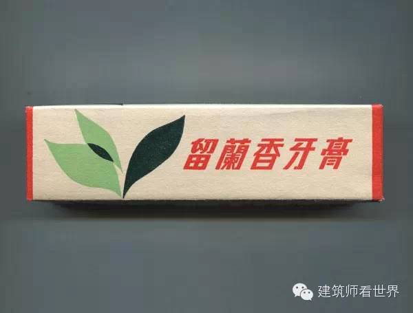
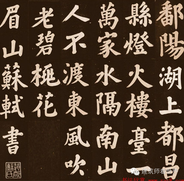
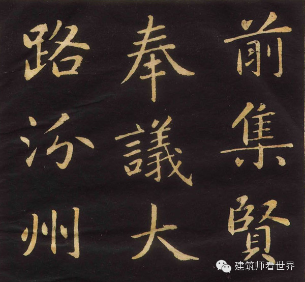
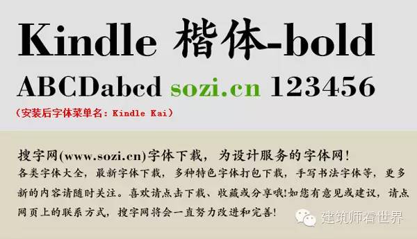
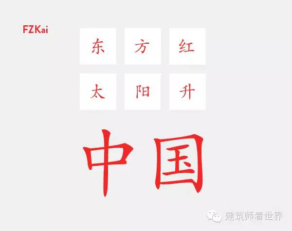
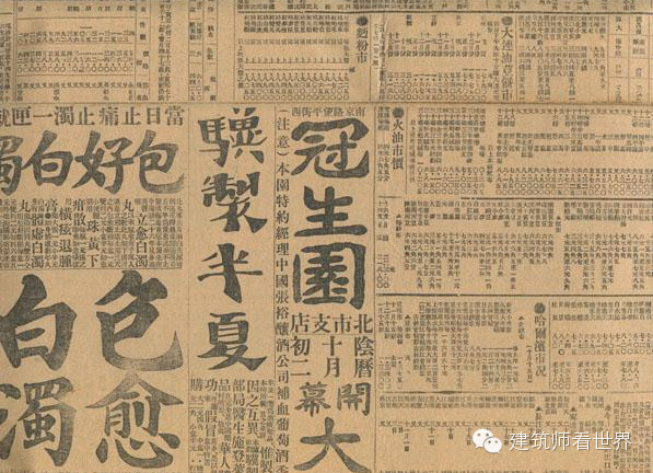
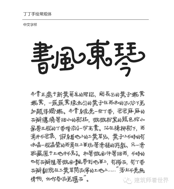
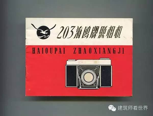
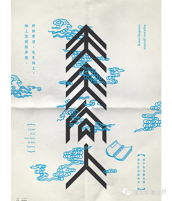
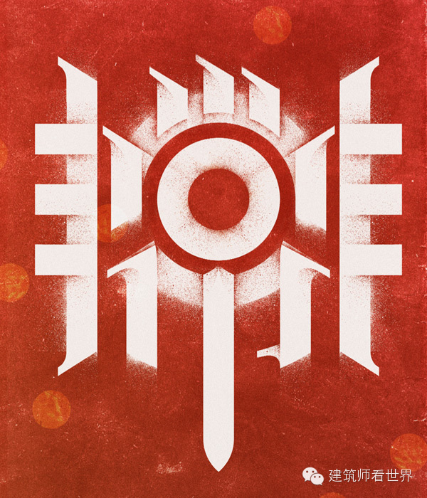
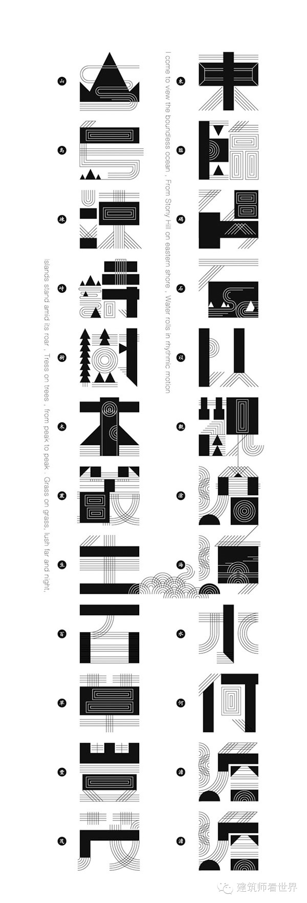
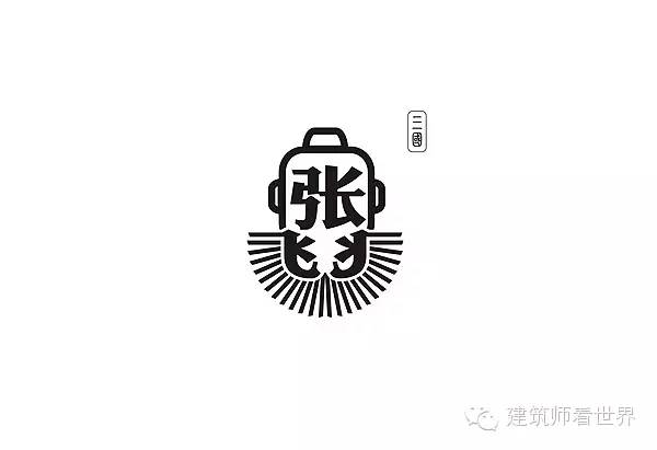
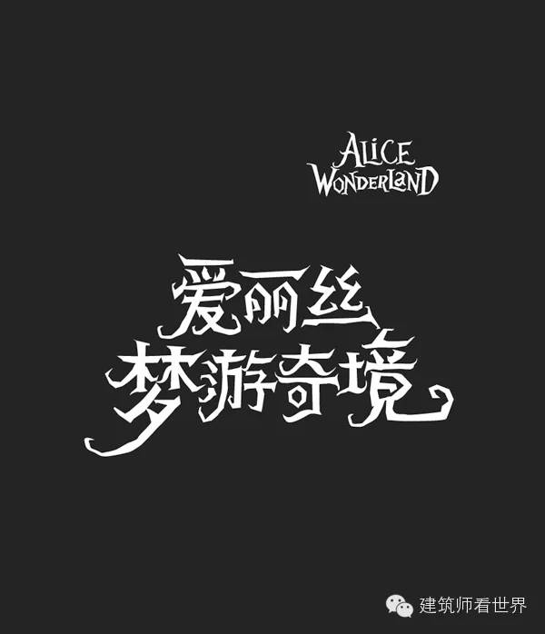
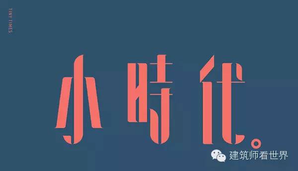
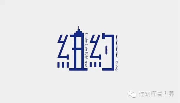
The answer is that they cannot be used. China has not joined Western fonts use several "main headings" and a series of "subheadings" to distinguish them. In the West, there are >serif fonts and >serif fonts, as well as >Gothic>handwriting>art style>slab A set of words including em>>Monospaced describe common typographical styles. While we can't really classify every typeface into either a serif or a sans-serif typeface (as hand-drawn script cannot, for example), these two categories are probably the most widely used classifications of typefaces, and their The scope of use has even gone beyond the design industry. From this point of view, the classification of Chinese fonts is very similar to our own. In Chinese, there are two main categories—>SongTi and >HeiTi, which can be understood as "Chinese serif fonts" and "Chinese sans serif fonts". If you must choose a font to represent the Chinese printing font, then Song Ti is the best choice. The use of Song style can be traced back to the heyday of Chinese woodblock printing - the Song Dynasty (960-1279 A.D.). Because of the horizontal grain of the wood used for engraving, horizontal strokes are easier to carve and still remain very small. On the contrary, vertical strokes are difficult to carve, so they will become thicker. At the same time, since the two ends of the horizontal strokes are easy to be worn, people added feet to them to make these places thicker and more durable. Therefore, as a font with horizontal horizontal strokes, thick vertical strokes, and gorgeous but standardized footwork, Song typeface has become the representative of Chinese serif characters. 中易宋体, or more commonly known in English as >SimSun, and its predecessor, Xin宋体 >NSimsun is the Simplified Chinese version of > This is Zhongyi Song Ti, a very practical Chinese Song Ti: Note that the font of Founder Bold Song maintains the characteristics of the classic Song typeface, which is thick vertically and thin horizontally. This font is created by Founder Font: Before the Chinese website of The New York Times Weekly was launched, Hong Kong typesetting expert Xu Hanwen was commissioned to design a version of Chinese fonts for it. The Song typeface he used has a strong contrast in stroke thickness, and the endpoint style matches the logo of the New York Times: Variations: 1950s Times New Roman Reference Books: Times New Roman on the Great Seal of the People's Republic of China used to sign the Constitution in 1954: The Times New Roman font used in the titles of selected articles below the cover of Marie Claire in 2009: The thin and tall Song typeface that appears on the wall slogan: The other main category is boldface, which roughly corresponds to "sans-serif". The invention of the black body will be relatively late. Scholars dispute the history of the boldface, but we can identify it as a product of early twentieth-century advertising print. SimHei is the standard sans serif counterpart to the serif font SimSun. In recent years, Microsoft Yahei has gradually replaced SimHei as the preferred webpage standard configuration, but there are still some compatibility issues: Microsoft Yahei was introduced from Windows Vista, but so far the large number of XP users in China prevents us from completely abandoning some outdated The SimHei font. The following figure is the basic SimHei: And the emerging black body-Microsoft Yahei, which I call the Chinese version of Helvetica: Siyuan black body is a lovely new version of black body launched by Adobe and Google in 2014. You can see how it differs from SumHei in endpoint handling: Bold type appearing in newspaper headlines in 1913: NotoSans Simplified Chinese is part of Google's universal language project (Google's universal language project): Currently my favorite black body is Yuehei from the word making workshop Shanghei, another unique style of boldface produced by Zixing Workshop: An italic design-y blackface printed on an ornate spearmint toothpaste case from the 1960s: Italics is modeled after a basic soft pen handwriting font. But italics is not a strange font, it is not very fancy, it is still built in certain rules, and maintains its normal structure. The following is Adobe italics, you can find it in Photoshop and other software of Adobe: If we want to go back to the source, "kai" here does not just refer to "soft brush handwriting", but refers to an ancient handwritten calligraphy style that was produced between 151 and 230 AD. In addition, there are other calligraphy styles that appear in modern font names, such as: cursive script, official script, running script, etc., but these fonts are too peculiar and stylized, so they are basically rare in print. If you want to learn more about calligraphy styles, check out this cool Letterpress Project Chronicle of Chinese Characters by one of my favorite modern printers, Zuo Zuo (for God's sake you must To see this > In Simplified Chinese, there is no web standard version of Kai, just call it "Kaiti" (or "BiaoKaiti"). You can use italics in web pages, but if the font size is small, it is best not to use it. The modern Kai script was influenced by the bold Kai script poetry style in works such as "Guo Du Chang" by the great calligrapher of the Song Dynasty Su Dongpo (AD 1037-1101): Official document around 1300 AD: Kindle italics bold: Block script: All large letters in this 1925 newspaper are in italics: FangSongTi is a mixed-style font, which has the structure of SongTi and is also influenced by the visual style of handwritten KaiTi. It is difficult for an untrained person to distinguish Song typeface from imitation Song typeface for the first time, but this is also skillful-the horizontal lines in classic Song typeface must be straight, while the imitation Song typeface will be slightly inclined. At the same time, imitation Song typeface does not have very large font feet, and the thickness contrast between horizontal and vertical strokes is not as large as Song typeface. Song-style font produced by Founder: Another strong rival - Hanyi imitation Song Dynasty produced by Hanyi: "Flying Song Dynasty" produced by Liu Congxin lcx: "Four Parts": Art fonts are a class of extremely stylized typefaces, and they can range from childish to heavy to novelty—as the name "art" suggests. In order to use such fonts online, you may need vector or bitmap implementations, or enable the very experimental Asian font library "You Fonts". The following is Ding Ding's hand-painted font, a font with circles from the character making workshop: Here is the fine art font printed on camera packaging in the 1970s: Roundface is a special subclass of boldface (sans-serif typeface). The name is very graphic - a sans serif typeface with rounded corners. Round bodies are common in modern insurance and advertising. It also doesn't have web standard fonts. As you can surmise, font makers usually prefix the font name with their own name. The ones starting with "HY" are from Hanyi, the ones starting with "FZ" are from Fangzheng, the ones starting with "MF" are from the character making workshop, and so on. Of course, they are many times more expensive than English fonts (of course they are more expensive! Because there are nearly 20,000 fonts to be made!). But don't despair: Some producers offer a limited font library for individual users, so if you just want to try out fonts, make a logo, or stylize your headlines, the trial version is a good choice. Chinese characters are strictly placed in squares, and carefully designed characters will use a square position evenly. Even Chinese punctuation marks occupy a square space, so there is no need for any spaces after periods and commas. I've been used to using spaces for years, but I have no hesitation in saying that the box is the fundamental building block of a written language. I won't knock your petty confidences: you should know from tons of Japanese manga that Asian languages can be read from right to left and top to bottom. However, in most cases, Chinese, like English, is read from left to right. But because Chinese is built in squares, Chinese has much better vertical typesetting performance than English. This means that short texts (book covers, logos or logos) where the artistic style dominates can be creatively placed anywhere without losing all of their readability - as long as the word order is not too out of order. But in more basic reading, a left-to-right, top-to-bottom order is standard. In a language with no spaces, how do you know where a word begins and ends? How do you know where to read a text if it can be written in any direction? Although I have studied Chinese for several years, I still cannot answer this question. But when I learned to read sentences, I stopped thinking about these problems. Obviously, other people have no such concerns: In 2008, researchers released a project, with the help of students from Tianjin Normal University, they wanted to study the impact of adding intervals in Chinese on reading. They added spaces between words and phrases, and the results were as follows: >“…research results show that adding spaces between words (or highlighting word boundaries) does not help Chinese reading, at least not in ordinary text without spaces.” The lack of spacing creates some interesting details in typography, most notably the absence of hyphens in Chinese—the typographer must know where words or semantics end and begin in order to read sentences correctly. Use your time wisely! Here are some nice Chinese typography designs, starting with a poster from TunHo Macau. This work contains four Chinese characters, from top to bottom, which is a Chinese proverb: "Every day up". You can find that the author turned Chinese characters into arrows pointing to the sky, and the surrounding auspicious clouds reveal their meaning. This excellent work was created by MoreTong in Shanghai. The painting contains two disassembled Chinese characters - very, that is, the Chinese characters of advertising agency Anomaly. He split "non" into two halves and placed them on the left and right of "chang". The following poetry visualization works are from Beijing printer LiamLee. Among the many works created by Mr.Mz, one of them is a visual representation of the name of the famous historical figure "Zhang Fei": This is a set of fonts created by Ding Yi, the founder of Zizhigongfang, for Disney. The main reason why I recommend it here is that Alice’s brand logo transcends language and is preserved intact: Empty series works by Singaporean artist Kevin: New York by ShangchinDing: Upstream illustration created by Wang2Mu in Shanghai (from creative blog NEOCHA): How about it? Very handsome! Now you can try to use Song Ti to complete a creation. You can also continue to search for more content about Chinese characters on the Internet. I believe you will find more unexpected discoveries!@font-face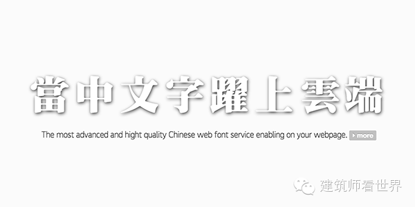

Arial
Web Standard
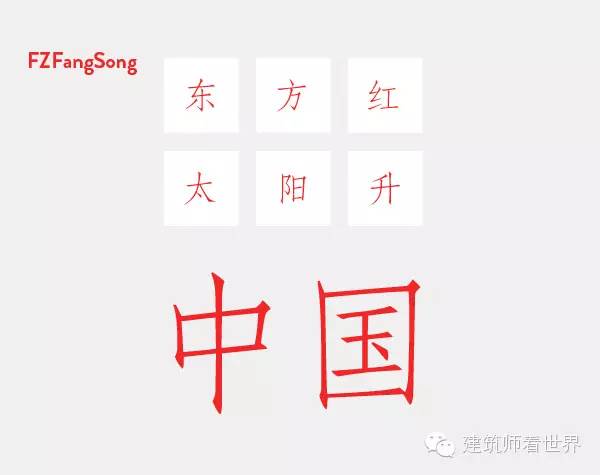
宋体例

Black body
Web page standard
Example in bold
Italic
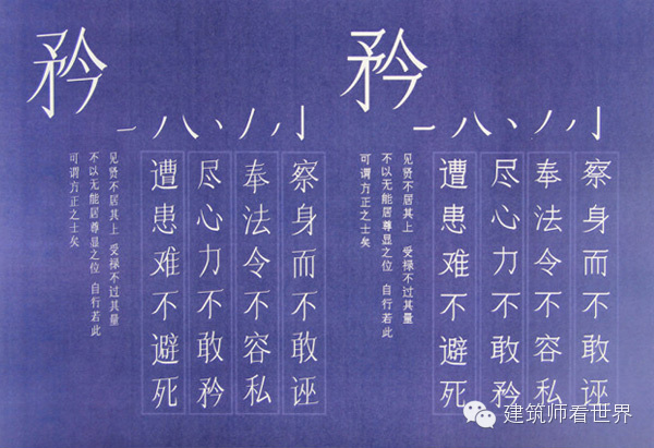
The name of the calligraphy in the font
Web Standards
Example of italics
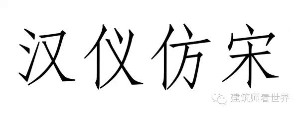
Imitation Song
Imitation Song example
Art style
Circle
You should have noticed: font name prefix
Yes! Authorization is required to use Chinese fonts
There are squares everywhere
Up, down, left, right: writing direction
There is no space!
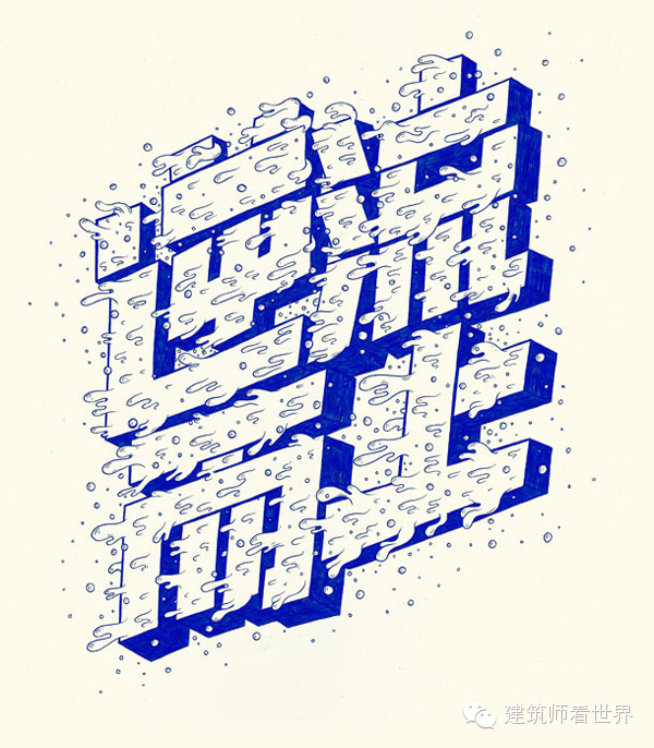
Grand view of modern Chinese typography
Articles are uploaded by users and are for non-commercial browsing only. Posted by: Lomu, please indicate the source: https://www.daogebangong.com/en/articles/detail/Super%20Interpretation%20%20Complete%20Guide%20to%20Chinese%20Fonts%20for%20Novices.html
 支付宝扫一扫
评论列表(196条)
测试