DIN
The story of the DIN font
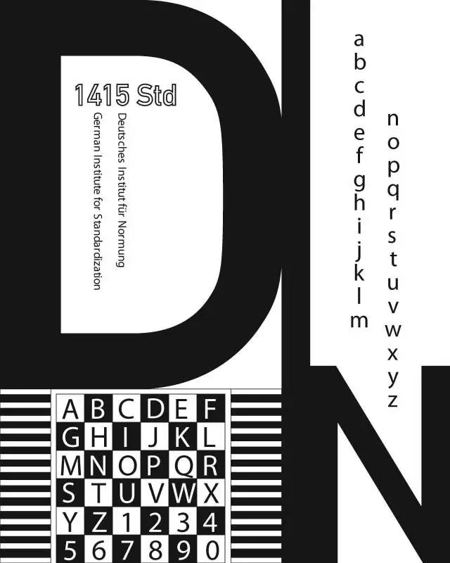
'DIN' is German Considered the "national font" because 'DIN' has a long history in Germany

back
Scenery
DIN
Development history
In 1905, the Royal Prussian Railways designed a set of fonts for their trains, charts and blueprints in that year
In 1920, Germany After the merger of all railway administrations, most railways in Germany adopted this font.
1923 River Main The D. Stempel AG Foundry in Frankfurt published for the first time an upgraded version of the typeface designed by the Prussian Railway Bureau.
In 1936, the set The font was revised again and named 'DIN 1451'. 'DIN 1451' is widely used in Germany as the standard typeface for traffic signs, street signs, house and license plates.
September 1939, 'DIN 1451' appears for the first time in an official German military document.
Decades after , 'DIN 1451' became the German national font used in various household products. DIN 1451 has become synonymous with German design.
'DIN 1451' was stereotyped as an "industrial-specific font" from the very beginning. Until the 1980s, several graphic designers began to try to use 'DIN 1451' in magazines and posters. In 1995 FontFont Type Foundry released an upgraded version of 'DIN 1451' designed by Albert-Jan Pool, named 'FF DIN'.

DIN font
and
Bauhaus
off
Department
Although there is no direct relationship between Bauhaus and DIN in terms of the origin of font design, there is no doubt that the typeface of railway has exerted a subtle influence on Bauhaus. The standardization of simple solutions is a common philosophy of DIN standards and Bauhaus.

Use DIN Comparison of bauhaus spelled out by Engschrift (above) and bauhaus logo designed by Joost Schmidt (below)
word
body
FFDIN font
The FF DIN font became popular with the addition of bold and italic. In order to make the font family more diverse, a round body was added.

In Germany, you will It is found that some people like DIN fonts, and some people have slightly complicated emotions about the positioning and meaning of this font.

Articles are uploaded by users and are for non-commercial browsing only. Posted by: Lomu, please indicate the source: https://www.daogebangong.com/en/articles/detail/Studying%20in%20Germany%20%20German%20national%20font%20DIN.html
 支付宝扫一扫
评论列表(196条)
测试