
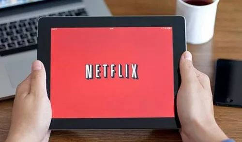
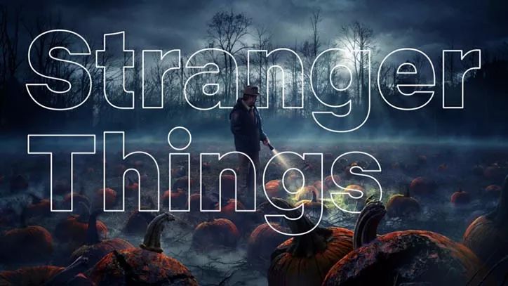
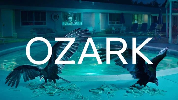
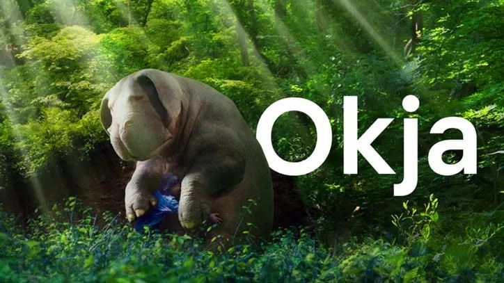
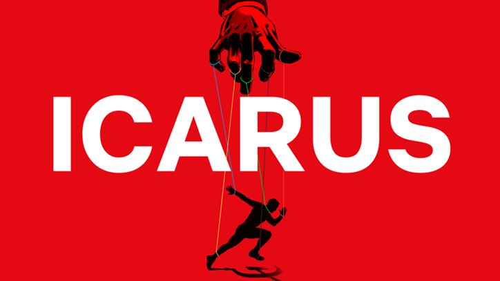
Let me introduce today's protagonist Netflix,This is the largest streaming media platform in the United States, the world's leading online video company. Founded in 1997 and headquartered in Los Gatos, California, the company was mainly engaged in online DVD rental in the early days, and started subscription service in 1999. Listed on NASDAQ in 2002. Launched online streaming service in 2007. In 2010, it began to expand its streaming service to the world, and officially entered the field of original programming, providing exclusive content. Since 2013, the popularity of a series of original dramas such as "House of Cards" has won a lot of word-of-mouth and market share for it.
Although we know that Netflix has already dominated the streaming media market in the United States, and its growth path is quite brilliant, but recently it has directly launched a brand custom font< /strong>, to strengthen brand identity.
This set of fonts is a very minimal sans-serif typeface - Netflix Sans, used for branding and marketing of the entire streaming platform. The typeface was developed by the in-house design team in collaboration with Dalton Maag.
Netflix Sans was designed with both display aesthetics and more practical functions in mind. The proportion of uppercase letters is designed to be "movie-style", while the proportion of lowercase letters is "small and efficient".
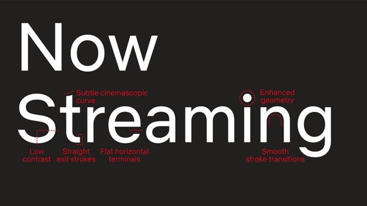
Noah Nathan describes the font style as clear and neutral, which avoids excessive design and makes people more focused on the information conveyed by the font.
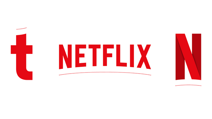
The arched cutout on the lowercase 't' is clearly inspired by the brand's signature 'cinemascopic curve'.
An excellent typeface, Netflix Sans comes in different weights, including regular, light, light, medium, bold and bold.
Additionally, the Netflix Sans font was developed by the in-house design team in collaboration with Dalton Maag.
The main reason for designing this typeface is that with the globalization of Netflix's business, the authorization fee of the original Gotham typeface has gradually increased. The reason for abandoning Gotham is to reduce costs, and designing custom fonts can make your brand image more "manageable". Adopting the new Netflix Sans font is said to save the company millions of dollars a year.
Finally, let’s review the Gotham font, a sans-serif font inspired by traditional New York street font styles. In 2000, designer Tobias Frere-Jones was commissioned by GQ magazine to create this typeface.
Gotham font is modern, concise, and has a wide range of applications. In addition, the 2008 Obama campaign slogan used Gotham~
Do you likeNetflix Sans?
Written by ✎ Little Mushroom
www.51design.com
?????????
Industrial Design | Interaction Design | Brand Design | Spatial Experience
Provide professional services for the whole industry chain
Add WeChat ID 15121033529Initiate your demand immediately
media@51design.com
For business cooperation/contribution/recruitment of writers, please send an email
Articles are uploaded by users and are for non-commercial browsing only. Posted by: Lomu, please indicate the source: https://www.daogebangong.com/en/articles/detail/Streaming%20media%20giant%20Netflix%20launches%20brand%20custom%20fonts%20which%20can%20save%20millions%20of%20dollars%20in%20addition%20to%20upgrading%20the%20image.html
 支付宝扫一扫
评论列表(196条)
测试