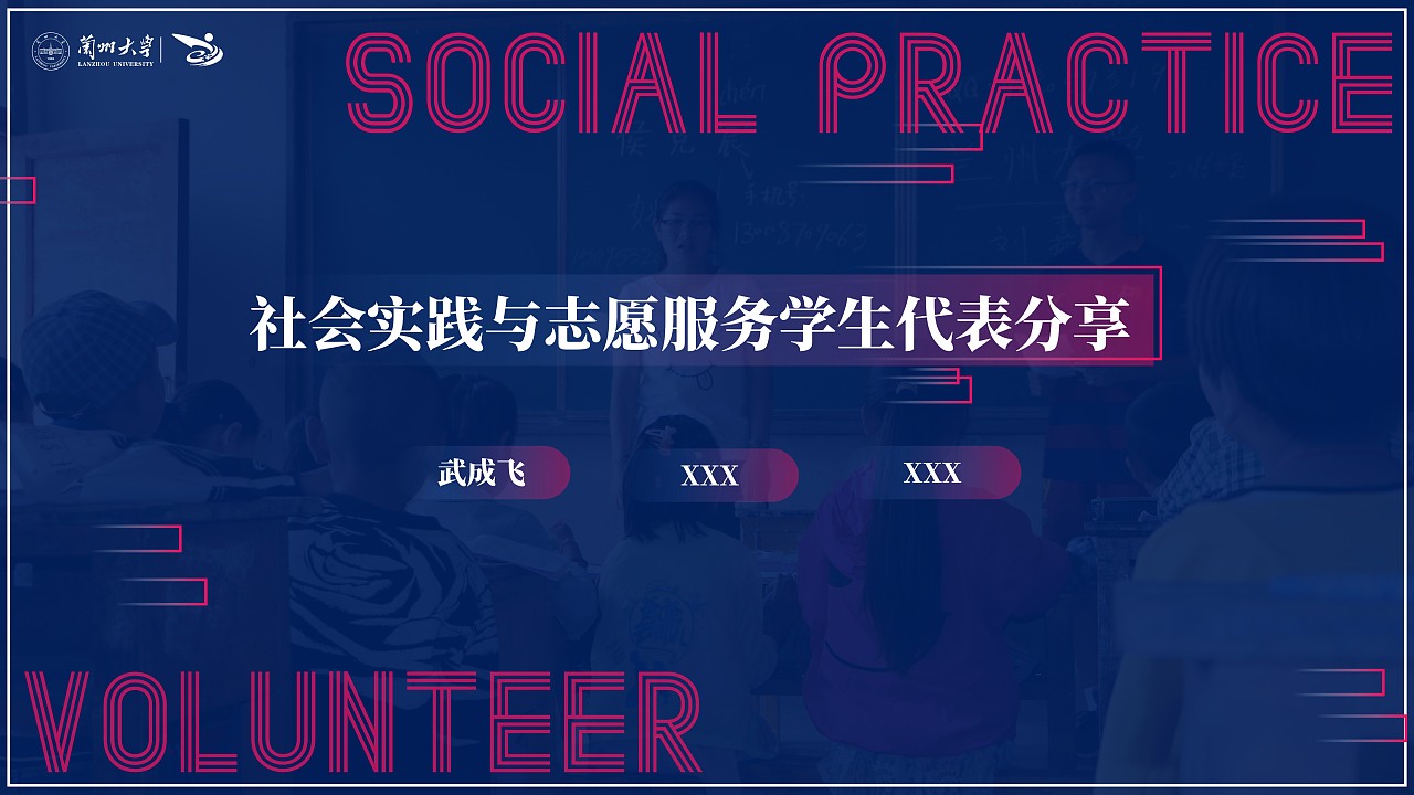
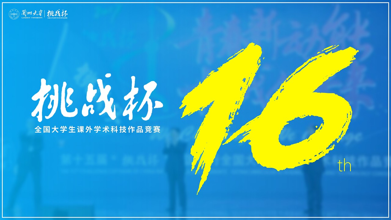
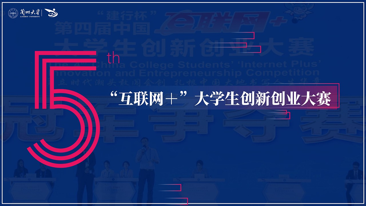
This is the link transition PPT I designed for the 2018 Lanzhou University Innovation Practice Annual Conference<br>------------------------- -------------------------------------------------- -<br>When I first received the task, the idea was to choose a regular red-gold background and a positive design style<br>But after communication considerations, it should reflect the tonality of innovation and practice< br>So try to break through and change, and present this PPT in a relatively "trendy" form.<br> This young "trendy" nature is mainly reflected in color matching (yellow, pink), dynamic background ( Data particles), typesetting (red and gray interspersed style), etc. <br> Regardless of whether it is recognized by the mainstream aesthetic vision, anyway, I personally passed this level<br> Selected a few pages for display. <br><br>To sum up, design is not easy, and breakthrough is even more difficult. <br><br><br> above.






Articles are uploaded by users and are for non-commercial browsing only. Posted by: Lomu, please indicate the source: https://www.daogebangong.com/en/articles/detail/Spring%20blossoms%20and%20autumn%20fruits%20a%20tribute%20to%20youth%20Innovation%20practice%20annual%20meeting.html

 支付宝扫一扫
评论列表(196条)
测试