Few people know that in the center of Shanghai, in Lane 1209, Xinzha Road, there is a unit named "Shanghai Printing Technology Research Institute".
The nine gilt characters inscribed by the seal-carving calligrapher Qian Juntao have faded on the south wall of Yimei Village, and the strokes of the word "Jiao" are incomplete; and the wooden signboard at the entrance of the alley has also been mottled.
Also inconspicuous is the font research room here, even the security guards in the lane and the surrounding businesses have never heard of it. But in the 1960s and 1970s, it had the same limelight, and the four major printing fonts of Song, Hei, Fangsong, and Kai were all born from here.
In life, fonts exist like air, and people often use them, but they don’t often think about them—because, as long as you open the computer and pull down the menu, there are many options, simple and convenient, as if they are an eternal part of the environment.
What few people also know is that the fonts are not automatically generated by the program, but carefully polished by strokes and strokes. They have value and they belong.
"Do you need to spend money to buy fonts?" Ding Yi, a font designer who is the founder of the font design company "Zaozi Workshop", has been asked countless times. Every time he has been noticed in these years, it is almost because of font rights protection. The most recent time was on April 26 this year, World Intellectual Property Day.
Rights
"I don't want to always get involved with rights protection, but there is no way. The fonts will be stolen as soon as they go on the market." The soft-spoken Ding Yi talked about rights protection, and his speech speed increased. The people who grow vegetables are going to starve to death.”
On the West Lake Avenue at night on April 27th, all kinds of shops were brightly lit. Ding Yi, who was on a business trip from Shandong to Hangzhou, pointed to the signboard of a silk shop. ".
After resigning from the fashion group in 2009, he began to specialize in font design. There are more than 90,000 Chinese characters, and at least 6,763 commonly used ones can be called a set of fonts. From the length and thickness of strokes to the structure and size of fonts, and then to the balance of the beauty of individual characters and the unity of the overall style, the design is not overnight. achievement.
Ding Yi started his business in Beijing at the beginning, and changed from a one-bedroom apartment to a shared apartment. Within a year, he was struggling, so he had to return to his hometown in Weifang with unfinished writing.
He judged that the fonts that designers can use are "not only lacking, but also very scarce", so he did not hesitate to borrow money to complete the font library.
As he expected, the two fonts "Junya" and "Shangya" were popular on the Internet as soon as they came out.

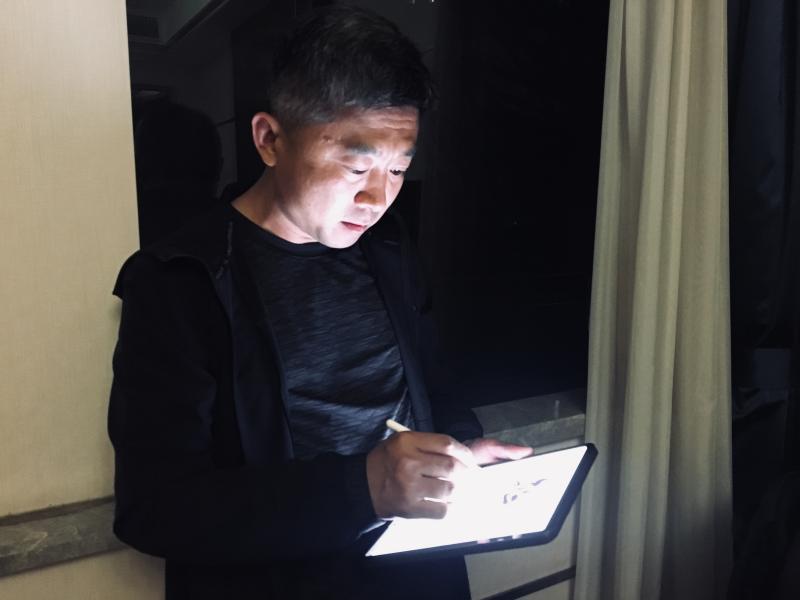
Ding Yi writes on the tablet, and he will record inspiration at any time. Photo by Liu Xueyan
However, there are very few formal sales, but the low-priced packages on the resource site are countless, and the download volume of a certain platform alone has reached millions. After communication, the answer given by the other party is that registered users upload by themselves, which has nothing to do with the platform.
Piracy almost destroyed the profit model of fonts. Founder Jinglei, which cooperated with Xu Jinglei, went on the market in 2007, and each set was priced at 10 yuan. Only more than 2,000 sets of genuine software were sold, while there were hundreds of thousands of pirated sets on the market.
"Most manufacturers such as Stone and Great Wall quit, and there are only 5 companies with more than 10 employees. Founder Font has suffered long-term losses, and was once considered by the company to cut it off." Huang Xuejun, deputy general manager of Founder Electronic Font Business Department, sighed, "From our point of view , Rights protection is indeed a somewhat helpless move.”
Since 2007, Founder has started two copyright lawsuits that have lasted for many years.
Founder and the game company Blizzard have been fighting a lawsuit for font infringement for 5 years, and the court finally supported Fang Zheng, ruling Blizzard for infringement and paying 2 million yuan in compensation. However, this amount is still far from Fang Zheng's claim.
Another lawsuit against the infringement of Procter & Gamble's "Rejoice" was not supported by the court from 2008 to 2011. The copyright issue of printing fonts and their individual characters, fonts and software has begun to be considered by the industry and legal circles.
"There are more than 400 types of Chinese character fonts, and nearly 3,000 types of Chinese fonts in Japan, not to mention more than 100,000 types of English fonts." Ding Yi believes that in the Chinese character font garden, there are far from many types of flowers, let alone Time to grow multiple layers of multi-colored roses.
The richness of font types is directly related to the profitability of the company. Whether it is Morisawa in Japan or Mona in the United States, both are companies with annual revenues of hundreds of millions.
In China, type designers are still a minority. Ordinary people can't tell the difference between different HeiTi and SongTi, let alone understand their production methods.
The turnaround of the "Character Making Workshop" has something to do with Disney. When "Alice in Wonderland" was released in China in 2010, Ding Yi found that the Chinese font did not match the style of the film, so he hand-painted these characters—curly bends, wizard hat-shaped pens, echoing fairy tales. Unexpectedly, the version he posted on his blog attracted Disney's attention. After that, he was responsible for the design of the Chinese characters in Shanghai Disneyland.
Wonderful Fairy is light, Alice is dreamy, Toy Story has the sense of building blocks, and Pirates of the Caribbean has the barbaric sense of swords... It took Ding Yi 5 years to complete hundreds of fonts in the park.
It has to be said that this year's visual China "black hole" picture has once again triggered copyright thinking in the font industry.
In Huang Xuejun's eyes, "With the country's emphasis on intellectual property rights, the font industry is developing again, but the proportion of actively purchasing font copyrights is not high, and the overall income of the industry is still not optimistic."
"The letter-making studio is quite lucky, at least it survived." Ding Yi said, it felt like climbing a mountain in the dark, with continuous wind and snow, and falling rocks.
This stone may be due to a broken capital chain, it may be that no one buys the font, or it may be repeatedly pirated.
Vigor
The seed of Ding Yi's "Mountain Climbing" was planted when the elementary school art teacher wrote the two art characters "Guang" and "Hua" on the blackboard. The aesthetic feeling between horizontal and vertical strokes deeply moved him and made his life intertwined with it.
But in the small town in the 1990s, Ding Yi mistakenly believed that the fonts existed naturally and were impeccable. At that time, he didn't know that the widely used printing fonts were "Made in Shanghai".
As soon as he came to work in Shanghai in 2000, he went straight to the Bund. On the bustling Nanjing Road, Ding Yi is most impressed by the old-fashioned signboards, which tell the beautiful past of a city.
These store signs, in the 1970s, were also a young man's favorite city scenery. In order to find beautiful handwritten fonts, this guy cycled from Zhongshan Park to work on Xuchang Road. He rode for an hour and a half.
His name is Chen Qirui, born in 1943, the first generation of typeface designers in Shanghai.
This old man, who calls himself "Qiwu old man Qirui", has all the past days printed in his mind - various fonts, every colleague, the desk lamp on the desk, the old Duan inkstone bought by Duo Yunxuan, and the old inkstone outside the window. His memory is amazing.
That was the golden age of lead printing after the founding of New China. Previously, the printed fonts were messy, and the printing masters were "in a family of their own". The old hand-carved fonts are very different, even with the same font, there is no uniform paradigm in size, height, thickness and depth.
There are 7 kinds of strokes of "dot" only, which are different in the characters of "Dong, Yan, etc". "Even in a book, the page numbers jump around like a cartoon." Chen Qirui opened a book and said, "It's hard for you young people to imagine."
At the Leipzig International Book Art Fair in 1959, the books published in Shanghai won the gold medal for book binding design, but suffered Waterloo for printing typesetting and font design. The important task of unifying and standardizing the printed fonts was entrusted to Shanghai.
In 1961, the Shanghai Institute of Printing Technology established a font research room. Mr. He Buyun, a veteran of the printing industry, is the director, and Zhang Longdi, the director of the typesetting room of the Third Municipal Printing Factory, presides over the typesetting. Top talents in Shanghai's calligraphy, painting, printing, and packaging gather here.
They tried to write more than 50 kinds of characters through the hundreds of movable type fonts they collected, and compiled the "Samples of Printed New Style Movable Type". There are more than 50 people working in groups in Song, Hei, and Kai.
"At that time, work was valued, and everyone was very motivated. Although it was a period of natural disasters, the working environment was still good. In order to prevent the fingers from freezing, a coal stove with iron pipes was installed in the office for heating." Chen Qirui, 18, from the press release The employees' children graduated from senior high school and participated in the publication of "Ci Hai" as soon as they entered the font room, witnessing the birth of Song and Hei Ti.
The main text of "Ci Hai" is based on "Xiu Ying Ti" used by "People's Daily", and incorporates the writing habits of Chinese characters into this Japanese font. For example, "日" and "日" have different meanings, so they are designed to be thin and long and flat and wide respectively.
It took two years to complete the old and innovate. Each character was drawn by pencil, drawn horizontal and vertical ink lines, hooked and pressed ink lines, filled with ink, sorted out and traced, and then hand-designed, and handed over to the workers of the font factory to engrave copper molds and cast them. type.
The manuscript has a total of 18,000 characters, and it is the first printed "Song typeface" standardized by the country, and it is also the first typeface designed by the font room, so it is named "Song typeface".

The two sheets on the left are Songyi and Heiyi used in the text and header of "Ci Hai", and the two sheets on the right are Song II and Hei Ti used in "Mao Xuan".
Chen Qirui took out the miniature version of "Ci Hai" from his study room, pointed to the 7th size text on it which was as big as a match head, and said with a proud smile: "This character is so small, but it is still very clear. The layout looks so comfortable. The paper is opaque and the line illustrations are very clear."
From handwriting to phototypesetting, Chen Qirui's manuscripts are leftovers that were selected back then, and now they are treasured, put in kraft paper bags, pasted on pictorials, and packed in envelopes. Although each word has turned yellow, it is not wrinkled or wrinkled, and the traces of careful revision in the past are left in the crevices of the brush painted with white ash.
After several relocations, the Shanghai Institute of Printing Technology moved to its present location on Xinzha Road. "The typeface research room is purposely located on the fourth floor, the highest, with a spacious area and a first-class environment." Chen Qirui is in the center room, with a desk near the window and plenty of sunlight.
During business training, some people teach about the blank space and layout in painting, and some people teach to type pencil drafts. The font room successively launched Song Er, Song San and other text characters. In 1978, Song Erti won the Shanghai Major Scientific and Technological Achievement Award.
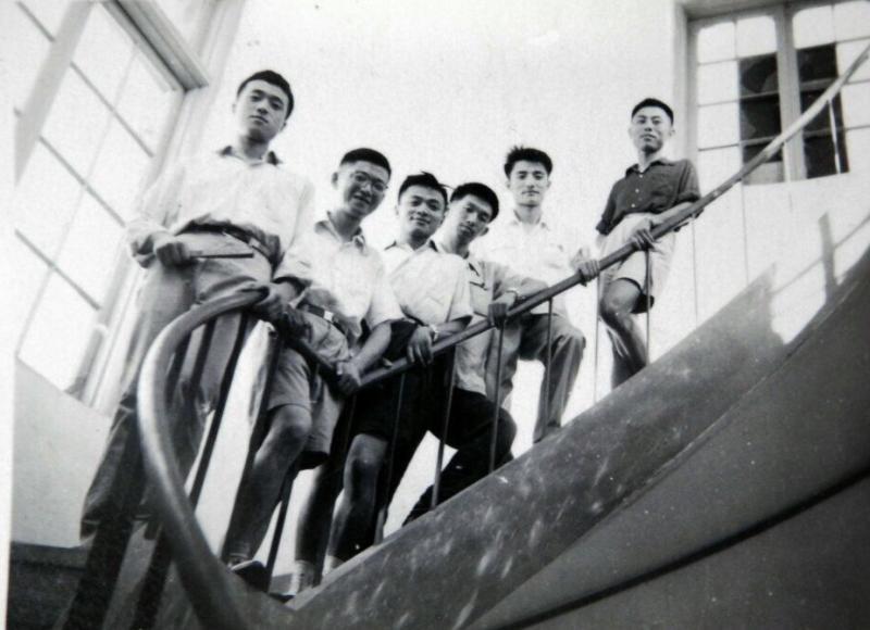
On the most iconic spiral escalator of the Institute of Printing and Technology, a precious photo was left - in the summer of 1964, six guys in shirts stood at the corner of the third to fourth floors. The frontmost Chen Qirui was 21 years old and aged The youngest, Zhang Jiasheng, Xu Xuecheng and others climbed up the stairs behind him.
That was the most vigorous time in the birthplace of the creation and writing of modern Chinese characters.

The photo was taken in 1964. From the front are Chen Qirui, Zhang Jiasheng, Guo Zuliang, Chen Yonghai, Xu Baikang, Xu Xuecheng.
Fade
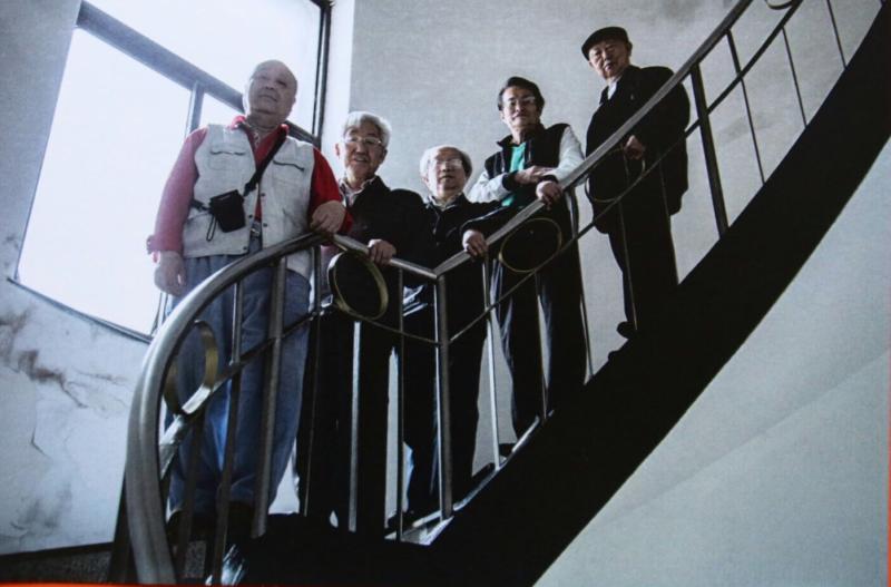
Reunited after 53 years, the 5 people re-photographed at the Indian Research Institute in their original positions. Shaohua has passed away, and his head is full of gorgeous hair. The eldest brother Xu Xuecheng is 90 years old, and one person has passed away.

In 2017, they reunited with the Institute of Printing and Printing, starting with Chen Qirui, Chen Chufu, Chen Yonghai, Xu Bokang, and Xu Xuecheng.
Looking back at that year, after the "Cultural Revolution", the Institute of Printing and Printing was disbanded, and the font designers were collectively sent to Shanghai No. 1 Font Factory. At this time, it was in a monopoly position in the industry. When the average annual salary of employees nationwide was only 1,271 yuan, the tax paid by the Shanghai No. 1 Typeface Factory to the state reached more than 100,000 yuan a year.
In order to enrich the layout of publications, the No. 1 Font Factory set a precedent, inviting calligraphers to write new printing fonts. Calligrapher Han Feiqing became the chosen one. He wrote for 14 months, a total of 4,050 commonly used simplified characters. Chen Qirui and Zhang Jiasheng trimmed them to make them more suitable for printing—the new Wei style was born.
After the font came out, there was no payment for the manuscript. The sense of honor of "doing things for the country" was extremely important to them at that time.
In 2015, at the "Xi Ma Hui" in Singapore, Han Feiqing's new Wei body was used for the seat lottery. Chen Qirui called Han Feiqing as soon as he saw it. Hearing the hearty and loud laughter of the 92-year-old man, his heart was warm.
In the era when Xinwei Style was born, in order to support the national informatization project, the Printing Research Institute provided free copy manuscripts of various fonts, which also became the basic computer fonts for most domestic font companies to start.
Just ten years later, with the popularization of basic computer technology, newly emerging fonts can become counterfeit products with slight modifications. Some font researchers said, "type designers are like pop singers, you can't stop someone from singing your song in the bathroom."
"Companies with large and small fonts are occupying the market. It looks like there are many characters, but they are actually similar, and they are all replicas of old fonts." Xu Xuecheng believes that it "seems to be prosperous, but in fact it is flashy."
Do Chinese printed fonts and their fonts constitute works? Is the purchase of the font library software an implied license for the single-character artwork? At present, in my country's academic circles, industry circles and even judicial trials, these issues are still inconclusive. According to Tao Xinliang, a professor at the School of Intellectual Property of Shanghai University, the font library does not constitute a work, but the original characters in it constitute works of art according to law and are protected by copyright law. The originality of a font can be judged by the thickness, length, radian, and ratio of radicals of the font strokes. If there is no obvious difference, font infringement can be determined.
When the trend swept across, the Institute of Printing and Printing did not recover: Although it has strong manual font design capabilities, it lacks market-oriented means and cannot form font library products.
At the beginning of this century, due to the opportunity of the application of "Chinese character printing and writing skills", Yuan Weimin, the head of the font room at that time, began to sort out the original manuscripts. From the warehouse that has been dusty for decades, and from the hands of private individuals who are difficult to contact, after traveling to many places, in his words, "it took a lot of effort", the original manuscript of the four fonts finally came to light.
In 2009, "Chinese character printing and writing skills" was included in the list of Shanghai intangible cultural heritage items.
No one buys fonts, they are copied, the salary of talents is low, and lack of attention. The font design talents of the Printing Institute are rapidly losing. Some people went to font companies in Taiwan, some chose computer companies, some joined the media advertising industry, and some concentrated on the study of calligraphy and painting. At present, only Tan Xiangsheng, the third-generation heir, is in office. Chen Qirui also worked as a calligraphy and painting editor at Shanghai Bookstore Publishing House in the 1980s.
When Hu Dan, the current head of the font room, came here 10 years ago, there were very few people. Now, newcomers have joined in the font room, and the fourth generation of inheritors is being cultivated. In order to discover newcomers and new characters, the Institute of Printing Research also held the "Printing Research Cup" font design competition; some of the original fonts of the predecessors were also sorted out and exhibited at the "Moving Type Fragrance" national tour exhibition.
Right now, the building is being renovated and the machines are rumbling. In the two photos taken on the escalator, the material of the handrails changed from iron to aluminum, and then replaced with wood, and the vertical railings also have more complicated patterns, as if the font design industry is becoming more and more diversified.
Regenerate blood
"Shanghai should become the national type design center." In the 2007 symposium on application for world heritage, Chen Qirui proposed to revive Shanghai's movable type design.
Why was Fangzheng not born in Shanghai? This is the common question of "Chen Qirui".
In 2010, Chen Qirui accidentally learned from the Internet that the Kangxi dictionary font designed by Li Xiangchen, a post-90s generation, became popular. Later, he saw netizens discussing "why there is no Song Siti" in the Douban "Typeface Exchange and Appreciation" group.
He understood that the answers were more than 40 years ago, "Song Si is the Kangxi dictionary style made by Xu Xuecheng back then. I experienced it personally, and the impression is indelible."
It takes time and effort to write with the mouse, and it is difficult to upload pictures and link files. Although he really wants to participate in online discussions, Chen Qirui can only regret it again and again.

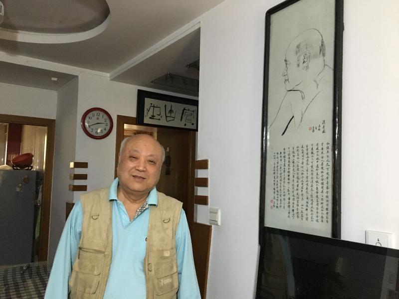
There are many calligraphy and paintings in the living room of Chen Qirui's house, and his self-portrait on the wall. Photo by Liu Xueyan
This spring, upon seeing the notice of the offline exchange meeting, Chen Qirui took his manuscript and volunteered to go. He spoke for two hours at a stretch, and the exchange meeting became his home field.
Li Zhiqian still remembers the shock at that time, the long-lost source was actually in Shanghai. He is the initiator of the Douban group, as well as a designer and font lover. Later, he launched the "Shanghai Movable Type" project, and Chen Qirui became the first dictator.
Following the lineage of their predecessors, Li Zhiqian, Gong Qijun and other partners interviewed a large number of type designers, relevant personnel in foundries, and calligraphers involved in font development through research and sorting out historical materials. Through dialogues, they spelled out the clarity of the past and present of Shanghai movable type Atlas.
In 2017, when they visited Wu Yongkang, the former director of the No. 1 Shanghai Typeface Factory, Chen Qirui found out that Gong Qijun was born in 1994, while Wu retired in the same year. He was 83 years old at the time.
"One is retired, one is just born; one is narrating history, and the other is seriously discovering, recording, and researching this history." Chen Qirui said, "It's so interesting that they can meet together."
"Movable type printing is also a sunset industry in foreign countries, but we can still see the most beautiful sunset." Li Zhiqian said that the emergence of customized small studios and the promotion of new software will inject vitality into the industry.
In Li Zhiqian's eyes, it is very irresponsible to history to always want to create hits instead of seriously polishing and developing the lineage. In the printing office located in Xiaonanmen, he told the students about the history of movable type, and the most basic strokes were repeatedly traced.
When Chen Qirui sees new fonts on the Internet, he sometimes sighs, "The characters are like crabs crawling, and they have no aesthetic feeling." He agrees with font designer Yue Xin, that the difficulty of imitating Song style characters in the standard text is even more difficult than sketching David.
Old designers who are familiar with traditional fonts often try to "hybridize" in the later stages of their careers, merging imitation Song and Song typeface, and colliding Kai typeface and Hei typeface. This skill is difficult for designers who are accustomed to computer spelling.
In the backyard of Chen Qirui's house, potted plants are as elegant as calligraphy and painting. The flowers in May are blooming, "the spring of font design has also come." He said.
Column Editor: Lin Huan Text Editor: Lin Huan Picture Editor: Da Xi Edit Email: eyes_lin@126.com
The title picture is Shanghai Institute of Printing Technology. Photo by Liu Xueyan
Articles are uploaded by users and are for non-commercial browsing only. Posted by: Lomu, please indicate the source: https://www.daogebangong.com/en/articles/detail/Song%20and%20Hei%20are%20all%20Made%20in%20Shanghai%20we%20should%20know%20more%20about%20fonts.html

 支付宝扫一扫
评论列表(196条)
测试