Happy New Year, fellow designers, today I want to share with you a little trick: put a large year on the cover when posting the work, so that others will think that this is a collection of annual works, thereby increasing the number of clicks (big mistake)
============================================================================================
Closer to home, I saw such a work picture on Dribble before

I found it very interesting, so I spread it out and made a 2017 font effect.

Today, I will share with you the general production process as a tutorial. I chose PS as the production tool. Some specific details and parameters, I hope you can make your own decisions with your own thinking , after all, the process of getting the answer is more important than the answer itself. There is a psd file in the attachment for reference. If there is still something unclear, you can leave a message for consultation, and I will share my thoughts and practices. I wish you all a sticky and wet New Year~
Note: The practice of the four numbers is similar, so when I explain the steps next, I will use the number 0 as an example. You can practice on a number first, and then diverge to do it after you understand it. It might be slow at first, but it will go faster and faster as you get used to it.
==================== The following four steps to explain =====================
The first step is to make the shape of the digital ontology. Here I use shape tools and Boolean operations, which are nothing more than addition and subtraction of rounded rectangles. Be careful to keep the same width. If you find it troublesome, you can also directly find a font to enter numbers and convert them into shapes.

The second step is to outline the shape of the slimy liquid. It is recommended to draw a picture on the paper to conceive. I imagine that the liquid is sprayed from the lower left corner to the upper right to the numbers, so that it is easier to determine the adhesion and hierarchical relationship everywhere.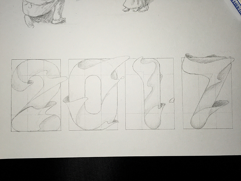
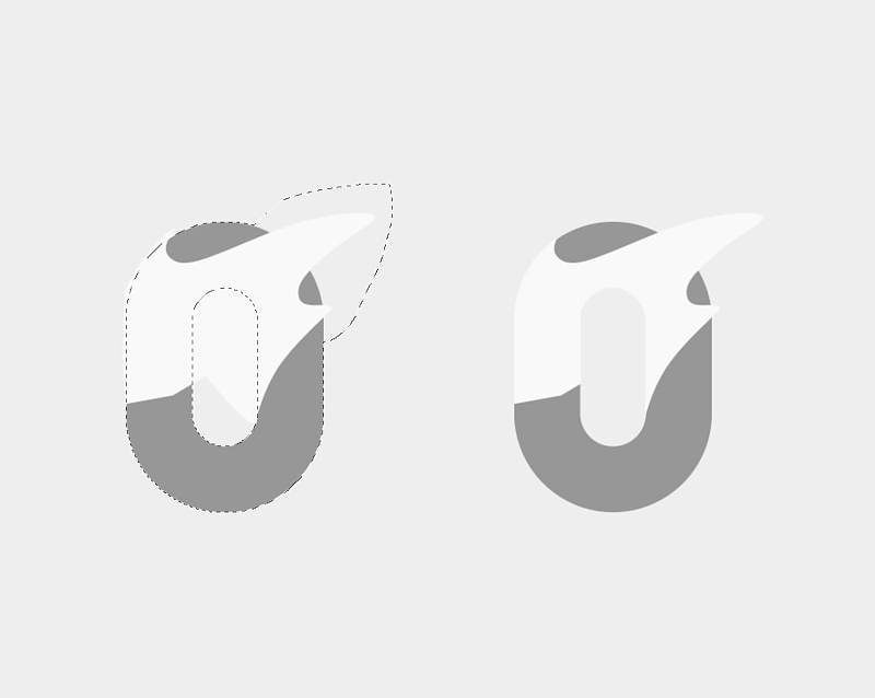
After drawing, take a photo and put it in PS, then use a pen to outline the shape. Pay attention to the distinction between bright and dark sides.

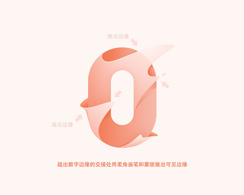
The arc part close to the number does not need to be drawn completely along the curve, but directly outside the curve and then use the mask function to erase the part outside the arc.
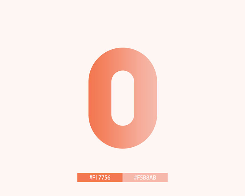
The third step is to add gradients to reflect the texture. First of all, decide the color tone you want to use. I used a more festive orange-red color to correspond to the New Year.
The main text is a relatively obvious gradient from dark to light. The dark color on the left is because it needs to line up with the liquid on the left to highlight the level, so the position of the gradient should be determined according to your shape, which can show the feeling of shadow That's it. Note that the "dark color" here cannot be just a change in lightness. If you only change the lightness, it will easily look dirty. Reduce the lightness while increasing the saturation, and even change the hue accordingly. By the way, fill the background color of the canvas with a light color of the same color.
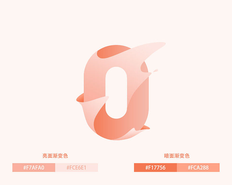
The light and dark sides of the liquid are textured with slight gradients of varying shades. There is also a reason for the choice of depth: after the liquid is sprayed, the number on the left side of the layer is closer, and the darker number at the bottom can be vaguely seen, so it is darker; while the right side of the liquid floats higher. If it is too close to the font, it will appear lighter.
Now it seems to be so interesting, right? Haha, the next step is to make the details fuller.
The fourth step is to add detailed light and shadow.
First, use the inner shadow of the layer style to add a dark edge to the left edge of the liquid (if the inner shadow affects other places other than the left side, you can copy the current liquid layer and add the inner shadow to the upper layer to be The affected part is erased with a mask, there are many methods (this method is for reference only);
Secondly, use a clipping mask to add a narrow bright edge to the higher edge (right click on the layer-create clipping mask, shortcut key option+command+G for mac version, shortcut key alt+ctrl+G for win version) .

Use the shape tool to draw some shadows on the numbers below the liquid, and use gradients or masks to adjust the depth of the shadows. The farther the liquid is from the numbers, the blurrier and lighter the shadows will be.

The part of the liquid beyond the number can be slightly erased with a mask, or a layer of shadow can be added with a brush and a mask, so that the edges of the numbers below can be seen through the translucent liquid.
So far, our sticky and wet font effect is basically done. Different characters and different liquids have different details. Everyone adjusts the details according to the shape they make. Finally, I wish you all more learning and progress in 2017!
If you think it is so interesting, please give it a thumbs up~
Articles are uploaded by users and are for non-commercial browsing only. Posted by: Lomu, please indicate the source: https://www.daogebangong.com/en/articles/detail/Slimy%20Typography%20Tutorial.html
 支付宝扫一扫
评论列表(196条)
测试